DIY Hand Watercolored Save the Dates + Thank You Cards

It’s the ladies of Anti­quaria, back with another fab­u­lous and cre­ative DIY project for you all!  This project is for wed­ding save the dates, but you can eas­ily apply this tuto­r­ial to any party invi­ta­tions or announcements!

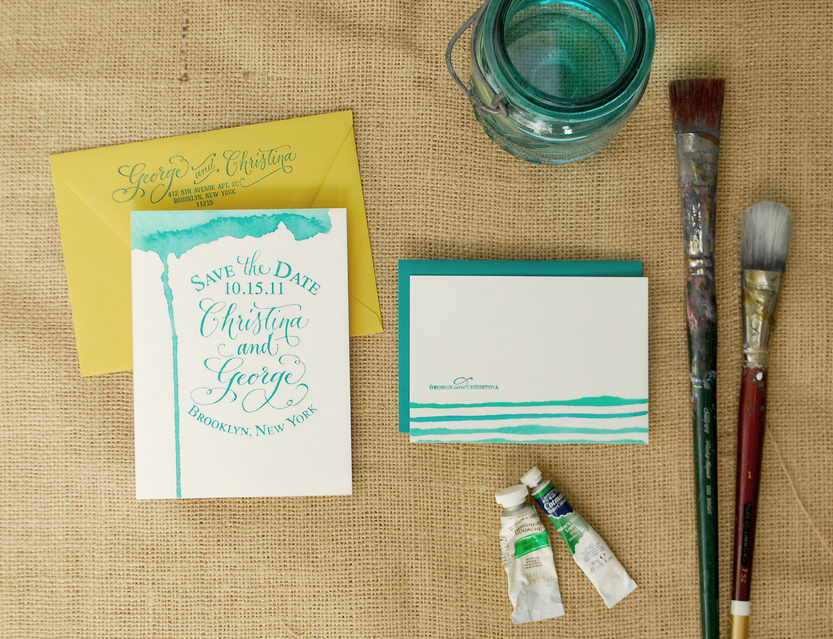
These Save the Dates and matching Thank You Cards combine the use of our custom rubber stamps with hand painted watercolor accents.  This DIY project is inspired by Emma’s reception invitations that we did a while back, after her wedding.  The calligraphy ended up having variegated shades, giving the illusion that it was watercolored.  We ended up loving the way that the calligraphy looked and Emma embellished the invitations with a bit of color on one side, changing the look of the whole thing!

Using beautiful turquoise and blue shades of watercolor and our custom rubber stamps, this DIY save the date looks modern and organic at the same time.  The best part of this is just how easy it is to do!!  You don’t have to be an artist to master these painting techniques.  Also, we love how using different color combinations or shapes yield different results – making each card totally unique and its own little work of art.
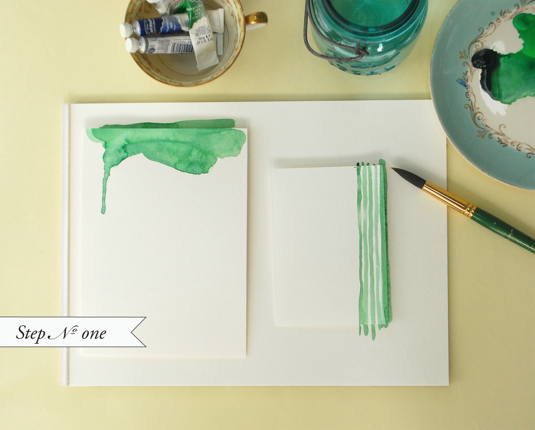
Step One: On pre-cut pieces of watercolor paper, get creative with painting.  We played with uneven painted stripes for the thank you cards and organic watery shapes for the save the dates.

Painting Tip: Go easy on the water to achieve a nice flat card.  Too much water will make your paper buckle or ripple when drying.

Watercolor Save the Dates: Step 1

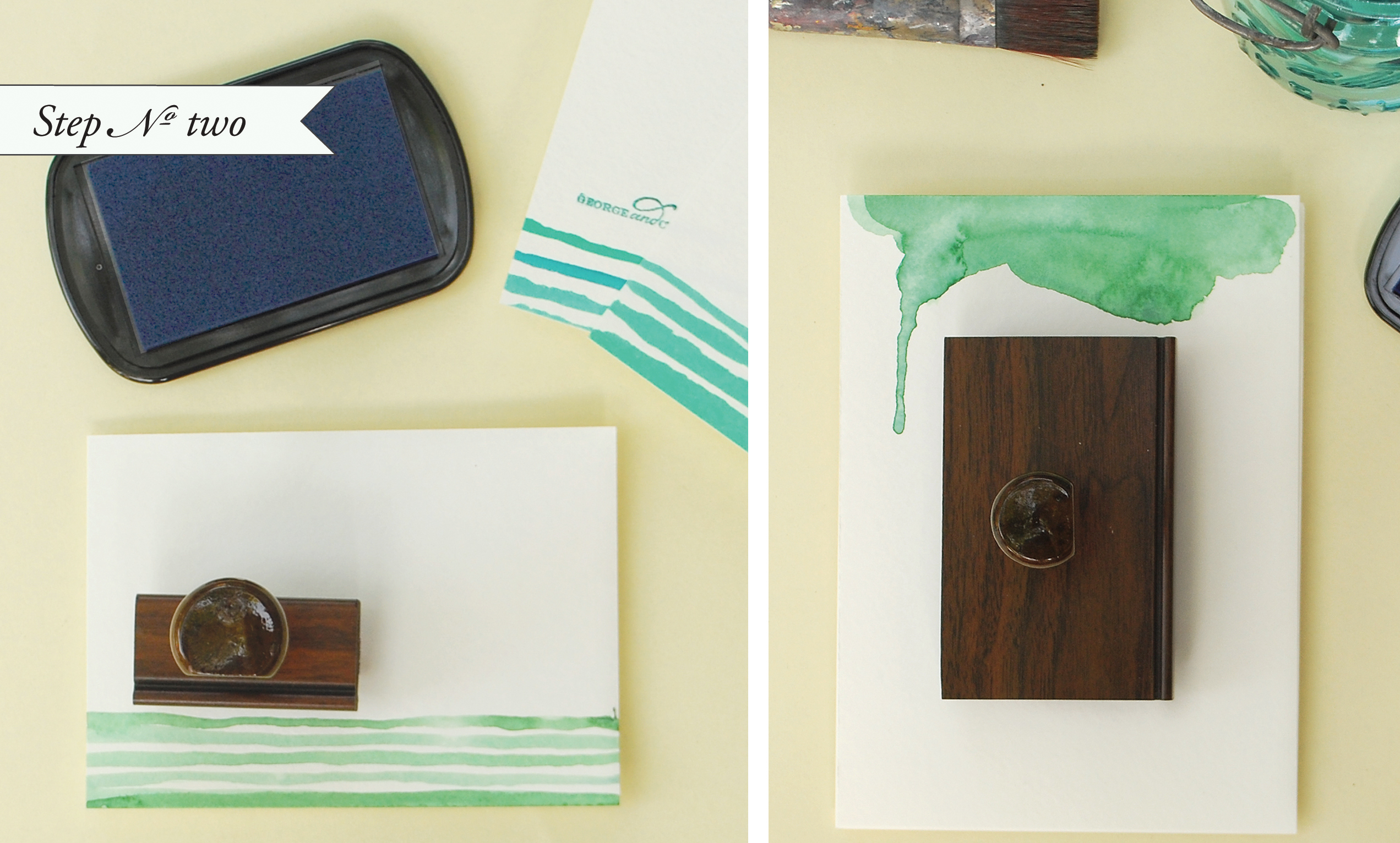
Step Two: Once your paint has dried, on a hard surface, ink your stamp and place it in the center of the card.  Apply even pressure and remove the stamp from the card.

For the Save the Date, we used the “Vintage Label” custom save the date stamp.  For the thank you notes, we used the “Simple but Sophisticated” monogram stamp – using a monogram stamp for your thank you notes can be a fun way to personalize them without breaking the bank after the wedding!

Watercolor Save the Dates: Step 2

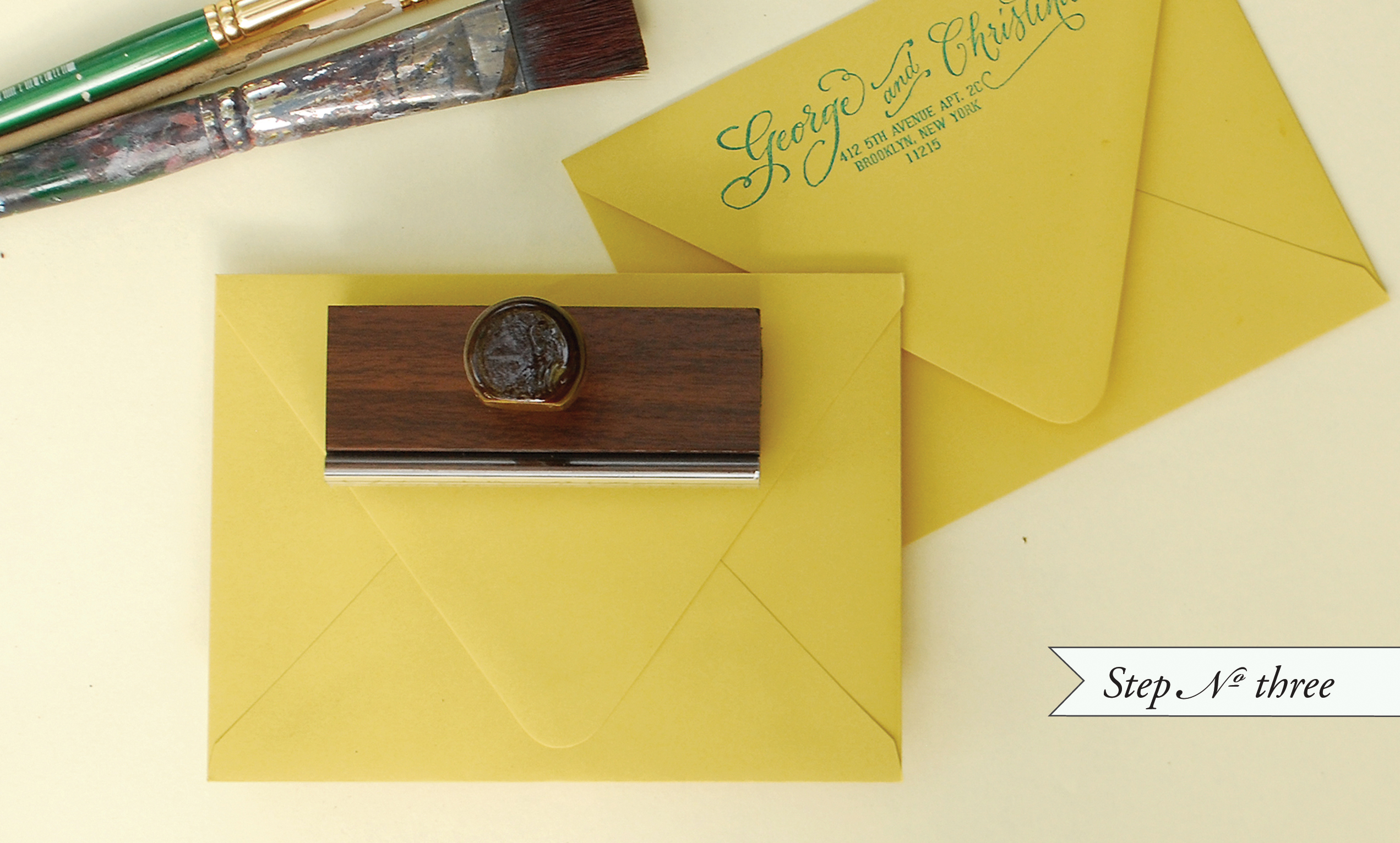
Step Three: We used the “Calligraphy Accent” return address stamp to finish everything off.

Now all that’s left is stuffing and addressing your envelopes!

Watercolor Save the Dates: Step 3

Materials List:

Custom Save the Date & Monogram rubber stamps.  The ones used in this tutorial are:

“Vintage Label” Save the Date Stamp,  “Simple but Sophisticated” Monogram Stamp,  “Calligraphy Accent” Return Address Stamp

Color Box Stamp Pad (we used a variety of teals and blues for this project)

Watercolors and brushes (you can purchase at any craft or art store)

A small dish and a jar of water (used to mix paint and wash brushes)

A6 Envelopes (shown above in Curry)

B4 Thank You Card Envelopes (shown above in Peacock)

Paper Options:

You can have large watercolor sheets or pads – the thicker the better, (purchased from your local art store) cut to size at your local print shop.

Just tell them the dimensions you need based on your envelope choice, the cut cards should be at least 1/4″ smaller than the envelope measurement.

If you are using the Paper Source A6 and B4 sizes that are shown above, ask for your pieces to be cut to

6 1/4″ x 4 1/2″ (A6) and 3 1/2″ x 5″ (B4).

If getting paper cut is too much of a hassle, you can use the luxe papers from Paper Source and buy them pre-cut.

Just be careful with how much water you use with your paints.  If you are using lightweight (90 lb) watercolor paper or the luxe papers from Paper Source, these papers will tend to buckle if you use too much water.

Photo Credits: Antiquaria

Whitney + A.K.’s Colorful Letterpress Wedding Invitations

Today I’m super excited to feature the wedding invitations from Whitney of Gus & Ruby Letterpress!  Whitney and Samantha are two seriously talented stationers, so when it came time for Whitney’s own wedding I was dying to see the invitations!  Whitney worked with Love*Jenna Calligraphy, incorporating Jenna’s beautiful script into a bright and colorful invitation suite inspired by dahlias and the bridesmaids’ wedding attire.  Cyd from The Sweetest Occasion is featuring the full wedding today, so check out all the beautiful details right here.  But now, time for the invitations and coordinating wedding stationery!

Letterpress-Calligraphy-Wedding-Invitation-Suite

From Whitney:  The entire wedding was planned around the color of the bridesmaid’s dresses (a vibrant, warm purple shade) and shoes (a bright shade somewhere between peach and coral) and the invitations were no exception.  I felt strongly that while I wanted our invitations to be different, I didn’t want to do something so over the top that it didn’t mesh with my and A.K.’s personalities, which are laid back and fun, but not flashy.  This was a struggle for me as a designer, printer and owner of a stationery boutique, but I think I succeeded in the end.  Overall I wanted the invitation suite to set the tone for the wedding: a fun, backyard garden-party with saturated mid-August colors.

Letterpress-Calligraphy-Wedding-Invitation-Envelopes

Letterpress-Calligraphy-Wedding-Invitation-Muslin-Bag

We used dahlias as our main flower and I created abstract versions of them to use as the design for the paper goods.  I didn’t want them to be obvious flowers so I spread them around the invitation at varying sizes and heights so they would feel celebratory – almost in the way fireworks do.  We chose Jenna Hein from Love*Jenna Calligraphy to write choice words for each piece because of her playful, whimsical style that also has traditional undertones.  The muslin bag came into play because I have never been a big fan of opening an invitation envelope and having numerous pieces fall into my hands.  The bag housed all of the pieces and also tied in to the numerous textures we used throughout the wedding.

Letterpress-Calligraphy-Wedding-Invitations Letterpress-Calligraphy-Wedding-Invitations

The biggest challenge aside from the number of runs through the press (most pieces were 4-color) was hand-mixing the inks to match the fabrics.  None of the colors I ended up with were actual PMS colors!

Letterpress-Calligraphy-Wedding-Invitation-RSVP-Card

Letterpress-Calligraphy-Wedding-Rehearsal-Dinner-Invitation

In addition to beautiful wedding and rehearsal dinner invitations, Whitney created several coordinating day-of stationery elements, including letterpress ceremony programs that honored the memories of family members, beautiful table numbers, and fun cake menus.  And of course, as a stationer, Whitney couldn’t forget to print herself some matching thank you cards!

Letterpress-Calligraphy-Wedding-Ceremony-Program Letterpress-Calligraphy-Wedding-Ceremony-Program

Letterpress-Calligraphy-Wedding-Ceremony-Program

Letterpress-Calligraphy-Wedding-Ceremony-Program

Letterpress-Calligraphy-Wedding-Table-Number-Sign Letterpress-Calligraphy-Wedding-Cake-Menu

Letterpress-Calligraphy-Wedding-Thank-You-Cards

So pretty!  Congratulations again to Whitney, and don’t forget to check out her beautiful wedding right here!

Design and Letterpress Printing: Gus & Ruby Letterpress

Calligraphy: Love *Jenna Calligraphy

Photo Cred­its: Brea McDon­ald Photography

{happy weekend!}

Not only is this a holiday weekend, but it also happens to mark the anniversary of a very important personal milestone.  One year ago today I officially became a full time blogger.  I worked a final day in my old office, bid farewell to my former colleagues, and practically skipped down the hallway and out of the building.  The transition was a long time coming, but it was still a huge (and terrifying) decision and I had no idea what would unfold over the coming weeks and months.  A year later, I’m so happy that I made the leap and incredibly grateful that I get to share beautiful paper with all of you each and every day.  So, from the bottom of my heart, thank you all for reading (and thereby making this blog possible), and I hope you have a wonderful holiday weekend!  But in the meantime…

summer-sunglasses

…a few links for your weekend!

This week on Oh So Beautiful Paper:

Have a wonderful holiday weekend!  I’m taking Monday off, but I’ll see you all back here on Tuesday (along with a fun little surprise!). xoxo

Photo Credits: Wiissa found via Creature Comforts

Red, White + Blue Wedding Stationery Inspiration

I know we’re all ready to get the long holiday weekend started, but I’ve got a bit of red, white, and blue inspiration for you before I sign off for the weekend.  Megan from Pink Piggy Design collaborated with photographer Kate Osborne and other Utah-based wedding vendors on a fun photo shoot full of 4th of July-themed wedding ideas.  In keeping with the summer holiday, there are lots of stripes, twine, and some of the most delicious-looking mini pies I’ve ever seen!

Red-White-Blue-Wedding-Invitations Red-White-Blue-Wedding-Invitations-Twine

From Megan:  We live in a blessed and privileged country, full of tradition and timeless symbols.  The inspiration behind these designs comes from our American roots, starting with the red, white, and blue color scheme!  This may not, at first thought, be the most ideal choice for summer wedding colors, but in the end is quite stunning.  The color combination provides amazing contrast that packs an eye candy punch that is a lot of fun to work with!  We drew from the most American symbol of all – our flag – and used striped patterns and different type faces for a little bit of fun modern play.

Red-White-Blue-Wedding-Invitations-Twine

Red-White-Blue-Wedding-Invitations-Detail Red-White-Blue-Wedding-Invitations-Stripes

Red-White-Blue-Wedding-Stationery

Red-White-Blue-Wedding-Stationery-Stripes Red-White-Blue-Wedding-Stationery-Stripes

Red-White-Blue-Wedding-Stationery-Pie-Signs

Red-White-Blue-Wedding-Stationery-Polka-Dots Red-White-Blue-Wedding-Inspiration

Thanks Megan!

Photography: Kate Osborne
Paper Details: Pink Piggy Design
Catering: Culinary Crafts
Rentals: Alpine Event Rentals
Napkins: Wildflower Linens
Floral Design: Studio Stems

Photo Credits: Kate Osborne Photography

Wedding Details: Creative Menu Ideas

Today we have more wedding day stationery ideas to share – this time focusing on wedding menus.  Menus are one of my favorite details at a wedding, and I love seeing how the bride and groom choose to give their guests a sneak peek of the meal to come.  Whether you go with a menu at each place setting or as part of the centerpiece, I’ve gathered some of the best ideas to share with you!

A classic round menu with beautiful calligraphy by Calligraphy Katrina. Photo by Krista Mason via Grey Likes Weddings.

This modern type menu (left) would be so easy to DIY.  Photo by Andrea Polito Photography via The Knot.  I also love the idea of tying the menu to a coordinated napkin with a piece of twine (with a love knot, of course!) for more a casual wedding (right).  Photo by Erin Hearts Court via The Knot.

I think just about everyone around the blogosphere fell in love with Anna Bond’s DIY wedding menu wheel – and for good reason!  Details and instructions on Design Sponge.

This napkin wrap menu (left) is so creative and modern! Design by Wiley Valentine, photo by Aaron Delesie via Gina DeDominici.  And these tiny art easels are perfect for making your menu part of table’s centerpiece (right). Photo by Poppy Lane via Style Me Pretty.

Having a western themed affair?  Carry it throughout all of your wedding stationery for a cohesive look.  Designed by Things Are Better with a Parrot.

Hand-illustrated menus have become really popular and they I think they add a great personal touch.  Check out these examples:

Stationery by Christine Schmidt of Yellow Owl Workshop and photo by Aaron Delesie, via MS Weddings (Left).  Notebook sketch menu designed by the groom, Erik Marinovich, and photo by Thayer Photo, via MS Weddings (Right).

Artwork by Erin Jang via her blog, The Indigo Bunting.

Another beautiful custom menu by Anna Bond of Rifle Paper Co.  Photo by Weddings by Two via Style Me Pretty.

These two ideas are genius!  An “interactive” menu photographed by Jennifer Roper via The Knot (left); and a menu that doubles as a favor bag designed by Good On Paper Design, photographed by Janae Shields, via Snippet and Ink (right).

Smock has some beautiful letterpress printed menus; this is the Engadine design with one of my favorite color combinations.

I’m in love with both of these rustic menu designs!  Cutting board centerpiece menu designed by Blue Pool Road and photographed by Bonnie Tsang via Snippet and Ink.  Wood menu created by Melangerie and photographed by Docuvitae via Style Me Pretty.


And while they’re not completely paper-related, how could I leave out chalkboard menus?  Here are two examples of how they can be done in a creative and stylish way.

Colorful chalkboard menu (left)photographed by Kamp Photography via Green Wedding Shoes.  Sundae chalkboard menu (right) features calligraphy by Love, Jenna, photographed by Scott Clark via 100 Layer Cake.

Thanks so much for joining me today!  I hope you’ve enjoyed this round up of creative and stylish wedding menu designs, and if you missed our earlier round-ups of wedding escort and place card ideas you can find them here and here.  I hope this serves as some inspiration for you as your plan your big day!

{images via their respective sources}

*Smock is a spon­sor of Oh So Beau­ti­ful Paper.  For more on my edi­to­r­ial poli­cies, please click here.