Costa Rica Destination Wedding Invitations

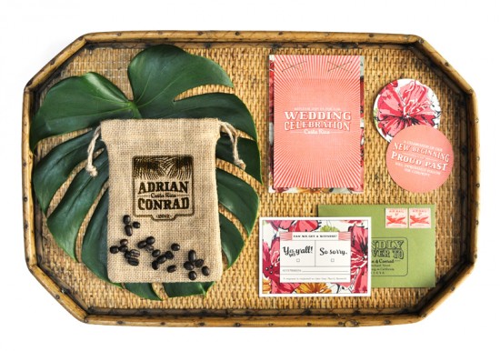
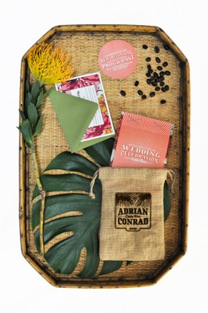
I love the idea of a destination wedding in a tropical location – beautiful beaches, lush surroundings, and lots of fun fruity drinks.  Nichole from Coral Pheasant created these Costa Rica destination wedding invitations for a recent event, and I love the way she combined burlap and bright patterns for a healthy dose of both color and texture.

Costa-Rica-Destination-Wedding-Burlap-Invitations

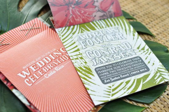
From Nichole: I designed this invitation for an event that was inspired by stunning destinations around the world.  Costa Rica was one of the chosen destinations where the lush rainforest and the fun, vibrant patterns of the Costa Rican culture inspired the design.  For the invitation I created a hand stitched book with three layers of pattern, the middle layer being printed on vellum for added depth and interest.

Costa-Rica-Destination-Wedding-Burlap-Invitations Costa-Rica-Destination-Wedding-Burlap-Invitations-Envelope

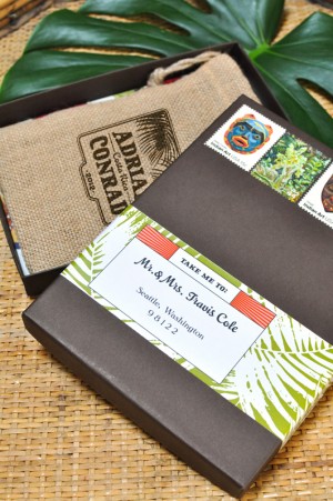
The book format invitation is perfect for a destination wedding as it allows for large amounts of information to be presented in a beautiful and organized manner.  The invitation suite was tucked into a custom printed burlap bag – a nod to the famous Costa Rican coffee – and then packaged in a chocolate brown box with a matching label.

Costa-Rica-Destination-Wedding-Burlap-Invitations-Detail

Thanks Nichole!

Photo Credits: Coral Pheasant

Lisa + Brian’s Modern Foodie Wedding Invitations

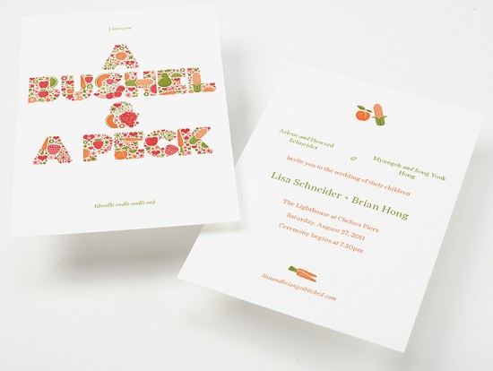
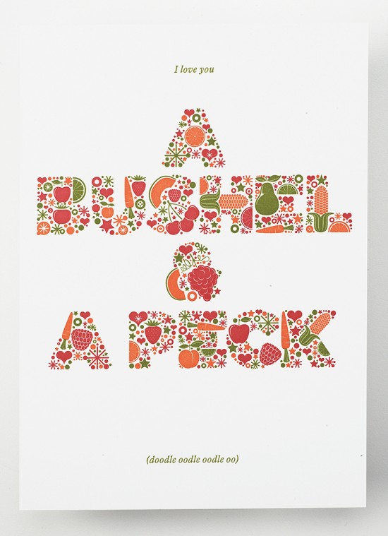
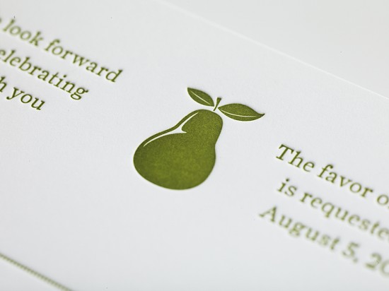
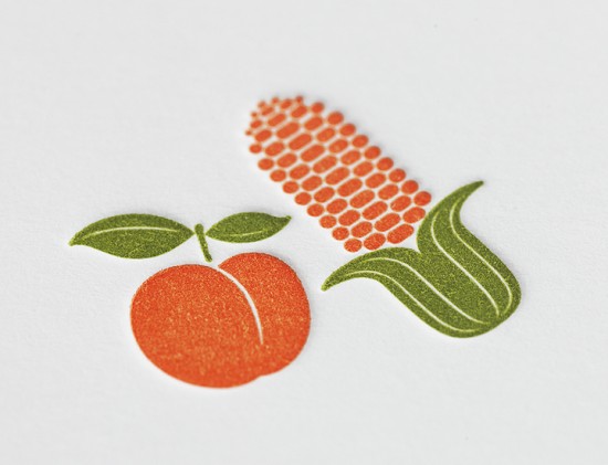
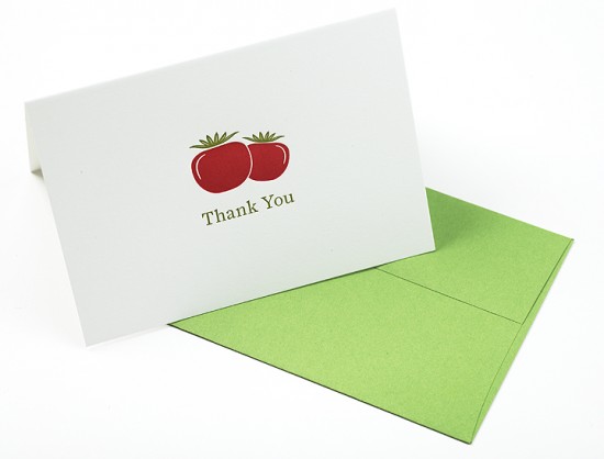
I love seeing all of the creative ideas and concepts that designers use to create wedding invitations.  The immensely talented Jordan and Jason of Enormous Champion sent over these beautiful letterpress wedding invitations that they created for friends getting married later this summer.  Jason and Jordan combined two of the couple’s big loves – food and Doris Day – into a truly unique modern invitation suite.

Enormous-Champion-Modern-Foodie-Letterpress-Wedding-Invitations

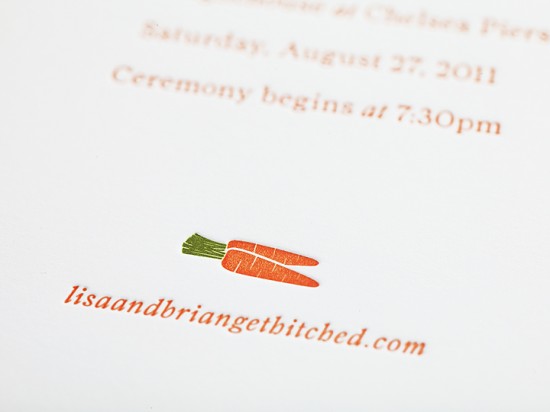
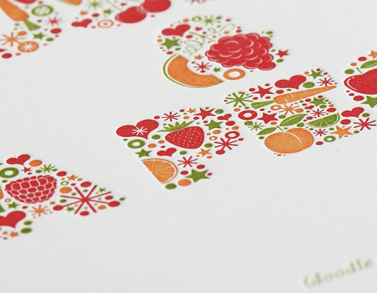
From Jason and Jordan: Our good friends Lisa & Brian are getting married later this summer… and we love them a bushel and a peck.  We recently completed a 3-color letterpress invitation suite printed on Neenah Classic Crest 165 lbs Solar White paper.  When they asked us to create their wedding invitation, the one thing they requested was an art piece (based on our All Good Things) to accompany the information portion of the invitation as a memento to their invited guests.  Lisa and Brian are life long foodies and Doris Day enthusiasts, the line comes from a song in musical Guys & Dolls and the letterforms are made up of fruits, veggies and a whole lotta love.

Enormous-Champion-Modern-Foodie-Letterpress-Wedding-Invitations

Enormous-Champion-Modern-Foodie-Letterpress-Wedding-Invitations

Enormous-Champion-Modern-Foodie-Letterpress-Wedding-Invitations

Enormous-Champion-Modern-Foodie-Letterpress-Wedding-Invitations

Enormous-Champion-Modern-Foodie-Letterpress-Wedding-Invitations

Enormous-Champion-Modern-Foodie-Letterpress-Wedding-Invitations

So awesome!  Check out more from Enormous Champion right here – thanks Jordan and Jason!

Photo Credits: Enormous Champion

Jennifer + Blake’s Sunny Yellow and Blind Deboss Wedding Invitations

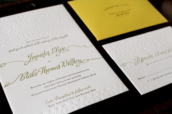
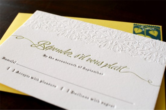
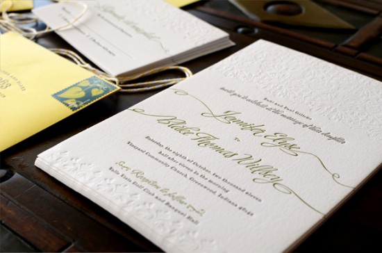
I spotted these sophisticated, yet modern, yellow wedding invitations on designer Sarah Rusin‘s blog, Ten Lines Pica.  Sarah created the invitation suite for an adorable couple, Jenni and Blake, and of course wanted the invitations to reflect their sunny personalities.  Sarah incorporated two beautiful fonts – one script and one serif – and a gorgeous blind (no-ink) pattern, and I absolutely love the resulting invitation design!

yellow-blind-deboss-letterpress-wedding-invitations

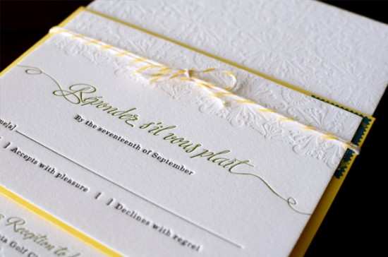
From Sarah: The couple, Jenni and Blake, are adorable and sunny and I think the final invitation captured their spirit perfectly.  Jenni wanted them to be sophisticated and a bit traditional but with some personality.  I designed a pattern for a blind deboss to give them a little extra visual interest.  I used two of my favorite typefaces, Ministry by Ale Paul and Eames from House Industries.  They were printed onto 110# Crane cotton paper.  I used Baker’s twine to keep them together; I felt like it suited the style really well and was extremely budget-friendly.

yellow-blind-deboss-letterpress-wedding-invitations-rsvp

yellow-blind-deboss-letterpress-wedding-invitations

yellow-blind-deboss-letterpress-wedding-invitations-rsvp

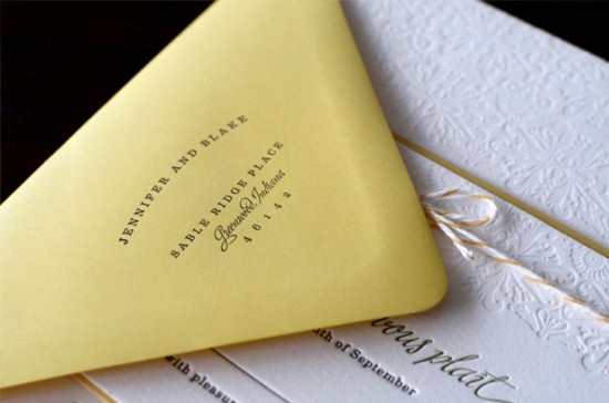
yellow-blind-deboss-letterpress-wedding-invitations-envelope

So pretty!  Thanks Sarah!

Photo Credits: Sarah Rusin Graphic Design

{happy weekend!}

Happy Friday everyone!  I feel like I’ve spent most of this week in daydream land, making plans for all of the things that I want to do with my husband when he comes back home in just a few weeks.  Most of them happen to involve food, since my husband has been living on terrible cafeteria food for the last six months.  And I think there should be at least one cake waiting for him when he comes home, don’t you agree?  Anyway, right now I’m looking forward to hanging out with one of my favorite girls tonight, but in the meantime…

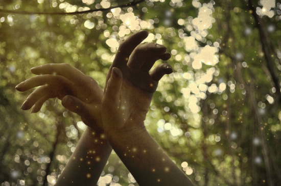
Fireflies

…a few links for your weekend!

This week on Oh So Beautiful Paper:

That’s it for me this week!  I hope you all have a wonderful weekend, and I’ll see you back here on Monday! xoxo

Photo Credit: Amber Nyman via Paper Schmaper

Gabby’s Whimsical Pink + Orange 4th Birthday Party Invitations

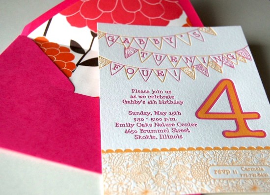
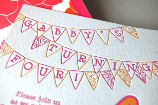
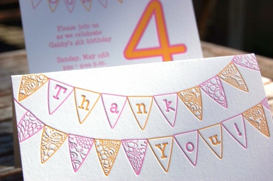
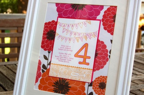
Carmela from Fiore Press created these adorable pink and orange letterpress invitations for her daughter’s 4th birthday party a couple of months ago.  Carmela incorporated bright colors, floral design elements, and a cute bunting illustration in the main invitation, along with matching thank you cards and floral envelope liners.  So fun!

Pink-Orange-Letterpress-Fourth-Birthday-Party-Invitation

Pink-Orange-Letterpress-Fourth-Birthday-Party-Invitation-Envelope-Liner

From Carmela: I’ve always loved flag banners and I really wanted to print something with bright colors for Gabby’s birthday.  I always hand mix the ink, and I just love the poppy and fuchsia in these invitations –they remind me of rainbow sherbet and summer.  Printing two colors with such tight registration can be tricky, but I love how these came out!

Pink-Orange-Letterpress-Fourth-Birthday-Party-Invitation-Detail

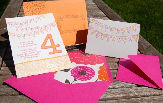
Pink-Orange-Letterpress-Fourth-Birthday-Party-Invitation-Suite

I also printed corresponding thank you notes, and the envelopes are probably my favorite part of the entire invitation.  I love printing on the corner of the envelope and having it spill over onto the flap – who wouldn’t love to get these in the mail?  I used both poppy and fuchsia colored envelopes (mainly because I couldn’t decide between the two!) and used brown ink to print the envelopes, and lined the envelopes with wrapping paper from Snow & Graham.  I loved being able to do these for my daughter.

Pink-Orange-Letterpress-Fourth-Birthday-Party-Invitation-Thank-You-Card

Pink-Orange-Letterpress-Fourth-Birthday-Party-Invitation-Envelope-Detail

Carmela even used the same Snow & Graham wrapping paper to frame the invitations after the party!

Pink-Orange-Letterpress-Fourth-Birthday-Party-Invitation-Floral

Thanks Carmela!

Photo Credits: Carmela | Fiore Letterpress