Mexican Tile-Inspired 50th Wedding Anniversary Party Invitations

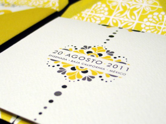
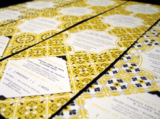
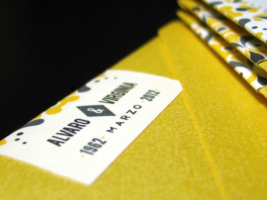
A 50th wedding anniversary is most definitely an occasion to be celebrated!  Lizzely from LizzyB Loves had the pleasure of designing her in-law’s 50th anniversary party invitations earlier this summer.  Lizzely drew her inspiration from the traditional tile work surrounding the celebration venue, a 1930s hotel in Mexico, and mid-century modern design.

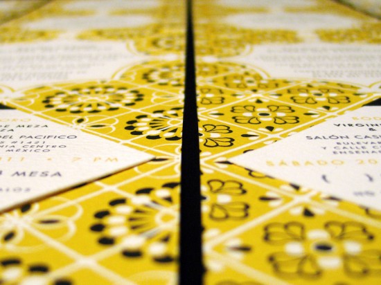
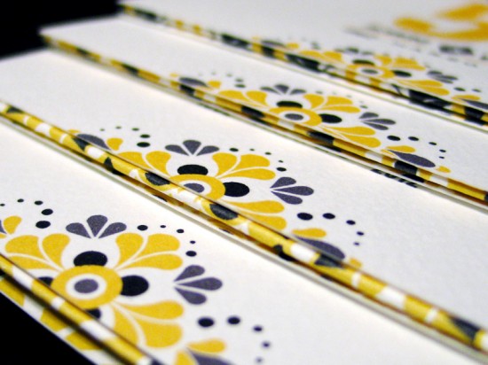
From Lizelly:  The anniversary celebration will be held in Ensenada, Mexico in a circular ballroom dating back to the 1930s, which used to be a casino and hotel in its prime and later a military fort during WWII.  I took inspiration from the various tile work surrounding the venue and created an assortment of pattern motifs used throughout the invitation suite.

My brother-in-law served as the client for this project, and early on he said that he wanted the tile motifs surrounding the venue to be used in the design.  He also wanted to give the invitations a Mad Men feel, so I came up with a Mad-Mex theme with the use of clean and modern text paired with the Mexican tile designs.

Thanks Lizelly!

Photo Credits: LizzyB Loves

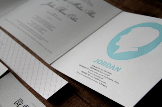
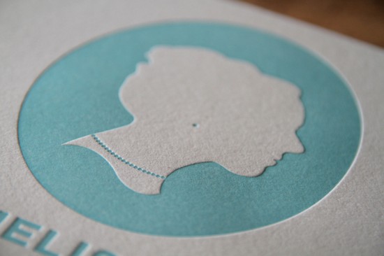
Melissa + Jordan’s Modern Silhouette Wedding Invitations

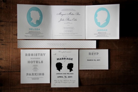
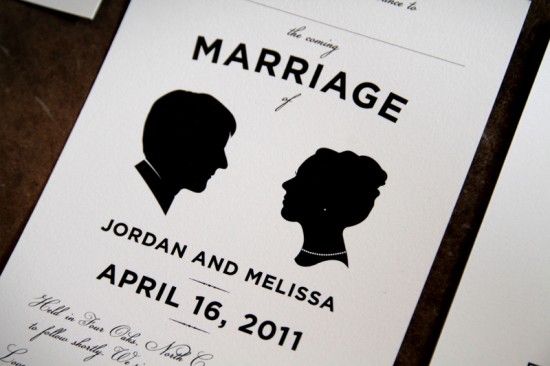
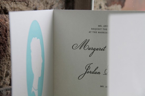
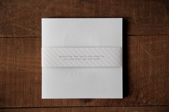
When it came time to design his own wedding invitations and save the dates, art director Jordan Eakin was inspired by the union of two family trees.  Jordan partnered with Sarah from Shed Letterpress to create a trifold invitation, with the invitation text mirrored by their silhouettes and a bit of personal family history.  Clean and minimal RSVP and accommodation cards completed the suite, all contained within the trifold and secured with a belly band with a quote from Emily Brontë (and one of my personal favorites!).

From Jordan: Our wedding package design was influenced by old family trees, books, cameos, antique silhouettes and a lovely pantone swatch.  We designed the invitation to represent our two family trees coming together and added our own cameos and silhouettes as a classic, timeless touch.

The trifold invitation was printed at Shed Letterpress in Durham, NC on 100% cotton, acid-free Rising Museum Barrier paper.

Thanks Jordan!

Concept and Design: Jordan Eakin

Letterpress Printing: Shed Letterpress

Check out the Designer Rolodex for more tal­ented wed­ding invi­ta­tion design­ers and the real invi­ta­tions gallery for more beau­ti­ful cus­tom invitations!

Photo Credits: Jordan Eakin

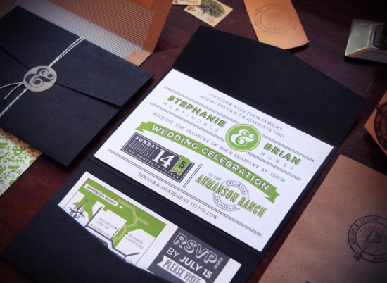
Brian + Stephanie’s Modern and Vibrant Wedding Invitations

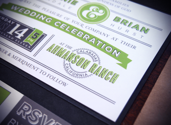
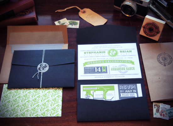
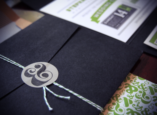
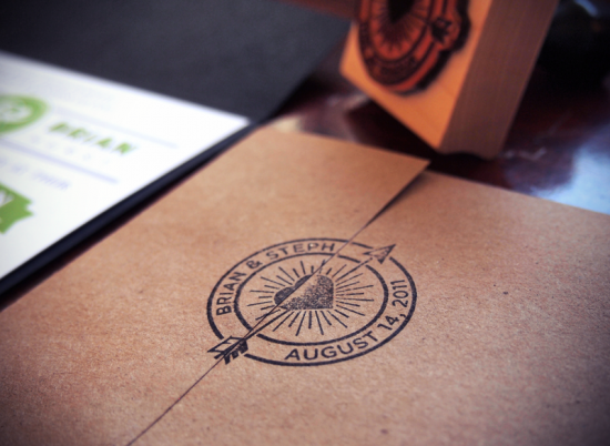
You might remember Brian and Stephanie’s aviation-inspired save the dates from a few months back, and today Brian is back to share their wedding invitations!  Brian wanted the invitation design to be elegant, but still modern and fun with bright pops of color.  Brian incorporated the custom rubber stamp that he made for the save the dates, and I love the ampersands that Brian used throughout the suite!

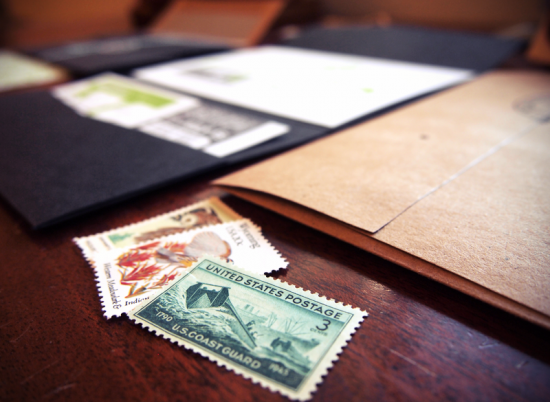
From Brian: I tried to design something classy and – something that fit “us.”  The main invitation piece is a simple A6, one-sided design, that doesn’t stray too far from our save the date concept.  The colors are gray and green, with some black elements included in the piece.  The kraft paper envelope was paired with a black and white checkered envelope liner.

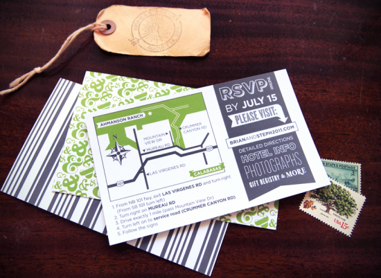
The enclosure is a black tri-fold from Paper Source.  Finished off with some string, round stickers (also Paper Source), and rubber stamps.  The invitations were digitally printed by Mottsy, which offers variable printing data so each individual “info” card (with the map) had one of 6 different designs on the back.

So cool!  Thanks Brian!

Check out the Designer Rolodex for more talented wedding invitation designers and the real invitations gallery for more beautiful custom invitations!

Photo Credits: Brian Hurst | The Quiet Society

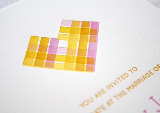
Citrus-Inspired Letterpress Overprinting Wedding Invitations

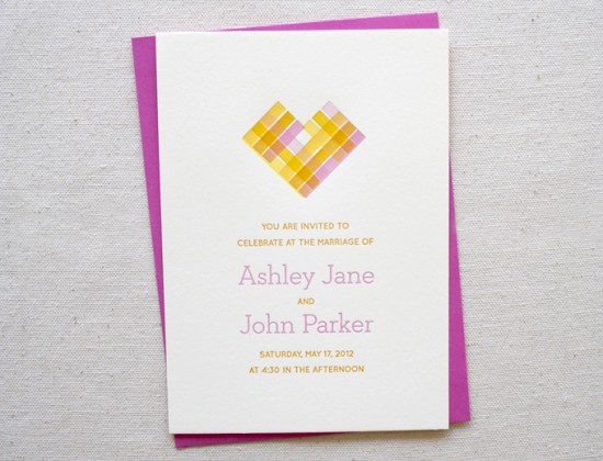
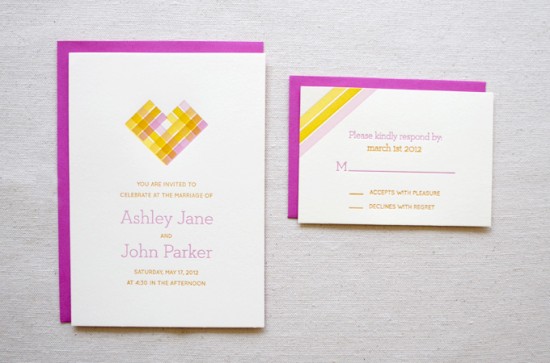
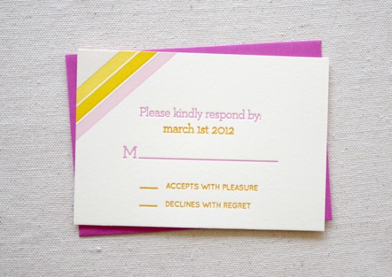
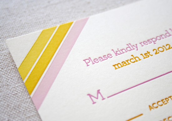
These invitations and bright, summery, and undeniably lovely.  The invitations were letterpress printed by Sara and Brad of Constellation & Co. for their design intern Sarah Paulhus.  The main invitation incorporates a letterpress technique known as overprinting – where two different ink colors are layered during the printing process to produce a new color – to create the heart design in the main invitation.  Sarah selected pretty citrus-inspired colors of pink, orange, and yellow for the entire suite.  Beautiful!

Pink-Yellow-Letterpress-Overprinting-Wedding-Invitations-Constellation-Co

From Sara of Constellation & Co.: Our summer intern Sarah Paulhus did the design for this fun invitation suite under our art direction, and then we produced them at the end of the internship for her portfolio.

Pink-Yellow-Letterpress-Overprinting-Wedding-Invitations-Constellation-Co

Pink-Yellow-Letterpress-Overprinting-Wedding-Invitations-Constellation-Co

Sarah described her inspiration this way: “My summer wedding concept was inspired by citrus!  Grapefruit, oranges, lemons – they all remind me of summer afternoons.  I wanted to take advantage of the letterpress process and add a vintage-y feel to the theme, which comes off in the paper choices and ink.  Overall, I want the design to be clean and fresh, breezy, but also warm and inviting.”  We think she did a great job – not bad for her first wedding invite!

Pink-Yellow-Letterpress-Overprinting-Wedding-Invitations-Constellation-Co

Pink-Yellow-Letterpress-Overprinting-Wedding-Invitations-Constellation-Co

Constellation & Co. is a mem­ber of the Designer Rolodex – you can see more of their beau­ti­ful work right here!

Photo Credits: Constellation & Co.

{happy weekend!}

Happy Friday everyone!  Did you have a good week?  Fall is definitely in the air this weekend, but I’m actually looking forward to the new season – spring and fall are my two favorite seasons in DC!  This weekend I’m looking forward to the Design Sponge book party in Georgetown, a neighborhood festival near my Capitol Hill ‘hood, and some antiquing with my husband and in-laws, who are visiting again this weekend.  But in the meantime…

Photo Credit: Marla and Shane Photographers via Urban Grace Interiors

…a few links for your weekend!

This week on Oh So Beautiful Paper:

Welcome to the newest Designer Rolodex members!

That’s it for me this week!  I hope you all have a wonderful weekend, and I’ll see you back here on Monday!  xoxo