{happy weekend!}

Happy Friday everyone!  I’m super excited for this weekend – tomorrow is Crafty Bastards, the DC area’s biggest craft fair!  Is anyone going?  I go every year and always have the best time wandering all the different booths at the show.  I can’t wait!  But in the meantime…


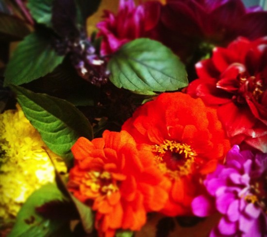
Photo by me.  A few fall flowers and some fresh basil that I picked up at the farmer’s market yesterday. The basil is such a lovely addition to the bouquet!

…a few links for your weekend!

I’m also super excited to announce that the lovely Jackie of 42 Pressed is celebrating her return from maternity leave (you might remember their adorable baby shower invitations) with a fun promotion!  Jackie is offering free save the dates to couples who order their wedding invitation suite from 42 Pressed.  Just enter code RILEYKICKOFF when ordering!

This week on Oh So Beautiful Paper:

Welcome to the newest members of the Designer Rolodex!

That’s it for me this week!  I hope you all have a wonderful weekend, and I’ll see you back here on Monday! xoxo

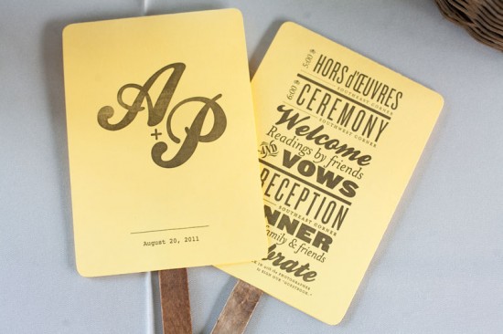
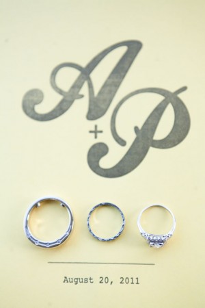
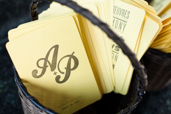
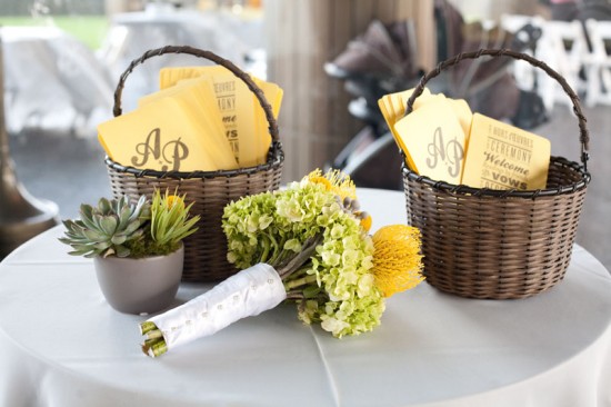
Amy + Patrick’s Wedding Ceremony Program Fans

As much as I adore wedding invitations, I love it when couples put some thought and energy into their day-of stationery.  Designer and letterpress printer Stephanie Laursen sent over these fun ceremony programs that she created for recent clients Amy and Patrick.  Stephanie incorporated the wedding color palette of yellow and gray along with the bride’s love of antique wood type into a clean yet vintage-inspired design.

From Stephanie: Amy & Patrick wanted a low key wedding, with sunny pops of yellow and cool gray hues.  They wanted a hand-printed program to give to guests, both as a functional piece to be used at the event, and as something to take home to remember the day.  Amy loves blocks of type, and mixtures of different fonts, and wanted the program to have a vintage wood type feel.


Thanks Stephanie!

Photo Credits: Azuree Wiitala

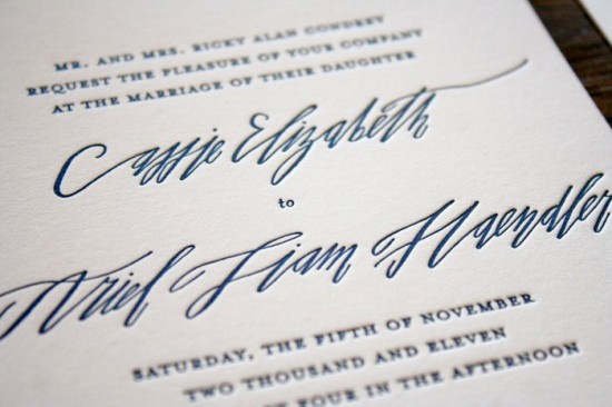
Cassie + Ariel’s Navy and White Calligraphy Letterpress Wedding Invitations

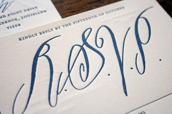
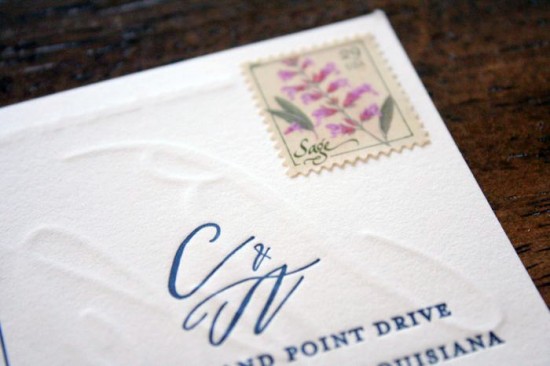
I haven’t been able to get these gorgeous navy and white wedding invitations out of my mind since spotting them on the Parrott Design Studio blog last week.  Sarah from Parrott Design Studio incorporated the bride’s favorite vintage wallpaper into the suite, using a scanned, resized version of the wallpaper pattern as backing for the super thick invitations.  The invitation suite also includes a double-sided RSVP postcard and an enclosure card pointing guests to Cassie and Ariel’s wedding website.

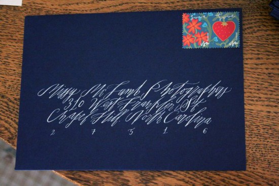
Betsy Dunlap provided lovely calligraphy accents for the invitation suite, including the names of the bride and groom, their initials, and rsvp card lettering.  Betsy also addressed 250 deep navy envelopes in a beautiful silver ink.  Simply stunning!

I love that Sarah used strips of fabric and custom wax seals to hold the assembled invitation suite together!

Check out more details on the invitations right here!

Design and Letterpress Printing: Parrott Design Studio

Calligraphy: Betsy Dunlap

Parrott Design Studio is a mem­ber of the Designer Rolodex – you can see more of Sarah’s beau­ti­ful work right here!

Photo Credits: Parrott Design Studio

Papel Picado Wedding Invitations from Avie Designs

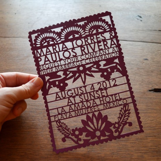
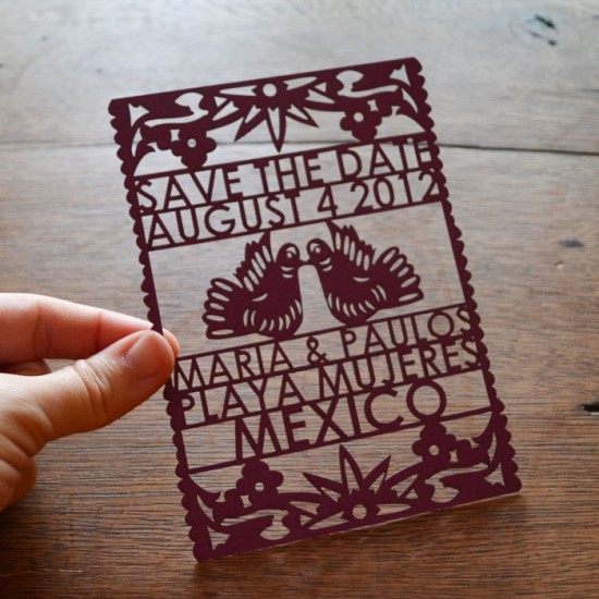
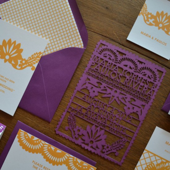
I’ve always loved the papel picado marriage announcements that Avis from Avie Designs made for her own wedding a couple of years ago – and I’m so happy to see that Avis recently added a papel picado-inspired design to her wedding invitation collection!  The new lasercut papel picado invitation design is available in a range of color options and as part of complete invitation suite, including save the dates, RSVP cards, programs, and escort cards.  So pretty!

You can see the full suite and more details over in the Avie Designs shop right here!

Photo Credits: Avie Designs

Danielle + Paul’s Vintage-Inspired Marquee Halloween Wedding Invitations

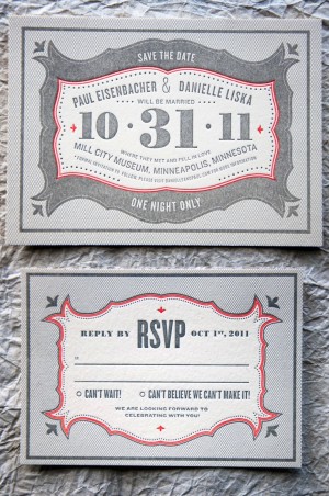
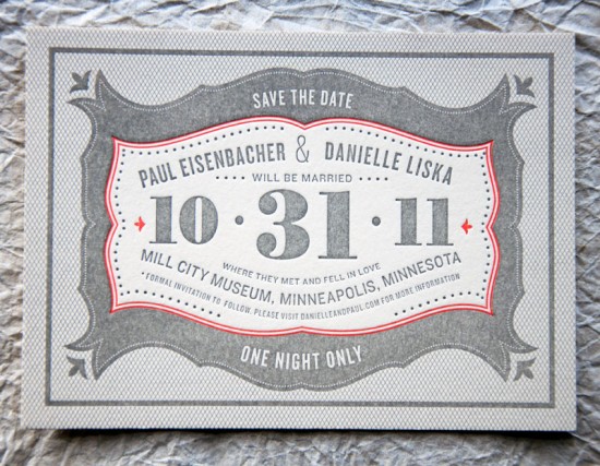
It’s always a good day when an invitation from Kate at Wit + Delight shows up in my inbox.  Kate sent over these fabulous custom invitations that she designed for a wedding taking place on Halloween.  Danielle and Paul’s wedding reception will include a masquerade, so Kate designed an invitation inspired by the concept of a 1920s marquee and incorporating Danielle and Paul’s color palette of cream, gray, and pumpkin!

From Kate: The wedding is taking place on October 31st in the ruins of a historic factory called the Mill City Ruins, which is equal parts elegant and mysterious.  Paul and Danielle have done a great job balancing the intrigue and liveliness of Halloween without feeling kooky, or costume-y.  Their palette is mostly creams and grays, with a pop of pumpkin.


The entire evening is filled with non-traditional details – like a masquerade! – and Danielle really loved the idea of invitations inspired by a vintage marquee.  We incorporated eclectic typography and ornate shapes to reference the 1920s era.  The invitations were printed by Evolutionary Press on thick cotton stock that gives the design a really great texture.

Thanks Kate!

Design and Concept: Kate Gabriel

Letterpress Printing: Evolutionary Press

Photo Credits: Kate Gabriel | Wit + Delight