Inspired By: Neon!

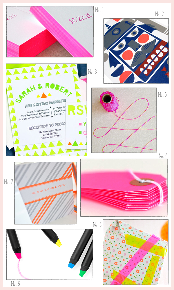
I’ve been in love with the neon design trend since May, when the bright fluorescent colors made a big splash at several exhibitor booths at the National Stationery Show.  More recently, I’ve been pleased to see neon used as accents for wedding invitations, from envelopes (like Jon and Alecia) to edge painting.  So today I thought I’d do a little round up of awesome neon paper goods and accessories!

No. 1 Neon wedding invitation edge painting by Delphine; No. 2 Nutcracker print with orange neon details by Bombina Studios; No. 3 Neon twine (available here in multiple colors) by Angela Hardison via You Are My Fave; No. 4 Gift tags by Knot & Bow (and more from Lox + Savvy here); No. 5 Neon washi tape (also available here) via Minimega; No. 6 Neon crayons from MOMA; No. 7 Neon letterpress greeting cards by Fig. 2 Design Studio; No. 8 Neon papercut wedding invitations by Love Citron

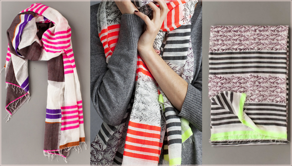
These aren’t made from paper, but I couldn’t resist including these gorgeous scarves with neon details from lemlem.  So, so pretty.

{images via their respective sources}

Alexandra + Doug’s Green and Kraft Graphic Wedding Invitations

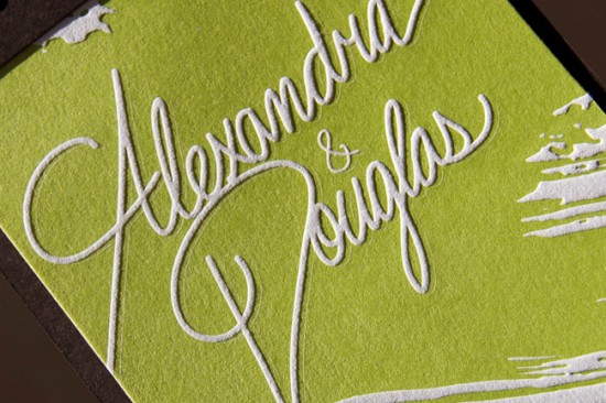
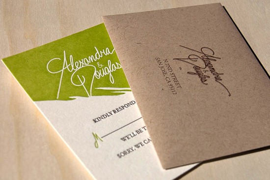
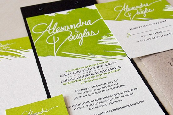
The texture of these wedding invitations is just so incredibly awesome.  Designed by Doug Hughmanick for his own wedding this summer and letterpress printed by Miguel from Heavy Metal Letterpress, the invitation features a brushstroke element at the top of each piece in the suite, knockout text, and kraft paper envelopes.  I love the bold color paired with classic wording and typeface selections.

Here’s a close up look at that awesome knockout text and texture…

Design: Douglas Hughmanick

Letterpress Printing: Heavy Metal Letterpress

Check out the Designer Rolodex for more tal­ented wed­ding invi­ta­tion design­ers and the real invi­ta­tions gallery for more beau­ti­ful cus­tom invitations!

Photo Credits: Miguel Castro | Heavy Metal Letterpress

Ashley + Nathan’s Whimsical and Rustic Burlap Wedding Invitations

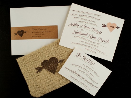
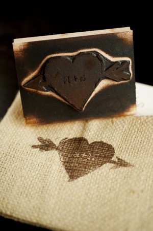
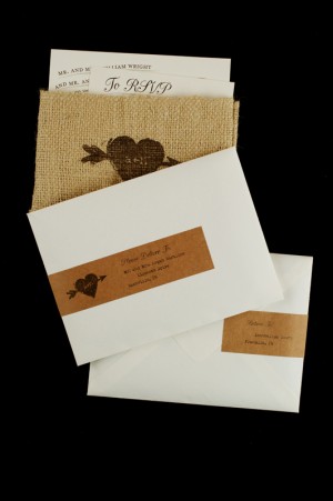
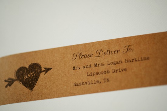
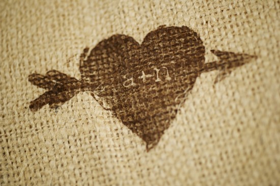
Ashley and Nathan’s wedding invitations from Jill at Lemon Tree Paper Co. feature burlap and kraft paper – the perfect combination for a rustic fall wedding!   Ashley and Nathan’s wedding will take place in Tennessee later this month, so Jill also incorporated hand-sewn burlap pockets with a custom rubber stamp, adding the kraft paper address labels on the outer envelopes for a finishing touch.  So cute!

From Jill: These invitations were made to reflect a classic fall barn wedding.  Ashley wanted a rustic feel, but with personal touches and unique qualities.  I sewed each of these burlap pockets individually, and stamped them with a custom rubber stamp that I designed just for them.  Ashley and Nathan plan to use the stamp throughout their wedding decor.  We also used kraft paper wrap-around address labels to complement the rustic feel of the burlap.


Thanks Jill!

Check out the Designer Rolodex for more tal­ented wed­ding invi­ta­tion design­ers and the real invi­ta­tions gallery for more beau­ti­ful cus­tom invitations!

Photo Credits: Justin Wright Photography

Seasonal Stationery: Halloween Cards

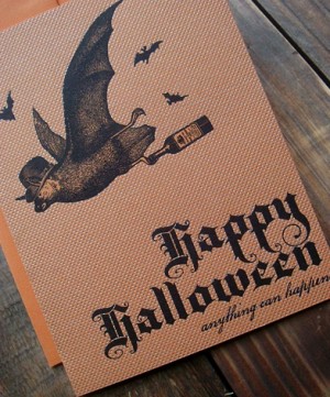
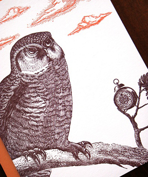
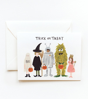
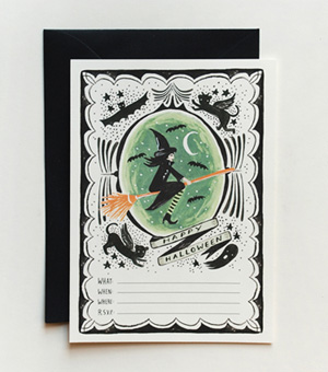
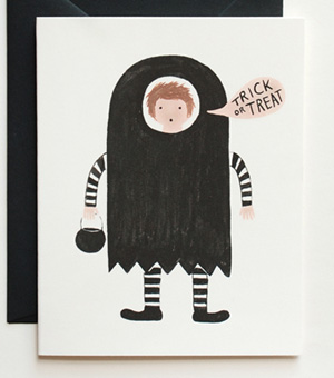
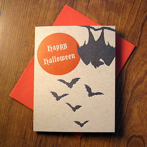
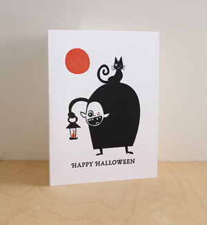
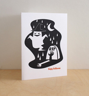
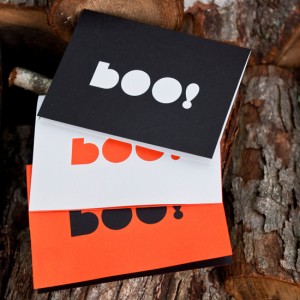
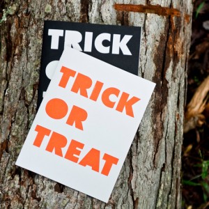
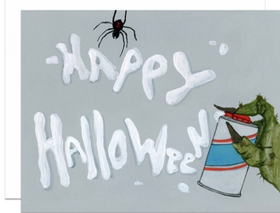
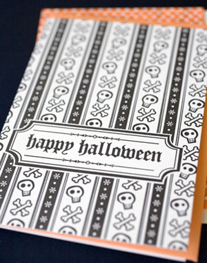
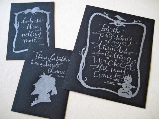
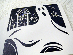
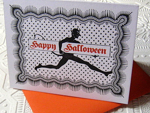
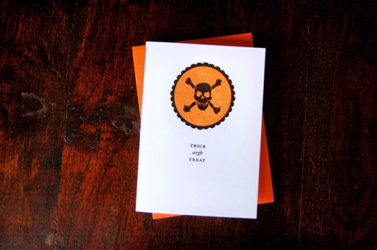
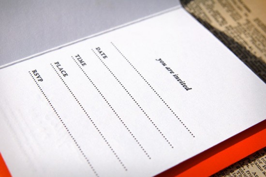
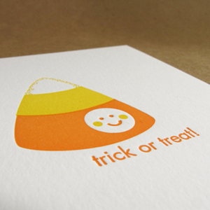
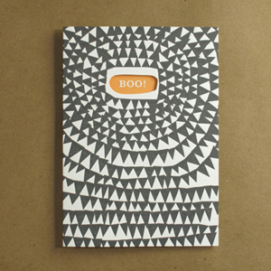
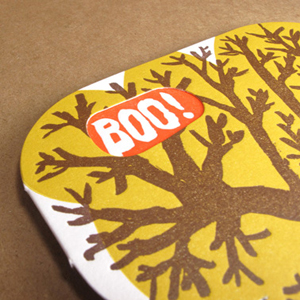
It’s October, which means Halloween is just around the corner!  I know this particular holiday isn’t for everyone, but it was my favorite holiday as a kid.  I loved coming up with costume ideas, decorating the house, dressing up in costumes (which were homemade more often than not), and of course the candy!   For those of you who love Halloween as much as I do, here are a few awesome cards (and a couple of party invitations) to help get the fun started!

Greenwich Letterpress Halloween Cards Greenwich Letterpress Halloween Cards

Greenwich Letterpress

Trick or Treat 
Black Cat Trick or Treat boy

Rifle Paper Co.

Flora & Fauna


Fugu Fugu Press

Love-Citron-Halloween-Card Love-Citron-Halloween-Card

Love Citron

illustrated-monster-halloween-card-dear-hancock

Dear Hancock


Hello! Lucky

Tag Team Tompkins


Inkadinkadoodle

Wild Ink Press


Egg Press

{images via their respective sources}
*Hello!Lucky is one of my fab­u­lous spon­sors; for more on my edi­to­r­ial poli­cies please click here.

Alecia + Jon’s Black, White, and Neon Graphic Wedding Invitations

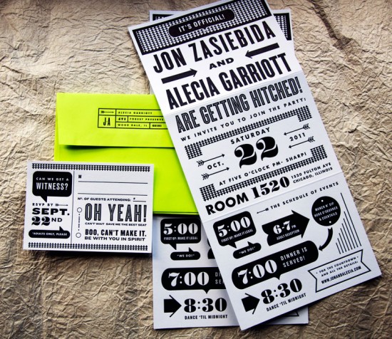
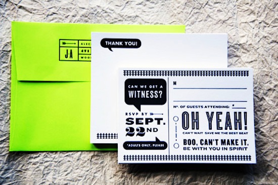
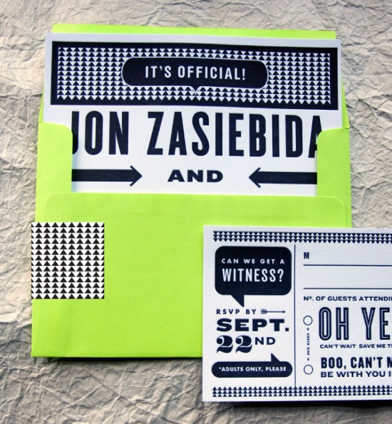
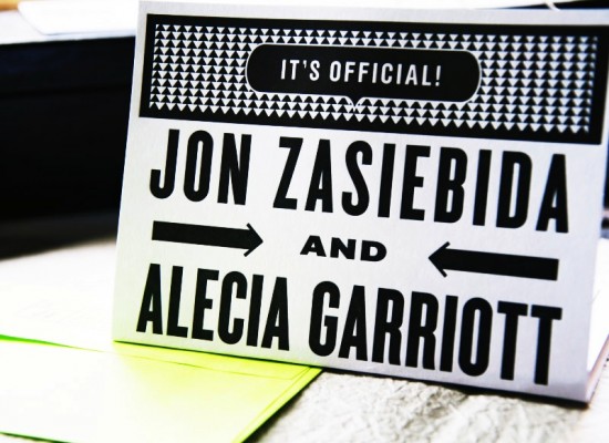
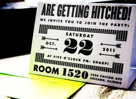
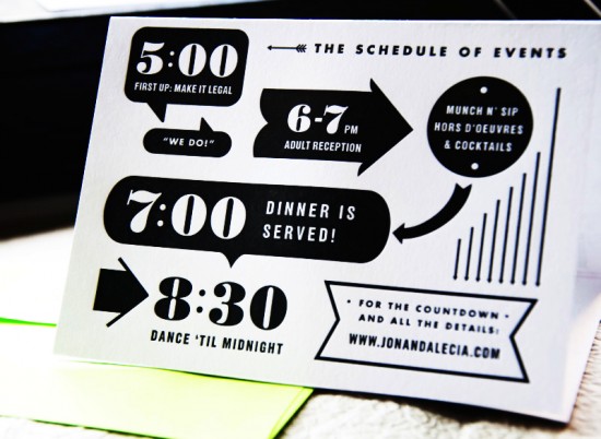
Happy Monday everyone!  We’re starting the week with another fabulous set of wedding invitations from Kate Gabriel of Wit + Delight.  Alecia and Jon wanted modern and funky invitations for their upcoming Chicago loft wedding.  Kate designed these awesome graphic black and white wedding invitations, then incorporated a bright (almost neon!) chartreuse green envelope for a bold pop of color.  Awesome!

From Kate: Jon and Alecia are planning a color-filled event in a downtown Chicago loft.  They wanted the invites to be bold and funky with a lot of their personality coming through.  They wanted letterpress invitations without breaking the bank, so we chose to print with black ink and use a bright chartreuse for the envelopes.  The graphic nature of the design really reflects their style and attitude.  I love the way we incorporated fun language in the word bubbles.

The main invitation was scored in two places and could be folded into a triangle shape to sit on a desk or console as an event reminder!  So cool!

Thanks Kate!

Design: Kate Gabriel

Letterpress Printing: Studio on Fire

Photo Credits: Kate Gabriel | Wit + Delight