Sarah + Michael’s Vintage-Inspired Wedding Invitations

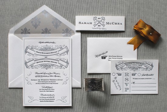
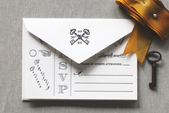
Alexandra from The Aerialist Press sent over these elegant vintage-inspired wedding invitations, and they seemed like the perfect way to help end the week!  Alexandra was inspired by the concept of the 1902s Great Gatsby era and wanted to give her clients a design that is classic yet a little bit playful.

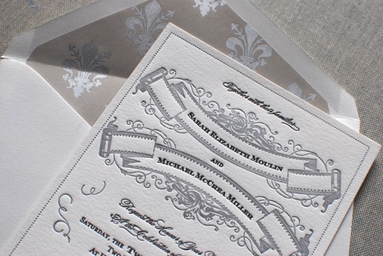
From Alexandra: This invitation suite was inspired by the novel The Great Gatsby and the era in which Fitzgerald’s story took place. The couple really wanted a suite that was simultaneously classic and vintage with a playful edge.

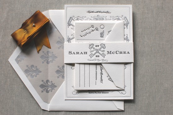
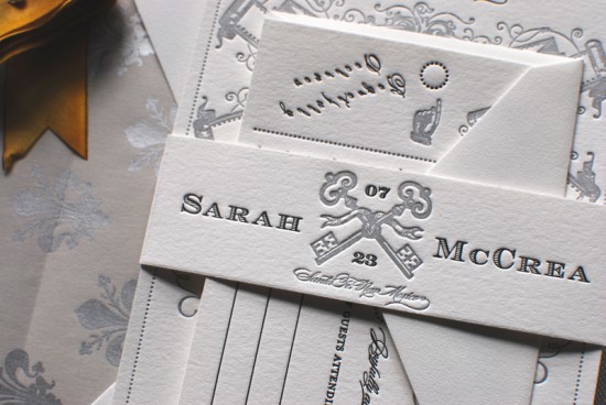
I like to think of the ’20s in Long Island as sort of decadent, theatrical and elegant with a twist.  When creating the suite we really wanted to capture that feeling as well as the wildness of Jay Gatsby’s parties as detailed so sharply in the book and his abiding infatuation and love for Daisy.  The bellyband ended up being our favorite part and really finished off the whole look.

The suite was printed on 110lb Pearl White Crane Lettra paper, the inks are metallic silver and black and we used the Engravers Shaded, Burgues, and Mrs. Eaves fonts (I can’t resist listing these since I’m a not-so-shy type nerd).  The envelope liner stock was sourced from Papermojo.

Thanks Alexandra!

The Aerialist Press is a mem­ber of the Designer Rolodex – you can see more of Alexandra’s beau­ti­ful work right here!

Photo Credits: The Aerialist Press

Claremont Collection Wedding Invitations from Curious & Co.

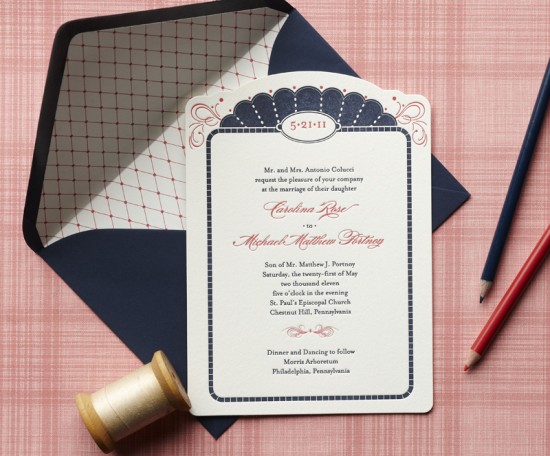
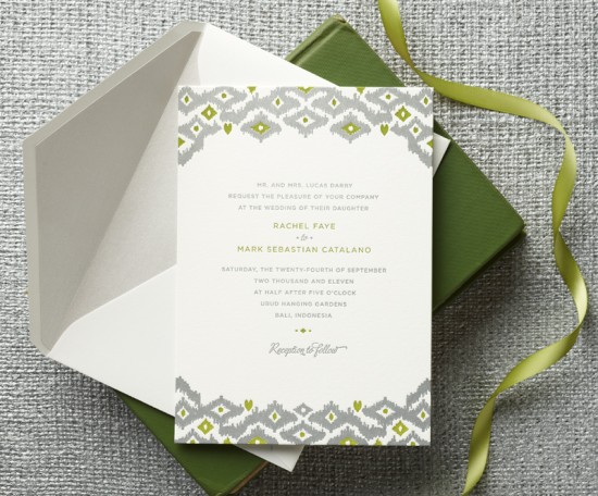
Today I’m thrilled to share some of the designs from the Claremont Collection, a wedding invitation line from Curious & Co. Creative with letterpress printing by Cleanwash Letterpress.  Curious & Co. Creative recently introduced four new designs to the collection, including the fabulous ikat wedding invitation that you might remember from the Martha Stewart Weddings sneak peek a couple of weeks ago.  I love the mix of modern and traditional design elements.  So pretty!

Curious & Co. Creative is a mem­ber of the Designer Rolodex – you can see more of their beau­ti­ful work and the full Claremont Collection right here!

Photo Credits: Trevor Dixon

Sara + Jeff’s Laser Etched Wood Veneer Wedding Invitations

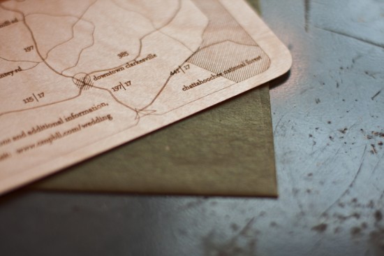
These wood veneer wedding invitations from Fourth Year Studio are so pretty.  Dianna and Emily from Fourth Year Studio created these invitations for a couple that loves hiking and the outdoors, and wood veneer proved to be the perfect medium!  Dianna and Emily combined etched wood veneer with flat printed pieces in a faux bois pattern for a modern and organic invitation suite.

From Dianna and Emily: Sara & Jeff came to us for invitations for their southern fall wedding.  They are avid hikers and love spending time outdoors together.  We knew we wanted to incorporate wood and laser etching into their set.  The concept was to incorporate their outdoor lover spirits with the beauty of the location they have chosen to get married.

Sara & Jeff’s initials area carved into the tree trunk on the front and on the back a map was etched of Clarksville, Georgia.  A perforated RSVP postcard was flat printed and tied to the custom map.   Once guests removed the postcard to mail back their RSVP, it revealed the map underneath!

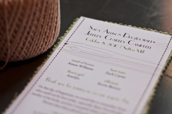
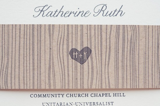
Corresponding thank you cards were flat printed with a wood grain detail.  The invitation suite was packaged in an olive green kraft envelope.  Sara and Jeff’s ceremony programs were also flat printed and stitched onto fabrics with a similar color palette.

Dianna and Emily created a second proof for Sara and Jeff that didn’t end up being produced, but I just had to include it here since I love this proof design as much as the actual invitation!  This design features laser cut paper layered over a piece of basswood to create the effect of stenciled text.  The two pieces were attached with string for a modern and organic feel.  So pretty!

Thanks ladies!  Check out more from Fourth Year Studio right here!

Photo Credits: Chris Melander

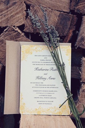
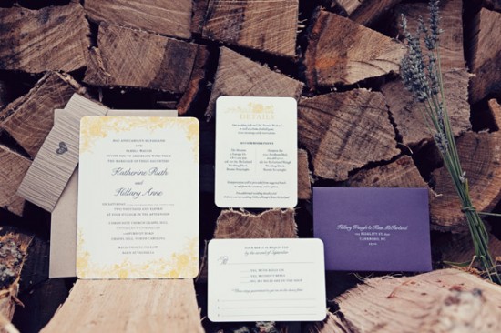
Kate + Hillary’s Rustic Wildflower Wedding Invitations

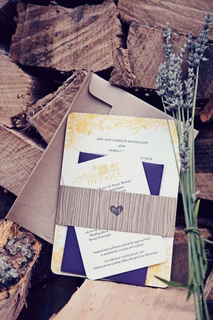
I absolutely adore these beautiful same-sex wedding invitations from Ellie at Hello Tenfold.  The wedding reception will take place on a farm in North Carolina later this fall.  Ellie incorporated lovely floral illustrations and woodgrain details to complement the rustic elegance of the wedding.  Gorgeous!

woodgrain_wedding_invitation_hellotenfold

From Ellie: Hillary and Kate are getting married this fall in North Carolina, with a reception at a farm in the country.  They’ll be incorporating fall colors (hopefully with some cooperation from the leaves!), wildflowers, burlap, and strings of lights for a casual but elegant affair.

purple_yellow_floral_woodsy_wedding_hellotenfold yellow_floral_wedding_hellotenfold

purple_yellow_floral_wedding_invitation_hellotenfold

Thanks Ellie!

Hello Tenfold is a mem­ber of the Designer Rolodex – you can see more of Ellie’s beau­ti­ful work right here!

Photo Cred­its: You Go, I Go, We Go

Katie + Alex’s Elegant Chicago Map Wedding Invitations

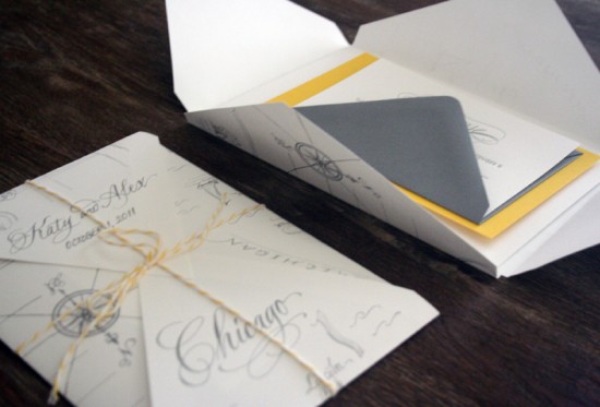
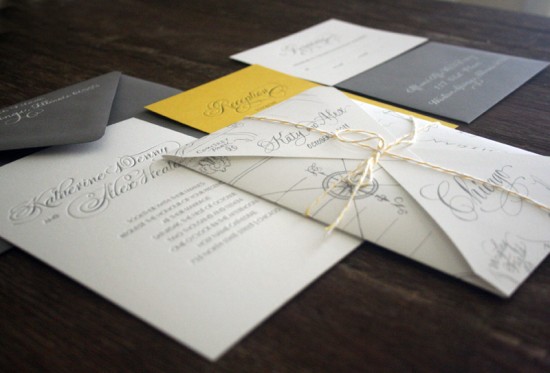
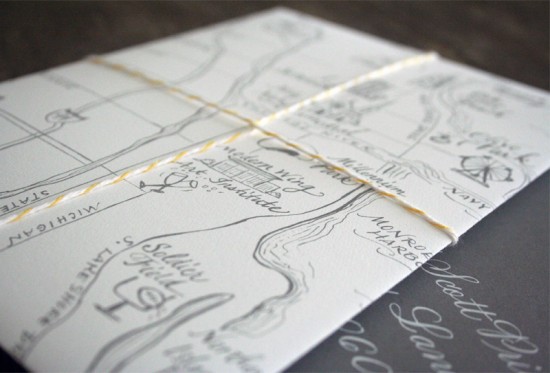
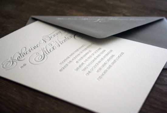
I love starting the week off with something pretty – and it really doesn’t get prettier than these Chicago map wedding invitations from Melissa and Amy of Atheneum Creative.  Katie and Alex wanted their home city of Chicago to serve as the focal point for their wedding invitations, so Melissa and Amy worked with an illustrator to create a custom map showcasing key landmarks for the couple and serving as an inner envelope.  Such a great idea!

From Melissa and Amy: Katy and Alex were looking for a unique way to introduce and share their story—starting right with the invitation.  Chicago is home to both the bride and groom; it’s where their relationship began and it is where they will share their fist kiss as husband and wife.  The city means so much and holds so many memories for them, what better way to tell their story than with a custom illustrated map of their personal Chicago landmarks (such as their high rise apartment, the bench they got engaged on, the church and reception location, and many others).

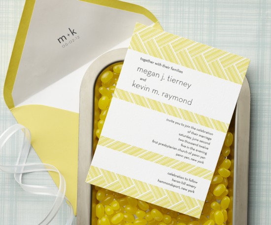
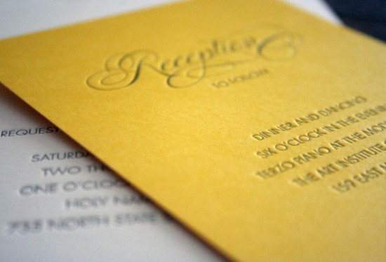
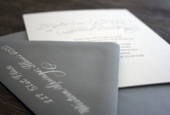
Keeping with their yellow and gray color theme, we kept the cards simple and understated to let the map become the star.  We wanted the map to be the first thing you see when you open the envelope, so we shaped it to serve as the inner envelope—wrapping the whole package in yellow twine. It was really great to hear about all the details in the city that meant so much to the couple and we were really excited to bring that story to life for them.

Stunning!  You can see more from Atheneum Creative right here!

Concept and Design: Atheneum Creative
Map Illustration and Calligraphy: Elizabeth Porcher Jones
Letterpress Printing: Side Show Press

Photo Credits: Atheneum Creative