It’s March, two months until the National Stationery Show. You’re in the thick of it and we don’t want to add anything to your list. On the contrary, this post is about breaking down the concept of NSS mailers so that you can pick the one that’s right for you, get it out the door, and get back to building your booth! And since we both receive a lot of mailers we thought we’d team up and tackle this subject together! –Emily & Nole
Illustration by Emily McDowell for Oh So Beautiful Paper
Some of you are asking if you even need to do a mailer? To this we could answer no (but we mean yes). No, you don’t need to. But yes, you should. Your business is paper and this is the National Stationery Show – a paper mailer is the best way to make a good impression with the retailers and press who will visit your booth. But what type of mailer? In other words, how much time and money should you invest?
First things first, let’s get to the heart of a trade show mailer. Mailers serve several interrelated purposes: 1) let retailers and press know that you’ll be exhibiting at a trade show; 2) tell them where to find you at said show; and 3) get everyone excited about the products you plan to bring to the show. If you’re a first time exhibitor your mailer may also serve as an introduction – no pressure! – but otherwise these are the essential goals. To accomplish these objectives your mailer must contain the following:
– Your company name (and social media handles)
– Your booth number
– Some sort of hint as to what we can expect from you at the show
And that’s really it! Everything else is totally optional. When it comes to mailer formats, there are a ton of possibilities (we’ll get into that a bit more below), but above all else your mailer should be a representation of your brand in a format that works for your brand. Be funny if your line is funny, pretty if your style is pretty, and make it letterpress if the rest of your line is letterpress (or if you’re introducing letterpress to an existing line). Creative and over the top can be a lot of fun – but only if it’s a good fit for your brand AND you have the time, resources, and energy to put together a quality mailer.
We went through some of our favorite mailers from last year’s show to pull a few examples of each type of mailer for you!
Simple Mailer or Postcard
- When to do it: You don’t have much time and you’re already feeling overwhelmed by your massive NSS to do list, but have a stellar card that can be a print or a postcard or, you know, a card.
- Pros: It doesn’t have to take too much time or money but can still be beautiful. It’s a good format to offer a show special or repurpose a botched batch of cards into postcards. It’s also often the perfect format for funny card lines!
- Cons: It may get lost in the shuffle, if you’re mailing it as a postcard, be ready for it to be smudged/bent.
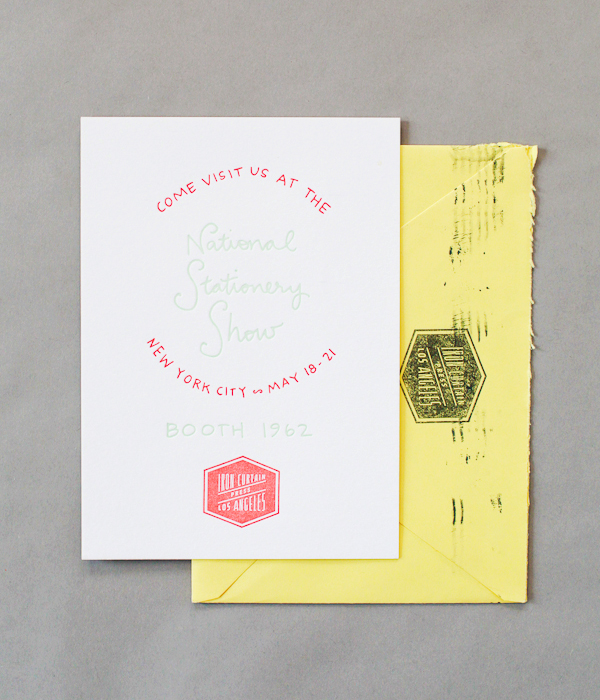
Iron Curtain Press
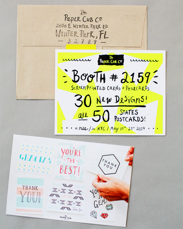
The Paper Cub
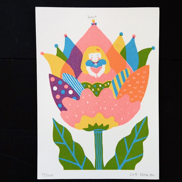
Sue Jean Ko
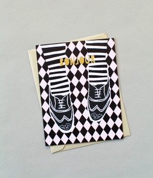
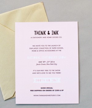
Think + Ink Studio
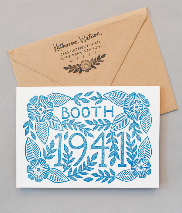
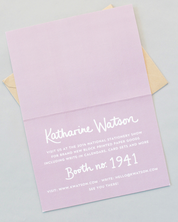
Katharine Watson
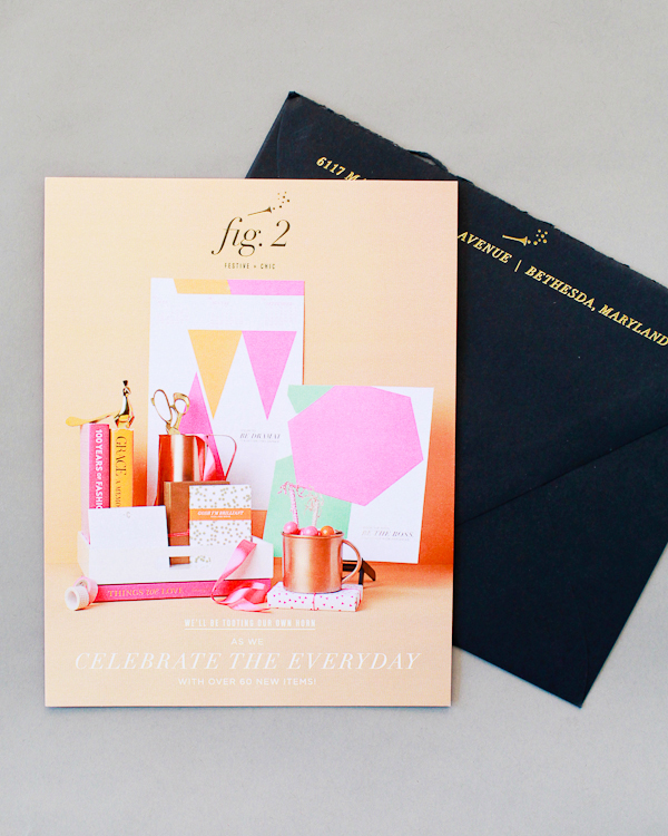
Fig.2 Design
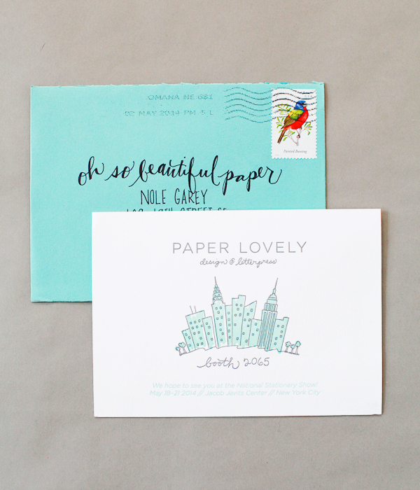
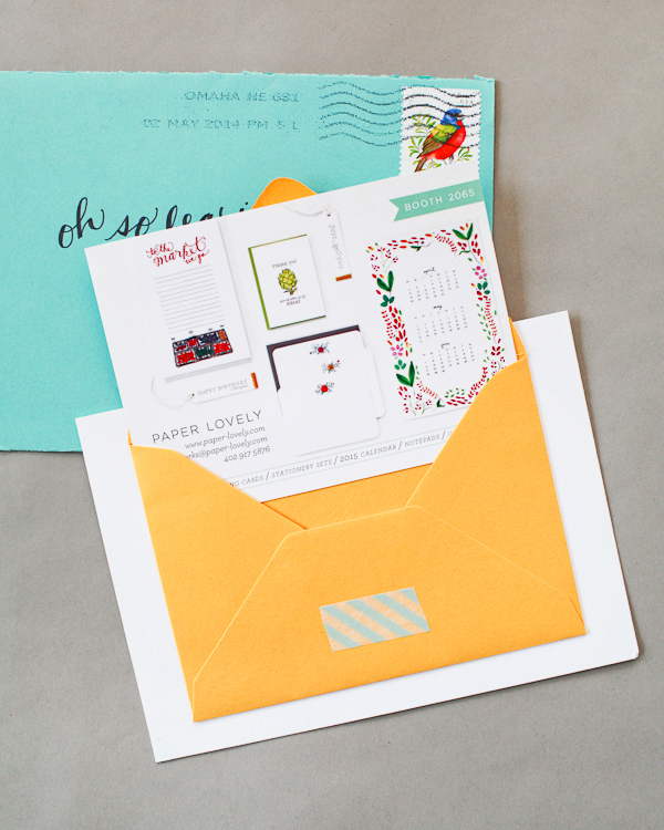
Paper Lovely
Emily’s notes: As a general rule, I love this option. It’s simple, it reminds me of you and they’re easy for me to keep in my NSS file. They’re not going to knock my socks off, but it’s like getting a lovely note from a friend. Think & Ink did a great job of incorporating a show special. I also loved the combo-envelope on a card from Paper Lovely (and a few others!), it incorporates the fun of envelope opening in a playful way. Sue Jean Ko’s was a numbered edition screen print, a nice touch.
Nole’s notes: I also appreciate a simple mailer – and sometimes they actually do stand out when you’re flooded with lots of non-traditional mailers! – but if you go this route, do something to personalize your mailer and/or make your mailer unique. Include a quick hand written note (always a good idea). Make your envelopes really pretty with hand lettered addresses or beautiful stamps. Just something, anything, that will help make a connection with the person receiving the mailer.
This is What We Do Best
- When to do it: You know who you are. You want to have some fun and show off some skills or special techniques. You have some time to experiment.
- Pros: This is the type of mailer that really shows off what you do best – from laser cutting to block printing to split fountain printing. It extends your brand. You may really really enjoy it when it’s done.
- Cons: This is likely to be a labor of love. You’re probably going to devote a fair amount of time to it and it may end up more in the “simple mailer/postcard” category in our eyes.
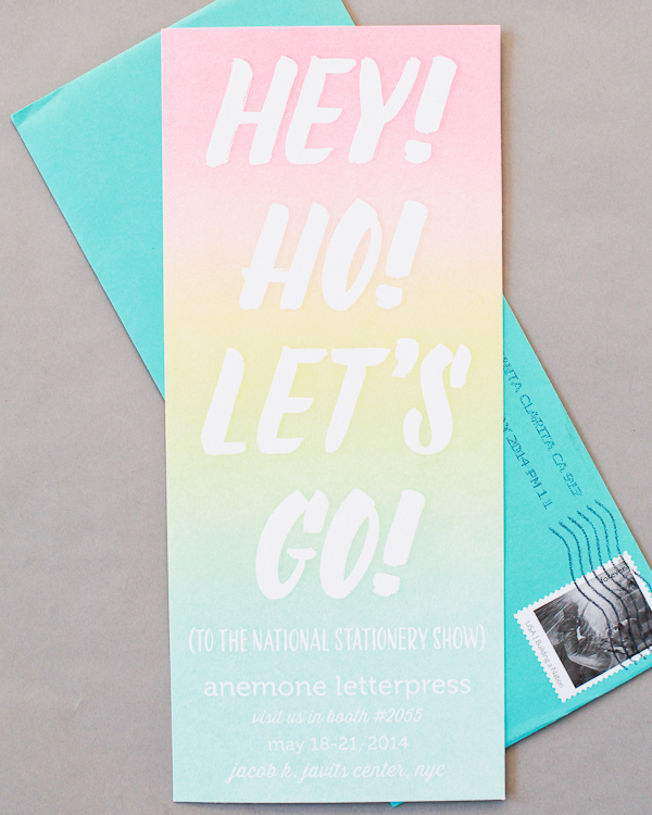
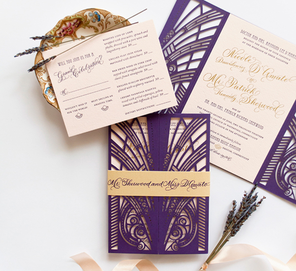
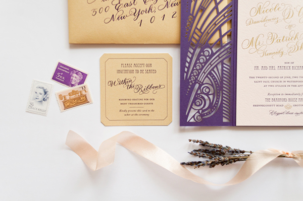
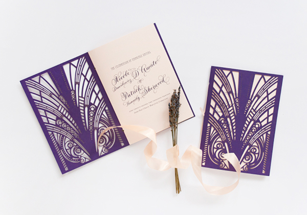
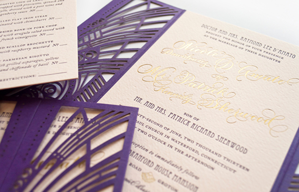
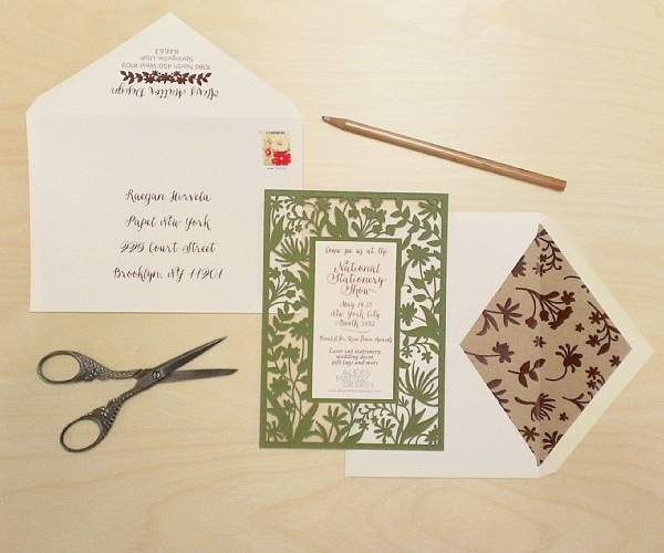
Anemone Letterpress
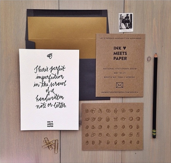
Ink Meets Paper (photo via their Instagram)
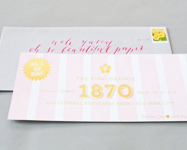
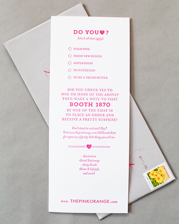
The Pink Orange
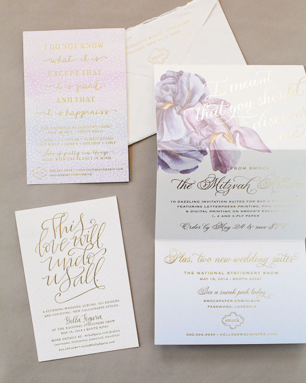
Smock + Bella Figura
Alexis Mattox Design (image via her Instagram)
Emily’s notes:Â I loved opening the mailers from Anemone Letterpress and Farewell Paperie. They weren’t over the top, but both were such true examples of who they were. Also, I’ve often seen these done as an experiment, but the reception is so warm, they become a staple card or print.
Nole’s notes: These are often my favorite mailers! They’re usually beautiful without going over the top, and they’re a great way to demonstrate a level of craftsmanship, like the rainbow roll mailer from Anemone Letterpress, the laser cut gorgeousness from Alexis Mattox Design, or the digital/foil combination from Smock.
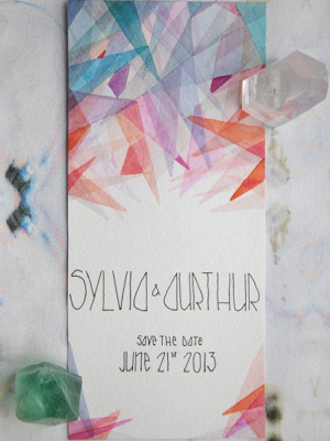
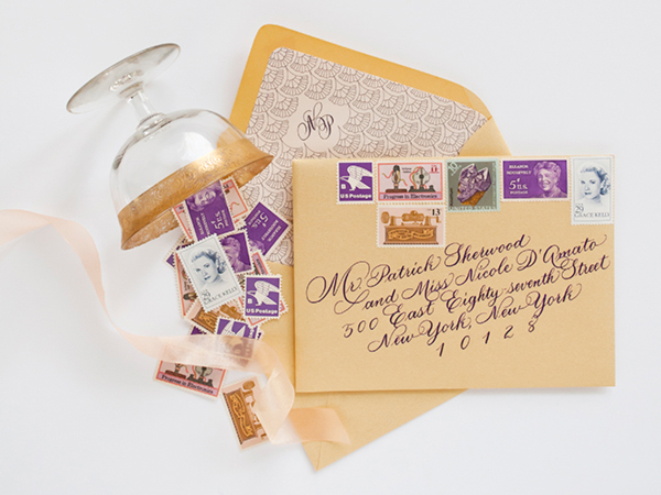
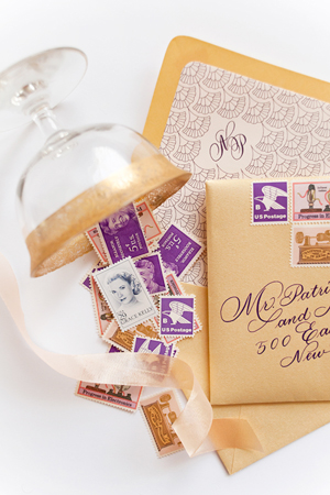
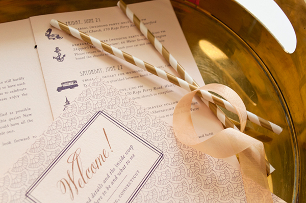
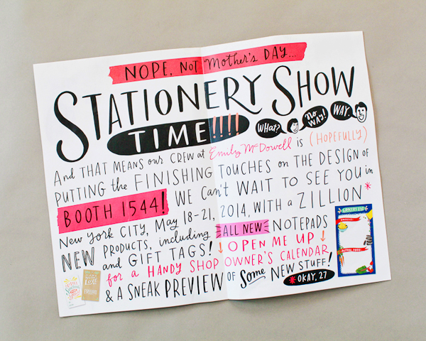
The Modified Look Book
- When to do it: You said you were going to keep it simple this year, but it turned out you had a lot to say. Or maybe you had some nice photos taken and why not turn it in to something a bit more than a postcard…
- Pros: It can tell a story about your line. You can include a heck of a lot of information.
- Cons: These can get really busy and overwhelming really fast. Make sure the mailer tells a story or it may end up in the discard pile.
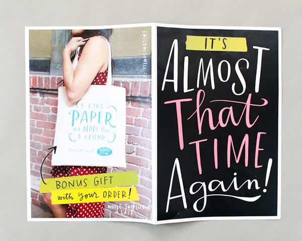
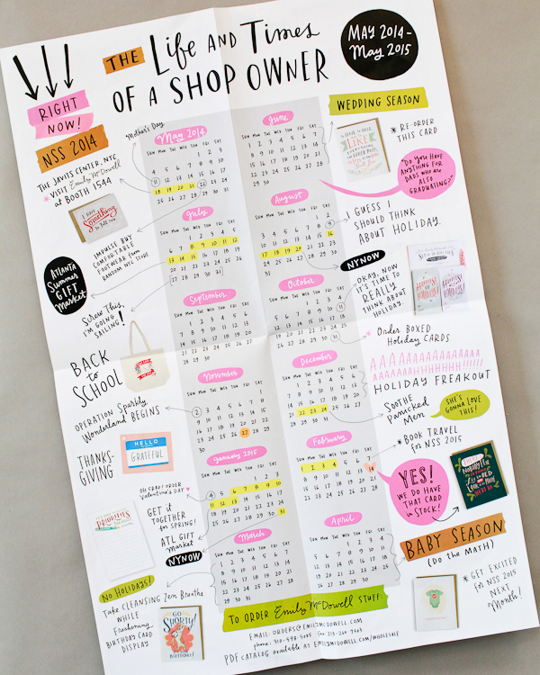
Emily McDowell

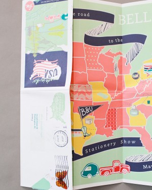
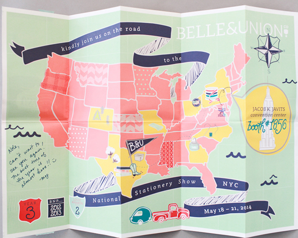
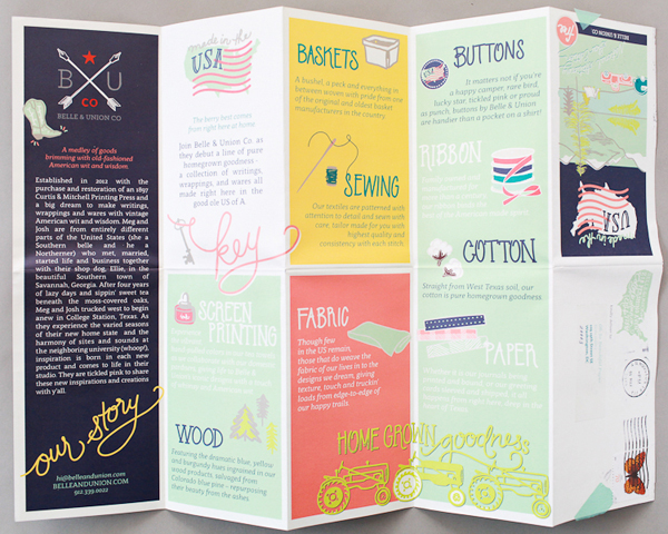
Belle & Union
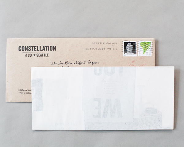
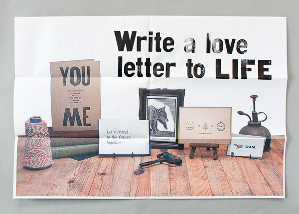
Constellation & Co.
Emily’s notes: I didn’t love folding and unfolding these, but I did like following the stories once they were folded out. I also liked Constellation & Co.’s styled photo: it situated me with their line and the longer envelope stood out.
Noles’s notes: This isn’t a format that works for everyone, but I loved all three of these mailers – and (unlike Emily) I enjoyed the fold out format! Emily McDowell’s was funny and a joy to read (and included a great teaser for those tote bags), Belle & Union’s told a story and was true to her brand, and the newsprint format from Constellation & Co. was really unique.
Functional Item or Samples
- When to do it: When you have a great idea, a line that offers items other than paper, or you want your NSS mailer to double as an introduction packet.
- Pros: If it’s good, a retailer will use it and remember you throughout the year. If it’s really good, you could end up with a brand new product for your line!
- Cons: It may be pricy and time consuming to construct and it might just be a throwaway (ak!).
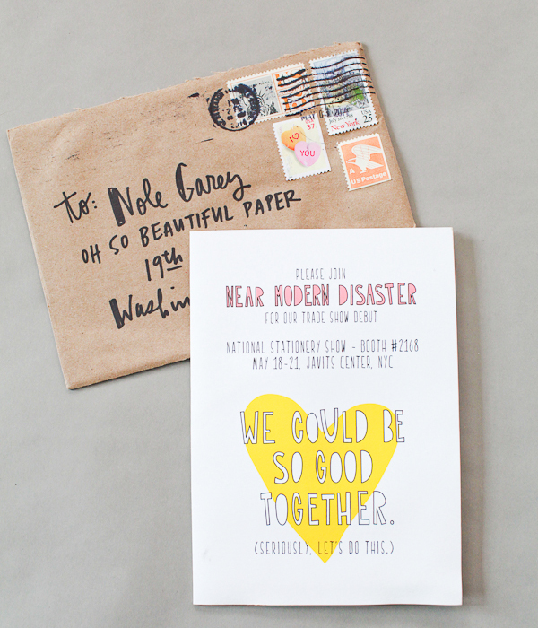
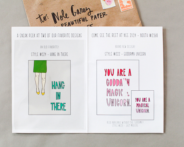
Near Modern Disaster (there were samples in here, but as you can see – I totally used them! –nole)
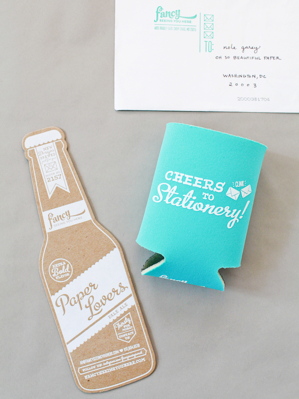
Fancy Seeing You Here
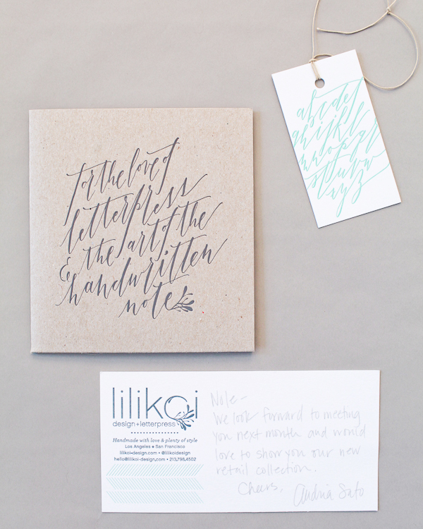
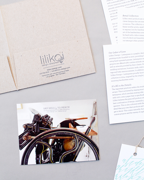
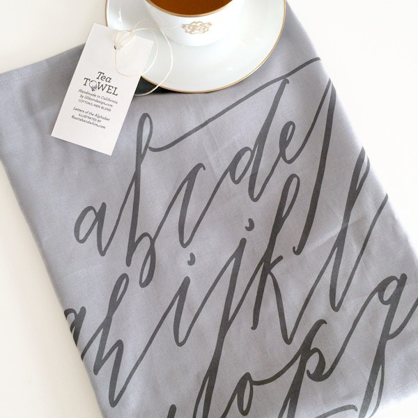
Lilikoi Design & Letterpress
Emily’s notes: I get such a kick out of Near Modern Disaster because she picked my favorite and least favorite cards from her line – bottom line, it made me visit and tell her this, which made me love her because she rolled with the fact that I told her I threw the “hang in here” card away because I couldn’t look at it. I kept Fancy Seeing You Here’s cozy for months even though I have never actually used a beer cozy in my life. I ended up giving it away, but it is one of the most memorable items I received. Lilikoi’s tea towel was one of my favorite items from the show. I went to their booth specifically to ask if they sold them wholesale and placed an order shortly after.
Nole’s notes: Sending samples is a great idea, particularly for first time exhibitors, but just make sure they’re usable samples! Don’t use adhesive that will destroy the back of the card. Include envelopes for mailing the cards. Functional items other than card samples can be more tricky. If you have a fantastic idea and can execute it properly then you should totally do it. The beer cozy from Fancy Seeing You Here was super memorable and one of my favorites from last year’s mailers. The calligraphy tea towel from Lilikoi Design & Letterpress was absolutely stunning. But if a functional item isn’t special, or looks really cheap, it can make a bad impression with the recipient. In that case it’s better to focus your resources elsewhere.
Out of the Box Creativity
- When to do it: It’s your first year and you have everything else under control. Or it’s not your first year, but you’re ready to have some fun. You want to introduce a new product. You want to be remembered.
- Pros: This is the hight of attention getting. It gets you buzz before the show when begins – especially in the world of Instagram! It ensures that you stick in your retailers minds as other mailers come and go. It makes you a destination at the show.
- Cons: It can be incredibly pricy and time consuming. Also, make sure you choose the appropriate container, as these are often the items that arrive torn/damaged.
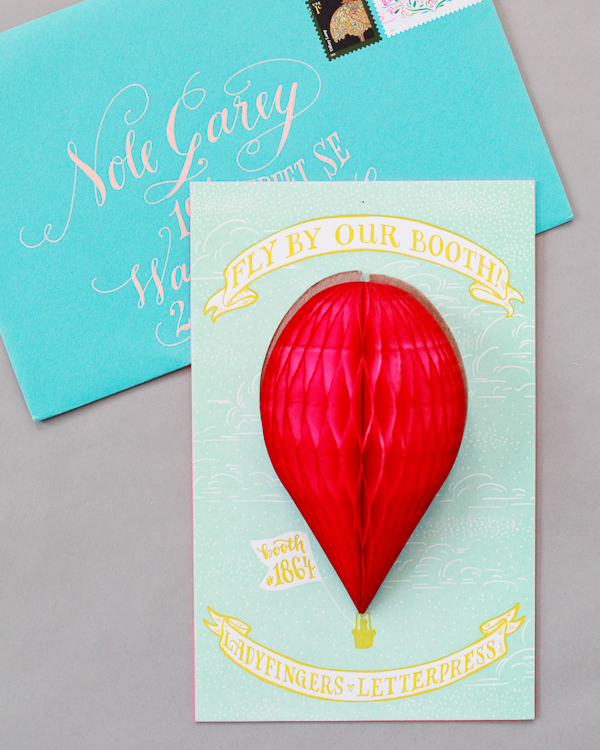
Ladyfingers Letterpress
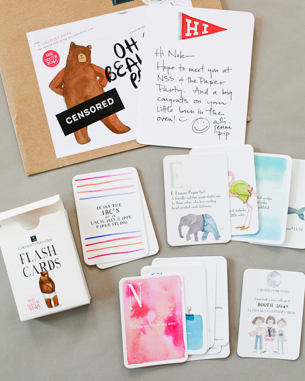
E. Frances Paper
Farewell Paperie
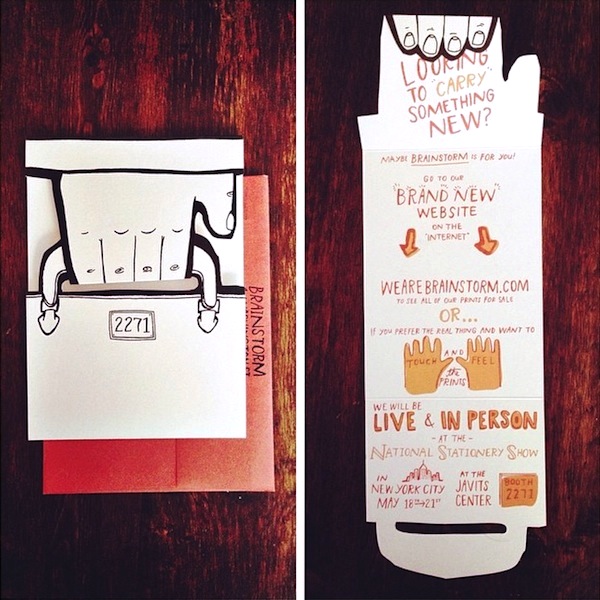
Brainstorm Print & Design
Moglea (image via her Instagram)
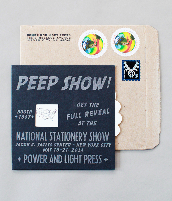
Power & Light Press
Emily’s notes:Â What do I like about these? Oh, I don’t know, probably everything. I love when lines take the time to really play and shine. It’s like Tina Fey and Amy Poehler at the Grammy’s: you’re clearly having fun and I’m eating it up. Ladyfingers’ honeycomb card, E. Frances’ perpetual adorable personalization, Brainstorm’s interactive die-cut briefcase, Power & Light’s peep show. I’m on the floor. This reminds me, you should all include your social media handles on these mailers. If I love someone, I post it on Instagram immediately and having your @ there makes it effortless.
Nole’s notes: These were all fabulous mailers, and they represented each brand in a unique and special way. Brainstorm’s mailer highlighted their illustration skills, Power & Light’s hinted at her raunchy sense of humor, and the Ladyfingers Letterpress mailer introduced their new deluxe line. If you have a fantastic (and original) idea for an NSS mailer, it’s a great way to be remembered!
Mailers are really the most fun time of year (for those of us receiving them). There were so many good ones that we didn’t share here, but we hope this post has your gears turning. So go, spend a day brainstorming, spend a week(end) making and mailing. Use that idea you’re not sure of yet, or find a way to repurpose a mistake. Aim to send them out a month before the show, but don’t worry if you’re just getting them in the mail two weeks before (we receive them right up until the show). Consider scheduling a simple reminder email for retailers in the week leading up to the show if you have time, because there are surprisingly few emails from you coming in as we sit waiting for the trains/planes/automobiles. Use the #nss2015 hashtag on Instagram to share your progress (+ find us to share: Emily and Nole). We can’t wait to see this year’s crop!
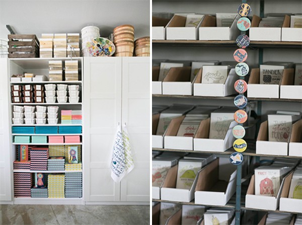
Photo Credits: Except where noted, all photos by Nole Garey and Emily Blistein for Oh So Beautiful Paper
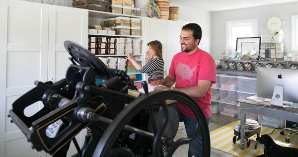
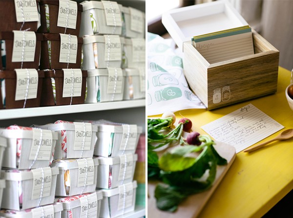
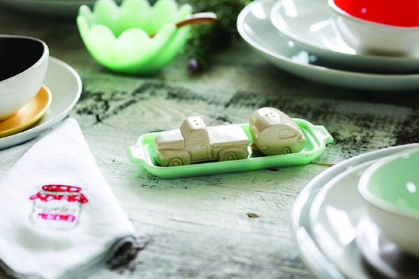
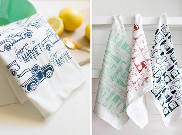 We’ve really enjoyed taking our favorite greeting card phrases and breathing new life into them across various product categories, most notably seen in the kitchen. Josh loves to cook and I love to eat, so it is a natural extension of the brand, something really fun to see the doodles come to life in three-dimensional form. Included in the photos are some of our newest wares to the collection, including
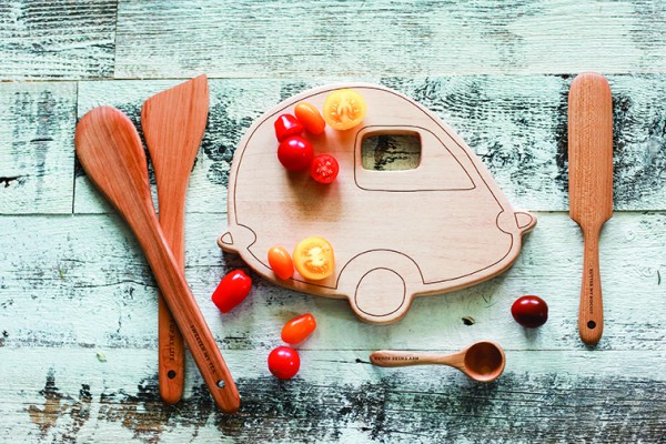
 Follow along on our journey, @belleandunionco and @presswhisperer on Instagram and Twitter. All photos by