Navy and White Mediterranean Inspired Wedding Invitations

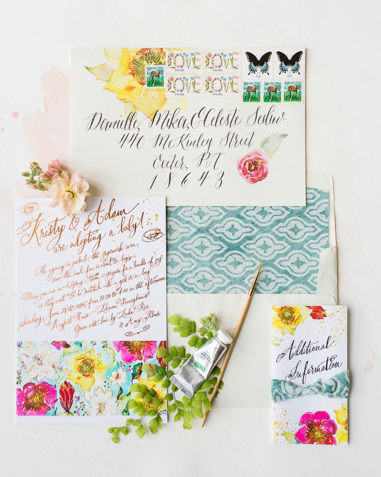
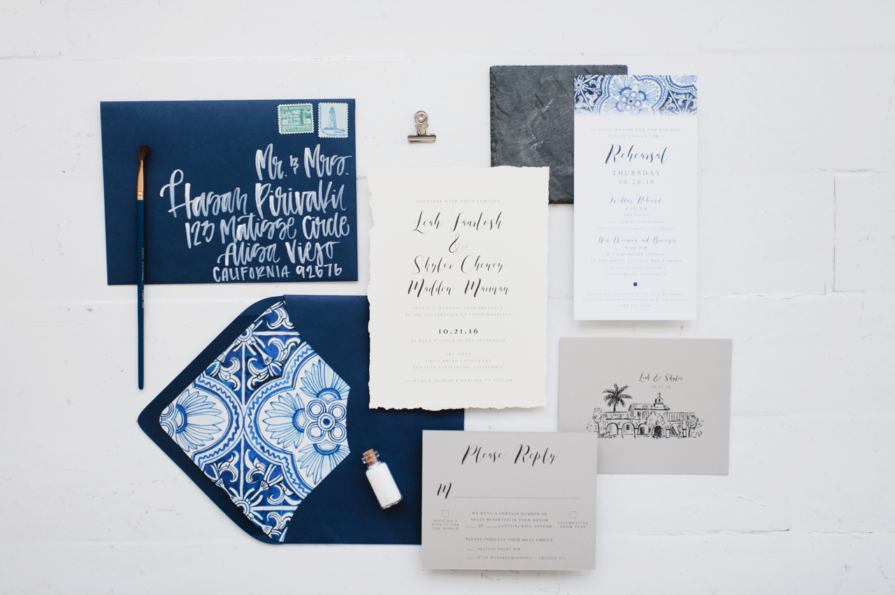
The essential ingredients of a Mediterranean-inspired wedding invitation? A gorgeous navy and white color palette, deckle edge paper, and absolutely stunning hand painted envelope liners. Camille of Robinson Paperie created these bespoke navy and white Mediterranean inspired wedding invitations inspired by the bride and groom’s favorite global destination: southern Italy! Every detail, down to the deckled edges on the invitation, brings a whole new meaning to the word handmade – and makes us daydream of quaint seaside towns on the Amalfi Coast!

Navy and White Mediterranean Inspired Wedding Invitations by Robinson Paperie

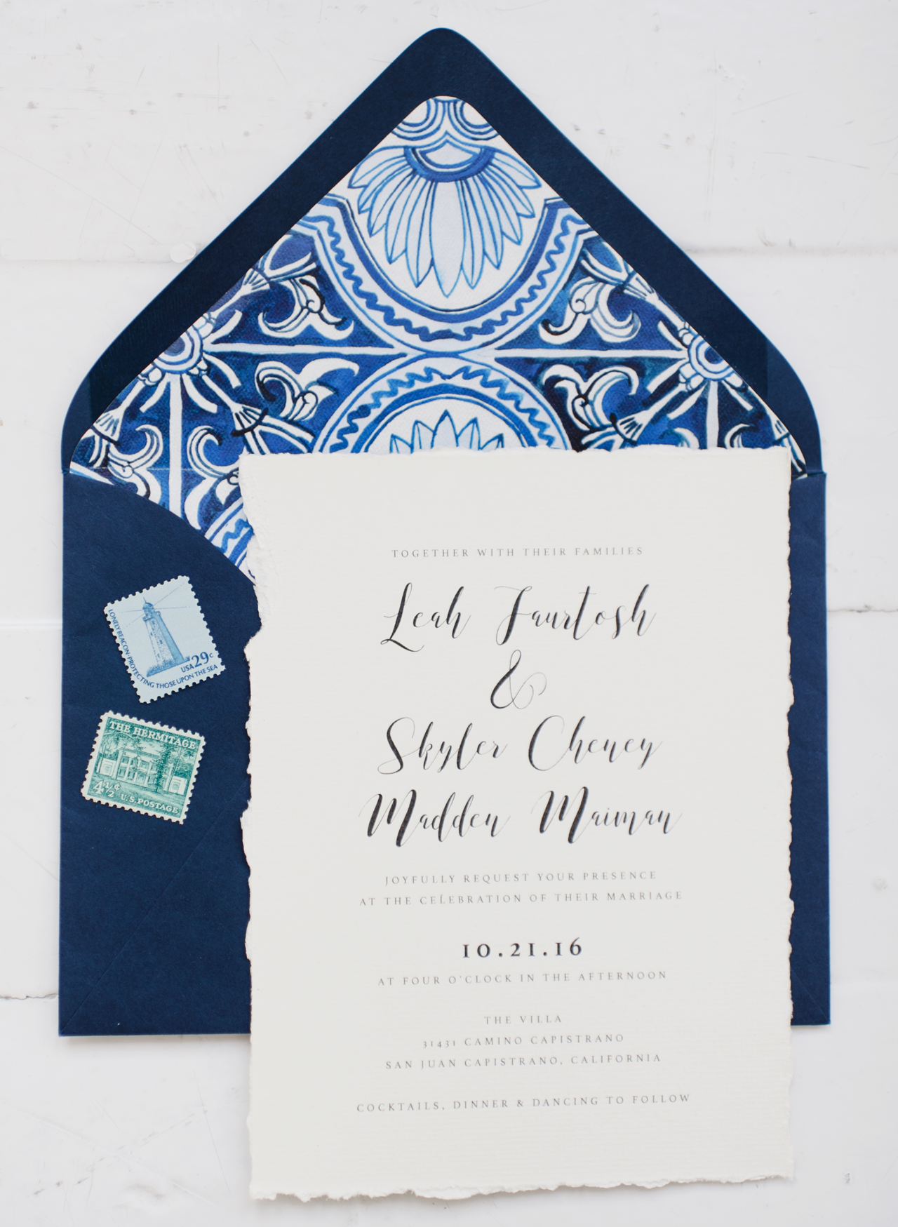
From Camille: When I was contacted by Leah and Skyler to design their wedding suite, it was their story that inspired me more than anything. The couple had just returned from an epic trip around the world: South America, Malaysia, Indonesia, New Zealand, Australia, you name it! I was eager to hear what part of the globe their wedding inspiration was going to come from and… it was Italy!

Navy and White Mediterranean Inspired Wedding Invitations by Robinson Paperie

Most people who think about Italian inspiration may think of wine, rolling hills, vineyards, olive branches, etc. But Leah and Skyler were eager to make their invitation feel traveled – as if guests might actually be joining them in Italy for the big day! After some thought, we found the perfect balance of “old and wise” and “new and fresh.”

Navy and White Mediterranean Inspired Wedding Invitations by Robinson Paperie

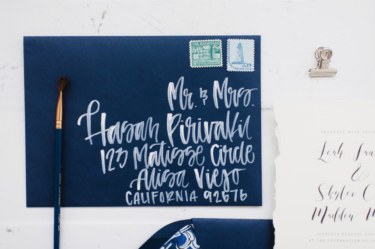
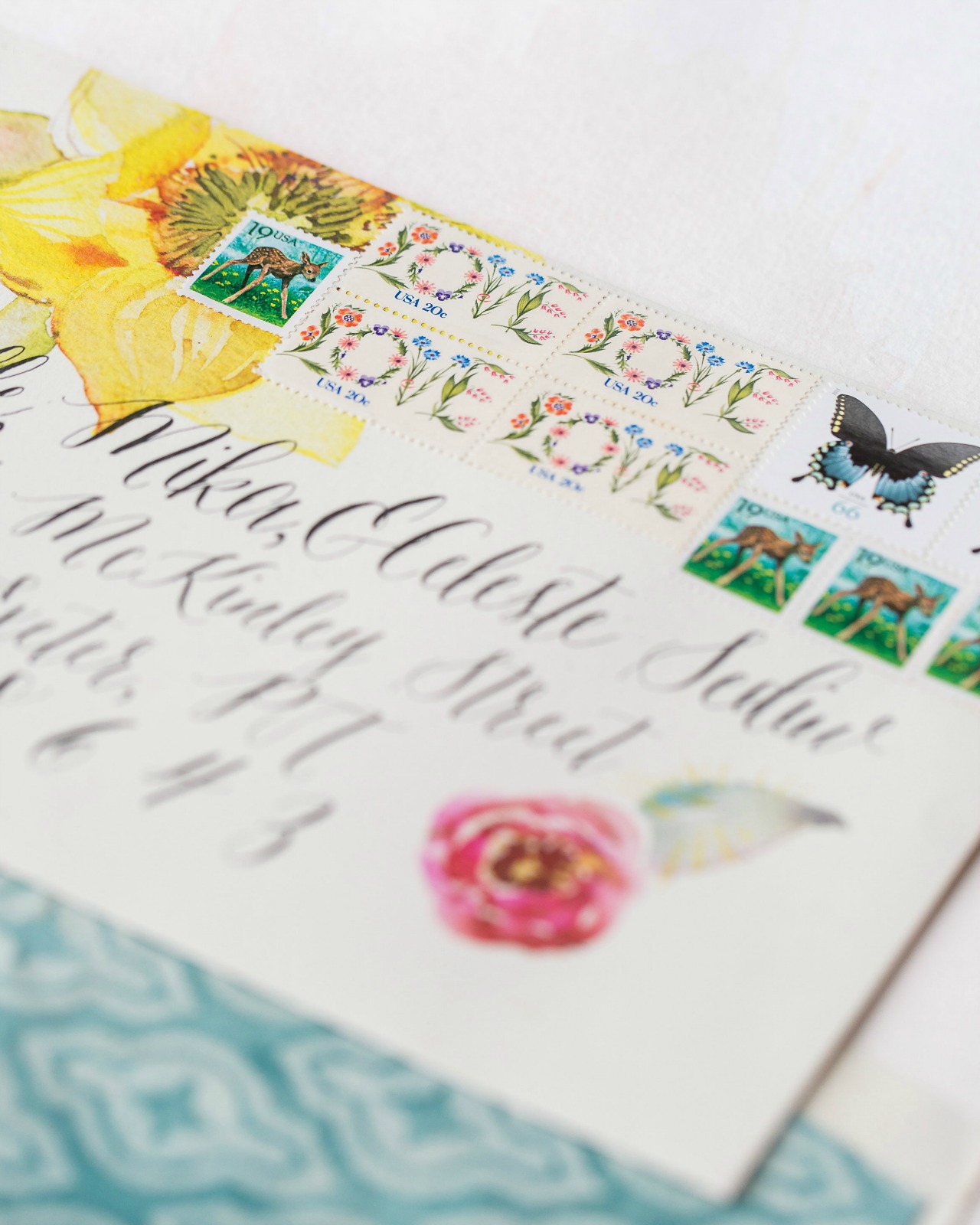
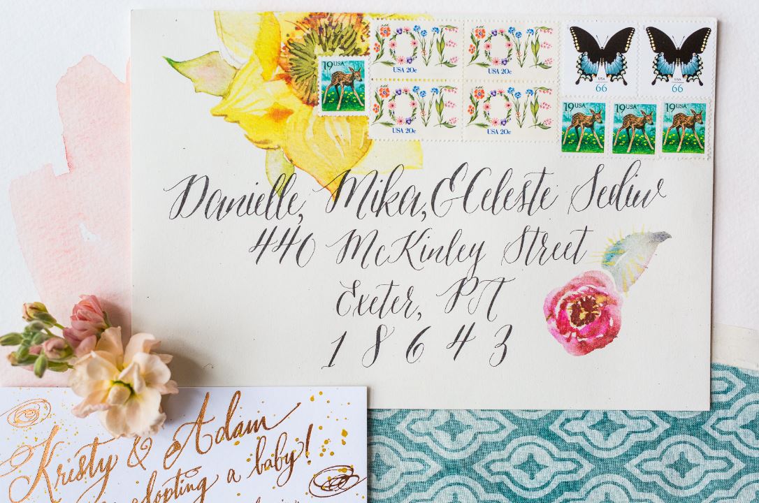
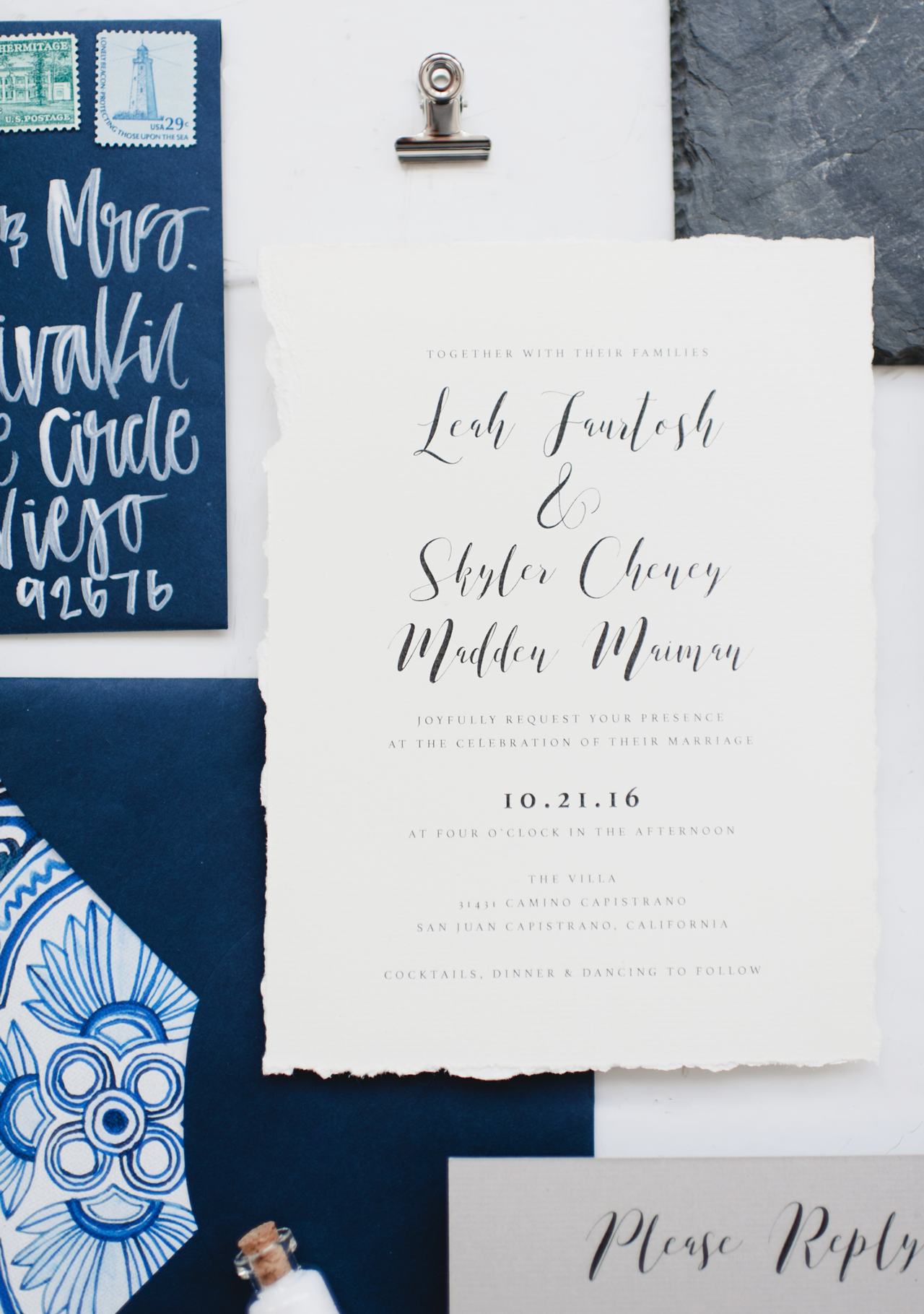
We pulled design inspiration from the Mediterranean, sketched art, organic fibers, textiles, natural papers, and more. Leah and Skyler really loved the idea of making everything look “done by hand” so we did just that. The edges of the invitation were deckled by hand, and all the envelopes were hand lettered with white opaque ink.

Navy and White Mediterranean Inspired Wedding Invitations by Robinson Paperie

The sketch of the church across the street from their wedding venue was hand illustrated. Even though the suite itself was simple in terms of the design, the watercolor tile liner was hand painted and given a cotton texture to make it look a little distressed. This was JUST the extra “pop” it needed! We carried over the textile design to the rehearsal dinner card and changed the shape to make it stand out. It was an honor to help this couple relive their travels through their wedding suite, and more importantly, share it with all their guests!

Navy and White Mediterranean Inspired Wedding Invitations by Robinson Paperie

Thanks Camille!

Design and Envelope Addressing: Robinson Paperie

Watercolor Liner: Ashley Laskowski

Printing: Nikko Media

Styling: Carina Skrobecki 

Check out the Designer Rolodex for more tal­ented wed­ding invi­ta­tion design­ers and the real invi­ta­tions gallery for more wedding invitation ideas!

Photo Credits: Carina Skrobecki Photography

The World of Illustration: Mari Andrew Illustration

Hello everyone! I think it’s safe to say everyone is feeling the need to find reasons to laugh and some lighthearted escapes. And that’s where illustration can really hit home. I’m beyond thrilled to share a peek into the work of a super talented illustrator, and a true artist crush of mine — Mari Andrew. It’s not everyday you look into someone’s Instagram feed and wish you could paper your walls with their work. But that’s the feeling I got when I first discovered Mari Andrew, an illustrator and writer living in Washington, D.C. Her illustrations are so personal, so real, and some are the literal laugh-out-loud variety. So I asked Mari to share some insight into her world as an illustrator, and as someone I wish I could meet for coffee and just chat (so this is the next best thing!). Here’s our Q&A and some of my all-time favorite illustrations of hers, but do check out her website and Instagram for even more! Jen

Mari Andrew Illustration

Mari Andrew Illustration

Mari Andrew Illustration

Mari Andrew Illustration

Q: Where do you like to work when you’re creating an illustration?

A: I work from the cutest little studio with the cutest little name — The Lemon Bowl. I used to work on a coffee table in my apartment, but that table is also where I eat, watch Netflix, email, and scroll through Instagram, so it didn’t feel like a very creative space. It changed my life to have a studio space where I could go and work, sort of like going to the gym. At the studio, I’m accountable to create and I feel much more disciplined and focused when I’m there. I sit at a long table and listen to podcasts and occasionally get up to stretch or dance a little.

Mari Andrew Illustration

Q: Where do you like to go to be inspired?

A: Brazil! But also, I walk two hours a day (to work and back home) and that’s a very creative time for me when I’m processing life events. It’s also a great time to look around to get inspired by other people and the interesting things I see along my commute through several neighborhoods.

Mari Andrew Illustration

Mari Andrew Illustration

Q: Do you have a favorite color or color palette?

A: I love fuchsia! I try to make as many Venn diagrams as I can to work in big splashes of pink. I really love the way black/white illustration looks, but I have too much fun with watercolor to stick to such a palette myself.

Mari Andrew Illustration

Q: What artist tools do you use for creating your illustrations-a-day?

A: I use the cheapest tools: A Sharpie pen and a travel watercolor set I got on Amazon for $19.99. I draw on nice watercolor paper though!

Mari Andrew Illustration

Mari Andrew Illustration

Q: I love how some of your illustrations so perfectly depict dating life, and the myriad of experiences you can have as a single person dating. Have those illustrations been some of the pieces that have resonated most with people? Do you have a favorite ice cream for breakup blues?

A: YES, I always think I am totally alone in my dating fiascos and breakups, but as soon as I publish something very personal, a lot of people always resonate. They say it makes them feel less alone, which is lovely, but I do it selfishly because it makes ME feel less alone! The dating illustrations are definitely the most popular; I think it’s because we all assume we’re somewhat isolated in our experiences and it’s nice to know that it’s just hard for everyone, no matter who you are.

A breakup ice cream has to be SUPER indulgent or it doesn’t work. I’d go for Ben and Jerry’s Half Baked. The more chunks of baked goods mixed in, the better.

Mari Andrew Illustration

Q: Are you a morning person or a night person? When do you create your best work?

A:  I have all my energy and create my best work in the morning. It’s a little stressful having that time of day be so productive in contrast to the rest: do I spend that energy on my art, on cleaning my apartment, exercise, or my 9-5 job? Art usually wins!

Mari Andrew Illustration

A big thank you to Mari Andrew for sharing her thoughts and work. Isn’t it amazing how art (that makes you think!) can be created simply with a sharpie and a cheap set of watercolors? I love that. See you back here soon!

Photos: Mari Andrew

DIY Colorful Halloween Treat Bags

Back in April, I got to play around with some envelope inspiration featuring light ink over dark watercolor washes using Sakura of America‘s opaque Soufflé pens. I loved the light-against-dark look so much, it got me thinking about other ways that I could use opaque ink colors over dark paper or surfaces. With Halloween just around the corner, I thought it would be fun to put a colorful DIY spin on Halloween treat bags using matte black paper treat bags. So today I’m thrilled to partner up with Sakura of America once again to share a couple of really fun ideas for DIY colorful Halloween treat bags using their opaque Soufflé pens and Permapaque dual point paint markers!

DIY Colorful Halloween Treat Bags

Halloween treat bags are a must for parents of school-aged children, but they’re also a fantastic option for anyone considering non-food trick-or-treating options for kids with food allergies. Halloween feels like the perfect time to break out a black treat bag, but I could also totally see a version of this DIY working for kids birthday parties any time of year. Maybe tiny bugs and creepy-crawlies for an insect-inspired party, or a colorful treasure map for a pirate party??

DIY Colorful Halloween Treat Bags

The Permapaque markers come in really bright and vibrant colors, along with gold, silver, and copper, while the Soufflé pens read much more pastel against the black paper. I just love the pops of color against the matte black paper, and the pastel tones of the Soufflé pens give off a vaguely ’70s black light poster vibe, which is pretty cool.

Let’s get to the how-to so you guys can give this a try at home!

DIY Colorful Halloween Treat Bags

Supplies

DIY Colorful Halloween Treat Bags

To make the hand lettered treat bags, use a white pencil to lightly write out the word or phrase you want on your treat bags. I had my daughter’s preschool class in mind when creating my treat bags, so I wanted to keep things really simple. A drawn out BOOOOOOOOOOOO!! is perfect for a bunch of 4 year-olds still learning how to read, but for older kids or a grown up Halloween party you could do a series of words or a favorite Halloween phrase. Write the letters in all caps and in varying sizes for a playful, whimsical feel. Then trace over the light pencil letters with Permapaque dual point markers or Soufflé pens. Allow the ink to dry completely, then add a second coat of ink if needed. So easy!

DIY Colorful Halloween Treat Bags

DIY Colorful Halloween Treat Bags

To make the illustrated candy Halloween treat bags, start by drawing solid color candy shapes using Permapaque paint markers and allow the ink to dry completely, usually just 2-3 minutes. I did a mix of triangular candy corn, round gum balls, and little twisty rolls, along with a random sprinkle pattern. Add a second coat of the Permapaque paint for more vibrant and smooth color coverage, then allow the ink to dry a second time. Finally, use the Soufflé pens to add detail over the Permapaque layer and to add more sprinkles.

DIY Colorful Halloween Treat Bags

DIY Colorful Halloween Treat Bags

DIY Colorful Halloween Treat Bags

DIY Colorful Halloween Treat Bags

I absolutely LOVE the way the Permapaque markers and Soufflé pens look on the matte black paper treat bags! I was really surprised by how well even the darker color Permapaque markers did against the black paper, and the pastel tones of the Soufflé pens are even more lovely in person. I also did a few versions on regular glassine treat bags so you could see what they would look like. The Soufflé pens had a tough time with the waxy coating on the glassine bags, but worked perfectly when layered over the Permapaque paint!

DIY Colorful Halloween Treat Bags

DIY Colorful Halloween Treat Bags

DIY Colorful Halloween Treat Bags

And don’t feel intimidated if illustration isn’t your thing. I went with a candy theme for my illustrations, but even a simple polka dot pattern would look amazing in the colorful ink against dark paper and would take approximately 30 seconds per bag. Or stars in varying sizes! Rainbow stars, or even an all-metallic design with stars in silver, copper, and gold. YES. If you’re feeling adventurous, try a Jack O’ Lantern face. So many great possibilities! I found the Permapaque markers better for a more bold and graphic lettering or illustration style, while the Soufflé pens are great for line illustrations and details, so just keep that in mind when creating your illustrations.

DIY Colorful Halloween Treat Bags

DIY Colorful Halloween Treat Bags

DIY Colorful Halloween Treat Bags

So bright and happy! You can pick up your own set of Soufflé pens here and Permapaque markers here – you’ll have so much fun creating colorful treat bags with them!

Photos by Nole Garey for Oh So Beautiful Paper

This post is sponsored by Sakura of America. All content and opinions are my own. Thank you for supporting the sponsors that make Oh So Beautiful Paper possible!

Whimsical Floral Adoption Baby Shower Invitations

Baby showers are just the best. They’re both a chance for parents-to-be to celebrate with family and friends and stock up on a few new baby essentials (OMGbabiesneedsomuchstuff). And seriously, there really are so many things that new parents need – including moms and dads becoming parents through adoption. I’m beyond thrilled and honored that the talented Kristy Rice of Momental Designs is sharing her whimsical floral adoption baby shower invitations with us today! The invitations feature Kristy’s signature vibrant hand painted florals, rose gold foil printing, and fabric envelope liners, these festive baby shower invitations – perfect for celebrating Kristy’s newest addition!

Whimsical Floral Adoption Baby Shower Invitations by Momental Designs

From Kristy: These invitations were very special for me as I created them for my own baby shower for my recent adoption. The invitations are loosely based on the paintings of artist, Frida Khalo, and a blooming cactus watercolor painting that I did. They are very whimsical, featuring a variety of different fun elements to help the overall aesthetic come to life!

Whimsical Floral Adoption Baby Shower Invitations by Momental Designs

The highlights of the design for me were the rose gold foil printing, fabric elements, and the individually hand painted components of the invitations. All pieces are hand painted using various techniques like gold spatter, bold aqua watercolor washes, and fuchsia free hand outlines on the menus.

Whimsical Floral Adoption Baby Shower Invitations by Momental Designs

Whimsical Floral Adoption Baby Shower Invitations by Momental Designs

The envelopes were lined with fabric for an added touch! To complement everything inside the envelopes, we featured calligraphy envelope addressing with colorful artwork on front and oversized vintage stamp composition.

Whimsical Floral Adoption Baby Shower Invitations by Momental Designs

Whimsical Floral Adoption Baby Shower Invitations by Momental Designs

Each guest wore paper flower crown, even the babies! Made from handmade, painted papers and greens, each crown had its own personality. Each seating card featured a personal free hand watercolor sketch that I made for guests based on their favorite flowers, favorite pet, favorite collectibles, favorite food, or a nickname. Seating cards were hung on a dip dyed fabric backdrop featuring a calligraphy laser cut wood sign and greenery.

Whimsical Floral Adoption Baby Shower Invitations by Momental Designs

The menus were die cut on shimmering gold stock with a nearly-neon pink painted edge. The edge painting was done a bit differently than usual as it was painted on the face of the menu along with the edge. Each menu was unique depending on how much pressure was applied to the brush during painting.

Whimsical Floral Adoption Baby Shower Invitations by Momental Designs

The vibrant floral aesthetic continued throughout the party with floral watercolor pattern placemats featuring dahlias, mulberries, vines and ranunculus. I had a blast putting together all the elements for this special day and making my vision come to life.

Whimsical Floral Adoption Baby Shower Invitations by Momental Designs

Whimsical Floral Adoption Baby Shower Invitations by Momental Designs

Thanks Kristy!

Design: Momental Designs

Envelope Calligraphy: Designsgirl

Wooden Calligraphy Sign: Laura Hooper Calligraphy

Event Planning: Patchwork Planning

Momental Designs is a member of the Designer Rolodex – you can see more of their beautiful work right here or visit the real invi­ta­tions gallery for more wedding invitation ideas!

Photo Credits: Danielle Coons Photography

Rustic Green and Gold Foil Wedding Invitations

I’ve been feeling dark greens in a major way recently, so I was thrilled when Catherine from Printerette Press sent over these gorgeous rustic green and gold foil wedding invitations! The invitation suite features Catherine’s signature hand lettering and botanical illustrations, including some sweet details important to the bride and groom tucked into those illustrations. And the dark green ink paired with shiny gold foil? Such a great combination! Oh, and for any engaged couples out there – make sure you read all the way to the end for details on an awesome discount on custom wedding invitations through the end of October!

Rustic Green and Gold Foil Wedding Invitations by Printerette Press / Photo Credit: Melissa Oholendt, Styling by Mae Mae & Co.

From Catherine: Of all of the weddings we’ve worked on, Rebecca and Bert’s wedding suite is one of our favorites. With so many fun elements such as gold foil and velvet, it’s hard to top! They were a joy to work with and were very excited to collaborate together on a truly personalized invitation.

Rustic Green and Gold Foil Wedding Invitations by Printerette Press / Photo Credit: Melissa Oholendt, Styling by Mae Mae & Co.

We hand drew the laurels and wreaths featured on the several of the paper pieces. The invitation was printed with a mix of deep green letterpress and gold foil to add a bit of dimension. Tucked into to the laurels are little illustrative elements of importance to the bride and groom: antlers, a bunny, a bicycle, a bumble bee, and a set of weights because of Bert’s background as a personal trainer!

Rustic Green and Gold Foil Wedding Invitations by Printerette Press / Photo Credit: Melissa Oholendt, Styling by Mae Mae & Co.

For the lettering on the invitation, we used a mix of hand lettering for their names and locations of the wedding and reception and a classic serif font for the rest of the invitation text. We highlighted the names of the bride and groom in gold foil on both the wedding invitation and save the date.

Rustic Green and Gold Foil Wedding Invitations by Printerette Press / Photo Credit: Melissa Oholendt, Styling by Mae Mae & Co.

We loved the mix of green and gold foil for a fall wedding. We backed the invitation with velvet flocking that matched to the custom made velvet jacket that Bert will wear on the big day! We used a duplexing process to adhere the velvet to our cotton paper. Things like this always take a little bit of practice to get right, but we love it when we get to try new things!

Rustic Green and Gold Foil Wedding Invitations by Printerette Press / Photo Credit: Melissa Oholendt, Styling by Mae Mae & Co.

Thanks Catherine!

Also, BIG news for any engaged couples out there: Printerette Press is offering 20% off a custom 3-piece wedding suite if you book your invitations by October 31! The design can include hand drawn portraits, calligraphy, custom watercolor florals, you name it! And any print method from digital to letterpress and even foil qualifies! What?!? That’s seriously such a great deal, I just had to pass it along to you guys! You can find all the details over on the Printerette Press blog right here.

Design: Printerette Press

Styling: Megan Gonzales of Mae Mae & Co.

Printerette Press is a member of the Designer Rolodex – you can see more of their beautiful work right here or visit the real invi­ta­tions gallery for more wedding invitation ideas!

Photo Credit: Melissa Oholendt