Texas Ranch Wedding Invitations

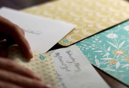
This week’s real wedding invitations come to us from Stephanie at Salt + Pepper Press – and they’re inspired by all things Texas!  Stephanie and her husband Robbie were married at Three Points Ranch in the heart of Texas in early May.  From the beginning, Stephanie and Robbie set out to create a true country Texas-style wedding – from a custom cattle brand to cowboy boots!

texas-ranch-wedding-tent

From Stephanie: Our goal was to make our wedding as tastefully Texan as possible.  We wanted to really emphasize that this was going to be a laidback ranch wedding with the whole cowboy feel and we wanted to make sure that feeling was present in the invitations.

Texas-Ranch-Save-the-Date

Texas-Ranch-Wedding-Invitations-Wood-Veneer

First we created our custom cattle brand, which is actually an S R G – our initials and the first letter of his last name.  In Texas, every ranch has its own brand that they use as their trademark from branding cattle to their logo and identity.  We wanted to create the same kind of brand that stood for us and our wedding.  From there we developed the invitation suite.

Texas-Ranch-Wedding-Invitations

texas-ranch-wedding-invitations-rsvp

To make sure that we pushed the ranch theme, we backed every invitation with wood veneer and branded it with our custom made cattle brand.  We also made belly bands out of the wood that wrapped around the wedding invitations and branded that as well.

Texas-Ranch-Wedding-Invitation

texas-ranch-wedding-invitations-wood-veneer-brand texas-ranch-wedding-invitations-thank-you-card

Texas-Ranch-Wedding-Invitations-Wear

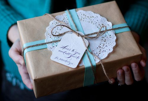
To take it one step further, we made a poster that reminded our guests of the iconic WANTED poster from the west and that we used instead of a enclosure card with reception information.  We had so much fun creating, printing and assembling the invitations!

Texas-Wedding-Invitations-Poster

Stephanie also sent over a bunch of photos from her wedding, courtesy of two pair photography, showing how she incorporated elements from the invitations into her Texas ranch wedding!

texas ranch wedding

texas ranch wedding

texas-ranch-wedding-invitations-ceremony-program

{the beautiful ceremony programs}

texas-ranch-wedding-table-setting2

{love the kraft paper table runner!}

texas-ranch-wedding-table-setting

texas-ranch-wedding-invitations-brand

texas-ranch-wedding-invitations-reception-coaster

{letterpress coasters with the wedding brand}

texas-ranch-wedding-invitations-pecan-favor-bags

texas-ranch-wedding-invitations-peanut-favor-bags

texas-ranch-wedding-invitations-custom-cup

texas-ranch-wedding-invitations-papel-picado

So gorgeous – and I absolutely love the papel picado banners!  Thank you so much, Stephanie, for sharing your wedding invitations and beautiful wedding day details!

{image credits: invitation photos by stephanie good, wedding photos by two pair photography}


Christine + Jason’s Polka Dot and Floral Wedding invitations

At the National Stationery Show last month, I got to talking with Christine from Flora and Fauna Press (you can see her NSS booth here) about the invitations from her wedding last year, and I made her promise to send over photos.  Well, they’ve arrived, and I think you’re going to love them as much as I do!  The design was inspired by the wedding venue – a ranch in southern California – and the swiss dot fabric that Christine used in her wedding dress.   Here she is, looking absolutely lovely:

swiss dot wedding dress

From Christine:  The overall invitation design was mostly inspired by the ranch where we were married.  I wanted a vintage country feel, while keeping it whimsical and fun.

california ranch wedding letterpress save the date

I decided to use polka dots after my dress designer suggested incorporating swiss dot fabric, since I thought it would be fun to tie that element into the wedding stationery.

swiss dot letterpress wedding invitations

swiss dot letterpress wedding invitations

california ranch wedding map directions

I used different size dots and a variety of stripes so the invitation suite didn’t get too “matchy”.

polka dot and striped wedding table numbers and placecards

wedding cupcakes and roses

Since I knew I needed papers to make cupcake flags and bunting, I matched my orange and green accent colors to French Papers “Pop-tone” swatches.

Gorgeous!  I love the crisp black and white with bright pops of color – Christine even created matching black and white letterpress bags for the candy buffet at the reception – not to mention the adorable mix of polka dots and stripes.  A huge thanks to Christine for sharing the photos from her wedding, and you can check out more wedding invitations from Flora and Fauna Press right here!

{image credits: christine brandt}

Smock Everyday Stationery

It's been a wedding-filled week over here, so I thought I'd help end the week with some gorgeous new stationery from Smock.  These town, country and isle lettersheets are blind deboss printed on the front with beautiful offset patterns on the back, all on Smock's environmentally-friendly bamboo paper:

Smock-everyday-stationery-blue
Smock-stationery-blue-closeup
Smock-everyday-stationery
Smock-everyday-stationery-ikat
Smock-everyday-stationery-pattern
Smock-everyday-stationery-yellow
Smock-stationery-yellow

Smock also recently released a collection of equally beautiful gift tags, also with a blind deboss on the front and patterned back:

Smock-everyday-giftwrap
Smock-gift-tags
Smock-hangtag-blind-letterpress
Smock-hangtag-with-pattern
Smock-hangtag-calligraphy 

On a slightly different note — do you recognize the calligraphy text from the first set of photos?  The "Dearest Fanny" letter is from poet John Keats to Fanny Brawne, which some of you might remember from the movie Bright Star.  I finally saw the movie a few weeks ago and it was everything I had expected it to be — beautiful scenery and cinematography, amazing costumes, and utterly romantic in every sense of the word.  Even my husband, who usually teases me about my penchant for sappy period romances, loved Bright Star.  Definitely worth adding to your netflix queue if you haven't already seen it…

{image credits: Smock}

*Smock is a sponsor on Oh So Beautiful Paper, but this is not a sponsored post.  For more on my editorial policy, please click here.

Spring Magnolia Wedding Invitations

Now that the trees have finally started blooming here — from the magnolias to the dogwoods to the cherry blossom trees — I haven’t been able to get these magnolia wedding invitations that Sarah posted a while back out of my head:

Spring-Magnolia-Wedding-Peach-Grey-Invitation
Spring-Magnolia-Southern-Wedding-Invitation
Spring-Magnolia-Letterpress-Wedding-Invitation

With magnolias illustrated by Jen from Swallofield, Sarah created these invitations for an upcoming wedding in South Carolina.  I love the color combination of peach and light gray, not to mention the blind debossed magnolias on the main invitation.  So pretty!

{image credits: parrott design studio}

Chris + Emma’s Vintage Texas Cactus Wedding Invitations

Brace yourselves, because today’s real wedding invitations are truly spectacular.  Combining three of my favorite things — gorgeous calligraphy, letterpress printing, and vintage stamps — Emma + Chris’s southwestern cactus-inspired wedding invitations are a true representation of their upcoming Texas wedding.  So let’s get right to it!

Emma-chris-texas-cactus-wedding-invitations-suite

From Emma: I am a designer living in Austin, Texas. I started designing wedding invitations about a year ago, when I took a job at a local invitation shop.  I draw my inspiration from nature, art, and all things vintage. (Update: Emma has since formed her own design studio called Antiquaria in partnership with calligrapher Bailey Amon)

Emma-chris-texas-cactus-wedding-invitations

Our wedding will be out doors in the hill country of Austin and I wanted an invitation that reflected the southwest without being overtly western.  I had the invitations letterpress printed at our awesome vendor Stationery Works using a warm gray ink.

Emma-chris-texas-cactus-wedding-invitations-gray-letterpress

Emma-chris-texas-cactus-wedding-invitations-rsvp

Keeping all the letterpress printed pieces one color helped keep the overall cost down and I was able to add in pops of color with the bright yellow envelope liner and a reproduction vintage postcard (which I printed myself). All the pieces were then tied together in little bundles with yellow bakers twine from Whisker Graphics.

Emma-chris-texas-cactus-wedding-invitations-stamps
Emma-chris-texas-cactus-wedding-invitations-calligraphy

The outer envelopes brought it all together with calligraphy by Bailey Amon and vintage cactus postage that I found on ebay.

Thanks so much Emma!  You can find more of Emma’s design inspiration and influences, as well as more tidbits about her wedding, on her blog, Love of Folly, and more of her beautiful designs at Antiquaria.

Image Credits: Emma | Antiquaria