Beth + Tomu’s Woodsy Screen Printed Walnut Wedding Invitations

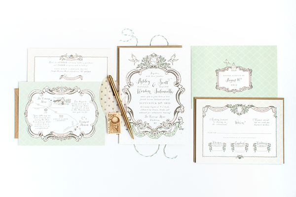
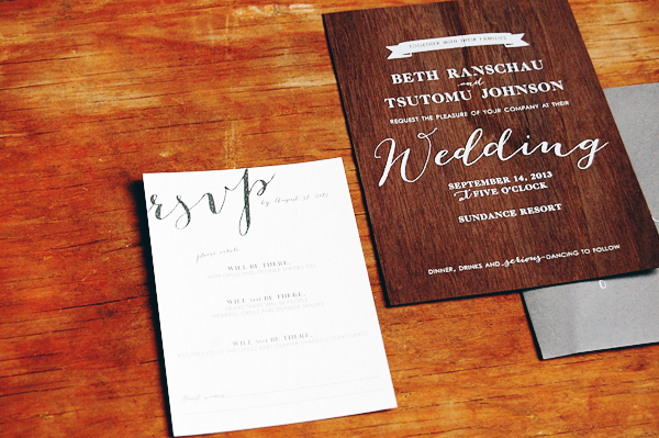
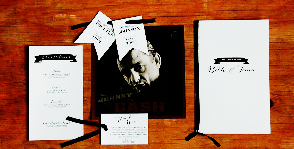
Nikkol from Peter Loves Jane sent over these lovely invitations for a wedding at the Sundance Resort! The bride and groom wanted to evoke the woodsy feeling of their wedding venue without being too rustic. Nikkol came up with the perfect solution: walnut wood veneer with white screen printed text! Nikkol paired the wood invitations with gray and white enclosures and gray envelopes to complete the suite.
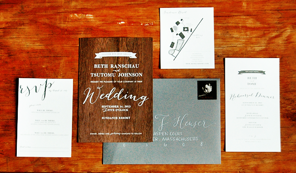
Screen-Printed-Rustic-Walnut-Wedding-Invitations-Peter-Loves-Jane

From Nikkol: Beth and Tomu are both sophisticated successful attorneys that are socially aware but have a spontaneous and fun side. Beth and Tomu decided to get married at Sundance Resort, which is nestled in the mountains and surrounded by towering evergreens. Beth already knew she wanted a woodsy element in her invitations, but wanted to steer clear of any rustic intonations.

Screen-Printed-Rustic-Walnut-Wedding-Invitations-Peter-Loves-Jane3

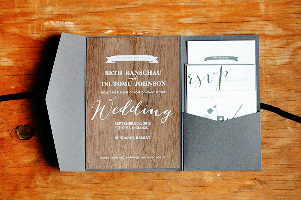
White screen printing on a walnut veneer was the perfect choice.  I used a recycled paper for the additional items in the suite and tucked it all inside a grey pocket enclosure tied each with a black silk ribbon.

Screen-Printed-Rustic-Walnut-Wedding-Invitations-Peter-Loves-Jane2

Screen-Printed-Rustic-Walnut-Wedding-Invitations-Peter-Loves-Jane4

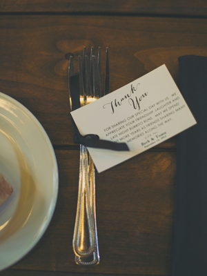
It was important to Beth and Tomu to thank each guest individually, so I designed playful thank you flags that we tied to the flatware at each place setting.  That way if a guest wanted to eat, they had to read the note!

Screen-Printed-Rustic-Walnut-Wedding-Invitations-Peter-Loves-Jane6Screen-Printed-Rustic-Walnut-Wedding-Invitations-Peter-Loves-Jane7

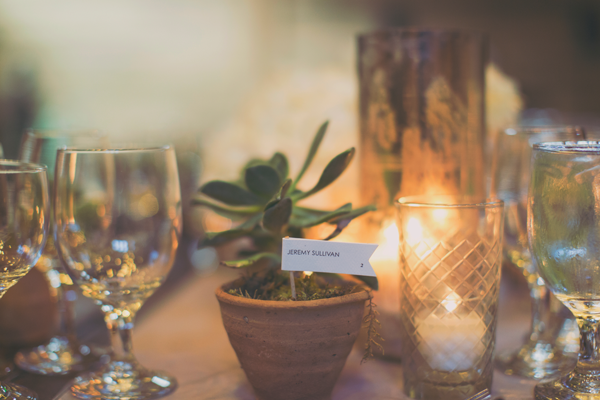
To add interest to the centerpieces and place settings, place card designs varied.  Some place cards were tented above their plates, while others were marked with flags in potted succulents.  The succulents were given to each guest as a favor at the end of the evening.

Screen-Printed-Rustic-Walnut-Wedding-Invitations-Peter-Loves-Jane8

Thanks Nikkol!

Design: Peter Loves Jane

Screen Printing: Cards of Wood

Calligraphy: BP Calligraphy

Wedding Photography: Alixann Loosle Photography

Event Planning: Attention 2 Detail

Photo Credits: Peter Loves Jane and Alixann Loosle Photography

Ashley + Scott’s Romantic Shabby Chic Wedding Invitations

Designer Alisa Bobzien sent over these wedding invitations that she recently created for a dog-loving bride and groom. Featuring a pair of beloved Boston terriers, the invitations reflect the romantic shabby chic wedding style with lots of illustrated details, ornate vintage-inspired frames, and a soft green, pink, and cream color palette. So pretty!

Romantic-Shabby-Chic-Wedding-Invitations-Alisa-Bobzien

From Alisa: Ashley and Scott wanted a design that featured their two Boston terriers and coordinated with their romantic shabby chic wedding. Their plans for decor included ornate vintage frames, bird cages and banners all in a color palette of white, cream, and soft greens and pinks, which I used as the inspiration for this hand-illustrated suite.

Romantic-Shabby-Chic-Wedding-Invitations-Alisa-Bobzien2

I worked directly with the bride and groom who had a lot of great ideas for personal touches, such as the quote along the bottom of the invitation, adding wedding rings to the beaks of the birds, and including a tiny detailed illustration of their venue on the map card.

Romantic-Shabby-Chic-Wedding-Invitations-Alisa-Bobzien4

Romantic-Shabby-Chic-Wedding-Invitations-Alisa-Bobzien6

Romantic-Shabby-Chic-Wedding-Invitations-Alisa-Bobzien7

All pieces were printed on bright white textured cover stock and paired with stamped kraft envelopes.

Romantic-Shabby-Chic-Wedding-Invitations-Alisa-Bobzien3

Romantic-Shabby-Chic-Wedding-Invitations-Alisa-Bobzien5

Romantic-Shabby-Chic-Wedding-Invitations-Alisa-Bobzien10

Thanks Alisa!

Check out the Designer Rolodex for more tal­ented wed­ding invi­ta­tion design­ers and the real invi­ta­tions gallery for more wedding invitation ideas!

Photo Credits: Alisa Bobzien

Geri + Bryce’s Elegant Gold Foil Wedding Invitations

Happy Monday everyone! I’m back from Alt Summit and feeling ready to take on the world, so let’s start with some beautiful wedding invitations! I always know it’s going to be a good week when I start with a custom design from Samantha and Whitney of Gus & Ruby Letterpress. Created for a wedding in a small town in Vermont, these invitations feature elegant gold foil, classic navy, vintage imagery, and map details – with absolutely stunning results!

Elegant-Gold-Foil-Wedding-Invitations-Gus-Ruby-Letterpress

From Samantha and Whitney: This custom suite was designed for a fabulous New York couple who were getting married at the stunning Woodstock Inn in Woodstock, Vermont. The bride and groom wanted the invitation suite to get their guests – coming from all over – excited about a trip to the gorgeous green hills of Vermont and quaint town of Woodstock while still speaking to their chic sense of style.

Elegant-Gold-Foil-Wedding-Invitations-Gus-Ruby-Letterpress2

A flat-printed folio featuring a vintage map of the Woodstock area was wrapped around the invitation panel and secured with gold threaded twine and a foil-stamped die-cut tag. The fun “See you in Vermont!” wording and location-specific wrap right away set the tone for this rustic-elegant destination wedding.

Elegant-Gold-Foil-Wedding-Invitations-Gus-Ruby-Letterpress3

Elegant-Gold-Foil-Wedding-Invitations-Gus-Ruby-Letterpress10Elegant-Gold-Foil-Wedding-Invitations-Gus-Ruby-Letterpress11

Inside the wrap, an invitation featuring gorgeous gold foil and elegant navy typography and some blind printed pattern for texture gave a fun twist on a classic layout – perfect for the couple’s vision of marrying the old-world charm of Vermont with their informed and stylish aesthetic.

Elegant-Gold-Foil-Wedding-Invitations-Gus-Ruby-Letterpress5

The invitations and reply postcards featured a mix of classic serif fonts and a whimsical, romantic script. Each invitation was printed on double-thick 220# cotton paper. As always, all the pieces were lovingly letterpress printed by hand on our antique press.

Elegant-Gold-Foil-Wedding-Invitations-Gus-Ruby-Letterpress6

Reply postcards featured a flat printed vintage postcard image of a covered bridge in Woodstock, Vermont duplexed together with a letterpress printed backside. A small brunch card featured a full flood of blind-printed pattern that gave the piece incredible texture and visual interest.

Elegant-Gold-Foil-Wedding-Invitations-Gus-Ruby-Letterpress7

Elegant-Gold-Foil-Wedding-Invitations-Gus-Ruby-Letterpress8

A custom envelope liner featuring another vintage Vermont image added an additional element of interest and our dear friend, Jenna, of Love, Jenna Calligraphy added her incredible hand-calligraphy on the envelope shown in the photos, too!

Elegant-Gold-Foil-Wedding-Invitations-Gus-Ruby-Letterpress9

Thanks so much Sam and Whit!

Design and Letterpress Printing: Gus & Ruby Letterpress

Calligraphy: Love, Jenna Calligraphy

Gus & Ruby Letterpress is a member of the Designer Rolodex – check out more of their beautiful work right here or visit the real invi­ta­tions gallery for more wedding invitation ideas!

Photo Credits: Brea McDonald Photography for Gus & Ruby Letterpress

Happy Weekend!

Happy Friday everyone! And greetings from Alt Summit! It has been so fun to connect with old friends and meet new ones over the last couple of days! Between a long weekend, two snow days in DC, and traveling to Salt Lake City, this week has been a complete whirlwind. Today is the second and final day of Alt, and tomorrow I fly home to my little family in DC. I’ve missed them so much! But in the meantime…

OSBP-Flight-to-SLC

Photo by me via Instagram

…a few links for your weekend!

This week on Oh So Beautiful Paper:

Check back soon for this week’s cocktail! I hope you all have a wonderful weekend, and I’ll see you back here next week! xoxo

Jen’s Nautical Baby Shower Invitations

How cute are these nautical baby shower invitations from Kim at Bright Room Studio? Created for Kim’s childhood friend Jen, the invitations combine a sweet anchor pattern, blue and mint color palette, and the sweetest greeting: Ahoy, it’s a boy!

Nautical-Baby-Shower-Invitations-Bright-Room-Studio6

From Kim: Jen is one of my best friends from high school so I was absolutely honored to create her baby shower invitation for her! The shower was thrown at her uncle’s seafood restaurant so a nautical theme was a no-brainer. And “Ahoy, it’s a boy!” was just too cute to pass up!

Nautical-Baby-Shower-Invitations-Bright-Room-Studio

Even though the invitation was for a baby shower, I wanted the design to be sophisticated. The blue-gray and mint color palette and subtle rope and anchor details were the perfect way to keep it masculine, preppy, and classic.

Nautical-Baby-Shower-Invitations-Bright-Room-Studio2

My favorite detail was the anchor pattern on the back. The mint anchors represent their new family, with a little baby anchor next to the “mom” and “dad” anchors.

Nautical-Baby-Shower-Invitations-Bright-Room-Studio4

Thanks Kim!

Bright Room Studio is a member of the Designer Rolodex – you can see more of Kim’s beautiful work right here!

Photo Credits: Bright Room Studio