Cinderella-Inspired Theatre Gala Invitations

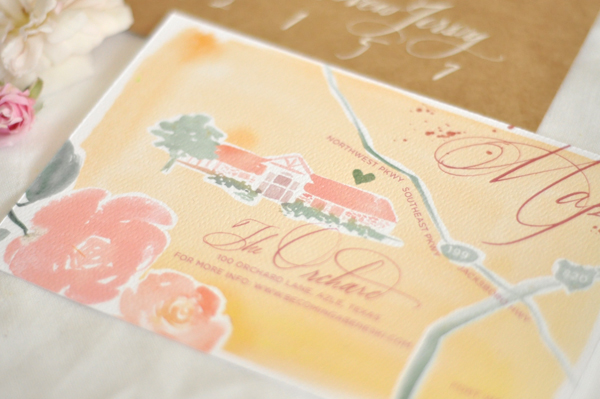
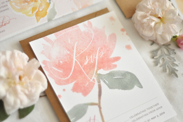
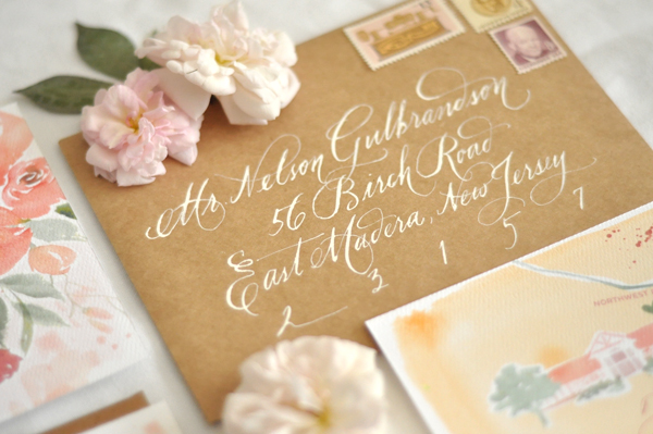
It’s not too often that I have the opportunity to share invitations for a theatre gala! Meenal and the team at Minneapolis-based agency KNOCK created the invitations for two parties held by the Children’s Theatre Company: a formal ball and a more relaxed “afterparty” a bit later in the evening. Both invitations were inspired by the theatre’s production of Cinderella. So fun!

Cinderella-Theater-Gala-Invitations-KNOCK

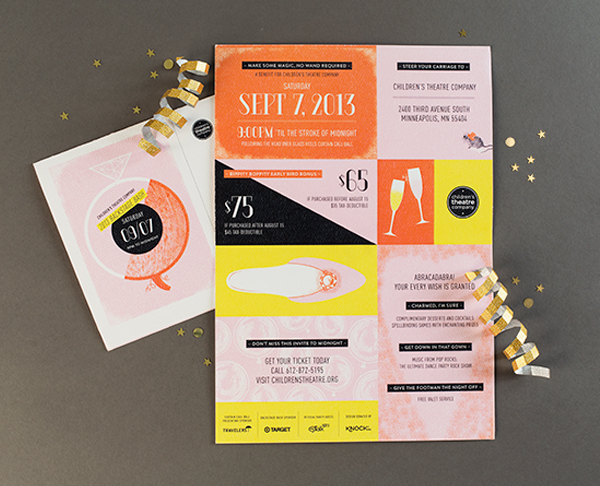
From Meenal: The nationally renowned Children’s Theatre Company in Minneapolis, Minnesota holds an annual fundraising gala with two phases: The formal Curtain Call Ball, and the unplugged Backstage Bash a little later in the evening. The challenge with designing for these events: developing distinct yet complementary themes, and designing event invitations that convince a very hard-to-impress audience to join the fun.

Cinderella-Theater-Gala-Invitations-KNOCK2

Cinderella-Theater-Gala-Invitations-KNOCK3

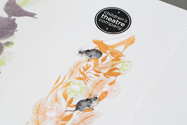
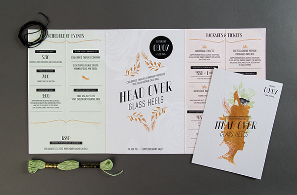
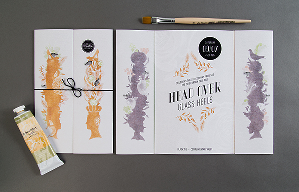
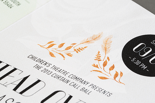
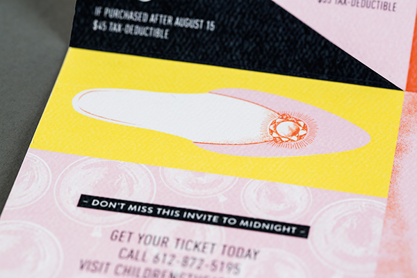
Both events were planned around the theatre’s production of Cinderella, so two themes needed to come to life. For the formal Curtain Call Ball, a Head Over Glass Heels theme incorporated ornate pouf hairstyles from 18th-century royalty; a modern twist came from unexpected surprises poking out of the exaggerated profiles.

Cinderella-Theater-Gala-Invitations-KNOCK4

Cinderella-Theater-Gala-Invitations-KNOCK6

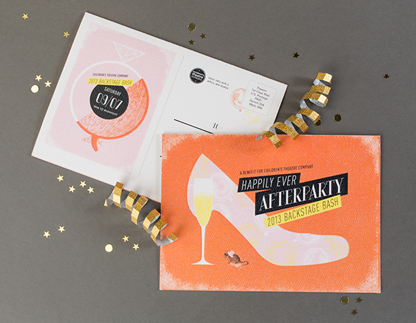
The grittier, wilder nature of the Backstage Bash came through in artwork for a Happily Every Afterparty invitation, tucking a glass of bubbly where a glass slipper heel would go. Typography and cute little mouse ensured consistency between the two invitations, while pumped-up color distinguished the bolder, younger Bash from the formal Ball.

Cinderella-Theater-Gala-Invitations-KNOCK7

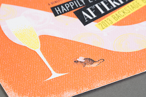
Digital printing was the best solution for the budget and quantity, so we used an uncoated, textured stock (Mohawk Via Felt, Pure White, 110#C) to elevate the look and create a customized sensibility. The paper was reminiscent of watercolor paper to give a tactile quality, plus it ensured the ink looked like it was sinking into the paper (as opposed to the shiny effect that digital printing can sometimes create).

Cinderella-Theater-Gala-Invitations-KNOCK8

Cinderella-Theater-Gala-Invitations-KNOCK9

Thanks Meenal!

Photo Credits: KNOCK

Irina + Roman’s Pressed Flower Wedding Invitations

So, this groom proposed using a poem. Can you think of a more romantic proposal?! When Nicole of Umama heard the story, she knew that she wanted to recreate that romantic feeling with calligraphy from M.K. Sadler and pressed flowers evoking a page from a well worn book. I love the soft and delicate nature of the resulting invitation!

Pressed-Flower-Poetry-Inspired-Wedding-Invitations-Umama5

From Nicole: Irina and Roman are lovers of prose, and we were totally smitten when Irina shared that Roman proposed using Percy Bysshe Shelley’s poem: Soul Meets Soul on Lover’s Lips. It was completely our muse. For this invitation, we wanted to create a page from a well-worn book with handwritten elements and the notion of flowers pressed between favorite pages. The soft elements are exactly as Shelley said and make for an invite that “points to the heavens.”

Pressed-Flower-Poetry-Inspired-Wedding-Invitations-Umama6

Pressed-Flower-Poetry-Inspired-Wedding-Invitations-Umama4Pressed-Flower-Poetry-Inspired-Wedding-Invitations-Umama

Pressed-Flower-Poetry-Inspired-Wedding-Invitations-Umama8

Pressed-Flower-Poetry-Inspired-Wedding-Invitations-Umama7

Thanks Nicole!

Design: Umama

Calligraphy: M.K. Sadler

Check out the Designer Rolodex for more tal­ented wed­ding invi­ta­tion design­ers and the real invi­ta­tions gallery for more wedding invitation ideas!

Photo Credits: Umama

Evie’s Calligraphy Baby Announcements

Ashley from Lemon and Lavender recently welcomed a baby girl – Evelyn – into her beautiful family. I love the birthday party invitations that Ashley designs for her children (Gavin’s camp-inspired invitations are some of my all time faves), so I was thrilled when she sent Evie’s birth announcement over! Ashley worked with calligrapher Joelle Duff from A Charming Occasion to create the most darling announcement – complete with Evie’s own personal monogram!

Calligraphy-Baby-Announcements-Lemon-and-Lavender6

From Ashley: Our sometimes gypsy life inspired Miss Evie’s birth announcement. We currently reside in West Africa, and knowing that she would be making her first of hopefully many trips across the globe by the tender age of 5 weeks, I wanted to incorporate that element in her announcement.

Calligraphy-Baby-Announcements-Lemon-and-Lavender

I enlisted the help of Joelle Duff of A Charming Occasion for custom calligraphy. She lettered Evelyn’s full name as well as the shorter version of her name. Since she goes by Evie we used the small enclosure card for her Sip & See as a way to incorporate that part of her name. Wanting to include a little bit of Senegal we took newborn photos of Evie in a traditional Senegalese basket to slip into navy 4bar envelopes. It’s always so fun to design for your own children and I was thrilled to have Joelle’s pretty work featured in the final design.

Calligraphy-Baby-Announcements-Lemon-and-Lavender5Calligraphy-Baby-Announcements-Lemon-and-Lavender8

Calligraphy-Baby-Announcements-Lemon-and-Lavender2

In addition to the announcement, I designed a monogram rubber stamp because let’s be honest you are never too young for your own monogram – especially if you hail from the South!

Calligraphy-Baby-Announcements-Lemon-and-Lavender3

Thanks so much Ashley – and welcome Evie!

Design: Lemon and Lavender

Calligraphy: A Charming Occasion

Photo Credits: Ashley La Rue | Lemon and Lavender

Chelsea + Brandon’s Rustic Vermont Wedding Invitations

Our next set of wedding invitations comes from Molly at Paisley Quill and was created for a Vermont mountain wedding! Molly dove into the rustic wedding theme with a nature-inspired color palette, a fold out map, and fun envelope liner. Whimsical calligraphy from Lettered Life and vintage postage completed this rustic invitation suite.

Rustic-Vermont-Wedding-Invitations-Paisley-Quill

From Molly: Chelsea and Brandon are a fun-loving couple that enjoy traveling, the outdoors, skiing, and hiking. It was only appropriate that they would be married at the base of a mountain. It was important that their invitations were reflective of their personalities, but kept with the rustic Vermont theme and in Chelsea’s words: “not too girly.”

Rustic-Vermont-Wedding-Invitations-Paisley-Quill3

Rustic-Vermont-Wedding-Invitations-Paisley-Quill10

There were so many pieces, it was like receiving a little present in the mail. Besides your typical invitation and response card, it also included an accordion style weekend itinerary that folded up and fit inside a mini kraft envelope, sealed with washi tape.

Rustic-Vermont-Wedding-Invitations-Paisley-Quill2

Rustic-Vermont-Wedding-Invitations-Paisley-Quill8

A custom, die-cut, fold out map included directions to all important locations for the weekend. An accommodations card included a tear-off ticket for s’mores at their rehearsal BBQ. Everything was held together with a die cut band.

Rustic-Vermont-Wedding-Invitations-Paisley-Quill5

Rustic-Vermont-Wedding-Invitations-Paisley-Quill9

Whimsical calligraphy by Lettered Life and vintage postage that the bride’s aunt and uncle collected helped complete the invitation suite. I also designed thank you cards, ceremony programs, and a custom rubber stamp used to stamp each mini envelope.

Rustic-Vermont-Wedding-Invitations-Paisley-Quill7

Thanks Molly!

Design: Paisley Quill

Calligraphy: Lettered Life

Check out the Designer Rolodex for more tal­ented wed­ding invi­ta­tion design­ers and the real invi­ta­tions gallery for more wedding invitation ideas!

Photo Credits: Paisley Quill

Tyler + David’s Floral Watercolor Wedding Invitations

With beautiful hand painted floral details and stunning calligraphy, these watercolor wedding invitations from Julie Song Ink are exactly what I need this Monday morning. I also love the way Julie incorporated the paint drips and ink splatters into the design at the couple’s request. White calligraphy on kraft envelopes was the perfect finishing touch!

Floral-Watercolor-Calligraphy-Wedding-Invitations-Julie-Song-Ink2

From Julie: Tyler and David appreciate the organic fluidity of watercolor, as well as all its painterly imperfections – so their suite incorporates romantic flowers spilling cheerfully onto the invitation and suite, paint drips and calligraphy ink splatter. The simple map highlights the venue where all the festivities take place. The suite was printed onto textured cotton paper to preserve the authenticity of the watercolor.

Floral-Watercolor-Calligraphy-Wedding-Invitations-Julie-Song-Ink3

Floral-Watercolor-Calligraphy-Wedding-Invitations-Julie-Song-Ink4

Floral-Watercolor-Calligraphy-Wedding-Invitations-Julie-Song-Ink5

Floral-Watercolor-Calligraphy-Wedding-Invitations-Julie-Song-Ink

Thanks Julie!

Julie Song Ink is a member of the Designer Rolodex – you can see more of Julie’s beautiful work right here or visit the real invi­ta­tions gallery for more wedding invitation ideas!

Photo Credits: Julie Song Ink