NSS 2014 Sneak Peek: Smock

Our next National Stationery Show sneak peek comes from a familiar exhibitor: Smock! This year, Smock (Booth 2341) will debut a brand new album of Mitzvah invitations, with designs for Bar, Bat, B’nai and B’not Mitzvahs featuring letterpress printing, foil stamping, and digital printing on thick bamboo paper. I’m also excited about some of the new additions to the Smock everyday collection, including silver and gold foil table number cards, place cards, new gift wrap patterns, and keepsake boxes!

NSS-2014-Sneak-Peek-Smock-Mitzvah-Collection

NSS-2014-Sneak-Peek-Smock-Mitzvah-Collection2

NSS-2014-Sneak-Peek-Smock-Mitzvah-Collection5NSS-2014-Sneak-Peek-Smock-Mitzvah-Collection6

NSS-2014-Sneak-Peek-Smock-Mitzvah-Collection7

NSS-2014-Sneak-Peek-Smock-Everyday5

NSS-2014-Sneak-Peek-Smock-EverydayNSS-2014-Sneak-Peek-Smock-Everyday2

NSS-2014-Sneak-Peek-Smock-Everyday10

NSS-2014-Sneak-Peek-Smock-Everyday6

NSS-2014-Sneak-Peek-Smock-Everyday7

NSS-2014-Sneak-Peek-Smock-Everyday8NSS-2014-Sneak-Peek-Smock-Everyday9

Photo Credits: Smock

Happy Weekend!

The peonies are blooming! After the most miserable winter on record, I want to drink in every single drop of spring this year. My beloved lilacs have sadly faded, but the peonies started to emerge just at the right time, and my roses are just behind them. I wish it could be Spring all year long! I’m gearing up for a busy weekend preparing for the National Stationery Show – it’s the last weekend before the big show! But in the meantime…

Coral-Peony-OSBP-Instagram

Photo by me via Instagram

…a few links for your weekend!

This week on Oh So Beautiful Paper:

Check back soon for this week’s cocktail! I hope you all have a wonderful weekend, and I’ll see you back here next week! xoxo

Tori + Dan’s Purple Woodland Fabric Wedding Invitations

This wedding sounds like such a dream: a beautiful garden estate, with the ceremony in a rustic converted barn and followed by an elegant ballroom reception. Jeannine from Blue Magpie had the responsibility of designing wedding invitations to fit all aspects of the wedding – elegant, rustic, and a little bit glamorous. Jeannine designed a custom woodland fabric featuring horses and Carolina Wrens, then finished the suite with a deep purple ribbon and silver card stock!

Purple-Woodland-Wedding-invitations-Blue-Magpie-OSBP

From Jeannine: My bride fell in love with a particular fabric we featured on our website, but unfortunately, it was no longer in print and we just couldn’t find enough for her wedding invitations. After going through several rounds looking for a good substitute, it dawned on me that we should design a fabric just for her! The bride loved horses, the groom loved birds, so they requested that the fabric feature both – and specifically, the Carolina Wren because it mates for life.

Purple-Woodland-Wedding-invitations-Blue-Magpie-OSBP7

The wedding was to be held on a beautiful garden estate with an amazing ballroom for the reception, but the ceremony was to be held in a converted barn with rustic white wooden beams, so the invitation had to be both elegant and rustic to match the amazing venue and tone of the wedding. We settled on a beautiful printed cotton featuring birds, horses, and woodland branches for the whimsical and rustic elements and paired it with a rich purple silk ribbon and a shimmery silver card stock border for glamour and elegance.

Purple-Woodland-Wedding-invitations-Blue-Magpie-OSBP2

Purple-Woodland-Wedding-invitations-Blue-Magpie-OSBP4

Purple-Woodland-Wedding-invitations-Blue-Magpie-OSBP5

For the save the dates, we decided to bring in some graphic elements from the printed cotton and to back it in the same rich purple silk as the ribbon to provide guests with a subtle hint of what was to come! And of course, the birds and horses had to make their appearances again on their custom postage and escort cards!

Purple-Woodland-Wedding-invitations-Blue-Magpie-OSBP8

Thanks Jeannine!

Blue Magpie is a member of the Designer Rolodex – you can see more of Jeannine’s beautiful work right here or visit the real invi­ta­tions gallery for more wedding invitation ideas!

Photo Credits: Blue Magpie

Envelope Address Hand Lettering Tutorial from Ladyfingers Letterpress

Hi Everyone! The ladies of Ladyfingers Letterpress were kind enough to fill in during my summer vacation last year, and this post on Arley-Rose’s signature hand lettering was one of my favorite posts that week! So I jumped at the chance when Arley-Rose volunteered to stop by with some tips and tricks for adorning your envelopes with beautiful and whimsical hand lettered addresses. Take it away ladies! –Nole

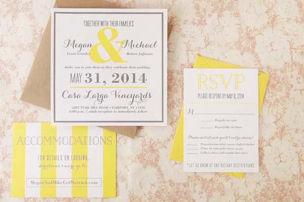
With the majority of correspondence these days taking place in the digital realm, it’s always such a treat to get something real and tangible in the mail. Heck, even before e-mail dominated our lines of communication, you knew something was really special when it arrived through your mail slot all decked out with big, beautiful lettering that you knew someone took time to carefully create. Hopefully by the end of this post you will want to sit yourself down and experiment with some of the styles shown below to make your own beautifully styled envelope addresses. –Arley-Rose of Ladyfingers Letterpress

Envelope Address Hand Lettering Tutorial by Ladyfingers Letterpress / Oh So Beautiful Paper

I like to think of hand-lettering as more of an “illustration using letters” more than a “trained handwriting” kinda thing, so I choose pens that give me the most control as possible. People are doing beautiful things with pointed pens and modern calligraphy these days, and I encourage you to experiment with pointed pens if you like, but for now I am going to stick the tools that I know and love.

We’ll begin our journey into the world of lettering with familiarizing ourselves with a few different lettering styles that will act as our foundation and give us some variation in style that we can draw upon throughout our lettering endeavors! Personally, I like to combine different lettering styles, fluctuating between scripts, roman, and sans-serif characters to give the piece a lot of motion and personality. Not sure what a roman character is? Read on! Have questions about the etiquette and formality of addressing your envelopes? Martha Stewart has a terrific go-to tutorial about that!

Hand Lettering Envelope Address Tutorial by Ladyfingers Letterpress / Oh So Beautiful Paper

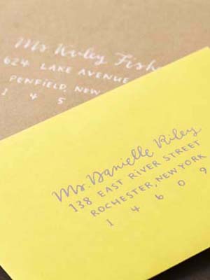
Roman lettering, which can also be called a “Serif,” has some of the earliest origins dating back to, well, the Romans! The word “Serif” is latin for “foot”, which makes sense when you look at the letters. See? They all have feet (except o’s)! Serifed typefaces such as Garamond or Baskerville look great as all caps and spaced out (which us type nerds refer to as “tracking”), or spelled out in both caps and lowercase with normal tracking. I sometimes like to make tall condensed roman letters if the address is really long and I need to make the most of my space. On capital As, Rs, Ns, Ys, Ks, Hs, and sometimes Gs, I like to add a little flourish, as you’ll notice on some of the envelope samples below.

Hand Lettering Envelope Address Tutorial by Ladyfingers Letterpress / Oh So Beautiful Paper

Now that you know that the word “Serif” means “foot”, naturally “Sans Serif” means “Without Feet!” Sans Serif letters were popularized in the mid twentieth century with the arrival of Helvetica, Gill Sans and Futura. I think they look great as all caps, tall and condensed! I also find that they’re easy to draw because they most closely resemble a clean, handwritten print style.

Hand Lettering Envelope Address Tutorial by Ladyfingers Letterpress / Oh So Beautiful Paper

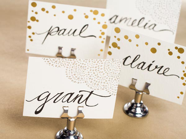
Now the fun part begins! Getting the hang of lettering a script might take some time to get the hang of, but here’s a secret! Write in cursive as you normally would, and then darken the strokes that should have accents. Feel free to refer to other scripts with a quick google image search to see where those accents should be. Have some fun with your script: it’s not necessary to keep a straight baseline, in fact I tend to like scripts that dance around a little bit on the page. They have more character! Ha! Get it! Character? Typography? Joke? Uhhh….. Nevermind.

Hand Lettering Envelope Address Tutorial by Ladyfingers Letterpress / Oh So Beautiful Paper

Hand Lettering Envelope Address Tutorial by Ladyfingers Letterpress / Oh So Beautiful Paper

My favorite go-to pen is the Pigma Micron from Sakura of America. I’ve been drawing with Micron pens since I was a wee young artist, and they continue to be my favorite pen for all types of uses, especially drawing on light-colored envelopes. My size of choice is an 08 but there was a time when all I used was the smaller 03s to get a really nice fine line.

Hand Lettering Envelope Address Tutorial by Ladyfingers Letterpress / Oh So Beautiful Paper

Hand Lettering Envelope Address Tutorial by Ladyfingers Letterpress / Oh So Beautiful Paper

Keep it classy! Sometimes a white pen is all you need to do the trick, especially on dark or brightly colored envelopes. My go-to is the White Gelly Roll 08, which gives me a nice smooth line without any breaks or clogs. I’ve found that the Metallic Silver Gelly Roll pen is also super awesome! It’s not really too sparkly, but is super opaque which is exactly what I want. I also like the Moonlight pens for an extra burst of color.

Envelope Address Hand Lettering Tutorial by Ladyfingers Letterpress / Oh So Beautiful Paper

Sometimes I like the swift expression that can only be found with a brush pen. When I don’t have time to whip out the gouache and brushes, the Pigma Brush pens really do the trick. They also come in  a variety of colors, so if you’re not feeling like black ink is your thing that day, you can also choose from a variety of other colors that look great on white or light colored envelopes.

Envelope Address Hand Lettering Tutorial by Ladyfingers Letterpress / Oh So Beautiful Paper

The Do Not Open Lettering Project  by Erik Marinovich was recently brought to my attention by my amazing typographer friend Jeremy Mickel, and it blew my mind. It still does blow my mind. Every time I look at it. I thought I would refer to it here because it shows how creative you can be with large oversize envelopes. Besides, envelopes: they’re really just a canvas for beautiful lettering, right? Anyway, the Permapaque markers are incredible for this task. They’re nice and opaque like a paint marker without the nasty smell, and you get a huge variety of colors!

Now that you’ve seen some samples, I’d love to see what you come up with! Don’t forget to tag your work on Instagram with @beautifulpaper, @ladyfingersletterpress and @sakuraofamerica. Thanks and happy lettering!

Pens provided by Sakura of America, with awesome stamps provided by Pack & Post!

Photo Credits: Ladyfingers Letterpress

Megan + Mike’s Rustic Modern Yellow Wedding Invitations

Ilana from Sugar & Type sent over these sunny yellow invitations that she created for a vineyard wedding in New York. The bride and groom wanted to mix modern and rustic elements into the design, so Ilana paired their sunny yellow and gray color palette with versatile kraft paper. Super cute!

Modern-Yellow-Wedding-Invitations-Sugar-and-Type-OSBP

From Ilana: Megan and Mike’s wedding colors were yellow and gray, and their venue was a beautiful winery in Upstate New York. They wanted to mix the rustic vibe of the vineyard with their modern and fun personalities. It was so fun to work with such a happy color! We chose kraft paper envelopes, and tied the suite together with raffia.

Modern-Yellow-Wedding-Invitations-Sugar-and-Type-OSBP3Modern-Yellow-Wedding-Invitations-Sugar-and-Type-OSBP4

We printed the invitation suite on Mohawk Felt paper, and the texture was incredible. It gave their modern design a rustic feel. Calligraphy by Kelly Place was the icing on the cake – it was a perfect addition to this sunshine filled wedding suite!

Modern-Yellow-Wedding-Invitations-Sugar-and-Type-OSBP2

Modern-Yellow-Wedding-Invitations-Sugar-and-Type-OSBP8

Modern-Yellow-Wedding-Invitations-Sugar-and-Type-OSBP6

Thanks Ilana!

Design: Sugar and Type 

Calligraphy: Kelly Place

Paper: Mohawk

Printing: Stationery HQ

Check out the Designer Rolodex for more tal­ented wed­ding invi­ta­tion design­ers and the real invi­ta­tions gallery for more wedding invitation ideas!

Photo Credits: Audra Zaba Photo