Ashley + Anthony’s Gray and White Foil Wedding Invitations

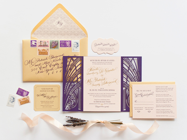
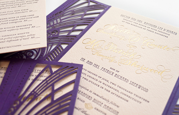
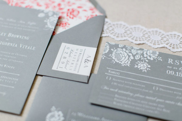
I love it when couples do something unexpected for their wedding invitations! Instead of going for a typical rustic design for their vineyard wedding, Ashley and Anthony chose a gray, white, and poppy red color palette and folk art-inspired floral details for their wedding invitations. Created by Emily and Anna of Paper Moss, the final design features gray paper paired with white foil printing and a pop of color in the envelope liner. So fun!

Gray-White-Foil-Floral-Wedding-Invitations-Paper-Moss-OSBP5

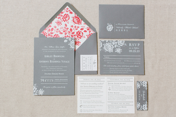
From Emily and Anna: Ashley and Anthony wanted something unconventional for their rustic wedding invitations. With a vineyard wedding and wedding colors of gray, poppy, and white, we jumped at the opportunity to use a gray stock as a base. Challenged with keeping the all gray invitation suite from feeling too dark, we chose a softer textured paper and added contrast with hot white foil printing.

Gray-White-Foil-Floral-Wedding-Invitations-Paper-Moss-OSBP6Gray-White-Foil-Floral-Wedding-Invitations-Paper-Moss-OSBP7

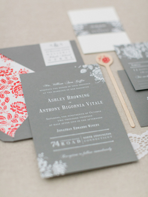
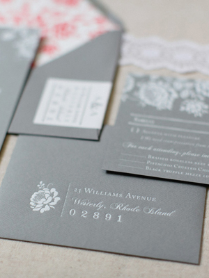
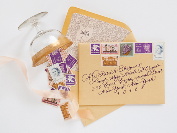
Inspired by folk art floral patterns, we brought in a floral motif to almost all the pieces but most prominent in the bright and happy poppy-colored envelope liner, and matching custom postage. In order to stay true to the romantic and rustic feel they were going for, we made sure to work with elegant fonts, along with floral art that had a hand-drawn feel.

Gray-White-Foil-Floral-Wedding-Invitations-Paper-Moss-OSBP

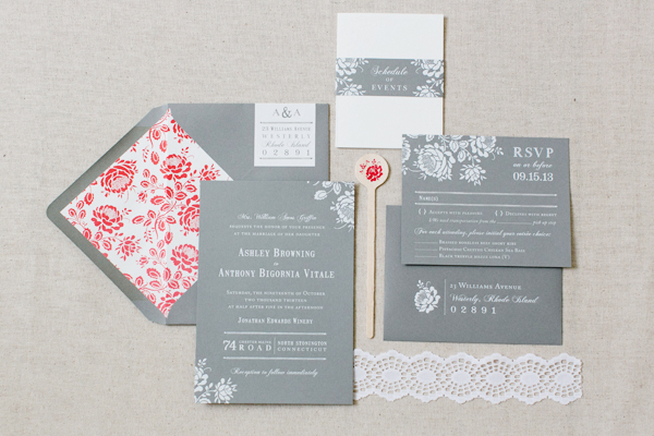
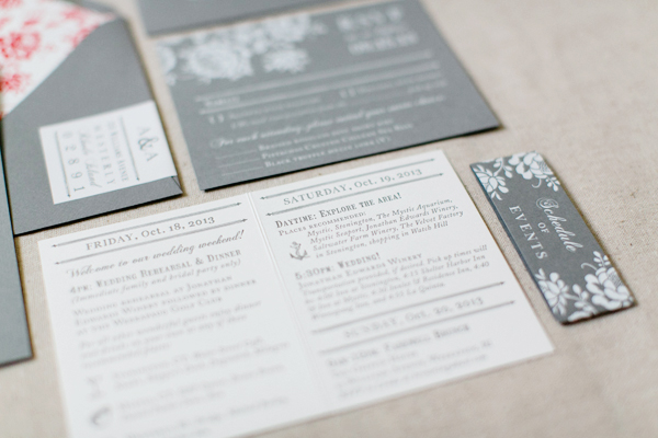
Ashley and Anthony loved the idea of a small booklet for their “Schedule of Events” held together by a mini belly band. To capitalize on this cute addition, we introduced a soft white stock with gray letterpress ink. This also complimented the address wrap labels around the envelopes!

Gray-White-Foil-Floral-Wedding-Invitations-Paper-Moss-OSBP4

Gray-White-Foil-Floral-Wedding-Invitations-Paper-Moss-OSBP3

Thanks ladies!

Check out the Designer Rolodex for more tal­ented wed­ding invi­ta­tion design­ers and the real invi­ta­tions gallery for more wedding invitation ideas!

Photo Credits: Ruth Eileen Photography

Nicole + Patrick’s Vintage-Inspired Lasercut Wedding Invitations

Happy Monday everyone! How about some beautiful vintage-inspired wedding invitations to start off the week? This invitation suite from Nichole at Coral Pheas­ant features gold foil on pale pink paper, intricate lasercut details, and romantic calligraphy from MM Ink. What more could a girl possibly ask for??

Lasercut-Great-Gatsby-Wedding-Invitations-Coral-Pheasant-OSBP

From Nichole: The wedding celebration of Nicole and Patrick was held at Branford House, a turn-of-the-century mansion with carved Gothic paneling and grand Baroque fireplaces overlooking the Long Island Sound. The magnificent Gatsby-esque venue, combined with details from the bride’s stunning beaded gown and palette of purples, pinks and gold was all the inspiration needed to bring this stationery suite to life!

Lasercut-Great-Gatsby-Wedding-Invitations-Coral-Pheasant-OSBP4

Lasercut-Great-Gatsby-Wedding-Invitations-Coral-Pheasant-OSBP3

The invitations were gold foil stamped and letterpress printed on blush Arturo cotton stock – duplexed to make it extra thick. Deco-inspired fonts were paired with beautiful calligraphy by MM Ink. Each invitation was mounted into a custom designed laser cut violet folio. For a modern take on the inner envelope, the folios were wrapped with a gold shimmer belly band each bearing the guest’s name in calligraphy.

Lasercut-Great-Gatsby-Wedding-Invitations-Coral-Pheasant-OSBP5

Lasercut-Great-Gatsby-Wedding-Invitations-Coral-Pheasant-OSBP9

The entire package was slipped into a gold shimmer envelope lined in a scallop pattern that was inspired by the beading on the bride’s gown. The outside of the envelope was just as carefully considered as the invitation. A collection of vintage stamps in coordinating shades of pink and purple adorned the outside and further ornamentation was added by MM Ink‘s gorgeous penmanship.

Lasercut-Great-Gatsby-Wedding-Invitations-Coral-Pheasant-OSBP2

Lasercut-Great-Gatsby-Wedding-Invitations-Coral-Pheasant-OSBP6

Lasercut-Great-Gatsby-Wedding-Invitations-Coral-Pheasant-OSBP11Lasercut-Great-Gatsby-Wedding-Invitations-Coral-Pheasant-OSBP10

For the day-of stationery, the laser cut folio was re–imagined as the cover for the wedding programs and an enlarged version of the die cut details card became the dinner menu. The welcome box contained sweet and salty snacks with coordinating labels and the cover of welcome booklet featured the scallop pattern used on the envelope liners. Nicole embraced every opportunity to bring elements of her invitation design to her celebration – and I adored her for that level of detail!

Lasercut-Great-Gatsby-Wedding-Invitations-Coral-Pheasant-OSBP7

Lasercut-Great-Gatsby-Wedding-Invitations-Coral-Pheasant-OSBP12

Thanks Nichole!

Paper Design: Coral Pheas­ant

Calligraphy: MM Ink

Coral Pheasant is a member of the Designer Rolodex – you can see more of Nichole’s beautiful work right here or visit the real wedding invitations gallery for more invitation inspiration!

Photo Credits: Coral Pheas­ant

Happy Weekend!

Happy Friday everyone! Are you all caught up in World Cup fever? It’s a pretty big deal here in the internationally-minded city of DC, so I’m definitely excited to watch the tournament progress. Mostly I’m excited for a quiet weekend celebrating Father’s Day with my little family. Best wishes to those of you celebrating Father’s Day this weekend, too! But in the meantime…

OSBP-Peony-Bouquet-Instagram

Photo by me via Instagram

…a few links for your weekend!

This week on Oh So Beautiful Paper:

Check back soon for this week’s cocktail! I hope you all have a wonderful weekend, and I’ll see you back here next week! xoxo

Paper Party 2014 Invitations!

You’ve already seen the photos from the 2014 Paper Party during the National Stationery Show, but today I wanted to share a few photos of my most favorite detail from the entire party: the invitations! The party invitations have become a dream project each year, with an amazing team contributing to everything from design to printing to envelope addressing. This year I was lucky enough to work with Mr. Boddington’s Studio, Smock, Mohawk, and Meant to Be Calligraphy. I’m so excited to share the resulting invitations with you!

Paper Party 2014 Invitations by Mr. Boddington's Studio, Smock, Mohawk, and Meant to Be Calligraphy for Oh So Beautiful Paper

I was absolutely thrilled to work with Mr. Boddington’s Studio on this year’s design – they designed everything from email save the dates to the tote gift bag design! I wanted the invitations to reflect the quirky sophistication that has become Mr. Boddington’s Studio signature style while also complementing our floral party inspiration. We decided to keep the main invitation in classic black and white with a botanical wreath printed in shiny metallic gold foil – all letterpress printed by Smock.

Paper Party 2014 Invitations by Mr. Boddington's Studio, Smock, Mohawk, and Meant to Be Calligraphy for Oh So Beautiful PaperPaper Party 2014 Invitations by Mr. Boddington's Studio, Smock, Mohawk, and Meant to Be Calligraphy for Oh So Beautiful Paper

We printed the invitations on Mohawk’s Superfine Ultrawhite Eggshell 130 lb paper. The envelopes are Mohawk’s Loop Antique Vellum Kraft paper envelopes in A7 size. Mr. Boddington’s Studio also designed a fun patterned envelope liner to add a little surprise of color, which was digitally printed by Smock.

Paper Party 2014 Invitations by Mr. Boddington's Studio, Smock, Mohawk, and Meant to Be Calligraphy for Oh So Beautiful PaperPaper Party 2014 Invitations by Mr. Boddington's Studio, Smock, Mohawk, and Meant to Be Calligraphy for Oh So Beautiful Paper

The amazingly talented Michele from Meant to Be Calligraphy addressed the envelopes in her Jackson style. We picked a light aqua ink to complement the blue in the envelope liners – I love the way it looks against the kraft paper!

Paper Party 2014 Invitations by Mr. Boddington's Studio, Smock, Mohawk, and Meant to Be Calligraphy for Oh So Beautiful Paper

Paper Party 2014 Invitations by Mr. Boddington's Studio, Smock, Mohawk, and Meant to Be Calligraphy for Oh So Beautiful Paper

Paper Party 2014 Invitations by Mr. Boddington's Studio, Smock, Mohawk, and Meant to Be Calligraphy for Oh So Beautiful Paper

I hope you love the invitations as much as I do!

Design: Mr. Boddington’s Studio

Printing: Smock

Paper: Mohawk Superfine Ultrawhite Eggshell 130 lb

Envelopes: Mohawk Loop Antique Vellum Kraft 80 text in A7 size

Envelope Calligraphy: Meant to Be Calligraphy

Photo Credits: Nole Garey for Oh So Beautiful Paper