Gracie’s Colorful Bridal Luncheon Invitations

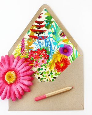
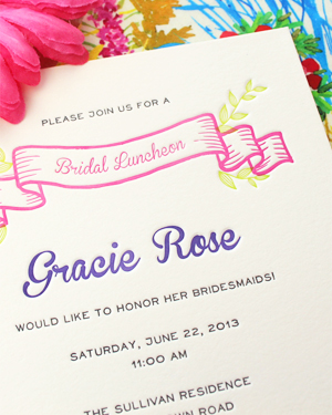
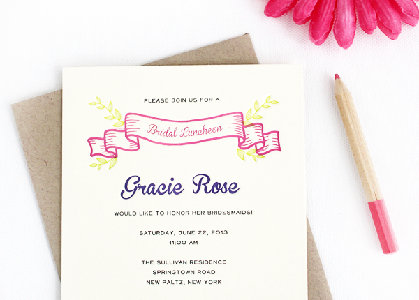
These adorable bridal luncheon invitations from Rafftruck Designs had me at the envelope liners: a swatch of vibrant Liberty of London fabric that the bride planned to use in her backyard wedding. Starting with the fabric as inspiration, Dara from Rafftruck Designs chose a bright summer color palette and sweet script font for the invitation design. Lovely!

Colorful-Floral-Bridal-Luncheon-Invitations-Rafftruck-Designs

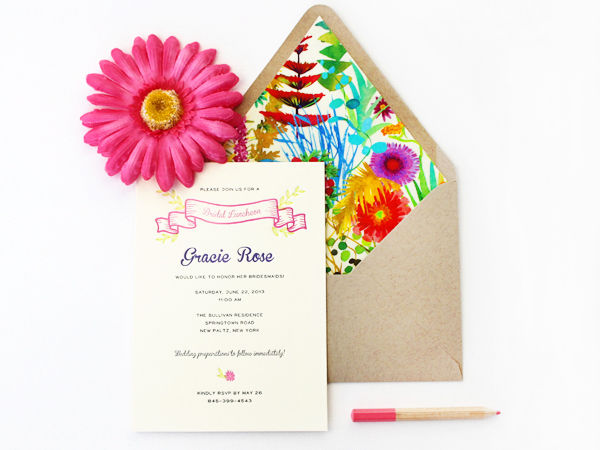
From Dara: Rather than a traditional bridal shower, Gracie held a bridal luncheon the morning of her vintage chic backyard wedding. A beautiful floral Liberty of London fabric set the tone for the day’s festivities so I knew I should incorporate the vibrant pattern into the invitations.

Colorful-Floral-Bridal-Luncheon-Invitations-Rafftruck-Designs2

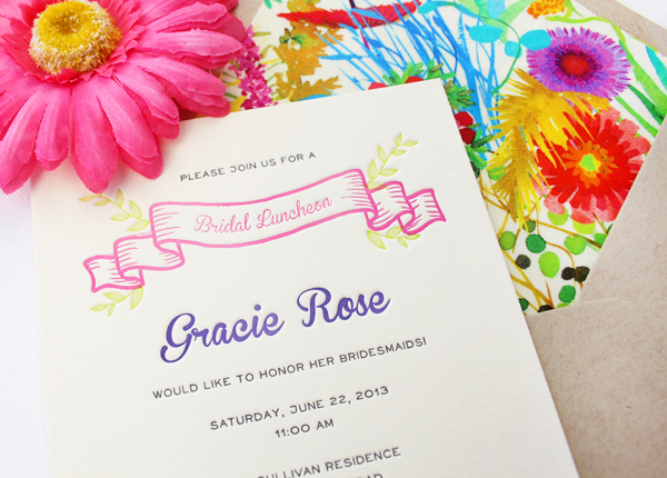
I started with bright, bold summer colors and selected a script font with lots of personality. The invitations were letterpress printed on 100% ecru cotton paper, which added the perfect amount of rustic romanticism to this bridal luncheon invitation. A kraft paper envelope lined with the amazing Liberty of London fabric completed the look.

Colorful-Floral-Bridal-Luncheon-Invitations-Rafftruck-Designs4Colorful-Floral-Bridal-Luncheon-Invitations-Rafftruck-Designs3

Colorful-Floral-Bridal-Luncheon-Invitations-Rafftruck-Designs6

Thanks Dara!

Design + Letterpress Printing: Rafftruck Designs

Photo Credits: Rafftruck Designs

Happy Weekend!

Happy Friday everyone! Are you ready for March? I definitely am! I’m ready for cherry blossoms and spring daffodils, tulips, and crocus… even if all those things are still a few weeks away, it’s something to look forward to! But in the meantime…

Floret-Flower-Farm-Dahlias

Gorgeous dahlias by Floret Flower Farm

…a few links for your weekend!

This week on Oh So Beautiful Paper:

Check back soon for this week’s cocktail! I hope you all have a wonderful weekend, and I’ll see you back here next week! xoxo

Courtney + Nate’s Wisconsin Lake Wedding Invitations

Created for a summer wedding along a lake in Madison, Wisconsin, these wedding invitations from Sugar River Stationers feature a beautiful line illustration of Madison and wave-inspired laser cut details. But my favorite detail? The wood box mailer, a fun nod to the groom’s profession as a distiller!

Wisconsin-Lake-Wedding-Invitations-Sugar-River-Stationers2

From Heather: We designed these wedding invitations for a July 2013 wedding in Madison, Wisconsin. I would categorize Courtney and Nathan’s stationery as “quirky” with lots of character. Courtney is an elementary school teacher and Nathan owns a distillery in Madison. The suite features an original line art illustration of Madison, as well as supplemental illustrations used in the custom stamps and various “day of” items. The couple live along one of Madison’s largest lakes and spend a great deal of time together boating.

Wisconsin-Lake-Wedding-Invitations-Sugar-River-Stationers

The invitation suite was mailed in a slide top wood box. Given that Nathan owns a distillery, the wood box and excelsior packaging appealed to him. Inside, the presentation layer features a laser-cut pocket with tag detail on the front.

Wisconsin-Lake-Wedding-Invitations-Sugar-River-Stationers4

The invitation is booklet format, with illustration and additional items such as the RSVP, map and accommodations card were housed inside the laser cut pocket. The RSVP features an original photograph of Courtney and Nate changed to vector art. We created custom stamps with another original illustration of Courtney and Nate sitting on a pier in front of the house and used the boat illustration for a circle cut tag that was placed around succulents used as favors.

Wisconsin-Lake-Wedding-Invitations-Sugar-River-Stationers3

Wisconsin-Lake-Wedding-Invitations-Sugar-River-Stationers5

Thanks Heather!

Design: Sugar River Stationers

Illustration: Steph Davies

Check out the Designer Rolodex for more tal­ented wed­ding invi­ta­tion design­ers and the real invi­ta­tions gallery for more wedding invitation ideas!

Photo Credits: Harper Fritsch Studios and Maureen Cassidy Photography

Happy Weekend!

Happy Friday everyone! I hope you’re somewhere warmer than DC – it’s only the end of January and this is the coldest winter I’ve experienced since moving here more than 10 years ago! We’re supposed to have a couple of nice days this weekend, which I’m looking forward to enjoying before I head up to New York for NYNOW on Monday. Next week: reports from NYNOW! But in the meantime…

OSBP-Alt-Travel-and-Great-Transformations

Photo by me via Instagram

…a few links for your weekend!

This week on Oh So Beautiful Paper:

Check back soon for this week’s cocktail! I hope you all have a wonderful weekend, and I’ll see you back here next week! xoxo

Rebecca + Jeffrey’s Windswept Beach Wedding Invitations

So what do I do when the temperatures dip to sub-zero levels? Dream of the beach! Nina from Tweedle Press sent over these windswept beach letterpress invitations for a summer wedding on the Jersey shore. The invitations feature pale pink text in a feminine script, blind impression background imagery, and a thin piece of wood veneer to evoke the feeling of driftwood.

Windswept-Beach-Letterpress-Wedding-Invitations-Tweedle-Press3

From Nina: When I first met with Rebecca last year to discuss her  invitations, she was very clear that, although their wedding would be at a beach location in New Jersey, they did NOT want any cheesy, theme-y, overdone imagery. We discussed muted colors, driftwood, beach grass, and shore birds. She also mentioned that she really liked the idea of bringing in a sea green and a feminine, pale pink. I could tell that they were putting together a very romantic and yet modern wedding, so I set to work using a flowing script font and subtle imagery.

Windswept-Beach-Letterpress-Wedding-Invitations-Tweedle-Press4

This was one of my favorite wedding invitations I worked on all of last year because it so beautifully showcases the best of what letterpress printing has to offer. The inkless or “blind” impression of the background scenery on each of the pieces, pressed into the thick cotton paper, looks delicious enough to eat.

Windswept-Beach-Letterpress-Wedding-Invitations-Tweedle-Press9

Windswept-Beach-Letterpress-Wedding-Invitations-Tweedle-Press5

To bring in the driftwood concept, we affixed the main invitations to a very thin slice of a wood. The translucent green envelopes gave the whole package an incredibly airy feel, and guests could see the natural twine wrapping before even opening the envelope. I love these invitations!!

Windswept-Beach-Letterpress-Wedding-Invitations-Tweedle-Press8

Windswept-Beach-Letterpress-Wedding-Invitations-Tweedle-Press6

Windswept-Beach-Letterpress-Wedding-Invitations-Tweedle-Press

Thanks Nina!

Tweedle Press is a member of the Designer Rolodex – you can see more of their beautiful work right here or visit the real invi­ta­tions gallery for more wedding invitation ideas!

Photo Credits: Tru Studio