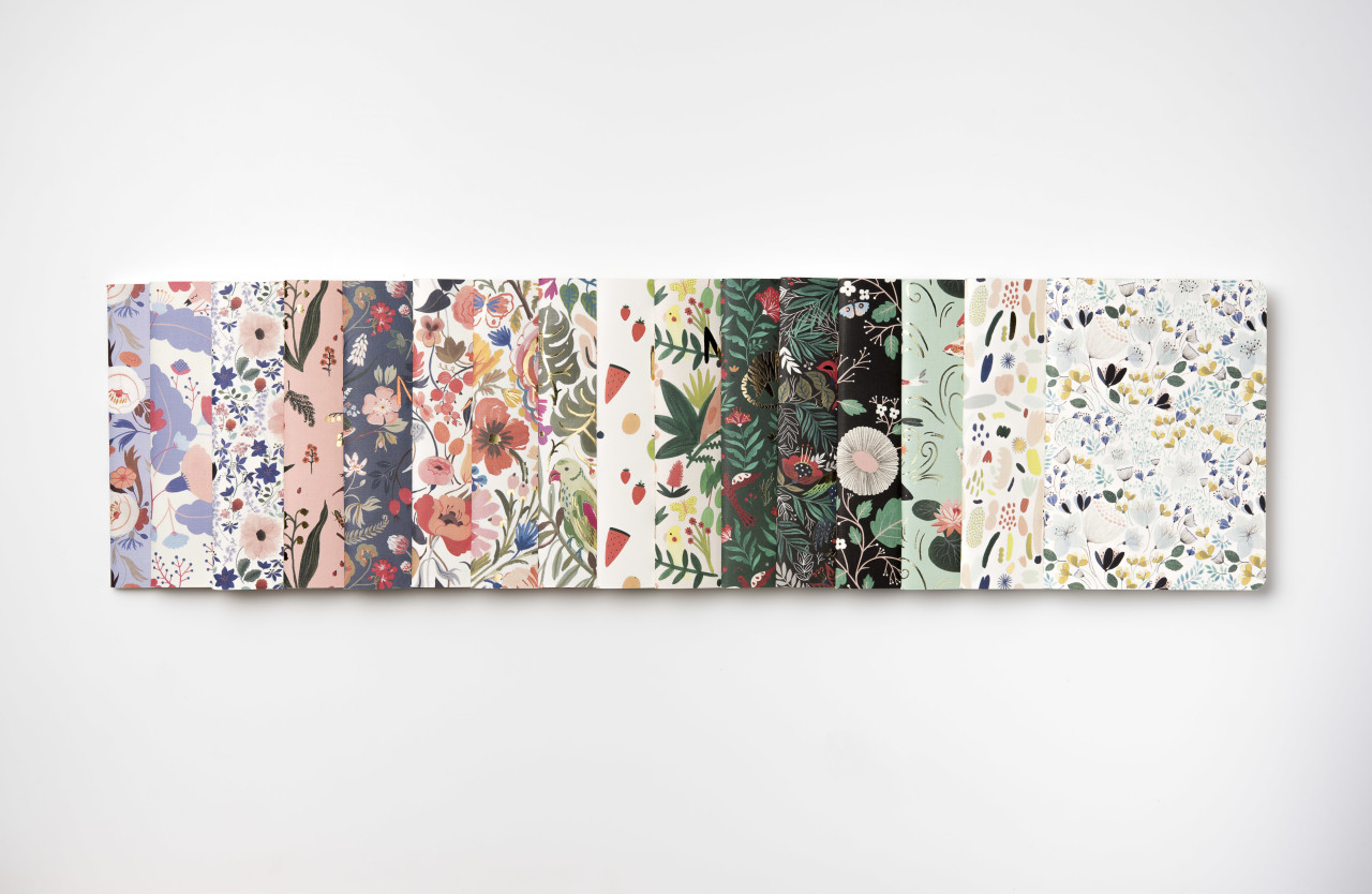
Behind the Stationery: Idlewild Co.

For this installment of Behind the Stationery, I’m thrilled to bring you a former fellow Brooklynite, Katie Gastley of Idlewild Co. on the blog sharing about her first wholesale order, what prompted a transition to a Florida office, and how she hand paints every design (!) that Idlewild produces. Cheers and take it away, Katie! –Megan
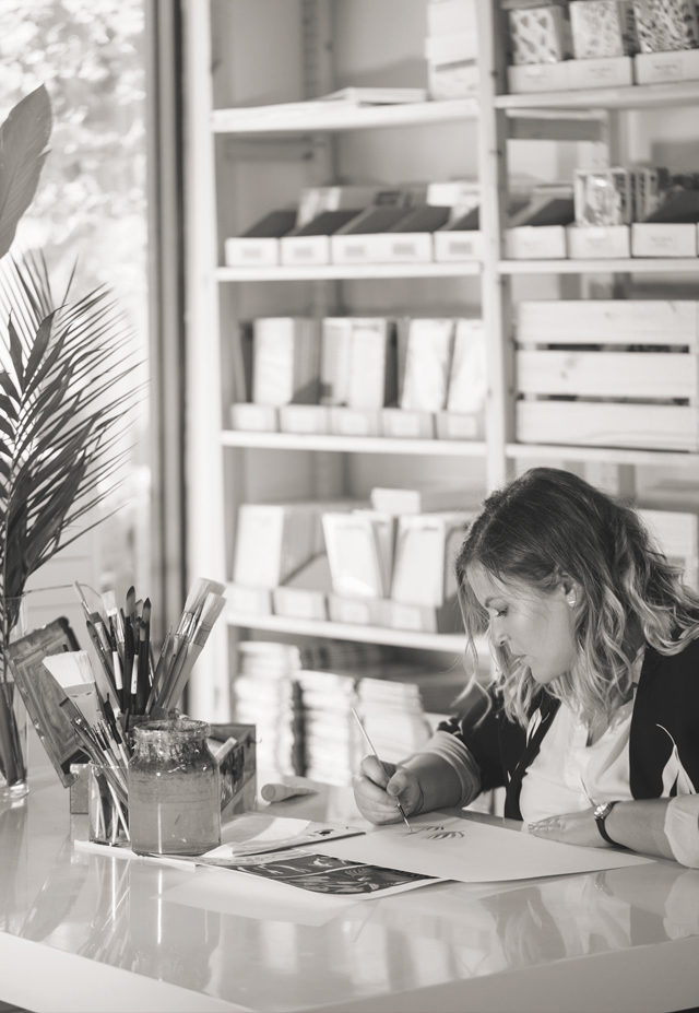
katie_painting

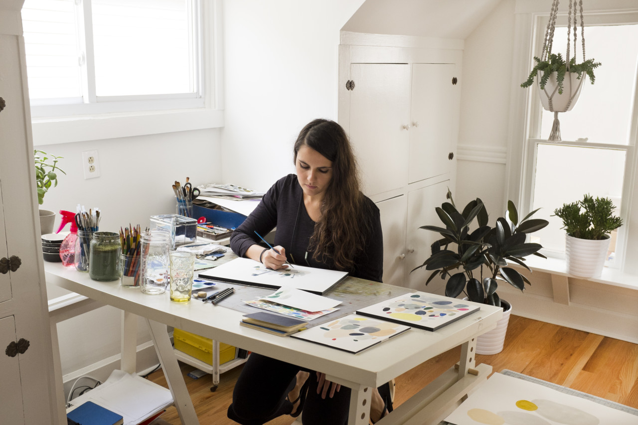
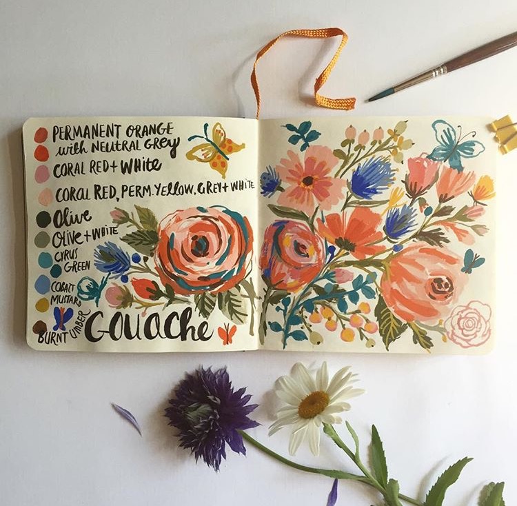
Ever since I can remember, I have always loved making things. Anything. Be it paintings, jewelry, ceramics, recipes, I’m in my prime when I’m creating. I moved from Pennsylvania to Brooklyn in 2002 to attend Pratt Institute, an Art and Architecture school focused on building a core fine art foundation; quite literally the perfect school for me! While refining all of my technical design skills that I use today to manufacture Idlewild Co.’s various products, I was also able to keep painting; something I found as more of a necessity to how I function rather than a hobby.
Behind the Stationery: Idlewild Co.

Upon graduation, I worked in various print and web design fields and built a small Etsy business on the side selling prints of my original paintings. I exhibited in my free time, selling my art prints in cafes and at various NYC craft festivals. One of my friends from college invited me to see her booth at the National Stationery Show; when I walked into the Javits Center and saw rows and rows of mega-creative-talent, and they were predominantly women-owned business… I was hyped! I knew I had found something special, and all of a sudden the direction of my side-business became a very focused goal. I was going to form a small collection of greeting cards, and apply for next year’s show.
Behind the Stationery: Idlewild Co.

At the time, I was working as a designer at Martha Stewart, another business run by smart and creative women (there’s a theme here…) and my nights were spent painting, printing, and packaging a small range of greeting cards and hand-bound notebooks to debut at the show. I knew a bit about selling through my experience at the local shows in New York, but figuring out my pricing and policies took quite a lot of work at the beginning.
Behind the Stationery: Idlewild Co.

I started the first batch of production with the only savings I had, and away I went to my first National Stationery Show booth built with the help of family and friends. My literal first sale was almost a disaster as I unknowingly applied NY State sales tax to a wholesale order. (Disclaimer: That is NOT how it works, but I was so thoroughly traumatized by the process of applying for a State Tax ID and wrapping my brain around its rules and guidelines, I was more than willing to hand over more than my fair share of taxes. Well, times have changed on that matter, my friend!) My buyer looked at me like I was an idiot and shared words that will probably forever echo in my mind: “Um, wholesale orders DO NOT pay tax.” Yeah, ok. Very shaky, but I had made my first sale, and it was quite a large one. Thankfully she looked past my rookie mistake – and they are still a current reseller of ours!
Behind the Stationery: Idlewild Co.

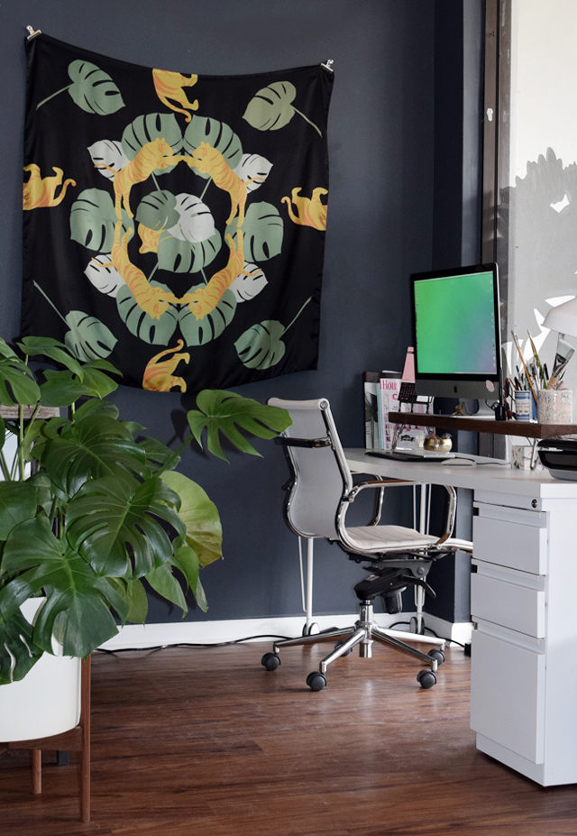
Running my business during the weekends out of my Brooklyn apartment became more and more difficult to manage during my already 50-hour long work week. I knew a change was in sight. It wasn’t possible to manage quitting my full-time job and running a hardly-profitable small business in the most expensive/greatest city in America, so my fiancé and I moved to the next-best place: the beach. He grew up in a small town on the Atlantic coast in Florida, and I was able to focus entirely on building my business.
Behind the Stationery: Idlewild Co.

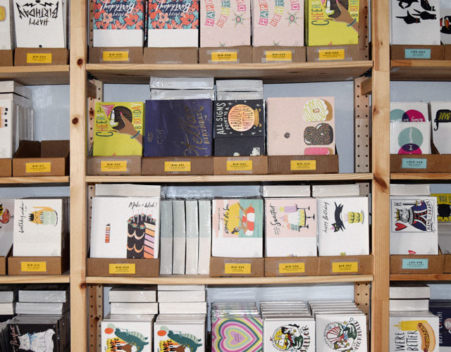
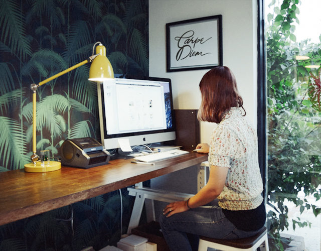
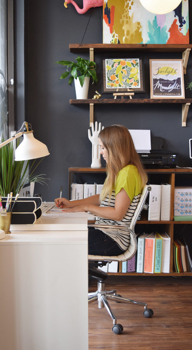
Progress was slow but steady and I was eventually able to afford a separate studio, then part time employees, and finally a full-time manager to oversee our wholesale partnerships, and studio manager to oversee our order fulfillment and inventory. With each step of growth I was able to allocate a little bit of the day-to-day “business” responsibilities to my employees, and devote more of my own time to creating new designs and prototyping new product categories.
Behind the Stationery: Idlewild Co.

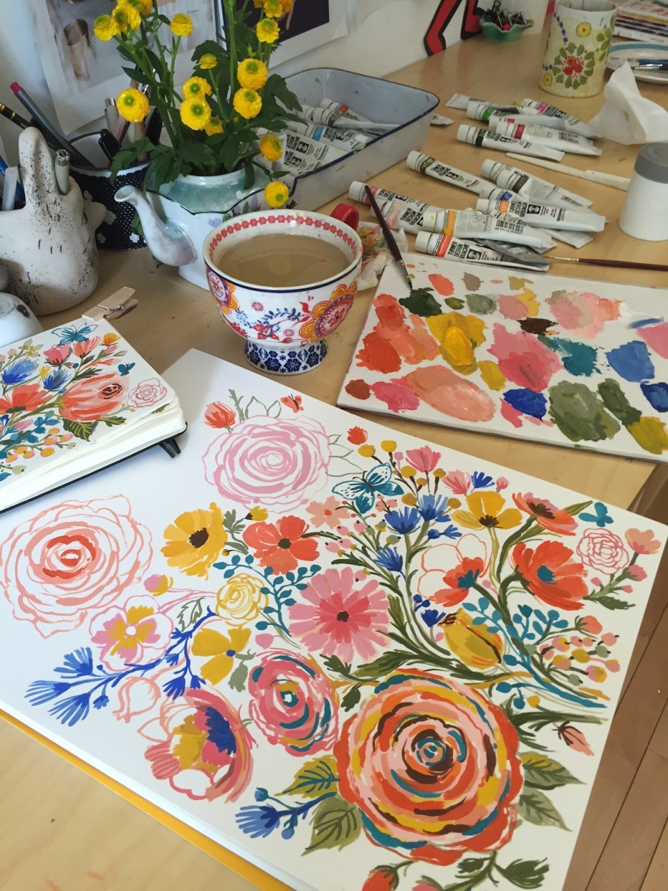
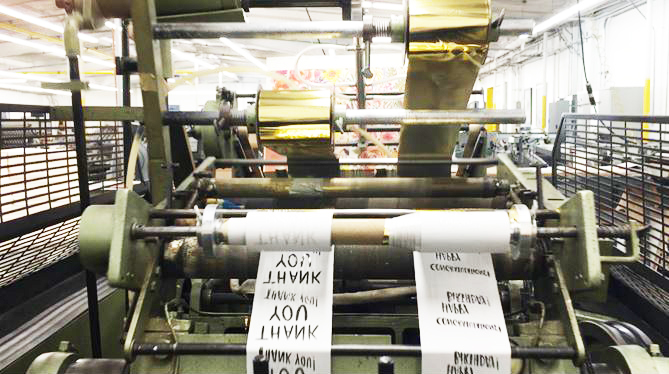
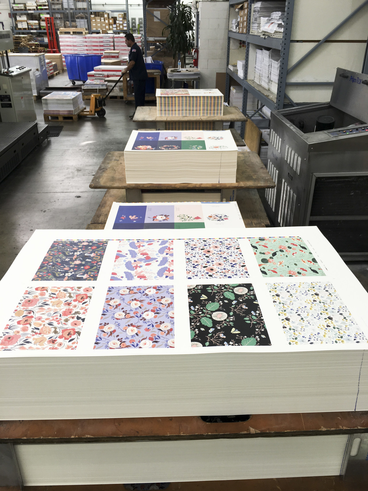
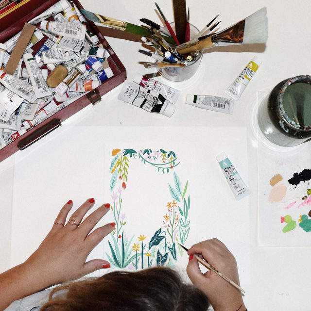
All of the designs at Idlewild Co. are created using my hand-painted artwork. Beginning with a sketch idea, I paint the final artwork and hand-lettering before scanning everything into the computer where any necessary tweaks are made, from color correcting to layout revising. After dropping the final artwork into specified mechanical files, they’re passed onto our local print partners for production. Most of our products contain a lot of color, so we use offset printing methods for the majority of our line. This gives us unlimited color options on press, which is important when replicating paintings.

Behind the Stationery: Idlewild Co.

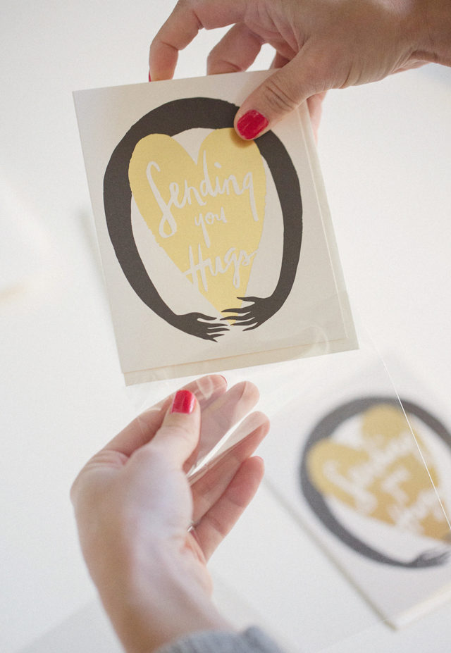
We don’t have the bandwidth or physical space to print our products in-house, so it’s absolutely necessary (and invaluable) for us to have a local printer we can work hand-in-hand with on our particular method of production. After the items have been printed and trimmed to their respective specifications, the final pieces are returned to our studio for packaging and finishing – and eventually fulfillment via our retail website or wholesale distributions.
Behind the Stationery: Idlewild Co.

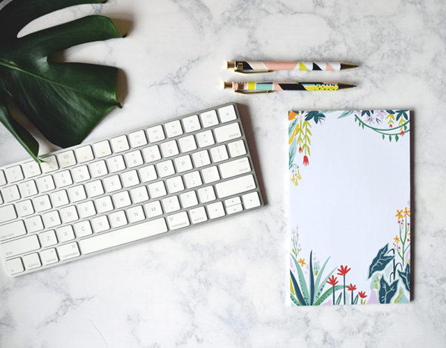
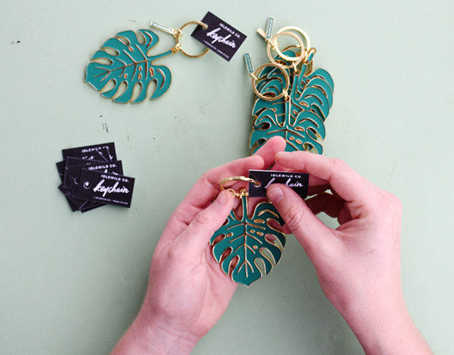
Currently, we’ve been expanding our line to include gift and accessory items; still based on our hand painted art. We’ve recently debuted our pen collections and enamel keychains, and are enjoying the challenge of working out the tricky details of manufacturing once you move to a 3-dimensional model. We’re currently in the process of planning a suite of notebooks that will debut at NYNOW in January.
Behind the Stationery: Idlewild Co.

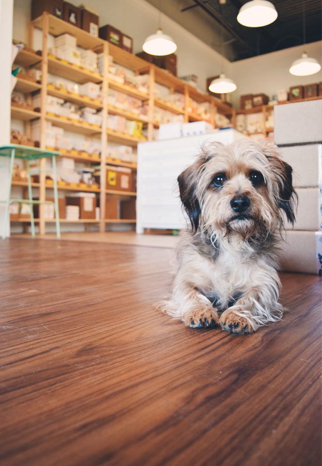
It has now been 3 years since I moved from Brooklyn, and I’m thrilled at the company Idlewild has become. A never-ending creative outlet for my maker-focused mind, haven, and collaborative hub for local artists, and perhaps what I’m most proud of: a woman-owned and women-operated small business. The team of “Idle-Ladies” I have the pleasure of working with keep our engines running smoothly, wholesale orders processed efficiently, products packaged beautifully, and orders shipped timely. We’ll keep making cards for as long as people enjoy sending them!
Behind the Stationery: Idlewild Co.

All photos by Idlewild Co.
Quick Pick: Farewell Paperie

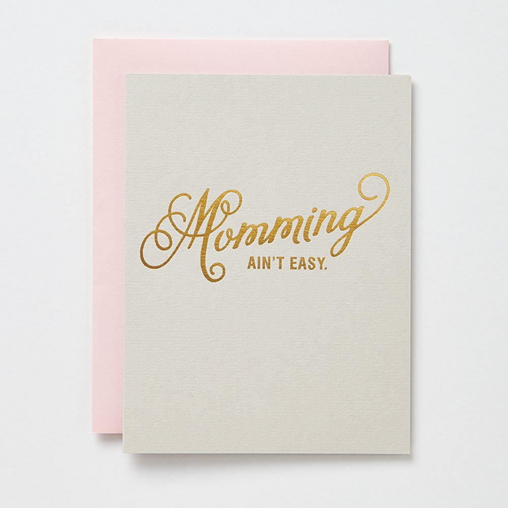
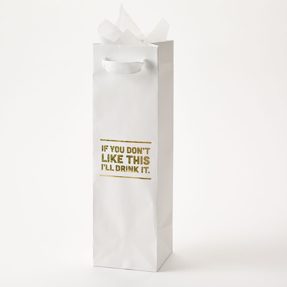
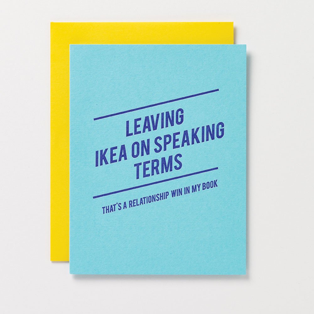
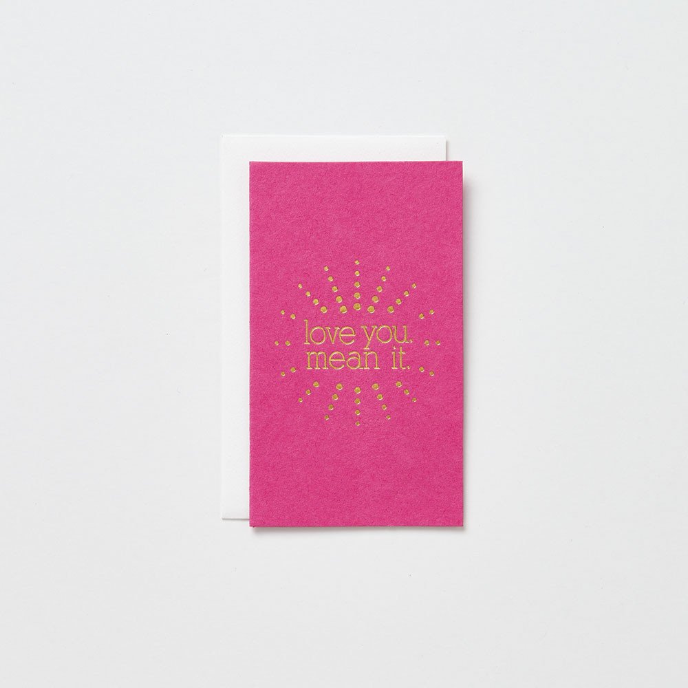
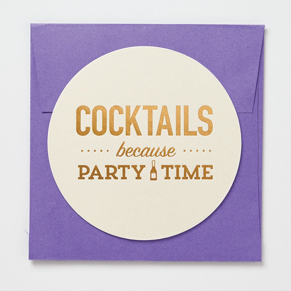
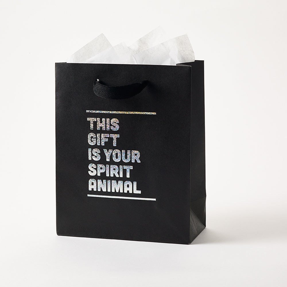
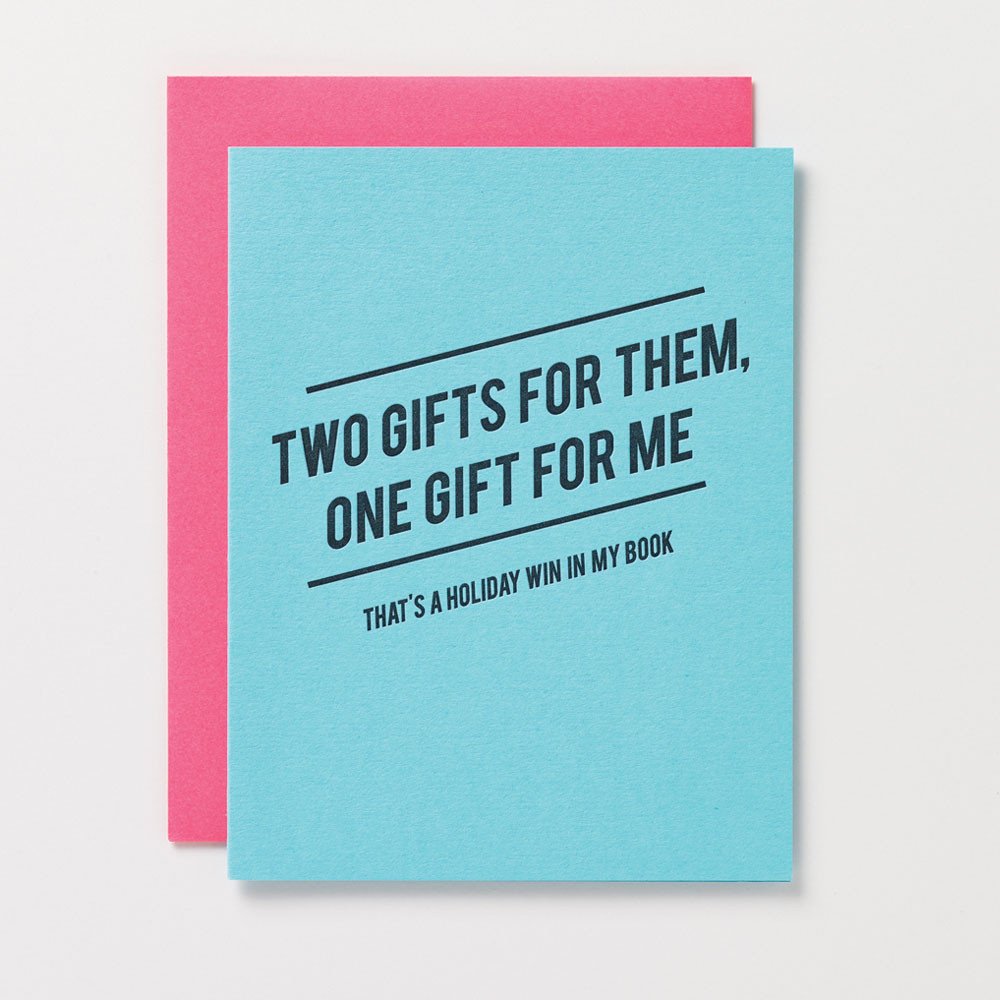
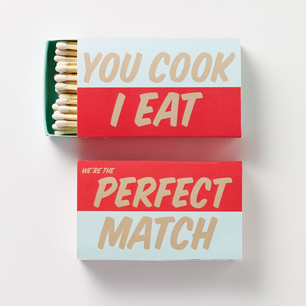
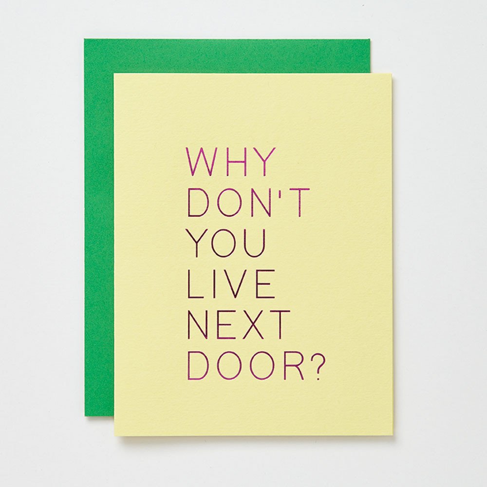
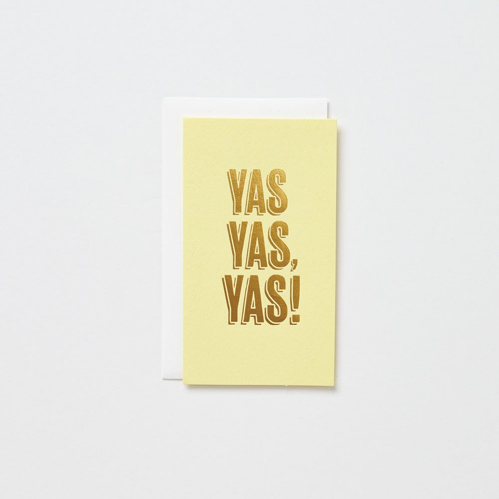
I got to see some of the latest stationery goodies from the ladies of Farewell Paperie back at NYNOW a few weeks ago. I shared a couple of favorites on Instagram, and I wanted to share a few more here! The “Momming” and Ikea cards below are my two personal favorites – I want to give them to pretty much everyone I know. I’m also loving the glitter foil gift bags and booze bags and the new mini cards for a fun gift tag alternative!

Quick Pick: Farewell Paperie / Momming Isn't Easy Card

Quick Pick: Farewell Paperie / Glitter Foil Booze Bag

Quick Pick: Farewell Paperie / Ikea Card

Quick Pick: Farewell Paperie / Love You, Mean It Mini Card

Quick Pick: Farewell Paperie / Cocktail Party Coasters

Quick Pick: Farewell Paperie / Glitter Foil Gift Bag

Quick Pick: Farewell Paperie / Holiday Card

Quick Pick: Farewell Paperie / Matchboxes

Quick Pick: Farewell Paperie / Miss You Card

Quick Pick: Farewell Paperie / Yas, Yas, Yas! Mini Card

Lots more over at Farewell Paperie!

Colorful Mexican Fete-Inspired Wedding Invitations

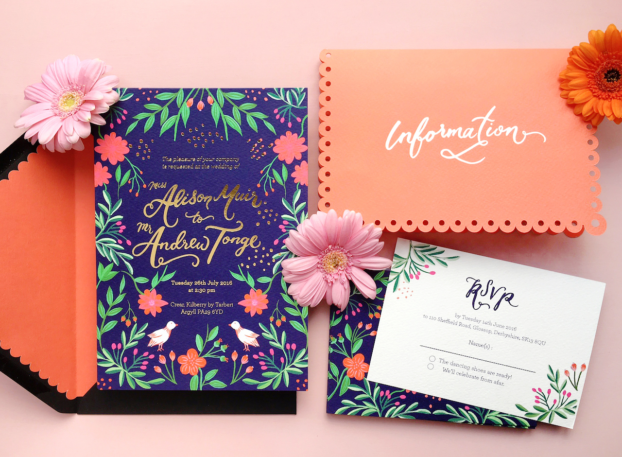
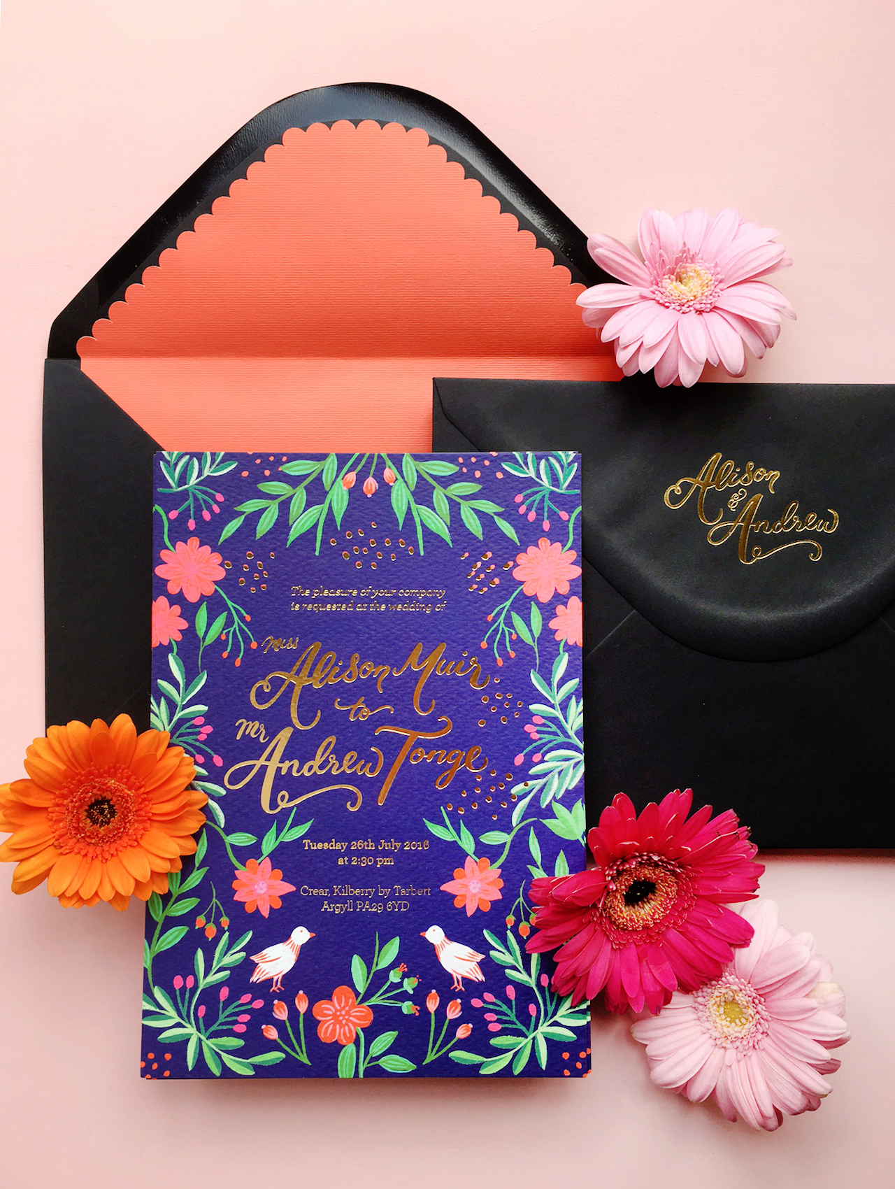
Well, hello there! Last week ended up being a bit more of a rollercoaster for me than I had originally expected – first, with a trip to New York for the NYNOW trade show (did you follow along on Instagram??), and second, we ended up having to replace our car! We’re a single car family here in DC, but we use our car every day for school drop offs and the commute to the military base where my husband works. Our poor 13-year old car decided to call it quits on us the day after I got back home. We’re super happy to have a brand new car sitting in our garage, even though the whole process took us about three full days. Anyway! I thought we’d start off the week with these colorful Mexican fete-inspired wedding invitations from Erin of BerinMade! I’m loving the bright illustrated florals and pretty gold foil details!

Colorful Mexican Fete-Inspired Wedding Invitations by BerinMade / Oh So Beautiful Paper

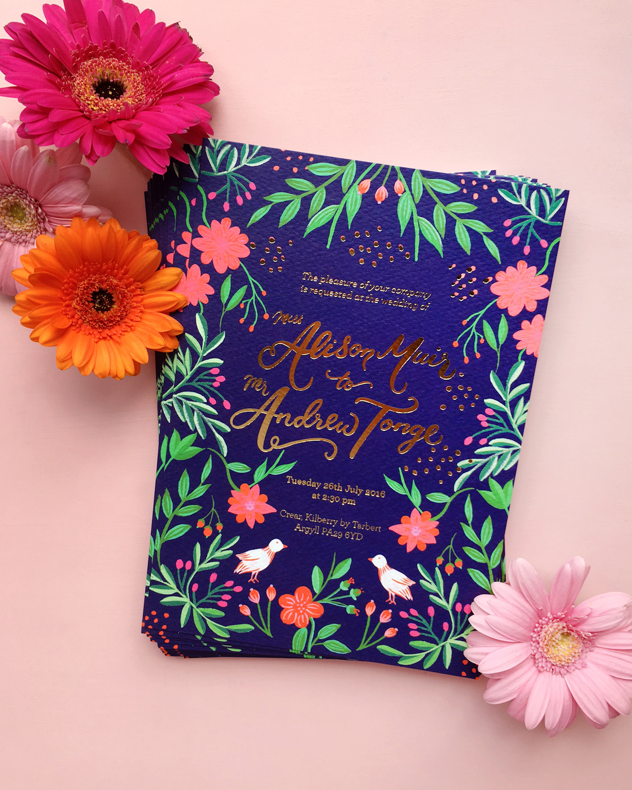
From Erin: Alison and Andrew were a dream couple to work with! They approached me last year with a few inspiration images, and wanted their wedding stationery to be loosely based on a colorful Mexican fete, with illustrations of flower, nature, and foil details. The goal is to have these elements as a nod to their fun, playful celebration, without necessarily being too “themed” or feminine.

Colorful Mexican Fete-Inspired Wedding Invitations by BerinMade / Oh So Beautiful Paper

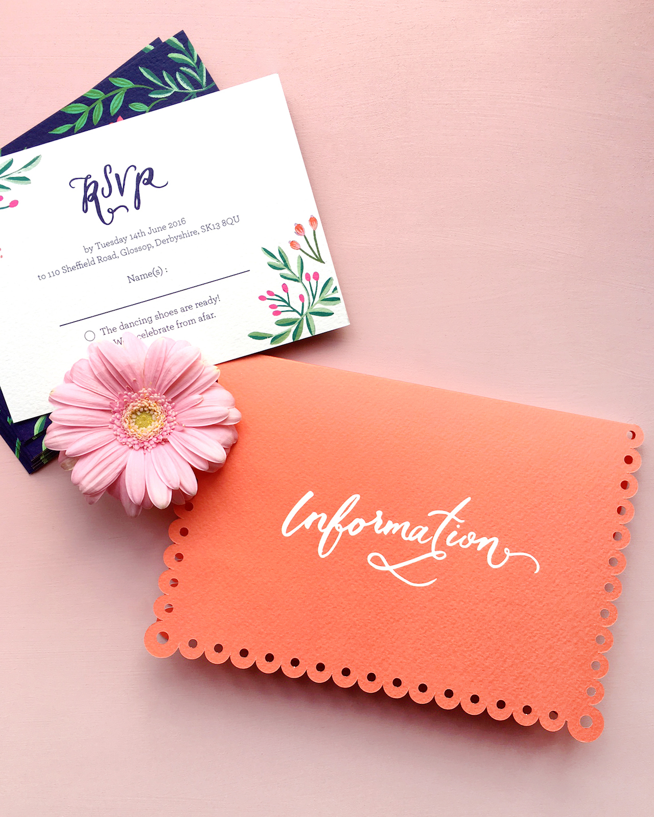
I pulled some inspiration images of Folk art, drawing inspiration from symmetrical patterns, very bright intricate floral patterns as well as papel picado, the art of paper cut flags.

Colorful Mexican Fete-Inspired Wedding Invitations by BerinMade / Oh So Beautiful Paper

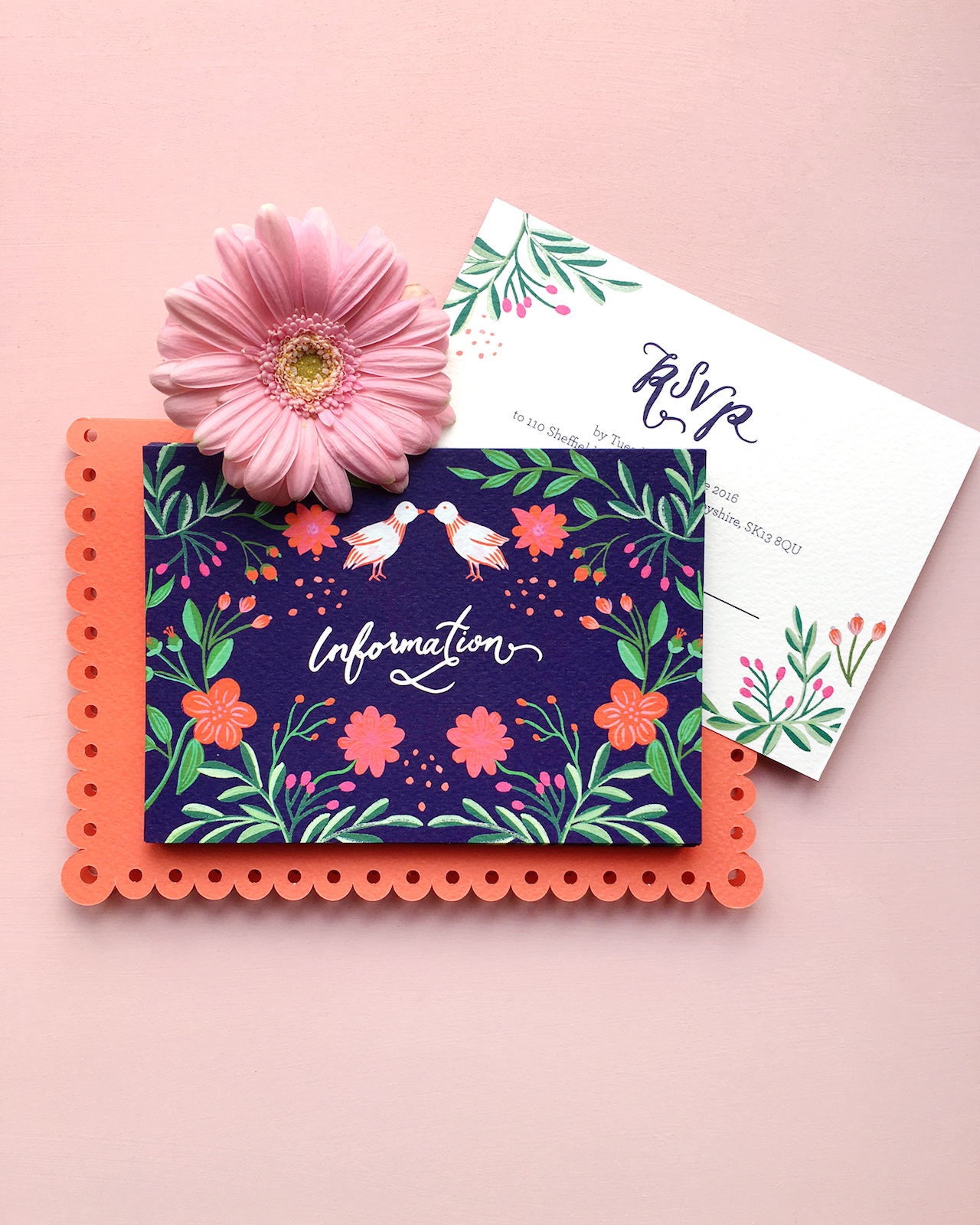
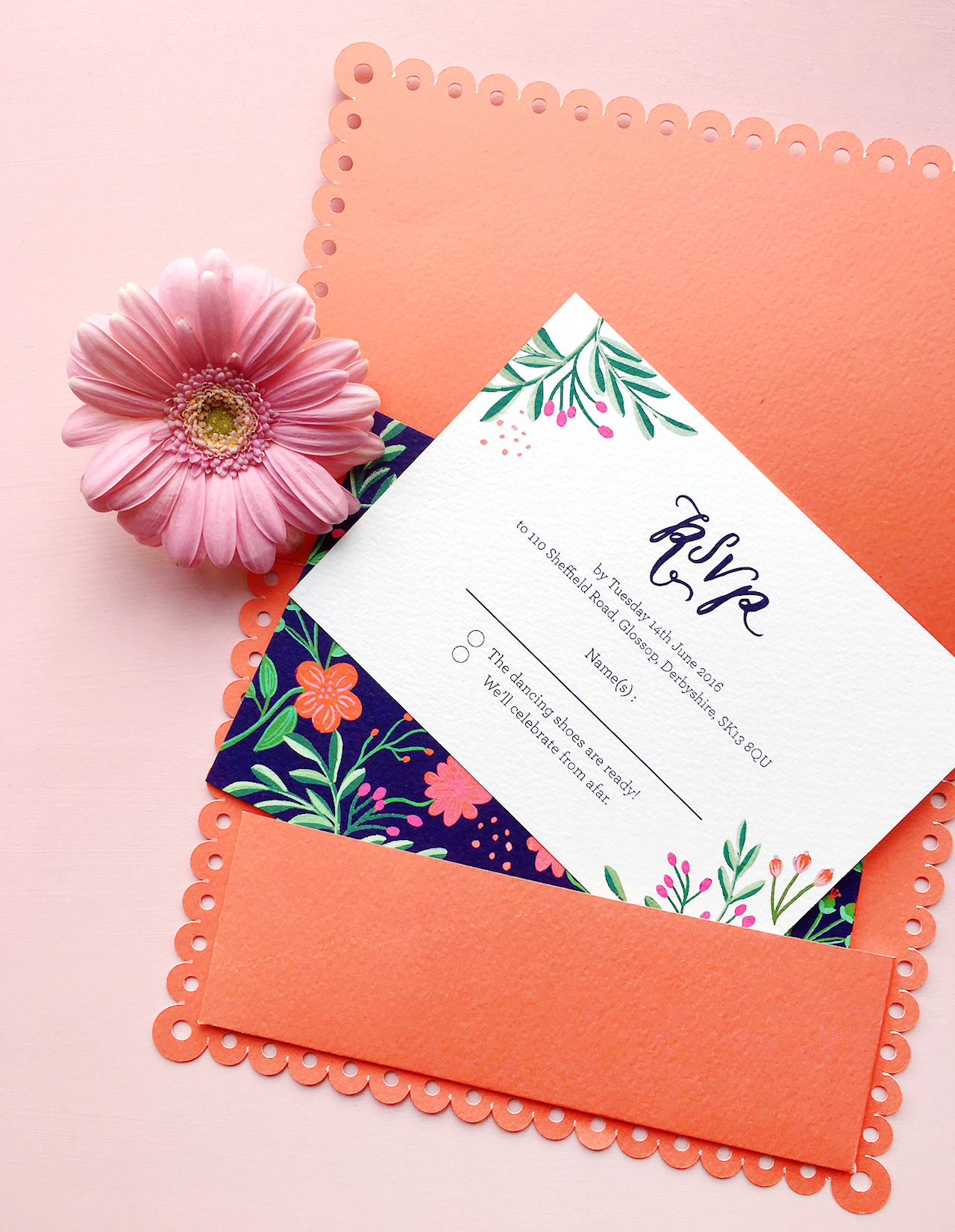
I wanted these to be subtle influences, so we decided to have the symmetrical illustrations take centre-stage and to make a separate enclosure pocket with a scalloped edge as an elegant nod to Mexican paper flags.

Colorful Mexican Fete-Inspired Wedding Invitations by BerinMade / Oh So Beautiful Paper

We went for a color palette that was bright and happy without being garish, and set it against the navy background to ground all the colorful elements together. It was after finalizing the illustrations and layouts that we decided to also lift a bit of the illustrations to foil alongside their names and the invitation text!

Colorful Mexican Fete-Inspired Wedding Invitations by BerinMade / Oh So Beautiful Paper

Colorful Mexican Fete-Inspired Wedding Invitations by BerinMade / Oh So Beautiful Paper

Thanks Erin!

BerinMade is a member of the Designer Rolodex – you can see more of Erin’s beautiful work right here or visit the gallery for more real wedding invitation inspiration!

Photo Credits: BerinMade

Happy Weekend!

Happy Friday everyone! A huge thanks to Nichole for her AMAZING guest posts on OSBP this week. Tomorrow I’m heading up to New York for the summer NYNOW market. I’m going to try to pop in here once or twice next week, but otherwise be sure to follow me on Instagram to see all my finds from the show.

The Indigo Bunting / Erin Jang via Instagram / Oh So Beautiful Paper

Image by Erin Jang / The Indigo Bunting via Instagram

On a much sadder note, I’ve spent quite a bit of time this week looking at the videos and images coming out of Aleppo, Syria and the situation is absolutely desperate right now. Aleppo is a city of 300,000 people, of which 120,000 are children, and they are suffering more than I can even begin to fathom at the hands of the Syrian government. Ten thousand children have already died in the conflict, from air strikes, starvation, and lack of medicine –4,500 of them from Aleppo alone. The Syrian government continues to drop bombs and chemical weapons on its own people every single day. As a mother, I’m heartbroken by the images of dead and wounded children coming out of Aleppo, but I’m also outraged that the international community has failed to intervene. I’m planning to say a bit more about this as soon as I can gather my thoughts, but in the meantime, please look at the hashtags (here, here, here, and here), read the media reports (the New York Times seems to have the best coverage at the moment), and, if you can, please donate to UNICEF.

On a lighter note, a few links for your weekend:

This week on Oh So Beautiful Paper:

That’s it for us this week! We’ll be back later this afternoon with this week’s cocktail recipe! xoxo

Behind the Stationery: Red Cap Cards

What an honor to share with you all this next stationery duo’s journey. From Red Cap Cards, Carrie and Hal are here to share about the importance of pajamas, insight on working with illustrators and artists, and behind their new collaborative collection debuting at NYNOW in two short weeks! It’s amazing to see how they changed their career paths and adjusted their vision, individually and together. —Megan

Behind the Stationery: Red Cap Cards / Oh So Beautiful Paper

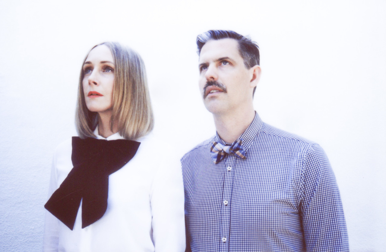
Hello! We are Carrie and Hal from Red Cap Cards. Our company is based out of Los Angeles, California. We are a stationery company that celebrates artists, creating a platform to share their work through beautifully designed paper products.

Our story began in 2005 when Hal and I decided we wanted to work together and create a lifestyle for ourselves that allowed us to be completely in charge of our own time. I think some people are just meant to work for themselves and that would be us. Hal and I both had different careers. He was running a coffee roasting business and I was a children’s theatre director. Although we were passionate about these careers, we decided to take a leap of faith and start a creative business that was in line with the creative vision we had for our life. At the time, I was illustrating cards as a hobby and people loved them. We recognized the potential in the concept of bringing amazing art and illustration to the doorstep (quite literally) of the masses. So, in our tiny West Hollywood bungalow, Red Cap Cards was born.
Behind the Stationery: Red Cap Cards / Oh So Beautiful Paper

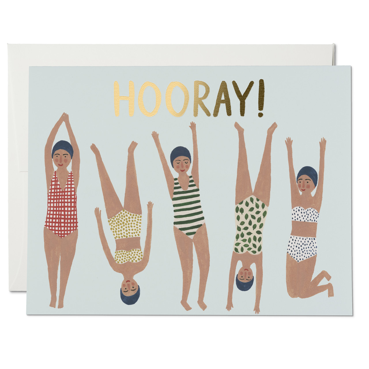
Over time our company has evolved. In the beginning, I was the only illustrator and now we have over twenty different artists in our line—which is constantly evolving. We realized early on that we had loyal fan base and felt that this was ultimately the most valuable aspect of our business. So in 2007, we began collaborating with artists from all around the world. We started with a few artists that were friends of ours, and then we added more over time.

Behind the Stationery: Red Cap Cards / Oh So Beautiful PaperPhoto (courtesy) of Kate Pugsley

All of the artists that we have worked with have ended up becoming friends and members of a tight-knit family that we cherish. Creating amazing products is a wonderful part of our business but being champions for the artists we work with is our favorite part of our job. They are some of the most talented artists out there, and we consider ourselves lucky to introduce their work to a new collective.

Behind the Stationery: Red Cap Cards / Oh So Beautiful Paper

Hal and I have held true to our vision. We work from home and can pretty much do our job from anywhere, thanks to the magic of technology. We always start the day with coffee. This is an essential in our house! I’m typically in pajamas all day; this is the sad but awesome truth. Hal and I sit at one long desk in our office that we have had for 10 years. We also have an amazing team of writers and designers who all work from their own spaces, and this is by design. One thing Hal and I have never wanted to do was manage people. We never liked feeling micro-managed, and we believe that our business model is one that empowers people and leads to a richer quality of work. I love knowing almost everyone on our team is happy working from the studios that inspire them. The remote office is the only way to go for us! Pajamas for everyone!

Behind the Stationery: Red Cap Cards / Oh So Beautiful Paper

I retired from illustrating for Red Cap Cards in 2012 to take on the role as our creative director and collection curator. I spend most of my day working with our creative team, which consists of our artists, our amazing designer, Michelle, and Andie who writes our blog and helps with all things PR-related. Hal typically spends his day working with our logistics team which consists of Betsy, our wholesale manager and all around super star, Denise, who manages our warehouse in Minnesota, and Rich, who runs all of our print jobs here in Los Angeles.

Behind the Stationery: Red Cap Cards / Oh So Beautiful PaperPhoto by Carolyn Gavin

When creating a collection for Red Cap I always begin with the illustrator. I think about the unique perspective that the individual artist will bring to our line. Each artist we work with has their own approach to their work, which means that each process is a little bit different. Some artists love direction and others, not so much. We always suggest that greeting card occasions help to inspire the narrative in our cards, but we try not to let those occasions limit our artists or box them in. We want our artists to create work that they love, which is communicated through a “free” artistic process. That’s really important to us. Sometimes we have a general theme to help inspire a collection, and others times it’s random and very organic.

Behind the Stationery: Red Cap Cards / Oh So Beautiful PaperPhoto by Carolyn Gavin

I typically start the process by looking at their current body of work to help give them a general direction of what I feel would work on a card. Then we start a conversation about the kind of collection they’d like to create. The challenge in working with many different artists is creating a cohesive collection. Our goal is to curate a line that harmonizes together, but one that allows each card to stand independently on its own.

Behind the Stationery: Red Cap Cards / Oh So Beautiful Paper

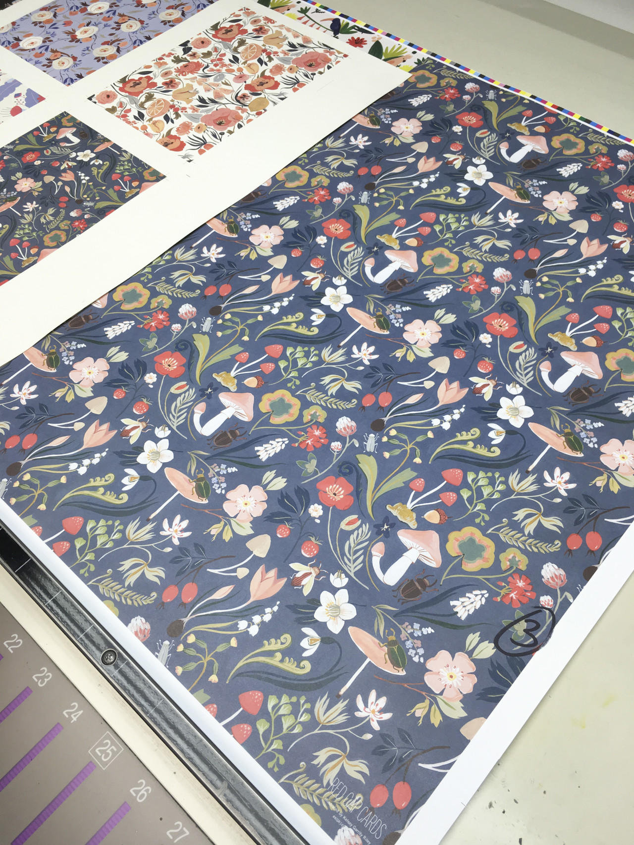
We use several different types of printing processes including offset and gold foil-stamping, and have a special collection of spot color Pantone® cards. All of our products are printed and manufactured right here in Los Angeles and are quality checked by our standards. Behind the Stationery: Red Cap Cards / Oh So Beautiful Paper

We show up at 9am for every press run and are there as our printers deliver the cards into our hands hot off the presses. We adore our pressmen, some of whom have been in the printing business for over thirty years!

Behind the Stationery: Red Cap Cards / Oh So Beautiful Paper

We adjust colors until they are as close to perfect as we can get, which can be a difficult process. Certain colors are hard to print, and we want to get them just right! After our cards are printed, we send them to our awesome warehouse in Minnesota, which is another business run by a husband-and-wife team. We love them dearly! They do an amazing job.
Behind the Stationery: Red Cap Cards / Oh So Beautiful Paper

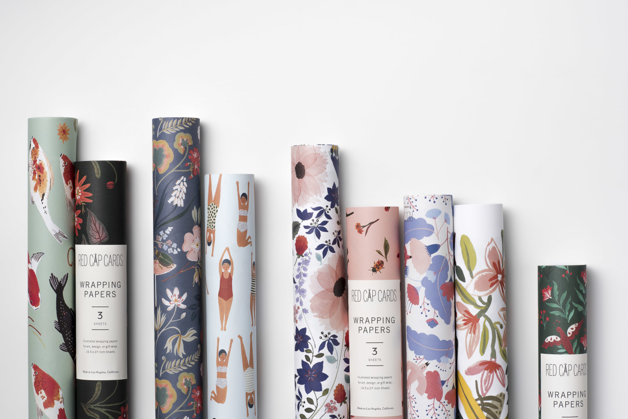
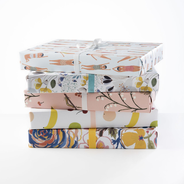
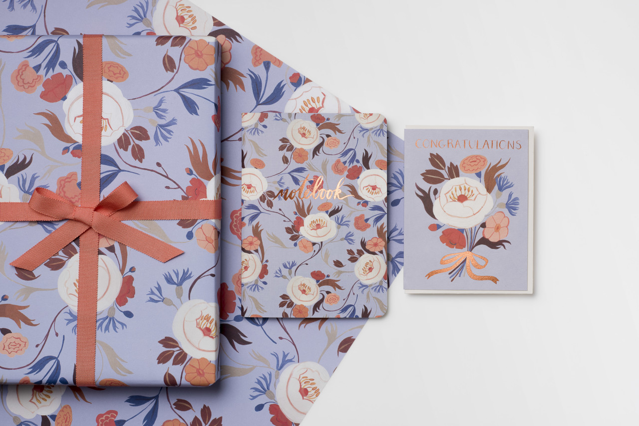
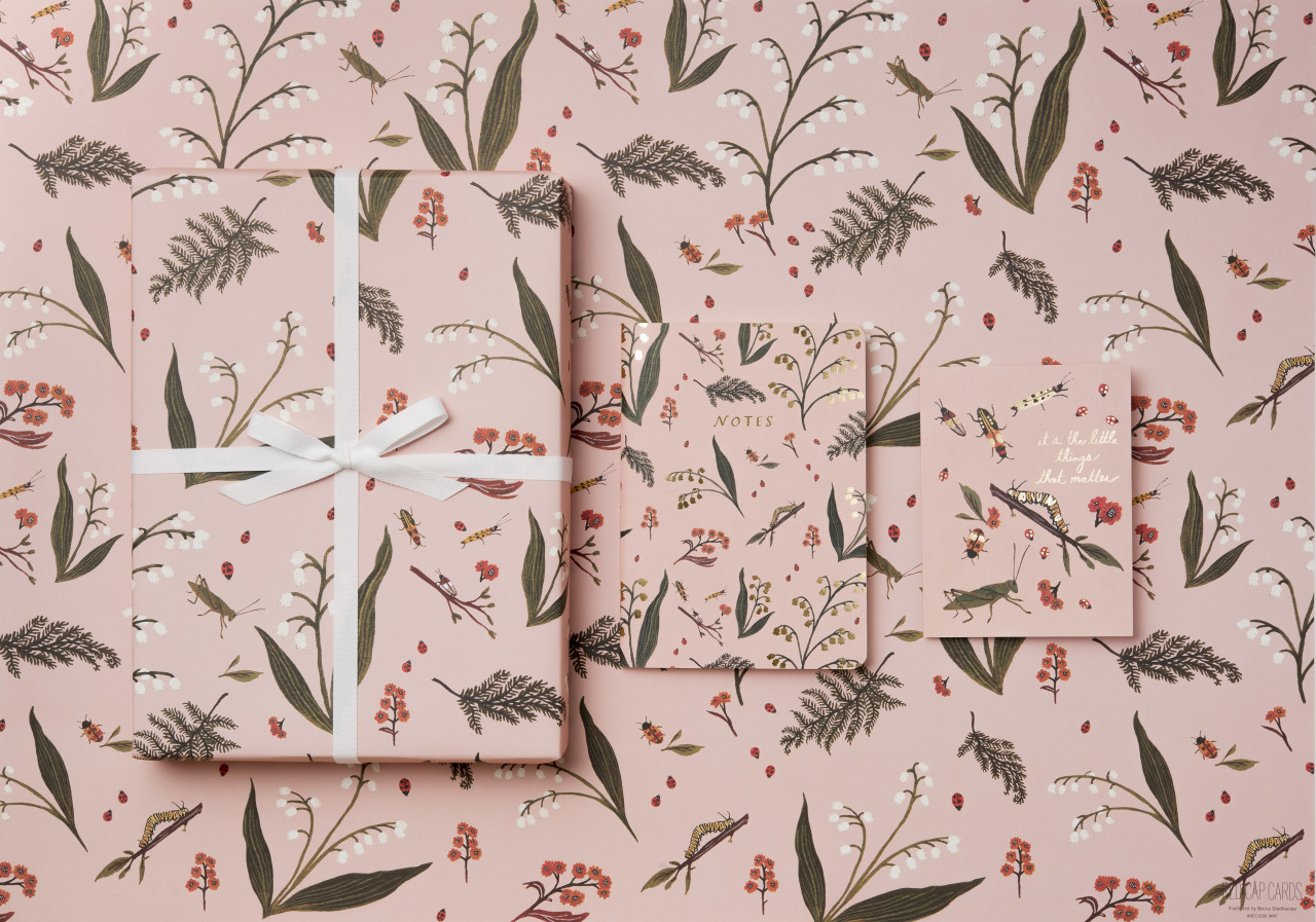
Recently, seven of our artists came together to create our first line of coordinating wrapping paper, notebook and greeting card suites. I wanted this collection to be a stunning showcase of how well our artists work together while remaining completely true to their individual vision. In order to do this, I had our artists create color stories that they shared with one another. The idea was to allow the different color stories inspire each other’s work.

Behind the Stationery: Red Cap Cards / Oh So Beautiful Paper

This was a really fun way to for our artists to play with one another and create a collection that harmonized in color. I’m so happy with the end result. We really do work with some of the most talented artists in the world, and wouldn’t trade it for anything. We hope that our labor of love comes through to the customers who buy our cards. This collection will be debuting at NYNOW on August 20th at the Crow & Canary booth!

Behind the Stationery: Red Cap Cards / Oh So Beautiful Paper

Hal and I are beyond grateful to be living such a wonderful life surrounded by so many talented people. If you would have asked me when I was a kid if I would grow up to run a stationery company, I would have laughed. I love how life can surprise you. I’m excited about the unknown future of Red Cap and I feel so much gratitude for folks like Oh So Beautiful Paper who have supported us from day one. That means the world to us.

Behind the Stationery: Red Cap Cards / Oh So Beautiful Paper

All photos taken by or for Red Cap Cards except where noted.

Interested in being featured in this column? Reach out to Megan at megan [at] ohsobeautifulpaper [dot] com for more details!