Copper and Leather Wedding Invitation Inspiration

Ear­lier this year I teamed up with a tal­ented mix of folks to bring to life a rich, rein­vented rus­tic vision dreamed up by Amy Cham­pagne Events and cap­tured by Char­lotte Jenks Lewis. Collaborating with other creatives is a wonderful opportunity to explore new ideas, to challenge yourself, and to foster and build new relationships. This particular styled shoot was no exception. Inspired by vin­tage ski lodges and the clas­sic cop­per cups of Moscow Mule fame, I got to work cre­at­ing some copper and leather wedding invitation inspiration. –Nichole of Coral Pheasant

Copper and Leather Wedding Invitation Inspiration by Coral Pheasant / Photo: Charlotte Jenks Lewis / Oh So Beautiful Paper

Copper and Leather Wedding Invitation Inspiration by Coral Pheasant / Photo: Charlotte Jenks Lewis / Oh So Beautiful Paper

The wedding invitation suite features a mix of con­trast­ing col­ors and tex­tures. The invi­ta­tion is laser etched script text on a sheet of cognac leather, the enclo­sure cards are accented with cop­per leaf detail­ing, and the outer enve­lope and liner bring in rich berry tones. The escort cards and several welcome and gift tags also feature laser etched text on cognac leather and were paired with deep cranberry red and burgundy ribbon.

Copper and Leather Wedding Invitation Inspiration by Coral Pheasant / Photo: Charlotte Jenks Lewis / Oh So Beautiful Paper

Copper and Leather Wedding Invitation Inspiration by Coral Pheasant / Photo: Charlotte Jenks Lewis / Oh So Beautiful Paper

Copper and Leather Wedding Invitation Inspiration by Coral Pheasant / Photo: Charlotte Jenks Lewis / Oh So Beautiful Paper

Sara from Ink Revival adorned the cranberry red enve­lope with her gor­geous cal­lig­ra­phy in cop­per ink. She was able to match the font used in the suite to create a cohesive look.

Copper and Leather Wedding Invitation Inspiration by Coral Pheasant / Photo: Charlotte Jenks Lewis / Oh So Beautiful Paper

Copper and Leather Wedding Invitation Inspiration by Coral Pheasant / Photo: Charlotte Jenks Lewis / Oh So Beautiful Paper

Copper and Leather Wedding Invitation Inspiration by Coral Pheasant / Photo: Charlotte Jenks Lewis / Oh So Beautiful Paper

One of my favorite ele­ments from the paper story is the wel­come box for wedding guests, a preview of a Moscow Mule station at the wedding reception. The welcome box fea­tures mini cop­per Moscow Mule cups and all the ingre­di­ents needed to make Moscow Mules — mini vodka bottles, ginger beer, and limes – and then a bit of relief if too many Mules are consumed!

Copper and Leather Wedding Invitation Inspiration by Coral Pheasant / Photo: Charlotte Jenks Lewis / Oh So Beautiful Paper

Copper and Leather Wedding Invitation Inspiration by Coral Pheasant / Photo: Charlotte Jenks Lewis / Oh So Beautiful Paper

Copper and Leather Wedding Invitation Inspiration by Coral Pheasant / Photo: Charlotte Jenks Lewis / Oh So Beautiful Paper

Ed Note: Coral Pheasant is a member of the Designer Rolodex – you can see more of Nichole’s beautiful work right here or visit the real wedding invitations gallery for more invitation inspiration!

Photo Credits: Charlotte Jenks Lewis

Behind the Stationery: Coral Pheasant

Hello! My name is Nichole and I am the Chief Dreamer and designer at Coral Pheasant on the Connecticut shoreline. I am delighted to be guest blogging on my favorite stationery spot on the web this week, and I’m excited to share some of my work and behind the scenes with you. I’m a paper nerd with a penchant for beautiful typography, gorgeous patterns and thick, luxurious stock. Custom invitations are my specialty. I adore clients who respect etiquette and tradition, appreciate the rules, and break them just a bit to create a hip, on-trend, thoughtful and highly personalized stationery suites.

Behind the Stationery: Coral Pheasant / Oh So Beautiful Paper

Art has been in my blood for as long as I can remember and my parents encouraged my pursuits wholeheartedly. One of my earliest memories of creating was building my dollhouse with my father. Everything on that miniature house was handcrafted from laying the chimney brick by little brick, to wallpapering the walls, to building the furniture. I delighted in working with my hands to make sure the tiniest of details was perfect. In college, I pursued my love of design by enrolling in a Fine Arts program and graduating with a Bachelor of Fine Arts degree.  It was during those four years that I became infatuated with typography and knew I had found my calling.

Behind the Stationery: Coral Pheasant / Oh So Beautiful Paper

The vendors that we hired for our wedding quickly became friends and I was invited to collaborate with them on editorial shoots. My involvement in these creative projects and their support was the kick in the pants I needed to formally develop my stationery business. For the next two years I worked both my corporate job and my own business. In 2012, I attended the Engage! Luxury Wedding Conference and had the great fortune of meeting Sarah Haywood, one of Britain’s top wedding planners. It was this serendipitous encounter that led to our collaboration on the redesign of her 240-page Wedding Bible and her Wedding Bible Planner. Meeting Sarah and landing the job gave me the confidence to dedicate myself full time to my business. Two weeks after returning home from the conference I resigned from my job and began the crazy, rewarding, challenging, wonderful journey of being an entrepreneur.

Behind the Stationery: Coral Pheasant / Oh So Beautiful Paper

When thinking of a name for my business I was sitting on the couch in our apartment’s living room and looking around the space. Sitting on a credenza that was a vignette I had styled that was composed of a tall cylindrical vase filled with pheasant feathers and a piece of coral. (I’ve long had a thing for what I like to call “animal ephemera”). I put the two words together and really liked how they sounded. After doing a quick internet search I confirmed that the URL was available (not an easy feat to find one that’s not been taken!) and knew I had a winner. For a while there, I always associated the word coral with the petrified piece that was the original inspiration. It wasn’t until I stared at the clothes hanging in my closet that I realized I owned multiple coral-colored things and a light bulb went on. Of course coral was also a color! It’s funny how something can be so obvious and yet so elusive.

Behind the Stationery: Coral Pheasant / Oh So Beautiful Paper

My design process begins with learning as much as I can about the couple I’m working with. I want to know what they love to eat, how they spend their vacations, where they shop and what makes their house a home. Learning what they love in their day-to-day life – and what they don’t! – helps tremendously in understanding the vision for their wedding day.

Behind the Stationery: Coral Pheasant / Oh So Beautiful Paper

My design process is also heavily inspired by vintage finds and studying beautifully curated interiors. In my questionnaire I ask my clients what the most treasured piece of furniture or art is in their home. This speaks volumes to me! I love the history behind objects and the visual storytelling that develops as these treasured pieces find their way into homes. The layering of unexpected items, their textures and patinas and patterns. It parallels the design of my stationery. I always seek to have each item in a suite coordinate with the whole but never “match.”  I like to vary the sizes of the cards and the colors of the envelopes and I strive to create an element of discovery. This element might be a charming detail tucked into the envelope liner or the unexpected placement of the stamp on an RSVP envelope.

Behind the Stationery: Coral Pheasant / Oh So Beautiful Paper

Working for yourself certainly has its rewards and challenges. One of the rewards is realizing my world got so much bigger. When I was working for a company, that was my world. I went to work, did my job and came home. I loved the people I worked with and they were essentially my “network.” For the most part we were all similar in age, doing similar things. When I started working for myself, I crossed paths with so many new people, with a multitude of talents, from wildly diverse backgrounds. It was – and is – wonderful to connect with people who are different from me. Each person brings a new perspective and can challenge you to see things in a new light. On the flip side, being a company of one can be lonely. I loved the people I worked with at my past job. There was definitely a social aspect to work where we all had lunch together and it was easy to bounce ideas around. I also had others to hold me accountable for tasks and projects. When you work for yourself, you have to make a concerted effort to network and you’re the one steering the ship.

Behind the Stationery: Coral Pheasant / Oh So Beautiful Paper

I hope you enjoyed learning a little bit about this gal behind the paper!

Photo Credits: Coral Pheasant

Wedding Invitation 101: Where to Start

Happy Monday everyone! I’ll be away for a couple of weeks to catch up on some personal things, but I’m leaving you in EXCELLENT hands while I’m away! Ashley from Fine Day Press graciously agreed to fill in for me this week, and we’re kicking things off with the first installment in a series of posts about wedding invitations! It’s a wonderful primer for anyone feeling overwhelmed by the world of wedding invitations and save the dates. Welcome Ashley!! –Nole

Invitation-101-Where-to-Start-Title

Hey there! Ashley Austin from Fine Day Press here. Nole has kindly invited me to guest blog this week, and I’m super-duper excited to be here sharing some fun posts with you all! Today we’re kicking off a weekly series all about wedding invitations called Wedding Invitation 101. Invitations are a big part of what I do over at Fine Day Press, in addition to greeting cards, calendars and other paper goodies. Over the years, I’ve learned a few tricks to streamline the process, and I’m sharing them with you here.

WHERE TO START

Your wedding invitations are often the first thing your guests will see; it should represent the spirit of the day and set the tone. It’s never too early in the planning process to start envisioning your dream invitations!

Will your wedding be a formal affair or is it more of a barefoot-on-the-beach event? Think about your style as a couple – does gold foil on navy stock suit your style, or will you go for a more romantic vibe with something hand-illustrated?

Maybe you’ve determined your wedding location, chosen your dress, flowers or even selected your color palette… All of these details can inspire your invitation suite.  But even if you haven’t figured those biggies out, you can still start dreaming up your perfect paper pairing.

FIRST STOP: GET INSPIRED!

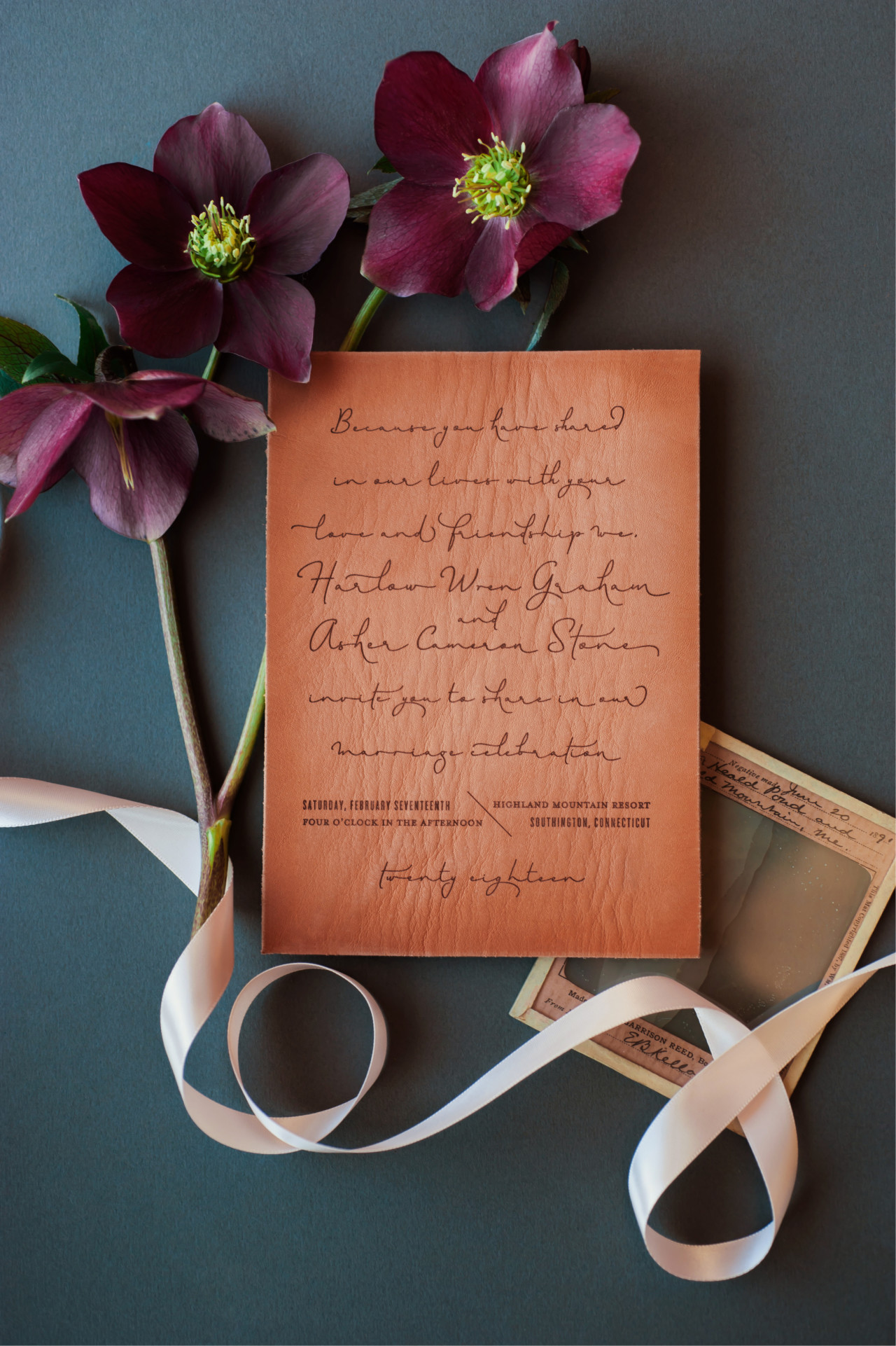
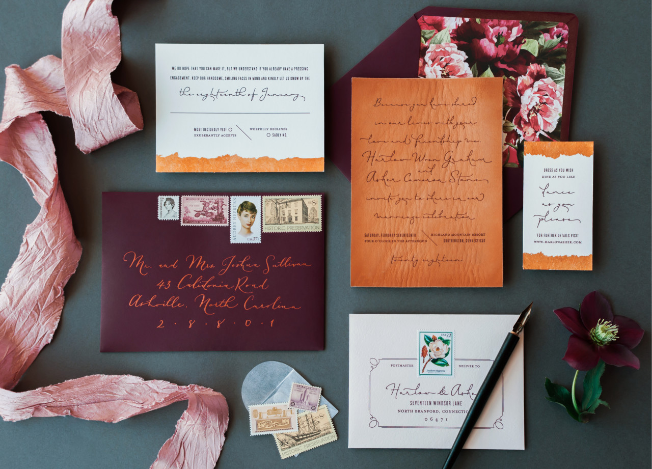
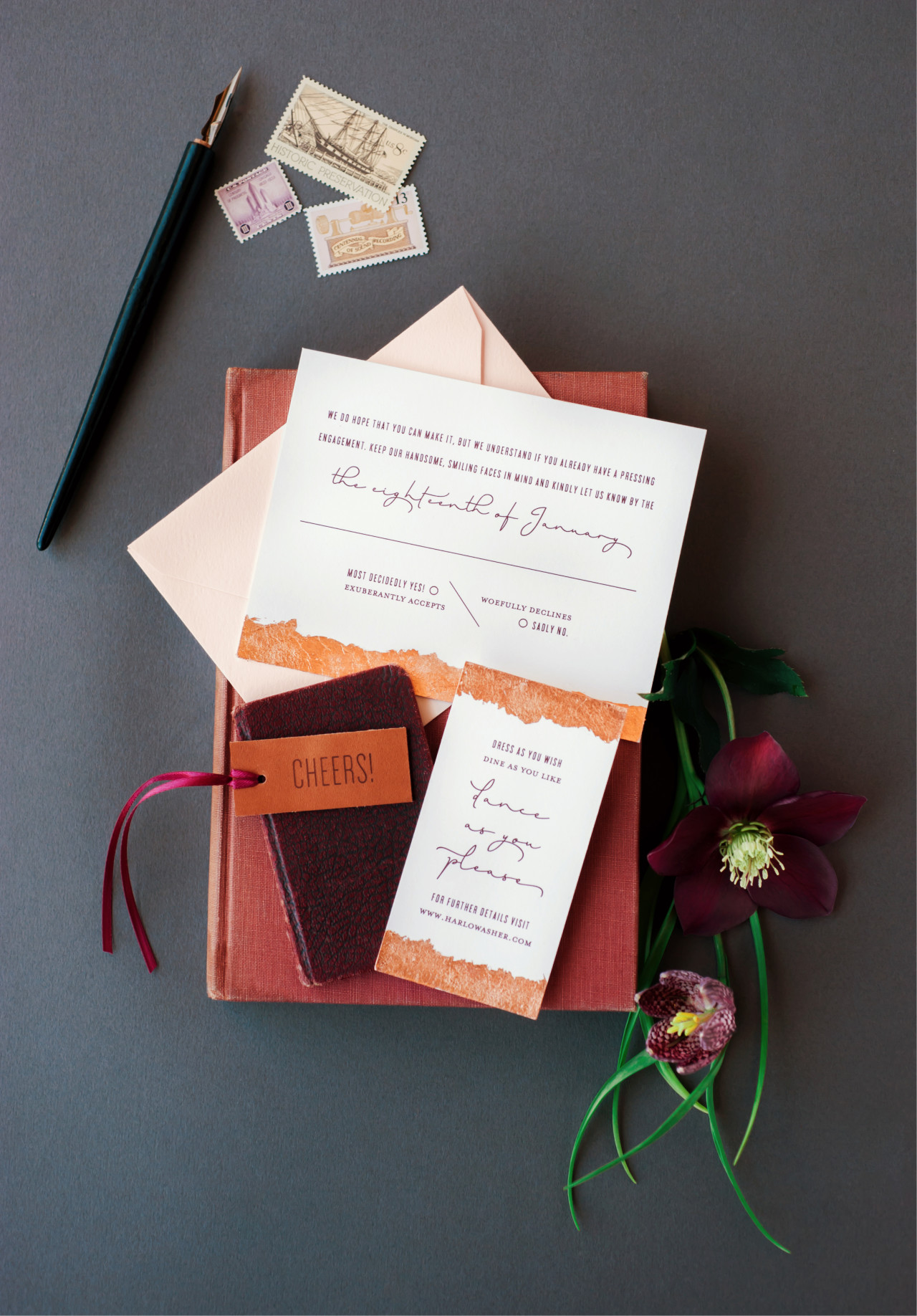
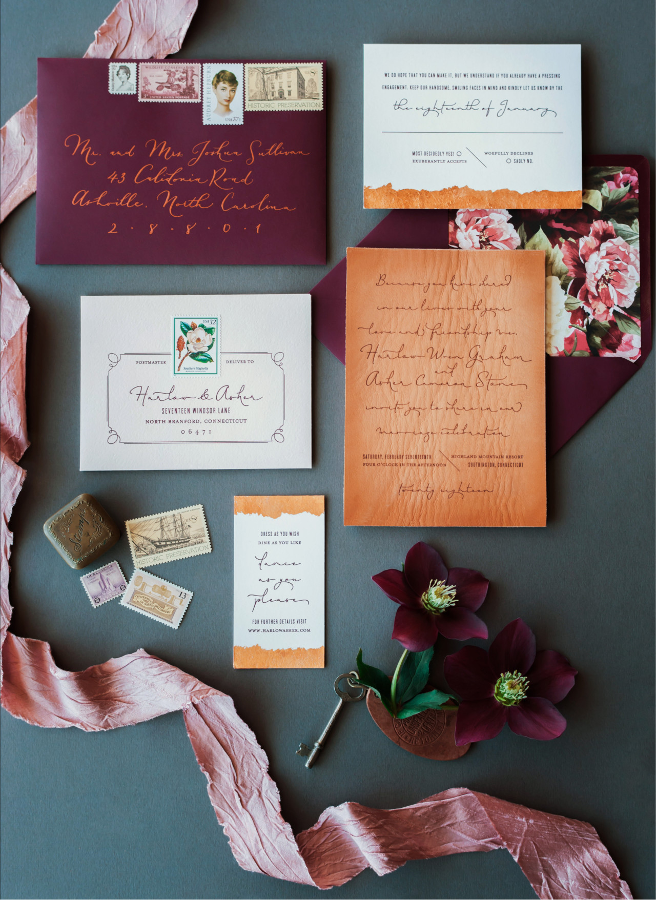
Collecting inspiration is a great way to kick off the process. This could be as simple as making a folder on your computer to save images as you’re browsing wedding blogs, clipping things out of magazines, or creating a Pinterest board specifically for invitation ideas (my personal favorite!). Below is an inspiration board I’ve created for example:

Invitation-101-Where-to-Start-1

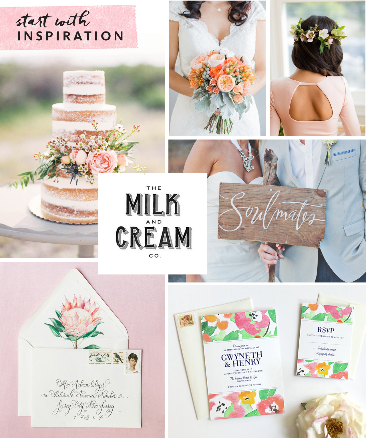
Clockwise from top center: Bouquet via Southbound Bride; Hairstyle via Refinery29;  Soulmates painted sign Julie Song Ink; Invitation by Fine Day Press; Envelope & liner by Lana’s Shop; Naked cake via Wedding Sparrow; Milk & Cream type via Pinterest

Don’t just collect examples of invitations – think about colors, textures, ribbons, flowers, anything that might inspire you – like a throw pillow that’s the perfect shade of coral or the lace detail on the back of a dress.

Start researching stationery shops (whether brick & mortar or online) to identify a few you might like to work with. Found a stationer you like? Most stationery companies allow you to order a sample, so that you can see the paper and quality in person before committing to a bigger purchase. Local shops will have samples on hand for you to touch and feel.

CUSTOM OR READY-MADE?

There are as many ready-made invitation styles out there as there are brides-to-be, and finding an existing design can be a great option. Your selected design can often be customized with your colors and typography choice, among other details.

If you love being part of the creative process, or have a very specific design idea for your suite, a custom design may be for you. Crafting a custom design typically takes longer and may involve an initial meeting, moodboard development (this is where that inspiration you’ve collected comes in handy), and multiple rounds of design development. Budget will come into play here as well, as creating a from-scratch design requires significantly more hands-on time and pricing usually reflects this.

TO SAVE OR NOT TO SAVE

Sending out a Save the Date is a great way to give everyone on your list a heads up on your plans, and set the tone for the invitation to follow. Save the Dates are a great opportunity to do a less formal version of your invitation – for example, a magnet, a balloon or even a temporary tattoo are fun ideas! If you are having a destination wedding in a far-flung locale, a Save the Date is a must, in order to give your guests sufficient time to plan their travels.

Invitation-101-Where-to-Start-2

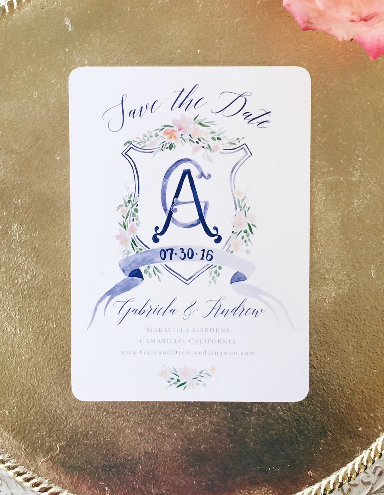
A beautiful printed Save the Date from Designer Rolodex member Sable & Gray

Are mailed Save the Dates a must-do? Not necessarily! If you are getting out your invitations super early, you could skip it. Or perhaps your wedding is small enough that word of mouth is sufficient until the invitations are sent. Some folks may prefer to send a digital Save the Date. This can also serve to direct guests to your wedding website. Keep in mind, though, that less digitally-savvy relatives (hi, Grams!) may feel left out with this option.

We’ll cover invitation timing in greater detail in a future installment of this series!

Happy Weekend!

Happy Friday everyone! I hope you all had an excellent first week of August! This week was a bit of a whirlwind for me, so I’m looking forward to a (hopefully) relaxing weekend. We went blackberry picking last weekend, but it was SO hot and the girls ran out of steam after about 15 minutes, so I’m thinking we’ll just hang poolside this weekend (if the weather cooperates). But in the meantime…

Rachelle Sartini Garner Calligraphy / OSBP

Image by Rachelle Sartini Garner Calligraphy via Instagram

…a few links for your weekend!

This week on Oh So Beautiful Paper – we were almost entirely dedicated to recaps from the 2016 National Stationery Show!

That’s it for me this week! We’ll be back later this afternoon with this week’s cocktail recipe – we have a brand new recipe theme for this month that I’m excited to share with all of you! Have a fantastic weekend, and I’ll see you back here next week! xoxo

The 2016 National Stationery Show, Part 13

Today we’re in for another double header recap from the 2016 National Stationery Show – and this time we’re all about letterpress exhibitors! With a total of sixteen exhibitors over the two posts, you’re in for some serious letterpress printed eye candy. This first installment includes Richie Designs, Inclosed Letterpress Co., Dahlia Press, Huckleberry Letterpress Co., Chez Gagné, My Darlin’, Violet Press, and Paper Bandit Press. Let’s get right to it!

NSS 2016: Richie Designs / Oh So Beautiful Paper

NSS 2016: Richie Designs / Oh So Beautiful Paper

NSS 2016: Richie Designs / Oh So Beautiful Paper

Continue reading