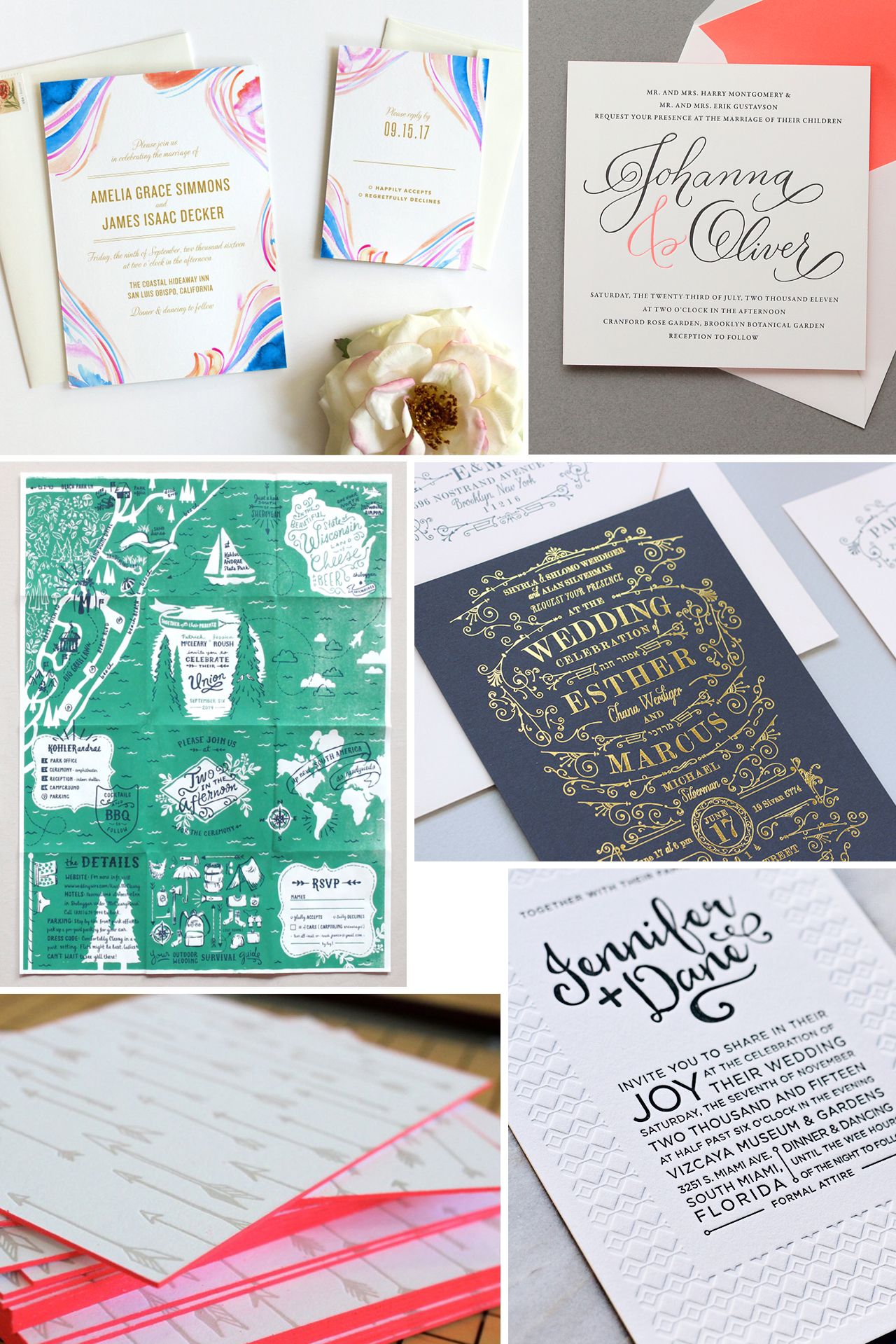
Hi guys, Ashley from Fine Day Press here! Welcome back to our Wedding Invitation 101 series, all about wedding invitations. Today’s post covers wedding invitation wording and etiquette. Be sure to check out our previous posts covering how to get started, when to send, and printing methods for lots more helpful information.
Wording and Etiquette (and When to Break the Rules)
What information do you need to have on your wedding invitation? Whose names do you need to include? What order do you put them in? Fear not, we have all the answers to your invitation wording and etiquette questions right here!
Simply put, your invitation wording style should match the tone of your wedding ceremony. Will your wedding be traditional, formal, religious, secular, casual, fun, laid-back, modern? Whatever adjectives describe your big day, those can be your guide when you’re crafting the language of your invitation. Of course, your stationer (Fine Day Press included!) will be adept at providing insight as well as grammatical and logistical know-how.
Grammar and Punctuation
Bad grammar is never ok! Neither is incorrect spelling. Be sure your apostrophes, pronouns and spellings are all up to par. Apostrophes indicate possession and should not be used with plural names, for example, “The Smiths invite you…†NOT “The Smith’s invite you…â€Â Punctuation, such as commas and periods, are generally not included — but in less formal invitations, an exclamation point for emphasis is totally fine if it jives with your wedding style!
What to Include
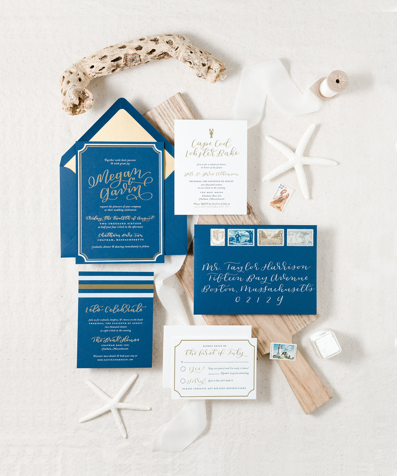
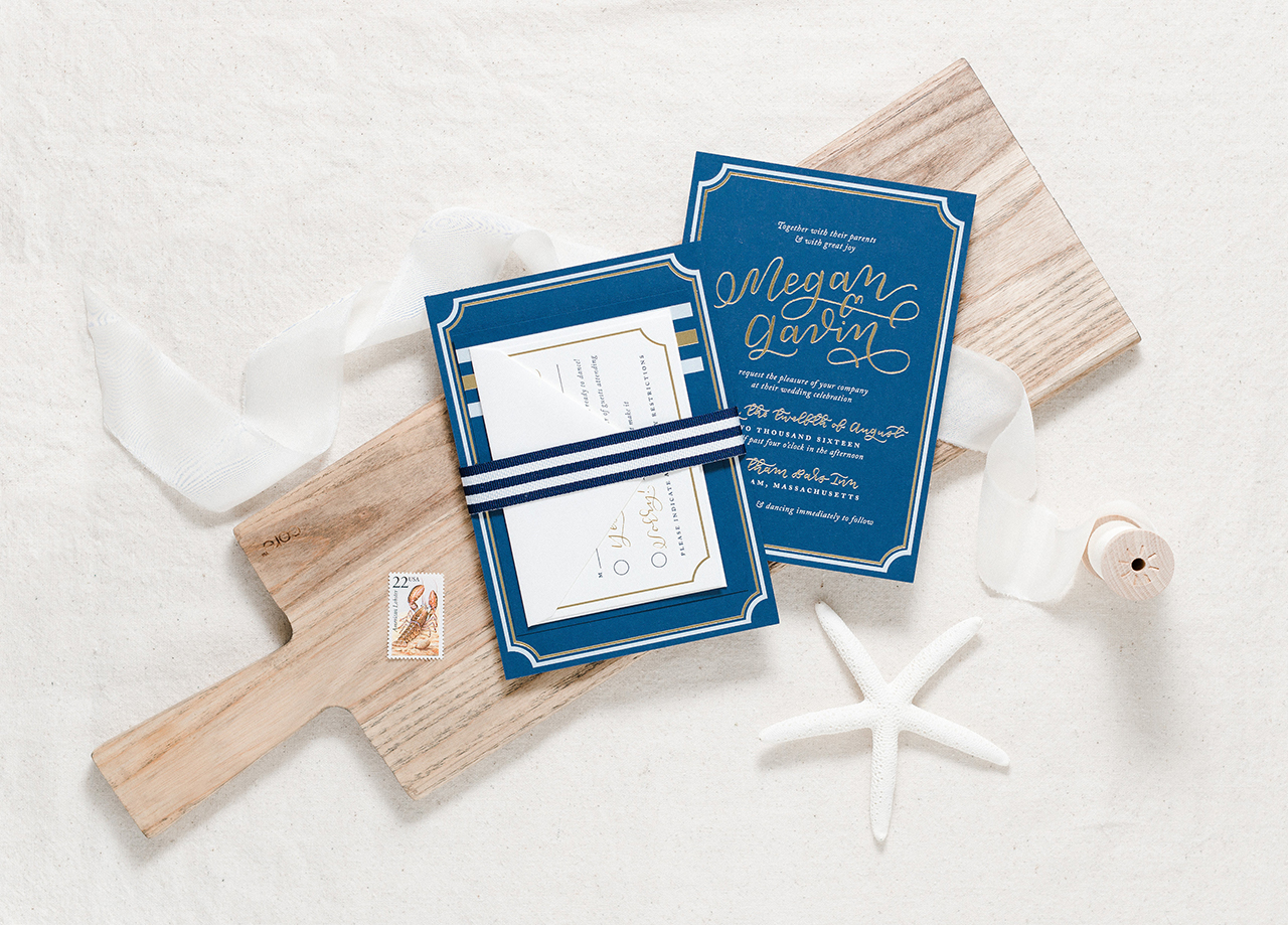
The information you’ll want to include will generally be in the order listed below:
Who’s Hosting
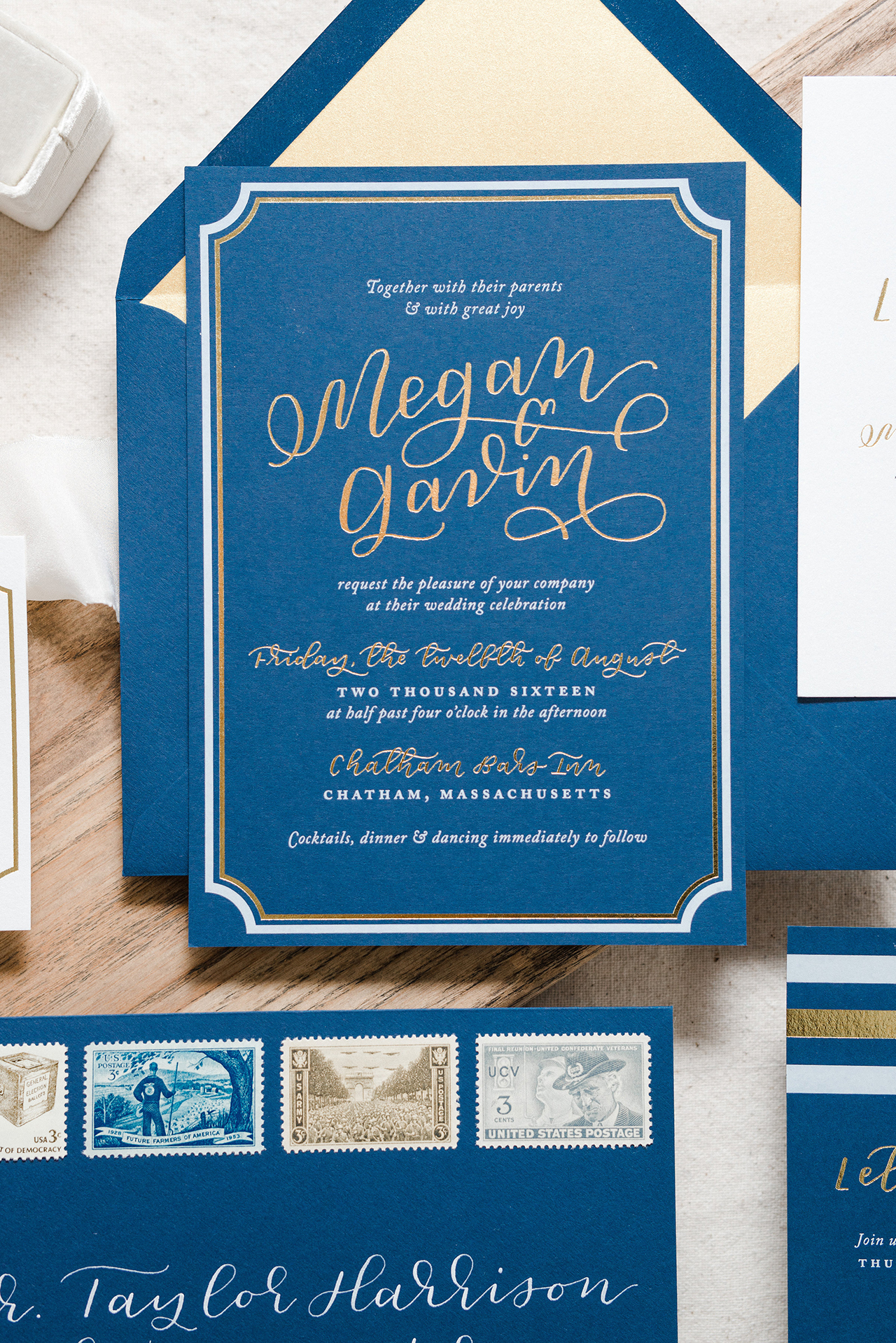
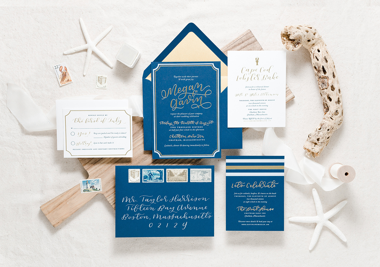
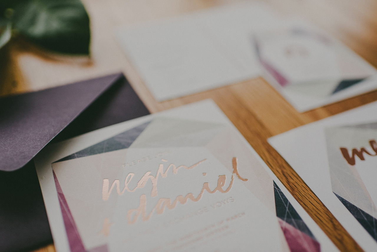
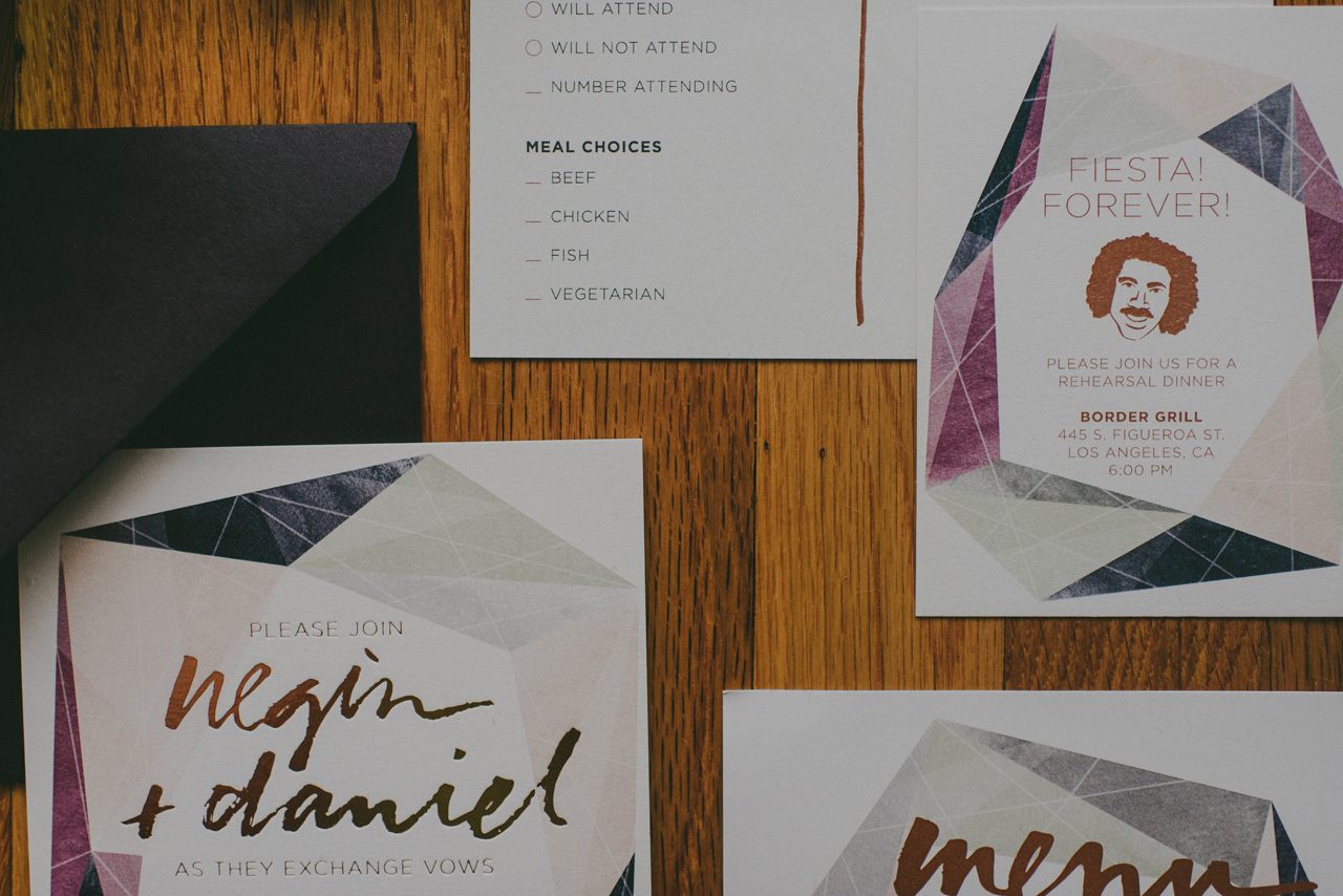
This is typically the very first thing listed on the invitation. It may be the parents of the bride, parents of the groom, the couple, or the couple with their families. This can be specific: “Mr. & Mrs. Robert Cannon invite you…†— or vague: “Together with their parents.†If the couple is hosting, you can start off with your names: “Emma and Robert invite you to celebrate their marriage…â€Â For divorced parents, you may choose to list their names on separate lines to indicate them as individuals. In the case of remarried parents, you can list them on the same line, separated by the word “and.â€
The words “Mr. & Mrs.†and the middle initials of parents (if including) should be the only abbreviations on your invitation. If someone is a Doctor or Reverend, spell those titles out fully. When including a deceased family member on the invitation, precede their name with “the late.†For example, “Emma Jane, daughter of Mrs. June Cannon and the late Mr. Robert Cannon.†If that feels too impersonal, perhaps add a line in memory of loved ones you’d like to remember on your ceremony day.
Request Line
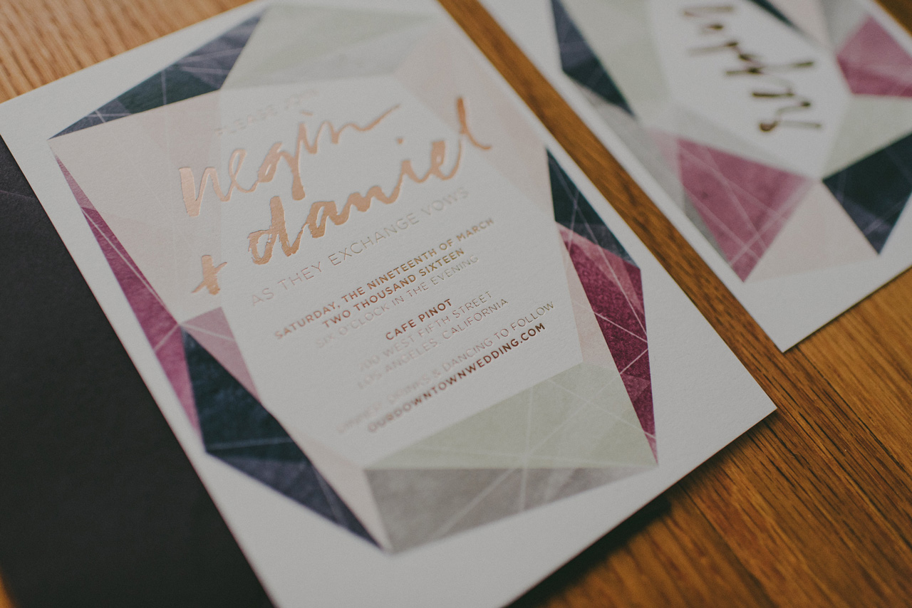
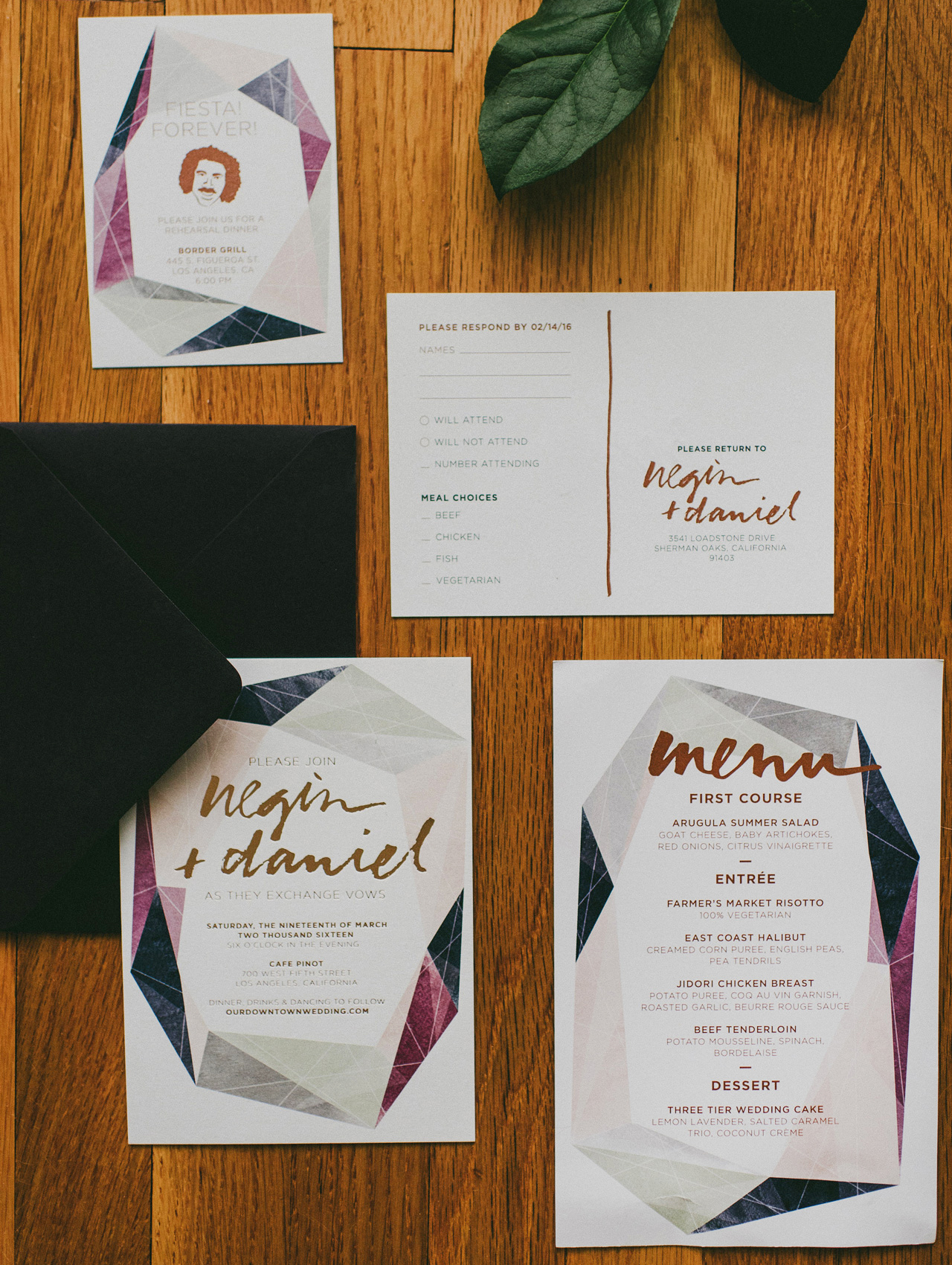
Are you asking people to celebrate with you as you exchange vows? Party with you as you tie the knot? Witness your love and commitment? There are a number of ways to say essentially the same thing, but each wording carries a different tone. Traditionally, religious ceremonies always request the honor of your presence., while secular events request the pleasure of your company.
Names of the Couple
This is pretty straightforward: first names only (casual), first + middle if listed with parents’ names, or first, middle, last (formal). See our wedding invitation wording cheat sheet for examples. The bride’s name is always listed before the groom’s. For two brides or two grooms, you can defer to alphabetical order or whatever looks best in the design.
Date and Time
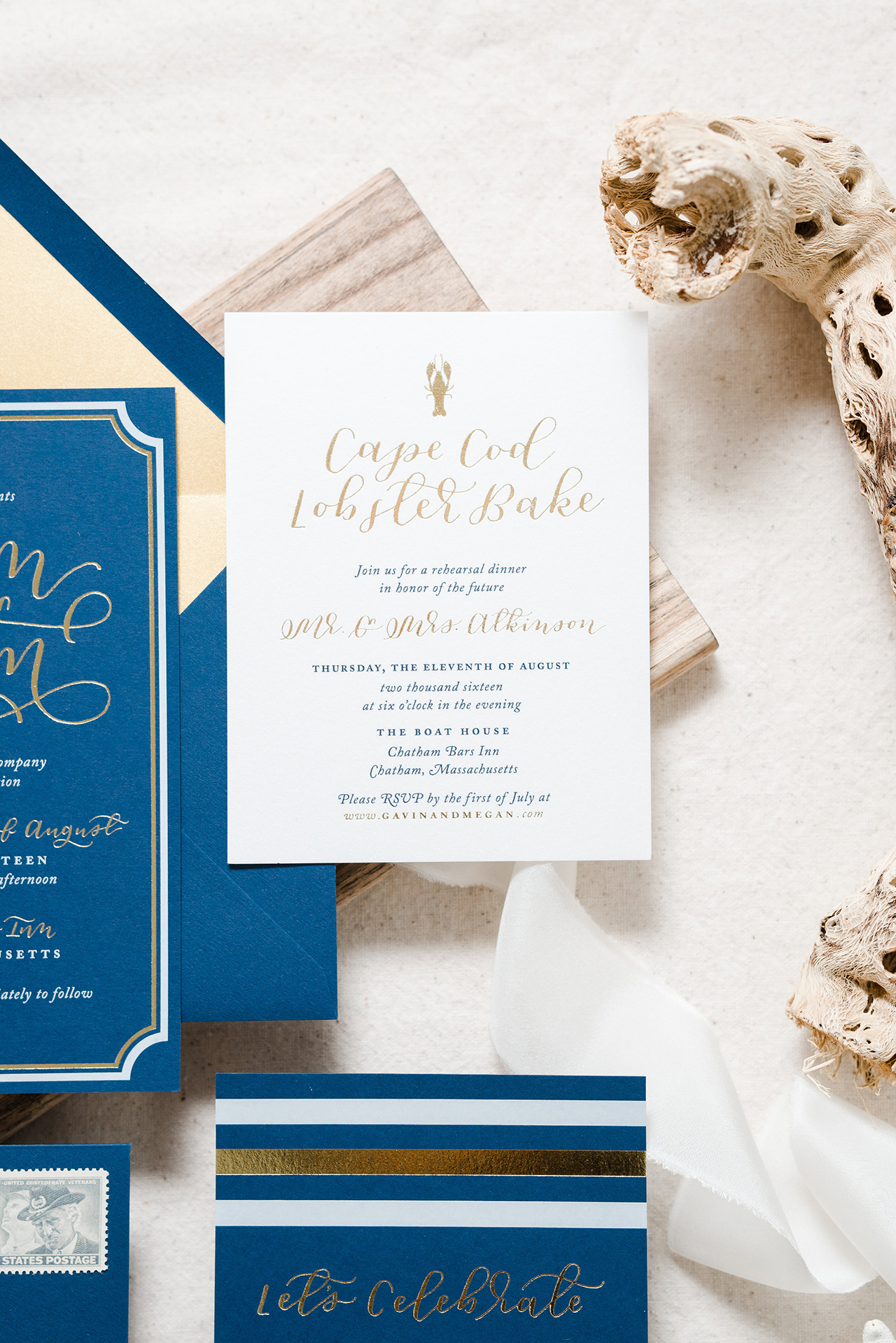
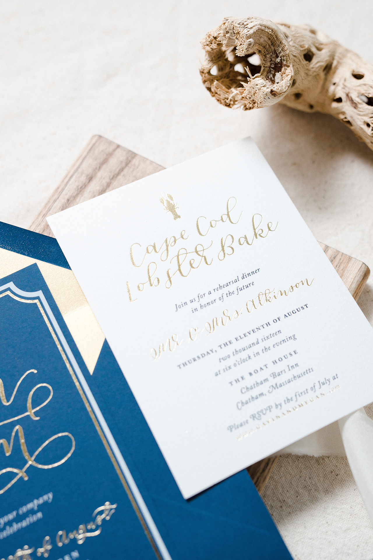
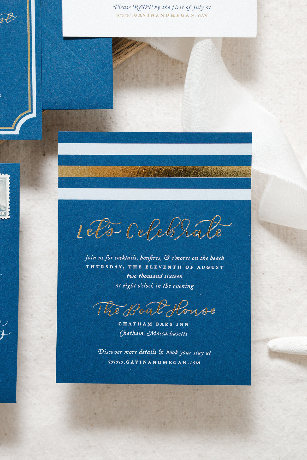
For traditional invitations, you’ll spell out dates and times in full (i.e. two thousand sixteen NOT 2016 and four o’clock not 4:00). However, occasionally a design will call for bold, modern typography that calls out the dates in numbers rather than words, and this is A-ok in my book. Generally, times will include a reference to time of day — such as “half past three in the afternoon†or “six o’clock in the eveningâ€.
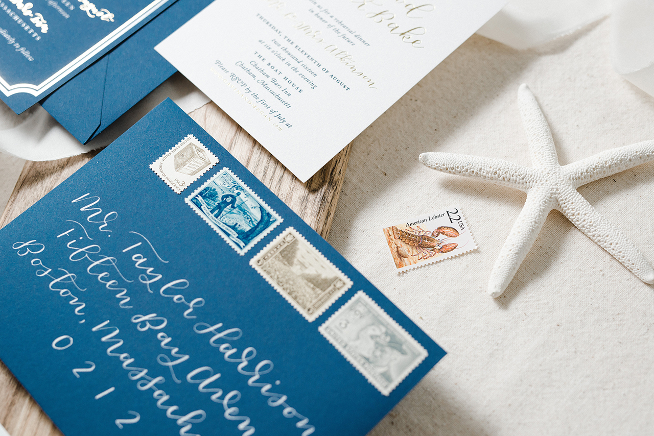
Location
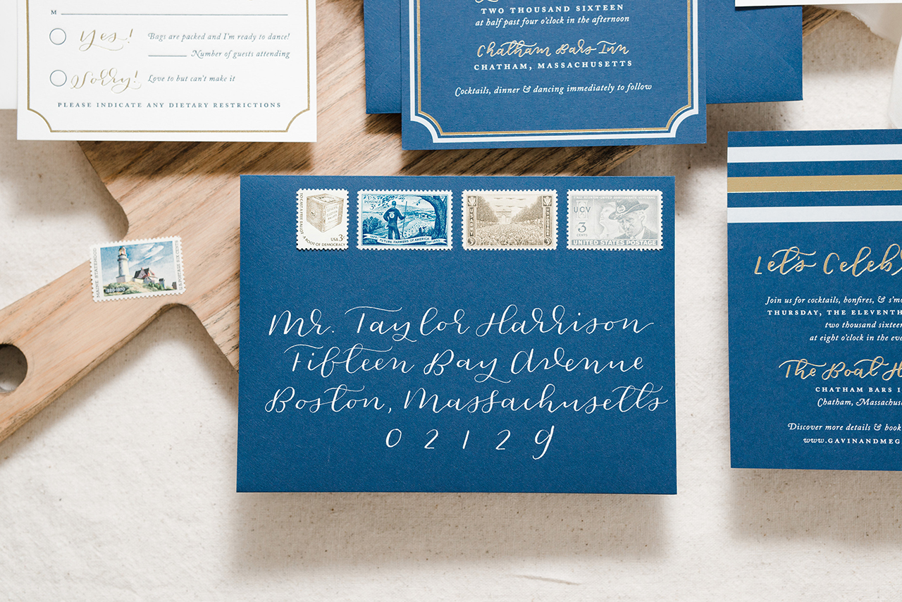
This includes the full venue name on one line, with the city and state on the following line. Listing the full address is optional and often not included. For private addresses however, such as family homes, the full address should be listed.

Above: Fine Day Press created this handy wedding invitation wording cheat sheet you can use to get started! Download it here.
Dress Code
You don’t have to list a dress code, but this can be a very helpful guide for your guests, and is absolutely required if your ceremony is black tie. Dress code should be listed on a line following the location. You can get creative here too, with a phrase like, “colorful island chic†for an oceanside destination wedding. If your wedding has a theme, like a Great Gatsby-inspired garden party, you can suggest similar dress, but worded in a way that makes sure guests know it’s okay to not fit the theme exactly: “Dress code: Semiformal /1920s-inspired attire encouraged but not requiredâ€. Remember, dress codes are meant to be encouraged, not enforced.
Lastly, keep in mind the environment and potential weather issues. For example, if your wedding is on grass or sand, you may want to say â€Stilettos not advised†or “Pack your flip flops for the ceremony†to give your guests a heads up on what’s appropriate. Likewise, if you are having an outdoor ceremony in potentially chilly weather, suggest bringing a wrap or sweater.
Post-ceremony details
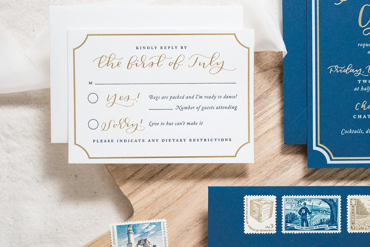
Think about what your guests need to know about the reception or any other post-ceremony festivities. A standard one would be, “Reception immediately following / Venue name.†However, you can have fun and show your personality here, too. For example: “Tequila shots and bad dance moves to follow†or “Cocktails, revelry and dancing to follow.† This information can also be printed on a separate card, smaller than the invitation.
Saying No Children
“Can we say we don’t want children at my wedding?”
I get this question a lot – and yes, it’s totally ok to say “no kids, please!â€Â Your guests will understand.
The most subtle way to do this is to address the invitation to the parents only. By not including the kiddos’ names on the envelopes, it’s implied that they are not invited. But this may be too subtle an approach that many guests might ignore. I suggest more direct wording included on the invitation to be sure you get the point across.
To do this, add the line, “This invitation is extended to adults only†or, more briefly, “Adults only†at the bottom of the invitation. Some couples like to differentiate the ceremony from the reception. “Your children are welcome at our ceremony. The reception is for guests 16 and up. Thanks for understandingâ€Â or simply “Our reception is for adults only†will suffice.
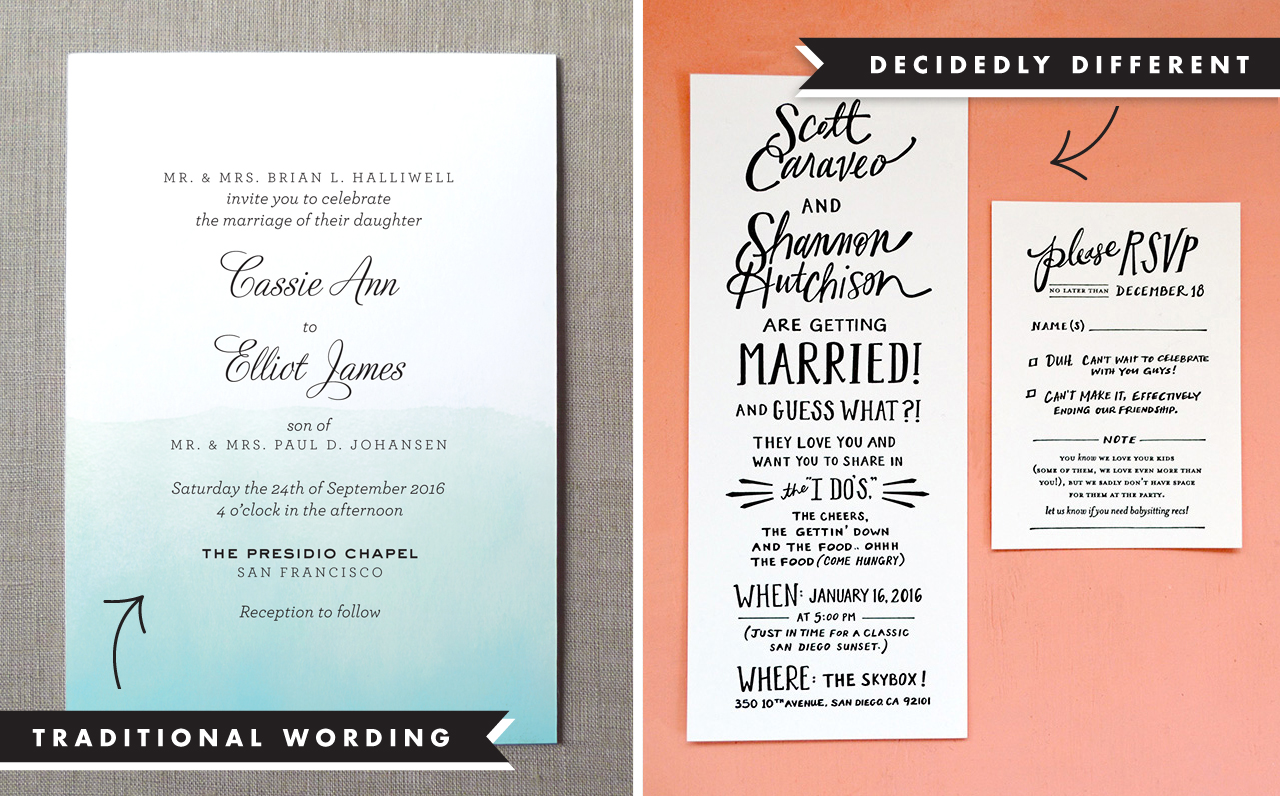
Above: Which route will you go? A traditional wording example, on the left, from Fine Day Press; On the right, a creative wording example from Odd Daughter Paper Co.
It’s Okay to Have Fun
It’s totally okay to throw out all of the above rules (except for the grammar and spelling, of course!) — as long as your invitation contains the necessary information (who, when and where), you can get as creative and personal as you like.
Want to work in your beloved pup’s name on the invitation? Do it! Want to include your shared love of wine or travel, or even the story of how you met? Go for it! After all, this is your special day , and the invitation will be something you can treasure and keep forever.
Every family and couple is unique; ultimately, you and your families will decide what’s best for your event.
Stay tuned for our fifth and final post, about mailing your invitations! (Hint: it’s not as simple as you think.)