{happy weekend!}

Happy almost weekend everyone!  Do you all have fun plans for the weekend?  My husband and I are looking forward to hanging out with some friends, attending one of our favorite antique fairs here in DC, and hopefully going to see a movie.  It’s been months since we last went out to the movies, which is really unusual for us!  But in the meantime…

…a few links for your weekend!

This week on Oh So Beautiful Paper:

We have another fun cocktail coming up for you this afternoon, so check back a bit later for the recipe!  I hope you all have a wonderful weekend, and I’ll see you back here on Monday! xoxo

Photo Credit: Scissor Variations

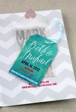
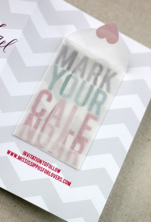
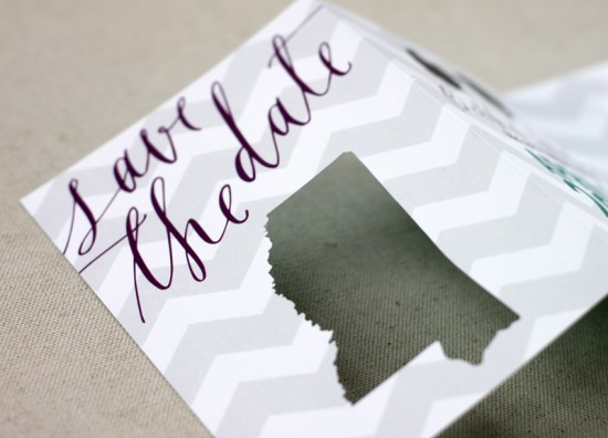
Beth + Michael’s Chevron Stripe Calligraphy Save the Dates

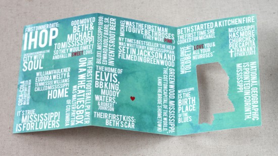
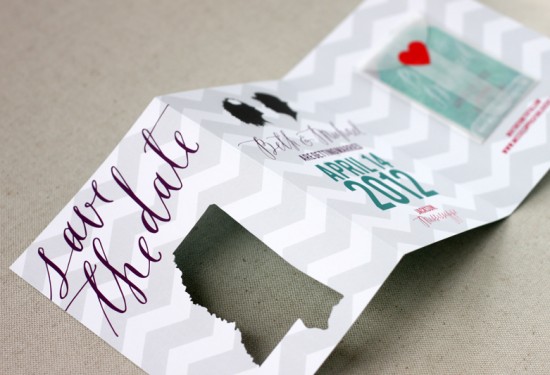
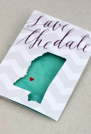
My oh my, I’m seriously in love with these save the dates. Created by Sarah of August Blume, Beth and Michael’s modern and whimsical save the dates combine beautiful lettering from Feast Calligraphy, chevron stripes, a fun interactive layout, and cut-out details. So cute!

From Sarah: I had the pleasure of designing a save the date card (and getting extra creative) for photographer Beth Morgan and her beau, Michael, for their spring 2012 wedding.  With a palette of teal, plum, fuchsia & slate (and the occasional red heart), we mixed their “Mississippi is for Lovers” theme with custom silhouettes and a muted chevron pattern.

We wanted a unique, interactive save the date to set the tone for their April wedding and to get guests excited about traveling to the South.  The couple met and fell in love in Mississippi so we included little-known-facts about the couple and their state on the back of the trifold card with a teal watercolor background.


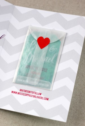
The last panel features a mini glassine envelope holding a hang tag so guests can mark their calendar!  The calligraphy was penned by the very talented Alissa of Feast Calligraphy.  The cards were digitally printed on solar white cover stock and each Mississippi was individually cut using my Silhouette Cameo.

I love it!  Thanks Sarah!

Check out the Designer Rolodex for more tal­ented wed­ding invi­ta­tion design­ers and the save the date gallery for more beau­ti­ful cus­tom save the dates!

Photo Credits: August Blume

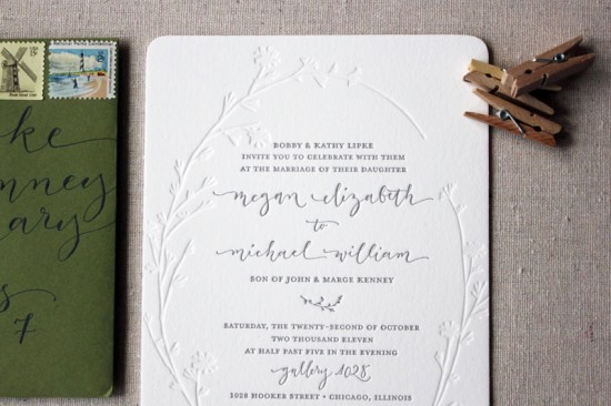
Megan + Mike’s Modern Organic Chicago Wedding Invitations

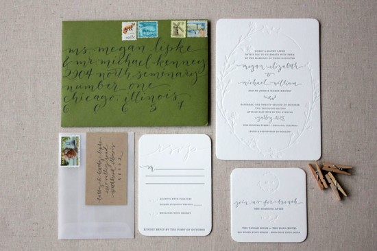
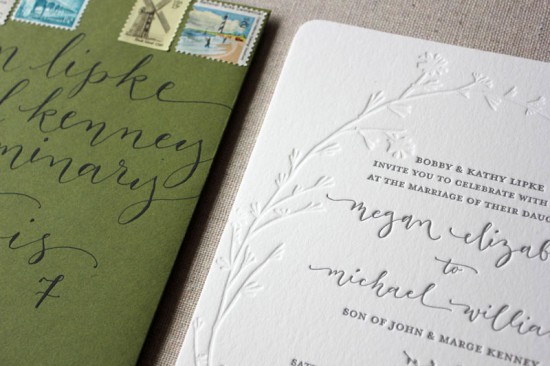
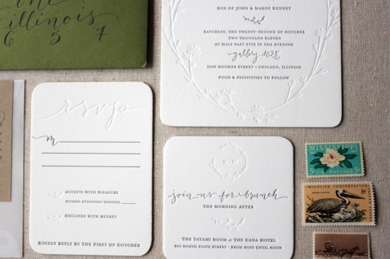
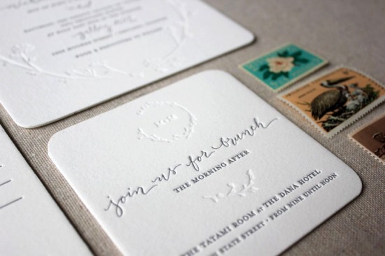
Happy New Year everyone!  We’re getting back to business and starting the new year off with a gorgeous wedding invitation suite from Megan of Ruby the Fox.  You may remember Megan’s awesome stitched save the dates from last April, and I’m just as much in love with her wedding invitations.  Megan wanted to keep the design simple and understated, with modern details in the blind impression letterpress elements, gorgeous calligraphy from Angelique Ink, and a custom garland illustration by the talented Shanna Murray.  So beautiful!

From Megan: Being a stationery designer, I knew our invitations had to be special, represent us as a couple, and reflect our vision for our wedding.  We chose to go very understated, organic, and simple with a clean color palette.

We utilized some amazingly talented vendors to make our vision come together.  We commissioned Shanna Murray to create the beautiful one-of-a-kind garland we used throughout the wedding suite.  Angi Phillips of Angelique Ink graced us with her gorgeous calligraphy and we found vintage stamps through The Paper Nickel Stamp Company.  We lined the envelopes in a white tissue paper which was possibly the only traditional part of the entire suite!

Thanks Megan!

Check out the Designer Rolodex for more tal­ented wed­ding invi­ta­tion design­ers and the real invi­ta­tions gallery for more wedding invitation ideas!

Photo Credits: Ruby the Fox

Kendra + Robb’s Rustic Woodgrain Wedding Invitations

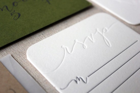
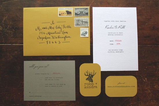
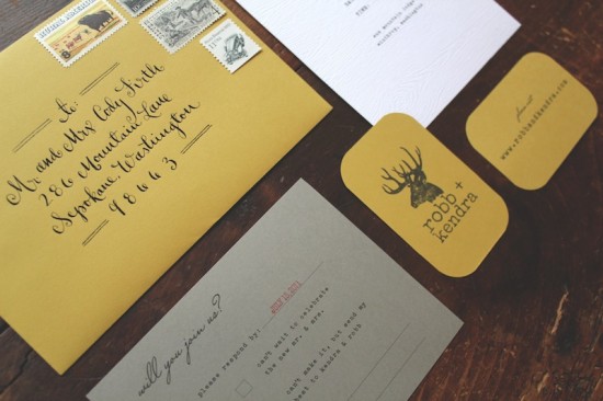
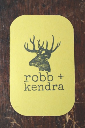
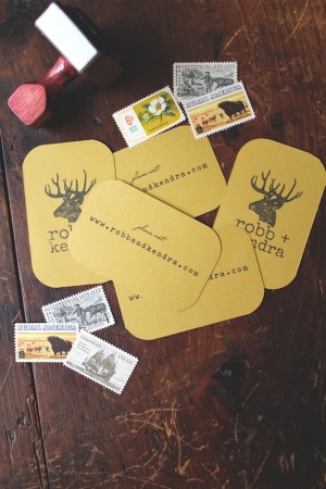
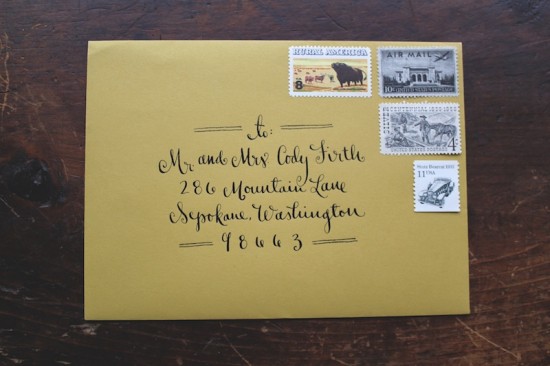
These gorgeous and woodsy wedding invitations come to us from Sally at La Happy, designed for an outdoor wedding in Washington state this past summer.  Sally kept the actual invitation simple and relaxed, bringing in hand stamped website cards and beautiful vintage stamps (not to mention stunning calligraphy) to pull the entire invitation suite together.

From Sally: I created this invitation for an outdoor rustic wedding in Winthrop, Washington, which is in the backwoods of Washington State.  The inspiration was the groom’s love of all things outdoors: camping, hiking, etc.  The bride and groom wanted a rustic wedding with a non-fussy, vintage feel, so we tried to incorporate that into the paper design.

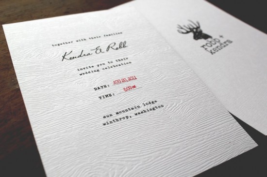
The colors of the wedding were really earthy.  Mustard yellow was a key color, then we brought in the stone gray as a neutral color to complement the yellow.  I created the “deer logo” for the wedding and then made a custom stamp out of it and stamped all of the paper pieces.  The invitation was printed on faux bios (a faux wood grain) paper, to relay the feel of the woods and the outdoors.


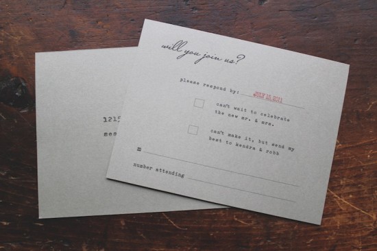
I created custom stamps to look like an industrial time stamp to use for the date and time of the wedding.  The bride and groom wanted to make sure the invitations did not feel fussy, so we made sure everything had a more industrial, vintage feel.  The RSVP card is a postcard with vintage stamps.  We worked with the lovely (and SO helpful) Virginia Sauder of Verde Studios to find the perfect vintage postage to fit the set.

Thanks Sally!

Invitation design + calligraphy: La Happy

Vintage Stamps: Verde Studio

Check out the Designer Rolodex for more tal­ented wed­ding invi­ta­tion design­ers and the real invi­ta­tions gallery for more wedding invitation ideas!

Photo Credits: La Happy

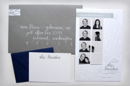
Alix + Brandon’s Photostrip and Letterpress Save the Dates

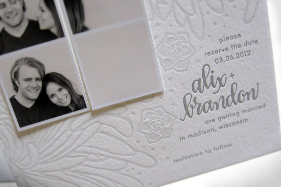
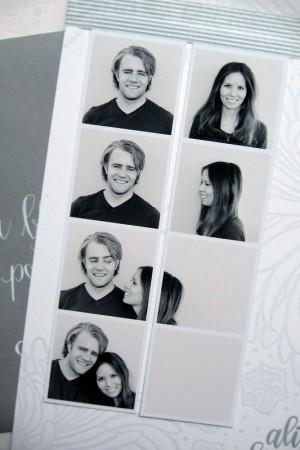
Happy Monday everyone!  We’re starting the last week before the Christmas holiday with a fun and totally cute save the date from Tara at Ephemera Press!  Alix and Brandon chose to incorporate faux-photo booth strips into their save the date, paired with a gray letterpress card with Tara’s illustrations and calligraphy.  So pretty!

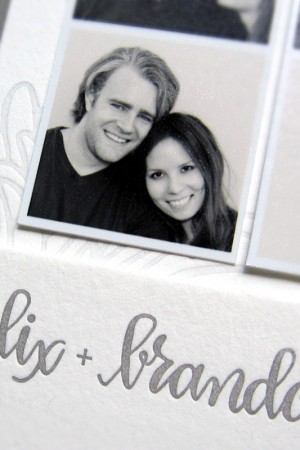
From Tara: Alix and Brandon had engagement photos taken by Wisconsin-based photographer Anna Page.  They had this fun idea to fake some old-fashioned photo booth strips, and crop things to that Alix was walking into the frame with Brandon.  I thought it was so clever!  We adhered the photos with washi tape, which was a perfect choice since Alix is half Japanese, and adores the Japanese aesthetic.

Alix asked me to design a letterpress card for these photos that was clean and organic, yet incorporated the chrysanthemums and succulents that will be at her reception next August.  A tall order!  We made it work by sticking with a monochromatic look, and lightening the ink so it was nice and subtle.  The type floats in the lower right corner and balances out the design overall.  The couple’s names are highlighted in my calligraphy.  I think it looks particularly good in all lower-case like this.


Finishing touches were coordinating gray envelopes, a matching letterpress wrap-around return address label, and hand-lettered guest addresses in white ink.  Alix and Brandon also got super-simple thank you cards.  I can’t wait to start on the invitations!

Thanks Tara!

Check out the Designer Rolodex for more tal­ented wed­ding invi­ta­tion design­ers and the real invi­ta­tions gallery for beau­ti­ful cus­tom wed­ding invitations!

Photo Credits: Ephemera

p.s. Tara tells me that she’s currently offering a $100 discount on wedding invitation orders from now until December 30!  Check out the details right here!