Happy Tuesday everyone! We ended up getting a few inches of snow (and ice) over the President’s Day weekend, so I thought it would be perfectly appropriate to start with these winter foliage wedding invitations from Julie of Hollyhock Lane for our first post of the week! The invitation suite features hand painted portraits of the bride and groom, along with colorful illustrations and modern brush lettering!
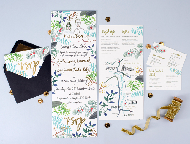
From Julie: This invitation suite was actually a special commission for my sister-in-law. When she got engaged, she knew immediately that she wanted to have a winter wedding. Being so close in timing to Christmas, Kate and Ben wanted to have a glitzy golden feel about their wedding, but they also wanted the design to include firs and winter berry foliage to tie in with the rustic theme of the rural barn where they would be holding their reception.
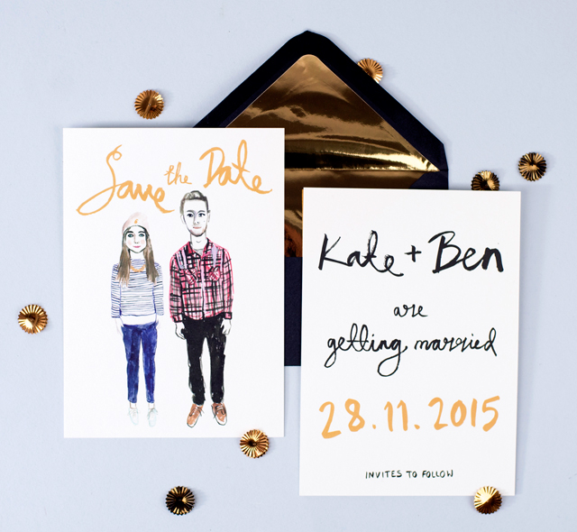
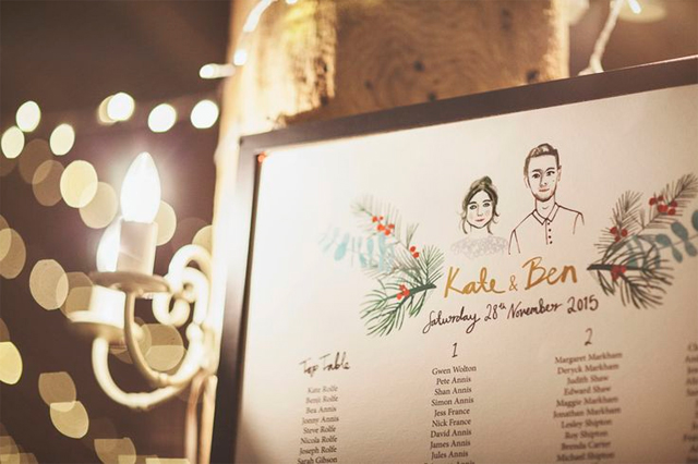
Kate and Ben liked the idea of having their own painted portraits within the stationery, and they liked the idea of being dressed in their signature casual clothes, hinting at their personality and interests (Kate herself being a fashion designer). However, we all decided this might not work for their actual invitations as it could look a bit too informal. So we decided to include the informal portraits on their save the dates, paired with some simple modern hand lettered script, giving the save the dates a slightly cheeky, relaxed feel.
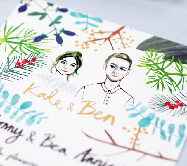
For the invitations, I adapted the same portraits to feature the head and shoulder shots of the couple, but this time capturing a glimpse of their wedding attire without giving away too many secrets of ‘the dress’.
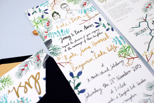
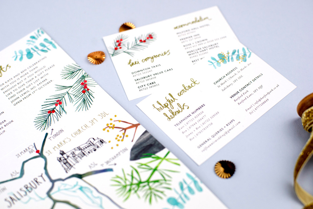
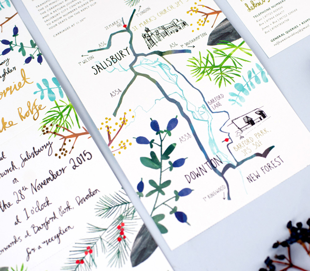
In terms of format, Kate and Ben loved the idea of a concertina folded invitation, which could include the invitation wording, a map of the church, reception venue and a few informative details, as well as a perforated reply slip which could be removed and sent as a postcard separately.
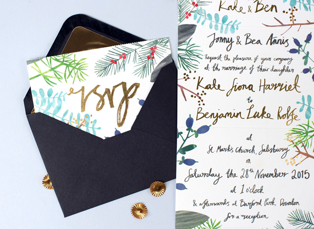
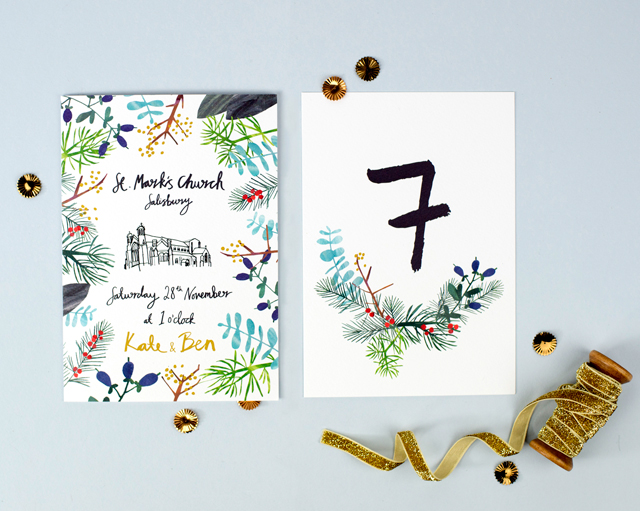
The whole design was framed with illustrated winter foliage of evergreens, firs, and berries in keeping with the wedding colours and which also repeated on the rest of the stationery. To give it a bit of wow factor and to match the gold used throughout the decorations on the day, we printed the invitation text in gold foil – which was also hand lettered in the same modern brush lettering that I had developed for their save the dates. The stationery was printed on GFSmith Callisto Pearl card, a beautiful off white colour somewhere between warm white and ivory, and with a soft delicate texture which lends itself so well to hand painted illustrations.
Thanks Julie!
Design: Hollyhock Lane
Printing: Century Studios
Check out the Designer Rolodex for more talÂented wedÂding inviÂtaÂtion designÂers and the real inviÂtaÂtions gallery for more wedding invitation ideas!
Photo Credits: Holly Booth Photography

