Moonrise Kingdom-Inspired Wedding Invitations

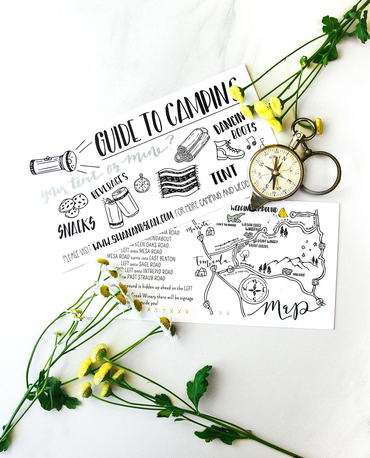
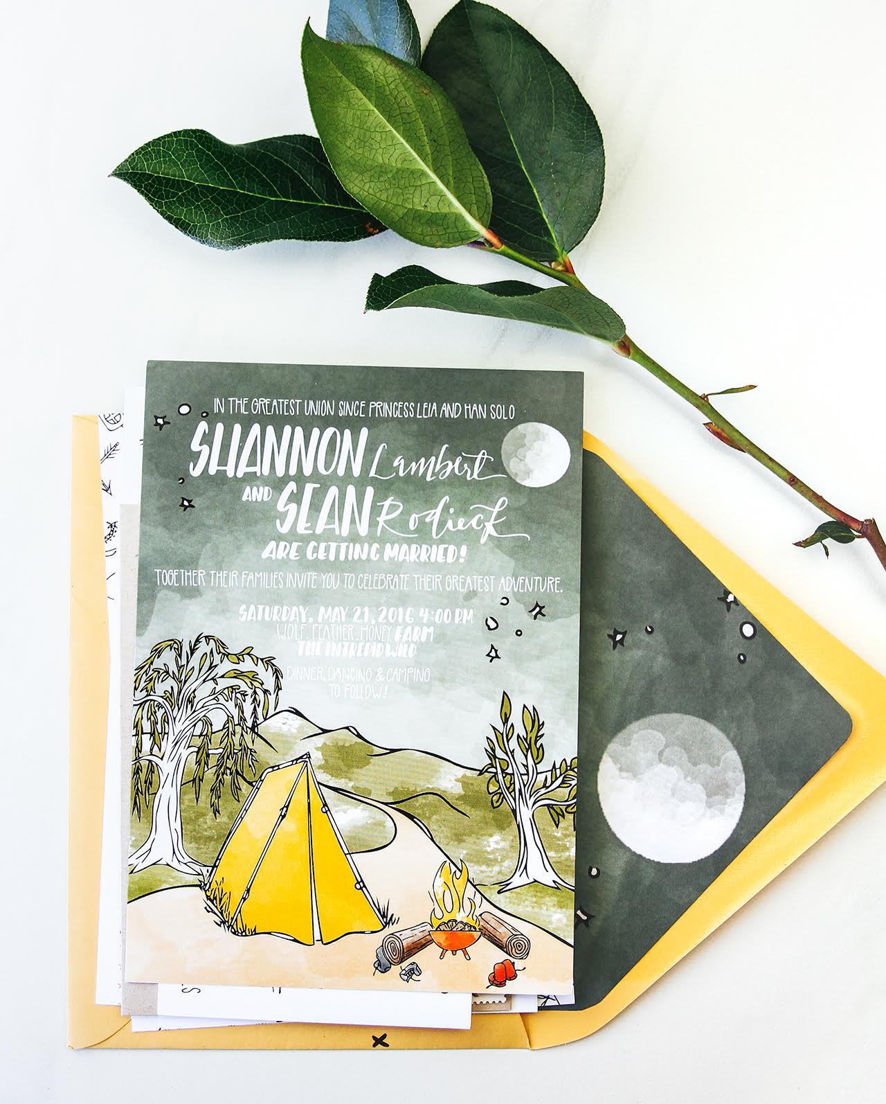
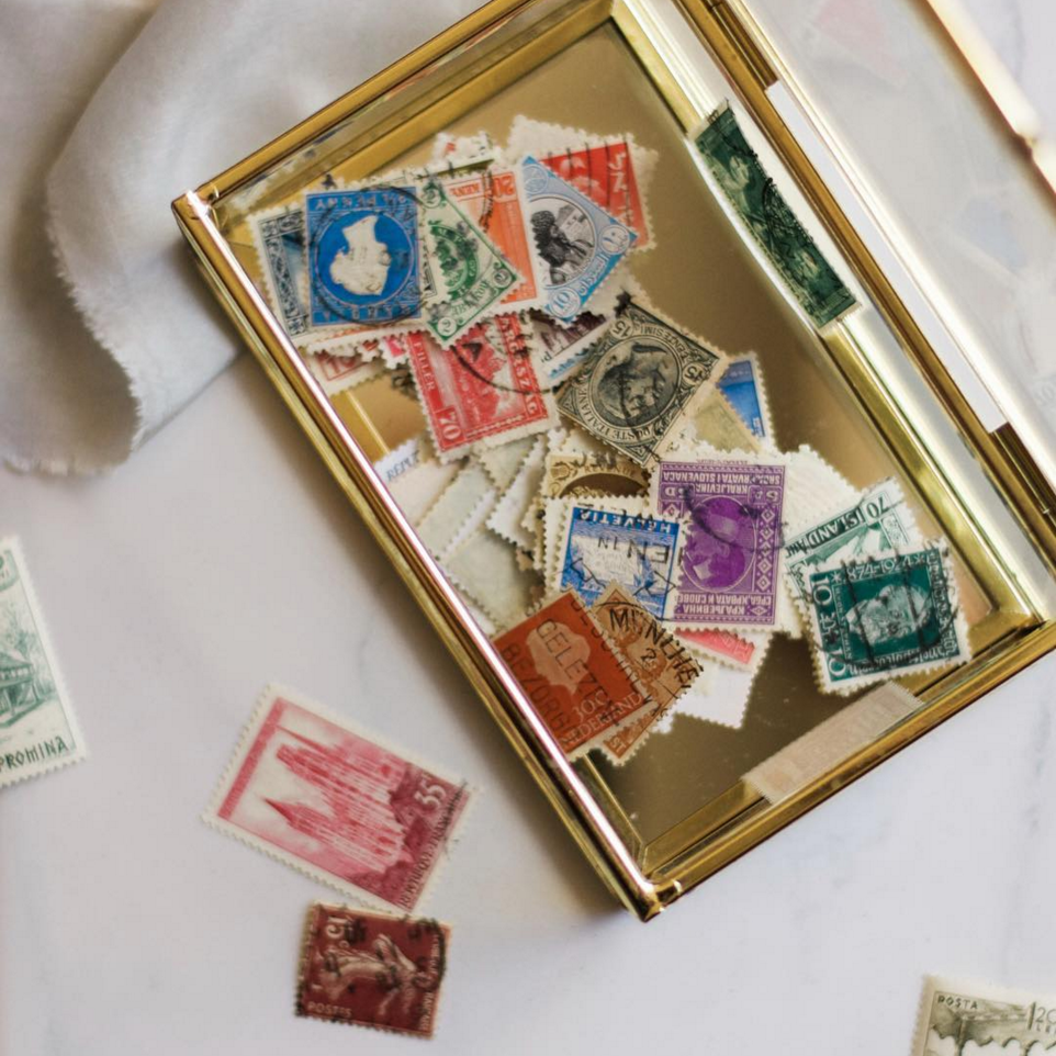
When you read the words “camping” and “Moonrise Kingdom” in an invitation submission, you know you’re in for a delightfully quirky and playful wedding invitation suite. Tori of The Cozy Gnome drew a handful of outdoorsy watercolor camping illustrations to bring these Moonrise Kingdom-inspired wedding invitations to life. Beautifully curated vintage stamps, bright mustard yellow envelopes, and simple hand lettering accent this rustic, yet whimsical, invitation suite!

Moonrise Kingdom-Inspired Wedding Invitations by The Cozy Gnome

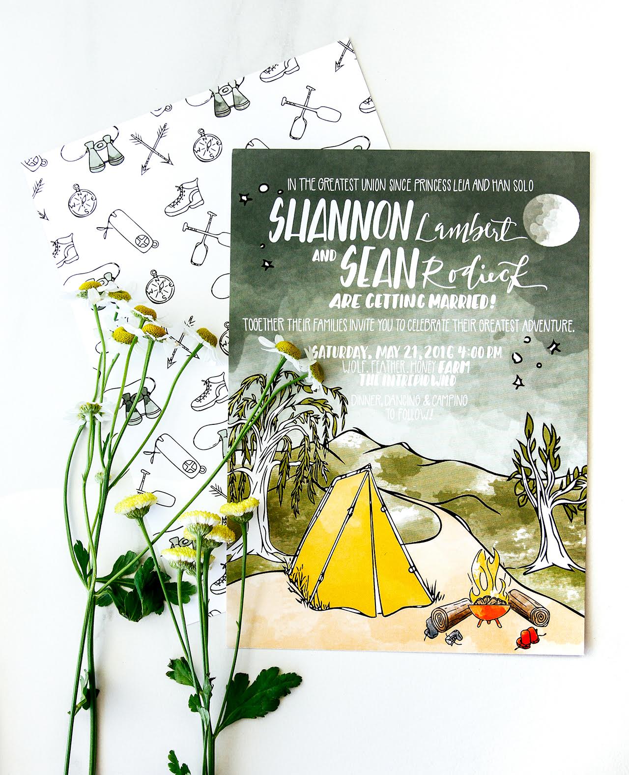
From Tori: I work the old fashioned way – by putting pen to paper, starting either with the lettering or the illustrations. In this case, there were so many fun, potential visuals so I starting drawing right away. The bride gave me two concepts for inspiration: camping and “Moonrise Kingdom.” As I started illustrating the tent and the trees, my excitement rose. I knew I wanted to keep the suite playful and full of warm tones so I spent a lot of time watercoloring the illustrations, allowing the white space to come through to give the invitation suite a more whimsical and outdoorsy feel.

Moonrise Kingdom-Inspired Wedding Invitations by The Cozy Gnome

Moonrise Kingdom-Inspired Wedding Invitations by The Cozy Gnome

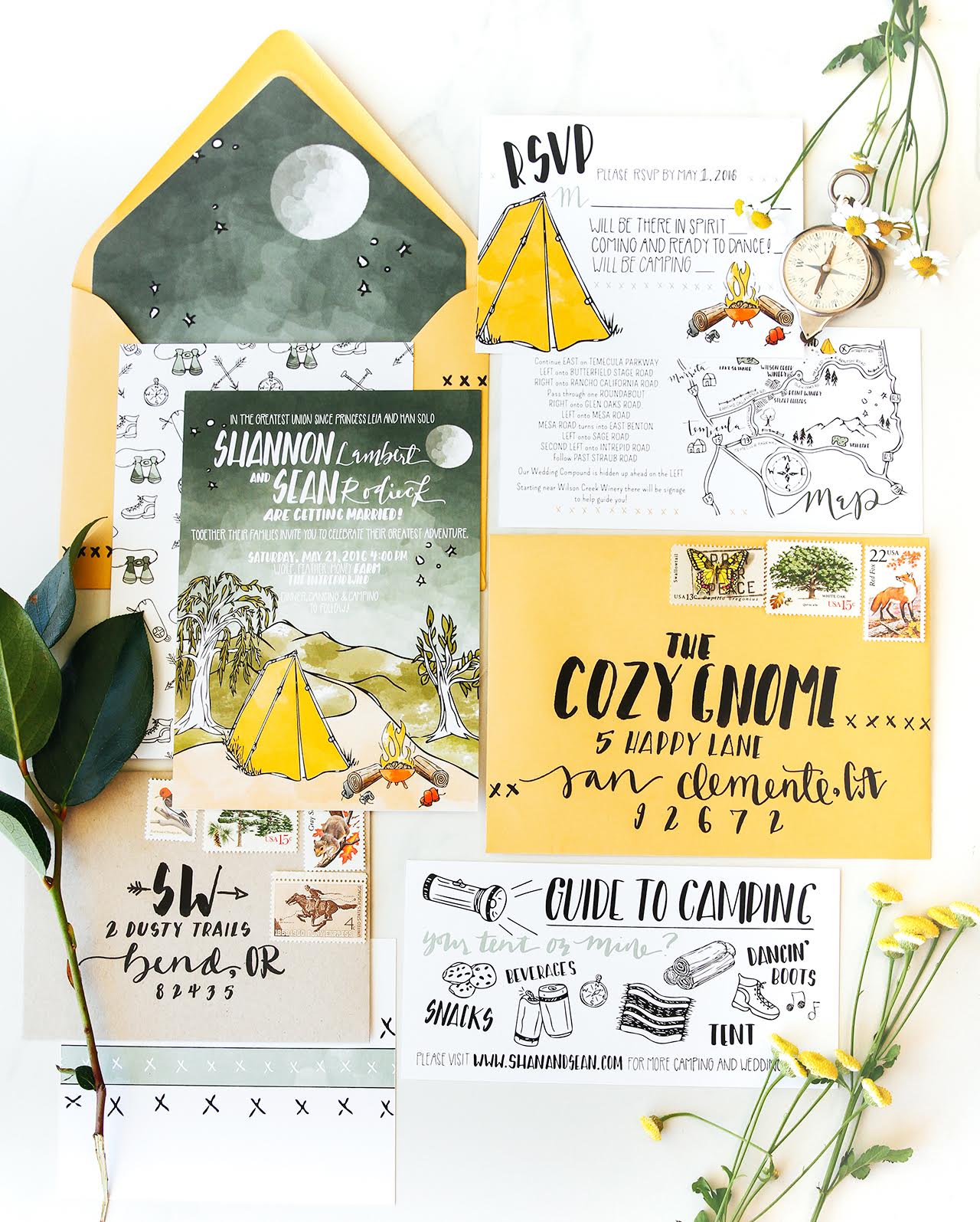
One of my favorite aspects of “Moonrise Kingdom” is Anderson’s homage to vintage decor and details, so I knew I wanted to incorporate that somehow. I collect vintage thermoses and knick knacks so I studied the lettering and before I knew it I was adding this chunky, retro lettering style to the suite.

Moonrise Kingdom-Inspired Wedding Invitations by The Cozy Gnome

Moonrise Kingdom-Inspired Wedding Invitations by The Cozy Gnome

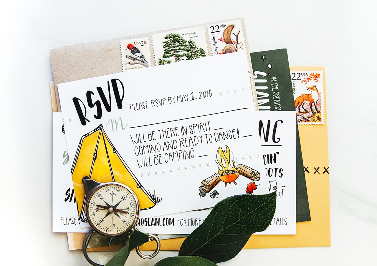
It all came together better than I envisioned and dreamed; it’s just so fun and playful which really propels you as an artist. The invitation suite was printed on a heavy, matte card stock. They really just burst with personality and that mustard yellow envelope just really pops!

Moonrise Kingdom-Inspired Wedding Invitations by The Cozy Gnome

Moonrise Kingdom-Inspired Wedding Invitations by The Cozy Gnome

Thanks Tori!

Design, Illustration, and Calligraphy: The Cozy Gnome

Printing: CatPrint

Check out the Designer Rolodex for more tal­ented wed­ding invi­ta­tion design­ers and the real invi­ta­tions gallery for more wedding invitation ideas!

Photo Credits: Tori Hernandez

Brush Lettered Gold and Navy Wedding Invitations

Happy Monday everyone! Let’s start the week off right with some gorgeous wedding invitations! It can be so hard to find a balance between elegant and semi-formal yet fun and beachy in a wedding invitation. Alex of Goodheart Design really hit the nail on the head with these brush lettered gold and navy wedding invitations! This invitation suite features Alex’s signature brush lettering, shiny gold foil against deep navy paper, and a surprise tropical pattern!

Brush Lettered Gold and Navy Wedding Invitations by Goodheart Designs

From Alex: This is definitely one of my favorite wedding invitation suites so far! This was my first time using this navy and coral color palette and experimenting with patterns – so it was fun trying to figure out how to make it all flow together in a beautiful way. I think gold foil is super classy, so pairing it with fun vibrant colors and patterns makes it feel a little more relaxed but still very nice.

Brush Lettered Gold and Navy Wedding Invitations by Goodheart Designs

The bride and groom were married at a beautiful villa by the beach in southern California. They had a very specific color scheme they wanted to stick to: navy, coral, peach, and gold. They wanted a semi-formal and elegant invitation with a fun beachy vibe.

Brush Lettered Gold and Navy Wedding Invitations by Goodheart Designs

We decided to keep the design simple with a modern sans serif font and brush lettering emphasizing their names. To bring in the fun factor, as well as the navy and coral color scheme, we had each piece printed on a different colored paper. To help incorporate the beachy vibe we printed a navy blue watercolor illustrated tropical leaf pattern on the back of the main invitation.

Brush Lettered Gold and Navy Wedding Invitations by Goodheart Designs

All three pieces were printed by Czar Press. The main invitation features gold foil on 110# navy paper that was duplexed to 110# white paper with the digitally printed tropical leaf pattern. The RSVP was digitally printed with navy text on 110# coral paper and the details card was also digitally printed with navy text on #110 blush paper. We wanted to keep the watercolor look throughout all the pieces, which is why most of the pieces were digitally printed. The envelopes were an orangey/coral color from Paper Source and were all hand addressed by me.

Brush Lettered Gold and Navy Wedding Invitations by Goodheart Designs

Brush Lettered Gold and Navy Wedding Invitations by Goodheart Designs

Thanks Alex!

Design: Goodheart Design

Printing: Czar Press

Styling: Anna Delores Photography

Goodheart Design is a member of the Designer Rolodex – you can see more of Alex’s beautiful work right here or visit the real invi­ta­tions gallery for more wedding invitation ideas!

Photo Credits: Anna Delores Photography

Happy Weekend!

Happy Friday everyone! I’m in full birthday party prep mode today, so I’m going to keep this short and sweet before I dash back to my to do list! But in the meantime…

Vintage Stamps by Paper and Posies / Photo by Margot Grey via Instagram

Vintage postage stamps by Paper and Posies via the #dailydoseofpaper feed

…a few links for your weekend!

This week on Oh So Beautiful Paper:

That’s it for us this week! Since we’re focused on birthday party prep this week, we’ll hold off on sharing a cocktail recipe until Monday – so check back next week for that! Have a fantastic weekend, and we’ll see you back here next week! xoxo

The World of Illustration: Emma Haines of Cut and Stick Design

Hi everyone! I’m Jen L’Italien, a Maine-based writer, mama, maker, potty training consultant (yes, that is a thing!), and longtime reader of OSBP (and fan of the lovely Nole and her crew). I’m so happy to be here on OSBP, with a column that scouts illustrators from around the world! For this month’s peek into The World of Illustration, I couldn’t resist rifting off all the unicorn love we’ve been seeing here on OSBP (because I live with a 5-year-old who believes unicorns reign supreme over mermaids, princesses, and sometimes even fairies.) So when I stumbled upon this unicorn illustration by UK-based illustrator and designer Emma Haines, I found my unicorn designing soul sister. Then low and behold, I discovered Emma Haines has a super illustration of a llama, a personal favorite four-legged creature. So let’s peek into the modern illustration world of Emma Haines of Cut and Stick Design and get transported to a magical land of cool design. Jen

The Word of Illustration: Emma Haines of Cut and Stick Design

This illustration is called A Unicorn in a Terrarium, and I love how it’s modern, whimsical — with a spot-on color palette. By the way, if your small human is also obsessed with unicorns, I highly recommend the book Uni the Unicorn by Amy Krouse Rosenthal — it’s a really sweet tale all about the magic in believing what you haven’t yet seen.

The Word of Illustration: Emma Haines of Cut and Stick Design

This modern llama illustration is the bees-knees in my book. Sure, the illustration would be perfect for a child’s room, but honestly, I could picture it in a dreamy meditation room (complete with a colorful kilim rug in the space) or as part of a colorful gallery wall.

The Word of Illustration: Emma Haines of Cut and Stick Design

This double-decker bus illustration (so adorable for a nursery!) is a sweet nod to London. Emma currently designs giftware, gift wrap, and stationery for an art licensing company based in Nottingham. It’s clear to see how she’s inspired by color and children’s picture books.

The Word of Illustration: Emma Haines of Cut and Stick Design

This whimsical botanical illustration is called Inky Jungle Pattern and I would love to see it as a wallpaper in my bathroom (or a big print of it framed for the wall).

The Word of Illustration: Emma Haines of Cut and Stick Design

I imagine this illustration working in so many mediums — the perfect gift wrap for a housewarming gift, a whimsical wallpaper for a playroom, or as a fabric to add in some playful color to a child’s space.

The Word of Illustration: Emma Haines of Cut and Stick Design

And a sweet and snoozy cat seemed the right way to end this jaunt through the amazing work of UK illustrator Emma Haines. See you soon with a peek into the work of another talented gem in the illustration world!

Photo Credits: Cut and Stick Design and Emma Haines

Tropical Seafoam and Gold Foil Save The Dates

Today’s tropical seafoam and gold foil save the dates were inspired by the destination wedding’s seaside venue of sunny Cabo San Lucas, Mexico! Designed by Clara of Goldie Design Co., this save the date combines traditional and elegant design elements with a beach-inspired color palette and plenty of shiny gold foil. So pretty!

Seafoam and Gold Foil Save the Dates by Goldie Design Co.

From Clara: When designing this custom save the date, the bride wanted to incorporate the fun Cabo destination wedding vibe while keeping it very traditional and elegant. By using a beach-inspired color palette of teals and blues, along with pops of blush pink and gold, and gorgeous engagement photos taken at the beach where the wedding will take place, the guests are sure to get a good feel for this destination wedding!

Seafoam and Gold Foil Save the Dates by Goldie Design Co.

The outer envelope is covered in beautiful navy blue calligraphy for the address, paired with beach-inspired vintage stamps – always a must! One of my favorite things about this navy blue ink is the way it has that flowing gradient effect throughout the letterforms. Upon opening the envelope, guests will find a seafoam green enclosure wrapped in a custom belly band. This belly band features a geometric pattern inspired by Mexican tiles found throughout the architecture of this destination, and topped off with a custom wedding monogram.

Seafoam and Gold Foil Save the Dates by Goldie Design Co.

When opening the enclosure, you will first see the custom calligraphy save the date card printed in gold foil front and center. The design of this card was kept very simple so that the eye wasn’t pulled to one part of the enclosure only – the entire invitation flowed together in perfect beachy unison! The pocket to the right holds the gold foil printed accommodations card and an accordion style card with several of the couple’s engagement photos.

Seafoam and Gold Foil Save the Dates by Goldie Design Co.

Tropical Teal and Gold Save the Dates by Goldie Design Co.

The bride had so many favorite engagement photos (I don’t blame her – I mean look at that beach!) that she asked me to design a creative way to display several of the images in addition to the one in the enclosure oval slot! So, this accordion card is what we ended up with, and it was a perfect little unique touch, especially with the wedding hashtag displayed on the back of the card!
Seafoam and Gold Foil Save the Dates by Goldie Design Co.
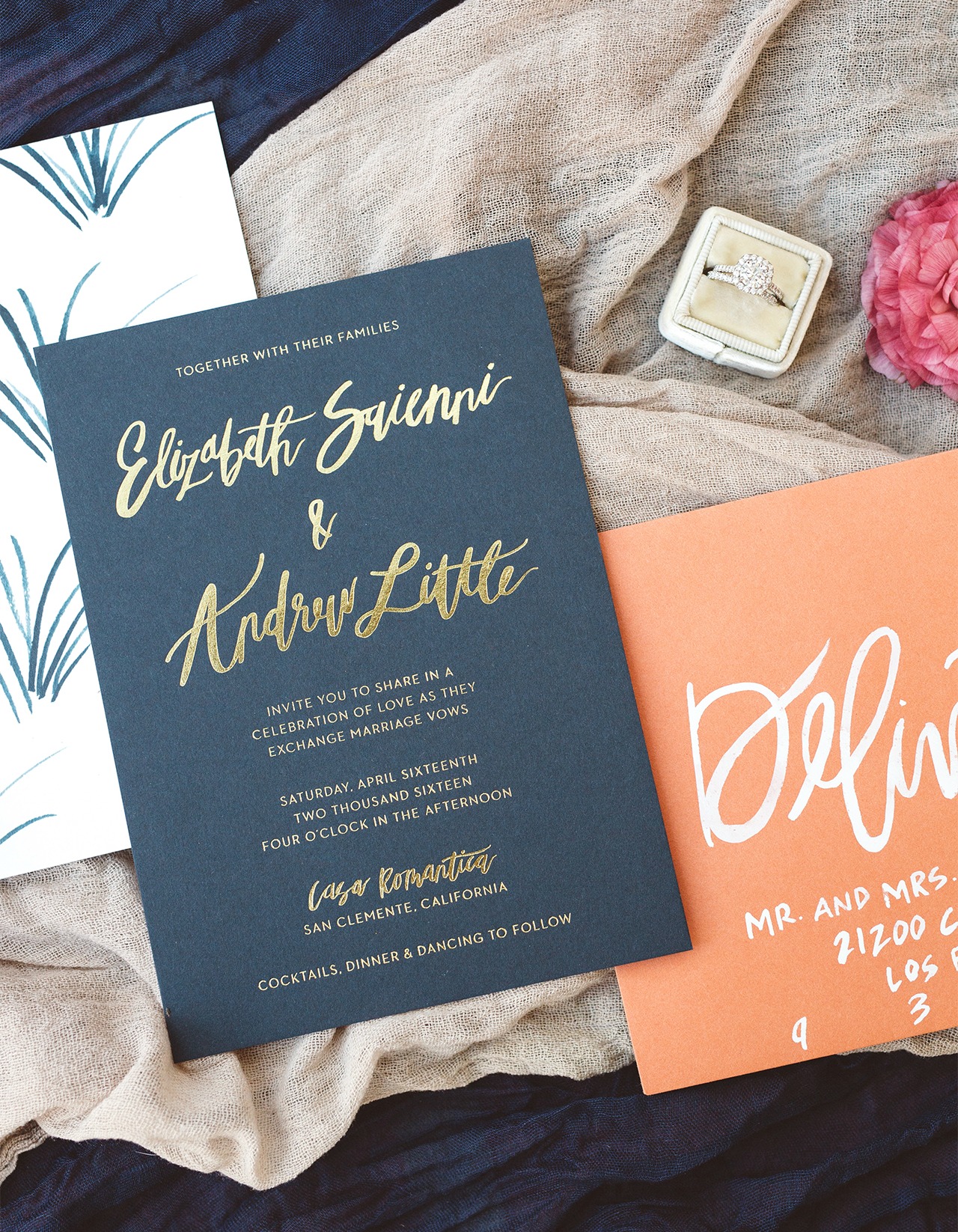
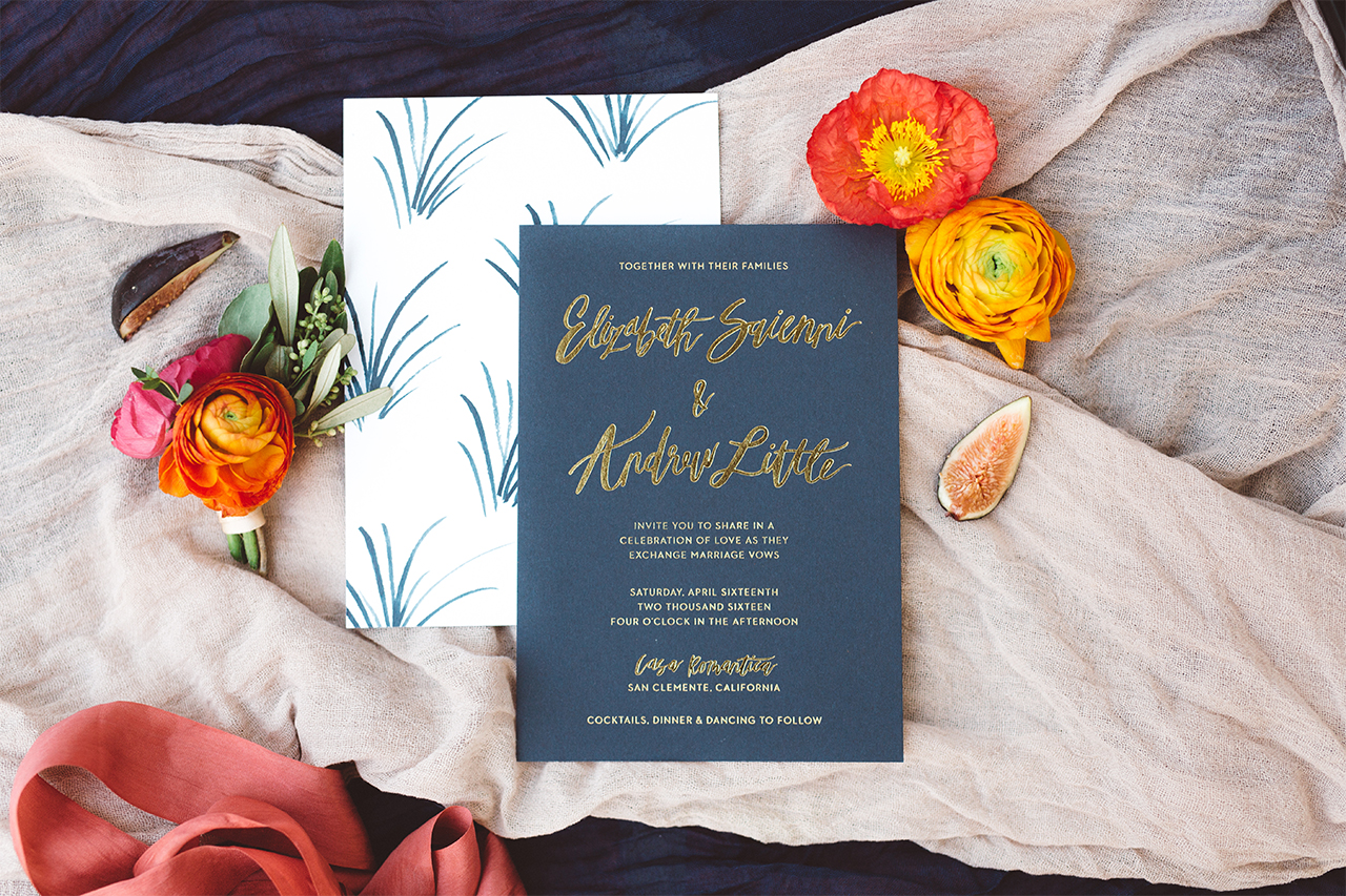
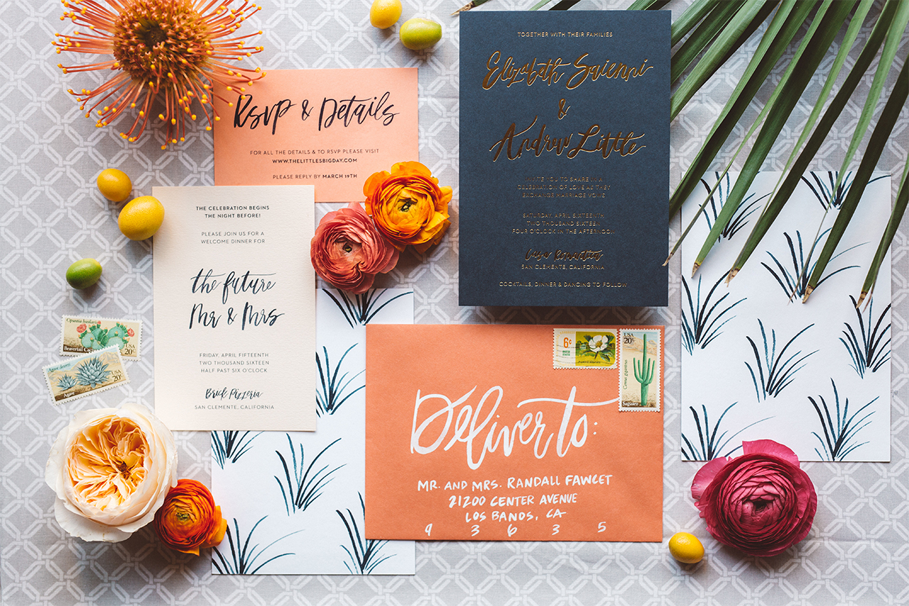
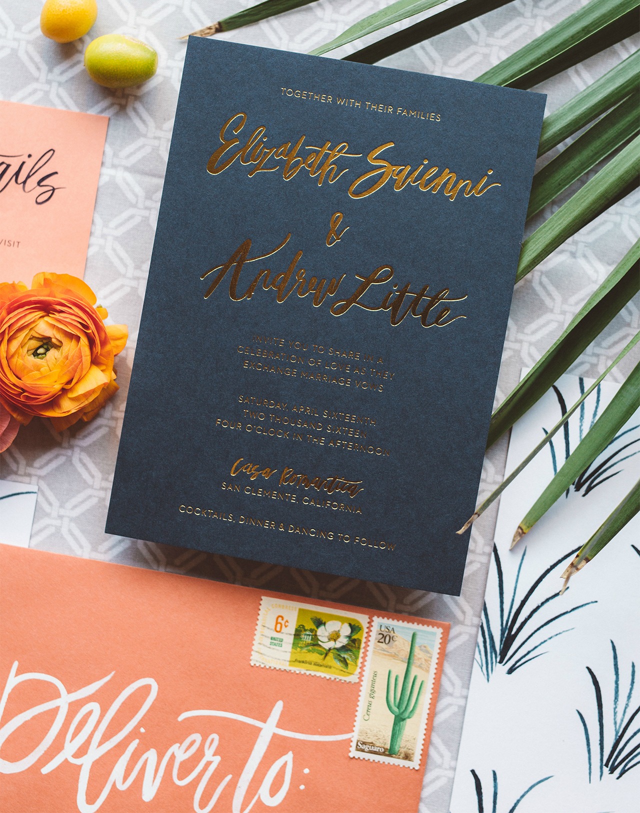
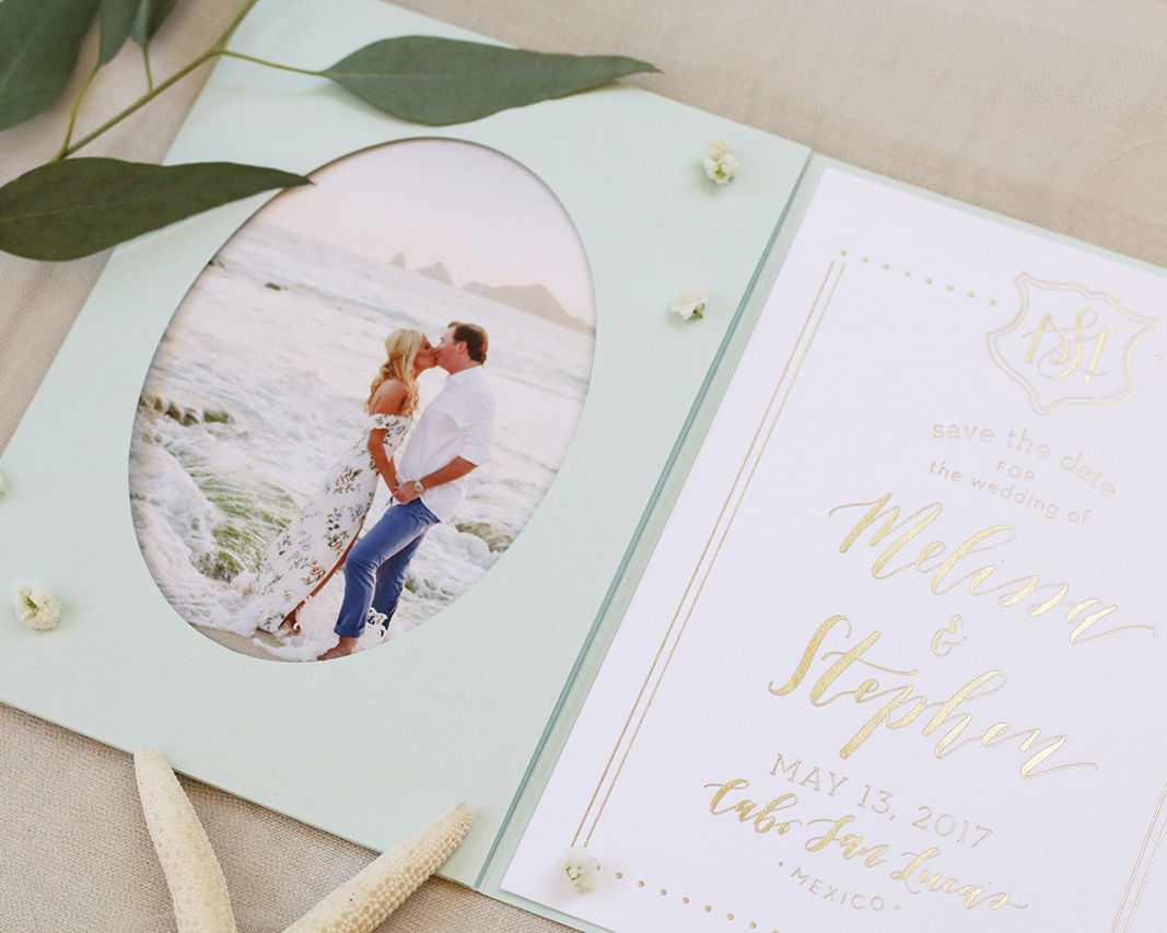
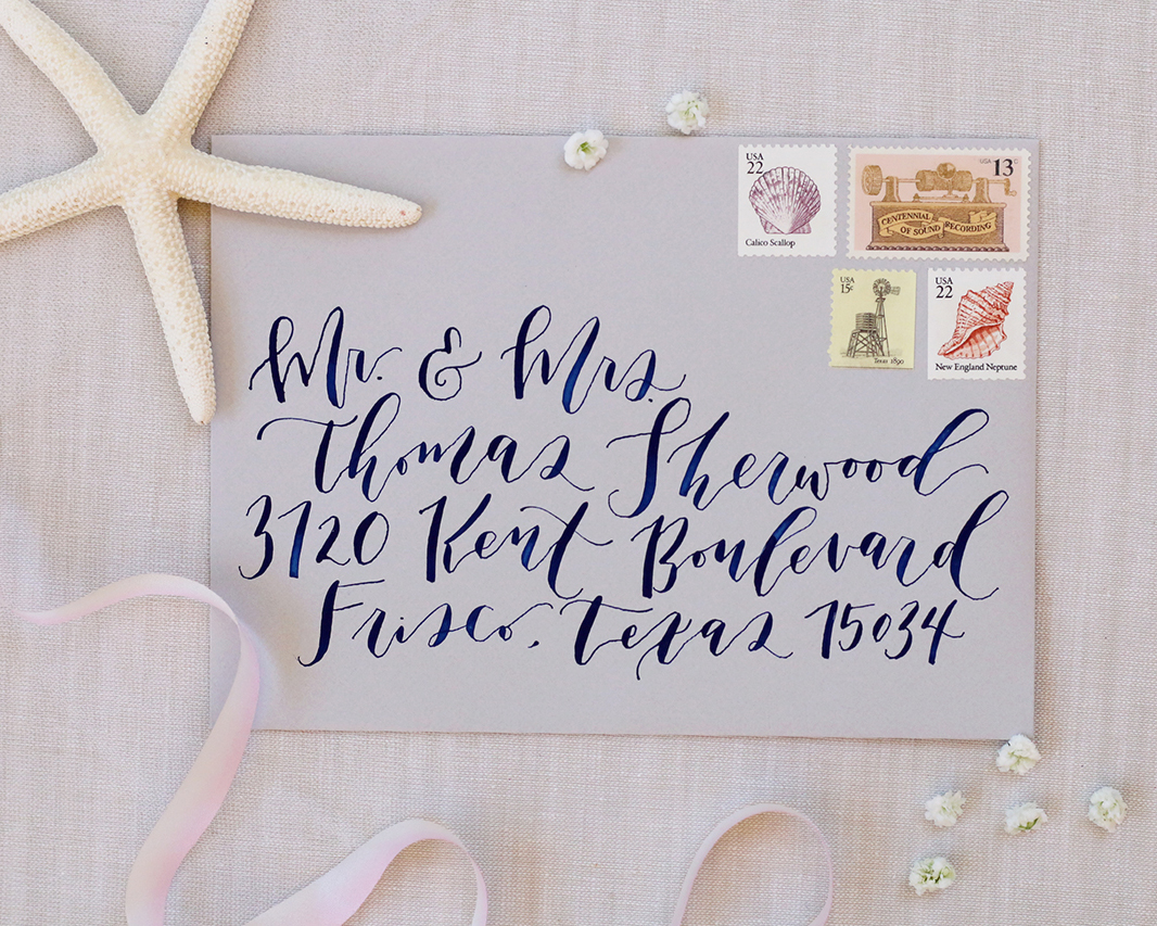
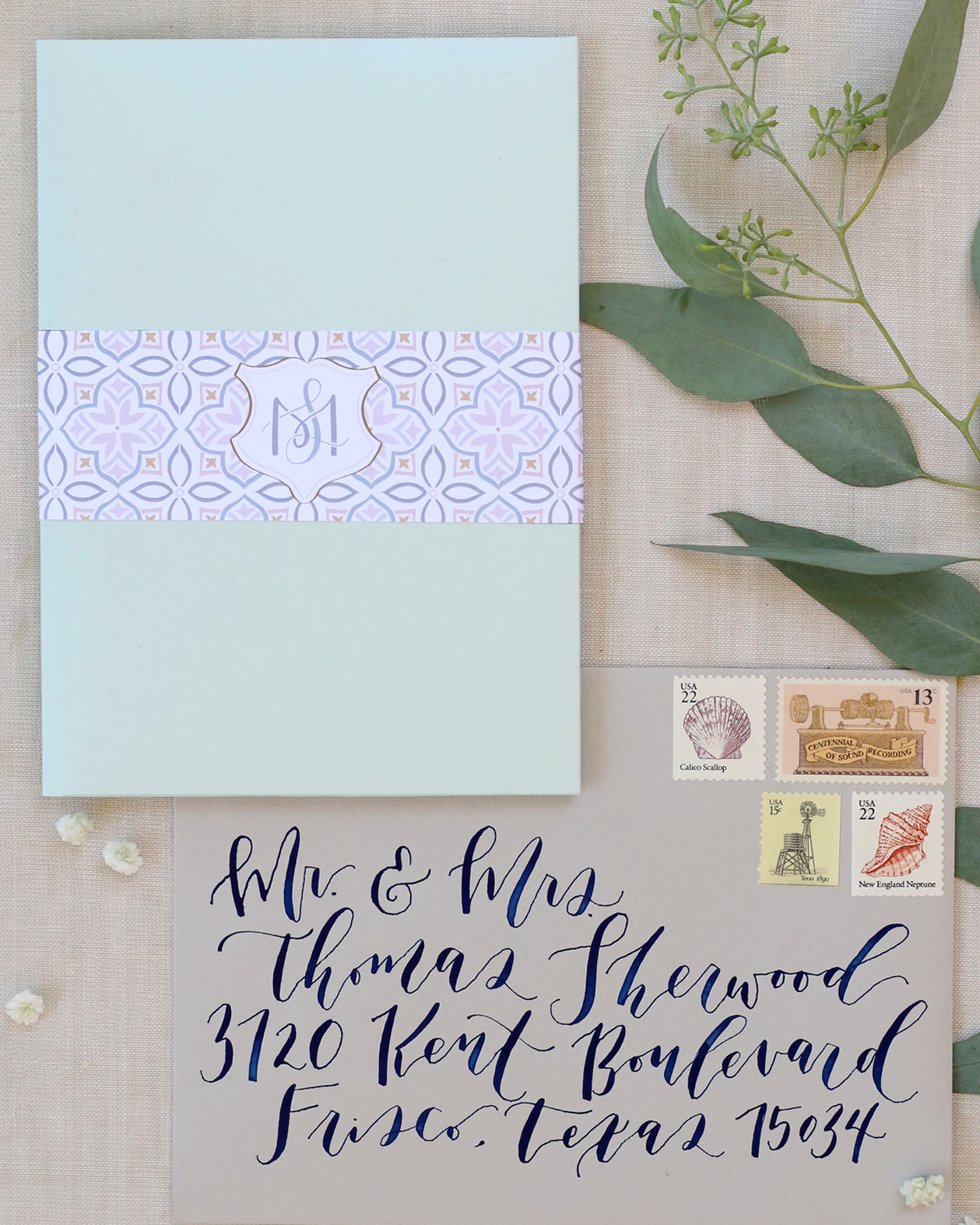
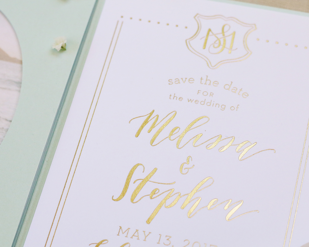
This save the date is the perfect combination of traditional, modern, beach elegance that will surely get guests excited for this gorgeous wedding happening in summer of 2017!

Seafoam and Gold Foil Save the Dates by Goldie Design Co.

Thanks Clara!

Design: Goldie Design Co.

Gold Foil Printing: Elefant Press

Digital Printing: Alphagraphics

Check out the Designer Rolodex for more tal­ented wed­ding invi­ta­tion design­ers and the real invi­ta­tions gallery for more wedding invitation ideas!

Photo Credits: Goldie Design Co.