The Printing Process: Screen Printing

While I’m away on vacation I’m running a series of guest posts on the various printing processes, from digital printing to engraving.  I’ve asked some designers and printers to share their expertise and lots of photos to fill you in on what you need to know about different stationery printing methods. Today I’ve asked two of my favorite screen printing ladies, Carrie and Laurie from Two Trick Pony, to walk us through the screen printing process.  Take it away ponies!

What is Screen Printing?

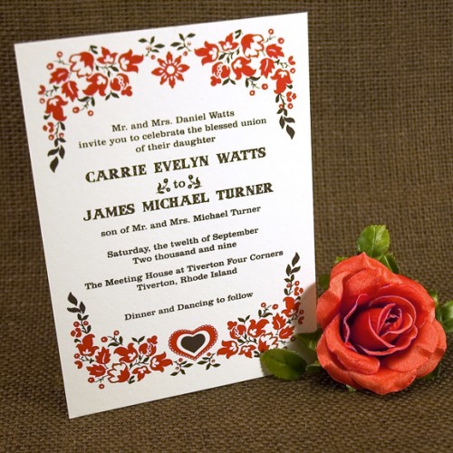
two-trick-pony-wedding-Invitation

Screen printing (also known as silk screening) is one of the oldest methods of printmaking, with examples dating back to the Song Dynasty in China.  The process involves creating a stencil of an image on a screen of porous mesh, traditionally made of silk.  A roller or squeegee is used to pull paint-like ink over the stencil, forcing it through the mesh onto the paper being printed.  Unlike the inks used in some other forms of printing, screen printing ink sits right on the surface of paper, resulting in incredibly rich, vibrant color.

The Printing Process

The screen printing process has multiple steps, starting with the process of creating the screen.

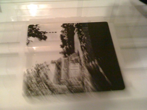
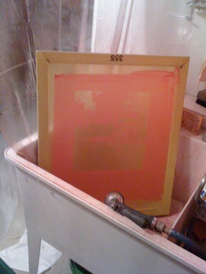
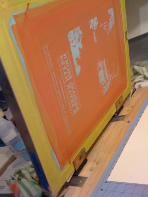
The screens are coated with a light sensitive emulsion, and exposed using a positive image.  Your positive can be created in a variety of ways, from digitally printed film, hand-cut rubylith, or hand drawn with ink on acetate.  The positive is positioned directly on the surface of the light table, and the screen placed over the positive, print side down.  The emulsion hardens when exposed to light, and remains soft and water-soluble where the positive blocks the light.  After exposure, we take the screen to the wash-out sink, and rinse away the soft emulsion.  Once the screen has dried completely, we lock the screen into hinges that are mounted onto our print surface.

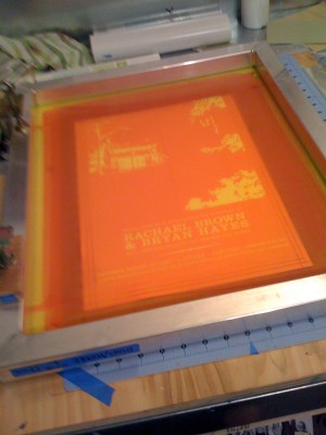
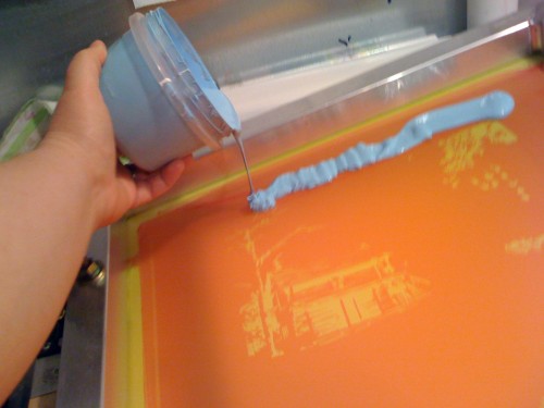
We align the paper for printing, and mark the location with registration tabs.  Ink is applied directly to one end of the screen in a long bead, ready to be pulled over the screen with the squeegee.

A nice, firm pass with the squeegee forces ink through the mesh, visibly showing on the print side of the screen.  The screen is lowered on the hinges, and the squeegee is used to press the inked mesh flat against the paper, transferring a thin, even layer of ink to the page.

The amount of ink transferred to the paper is controlled by the thickness of the emulsion, so crisp images need a fine, even coat of emulsion to maintain their detail.

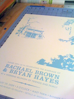
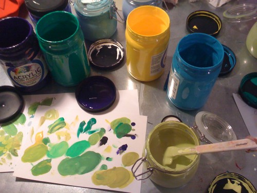
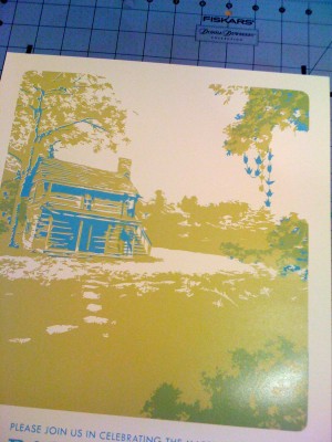
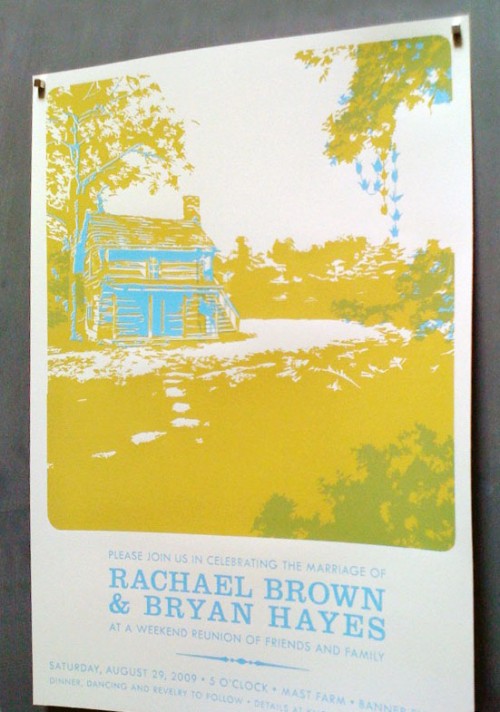
Mixing the second color for this particular job was a challenge; we wanted to create the illusion of a 3rd color in the print, so the second ink needed to be transparent and overlay the first color to create a pleasing effect.  We settled on a yellowish green that would create a darker green where it overlapped the blue.

Registration was tight!  The blue and yellow-green had to line up perfectly along the sides of the image.

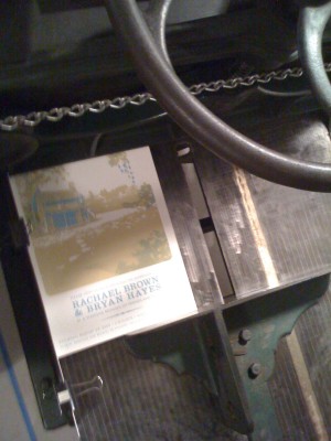
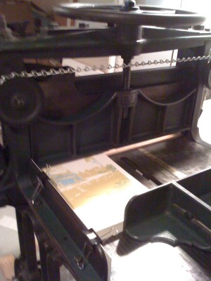
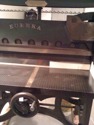
Printing finally completed, it’s time to cut!  Our cutter, Cooper, was made in 1867, and still works like a charm.

Two-Trick-Pony-Screen-Printed-Wedding-Invitation

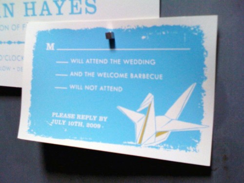
Two-Trick-Pony-Screen-Printed-Wedding-Invitation-RSVP

The final piece; poster sized invite, ready to be rolled into tubes and mailed to guests!

Tips and Advice

Like most hand-printing methods, screen printing has a very distinctive look.  Even though the surface is flat, the velvety finish and extreme vibrancy of the ink cannot be replicated with any other technique.  Screen printing can also be used on a variety of surfaces, so anything that has a flat surface can be printed; paper, chip board, fabrics, wood, leather and metal are all viable candidates!

two-trick-pony-blue-wedding-Invitation

Like any other printing process, screen printing definitely has specific limitations, which makes it better suited for some projects (and not so well suited for others).  Fine details or delicate text can be lost or broken up in the printing process, and large blocks of text can be difficult to print consistently.  Light ink on dark paper works beautifully, but textured papers are out.  Thin papers also present difficulty, as the ink could cause them to buckle or warp.

Thank you so much Ponies!  You can see more of the talented screen printed designs from Two Trick Pony right here!

Photo Credits: Two Trick Pony

Fall Ski-Inspired Aspen Save the Dates

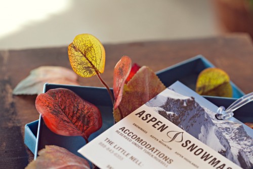
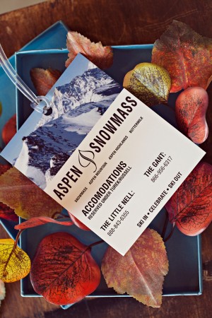
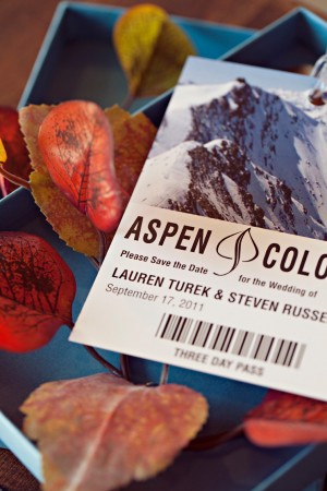
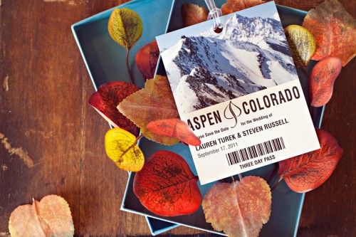
Now this is a pretty package!  Vanessa from Alchemy Fine Events recently worked on a fun wedding save the date inspired by the wedding location – Aspen, Colorado!  Vanessa created a double-sided save the date that mimics the venue’s mountain ski pass, all nestled in a lovely blue box filled with gorgeous fall aspen leaves.

Fall-Aspen-Wedding-Save-the-Dates

From Vanessa: Aspen holds a special place in Lauren and Steve’s hearts and made for the perfect fall destination wedding location.  Lauren, who had grown up skiing in Aspen’s Snowmass resorts, wanted her guests to take a double-take when they opened their festive save the date designed to replicate the mountain’s ski pass.

Fall-Aspen-Wedding-Save-the-Dates Fall-Aspen-Wedding-Save-the-Dates

We designed these ski pass save the dates to be sent nestled atop fall-hued Aspen leaves and inside of a sky blue mailer box as a nod to the Fall time festivities to come.  With a little sense of humor and personalization, having some fun with your save the dates is always a must-do!

Fall-Aspen-Wedding-Save-the-Dates

So pretty!  Thanks Vanessa!

Photo Credits: Scott Lawrence Photography

Sarah’s Modern Moving Announcements

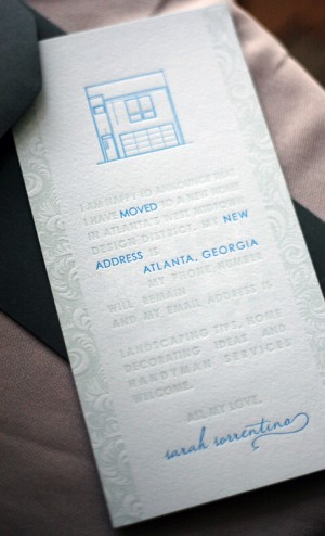
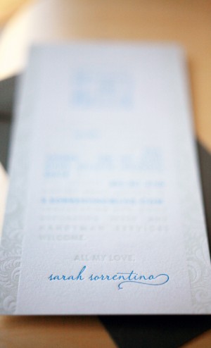
After last week’s moving announcement post, Sarah from Foglio Press sent over the letterpress moving announcements from her own recent move to a new home. They’re so clean and minimalist, which is so different from most moving announcements.  Aren’t they pretty?

Modern-Letterpress-Moving-Announcements Modern-Letterpress-Moving-Announcements

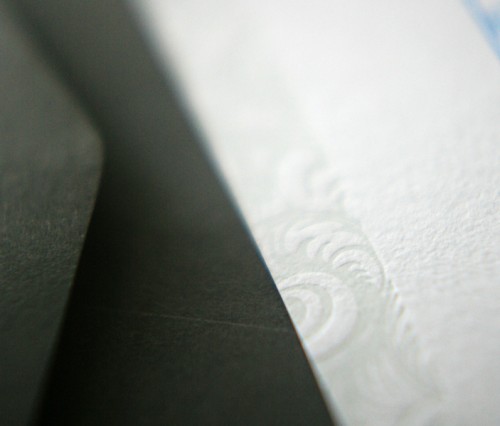
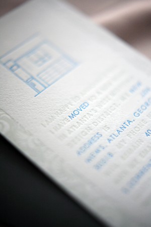
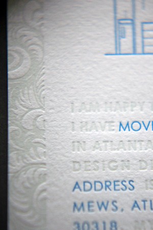
From Sarah:  I designed them and worked with Kseniya Thomas of Thomas Printers for the letterpress printing.  We used Arturo’s pale blue stock (inspired by the pale blue color of my new home!) and printed with a pop of turquoise complemented by a blind impression.  On the blind impression we used a clear varnish which actually ended up giving those design elements a bit of a greenish-blue tint against the blue paper – a happy accident which turned out really pretty and added a touch more contrast to the blind impression!

Modern-Letterpress-Moving-Announcements

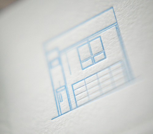
I chose a feathery, leafy pattern to go down the sides and add a little bit of a feminine touch to the otherwise minimal and modern design, and I designed the pattern so that the negative letterpress space would leave the pattern itself raised.  The artwork at the top is the actual elevation of my home, scanned in from the floor plans.

Modern-Letterpress-Moving-Announcements

Modern-Letterpress-Moving-Announcements Modern-Letterpress-Moving-Announcements

Thanks Sarah!

Photo Credits: Foglio Press

*Thomas Printers is a spon­sor of Oh So Beau­ti­ful Paper; for more on my edi­to­r­ial poli­cies please click here.

Enrique + Annessa’s Creative Mexico Destination Wedding Invitations

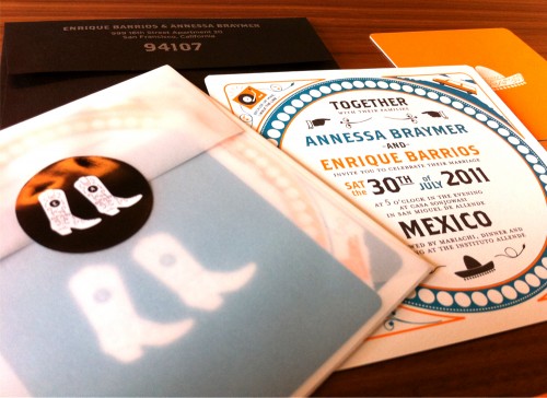
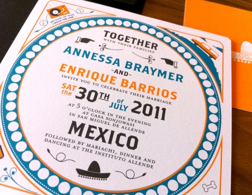
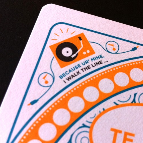
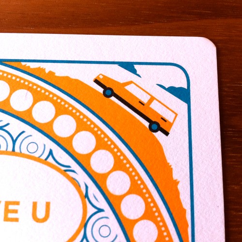
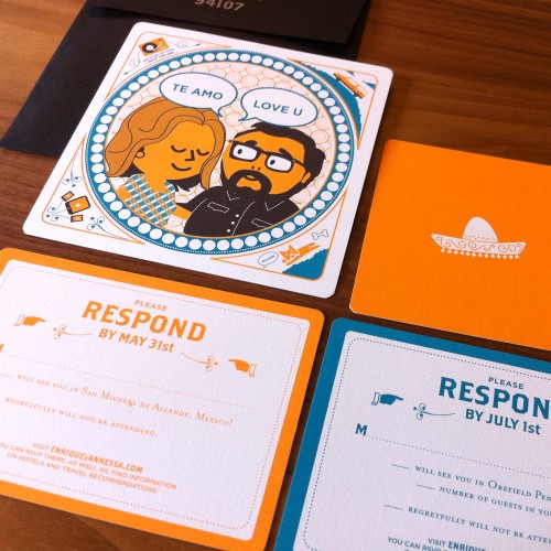
Enrique and Annessa are graphic designers getting married in Mexico this summer (congrats you two!) with a follow-on event a few weeks later in Pennsylvania.  When it came time to create their wedding invitations, Enrique and Annessa found themselves inspired by double-sided letterpress coasters and knew they wanted to share their fun sense of humor with their wedding guests.  They decided to go with a fresh blue and orange color palette to represent their sunny destination wedding location – and a totally adorable illustration of the happy couple!

Orange-Blue-Modern-Mexico-Wedding-Invitations-Suite

Orange-Blue-Modern-Mexico-Wedding-Invitations-Glassine-Envelope

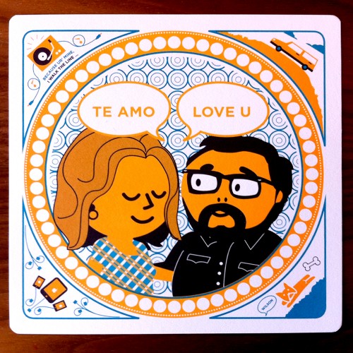
From Enrique and Annessa:  The inspiration for the format came from letterpress coasters we had seen once.  We really liked how they showcased personal items that turned into short stories about the person(s) on the front of the coasters.

Orange-Blue-Modern-Mexico-Wedding-Invitation

Orange-Blue-Modern-Mexico-Wedding-Invitations-Bride-Groom-Illustration

In this case, we included our French bulldog Mr. Wilson, my love for gadgets, Annessa’s old 87’ Volvo, and my love for Johnny Cash. We really wanted to play up the fun, intimate details we know about each other and share them with our guests.  Humor is the soul and foundation to our relationship, so we felt it appropriate to illustrate each other the way we see each other.

Orange-Blue-Modern-Mexico-Wedding-Invitations-Detail

Orange-Blue-Modern-Mexico-Wedding-Invitations-Detail

Since we are having two events, Mexico and Pennsylvania, we had to double up on invitations while hinting at the theme of each event.  Pennsylvania will be a more country feel, so we used iconography such as cowboy boots.  For Mexico, we used, of course, a very appropriate sombrero.

Orange-Blue-Modern-Mexico-Wedding-Invitations-Illustration

Over all, there were some ups and downs through the process of designing and coming up with a final solution, but it feels very rewarding to know that we designed them ourselves.  We hope our guests enjoy them as well.

Thank you so much Enrique and Annessa!

Photo Credits: Enrique Barrios and Annessa Braymer

{happy weekend!}

Happy Friday everyone!  Do you have anything fun planned for your weekend?  Despite my enthusiasm for the cherry blossoms, it’s still pretty cold and wintery here, so I have a feeling I’ll be spending most of the weekend bundled up as I try to check things off my to-do list.  But in the meantime…

…a few links for your weekend!

This week on Oh So Beautiful Paper:

That’s it for me this week!  I hope you all have a lovely weekend, and I’ll see you back here on Monday! xoxo

Photo Credit: Cassia