Brick + Mortar: How to Get Feedback From Retailers

My last post, How to Take Feedback Like a Multi-vitamin, gave you some tips to use feedback to help grow your business. Once the post aired, however, I realized that many of you were really looking for something a little more basic: how to get feedback from retailers. So let’s hop from one metaphor to another, today I want you to think back to the middle school notes you sent and received…yes, no, maybe? –Emily of Clementine
Hello Brick + Mortar: How to Take Feedback

Illustration by Emily McDowell for Oh So Beautiful Paper

Many of my posts touch on the interaction between wholesale lines and your interaction with retail shops. I started this column off (3 years ago!) by telling you how to get a retailer’s attention, then followed up with how to stay in contact and how to submit your line by email and snail mail. I also talked about why retailers might be rejecting your line, and specifically talked about how you can ask for feedback when a retailer says no to your line. But I know this is one of the biggest challenges to putting yourself out there as a wholesale line, so let’s tackle the two best ways to get feedback: you can ask, or you can ask and offer.

*

ASK: It seems simple, but sometimes simply asking is the best way to gather feedback from retailers. Retailers don’t reply to emails because: we are incredibly busy and we don’t want to say no/you didn’t give us the invitation to say maybe. But sometimes, we really do have quick, relevant feedback that could help grow your line.

Who to ask

Retailers who don’t yet carry your line, those who expressed an interest but never followed up, or those who haven’t ordered for a long time.

When to ask

At the close of your follow up email, or any correspondence after the initial outreach. Most retailers make a gut YES, NO, MAYBE determination within 30 seconds of opening your email/mailer. You’ll hear from the YESES. It’s the NO and MAYBES that will drive you crazy, because you won’t hear from either of them.

What to ask

There are really only two questions you’re asking and you should keep it short and simple, like a middle school note:

  • Would my work ever be right for your shop: yes, no, maybe?
  • If maybe, is there something I could do to to sway you to a yes?

How to ask

Make it clear that you actually want feedback. Craft your own version of: “I hope to keep you updated on my line as it grows, but I don’t want to bother you. If you would like to continue to follow my line, please answer yes, no, or maybe. If your answer is maybe, I would really value any quick thoughts or hesitations you have about my line.”

What’s to love about this type of feedback? You get a better sense of who your people are. If you craft your question well, the MAYBES might say more which could lead to more yeses. And if you’re ready for the sting, it will get you some nopes, that will help you stop wasting your time on the shops that aren’t right, so you can go after the ones that are (Oh, and it’s a great cure for the dreaded radio silence.)

*

ASK + OFFER: You understand the ask. The offer is what makes a retailer actually stop, sit down, and reply thoughtfully.

Who to ask

Retailers who currently carry, or have carried your line in the past.

When to ask

Anytime you’re hungry for substantial feedback, considering a change in your line, or want to increase your wholesale outreach.

What to ask

You are asking retailers who have sold your work to give you thoughtful feedback about how to improve your line. You are asking specific questions, (probably in the form of an online survey) that will help you get real answers to what they perceive as your strengths, weaknesses, and opportunities. Craft your questions so that you do not get generic responses.

What to offer

Something they would appreciate, that you can easily give: free product, a discount code to your shop, or free shipping. How much? Consider what would make you stop and fill out a survey. I would generally figure an offer of $25-$50 for every 15 minutes.

How to ask

Make it clear that you would love to have their insight as a retailer who sells their work, that you’re looking for specific feedback to help grow your line and that you value their time so you want to offer them something if they take the time to help your line grow.

What’s to love about this type of feedback? You get real answers, often a suggestion that can strengthen you relationships with stores to get you feedback (and friendship?) that’s ongoing!
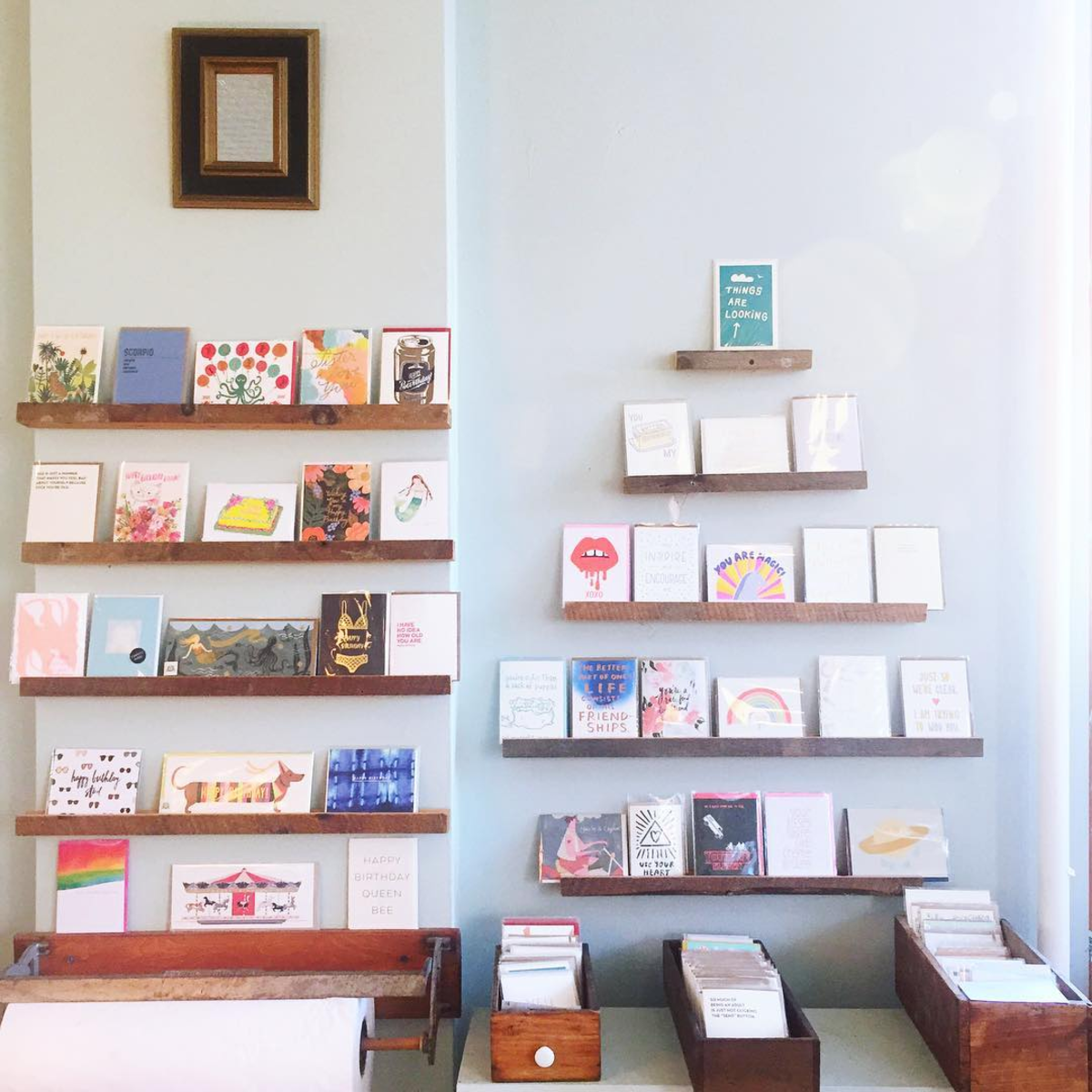
Clementine Card Wall / Oh So Beautiful Paper

Clementine‘s current card wall, feedback welcome.

I will be honest, I could spend all day talking to creative product lines about how to edit and expand your lines. It’s why I love writing this column and why I started consulting. But before I began offering feedback like it was my (actual) job, I honestly felt awkward, I thought I was intruding. I bet most of your retailers feel the same way, so give them an easy way to say: yes, or maybe and then come back and share your middle school note folding skills. xo ~Emily

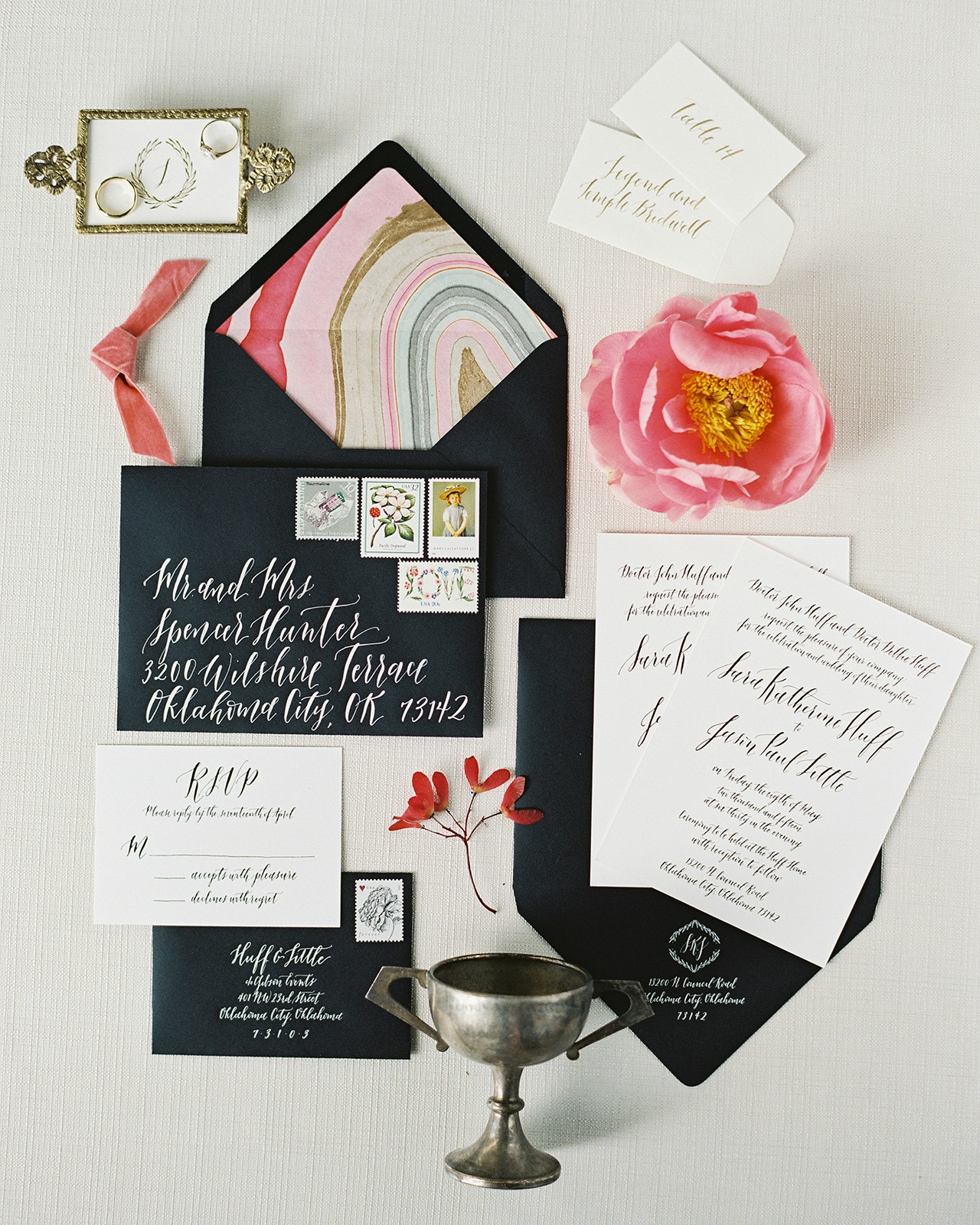
Black and White Foil Stamp Calligraphy Wedding Invitations

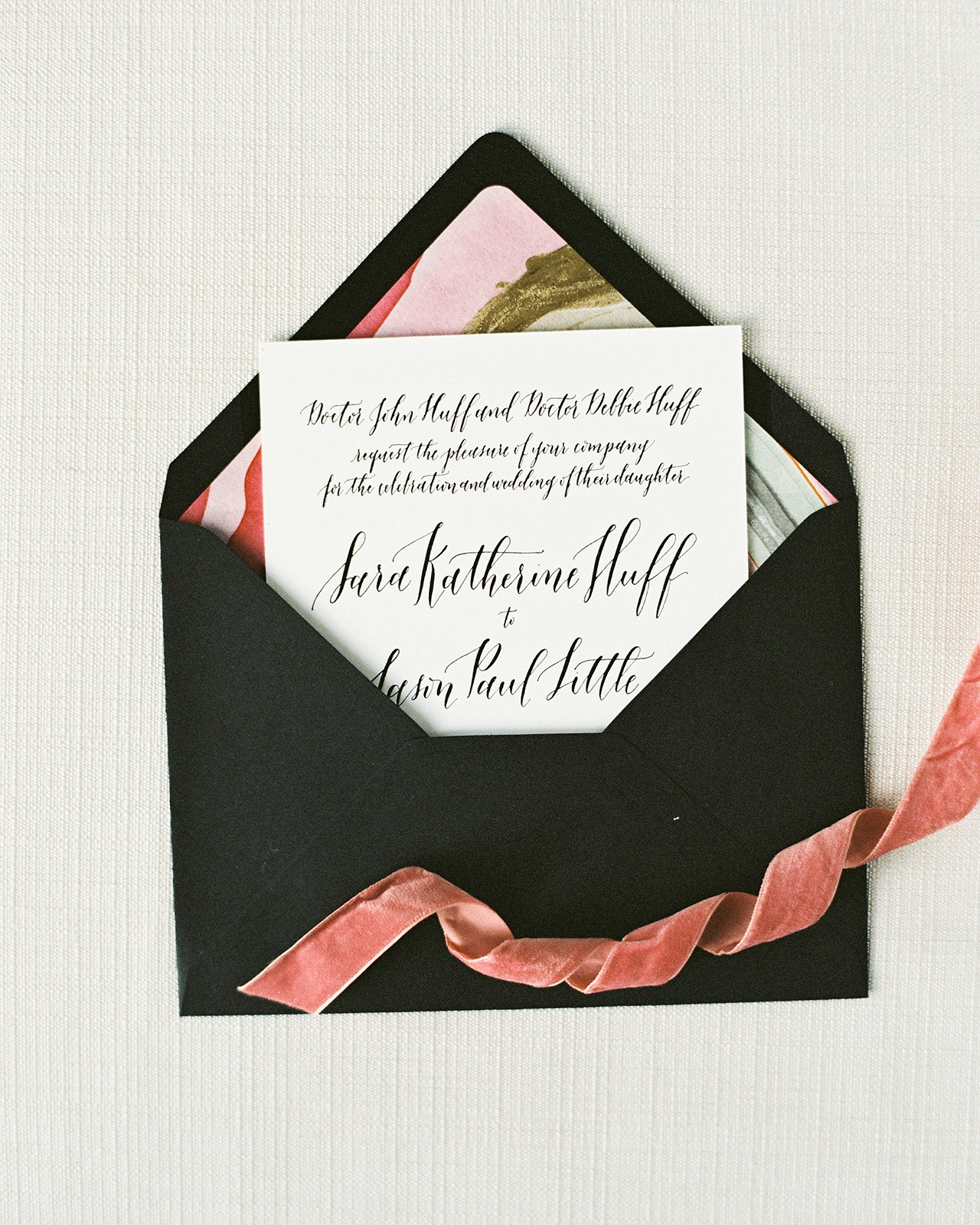
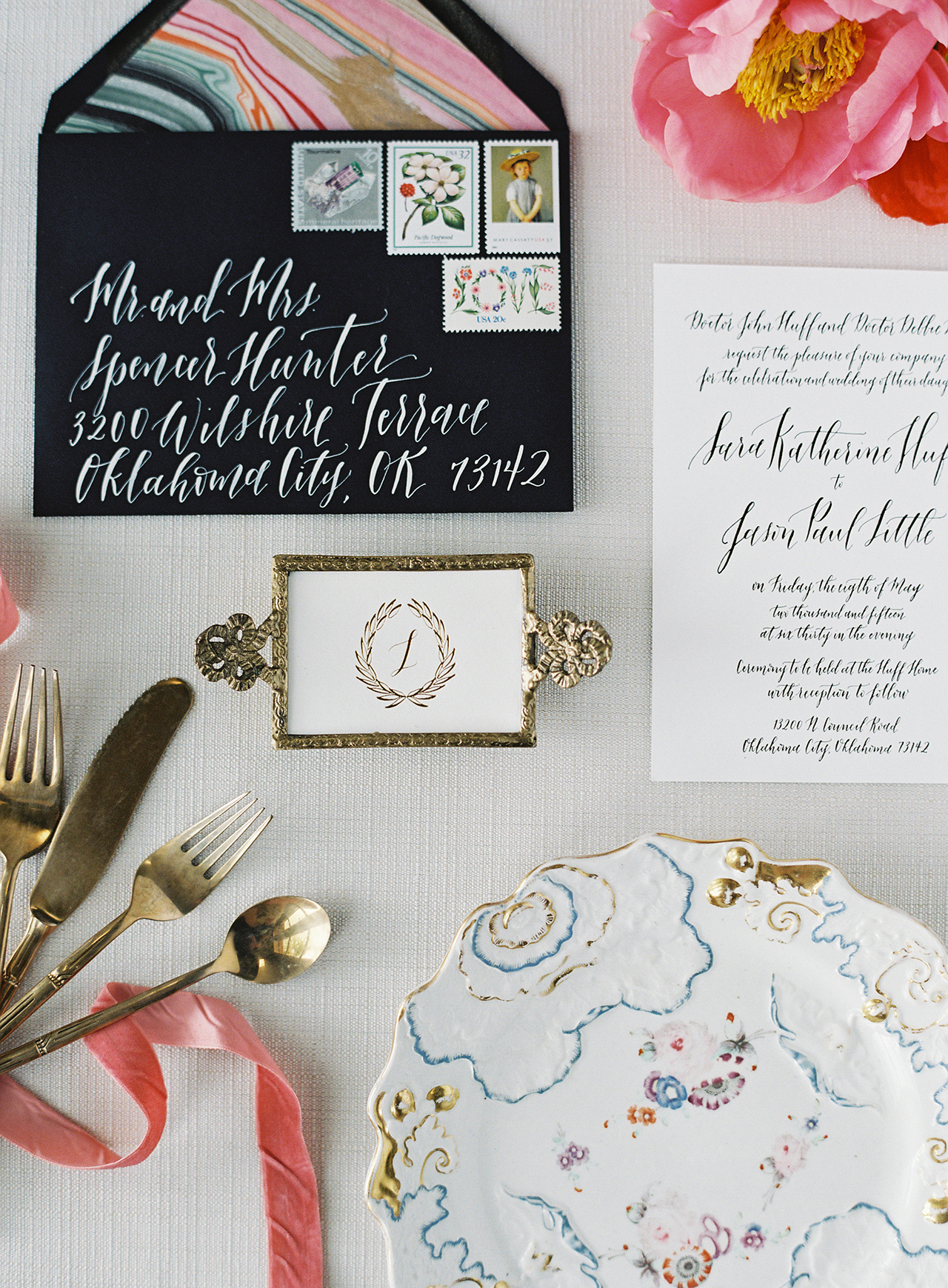
When a stylish boutique owner gets engaged and teams up with a design maven like Lauren of Blue Eye Brown Eye for her wedding stationery, you just know that invitation is going to pack a punch! These black and white foil stamp calligraphy wedding invitations are bold yet totally refined and elegant, and are complemented by colorful marbled envelope liners and curated vintage stamps! Lauren’s calligraphy is beautifully incorporated throughout and I love how the day of stationery pieces incorporate gold into the overall design aesthetic. Bold, unique, and timeless – what a great combo!

Black and White Foil Stamp Calligraphy Wedding Invitations

From Lauren: Vintage stamps. Marbled Liners. Classic black and white with pops of color. All of the makings of a beautiful and timeless wedding suite. Enter couple Sara Kate and Jason, a stylish match made in heaven. The bride is the owner of Sara Kate Studios, an eclectic boutique, styling company, and interior design power house out of Oklahoma City, and had a distinct vision to match her impeccable taste.

Black and White Foil Stamp Calligraphy Wedding Invitations

Mixing classic black and white with pops of color in the envelope liners and vintage stamps, their invitation perfectly represented them as a couple. We had a lot of fun pulling together the vintage stamp collection, representing artists, florals, a mix of colors, and geodes, which went along with the hand marbled envelope liners in shades of pinks, blues, golds, and blacks. Each liner was different, a detail I love to incorporate. It gives each invitation its own special and individual personality.

Black and White Foil Stamp Calligraphy Wedding Invitations

We incorporated foil printing in each element for this project, from invitations to day of pieces. For the invitation, black foil printing on thick, white cotton stock made the text pop and stand out, and white the white foil printing on black envelopes added drama. Mix that with white calligraphy on a black envelope, and you get a distinct look (and a personal favorite of mine).

Black and White Foil Stamp Calligraphy Wedding Invitations

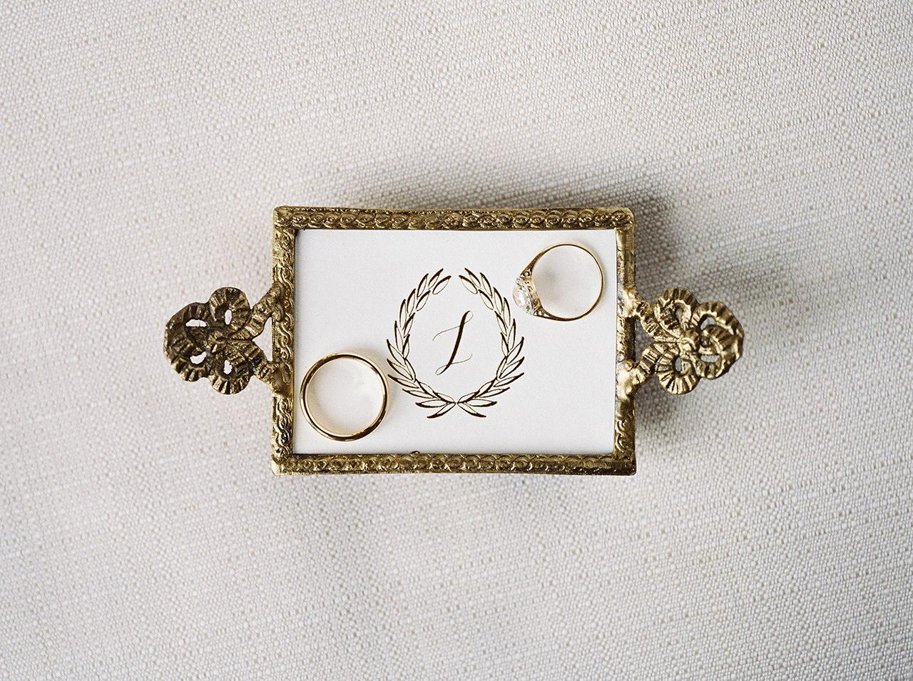
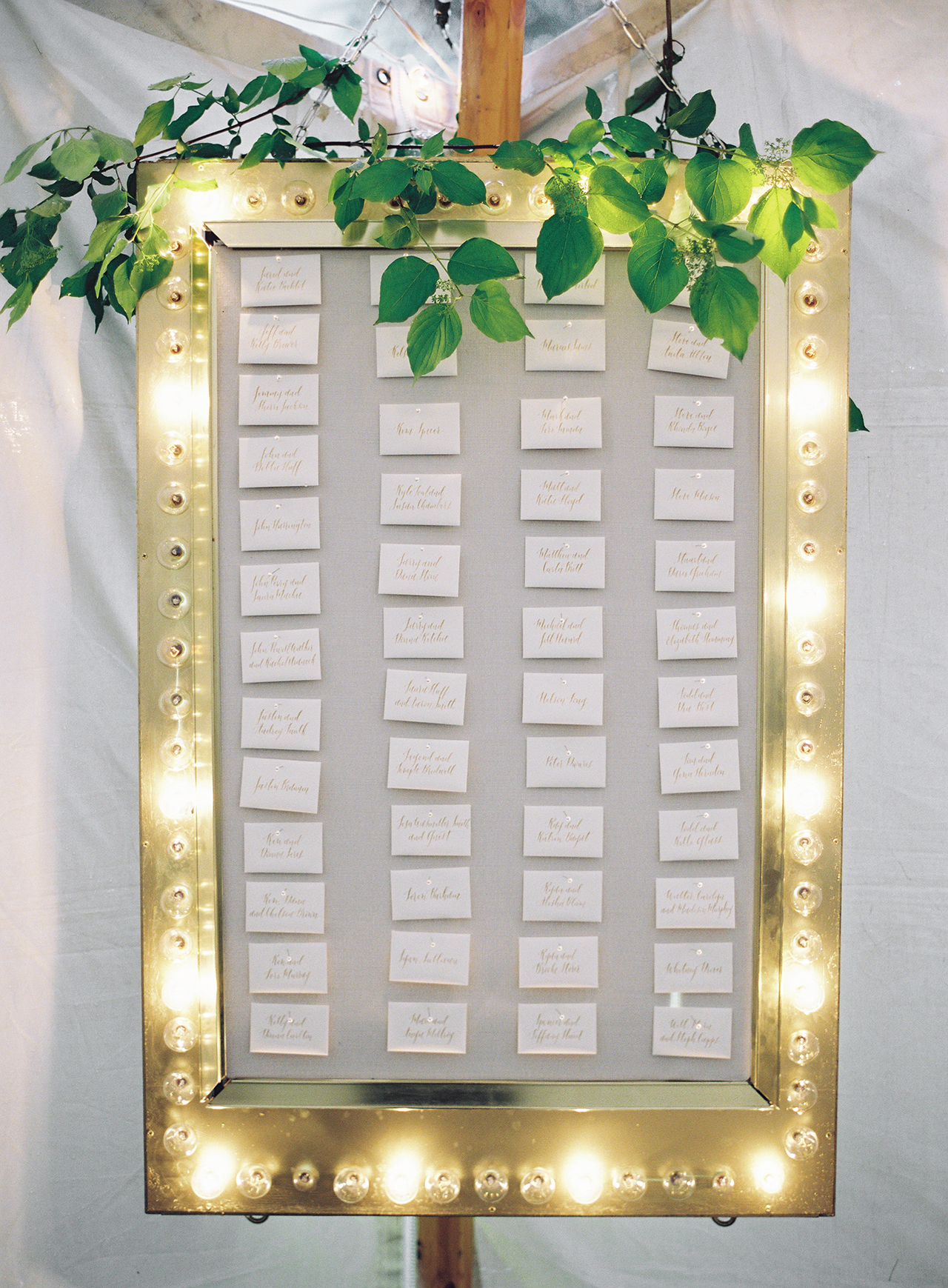
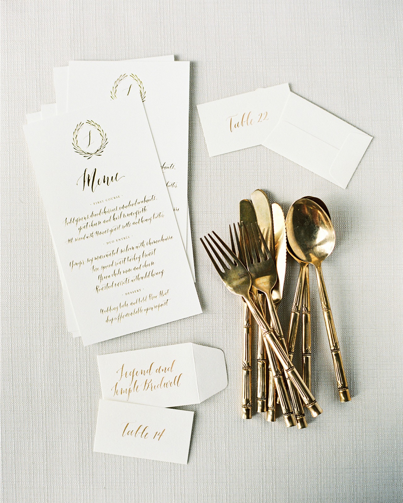
For day of pieces, we transitioned from black and white to gold, incorporating calligraphy into the menu designs, and a custom hand drawn laurel wreath with their new last name monogram – L. We carried the gold through to the escort cards in a unique display: using a vintage bulb frame, a special piece of the bride’s.

Black and White Foil Stamp Calligraphy Wedding Invitations

Black and White Foil Stamp Calligraphy Wedding Invitations

Black and White Foil Stamp Calligraphy Wedding Invitations

The bride used her impeccable styling skills and composed each vignette for the paper prior to the wedding, making the images all the more special because they have her special touch.

Black and White Foil Stamp Calligraphy Wedding Invitations

Thanks Lauren!

Design and Calligraphy: Blue Eye Brown Eye

Printing: Letterpress Graphics

Marbled Paper: Paper Mojo

Styling: Sara Kate Studios

Wedding Planner: Gibson Events

Check out the Designer Rolodex for more tal­ented wed­ding invi­ta­tion design­ers and the real invi­ta­tions gallery for more wedding invitation ideas!

Photo Credits: Brett Heidebrecht

A Sudsy Whiskey Sour

The weather has turned, and I’m in the mood for dark, rich drinks. And since we’re spending October with beer cocktails, what better thing is there to jam together a dark and rich classic cocktail – the Whiskey Sour – with a dark rich Porter beer? This beer and whiskey sour cocktail recipe is the perfect addition to your fall cocktail menu. –Andrew

Beer and Whiskey Sour Cocktail Recipe / Liquorary for Oh So Beautiful Paper

Beer and Whiskey Sour Cocktail Recipe / Liquorary for Oh So Beautiful Paper

Sudsy Whiskey Sour

2 oz Whiskey
3/4 oz Lemon Juice
3/4 oz Pedro Ximénez Sherry
1/2 oz Amaro Montenegro
Porter Beer

Add the whiskey, lemon juice, sherry, and amaro in a cocktail shaker filled two-thirds with ice and shake to combine. Strain into a highball glass filled with fresh ice and top with the porter. Give it a gentle stir and enjoy!

Beer and Whiskey Sour Cocktail Recipe / Liquorary for Oh So Beautiful Paper

The Whiskey Sour is a pretty simple drink – whiskey, your choice, with a bit of lemon and a bit of sugar. This drink jazzes it up a bit with Pedro Ximénez sherry, a sherry made from dried grapes that is full of fruity raisin notes and is sweet enough that you can use it in place of simple syrup. It’s rounded out by Amaro Montenegro, a gently bitter Italian liqueur, that adds another layer of dark, herbaceous complexity. (You could try out any gentle amaro here or, if you don’t have one handy, try throwing in a few dashes of Angostura bitters to help give it that extra layer of complexity and a touch of bitterness.)

Beer and Whiskey Sour Cocktail Recipe / Liquorary for Oh So Beautiful Paper

So to all that, we add porter, a dark, sweet, malty beer that gets its name from the English workers who used as something of an early energy drink. Pouring it on top of your Whiskey Sour gives you a layered drink, one that starts out sweet and malty and grows progressively more complex – both fruity and a bit herbal as you get closer to the bottom. (Or, I suppose, in reverse if you drink this with a straw, which is totally your prerogative.)

Beer and Whiskey Sour Cocktail Recipe / Liquorary for Oh So Beautiful Paper

(Don’t forget to follow us on Instagram!)

Glassware by Liquorary

Photo Credits: Nole Garey for Oh So Beautiful Paper

Navy and White Mediterranean Inspired Wedding Invitations

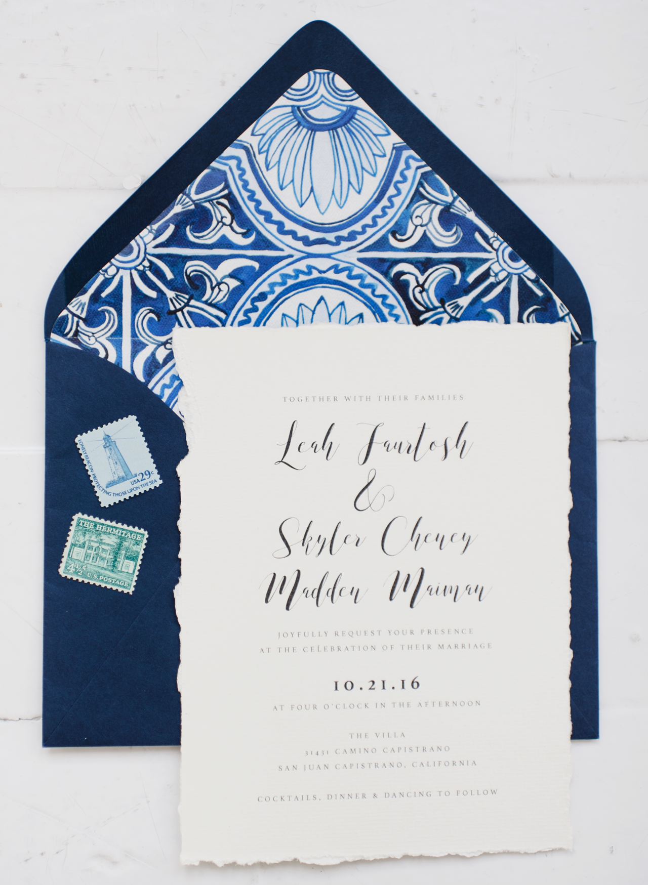
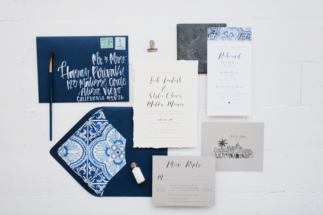
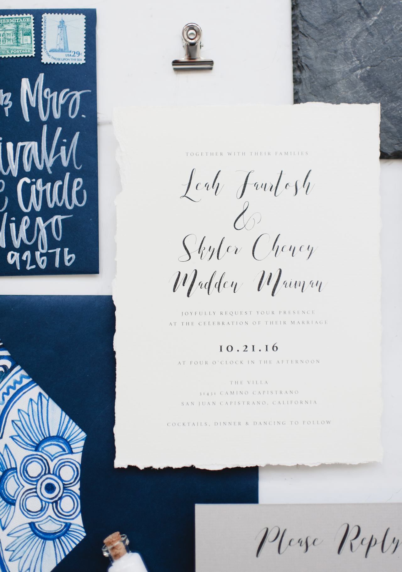
The essential ingredients of a Mediterranean-inspired wedding invitation? A gorgeous navy and white color palette, deckle edge paper, and absolutely stunning hand painted envelope liners. Camille of Robinson Paperie created these bespoke navy and white Mediterranean inspired wedding invitations inspired by the bride and groom’s favorite global destination: southern Italy! Every detail, down to the deckled edges on the invitation, brings a whole new meaning to the word handmade – and makes us daydream of quaint seaside towns on the Amalfi Coast!

Navy and White Mediterranean Inspired Wedding Invitations by Robinson Paperie

From Camille: When I was contacted by Leah and Skyler to design their wedding suite, it was their story that inspired me more than anything. The couple had just returned from an epic trip around the world: South America, Malaysia, Indonesia, New Zealand, Australia, you name it! I was eager to hear what part of the globe their wedding inspiration was going to come from and… it was Italy!

Navy and White Mediterranean Inspired Wedding Invitations by Robinson Paperie

Most people who think about Italian inspiration may think of wine, rolling hills, vineyards, olive branches, etc. But Leah and Skyler were eager to make their invitation feel traveled – as if guests might actually be joining them in Italy for the big day! After some thought, we found the perfect balance of “old and wise” and “new and fresh.”

Navy and White Mediterranean Inspired Wedding Invitations by Robinson Paperie

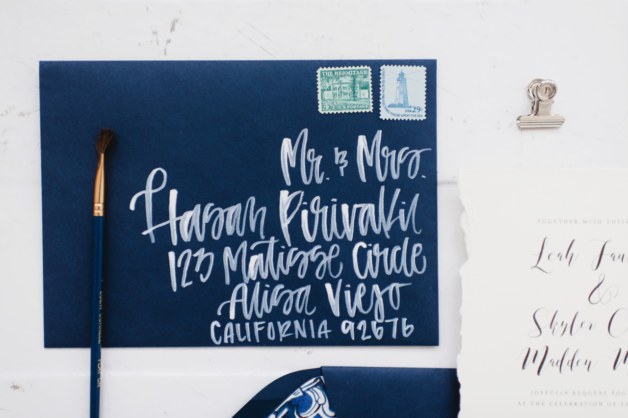
We pulled design inspiration from the Mediterranean, sketched art, organic fibers, textiles, natural papers, and more. Leah and Skyler really loved the idea of making everything look “done by hand” so we did just that. The edges of the invitation were deckled by hand, and all the envelopes were hand lettered with white opaque ink.

Navy and White Mediterranean Inspired Wedding Invitations by Robinson Paperie

The sketch of the church across the street from their wedding venue was hand illustrated. Even though the suite itself was simple in terms of the design, the watercolor tile liner was hand painted and given a cotton texture to make it look a little distressed. This was JUST the extra “pop” it needed! We carried over the textile design to the rehearsal dinner card and changed the shape to make it stand out. It was an honor to help this couple relive their travels through their wedding suite, and more importantly, share it with all their guests!

Navy and White Mediterranean Inspired Wedding Invitations by Robinson Paperie

Thanks Camille!

Design and Envelope Addressing: Robinson Paperie

Watercolor Liner: Ashley Laskowski

Printing: Nikko Media

Styling: Carina Skrobecki 

Check out the Designer Rolodex for more tal­ented wed­ding invi­ta­tion design­ers and the real invi­ta­tions gallery for more wedding invitation ideas!

Photo Credits: Carina Skrobecki Photography

Happy Weekend!

Happy Weekend everyone! Can you believe Halloween is just over a week away?? Sophie wants to be a fairy for Halloween, which means Alice will also be a fairy since she only ever wants to do the same things as Sophie. But I’m still trying to decide if I want to do something a bit more homemade for their costumes or go with a store-bought costume. We have fairy wings and wands, so I think all we’d really need is a dress? For those of you that are parents: do you also dress up with your kids for Halloween? I don’t see many parents in costume in our neighborhood, but I think it would be fun to do a family costume someday! Ah, well. In the meantime…

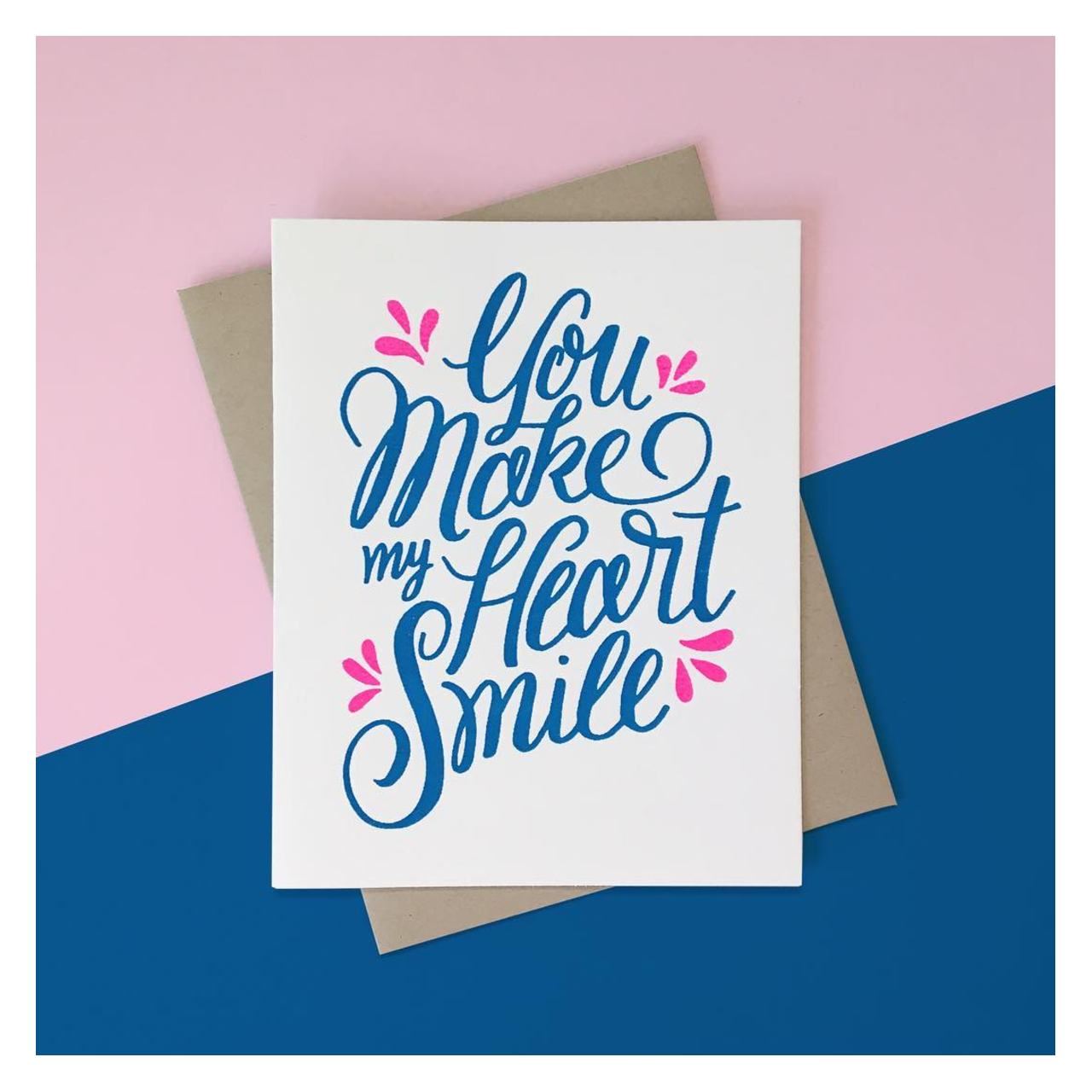
Meeschmosh "You Make My Heart Smile"

Card by Meeschmosh via Instagram

…a few links for your weekend!

This week on Oh So Beautiful Paper:

That’s it for us this week! We’ll see you back here next week! xoxo