Abigail + Tim’s Art Nouveau Wedding Invitations

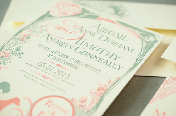
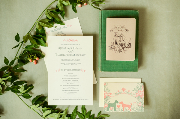
Ooooh, I’m loving the combination of green and coral in these vintage-inspired wedding invitations from our friends (and DIY contributors!) Bailey and Emma of Antiquaria. Inspired by the bride’s love of Art Nouveau era posters and the idea of an outdoor garden party, the invitations feature hand lettering and illustrations of the couple’s two dogs. So cute!

Art-Nouveau-Custom-Wedding-Invitations-Antiquaria

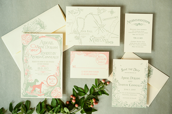
From Bailey and Emma: Abigail and Tim asked us to design an invitation suite for their wedding this past June. Abigail described the wedding as being a vintage garden theme using shades of green and coral. She wanted an invitation that looked like a vintage Art Nouveau poster and that incorporated her two beloved dogs, Nipper and Ginny. We took the challenge head on and designed a poster-like invitation that incorporated everything on her wish list.

Art-Nouveau-Custom-Wedding-Invitations-Antiquaria2

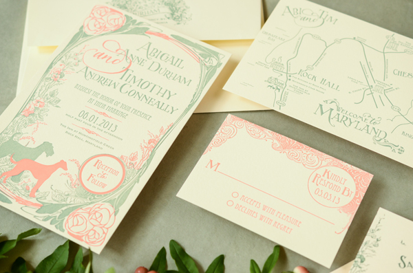
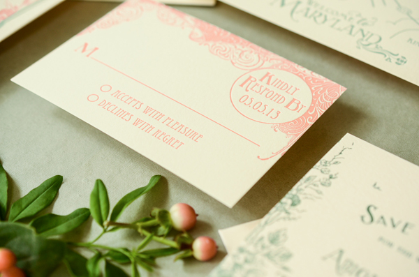
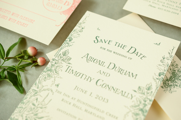
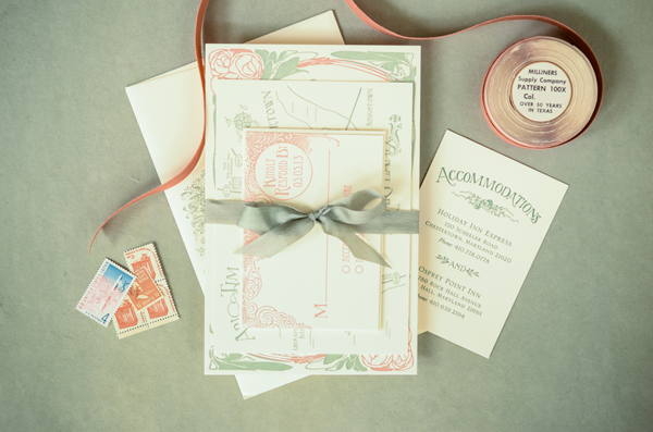
The design itself included illustrations of her dogs and accents of hand lettering which helped make the design look vintage. The design really came to life once it was letterpress printed on cotton paper using coral and succulent green inks. In the end, the invitation suite included A6 save the dates, A9 invitations, 4bar reply cards, and a 4×6 hand illustrated map.

Art-Nouveau-Custom-Wedding-Invitations-Antiquaria4

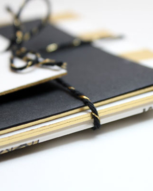
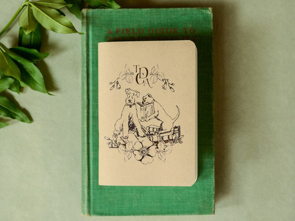
We carried the invitation theme through to the reception stationery including programs and thank you cards. Abigail has a love of books, so as favors for the guests we made little keepsake notebooks with an illustration of her dogs reading on the cover.

Art-Nouveau-Custom-Wedding-Invitations-Antiquaria5

Art-Nouveau-Custom-Wedding-Invitations-Antiquaria3

Art-Nouveau-Custom-Wedding-Invitations-Antiquaria7

From the bride, Abigail: We are very much dog people and wanted to find a way to show our love for our pups while keeping the invitations elegant and within our vintage garden party theme. The attention to detail within the design really helped to personalize the invitation and we especially loved the map with the silhouettes of our dogs. Tim and I are both big readers and love to write, draw, and create. The notebook favors illustrated this side of us perfectly and looked gorgeous paired with Blackwing pencils (a favorite of famous composers and writers) on the tables with all the flowers.

Art-Nouveau-Custom-Wedding-Invitations-Antiquaria8

Before the wedding I was thinking of not putting much effort into wedding invitations, but I am so glad I changed my mind because these are one of my favorite things from the wedding and will be a treasured keepsake for years to come.

Art-Nouveau-Custom-Wedding-Invitations-Antiquaria9

Thanks ladies!

Anti­quaria is a mem­ber of the Designer Rolodex – you can see more of their beau­ti­ful work right here or visit the real wedding invitations gallery for more wedding invitation ideas!

Photo Credits: Antiquaria

Courtney + Nate’s Wisconsin Lake Wedding Invitations

Created for a summer wedding along a lake in Madison, Wisconsin, these wedding invitations from Sugar River Stationers feature a beautiful line illustration of Madison and wave-inspired laser cut details. But my favorite detail? The wood box mailer, a fun nod to the groom’s profession as a distiller!

Wisconsin-Lake-Wedding-Invitations-Sugar-River-Stationers2

From Heather: We designed these wedding invitations for a July 2013 wedding in Madison, Wisconsin. I would categorize Courtney and Nathan’s stationery as “quirky” with lots of character. Courtney is an elementary school teacher and Nathan owns a distillery in Madison. The suite features an original line art illustration of Madison, as well as supplemental illustrations used in the custom stamps and various “day of” items. The couple live along one of Madison’s largest lakes and spend a great deal of time together boating.

Wisconsin-Lake-Wedding-Invitations-Sugar-River-Stationers

The invitation suite was mailed in a slide top wood box. Given that Nathan owns a distillery, the wood box and excelsior packaging appealed to him. Inside, the presentation layer features a laser-cut pocket with tag detail on the front.

Wisconsin-Lake-Wedding-Invitations-Sugar-River-Stationers4

The invitation is booklet format, with illustration and additional items such as the RSVP, map and accommodations card were housed inside the laser cut pocket. The RSVP features an original photograph of Courtney and Nate changed to vector art. We created custom stamps with another original illustration of Courtney and Nate sitting on a pier in front of the house and used the boat illustration for a circle cut tag that was placed around succulents used as favors.

Wisconsin-Lake-Wedding-Invitations-Sugar-River-Stationers3

Wisconsin-Lake-Wedding-Invitations-Sugar-River-Stationers5

Thanks Heather!

Design: Sugar River Stationers

Illustration: Steph Davies

Check out the Designer Rolodex for more tal­ented wed­ding invi­ta­tion design­ers and the real invi­ta­tions gallery for more wedding invitation ideas!

Photo Credits: Harper Fritsch Studios and Maureen Cassidy Photography

Happy Weekend!

Happy Friday everyone! I greedily look forward to each Friday this time of year because with every passing week we get closer to spring! I’m sure I sound like a broken record at this point, but some days it’s really all I can think about. Anyway. Our big news this week is that we just finished our first major project at home: living room built-ins! I’ll be sharing more about those soon, but I’m so happy they’re done and looking forward to a weekend of filling them with books and some of our other favorite objects. But in the meantime…

Jenny-Vorwaller-Never-Fade-Painting

Never Fade painting by Jenny Vorwaller (I’m obsessed with the entire series)

…a few links for your weekend!

This week on Oh So Beautiful Paper:

Sadly, no cocktail recipe this afternoon! We had an unexpectedly hectic week, so we’re taking some time to regroup and will be back in cocktail action next Friday. I hope you all have a wonderful weekend and I’ll see you back here early next week! xoxo

Michelle + Bernie’s Black and Gold Brooklyn Wedding Invitations

Michelle and Bernie wanted their wedding in Brooklyn’s DUMBO neighborhood to be a giant party celebrating their marriage. For their invitations and save the dates, Michelle (the designer behind Meesch) started with a black and gold color palette. Michelle also incorporated lots of fun celebratory details throughout the suite, like tissue paper confetti with the save the dates and a glittery gold envelope with the invitations. So fun!

Black-Gold-Brooklyn-Wedding-invitations-Meesch

From Michelle: Bernie and I got married at Rebar in DUMBO. It was the perfect venue for us. We wanted a party to celebrate our marriage and that’s exactly what we had. When deciding on the design, black and gold kept twirling around in my thoughts. The tone was set with the save the dates. I hole punched tissue paper, and put handfuls in cello bags and taped them to the announcement that I screen printed, with awesome washi tape.

Black-Gold-Brooklyn-Wedding-invitations-Meesch4

Black-Gold-Brooklyn-Wedding-invitations-Meesch3

When creating the invitation suite, I wanted to to keep it fun. In the end, it was a little recap of or relationship. The invitations I letterpress printed on Crane’s Lettra and then had them foiled stamped and the edges painted in gold. For the black envelopes, I screen printed “The story goes like this…” and the return address. Once that was done, I took rolls of gold glitter wrapping paper and cut down smaller squares for the envelope liners, adding some extra flare.

Black-Gold-Brooklyn-Wedding-invitations-Meesch2

Black-Gold-Brooklyn-Wedding-invitations-Meesch10

Instead of doing inserts for the directions and accommodations info, I decided to make a little info booklet. Inside was everything everyone needed to know; how to get there, where to stay, and then we highlighted some of our favorite spots. Since we would be taking pictures by the Brooklyn Bridge, I drew the illustration for the cover. Everything was tied up nicely with black and gold twine from Knot + Bow.

Black-Gold-Brooklyn-Wedding-invitations-Meesch6Black-Gold-Brooklyn-Wedding-invitations-Meesch5

Black-Gold-Brooklyn-Wedding-invitations-Meesch9

I screen printed the image of the Brooklyn Bridge onto welcome tote bags for the guests that were staying at the hotel. We tied a smaller version of the map around the handles, which also listed events going on that weekend in Brooklyn.

Black-Gold-Brooklyn-Wedding-invitations-Meesch11Black-Gold-Brooklyn-Wedding-invitations-Meesch8

For our favors, we decided on coasters. Mama’s Sauce foil stamped the image of the Brooklyn Bridge, and we wrapped them up in some awesome bags from For Your Party, along with an insert that thanked everyone, and had a link to songs from our wedding playlist. I spray painted little action figures for the food cards, and made bags of confetti to be thrown for when we walked down the aisle.

Black-Gold-Brooklyn-Wedding-invitations-Meesch7

Thanks Michelle!

Design: Meesch

Foil Stamping: Mama’s Sauce

Twine: Knot + Bow

Check out the Designer Rolodex for more tal­ented wed­ding invi­ta­tion design­ers and the real invi­ta­tions gallery for more wedding invitation ideas!

Photo Credits: Meesch

Happy Weekend!

Happy Friday everyone! Less than a week before Christmas! I’ll be back on Monday and Tuesday with a couple of quick (but very fun) posts before heading off for our annual holiday hiatus. But in the meantime…

OSBP-St-Germain-New-Years-Eve-Cocktail-Party-Ideas-Recipes

Our New Year’s Eve Cocktail Dinner Party with St-Germain

…a few links for your weekend!

This week on Oh So Beautiful Paper:

Check back soon for this week’s cocktail! I hope you all have a wonderful weekend, and I’ll see you back here early next week! xoxo