Modern Neon Typography Wedding Invitations

I’ll always have a soft place in my heart for typography-driven wedding invitations, especially when there’s a pop of neon involved! Sabrina from Smudge Ink sent over these bold and modern neon typography invitations for a wedding in Boston Harbor. I’m absolutely loving the playful wording throughout the invitation suite, from the RSVP cards to the adorable lobster eating guides!

Modern Neon Typography Wedding Invitations by Smudge Ink / Oh So Beautiful Paper

From Sabrina: Elizabeth and Tucker weren’t afraid to speak volumes when it came to their invitations. I knew it would be a fun suite to design as soon as I saw their wedding hashtag #atuckinggoodtime (a clever play on their names). And Alexis, their event designer and wondergal behind The Little Things, was already brimming with ideas for how to capture the couple’s vision for a lively celebration on the Boston Harbor Islands.

Modern Neon Typography Wedding Invitations by Smudge Ink / Oh So Beautiful Paper

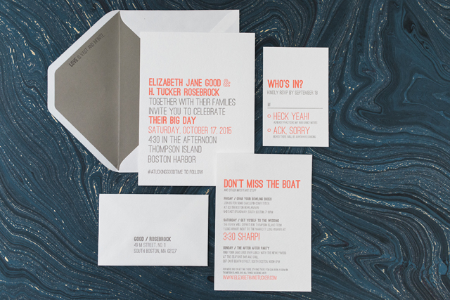
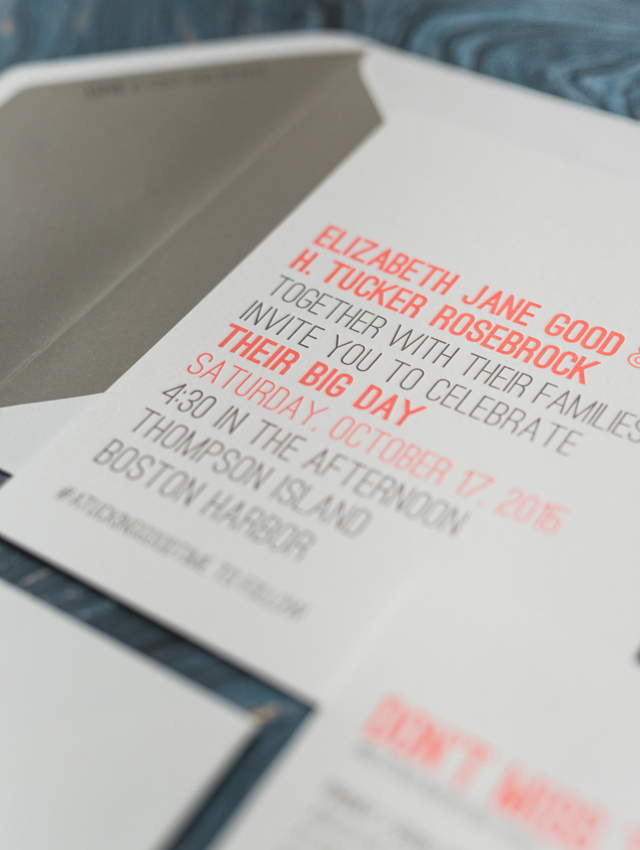
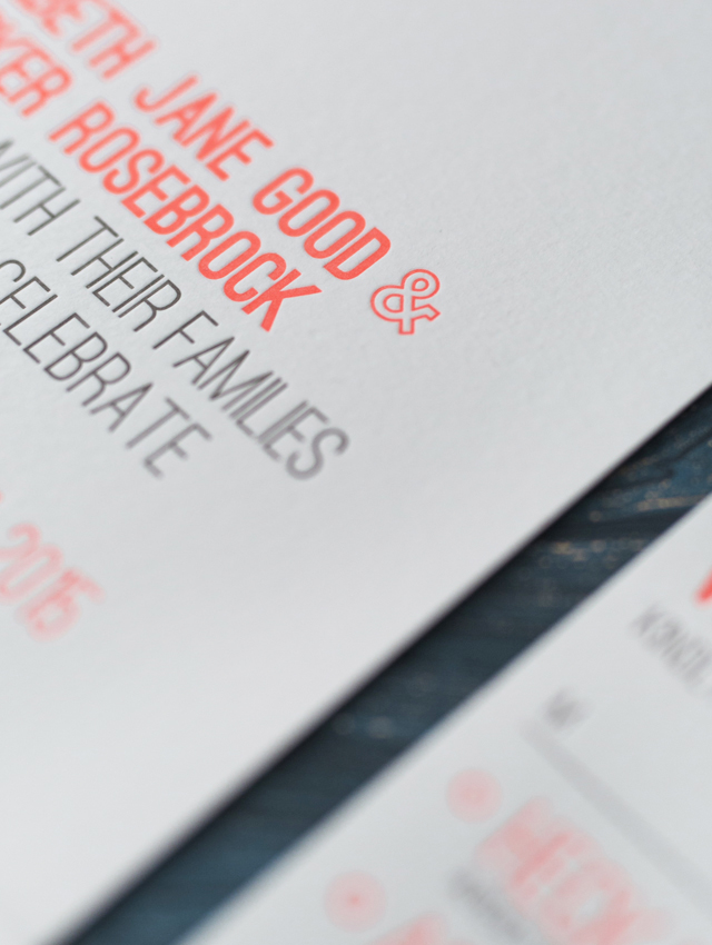
The natural elements provided by the rocky beaches and green landscape of Thompson Island would be a nice escape from the city. But for their stationery Elizabeth and Tucker wanted to offset the rustic feel of their venue with a more bold and modern aesthetic. We immediately decided to keep the look feeling clean cut and fresh with a typography-only design. To play up the couple’s big and bright personalities, we chose to letterpress print in neon coral and gray inks. A coordinating gray envelope liner with one of the couple’s favorite quotes brought everything together.

Modern Neon Typography Wedding Invitations by Smudge Ink / Oh So Beautiful Paper

Modern Neon Typography Wedding Invitations by Smudge Ink / Oh So Beautiful Paper

Modern Neon Typography Wedding Invitations by Smudge Ink / Oh So Beautiful Paper

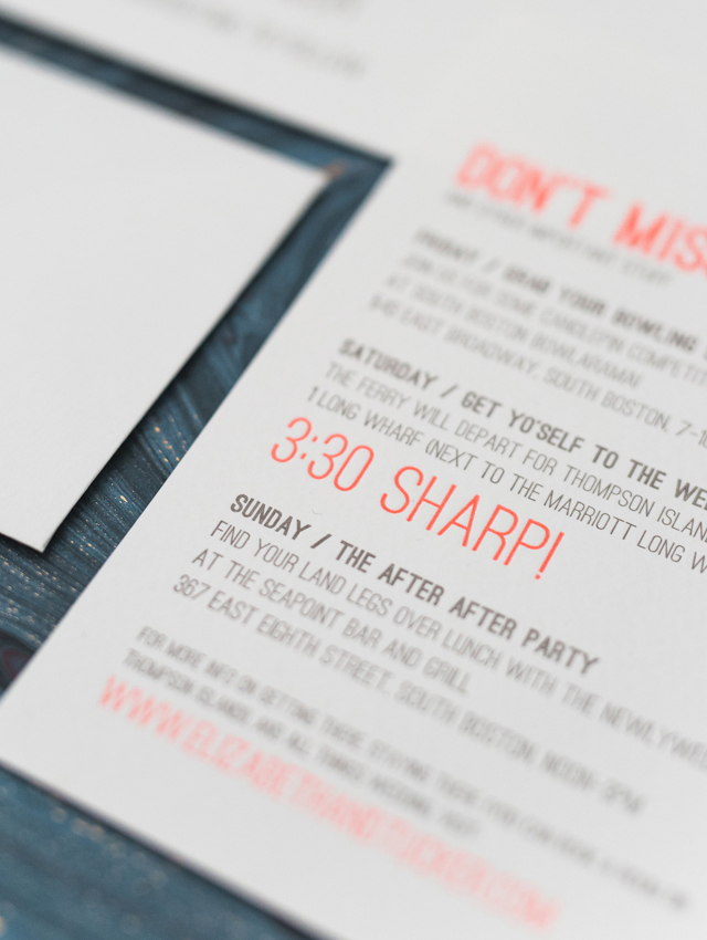
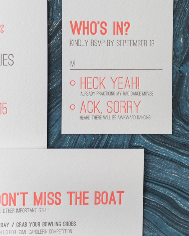
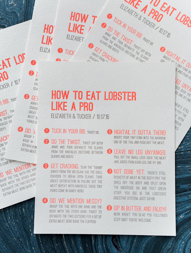
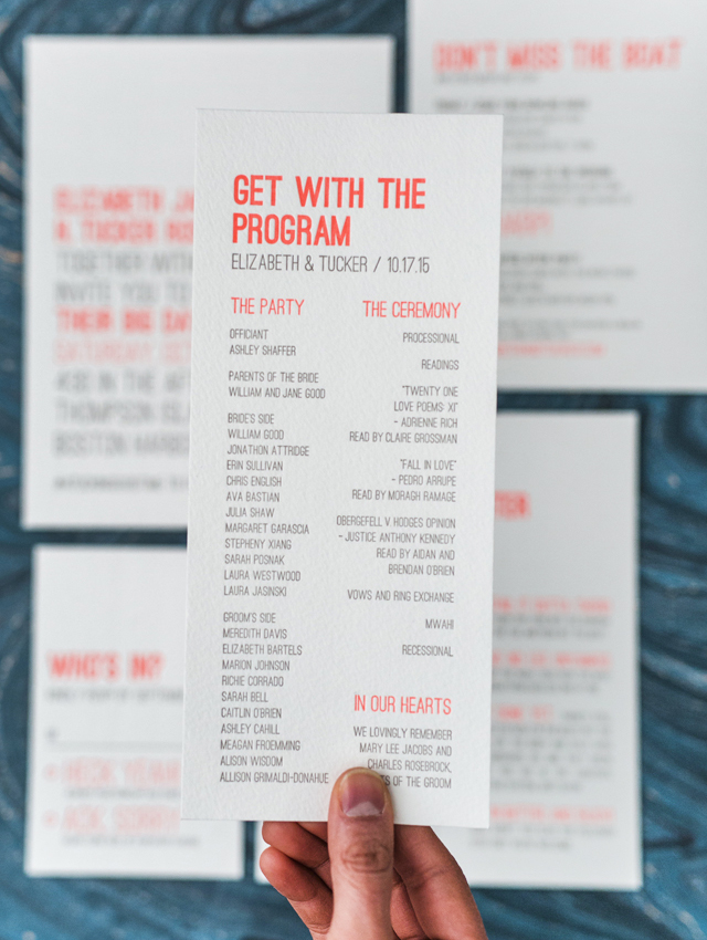
I love how we paired their affinity for clean typography with slightly cheeky copy that perfectly captured their fun-loving personalities. From the replies to the ferry schedule, coming up with just the right wording was probably my favorite part of their stationery. We carried this playfulness right up to the wedding day with letterpress printed programs and how-to-eat-lobster “menus.”

Modern Neon Typography Wedding Invitations by Smudge Ink / Oh So Beautiful Paper

Modern Neon Typography Wedding Invitations by Smudge Ink / Oh So Beautiful Paper

Thanks Sabrina!

Design and Letterpress Printing: Smudge Ink

Styling: The Little Things

Smudge Ink is a member of the Designer Rolodex – you can see more of their beautiful work right here or visit the real invi­ta­tions gallery for more wedding invitation ideas!

Photo Credits: Sarah Jayne Photography

Hand Lettered San Diego Wedding Invitations

How fun are these hand lettered San Diego wedding invitations from Katie at Odd Daughter Paper Co.?!? I’m completely obsessed with every detail in this invitation suite, from the playful invitation wording, to the modern hand lettering, to the illustrated map of San Diego food spots. I wish every wedding invitation came with an illustrated food map – don’t you?

Hand Lettered San Diego Wedding Invitations by Odd Daughter Paper Co. / Oh So Beautiful Paper

From Katie: This San Diego wedding invitation suite was all about hand lettered type and a custom illustrated map. The couple is hysterical and had awesome wording for the invitation and reply card. I wanted their wording and the hand lettering to shine so I kept the design fairly simple with black text on white paper. Czar Press did an amazing job on these letterpress pieces and I think the simplicity of the design also highlights the beauty of letterpress printing.

Hand Lettered San Diego Wedding Invitations by Odd Daughter Paper Co. / Oh So Beautiful Paper

Hand Lettered San Diego Wedding Invitations by Odd Daughter Paper Co. / Oh So Beautiful Paper

In addition to their love for each other, the couple LOVES food. And their city! Did I mention they were so fun to work with?! We decided a map highlighting the best food spots in San Diego was the perfect way to personalize the invitations AND give their out of town guests the inside scoop on the best places to eat. I chose to do a tri-fold piece so that we could fit the map, all of the food descriptions, and a few additional wedding details all in one place. The bride requested little hand drawn illustrations at each spot on the map (“I’m picturing a tiny bowl of noodles and a tiny beer bottle… etc.”) and this is where I was able to add some little pops of color. The map was printed digitally on cotton paper by Czar Press, which gives it a luxurious feel without the cost of multiple letterpress colors.

Hand Lettered San Diego Wedding Invitations by Odd Daughter Paper Co. / Oh So Beautiful Paper

The invitation suite was finished with a custom address stamp that included the couple’s names in hand lettering combined with a simple serif font. For envelopes, we went with a classic gray #10 envelope for the invitation and a sweet coral 4bar for the reply card. All that to say, it was such a fun invitation. I had such good wording and content to work with!!

Hand Lettered San Diego Wedding Invitations by Odd Daughter Paper Co. / Oh So Beautiful Paper

Thanks Katie!

Design and Hand Lettering: Odd Daughter Paper Co.

Printing: Czar Press

Check out the Designer Rolodex for more tal­ented wed­ding invi­ta­tion design­ers and the real invi­ta­tions gallery for more wedding invitation ideas!

Photo Credits: Odd Daughter Paper Co.

DIY Spray Painted Gift Wrap

When it comes to DIY supplies, I tend to play favorites: paint pens, paper (naturally), gold leaf, and acrylic paint are all at the top of my go-to supply list. Also at the top of that list? Spray paint! I’m completely addicted to making these DIY spray painted acrylic signs for parties (like this year’s Paper Party!), and I’ve spray painted many a chair and table for home DIY projects. So when The Home Depot asked me to create DIY wrapping paper as part of their annual Holiday Style Challenge, I knew I wanted to use spray paint as part of my project!

DIY Spray Painted Gift Wrap / Oh So Beautiful Paper

The final DIY spray painted gift wrap project incorporates newsprint packing paper, various shades of Rust-Oleum spray paint, copper wire, nylon neon twine, and gift tags made from paint chips! So basically, I raided the paint aisle to create my ideal subtle, whimsical, shimmery, painterly-meets-ombré wrapping paper! You can find the full tutorial over on The Home Depot blog right here – and of course all of the materials used are available right at The Home Depot!

DIY Spray Painted Gift Wrap / Oh So Beautiful Paper

DIY Spray Painted Gift Wrap / Oh So Beautiful Paper

I tried at least a dozen different color combinations, each combining one or two color spray paints with a metallic spray paint. The pink versions are my favorite; I love the subtle ombré from mixing shades of pink with the metallic spray paint! But I also love the high contrast black and shimmery pastel blue. I found that a thin layer of metallic spray paint over any color helped blend everything together, and my favorite metallic ended up being this subtle pearl spray paint called Champagne Mist. It left the perfect amount of shimmer without changing the color of the wrapping paper. Another favorite combination involved bright coral and gold spray paint. So many great options!

DIY Spray Painted Gift Wrap / Oh So Beautiful Paper

DIY Spray Painted Gift Wrap / Oh So Beautiful Paper

The paint chip gift tags also received a layer of metallic spray paint, which is really lovely in person but kind of subtle in photos. Next time I’d love to try pairing two bright colors together for more contrast! I wrapped the gift boxes with the spray painted gift wrap and copper hobby wire with the paint chip gift tags. For smaller gift boxes I also used ribbons made of strips ripped from cotton painter’s rags. I love the additional texture of the loose cotton weave and frayed edges!

DIY Spray Painted Gift Wrap / Oh So Beautiful Paper

DIY Spray Painted Gift Wrap / Oh So Beautiful Paper

A huge thanks to The Home Depot for inviting me to be part of this year’s Holiday Style Challenge! I had a BLAST! You can find the full tutorial for this DIY Spray Painted Gift Wrap here, and more holiday ideas on The Home Depot’s Holiday Style Challenge Pinterest board!

Photo Credits: Nole Garey for Oh So Beautiful Paper

How to Use Vintage Stamps

I love, love, LOVE using vintage postage stamps on envelopes. They add a little something special to everything from wedding invitations to dinner and cocktail party invitations to baby announcements. Vintage stamps offer a wonderful opportunity to represent your personal style, whether chosen thematically or by color palette. And since unused postage never expires, there are endless options to suit every type of occasion – from a formal black tie wedding to a casual backyard gathering. Here are a few of my tips for how to use vintage stamps – plus, I put a collection together with some of my favorite vintage stamps that you can use in your own projects!

How to Use Vintage Stamps / Oh So Beautiful Paper for eBay

How to Use Vintage Stamps / La Happy

Photo Credit: La Happy Design & Calligraphy

1. Add it Up

First things first: vintage postage must add up to current postage rates. While searching and shopping for stamps, make sure that you have one stamp worth at least 25¢ (or more!). Wedding invitations and birth announcements mailed in a larger envelope usually require a minimum of 71¢ postage. The 3¢ and 8¢ stamps are great for rounding out a color palette or subject theme, but you’ll need a 29¢ or 33¢ stamp in the mix to make up the difference in the total postage amount.

How to Use Vintage Stamps / Wondrous Whimsy

Photo Credit: Diana McGregor Photography / Calligraphy by Wondrous Whimsy

How to Use Vintage Stamps / Anne Robin Calligraphy and Underwood Letterpress

Photo Credit: Stephanie Collins Photography / Calligraphy by Anne Robin / Vintage Postage by Underwood Letterpress

2. Plan it Out

Plan your stamp arrangement ahead of time to make sure you leave room for an address – and to maximize visual impact. Some stamps look best in a straight row across the top of an envelope, while others look best in a puzzle piece arrangement in the corner. It all depends on the stamps you select!

How to Use Vintage Stamps

Calligraphy: The Weekend Type / Floral Styling: The Moss & Rose / Styling: Two Be Wed / Photo Credits: Korie Lynn Photography

How to Use Vintage Stamps / Anne Robin Calligraphy and Underwood Letterpress

Photo Credit: Stephanie Collins Photography / Calligraphy by Anne Robin / Vintage Postage by Underwood Letterpress

3. Color Theory

The easiest way to group vintage stamps together? By color! Let your wedding color palette guide your vintage stamp selections and your envelopes will shine! You can even address the envelopes using ink in a complementary color to make your envelopes even more special and complete the overall look.

How to Use Vintage Stamps / Antiquaria Design

Photo Credit: Antiquaria Design Studio

4. Personal Geography

I love it when couples share a glimpse of their personal history – and geography! – in their vintage stamp selections. It can be as simple as a stamp with the city or state where the couple met, along with stamps of their home state. Perhaps they grew up in Montana and Texas but met in college in DC. When placed together on an envelope, these stamps tell such a fun story!

How to Use Vintage Stamps / Coral Pheasant

Photo Credit: Coral Pheasant

How to Use Vintage Stamps / Lauren Chism Fine Papers

Photo Credit: Lauren Chism Fine Papers

5. Stick to a Theme

Love science? Have a passion for architecture? Maybe you’re both crazy for horses, or you met while working on a political campaign. Whatever your interests, let them shine in your envelope postage! You can find vintage postage stamps for practically any topic or theme, from travel to modern art.

How to Use Vintage Stamps / Blue Eye Brown Eye Calligraphy

Photo Credit: Blue Eye Brown Eye Calligraphy

6. Pretty Botanicals

If themes aren’t your thing, go with flowers! My favorite vintage stamps feature floral designs – and they look so incredibly beautiful when grouped together on a wedding invitation envelope! My favorite floral stamps are the Mississippi and Alabama statehood stamps, along with this love stamp.

p.s. Where to find (and buy) vintage stamps and more inspiration for mixing vintage stamps

This post was created in partnership with eBay. All content and opinions are my own. Thank you for supporting the sponsors that make Oh So Beautiful Paper possible!

Rustic Moonrise Kingdom-Inspired Wedding Invitations

Rubber stamps are such an underutilized method for printing wedding invitations! Michael of Anticipate Invitations created these Moonrise Kingdom-inspired wedding invitations for a rustic wedding in Maine – and almost the entire suite is printed using rubber stamps! I love the attention to detail in these wedding invitations, right down to the vintage postcard hexagon tag!

Rustic Rubber Stamp Wedding Invitations by Anticipate Invitations / Oh So Beautiful Paper

From Michael: Alexis and Brian drew inspiration for their custom wedding invitation from Wes Anderson films (think Moonrise Kingdom and Grand Budapest Hotel) and the vibe of their rustic venue, Josias River Farm in Cape Neddick, Maine. It had to be colorful—but not bold, vintage—but not campy, and modern—but not unwelcoming. Although with the venue being a farm it could skew rusticly romantic, the couple requested something a bit more unexpected. We were happy to accept the challenge and the couple was a breath of fresh air to work with. They were able to articulate what it was they wanted their guests to feel, and that was a great starting point from which to jump from.

Moonrise Kingdom-Inspired Wedding Invitations by Anticipate Invitations / Oh So Beautiful Paper

Since materials were just as important as the design to the couple, we turned to the beautiful handmade quality that only rubber stamps can give for printing. The printing was done on large sheets of paper and then later cut down to size so that less precision was needed to ensure they were printed straight. Aside from the full-color vintage postcard hexagon card, all the pieces were printed using this method.

Moonrise Kingdom-Inspired Wedding Invitations by Anticipate Invitations / Oh So Beautiful Paper

The invitation card was printed on pale blue paper, backed with an off-white, speckled recycled paper for thickness, and then printed using an extra-large custom rubber stamp. The coral RSVP postcard was cleverly written in a Mad Libs style and was also backed with a contrasting paper color to give it rigidity and cohesiveness. All the pieces were packaged together with coral bakers twine and a hexagon card made from a vintage Maine postcard. A brown kraft pastry bag stood in for an envelope and added just the right amount of quirkiness and vintage flair.

Moonrise Kingdom-Inspired Wedding Invitations by Anticipate Invitations / Oh So Beautiful Paper

Return address labels were printed on the same blue green paper as the invitation and sealed the pastry bag closed for mailing. A collection of nature-themed, vintage postage stamps were sourced by the bride and completed the whole package.

Moonrise Kingdom-Inspired Wedding Invitations by Anticipate Invitations / Oh So Beautiful Paper

Moonrise Kingdom-Inspired Wedding Invitations by Anticipate Invitations / Oh So Beautiful Paper

Thanks Michael!

Check out the Designer Rolodex for more tal­ented wed­ding invi­ta­tion design­ers and the real invi­ta­tions gallery for more wedding invitation ideas!

Photo Credits: Anticipate Invitations