Brick + Mortar: Stationery Matters. It’s time to create.

If you care about words, and how they’re used, this has been a challenging year. If you care about sentiments, and kindness and how to get back to a place where we value kind sentiments, this has been an excruciating week (months, year). In the stationery world, where we all mingle, we can feel removed from tangible ways to enact positive political change, but I’m here to tell you, we’re in the quiet center of it. Stationery matters. We can shift the discourse by creating new opportunities for conversation. Let’s use our power for good ~ Emily at Clementine

Ladyfingers Letterpress: It's Going to be OK

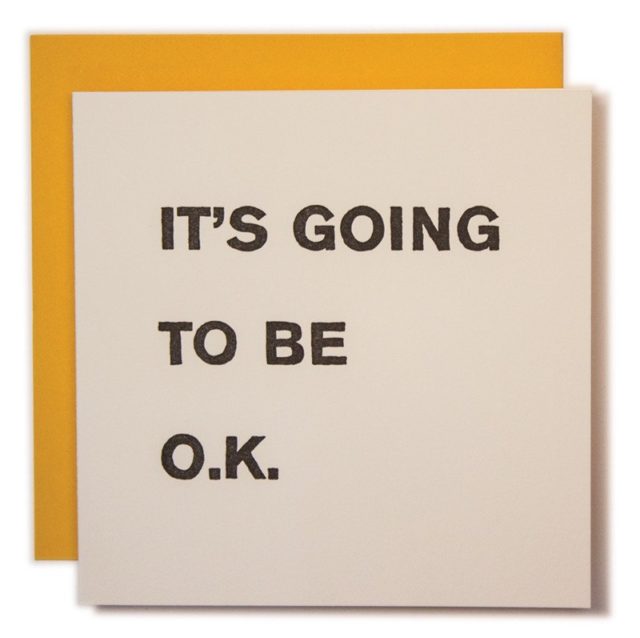
Ladyfingers Letterpress, it’s going to be ok.

I am not a political commentator and this is not the place, but it doesn’t take an expert to know we are unsettled by recent political events. As creatives and small business owners, many of us have been stunned into silence, unsure of how our daily offerings can actually help. I want this post to remind you that creativity has power because it radiates. I see your work touch lives everyday. The most poignant moments I share with customers are over their card purchases. People write when they can’t pick up the phone; when they know the right card will lift a friend’s mood; when their own joy overflows and they want to share it; when they don’t know what to say to ease someone’s pain, but they know they have to say something; when they ache for connection. As makers of cards, creators of sentiments, you are creating new avenues for connection. So what should you do today? What you do best:

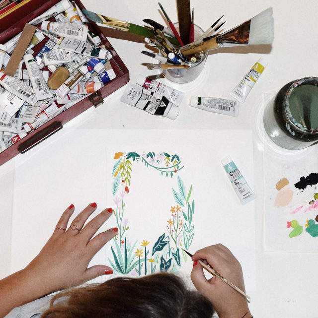
1. Create the cards that are missing from the market place. Create them now. Say the things you want to say (design them well) and print them. Are you afraid they won’t sell? Be afraid. Create them anyway. We need fresh love. With Leonard Cohen’s passing, his words reverberate this week:

Ring the bells that still can ring/
Forget your perfect offering/
There is a crack in everything/
That’s how the light gets in.


2. Write. Write to give thanks, write because appreciation lifts spirits, write to offer support, write to lift the darkness. Write to people you don’t know, who are scared because they are being threatened, find a teacher or a place of worship where students or members of a congregation have been targeted. Write letters to the editor, or small notes to any member of your community who is struggling. Write to your high school friends and current neighbors. Write to your family members who you disagree with, write to your family members who you love. Flood the world with actual, tangible good words.

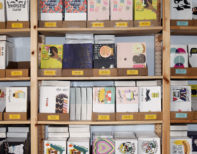
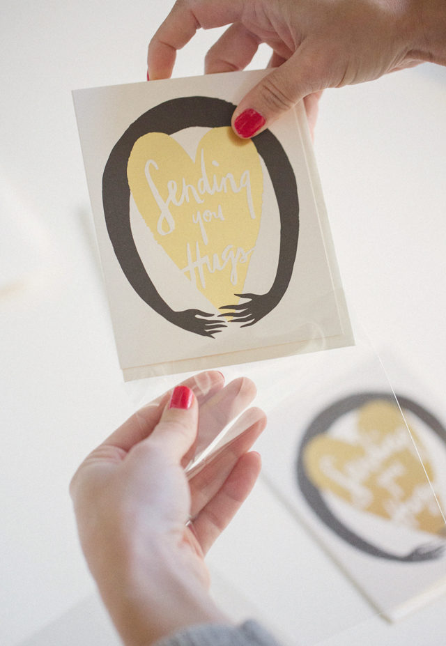
Here is a sample of the cards and prints that remind me that simple, fresh sentiments can create a zing of hope, humor, and possibility. I’m sending some and framing others. I hope you’ll join me – share the new designs you create and the cards you’re sending out. I’d love it if you’d also add #osbpsendlove so we can see and share hope within this community. Move mountains with your words. Make love big. xo Emily Ghost Academy: Bad Bitches Run This Shit
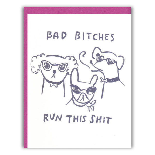
Ghost Academy, bad bitches run this shit

La Familia Green: I'm Here for Anything You Need

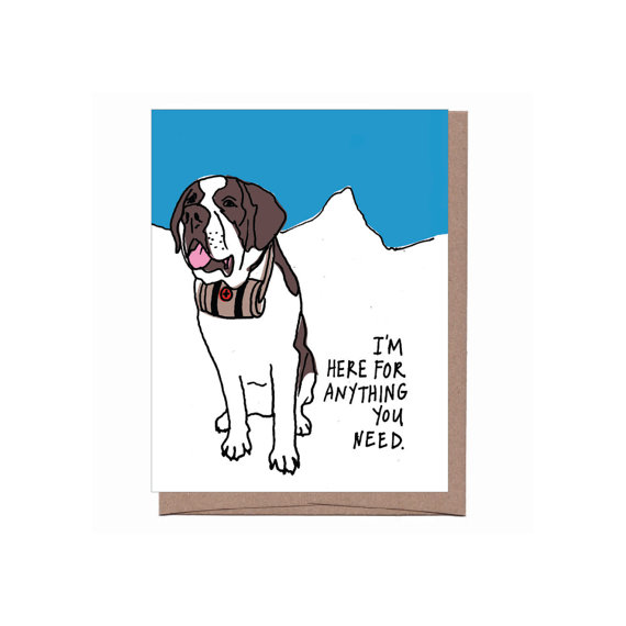
La Familia Green, I’m here for anything you need.

People I've Loved: Shit Doesn't Have to Make Sense

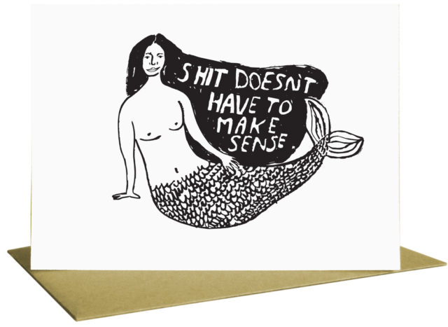
People I’ve Loved, shit doesn’t have to make sense

Yellow Owl Workshop: Friends Come in All Colors and Shapes Print

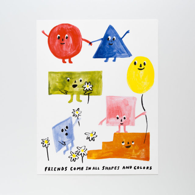
Yellow Owl Workshop, friends come in all shapes and colors

Ink Meets Paper: Together We Can Get Through Anything

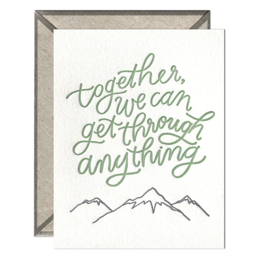
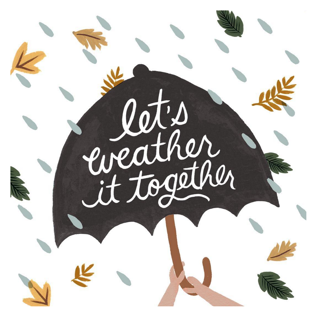
Ink Meets Paper, together we can get through anything

Emily McDowell: Broken Objects

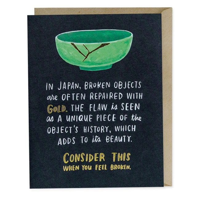
Emily McDowell, broken objects

Daydream Prints: Find Your Tribe, Love Them Hard

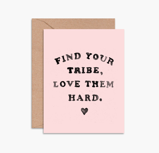
Daydream Prints, find your tribe, love them hard

Behind the Stationery: Idlewild Co.

For this installment of Behind the Stationery, I’m thrilled to bring you a former fellow Brooklynite, Katie Gastley of Idlewild Co. on the blog sharing about her first wholesale order, what prompted a transition to a Florida office, and how she hand paints every design (!) that Idlewild produces. Cheers and take it away, Katie! –Megan

katie_painting

Ever since I can remember, I have always loved making things. Anything. Be it paintings, jewelry, ceramics, recipes, I’m in my prime when I’m creating. I moved from Pennsylvania to Brooklyn in 2002 to attend Pratt Institute, an Art and Architecture school focused on building a core fine art foundation; quite literally the perfect school for me! While refining all of my technical design skills that I use today to manufacture Idlewild Co.’s various products, I was also able to keep painting; something I found as more of a necessity to how I function rather than a hobby.

Behind the Stationery: Idlewild Co.

Upon graduation, I worked in various print and web design fields and built a small Etsy business on the side selling prints of my original paintings. I exhibited in my free time, selling my art prints in cafes and at various NYC craft festivals. One of my friends from college invited me to see her booth at the National Stationery Show; when I walked into the Javits Center and saw rows and rows of mega-creative-talent, and they were predominantly women-owned business… I was hyped! I knew I had found something special, and all of a sudden the direction of my side-business became a very focused goal. I was going to form a small collection of greeting cards, and apply for next year’s show.

Behind the Stationery: Idlewild Co.

At the time, I was working as a designer at Martha Stewart, another business run by smart and creative women (there’s a theme here…) and my nights were spent painting, printing, and packaging a small range of greeting cards and hand-bound notebooks to debut at the show. I knew a bit about selling through my experience at the local shows in New York, but figuring out my pricing and policies took quite a lot of work at the beginning.

Behind the Stationery: Idlewild Co.

I started the first batch of production with the only savings I had, and away I went to my first National Stationery Show booth built with the help of family and friends. My literal first sale was almost a disaster as I unknowingly applied NY State sales tax to a wholesale order. (Disclaimer: That is NOT how it works, but I was so thoroughly traumatized by the process of applying for a State Tax ID and wrapping my brain around its rules and guidelines, I was more than willing to hand over more than my fair share of taxes. Well, times have changed on that matter, my friend!) My buyer looked at me like I was an idiot and shared words that will probably forever echo in my mind: “Um, wholesale orders DO NOT pay tax.” Yeah, ok. Very shaky, but I had made my first sale, and it was quite a large one. Thankfully she looked past my rookie mistake – and they are still a current reseller of ours!

Behind the Stationery: Idlewild Co.

Running my business during the weekends out of my Brooklyn apartment became more and more difficult to manage during my already 50-hour long work week. I knew a change was in sight. It wasn’t possible to manage quitting my full-time job and running a hardly-profitable small business in the most expensive/greatest city in America, so my fiancé and I moved to the next-best place: the beach. He grew up in a small town on the Atlantic coast in Florida, and I was able to focus entirely on building my business.

Behind the Stationery: Idlewild Co.

Progress was slow but steady and I was eventually able to afford a separate studio, then part time employees, and finally a full-time manager to oversee our wholesale partnerships, and studio manager to oversee our order fulfillment and inventory. With each step of growth I was able to allocate a little bit of the day-to-day “business” responsibilities to my employees, and devote more of my own time to creating new designs and prototyping new product categories.

Behind the Stationery: Idlewild Co.

All of the designs at Idlewild Co. are created using my hand-painted artwork. Beginning with a sketch idea, I paint the final artwork and hand-lettering before scanning everything into the computer where any necessary tweaks are made, from color correcting to layout revising. After dropping the final artwork into specified mechanical files, they’re passed onto our local print partners for production. Most of our products contain a lot of color, so we use offset printing methods for the majority of our line. This gives us unlimited color options on press, which is important when replicating paintings.

Behind the Stationery: Idlewild Co.

We don’t have the bandwidth or physical space to print our products in-house, so it’s absolutely necessary (and invaluable) for us to have a local printer we can work hand-in-hand with on our particular method of production. After the items have been printed and trimmed to their respective specifications, the final pieces are returned to our studio for packaging and finishing – and eventually fulfillment via our retail website or wholesale distributions.

Behind the Stationery: Idlewild Co.

Currently, we’ve been expanding our line to include gift and accessory items; still based on our hand painted art. We’ve recently debuted our pen collections and enamel keychains, and are enjoying the challenge of working out the tricky details of manufacturing once you move to a 3-dimensional model. We’re currently in the process of planning a suite of notebooks that will debut at NYNOW in January.

Behind the Stationery: Idlewild Co.

It has now been 3 years since I moved from Brooklyn, and I’m thrilled at the company Idlewild has become. A never-ending creative outlet for my maker-focused mind, haven, and collaborative hub for local artists, and perhaps what I’m most proud of: a woman-owned and women-operated small business. The team of “Idle-Ladies” I have the pleasure of working with keep our engines running smoothly, wholesale orders processed efficiently, products packaged beautifully, and orders shipped timely. We’ll keep making cards for as long as people enjoy sending them!

Behind the Stationery: Idlewild Co.

All photos by Idlewild Co.

Happy Weekend!

Happy Friday everyone! I’m feeling soooooooo much better after my little surgery on Monday and looking forward to really getting back in the swing of things after a couple of rough weeks. Right now, I’m sending lots of positive vibes to our friends in the Southeast with the arrival of Hurricane Matthew. Stay safe everyone! But in the meantime…

Rifle Paper Co. / Let's Weather It Together

Image by Rifle Paper Co. via Instagram, and you can buy a version of this illustration as a card here

…a few links for your weekend:

This week on Oh So Beautiful Paper:

That’s it for us this week! I hope you all have a fun and relaxing long weekend, and I’ll see you back here next week! xoxo

Calligraphy Inspiration: Cami Monet

Hello! I’m excited to be here with a column that scouts calligraphy artists and inspiring examples of modern lettering. Many moons ago, I lived in New York and went to my first Stationery Show as an editor at Real Simple. Back then, letterpress seemed to be all the rage with modern stationery, but in recent years, I’ve watched calligraphy step out of its former just-for-wedding typecast and into the modern paper world. You see examples of calligraphy everywhere now from bar menus to home décor — wherever you find type (including tattoos!). I’m kicking off my first installment with the work of calligraphy artist Cami Monet Miller. Her style feels organic, soulful, and so artistic. She often works in watercolor and uses deckled-edge papers that adds a modern handmade touch. Be sure to check out her Instagram for even more beautiful calligraphy! Jen

Calligraphy Inspiration: Cami Monet

I’m just in love with everything in this photo, including the color palette. Photo by Jennifer Weinman.

Calligraphy Inspiration: Cami Monet

I’ve always been drawn to the rustic woodland style in decorating (long before moving to Maine.) These placeholders (which double as coasters!) feel like a woodland fairy tale. The wood slices with their textured bark add a natural simplicity to the table. Then the black brushstroke calligraphy creatures a sweet, flirty contrast.

Calligraphy Inspiration: Cami Monet

Cami just posted these acrylic place cards on her Instagram, which are going to be tied around napkins for a wedding. The mix of the modern clear acrylic with the white brushstroke calligraphy — heart-eye emojis all the way.

Calligraphy Inspiration: Cami Monet

Calligraphy Inspiration: Cami Monet

What really caught my eye as I browsed through Cami Monet’s work is the sheer variety of pieces and ways that she plays around with her organic brushstroke calligraphy. Each snap seems to feature something new, unique, and special to that particular event, which I imagine is no easy feat for an artist running a small business.

Calligraphy Inspiration: Cami Monet

Gold ink calligraphy on white backsplash tiles — what a wow detail for wedding place cards!

Calligraphy Inspiration: Cami Monet

I am a sucker for anything with that modern vintage vibe, so this snap rose to the top of my favorites. Cami created these home décor goodies for a pop-up shopping market, and I can think of several people on my holiday shopping list who would love those rolling pins.

Calligraphy Inspiration: Cami Monet

I know calligraphy on globes is not the newest idea, but I had to share here because I still have one on my wish list. Such a beautiful addition for an office or living room.

Calligraphy Inspiration: Cami Monet

Cami Monet has an Etsy shop where you can purchase readymade watercolor and calligraphy creations, or order custom wedding invitations. You’ll find prints —  like this boho sweet Stay Wild printed sign — paper goods, and even mugs with quips in calligraphy (for the prettiest morning cup of joe.) Anyone else itching to throw a dinner party with some fancy calligraphy place cards now?

Photo Credits: Cami Monet, except where noted

Behind the Stationery: Coral Pheasant

Hello! My name is Nichole and I am the Chief Dreamer and designer at Coral Pheasant on the Connecticut shoreline. I am delighted to be guest blogging on my favorite stationery spot on the web this week, and I’m excited to share some of my work and behind the scenes with you. I’m a paper nerd with a penchant for beautiful typography, gorgeous patterns and thick, luxurious stock. Custom invitations are my specialty. I adore clients who respect etiquette and tradition, appreciate the rules, and break them just a bit to create a hip, on-trend, thoughtful and highly personalized stationery suites.

Behind the Stationery: Coral Pheasant / Oh So Beautiful Paper

Art has been in my blood for as long as I can remember and my parents encouraged my pursuits wholeheartedly. One of my earliest memories of creating was building my dollhouse with my father. Everything on that miniature house was handcrafted from laying the chimney brick by little brick, to wallpapering the walls, to building the furniture. I delighted in working with my hands to make sure the tiniest of details was perfect. In college, I pursued my love of design by enrolling in a Fine Arts program and graduating with a Bachelor of Fine Arts degree.  It was during those four years that I became infatuated with typography and knew I had found my calling.

Behind the Stationery: Coral Pheasant / Oh So Beautiful Paper

The vendors that we hired for our wedding quickly became friends and I was invited to collaborate with them on editorial shoots. My involvement in these creative projects and their support was the kick in the pants I needed to formally develop my stationery business. For the next two years I worked both my corporate job and my own business. In 2012, I attended the Engage! Luxury Wedding Conference and had the great fortune of meeting Sarah Haywood, one of Britain’s top wedding planners. It was this serendipitous encounter that led to our collaboration on the redesign of her 240-page Wedding Bible and her Wedding Bible Planner. Meeting Sarah and landing the job gave me the confidence to dedicate myself full time to my business. Two weeks after returning home from the conference I resigned from my job and began the crazy, rewarding, challenging, wonderful journey of being an entrepreneur.

Behind the Stationery: Coral Pheasant / Oh So Beautiful Paper

When thinking of a name for my business I was sitting on the couch in our apartment’s living room and looking around the space. Sitting on a credenza that was a vignette I had styled that was composed of a tall cylindrical vase filled with pheasant feathers and a piece of coral. (I’ve long had a thing for what I like to call “animal ephemera”). I put the two words together and really liked how they sounded. After doing a quick internet search I confirmed that the URL was available (not an easy feat to find one that’s not been taken!) and knew I had a winner. For a while there, I always associated the word coral with the petrified piece that was the original inspiration. It wasn’t until I stared at the clothes hanging in my closet that I realized I owned multiple coral-colored things and a light bulb went on. Of course coral was also a color! It’s funny how something can be so obvious and yet so elusive.

Behind the Stationery: Coral Pheasant / Oh So Beautiful Paper

My design process begins with learning as much as I can about the couple I’m working with. I want to know what they love to eat, how they spend their vacations, where they shop and what makes their house a home. Learning what they love in their day-to-day life – and what they don’t! – helps tremendously in understanding the vision for their wedding day.

Behind the Stationery: Coral Pheasant / Oh So Beautiful Paper

My design process is also heavily inspired by vintage finds and studying beautifully curated interiors. In my questionnaire I ask my clients what the most treasured piece of furniture or art is in their home. This speaks volumes to me! I love the history behind objects and the visual storytelling that develops as these treasured pieces find their way into homes. The layering of unexpected items, their textures and patinas and patterns. It parallels the design of my stationery. I always seek to have each item in a suite coordinate with the whole but never “match.”  I like to vary the sizes of the cards and the colors of the envelopes and I strive to create an element of discovery. This element might be a charming detail tucked into the envelope liner or the unexpected placement of the stamp on an RSVP envelope.

Behind the Stationery: Coral Pheasant / Oh So Beautiful Paper

Working for yourself certainly has its rewards and challenges. One of the rewards is realizing my world got so much bigger. When I was working for a company, that was my world. I went to work, did my job and came home. I loved the people I worked with and they were essentially my “network.” For the most part we were all similar in age, doing similar things. When I started working for myself, I crossed paths with so many new people, with a multitude of talents, from wildly diverse backgrounds. It was – and is – wonderful to connect with people who are different from me. Each person brings a new perspective and can challenge you to see things in a new light. On the flip side, being a company of one can be lonely. I loved the people I worked with at my past job. There was definitely a social aspect to work where we all had lunch together and it was easy to bounce ideas around. I also had others to hold me accountable for tasks and projects. When you work for yourself, you have to make a concerted effort to network and you’re the one steering the ship.

Behind the Stationery: Coral Pheasant / Oh So Beautiful Paper

I hope you enjoyed learning a little bit about this gal behind the paper!

Photo Credits: Coral Pheasant