Anyone in the mood for bright and colorful modern wedding invitations? Good! We’ve got you covered with these lovely painterly beauties from Ashley at Fine Day Press. These beautiful invitations feature colorful abstract watercolor artwork with a funky angular shape, a bit of gold foil for sparkle, and gorgeous envelopes in complementary colors. Let’s take a look!
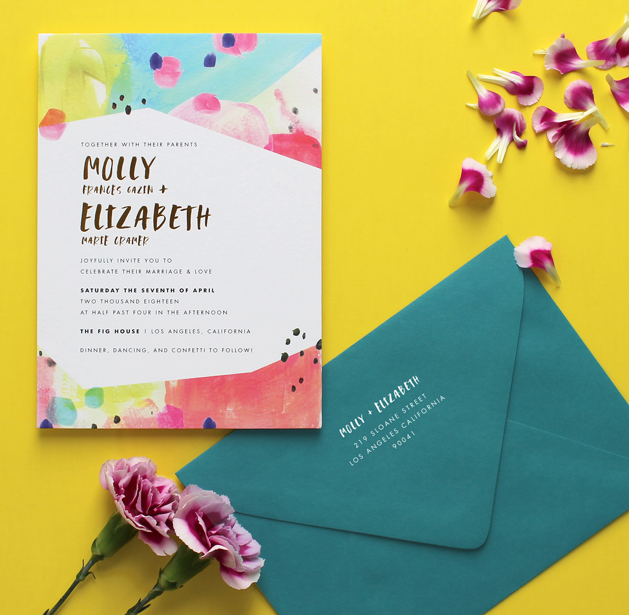
From Ashley: Molly and Elizabeth share a love of color and are getting married at the Fig House, a modern venue in Los Angeles filled with bold, jewel-toned hues. Molly reached out about creating a custom invitation suite with a painterly, brightly hued feel for their wedding. As soon as I read her email, I knew it was a match made in paper heaven!
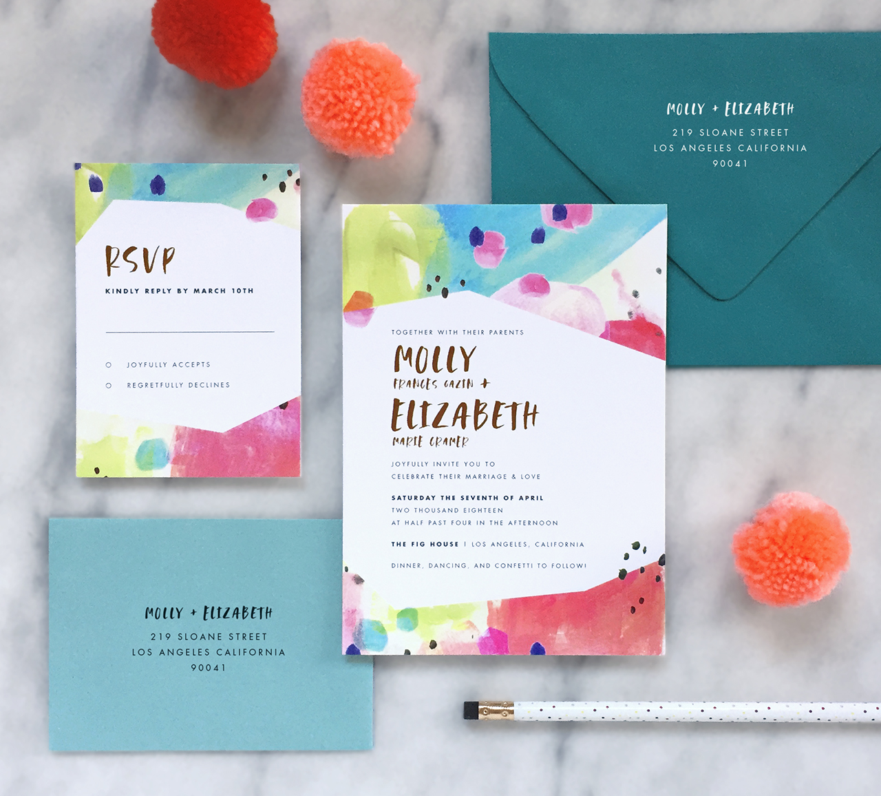
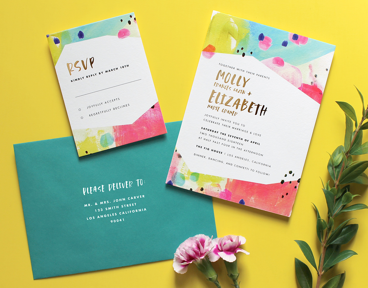
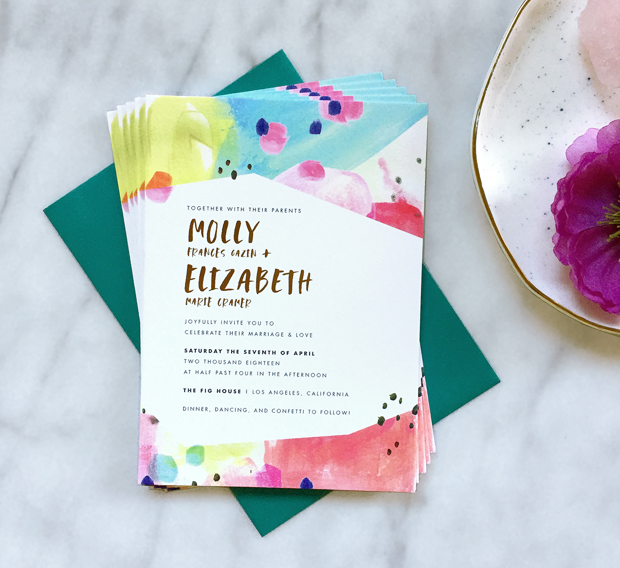
To start, I created a custom painted design featuring turquoise, bright yellow and hot pink tones that we turned into the invitation’s colorful background. The couple is inspired by hexagons and geometric shapes, also featured in the venue, so we incorporated an angular shape to the invitation design.
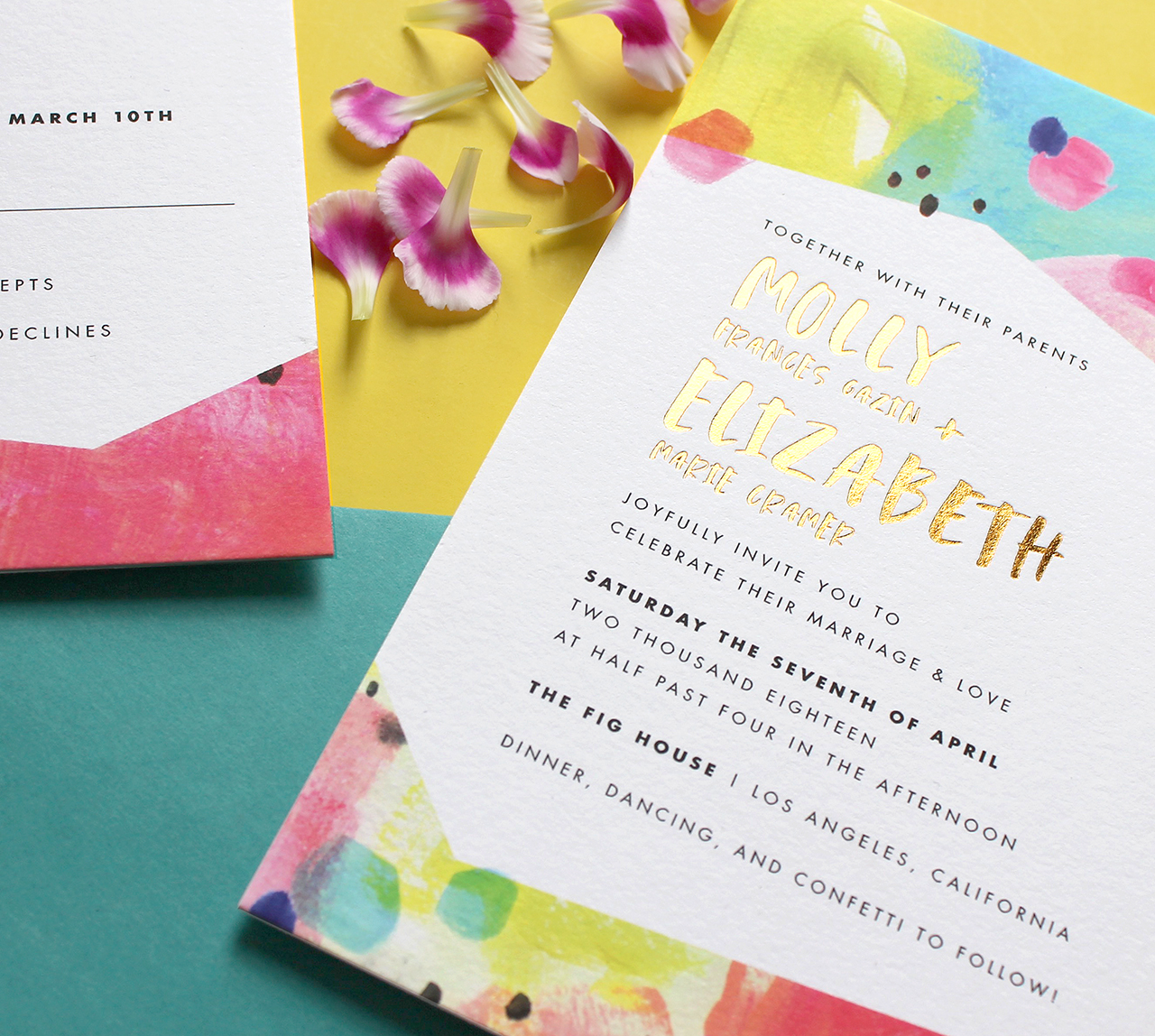
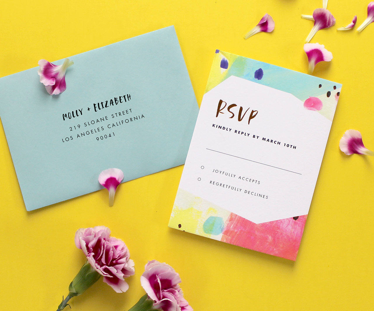
We used bold brush lettering to highlight Molly and Elizabeth’s names, paired with a modern sans serif for the rest of the type. The names are printed in a gorgeous gold foil stamp that adds a super special touch, and to finish it off we printed on our double-thick cotton stock. So dreamy! We chose Euroflap envelopes by Waste Not Paper in the shades Pool and Peacock to complement the design of these bright and colorful modern wedding invitations.
Molly told me later that working on the wedding invitations was her absolute favorite part of the wedding planning process, and that Elizabeth’s mom cried when she saw them, because they suited the couple so perfectly. How sweet is that?!? So thrilled I got to be a part of this beautiful couple’s special day!
Thanks Ashley!
Check out the Designer Rolodex for more talÂented wedÂding inviÂtaÂtion designÂers and the real inviÂtaÂtions gallery for more wedding invitation ideas!
Photo Credits: Fine Day Press