Modern Fiesta Wedding Celebration Invitations

These gorgeous invitations totally had me at the sun-bleached desert color palette. Dreamy shades of peach, pink, blue, and green mixed with kraft paper? Yes, please. The modern fiesta wedding celebration invitations from Lauren at Charm & Fig feature white foil on kraft paper for the main invitation, geometric patterns, and several different paper finishes. So creative!

Modern Fiesta Wedding Celebration Invitations by Charm and Fig / Oh So Beautiful Paper

From Lauren: Lindy and Chris are an adorable LA couple with endless creativity: they write, produce, act, model… you name it. A few months after they became engaged, they had a very sweet and private wedding ceremony on the beautiful beaches of Malibu, California. With the blessing of the couple, the parents planned one fabulous Tex-Mex fiesta to honor the newlyweds in their home state.

Modern Fiesta Wedding Celebration Invitations by Charm and Fig / Oh So Beautiful Paper

Since this invitation was all about the celebration, we skipped a lot of the formalities and focused on an energetic invitation that would capture the couples’ creative personalities and playful style. Knowing a little bit about the couple, I wanted the suite to feel like it was telling a story with color, layers and texture. To illustrate this, we used a sun-bleached color palette, geometric patterns, and multiple paper finishes.

Modern Fiesta Wedding Celebration Invitations by Charm and Fig / Oh So Beautiful Paper

Modern Fiesta Wedding Celebration Invitations by Charm and Fig / Oh So Beautiful Paper

The invitation was white foil-printed on kraft paper – a simple color scheme that found a perfect balance with the complexity of the design. We were able to pick up some of the Navajo-inspired patterns on the invitation and use them throughout the suite to unify each piece. The map, directions and registry information were printed on a transparent white vellum to add another layer to the ethereal suite.

Modern Fiesta Wedding Celebration Invitations by Charm and Fig / Oh So Beautiful Paper

Modern Fiesta Wedding Celebration Invitations by Charm and Fig / Oh So Beautiful Paper

As a gift, the groom’s mother commissioned custom thank you notes for Chris and Lindy. We used the L+C cross monogram from the RSVP card and had it gold-foiled stamped on crisp white paper for an effortlessly luxe look.

Modern Fiesta Wedding Celebration Invitations by Charm and Fig / Oh So Beautiful Paper

A vintage-looking postcard RSVP was a must! It kept things casual and afforded us another opportunity to add gorgeous imagery – in this case, a dreamy desert scene with pops of blush, green and dusty blue hues. On the flip side, we added a place to write advice for the newlyweds, of which the answers will undoubtedly provide insight, joy and maybe a couple of laughs years to come.

Modern Fiesta Wedding Celebration Invitations by Charm and Fig / Oh So Beautiful Paper

Thanks Lauren!

Design: Charm & Fig Paper Goods

Foil Stamping : Quality Printing Company

Laser-Printing: Crest Printing


Check out the Designer Rolodex for more tal­ented wed­ding invi­ta­tion design­ers and the real invi­ta­tions gallery for more wedding invitation ideas!

Photo Credits: Bri Costello Photography

Happy Weekend!

Happy Friday everyone! It has been a rainy and gloomy week here in DC, which is kind of the perfect weather for getting things done indoors. I’ve been busy making decorations for this year’s Paper Party at the National Stationery Show, which is coming up in just a couple of weeks!! But in the meantime…

Disco Ice Cream Pins by Bash Party Goods via Instagram

Disco ice cream pins by Bash Party Goods via Instagram

…a few links for your weekend!

This week on Oh So Beautiful Paper:

That’s it for me this week! Check back in just a bit for this week’s cocktail recipe! I hope you have a wonderful weekend, and I’ll see you back here on Monday! xoxo

Illustrated Storybook Wedding Invitations

I love the mix of classic elegance and youthful whimsy in these illustrated storybook wedding invitations and save the dates from Jen at Shipwright & Co. Inspired by the illustrations of Ludwig Bemelmans (creator of the Madeline books) and with a color palette inspired by natural plant dyes, the invitation suite features illustrations of animals dancing at dusk and nighttime, surrounded by beautiful woodland flora. Just gorgeous!

Illustrated Storybook Wedding Invitations by Shipwright & Co. / Oh So Beautiful Paper

From Jen: Ashley and Mike met in New York and had many dates at Bemelmans Bar, which is named in honor of Ludwig Bemelmans – creator of the Madeline children’s books. The walls are covered with his illustrations, featuring many animals frolicking in the woods. Ashley and Mike wanted to capture that magic and whimsy of those illustrations in their invitations, and we were super excited to oblige as we are big fans of classic children’s book illustrations.

Illustrated Storybook Wedding Invitations by Shipwright & Co. / Oh So Beautiful Paper

Illustrated Storybook Wedding Invitations by Shipwright & Co. / Oh So Beautiful Paper

Illustrated Storybook Wedding Invitations by Shipwright & Co. / Oh So Beautiful Paper

The save the dates capture the animals dancing at dusk on the barn where Ashley and Mike tied the knot, and the invitations move into a nighttime world, layered in three colors with the handwritten text filling up the full moon. These pieces are all about the details. Each animal and plant was chosen especially for each spot. We also love their color scheme, which was inspired by natural plant dyes.

Illustrated Storybook Wedding Invitations by Shipwright & Co. / Oh So Beautiful Paper

Illustrated Storybook Wedding Invitations by Shipwright & Co. / Oh So Beautiful Paper

Illustrated Storybook Wedding Invitations by Shipwright & Co. / Oh So Beautiful Paper

Illustrated Storybook Wedding Invitations by Shipwright & Co. / Oh So Beautiful Paper

Thanks Jen!

Design and Letterpress Printing: Shipwright & Co.

Check out the Designer Rolodex for more tal­ented wed­ding invi­ta­tion design­ers and the real invi­ta­tions gallery for more wedding invitation ideas!

Photo Credits: Emma K. Morris

Behind the Stationery: Atheneum Creative

We’re headed down south for today’s Behind the Stationery feature. Melissa of Atheneum Creative is a rockstar at custom invitations and pretty event trinkets of all kinds! Working with and beyond the paper medium, Melissa collaborates with other vendors and artists to create something special and unique for her clients. Take it away, Melissa! –Megan
Behind the Stationery: Atheneum Creative / Oh So Beautiful Paper

Hello! I’m Melissa, creative director and owner of Atheneum Creative in Charlotte, North Carolina. Atheneum was established in 2011 with the idea of bringing stories to life through a unique branded experience. I have always had a passion for pretty things, paper, and pushing the envelope. With my background in branding, it was a natural fit to bring that process into the wedding world.

Behind the Stationery: Atheneum Creative / Oh So Beautiful Paper

Prior to the start of Atheneum, I was working for a small boutique design shop based in Chicago. Over the years, I had the opportunity to collaborate with some of the most challenging and inspiring industries in the field, creating nationally recognized work and truly building a love for this profession. Working with a lot of non-profits, educational institutions and hospitals, my everyday was filled with annual reports, branding and promotional collateral. Don’t get me wrong, I love working on all of that especially with the non-profits who have such great stories to tell, but it was always the special invitations and events that would grace our door that really light the fire in me. Picking papers, materials, and thinking about unique ways to mail always got me excited and I knew where my heart was.

Behind the Stationery: Atheneum Creative / Oh So Beautiful Paper

So from there, Atheneum was born. I love a challenge. It is always a little scary to be experimental (I never tell the clients I’m scared), but I love when a client comes in for a meeting and says, “I want something no one has ever seen before.” It makes my heart race a little, but that’s the fun part, right?

Behind the Stationery: Atheneum Creative / Oh So Beautiful Paper

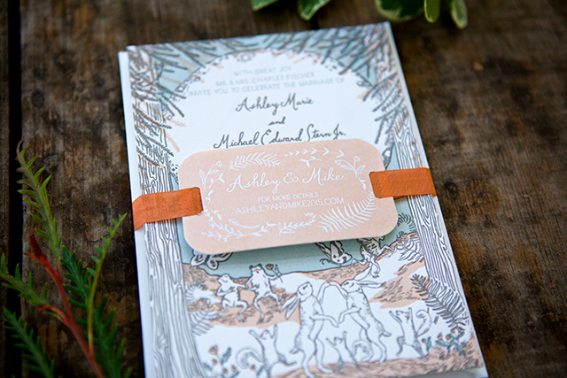
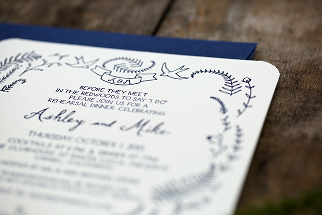
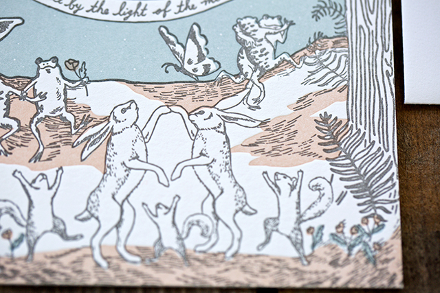
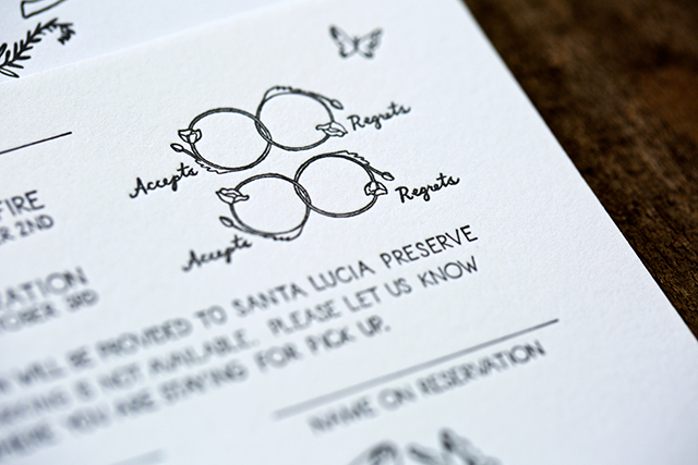
I incorporate almost all printing methods into our work: digital, offset, letterpress, foil, engraving, screen, vinyl, etc. I especially love when a client wants to bring in something more three dimensional — bowties on a stick, keys, or wood blocks — or when we push the materials and print on wood, glass, metal, copper, leather, silk, etc. I think that is what makes Atheneum Creative a bit more unique: I love to challenge myself to make something really unique and help tell the story of our clients.

Behind the Stationery: Atheneum Creative / Oh So Beautiful Paper

I recently sat down with a client to brainstorm a birth announcement / baptism announcement and she showed me the bible verse she wanted to use, but didn’t know how to tie it all together to tell her story. I came up with the idea of exploration and adventure to pull you through his birth and life moments to the baptism. We even brought in a real compass to include in the announcement, which we printed on the inside cover. I am hoping to shoot this soon so we will have some photos to share, but for now, I included some iPhone process shots.

Behind the Stationery: Atheneum Creative / Oh So Beautiful PaperBehind the Stationery: Atheneum Creative / Oh So Beautiful Paper

I am the creative director for all of the work, but we do have a great team we collaborate with including graphic designers, calligraphers, illustrators and photographers. Collaborating is one of the best parts of being a designer. My typical day is usually broken up by a few hours of design work and a few hours of assembly.

Behind the Stationery: Atheneum Creative / Oh So Beautiful Paper

There is almost always a trip to some of the local printers we use for a press check or pick-up. Everyone at the post office knows me! I call that my second home as I spend so much time there! For example, this morning, after dropping the kids off, I was on a foil press check at 8:30 am with the client, approved a digital sheet at another printer at 9:15 am, dropped off envelopes to a calligrapher at 10 am and then wrapped up my morning at the post office to purchase 920 stamps for an assembly job tomorrow. I don’t have a set schedule as every day is different, but I am usually in the office from 8am – 6pm (with my dog sitting by my side all day long). My kids also love to visit me when I am working!

Behind the Stationery: Atheneum Creative / Oh So Beautiful Paper

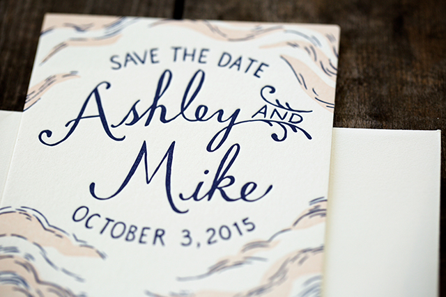
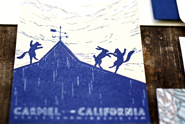
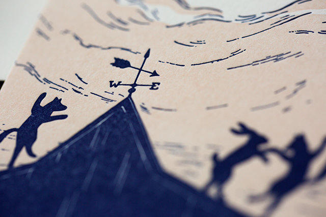
A lot of our clients are not local and a good handful of them are overseas. I typically start every project with a call or in person meeting to discuss the look of the wedding day. Sometimes brides have a good idea of what they are after and others have no idea—which is not a problem! We take the look and feel of the day and carry it over into their stationery. We might start with a logo or monogram, or just colors and patterns that will pull everything together.

Behind the Stationery: Atheneum Creative / Oh So Beautiful Paper

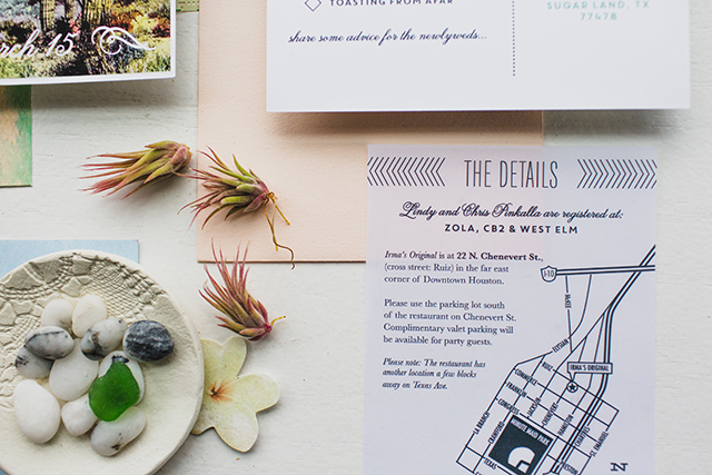
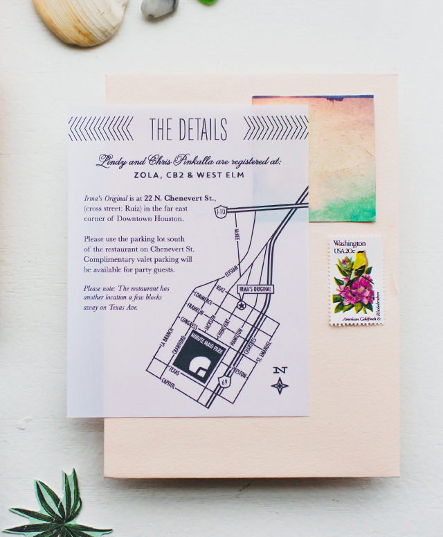
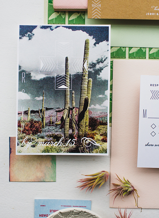
From there we work on various design options to give clients a nice range to choose from. We also work with creative language to ensure a wedding brand fully expresses the client’s personality. Once we go a few rounds of revisions, we are off to print. We are usually assembling in about three weeks. Then we shoot it and submit it to OSBP 🙂

I know everyone always says this, but our clients are truly the best! They trust us and allow us to get creative and unique with their work and if it was not for clients like that, we would not have the super fun portfolio we do today!

Behind the Stationery: Atheneum Creative / Oh So Beautiful PaperThanks, Nole and Megan!

Photos by Allison Kuhn (office), Chelsea Davis (new work), and Melissa Broderick (compass work).

Interested in participating in this column? Email Megan at megan [at] ohsobeautifulpaper [dot] com.

DIY Colorful Envelope Address Ideas

I’ve been obsessed with bright and colorful envelope addresses lately, especially envelopes that use white or light ink over bold and saturated watercolor paint! These invitations from Kim at Bright Room Studio and these save the dates by Gina at Eleven and West are recent favorites. So when Sakura of America got in touch about their new opaque Soufflé pens and vibrant Glaze pens, I knew EXACTLY what I wanted to do with them! I enlisted my talented friend Michele of Meant to Be Calligraphy to help write out the addresses on some (well, a lot) of envelopes, and today we’re sharing the results with you – along with the how-to so you can recreate these DIY colorful envelope address ideas at home!

DIY Colorful Envelope Address Ideas with Sakura of America Glaze and Soufflé Pens / Oh So Beautiful Paper

Let’s start with the Soufflé pens, which come in some really gorgeous pastel tones and white ink! Since the ink is opaque you can use the pens on dark paper or layer them over dark paint colors! I had the BEST time coming up with color combinations for these envelopes: pale pink over dark green watercolor paint, peach over cobalt blue watercolor, lavender over indigo watercolor, citron/mint over black watercolor, and aqua over violet watercolor. I can’t pick a favorite color combination!

DIY Colorful Envelope Address Ideas with Sakura of America Glaze and Soufflé Pens / Oh So Beautiful Paper

To create the watercolor envelopes, we used Sakura’s Koi Watercolor Field Sketch Travel Kit to paint really vibrant colors on white cotton envelopes. We started painting right below the point where a stamp would be placed and painted horizontal strokes from left to right, working our way down the front of the envelope. The trick is to use high quality cotton or bamboo envelopes, which will absorb the watercolor without too much warping, and to use very little water and a ton of pigment when painting. We used only enough water to spread the paint over the envelope, rather than adding pigment to a cup or bowl full of water. Practice on a test sheet of watercolor paper until you achieve your desired hue, and be sure to place a clean sheet of paper under your envelopes while painting.

DIY Colorful Envelope Address Ideas with Sakura of America Glaze and Soufflé Pens / Oh So Beautiful Paper

Once the envelopes are fully dry, start writing the addresses! The Soufflé pens go on dark but lighten considerably as they dry, which can make them a bit tricky in the beginning – but you’ll quickly get the hang of it. Mix different lettering styles, from script to serif to all caps, and have fun with embellishments like dots, lines, arrows, and ornamental frames!

DIY Colorful Envelope Address Ideas with Sakura of America Glaze and Soufflé Pens / Oh So Beautiful Paper

DIY Colorful Envelope Address Ideas with Sakura of America Glaze and Soufflé Pens / Oh So Beautiful Paper

DIY Colorful Envelope Address Ideas with Sakura of America Glaze and Soufflé Pens / Oh So Beautiful Paper

Now for the Glaze pens, which offer a really unique 3D ink and glossy, vibrant colors that remind me of watercolors! The Glaze pens are translucent, so we paired them with subtle dip dye envelopes. I really love the tone-on-tone look of blue, pink, and purple Glaze pens against blue, pink, and lavender dip dyed envelopes, but we also created some fun contrasting envelope addresses with tropical green against pale pink – even a rainbow envelope address!

DIY Colorful Envelope Address Ideas with Sakura of America Glaze and Soufflé Pens / Oh So Beautiful Paper

As with the watercolor envelopes, the key to successful dip dyed envelopes is to use high quality cotton or bamboo envelopes. They absorb the dye and Glaze pen ink so well! To dip dye envelopes, mix food coloring with warm water in a vessel that is at least half an inch wider than your largest envelope and around three inches deep. I like using foil square cake pans to dip dye, and you can dip the envelopes at an angle to achieve more color coverage. When you’ve achieved your desired shade, dip (and quickly remove) the envelope in the dye bath, then blot dry with a paper towel and set aside to dry.

DIY Colorful Envelope Address Ideas with Sakura of America Glaze and Soufflé Pens / Oh So Beautiful Paper

When addressing your envelopes, have fun mixing script lettering with lowercase and all caps, and play around with proportions! I also added a second layer of ink to some of the addresses (after waiting for the first layer to dry completely) for a more whimsical look. The best part is that you don’t have to be a lettering genius to create these envelopes – the colorful ink alone adds a major dose of whimsy to the envelope, and the combination of colorful ink with playful, imperfect lettering just makes my heart happy.

DIY Colorful Envelope Address Ideas with Sakura of America Glaze and Soufflé Pens / Oh So Beautiful Paper

To create the little palm frond illustrations, I sketched them out very lightly with pencil first, then went over the pencil sketch with the Glaze pens. I also want to add whimsical polka dots to ALL of my envelopes from now on! Wouldn’t it make you so happy to receive that neon pink and coral envelope in the mail??

DIY Colorful Envelope Address Ideas with Sakura of America Glaze and Soufflé Pens / Oh So Beautiful Paper

DIY Colorful Envelope Address Ideas with Sakura of America Glaze and Soufflé Pens / Oh So Beautiful Paper

So fun, right??? You can pick up your own set of Soufflé pens here and Glaze pens here – you’ll have so much fun creating bright and beautiful envelope addresses with them!

Photos by Nole Garey for Oh So Beautiful Paper

This post is sponsored by Sakura of America. All content and opinions are my own. Thank you for supporting the sponsors that make Oh So Beautiful Paper possible!