Peach-Basil Shrub Cocktail and Mocktail

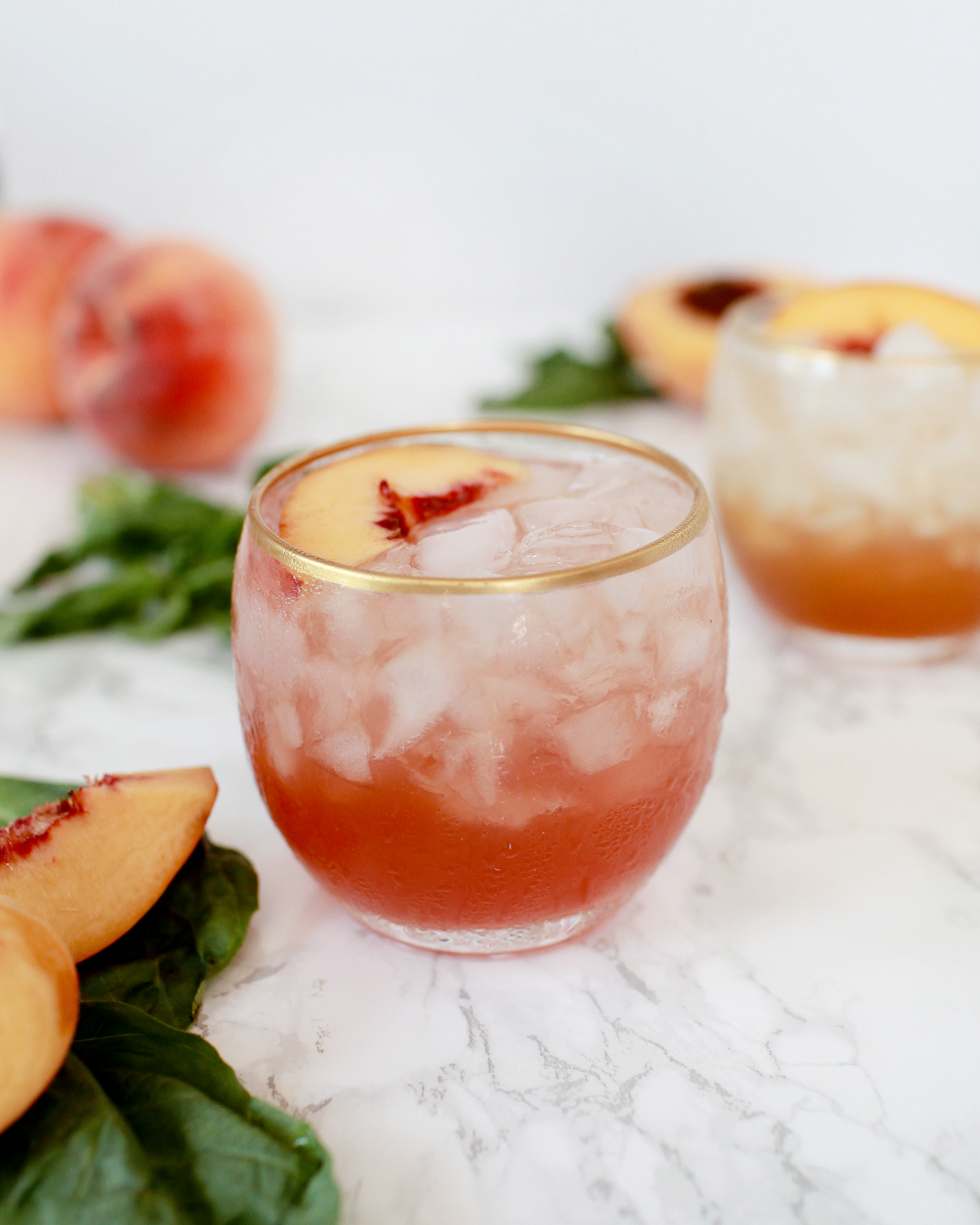
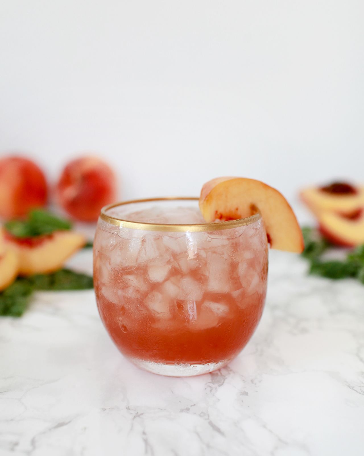
Shrubs are pretty great summer drinks. They’re bracingly sweet-tart, a combination that helps quench thirst on the hottest days. This is something people figured out centuries ago – these sweetened vinegar drinks used to be the energy drinks of Colonial America. Let’s do it again, using two terrific summer ingredients: peach and basil. Bonus: Once you make the shrub syrup, shrubs are super easy to turn into mocktails, so we included a bonus mocktail recipe below. It’s a special 2-in-1 cocktail post: a Peach-Basil Shrub Cocktail and Mocktail. –Andrew

Peach-Basil Shrub Cocktail and Mocktail Recipe / Liquorary for Oh So Beautiful Paper

Peach-Basil Shrub Cocktail and Mocktail Recipe / Liquorary for Oh So Beautiful Paper

Peach-Basil Shrub Cocktail

  • 2 oz Whiskey*
  • 1 oz Peach-Basil Shrub
  • 1/2 oz Lemon Oleo Saccharum
  • 1/2 oz Lime Juice
  • 1/2 oz Sweet Vermouth
  • 1/4 oz Campari

Peach-Basil Shrub Cocktail and Mocktail Recipe / Liquorary for Oh So Beautiful Paper

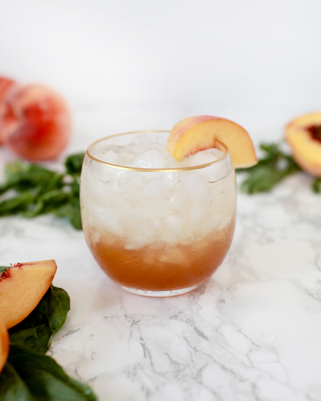
Peach-Basil Shrub Mocktail

  • 3 oz Peach-Basil Shrub
  • Soda Water

To make the peach-basil shrub: combine a cup of sugar and a cup of apple cider vinegar in a saucepan over low heat, stirring frequently until the sugar is fully dissolved into the vinegar. While the vinegar is heating, combine a cup of diced peach – about one large peach’s worth – and a handful of fresh basil leaves in a blender. Once the sugar has dissolved into the vinegar, remove the saucepan from the heat and let it cool to room temperature. Then add the sweetened vinegar to the blender and blend the peach, basil, and vinegar to a pulp. Strain the mixture through a few layers of cheese cloth or a coffee filter, then bottle and refrigerate the shrub.

Peach-Basil Shrub Cocktail and Mocktail Recipe / Liquorary for Oh So Beautiful Paper

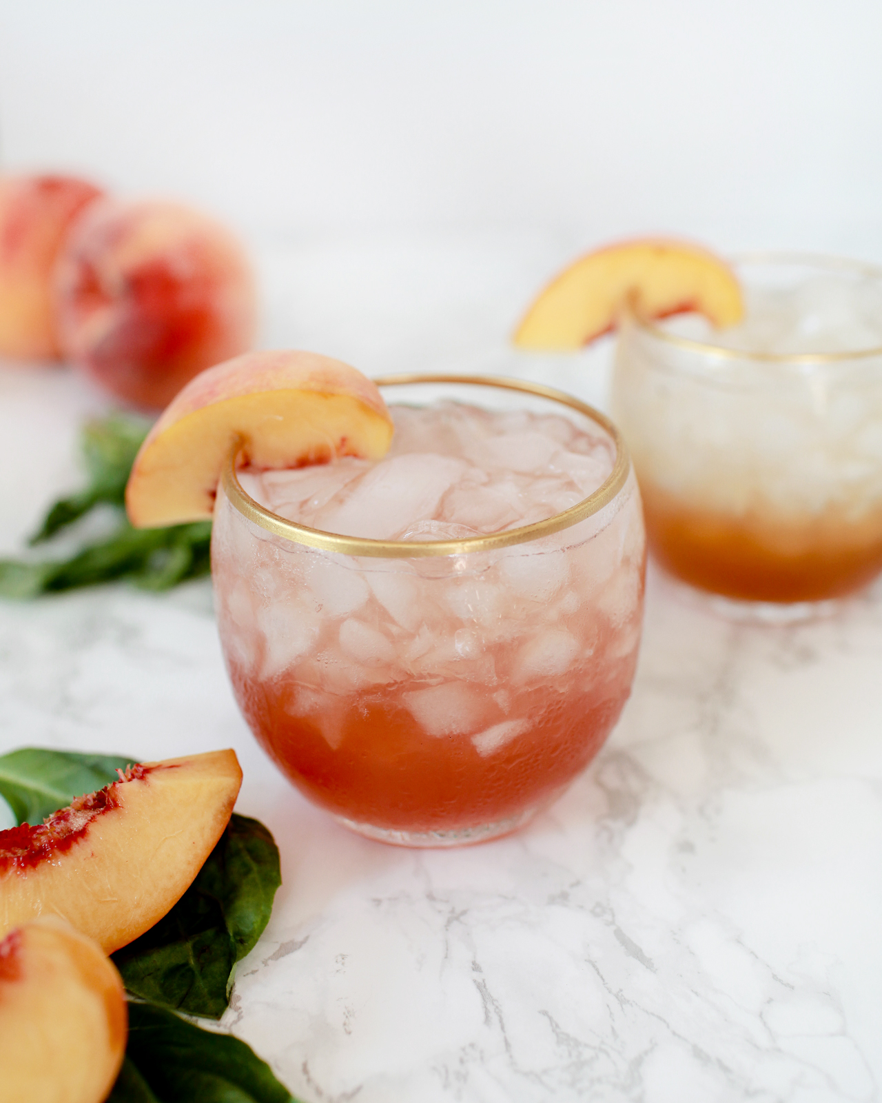
To make the cocktail: combine all the ingredients in a shaker filled two-thirds with ice and shake well. Strain into a lowball glass filled with fresh ice and garnish with a slice of peach or fresh basil. Enjoy!

There are a couple of traditional ways of making shrubs, each of which has some drawbacks. You can simmer equal parts of vinegar, sugar, and fruit together over low heat. This is a quick way to make a shrub, but the resulting shrub will taste of cooked fruit. Or you can infuse the fruit into the vinegar, letting vinegar and sugar and fruit sit together in the fridge, which will give you cleaner, clearer fruit flavors but also takes days to infuse. This version is the best of both worlds, a quick process that preserves those clear fruit flavors. It saves all the heating for the vinegar alone, which has no effect on the flavor, but also speeds up the process dramatically, using the blender to infuse quickly.

Peach-Basil Shrub Cocktail and Mocktail Recipe / Liquorary for Oh So Beautiful Paper

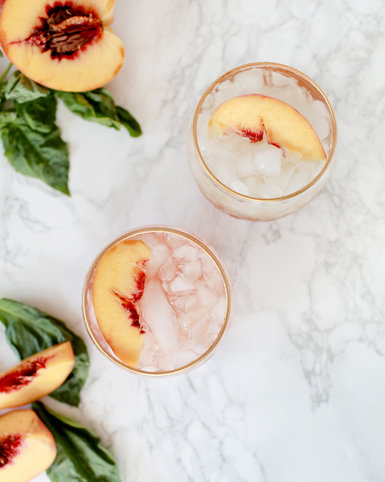
The resulting cocktail is tart and savory, with lots of fruit and basil and vinegary tart notes up front, with a solid whiskey backing. Sweet vermouth and Campari are here both to take the edge off the shrub’s acidity, which can be a bit sharp when not rounded out, and to add some more Italian flavors to complement the shrub’s classic Italian pairing of peaches and basil.

This shrub is just as delicious as a mocktail. Just put three ounces of the shrub into a highball glass filled with ice and top with soda water to taste, giving it a stir to incorporate. Tasty, bright, refreshing, and totally booze free!

*We used Heritage Cask Whiskey by one of our favorite distilleries, Stonecutter Spirits in Vermont. Their whiskey is aged in bourbon and wine barrels and tastes like a rich, robust Irish whiskey.

Don’t forget to follow us on Instagram!

Glassware by Liquorary

Photo Credits: Nole Garey for Oh So Beautiful Paper

Happy Weekend!

Happy Friday everyone! I hope you all enjoyed Ashley’s wonderful guest posts this week! I absolutely loved all of her posts! Nichole from Coral Pheasant will be joining us next week, and she has some seriously beautiful posts planned that you won’t want to miss! But in the meantime…

Maybelle Imasa via Instagram / Oh So Beautiful Paper

Image by Maybelle Imasa via Instagram

…a few links for your weekend:

This week on Oh So Beautiful Paper:

That’s it for us this week! We’ll be back later this afternoon with this week’s cocktail recipe – so check back for that! Have a fantastic weekend, and we’ll see you back here next week! xoxo

Well Said Type 160 + desktop download!

Hiya! It’s Ashley from Fine Day Press with my last post of the week. It’s been SO much fun guest blogging! I’ll be back with more of our Wedding Invitation 101 series very soon, but in the meantime, here’s my spin on the weekly Well Said Type column!

Fine-Day-Press-Well-Said-Type

This week’s post is also available as a digital download, hooray!

DESKTOP | iPhone


Modern Brush Lettering Tips for Beginners

Modern Brush Lettering Tips for Beginners from Fine Day Press / Oh So Beautiful Paper

Hi there! Ashley from Fine Day Press here with another guest post – this time on one of my favorite topics, brush lettering. My background is in graphic design; I’ve been painting and lettering for as long as I can remember and  it’s something I’ve always been passionate about. Recently, I’ve been teaching Intro to Modern Brush Lettering workshops at The Paper+ Craft Pantry here in Austin. I’m excited to share some of my best modern brush lettering tips for beginners with you here, along with a downloadable Brush Lettered Alphabet I created that you can use as a practice guide!

I think it’s so great that there’s a big interest in hand lettering these days. We’ve been hearing about handwriting and lettering as potentially becoming a lost art as we all become more technology-dependent. And I’ll admit, after a day of working on the computer, it sometimes feels strange to hold a pen or brush until I get warmed up. But there are so many examples of beautiful hand-done type in the stationery and design world right now, so I personally hope this trend continues for a long time.

Brush lettering is the most painterly of all hand lettering styles – it can be spontaneous, free flowing, and a little messy (in a good way). One of the cool things about brush lettering is that, once you know the basics, you can loosen up and develop your own style with it.  The best way to find your style is to practice, practice, practice.

RECOMMENDED MATERIALS

• #6 pointed round brush
You can experiment with different sizes and shapes but this is a great all-purpose brush.

• India ink or watercolor paint
Both of the above work well for brush lettering. For beginners (and for those working only in black), I recomment giving India ink a try. It’s very fluid, and gives you a super-smooth medium for practicing with the brush. If you want a more textured look or want to experiment with colors, go for watercolor. A word of warning: because of its fluidity, india ink is highly spill-able, and it will stain, so be careful when using it and clean up any spills right away.

• Protected work surface (cutting board, vinyl tablecloth, or art table)
Brush lettering can be wet and messy, so protect your table with a large cutting board or vinyl tablecloth. I have a table cover from Party City that makes a great work surface.

• Small palette cup to hold paint or ink
I like this one from Michael’s. 

TIP: A LITTLE INK GOES A LONG WAY. Start with a small amount of paint or ink in your plastic palette dish. You can always add more!

• Jar of water

• Paper towels

• Pencil, ruler, eraser

• Scratch paper for preparatory sketching

• Card stock for practicing
Card stock is more economical than watercolor paper so it’s great for practicing! Save the watercolor paper for when you’re ready to make a more finished piece.

• Watercolor paper or Bristol board
Both of these thick surfaces will stand up well to a wet medium like brush lettering. Bristol board is very smooth, whereas watercolor paper will usually have a bit more toothiness and texture.

Modern Brush Lettering Tips for Beginners from Fine Day Press / Oh So Beautiful PaperModern Brush Lettering Tips for Beginners from Fine Day Press / Oh So Beautiful Paper
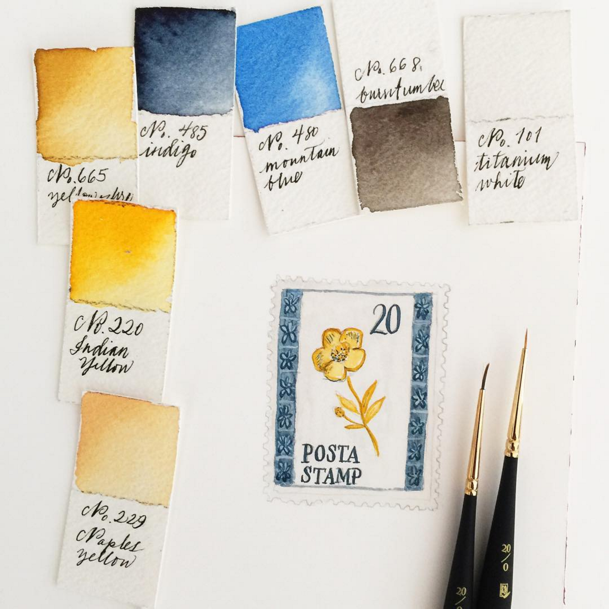
Above: Sample practice strokes, along with a practice session from our recent workshop (photo by Lucia Hua)

WARM UP

A lot of brush lettering is about movement. You want to keep it loose and try to make your motions smooth, so I like to be relaxed when I’m lettering! Beginning with several practice brush strokes will help get you in a relaxing frame of mind.

Start out with a small stack of cardstock and do some basic brush motions to get warmed up. Wet your brush in your water jar, then dip into your ink. Practice making very basic motions – vertical, diagonal, horizontal lines. Vary the pressure of your stroke and notice how this impacts your line – more pressure will give you a thicker line. Continue to load up your brush with ink between every few strokes. Practice making curves, o’s and loops. I like to fill 1 or 2 sheets of paper with these types of practice stokes before I start lettering.

Next, it’s time to practice the alphabet! This may take you back to your grade school days of practicing cursive. I recommend practicing two ways – first, lightly sketch the letter in pencil and trace it with your brush to get a feel for the letterform. Then try it freehand. Test out different angles with your brush as you practice and see how these affect your stroke. To download my sample alphabet, click here.

Modern Brush Lettering Tips for Beginners from Fine Day Press / Oh So Beautiful Paper

Modern Brush Lettering Tips for Beginners from Fine Day Press / Oh So Beautiful Paper

Above: Workshop photo by Lucia Hua; Sample alphabet by Fine Day Press

MAKING AN ART PIECE

When you’re ready to make an art print of your brush lettering, there are a few steps involved. You’ll want to have a few pieces of scratch paper and your pencil handy to create a few preparatory sketches. These sketches will give you an opportunity to think about the composition of your piece – how do you want the words arranged on the page? Will some words be bigger than others for emphasis? Will some of the type be on a curve? There are so many options here!

Once you have a sketch you like, do a practice version on cardstock – lightly sketch out the words in pencil. You don’t have to exactly trace over them, but you want to create a visual guideline for where your brushstrokes will go on the page. Use your brush and ink to go over the letters. After you’ve done this, you can see if you want to make any changes before moving on to your nice watercolor paper.

Modern Brush Lettering Tips for Beginners from Fine Day Press / Oh So Beautiful Paper

Modern Brush Lettering Tips for Beginners from Fine Day Press / Oh So Beautiful Paper

Above: My initial sketches for “To the moon & back”; the final art print

Next, you’re ready to start on your watercolor paper (or Bristol board). Again, I like to lightly sketch out my composition here just to make sure it’s fitting on the page how I want it. Leave some margins around your work and try to center your artwork on the page.

TIP: EXHALE AS YOU STROKE THE BRUSH

It helps to take a breathe and exhale as you start a new stroke – this will steady your brush and relax your hand.

Aim to find a smooth rhythmic movement with your brush. Don’t rush it – paint each letter one stroke at a time. Go back into your water and india ink as much as needed. Depending on how much ink you get on the brush, how absorbent the paper is, and what kind of letter you’re making,  you may need to “reload” after each letter or two.

I like to think of brush lettering as more like painting than writing – and most of all, I just enjoy the process! Don’t worry to much about results when you’re starting out. Just keep going until you get to where it feels natural, and have fun with it – that’s where the real creative magic happens!

Behind the Stationery: Red Cap Cards

What an honor to share with you all this next stationery duo’s journey. From Red Cap Cards, Carrie and Hal are here to share about the importance of pajamas, insight on working with illustrators and artists, and behind their new collaborative collection debuting at NYNOW in two short weeks! It’s amazing to see how they changed their career paths and adjusted their vision, individually and together. —Megan

Behind the Stationery: Red Cap Cards / Oh So Beautiful Paper

Hello! We are Carrie and Hal from Red Cap Cards. Our company is based out of Los Angeles, California. We are a stationery company that celebrates artists, creating a platform to share their work through beautifully designed paper products.

Our story began in 2005 when Hal and I decided we wanted to work together and create a lifestyle for ourselves that allowed us to be completely in charge of our own time. I think some people are just meant to work for themselves and that would be us. Hal and I both had different careers. He was running a coffee roasting business and I was a children’s theatre director. Although we were passionate about these careers, we decided to take a leap of faith and start a creative business that was in line with the creative vision we had for our life. At the time, I was illustrating cards as a hobby and people loved them. We recognized the potential in the concept of bringing amazing art and illustration to the doorstep (quite literally) of the masses. So, in our tiny West Hollywood bungalow, Red Cap Cards was born.
Behind the Stationery: Red Cap Cards / Oh So Beautiful Paper

Over time our company has evolved. In the beginning, I was the only illustrator and now we have over twenty different artists in our line—which is constantly evolving. We realized early on that we had loyal fan base and felt that this was ultimately the most valuable aspect of our business. So in 2007, we began collaborating with artists from all around the world. We started with a few artists that were friends of ours, and then we added more over time.

Behind the Stationery: Red Cap Cards / Oh So Beautiful PaperPhoto (courtesy) of Kate Pugsley

All of the artists that we have worked with have ended up becoming friends and members of a tight-knit family that we cherish. Creating amazing products is a wonderful part of our business but being champions for the artists we work with is our favorite part of our job. They are some of the most talented artists out there, and we consider ourselves lucky to introduce their work to a new collective.

Behind the Stationery: Red Cap Cards / Oh So Beautiful Paper

Hal and I have held true to our vision. We work from home and can pretty much do our job from anywhere, thanks to the magic of technology. We always start the day with coffee. This is an essential in our house! I’m typically in pajamas all day; this is the sad but awesome truth. Hal and I sit at one long desk in our office that we have had for 10 years. We also have an amazing team of writers and designers who all work from their own spaces, and this is by design. One thing Hal and I have never wanted to do was manage people. We never liked feeling micro-managed, and we believe that our business model is one that empowers people and leads to a richer quality of work. I love knowing almost everyone on our team is happy working from the studios that inspire them. The remote office is the only way to go for us! Pajamas for everyone!

Behind the Stationery: Red Cap Cards / Oh So Beautiful Paper

I retired from illustrating for Red Cap Cards in 2012 to take on the role as our creative director and collection curator. I spend most of my day working with our creative team, which consists of our artists, our amazing designer, Michelle, and Andie who writes our blog and helps with all things PR-related. Hal typically spends his day working with our logistics team which consists of Betsy, our wholesale manager and all around super star, Denise, who manages our warehouse in Minnesota, and Rich, who runs all of our print jobs here in Los Angeles.

Behind the Stationery: Red Cap Cards / Oh So Beautiful PaperPhoto by Carolyn Gavin

When creating a collection for Red Cap I always begin with the illustrator. I think about the unique perspective that the individual artist will bring to our line. Each artist we work with has their own approach to their work, which means that each process is a little bit different. Some artists love direction and others, not so much. We always suggest that greeting card occasions help to inspire the narrative in our cards, but we try not to let those occasions limit our artists or box them in. We want our artists to create work that they love, which is communicated through a “free” artistic process. That’s really important to us. Sometimes we have a general theme to help inspire a collection, and others times it’s random and very organic.

Behind the Stationery: Red Cap Cards / Oh So Beautiful PaperPhoto by Carolyn Gavin

I typically start the process by looking at their current body of work to help give them a general direction of what I feel would work on a card. Then we start a conversation about the kind of collection they’d like to create. The challenge in working with many different artists is creating a cohesive collection. Our goal is to curate a line that harmonizes together, but one that allows each card to stand independently on its own.

Behind the Stationery: Red Cap Cards / Oh So Beautiful Paper

We use several different types of printing processes including offset and gold foil-stamping, and have a special collection of spot color Pantone® cards. All of our products are printed and manufactured right here in Los Angeles and are quality checked by our standards. Behind the Stationery: Red Cap Cards / Oh So Beautiful Paper

We show up at 9am for every press run and are there as our printers deliver the cards into our hands hot off the presses. We adore our pressmen, some of whom have been in the printing business for over thirty years!

Behind the Stationery: Red Cap Cards / Oh So Beautiful Paper

We adjust colors until they are as close to perfect as we can get, which can be a difficult process. Certain colors are hard to print, and we want to get them just right! After our cards are printed, we send them to our awesome warehouse in Minnesota, which is another business run by a husband-and-wife team. We love them dearly! They do an amazing job.
Behind the Stationery: Red Cap Cards / Oh So Beautiful Paper

Recently, seven of our artists came together to create our first line of coordinating wrapping paper, notebook and greeting card suites. I wanted this collection to be a stunning showcase of how well our artists work together while remaining completely true to their individual vision. In order to do this, I had our artists create color stories that they shared with one another. The idea was to allow the different color stories inspire each other’s work.

Behind the Stationery: Red Cap Cards / Oh So Beautiful Paper

This was a really fun way to for our artists to play with one another and create a collection that harmonized in color. I’m so happy with the end result. We really do work with some of the most talented artists in the world, and wouldn’t trade it for anything. We hope that our labor of love comes through to the customers who buy our cards. This collection will be debuting at NYNOW on August 20th at the Crow & Canary booth!

Behind the Stationery: Red Cap Cards / Oh So Beautiful Paper

Hal and I are beyond grateful to be living such a wonderful life surrounded by so many talented people. If you would have asked me when I was a kid if I would grow up to run a stationery company, I would have laughed. I love how life can surprise you. I’m excited about the unknown future of Red Cap and I feel so much gratitude for folks like Oh So Beautiful Paper who have supported us from day one. That means the world to us.

Behind the Stationery: Red Cap Cards / Oh So Beautiful Paper

All photos taken by or for Red Cap Cards except where noted.

Interested in being featured in this column? Reach out to Megan at megan [at] ohsobeautifulpaper [dot] com for more details!