Whimsical Baby Shower Invitations + Announcements

After I posted these baby shower invitations a couple of weeks ago, I received the sweetest e-mail from Tovah at Brighten My Day studio.  Tovah creates entirely custom wedding invitations, Bar and Bat Mitzvah invitations, and — of course — baby announcements!  The amazing thing, particularly in this era, is that Tovah operates entirely by word of mouth and does not maintain a website (!) — and as a result, Tovah forms a personal relationship with each of her clients that is reflected in the final design.  Here are a few examples — along with some background from Tovah on each of the designs:
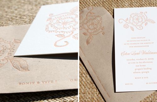
Orange-Floral-Letterpress-Birth-Announcement

LEAH WALDMAN

I have worked with this family for years, and was honored to create the invitation for their granddaughter’s naming ceremony.  They wanted an invitation that was warm and sophisticated, and while they wanted a little sweetness, they did not want the invitation to feel juvenile nor whimsical.  We letterpress printed the invitation on a heavy, nearly white board in a warm tangerine hue, a compliment both to the décor in their home and a match to the warmth of this family.  The invitation is monarch sized and paired with a kraft colored enveloped, also letterpress printed in the orange ink.  The floral image has a hand-drawn feel, and is carried through to wrap around the envelope flap.
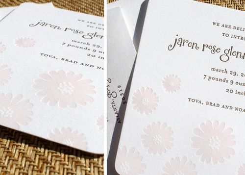

Pink-Daisy-Letterpress-Baby-Announcement

JAREN ROSE

This is my daughter’s birth announcement.  I wanted some sweetness, but still clean and contemporary.  This one was a 4Bar announcement {petite and girly} letterpress printed in latté and petal inks.  The “relief” dot detail on the flowers has a great feel when letterpress-printed, and the pink was a translucent, delicate shade that I just loved.
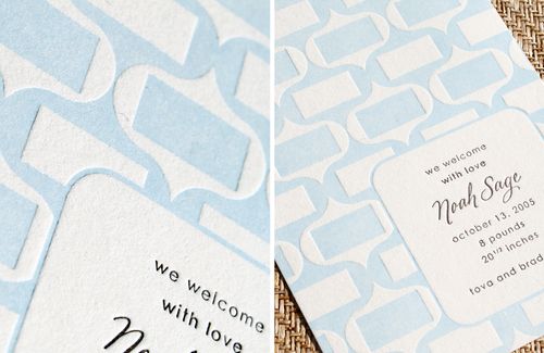

Blue-Geometric-Letterpress-Baby-Announcement

NOAH SAGE

This is the birth announcement of my now 4-year old son.  I wanted something that felt modern, but with a softness that still felt ‘baby.’  The announcement was letterpress printed in light blue and chocolate inks on a gorgeous soft white stock.  His name was lettered by the amazing Gail Brill.
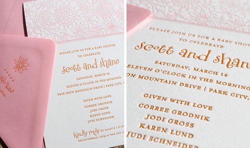
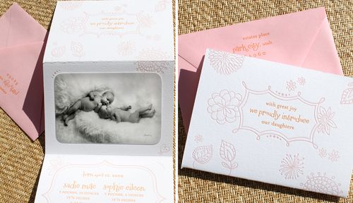

Pink-Floral-Letterpress-Baby-Shower-Invitation

Floral-Twins-Letterpress-Baby-Announcements

SCOTT AND SHANE

This couple had gone through the surrogate process and were soon bringing home twin baby girls.  We used their nursery — a contemporary room of orange and pink with vintage elements — as inspiration for the both their shower invitation as well as their baby announcement.  The shower invite (top) featured a floral illustration that was letterpress printed into heavy, nearly white board in blossom and tangerine inks.  The announcement (bottom) was a tri-fold design printed on fluorescent white 110 lb. cotton Lettra and featured a gorgeous black and white photo of the newborns. 
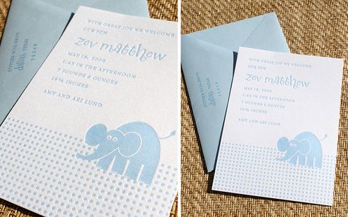

Blue-Elephant-Letterpress-Baby-Announcement

ZEV MATTHEW

This couple were using whimsical animals throughout Zev’s new nursery, so I used that as inspiration, knowing that Mom and Dad also had a clean, unfussy personal style.  They wanted to keep the design to  a single color {for budget reasons} and loved the sweetness of a 4-bar card.  The announcement was paired with bluebell envelopes, letterpress printed tone-on-tone in a deeper bluebell ink.

Thanks so much Tovah!  If you're interested in working with Tovah for baby announcements or Bar and Bat Mitzvah invitations, you can contact her via e-mail by clicking here!

{image credits: tovah glenn}

Jefferson + Sarah’s Amazing Woodgrain Wedding Invitations

These invitations are another of my favorites from 2009 — the mix of woodgrain details and amazing typography just blow me away every time.  I first saw Jefferson and Sarah’s autumn Nashville wedding invitations on the Studio on Fire blog back in November, but when the designer (and groom!) Jefferson Perky sent over his take, I couldn’t resist sharing his perspective!

Woodgrain-typography-invitation-suite

From Jefferson: This invitation package was design for my own wedding. The idea was to create the feel of an elegant fall wedding with a hint of whimsy.  The growth of tree metaphor was carried out through the entire suite, from the Save the Date through the thank you cards.

Woodgrain-typography-letterpress-invitations
Woodgrain-typography-letterpress-invitation-detail

Everything but the envelopes was printed in a single color (black) on the same sheet and trimmed from there (a great cost saving technique).  Although I decided early on in the design process that the invitations would be letterpress printed, I still wanted to maintain a good range of value in the greyscale imagery.  So first we had the paper digitally printed to get the woodgrain imagery the way we wanted it before letterpress printing the text of the invitation.

Woodgrain-typography-letterpress-invitation-detail2
Woodgrain-typography-letterpress-invitation-type

The mix of digital and letterpress printing on soft cotton Lettra paper both allowed for the gradient detail in the tree rings and created subtle tactile differences in the invitation suite.

Woodgrain-typography-save-the-date

My wife teared up when they came back from the printer and we started assembly.  Happy tears. (Ed note: awwww… how sweet!)

Woodgrain-typography-thank-you-card

You can read more about these invitations over on Beast Pieces, and check out the Perky Bros website for lots of cool business collateral and print designs.  Thanks Jefferson!

{image credits: Studio on Fire and Perky Bros}

Simple Blind Emboss Wedding Invitations

I love the quiet during the week between Christmas and New Year’s – it’s the perfect time to look back on the year that was before starting the new year.

This week I’ve been spending quite a bit of time going through my archives and trying to get myself as organized as possible before 2010, and I came across these beautiful blind emboss wedding invitations printed by Studio on Fire:

Blind-emboss-white-wedding-invitation

Designed by Aya Ikegaya for a summer wedding, the serene white and soft gray color palette would also perfect for a winter wedding.  The main invitation is actually the embossed text on the outer sleeve with letterpress enclosures on the inside, including a map and accommodation information:

Blind-emboss-white-wedding-invitation2
Blind-emboss-white-wedding-invitation3
Blind-emboss-white-wedding-invitation4
Blind-emboss-white-wedding-invitation5
Studio on Fire also gives a wonderfully concise explanation of the different printing methods for embossing and letterpress, which you can check out along with a few additional photos right here.

{image credits: studio on fire}

Red + Aqua Papel Picado Wedding Invitations

Good morning!  I hope everyone had a wonderful holiday weekend!  I’m slowly easing back into my normal routine, and to help with that process I thought I’d feature a wedding invitation suite that is easily one of the most beautiful I’ve seen in a long time — these gorgeous papel picado wedding invitations by Parrott Design Studio:

Red-aqua-papel-picado-wedding-invitations

Sarah designed these letterpress wedding invitations for a bride with a serious love for design and textiles.  In addition to the beautiful papel picado banner (note the wedding date in the hearts below!), Sarah lined the back of the invitations with a stylized version of a Liberty of London print and contrasted Crystal Kluge’s lovely Nelly Script with a modern sans serif font:

Red-aqua-papel-picado-wedding-invitations2

To complement the color palette of the invitation suite, the envelopes were lined with vintage oceanic maps in soft blue and aqua hues:

Red-aqua-papel-picado-wedding-invitations3

Gorgeous, right?  Check out the rest of the story and inspiration sources behind these wedding invitations right here!

{image credits: Parrott Design Studio}

New Year’s Eve Invitations

I love seeing how different people interpret and commemorate an occasion celebrated all around the world, like New Year's Eve.  So I asked a few designers to share some recent New Year's projects, and here's what they sent over!

Czar Press designed this festive New Year's Eve party invitation with bright pops of red — and complete with a cheat sheet for the symbols on the main invitation:

Red-White-Letterpress-New-Year-Invitations
Red-White-Letterpress-New-Year-Invitations2{czar press}


This next couple decided to also celebrate their engagement on New Year's Eve, and asked Peculiar Pair Press to design a modern invitation inspired by the work of contemporary artist Margaret Kilgallen:

Black-White-Killgalen-New-Year-Invitation-

{peculiar pair press}


This couple was married on New Year's Eve last year, and worked with Brown Sugar Design Studio to design a playful invitation suite (folding out to a total size of 20 x 5"!) that both reflected the festive time of year as well as their Scottsdale, Arizona destination wedding location:

New-Year-Nouveau-Fold-Out-Invitation
New-Year-Nouveau-Invitation


This New Year's Eve party invitation by Wiley Valentine incorporates festive flourishes and ornamental details, but with a softer color palette inspired by wintery hues:

Blue-Peacock-New-Year-Invitations
Blue-Peacock-New-Year-Invitations2

How are you celebrating on New Year's Eve?

{images from their respective sources}