Maylin + John’s Brooklyn Map Wedding Invitations

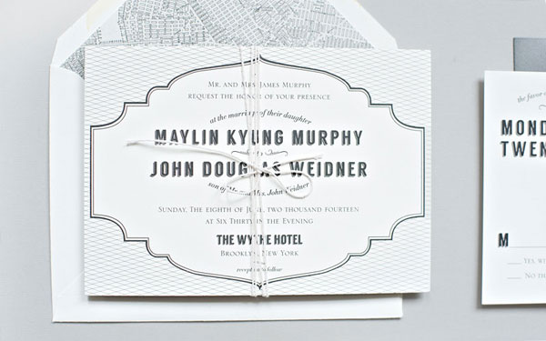
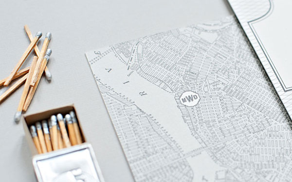
As much as I love a bright and colorful wedding invitation suite, there’s just something classically elegant about a monochrome design! Becca from Suite Paperie sent over these beautiful invitations for a wedding in Brooklyn. Becca mixed modern fonts and patterns with vintage-inspired design elements and a reproduction antique map to create a perfectly timeless wedding invitation.
Map-Wedding-invitations-Suite-Paperie-OSBP5

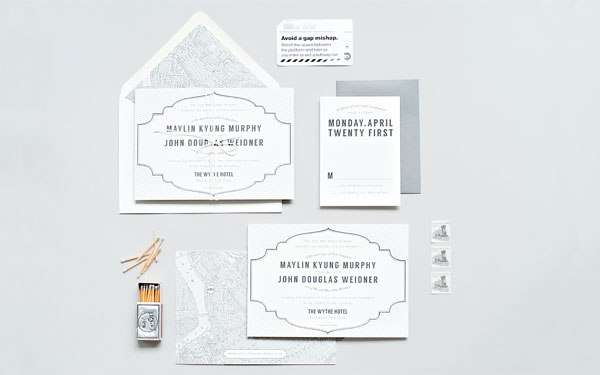
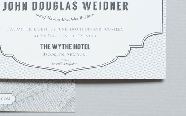
From Becca: The perfect mix of steampunk, vintage and modern, this monochromatic suite is easily one of our favorites of the season! A vintage map paired with a clean modern design makes this suite a perfect fit for the couple’s wedding at the super-cool Wythe Hotel in Brooklyn.
Map-Wedding-invitations-Suite-Paperie-OSBP

Map-Wedding-invitations-Suite-Paperie-OSBP2

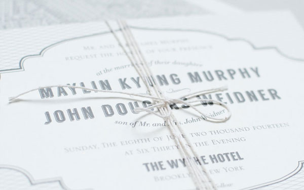
The suite includes a double-mounted digital invitation and RSVP card with a charcoal envelope. The front of the invitation is adorned with a modern crosshatch pattern and a bold sans serif type, and on the back, the couple’s custom monogram is added to a vintage map of Brooklyn. To bring everything together, the envelope is also lined with the map, and the whole suite is held together with cotton twine.
Map-Wedding-invitations-Suite-Paperie-OSBP4

Map-Wedding-invitations-Suite-Paperie-OSBP3

Thanks Becca!

Check out the Designer Rolodex for more tal­ented wed­ding invi­ta­tion design­ers and the real invi­ta­tions gallery for more wedding invitation ideas!

Photo Credits: Lindsay Nathanson

Emily + Mike’s Desert Botanical Wedding Invitations

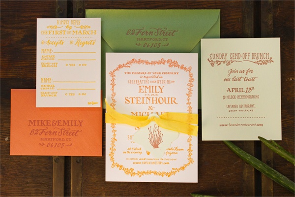
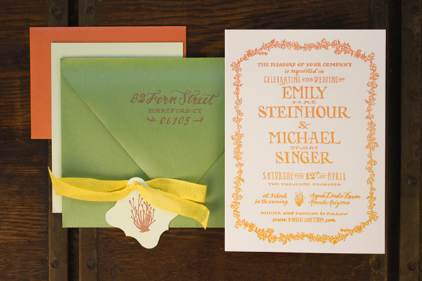
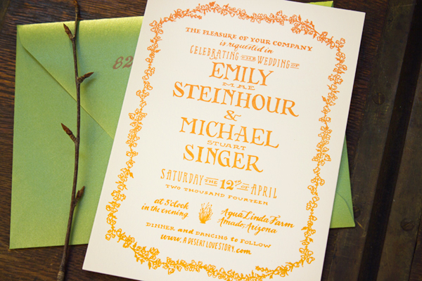
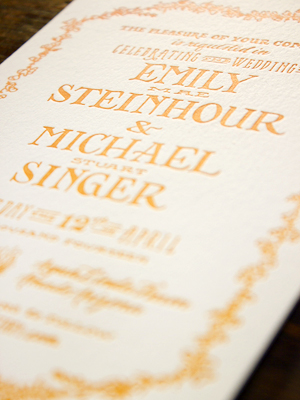
When these two botanists decided to get married in the Arizona desert, they turned to Arley-Rose and Morgan of Ladyfingers Letterpress to incorporate their favorite plant specimens into their wedding invitations. Paired with Arley-Rose’s signature hand lettering, the invitation suite features desert cacti and floral illustrations – all letterpress printed in desert-inspired hues of pink and orange. So pretty!

Hand-Lettered-Wedding-Invitations-Ladyfingers-Letterpress-OSBP

From Arley-Rose and Morgan: Emily and Mike are a lovely couple whose botanical passions inspired the look and feel for their entire wedding. When they showed us photos of the beautiful Arizona desert landscape where they will have their ceremony, they pointed out each plant specimen in the photo with great excitement – as if they were characters in their favorite book! 

Hand-Lettered-Wedding-Invitations-Ladyfingers-Letterpress-OSBP2

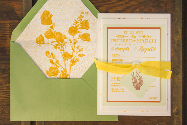
We knew that integrating the objects of desire of these two botanists would be a focal point for the wedding invitations. They sent us tons of photos of desert cacti and gorgeous blossoming flowers that I didn’t even know existed! Emily said that she was especially smitten with the Globe Mallow, which we letterpress printed into the envelope liner.

Hand-Lettered-Wedding-Invitations-Ladyfingers-Letterpress-OSBP10 

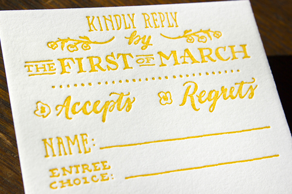
The suite was tied together using a loose weave Italian ribbon and decorated with a letterpress hang tag that featured an illustration of one of their favorite desert cacti. The main invitation is bordered with a delicate botanical illustration and letterpress printed with a rainbow roll effect that evokes a late summer pink-to-orange desert sunset. The RSVP card was multi-tiered for guests who were RSVPing for different events. Also included was a double sided send off brunch and a rehearsal dinner card that was letterpress printed on a soft mint green paper.

Hand-Lettered-Wedding-Invitations-Ladyfingers-Letterpress-OSBP3

Hand-Lettered-Wedding-Invitations-Ladyfingers-Letterpress-OSBP8 

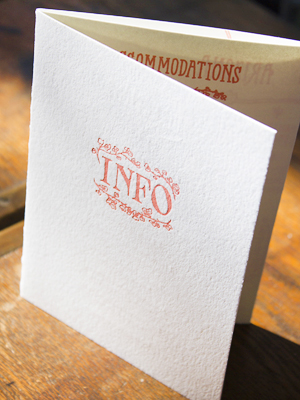
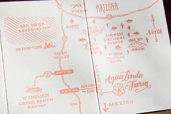
The suite also included an extensive info booklet that gave information on where to stay, what sort of weather to expect, and a handy map of the area since GPS is unreliable in that neck of the woods.

Hand-Lettered-Wedding-Invitations-Ladyfingers-Letterpress-OSBP4Hand-Lettered-Wedding-Invitations-Ladyfingers-Letterpress-OSBP7

Hand-Lettered-Wedding-Invitations-Ladyfingers-Letterpress-OSBP9

Thank you so much ladies!

Design + Letterpress Printing: Ladyfingers Letterpress

Italian Cotton Ribbon: Studio Carta

Ladyfingers Letterpress is a member of the Designer Rolodex – check out more of their beautiful work right here or visit the real invi­ta­tions gallery for more wedding invitation ideas!

Photo Credits: Ladyfingers Letterpress

Michelle + Matt’s Whimsical Watercolor Save the Dates

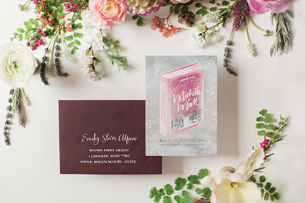
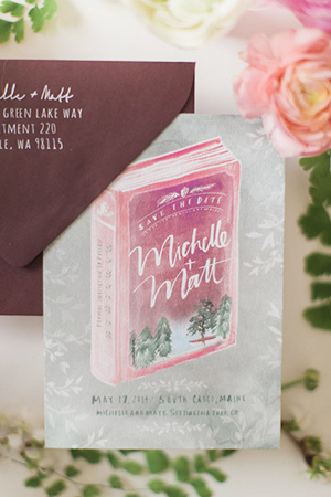
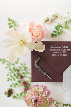
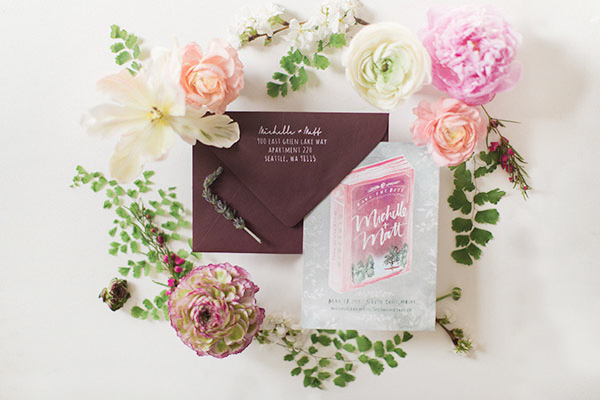
Happy Monday everyone! Emily from mStarr event design sent over these whimsical wedding save the dates for a couple with a fondness for libraries and the great outdoors. After deciding on the overall concept with her clients, Emily turned to Julie Song Ink for the watercolor illustration and design, then to Anne Robin Calligraphy to address the deep plum envelopes. The result is simply stunning!

Watercolor-Wedding-Save-the-Dates-Julie-Song-Ink

From Emily: Michelle and Matt met in their college library and both are doctors (she a medical doctor, he a PhD), so they’ve seen their fair share of libraries! They’ll be taking over the Migis Lodge and its campgrounds for their wedding, with a reception in the main lodge overlooking Sebago Lake, fire pits, and cabins! From the very beginning of our overall design process, we envisioned a “summer camp chic” weekend with books and organic and whimsical elements woven throughout.

Watercolor-Wedding-Save-the-Dates-Julie-Song-Ink6Watercolor-Wedding-Save-the-Dates-Julie-Song-Ink5

So when it came time to think about their wedding stationery, I suggested the one and only Julie Song to bring the vision to life with her free flowing calligraphy and watercolor illustrations. We shared the general color palette along with the idea to incorporate a book and the outdoors – and let her run with it! We decided on that gorgeous deep berry color for the envelope and asked one of my favorite calligraphers Anne Robin to do the addresses in white ink. She nailed it.

Watercolor-Wedding-Save-the-Dates-Julie-Song-Ink2

Thanks Emily!

Design: Julie Song Ink

Envelope Calligraphy: Anne Robin Calligraphy

Art Direction: mStarr event design

Floral Styling: Petal Floral Design

Julie Song Ink is a member of the Designer Rolodex – you can see more of Julie’s beautiful work right here or visit the real invi­ta­tions gallery for more wedding invitation ideas!

Photo Credits: Hello Love Photography

Happy Weekend!

Oh man you guys, this was a rough week. As I mentioned last week, Sophie came down with a bug, which a few days later morphed into a double ear infection and lower chest infection. We have one sad little toddler on our hands, which has resulted in several sleepless nights and two exhausted parents. I struggle during weeks like this: days that feel like a slog behind the scenes while trying to push forward and share pretty things for all of you to enjoy. I want to share the good and the bad here, but when things get tough (and especially when I’m feeling wiped out) it often feels easier to be quiet and wait for the storm to pass. I’m also way overdue for a Sophie update and a general life update, but that will have to wait for next week when I hopefully have a bit more energy. But in the meantime…

Paper-Party-Flowers-OSBP-Instagram

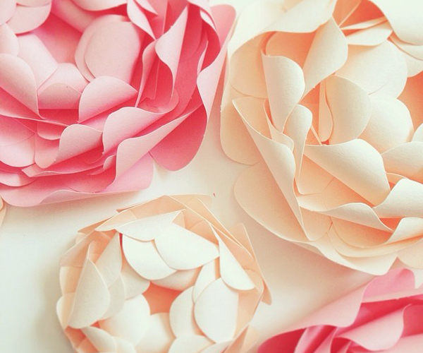
Photo by me via Instagram / Playing around with some paper flowers for my upcoming annual Paper Party!

…a few links for your weekend!

This week on Oh So Beautiful Paper:

Check back soon for this week’s cocktail! I hope you all have a wonderful weekend, and I’ll see you back here next week! xoxo

Ashley + Jeff’s Modern Chic Neon Pink Wedding Invitations

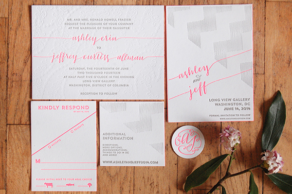
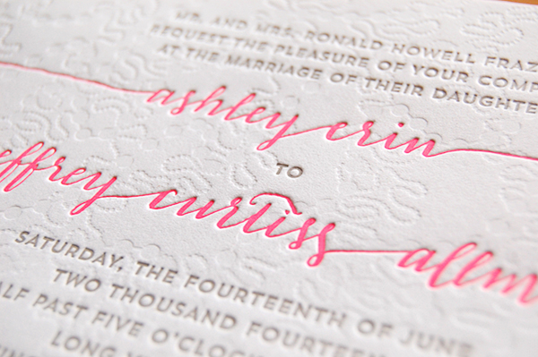
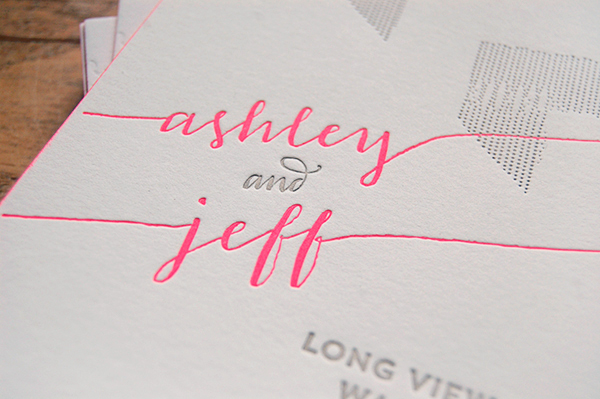
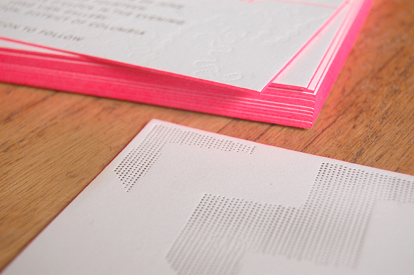
These weddings invitations are the result of a fantastic collaboration – designed by the bride (and featuring her own calligraphy!) and letterpress printed by Alia and Jason of Darling Press. Ashley wanted her wedding invitations to reflect both her love of paper (yay!) and her modern chic wedding style. The design features a blind impression pattern inspired by the texture on Ashley’s wedding dress and pops of neon pink. Love!

Neon-Pink-Modern-Calligraphy-Wedding-Invitations

From Ashley: I wanted our invitations to be really unique and really us. I love paper, typography, letterpress, and everything that goes along with it. I wanted to set a tone through the paper that we could carry throughout the rest of the wedding plans: sophisticated, chic, modern, and clean. Our wedding will take place in an art gallery in DC, and our tables will be Pantone colors instead of numbers – hence my interest in getting very specific ink colors.

Neon-Pink-Modern-Calligraphy-Wedding-Invitations2

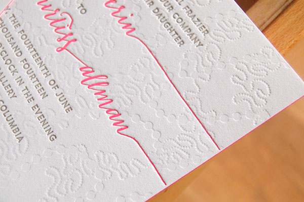
The blind impression pattern is inspired by the embellishment on my wedding dress. I was using a font for the calligraphy at first, but then I took a calligraphy class from Michele Fritz of Meant to be Calligraphy here in DC, and she convinced me to replace that font with my own writing.

Neon-Pink-Modern-Calligraphy-Wedding-Invitations3

When it came time to print the invitation suite, Alia and Jason of Darling Press to letterpress printed the design on 236# Savoy Bright white paper with neon pink edge painting.

Neon-Pink-Modern-Calligraphy-Wedding-Invitations4

Neon-Pink-Modern-Calligraphy-Wedding-Invitations5

Thanks Alia and Jason!

Design: Ashley Frazier

Letterpress Printing: Darling Press

Check out the Designer Rolodex for more tal­ented wed­ding invi­ta­tion design­ers and the real invi­ta­tions gallery for more wedding invitation ideas!

Photo Credits: Darling Press