Embroidery and Millinery Wedding Invitation Inspiration

As promised, I’m back with more from the talented Kristy Rice of Momental Designs from her shoot at the Biltmore Estate in North Carolina! Kristy was inspired by cross-stitch embroidery and vintage millinery details to create two very different – but incredibly beautiful – wedding invitation designs that suit the antique beauty of the estate. Kristy incorporated an incredible level of detail into her designs, from watercolor cross-stitch inspired artwork to floral appliqués. Gorgeous!
Embroidery-Inspired-Wedding-Invitations-Momental-Designs-OSBP-2

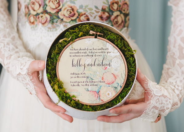
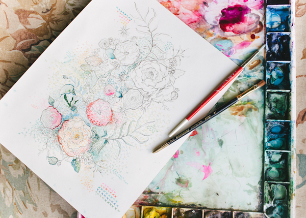
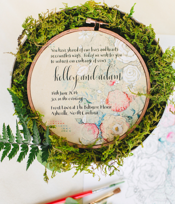
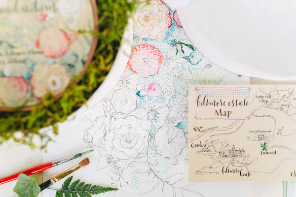
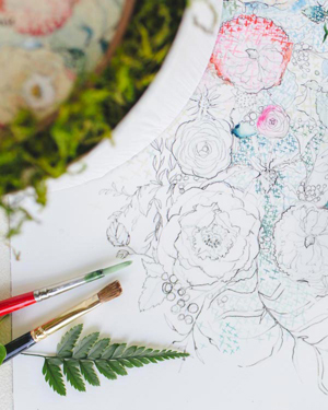
From Kristy: This embroidery-inspired invitation reinterprets the look of cross stitch in watercolor and pattern.

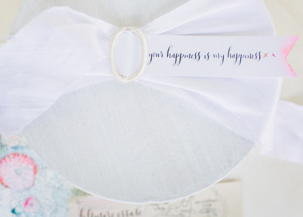
 Punchy blooms are made up of tiny watercolor “x” shapes in shades of coral, poppy, blue, and greens. The invitation is stretched into a copper painted embroidery hoop – all presented in a round box filled with fresh moss and tied up with white silk Dupioni ribbon.

Embroidery-Inspired-Wedding-Invitations-Momental-Designs-OSBP-1

Embroidery-Inspired-Wedding-Invitations-Momental-Designs-OSBP-7

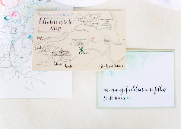
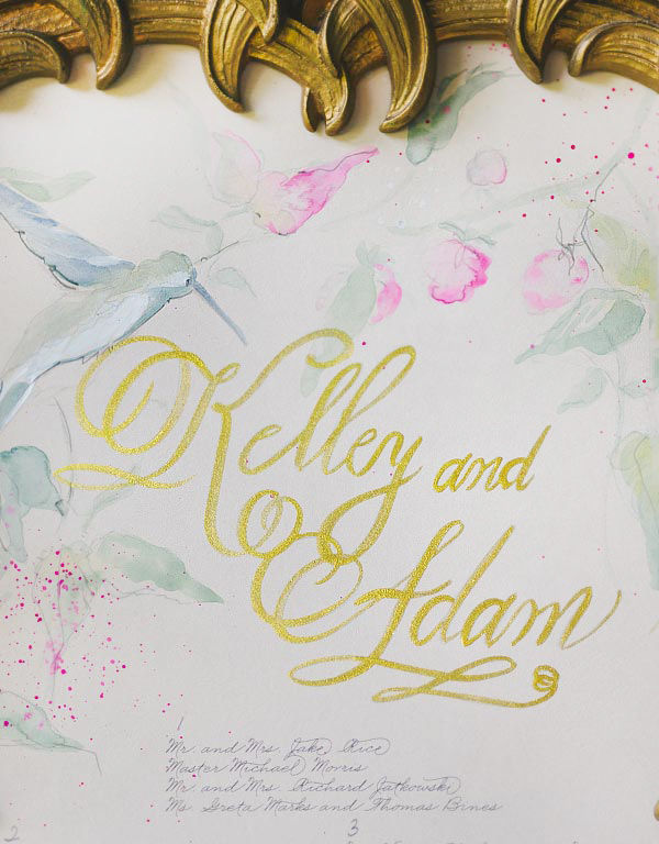
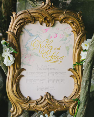
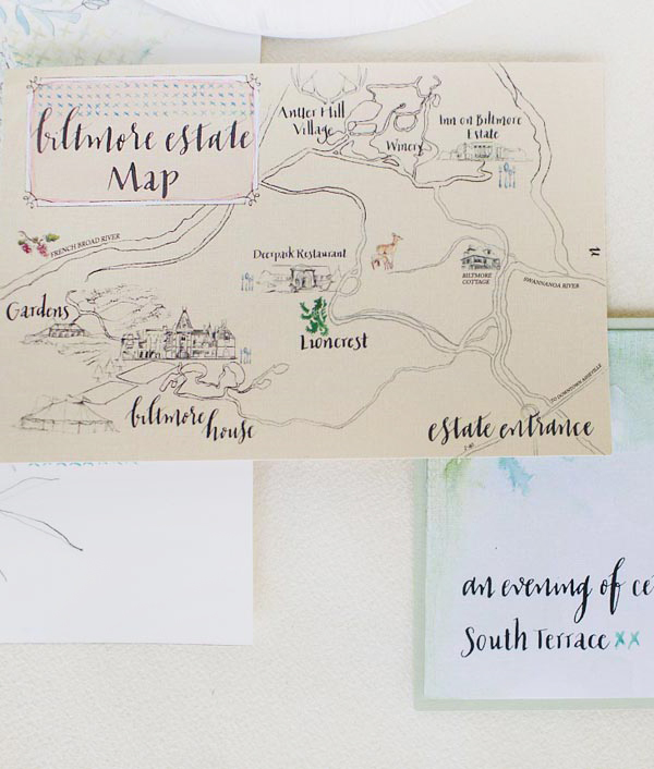
With acres of forest woven throughout the property to include restaurants, shops and a winery, a hand-drawn map was a necessity for the navigation of guests. Although George Vanderbilt constructed a stately home with miles of landscaping ingenuity, his desire to live in the simplicity of the North Carolina mountains inspired me to instill this nature-inspired approach in my artwork.
Biltmore-Estate-Wedding-Invitation-Inspiration-Momental-Designs-OSBP2

Embroidery-Inspired-Wedding-Invitations-Momental-Designs-OSBP-4

Embroidery-Inspired-Wedding-Invitations-Momental-Designs-OSBP-5

Embroidery-Inspired-Wedding-Invitations-Momental-Designs-OSBP-14

Next up – an invitation suite inspired by vintage millinery details!
Millnery-Wedding-Invitations-Momental-Designs-OSBP-7

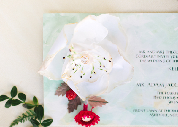
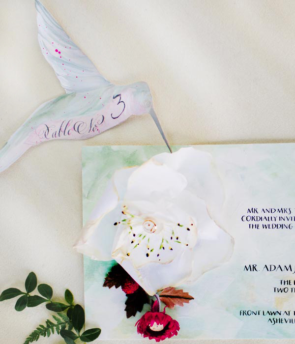
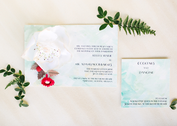
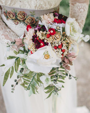
This invitation suite was inspired by vintage millinery and paper blooms in a beautiful bridal bouquet. Delicate rice paper magnolia blooms feature button centers and vintage millinery stamens. Sweet beaded strawberries peek out from behind the bloom. The invitation was hand painted in shades of fresh greens, gold, and white to mimic the textures of iconic oil paintings.


Biltmore-Estate-Wedding-Invitation-Inspiration-Momental-Designs-OSBP6Biltmore-Estate-Wedding-Invitation-Inspiration-Momental-Designs-OSBP

Millnery-Wedding-Invitations-Momental-Designs-OSBP-8

Biltmore-Estate-Wedding-Invitation-Inspiration-Momental-Designs-OSBP4

Millnery-Wedding-Invitations-Momental-Designs-OSBP-6

Millnery-Wedding-Invitations-Momental-Designs-OSBP-4

Thanks so much Kristy!

Design and Hand Painted Stationery: Momental Designs

Calligraphy: Meant to Be Calligraphy

Venue: Biltmore Estate, Asheville, North Carolina

Check out the Designer Rolodex for more tal­ented wed­ding invi­ta­tion design­ers and the real invi­ta­tions gallery for more wedding invitation ideas!

Photo Credits: With Love and Embers
Hand Painted Wedding Invitation Inspiration

Happy Monday everyone! You’re in for such a treat: the amazingly talented Kristy Rice of Momental Designs sent over three beautiful hand painted wedding invitations that she created for a shoot at the stunning Biltmore Estate in North Carolina – and we’re going to see all three! We’ll start off with the first invitation suite and some of the beautiful inspiration from the shoot, followed by the two other invitation suites a bit later. Let’s get right to it!

Biltmore-Estate-Inspired-Watercolor-Wedding-Invitations-Momental-Designs-OSBP-17

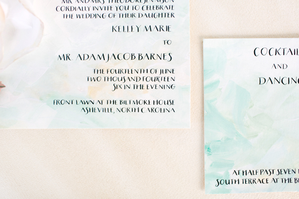
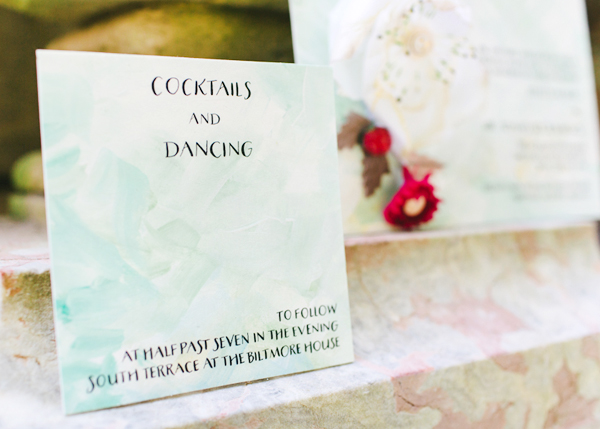
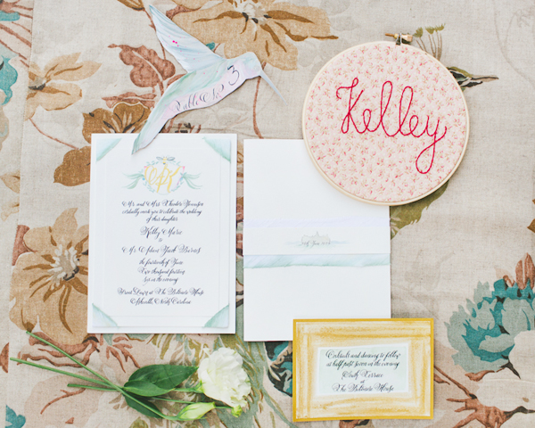
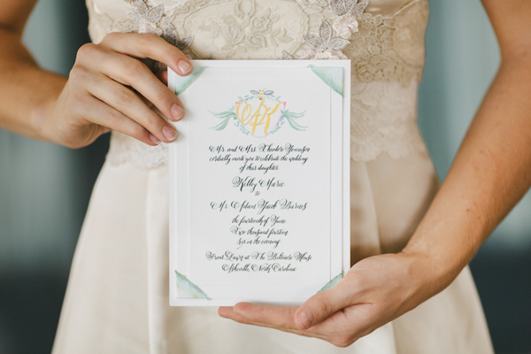
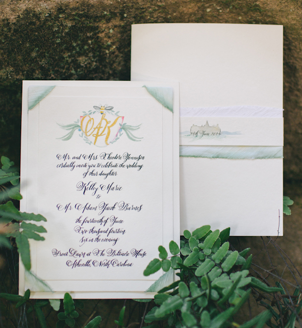
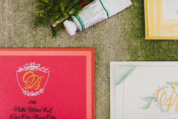
From Kristy: The antiquity of the Biltmore Estate in Asheville, North Carolina lends itself to creating wedding stationery that you might find in the actual details of the Vanderbilt home within the embossed wallpaper, ornate woodwork, treasured artworks, or the rich draperies adorning each window. I decided right away to feature a family crest-style monogram, just as the Vanderbilt family would have had on their own letterhead. But we updated the look with watercolor and hand gilded touches.

Biltmore-Estate-Inspired-Watercolor-Wedding-Invitations-Momental-Designs-OSBP-11

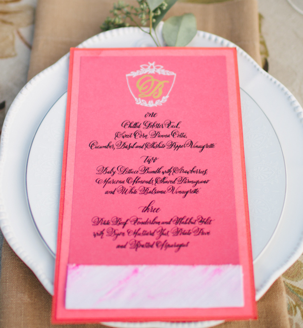
We evolved a traditional monogram concept to reveal a modern aesthetic. Hand gilded initials mingle with watercolor moments. The invitation features hand painted Dupioni silk photo corners in sage green with subtle ombre fading along the edge. The invitation also features the same hand painted silk in a wrap with a watercolor silhouette of the Biltmore Estate. The menu features a tonal layering of stock in bright pink hues.

Biltmore-Estate-Inspired-Watercolor-Wedding-Invitations-Momental-Designs-OSBP-3

Biltmore-Estate-Wedding-Invitation-Inspiration-Momental-Designs-OSBP3

Biltmore-Estate-Inspired-Watercolor-Wedding-Invitations-Momental-Designs-OSBP-12

Biltmore-Estate-Wedding-Invitation-Inspiration-Momental-Designs-OSBP7

Biltmore-Estate-Wedding-Invitation-Inspiration-Momental-Designs-OSBP5Biltmore-Estate-Inspired-Watercolor-Wedding-Invitations-Momental-Designs-OSBP-27

Biltmore-Estate-Inspired-Watercolor-Wedding-Invitations-Momental-Designs-OSBP-29

Biltmore-Estate-Inspired-Watercolor-Wedding-Invitations-Momental-Designs-OSBP-9

Biltmore-Estate-Inspired-Watercolor-Wedding-Invitations-Momental-Designs-OSBP-18

Biltmore-Estate-Inspired-Watercolor-Wedding-Invitations-Momental-Designs-OSBP-6

Embroidery-Inspired-Wedding-Invitations-Momental-Designs-OSBP-17

Biltmore-Estate-Wedding-Invitation-Inspiration-Momental-Designs-OSBP10

Thanks Kristy – and check back for the other two invitations (inspired by embroidery and vintage millinery!) a bit later!

Design and Hand Painted Stationery: Momental Designs

Calligraphy: Meant to Be Calligraphy

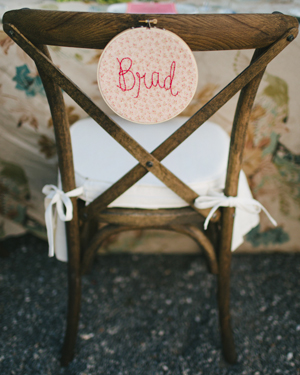
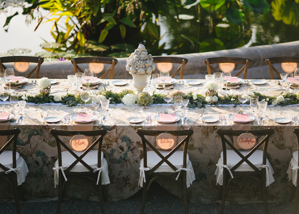
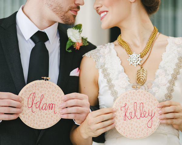
Hoop Art Place Cards: Thimble and Thistle

Venue: Biltmore Estate, Asheville, North Carolina

Check out the Designer Rolodex for more tal­ented wed­ding invi­ta­tion design­ers and the real invi­ta­tions gallery for more wedding invitation ideas!

Photo Credits: With Love and Embers
Happy Weekend!

Happy Friday everyone! I’m still in a festive mood after our modern Tiki party earlier this week – I hope you enjoyed it as much as we enjoyed putting all the details together! And the gorgeous (totally unseasonal) weather we’re experiencing in DC this week definitely helps me stay in a happy mood. This weekend I’m excited to check out the annual Lotus Festival at the Aquatic Gardens, especially since the lotus and water lilies are at peak bloom this time of year! But in the meantime…

Tiki-Cocktail-Party-Inspiration-OSBP-Bacardi-StGermain-131

Photo by me from our modern Tiki cocktail party!

…a few links for your weekend!

This week on Oh So Beautiful Paper:

Check back soon for this week’s cocktail! I hope you all have a wonderful weekend, and I’ll see you back here next week! xoxo

Penelope’s Floral Letterpress Baby Announcements

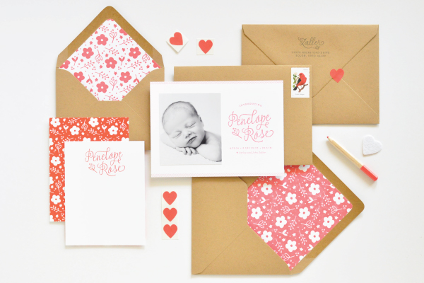
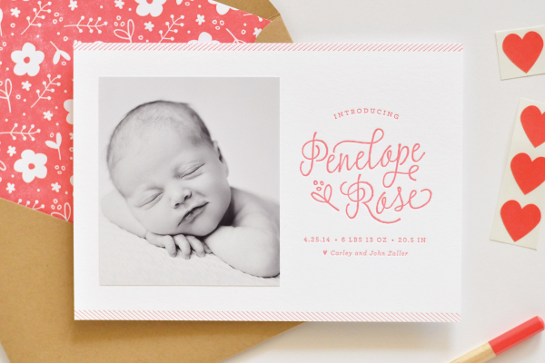
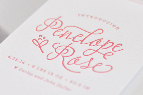
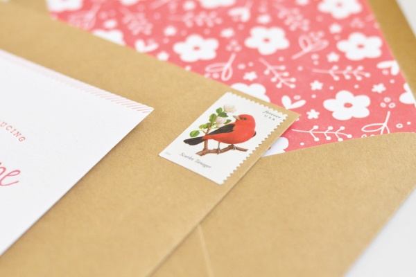
Aaaah! How cute are these red, white, and kraft paper floral birth announcements for a sweet baby girl?!? Created by designer Lauren Chism for her new niece Penelope, the beautiful announcements feature simple letterpress printed text paired with a matte black and white photograph and floral envelope liners. So pretty!

Floral-Letterpress-Baby-Announcements-Lauren-Chism-OSBP

From Lauren: My sister, Carley, and her husband John welcomed their adorable daughter, Penelope, at the end of April and we all couldn’t be more in love with her. As Carley’s ‘personal stationer’ I was dreaming up ideas for the announcements the moment we found out they were having a girl. They are my favorite gift to give friends and family – quite a bit more fun to give than diapers and wipes!

Floral-Letterpress-Baby-Announcements-Lauren-Chism-OSBP2

When it came to the design, Carley was drawn to the clean look and simplicity of letterpress, which is my personal favorite form of printing. Penelope’s nursery incorporated brighter colors of red, blue and yellow with floral details, and I wanted to incorporate those things without being too literal. We ended up going with red letterpress text with a black and white photo, paired with kraft envelopes. The announcements were printed on 118# cotton Savoy and the gorgeous matte photos were attached to each card.

Floral-Letterpress-Baby-Announcements-Lauren-Chism-OSBP4

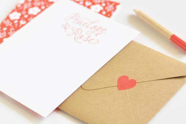
To balance the minimalist design of the announcement, I created a floral pattern for the envelope liners to add a little playful, feminine element to the suite. When doing custom announcements, I love trying something new, so I decided to have the liners letterpress printed as well. I was so torn about which color way to print: the red and white backgrounds both offered a unique look. With the red background, I love the salty texture and mottled look that resulted from flooding the press with so much ink, but also loved the contrast of white against the kraft envelopes. Indecision won out and I ended up using a mix of both – I still can’t decide which one I like best!

Floral-Letterpress-Baby-Announcements-Lauren-Chism-OSBP6

For the envelopes, instead of my usual go-to washi tape, I closed each with little heart stickers from Thatch and Thistle. They were so cute and tiny – the perfect final touch to the announcements.

Floral-Letterpress-Baby-Announcements-Lauren-Chism-OSBP9

Thanks Lauren!

Design: Lauren Chism

Baby Photography: Photography by Brea

Letterpress Printing: Elefant Press

Lauren Chism Fine Papers is a member of the Designer Rolodex – you can check out more of Lauren’s work right here!

Photo Credits: Lauren Chism Fine Papers

DIY Wedding Reception Table Numbers
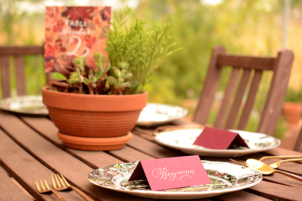
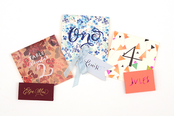
Summer brings wedding galore, and for us…that means party decor! We’ve been helping clients create gorgeous day of stationery and in the process have come up with some fun and festive table numbers that you can do yourself! We know that by the time couples usually think about reception stationery, they’re usually over their budget and are short on time. Luckily, these table numbers are not costly or time consuming. You could easily knock them out in an afternoon. There are endless options once you have the basics of creating them…so the only limit to the project is your imagination! We’ll show you three different styles to kick start your creativity. To complete your tablescape, we’ll also show you place cards to complement to each design. – Bailey and Emma of Antiquaria

DIY Tutorial: Wedding Reception Table Numbers by Antiquaria for Oh So Beautiful Paper

Up until adding the actual numbers to the cards, the process is exactly the same. We will be making 5.5″ square tented cards (showing the pattern on both sides) and the size works perfectly with a standard 8.5″ x 11″ piece of card stock.

DIY Tutorial: Wedding Reception Table Numbers by Antiquaria for Oh So Beautiful Paper

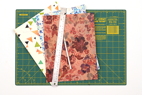
Step One: Select your paper and cut the cards to size. Cut a rectangle measuring 5.5″ x 11″. If you’re using a standard sheet of paper like we did, that is only one cut (since the length is already 11″).

DIY Tutorial: Wedding Reception Table Numbers by Antiquaria for Oh So Beautiful Paper

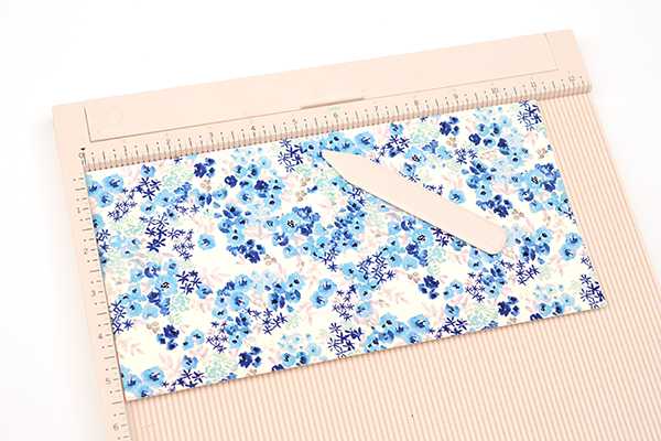
Step Two: To make the tented card and have a clean fold, you’ll want to score the paper at the 5.5″ mark on a score board. Repeat steps one and two until you have enough cards to accommodate all of your tables (usually between 8-25 for a standard wedding).

Option One: Painted Script Floral

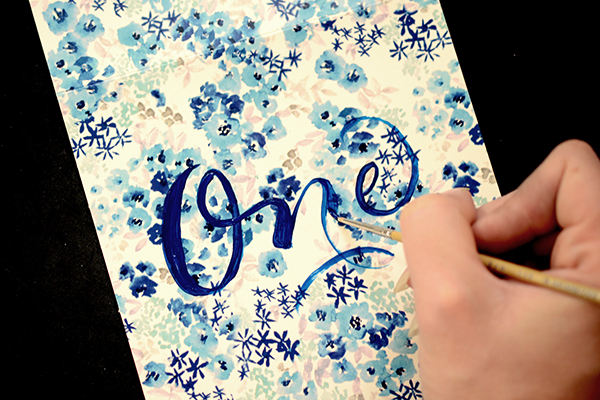
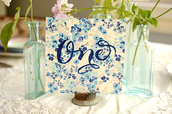
For the first version that we put together, we used our “Paloma” Blue Floral Card Stock and painted the table numbers (spelled out) in navy blue acrylic paint. The effect is playful and traditional at the same time.

DIY Tutorial: Wedding Reception Table Numbers by Antiquaria for Oh So Beautiful Paper

With a small pointed paint brush, write out the table number in cursive across the middle of the card. Go back over the letters, adding weight to the lines (as shown above). If you need help finding out where the weights should go or what shape to paint the letters, refer to a favorite script font or perhaps your invitation suite! That way, everything will coordinate.

DIY Tutorial: Wedding Reception Table Numbers by Antiquaria for Oh So Beautiful Paper

DIY Tutorial: Wedding Reception Table Numbers by Antiquaria for Oh So Beautiful Paper

Option Two: Modern Neon Geometric

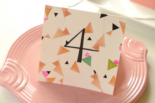
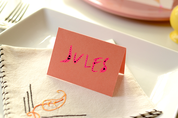
In this interpretation, we’ve put a modern spin on the technique. We used our “Geo” patterned card stock and wrote the number in a simplistic style to create the look. Pops of neon pink painted on help add some punch to the cards.

DIY Tutorial: Wedding Reception Table Numbers by Antiquaria for Oh So Beautiful Paper

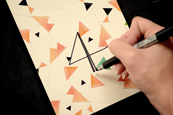
First you’ll write the table number in the center using a permanent black marker. Fill in and bulk up the number as needed (shown above).

DIY Tutorial: Wedding Reception Table Numbers by Antiquaria for Oh So Beautiful Paper

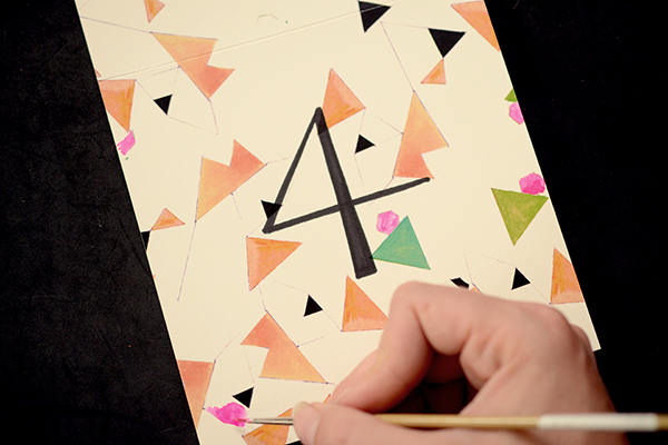
Next you’ll add the final touch of neon using hot pink gouache. We painted into different shapes already printed on the paper making sure they all balanced with one another.

DIY Tutorial: Wedding Reception Table Numbers by Antiquaria for Oh So Beautiful Paper

DIY Tutorial: Wedding Reception Table Numbers by Antiquaria for Oh So Beautiful Paper

Option Three: Autumn Garden Floral

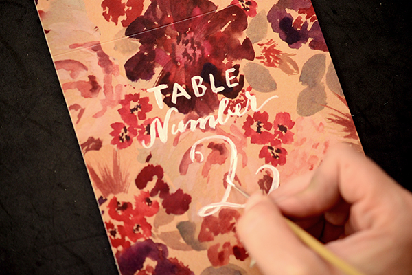
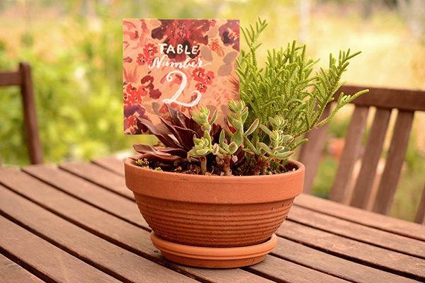
For our final interpretation, we used our “Diana” floral card stock to create the perfect garden inspired table decor. The gorgeous rich shades of the pattern mean that this style would just as easily work for fall and winter weddings.

DIY Tutorial: Wedding Reception Table Numbers by Antiquaria for Oh So Beautiful Paper

With a small pointed paint brush, paint the word “TABLE” about 1 inch from the fold with white acrylic paint. Below that, in cursive, paint the word “Number,” trying to center it as much as possible. Finally, you’ll add the numeral centered below. Go back over the number, adding weight to the lines (as shown above). It would be extremely helpful to have these cards planned out on a separate sheet of paper before painting on the lettering. That way, you can know exactly how to center the text, and how large you should make it.

DIY Tutorial: Wedding Reception Table Numbers by Antiquaria for Oh So Beautiful Paper

TableNumberDIY-Diana-Placecard-2

TableNumberDIY-Diana-Final-2

Materials

Patterned Paper

Self Healing Mat

Craft Knife

Metal Ruler

Scoreboard

Acrylic paints

Permanent Marker

Anti­quaria is a mem­ber of the Designer Rolodex – you can see more of their beau­ti­ful work right here!

Photo Credits: Antiquaria for Oh So Beautiful Paper