Elegant Copper Foil Wedding Invitations on Handmade Paper

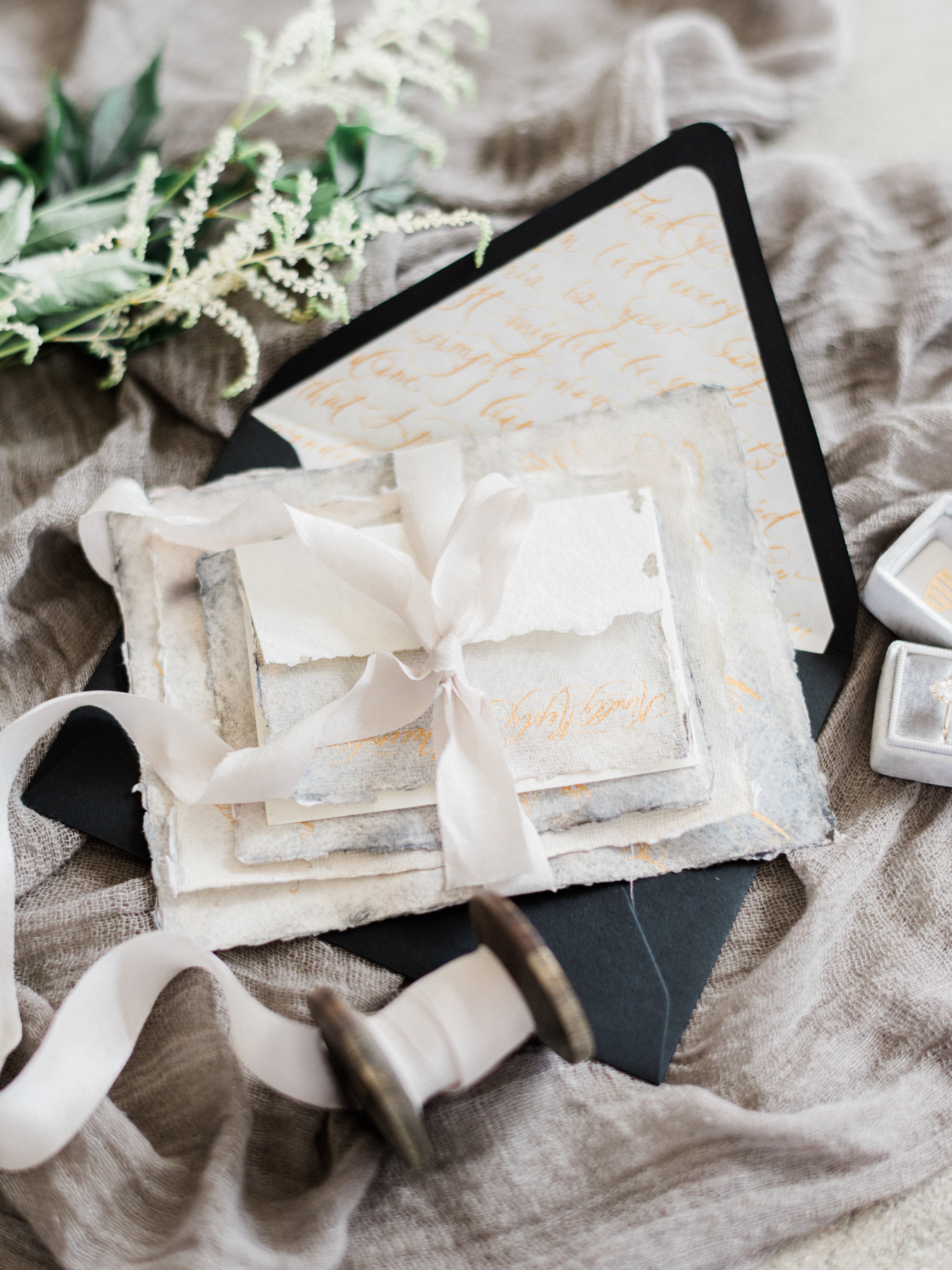
What better item to choose for your “something old and something new” than gorgeous invitations inspired by your own parents’ wedding invitations? These copper foil wedding invitations on handmade paper from Alex of Al Stampa are an homage to the bride’s mother’s invitation from the 1970s. With elegant copper foil text on handmade paper with delicate torn edges, not to mention STUNNING emerald green envelopes, these invitations are a fresh take on a vintage beauty!
Copper Foil Wedding Invitations on Handmade Paper by Al Stampa

From Alex: Janice and Spencer have one of those love stories that you only see in the movies. In love in high school, separated for almost 10 years, only to then fall in love again years later when a friend organized them to be at the same New Years party.

Copper Foil Wedding Invitations on Handmade Paper by Al Stampa

Their wedding was set in a lavender field in Wiscasset, Maine at the stunning Marianmade Farms. To say it was a beautiful wedding is an understatement. Janice put her vision into every aspect of the wedding, and they both created magical moments all throughout the evening. Some examples include handmade paper florals, a watercolor backdrop for a photo booth, all of which came back to the colors we used in the invitation; lavender, copper, and emerald.

Copper Foil Wedding Invitations on Handmade Paper by Al Stampa

The most spectacular part of this suite was the inspiration. The bride wanted to emulate her parent’s invitation from 1973. The simplicity of this invitation, with the handmade paper, copper text, and hand torn edges, is something you don’t see too often nowadays and was an honor to use as part of this couple’s story.

Copper Foil Wedding Invitations on Handmade Paper by Al StampaCopper Foil Wedding Invitations on Handmade Paper by Al StampaI worked with Signora e Mare and ordered their ecru handmade paper, which had a subtle lavender color to it and was the perfect choice for this suite. Because the couple loves a certain modernity to their life and their special day, I opted for a modern font and added an illustration of the camper van that is situated on Marianmade Farm, in front of which they took their wedding portraits.

Copper Foil Wedding Invitations on Handmade Paper by Al Stampa

I foil stamped the invitation in the copper color, which was a beautiful contrast to the lavender hued paper. The RSVP card was our all time favorite, a small, almost circular tearing of the paper, with a matching envelope.

Copper Foil Wedding Invitations on Handmade Paper by Al Stampa

Copper Foil Wedding Invitations on Handmade Paper by Al Stampa

For the envelope, I scoured the internet for the perfect emerald color that the bride had envisioned. I found the most beautiful soft-touch emerald envelopes called Plike, and foil printed their return address stamp on the back. The finishing touch? Sarah Vaughan Stamps to throw in another rich color to the mix, and to nod to the couple’s love of jazz music.

Copper Foil Wedding Invitations on Handmade Paper by Al Stampa

Thanks Alex!

Design, printing, and styling: Al Stampa

Handmade paper: Signora e Mare

Envelopes: Plike Envelopes

Check out the Designer Rolodex for more tal­ented wed­ding invi­ta­tion design­ers and the real invi­ta­tions gallery for more wedding invitation ideas!

Photo Credits: Roland Kielman and Alex Labriola

Calligraphy Inspiration: Ruth Jahja of Seniman Calligraphy

Hey everyone! I’m excited to share some pretty lettering work with you today. What I love in the paper world is when you spot wedding invitation suites that don’t look quite like everyone else’s. And I’m a big fan of seeing calligraphy in places beyond paper. Because why not dress up a celebration with pretty lettering in other places, too?! So here’s a look into the lettering work of Ruth Jahja of Seniman Calligraphy. Let’s hear what Ruth has to share about her experiences as a calligrapher! â€“ Jen

Calligraphy Inspiration: Ruth Jahja of Seniman Calligraphy

Calligraphy Inspiration: Ruth Jahja of Seniman Calligraphy

Photo Credits: Tenth and Grace

Ruth Jahja is Indonesian and she came to the United States for her bachelor’s degree in Interior Architecture. “Drawing and painting have been something I’ved loved to do since I was a kid but I decided to pursue something a bit more stable for my degree,” she shares. After working for a few years as an interior designer in Los Angeles, she stumbled on calligraphy while trying to find a new hobby. It turned out to be even more fun than she expected, and she wanted practice, so she decided to set up an Instagram account and Etsy shop to make a little extra pocket money. One thing led to another, and after a couple of photographers took a leap of faith and collaborated with her on some styled shoots, more work followed. “Almost a year since I posted my very first Instagram photo, I decided to do this full time and it’s been an adventure ever since,” shares Ruth.

Calligraphy Inspiration: Ruth Jahja of Seniman Calligraphy

Photo Credit: Tenth and Grace

Where does the name come from? Ruth shares: Seniman means artists and craftsmen in Indonesian, so it’s my little homage to my heritage and a commitment for what kind of work I want to produce.

Calligraphy Inspiration: Ruth Jahja of Seniman Calligraphy

Photo Credit: Diane McGregor Photography

What a wow statement this giant menu board makes in a reception!

Calligraphy Inspiration: Ruth Jahja of Seniman Calligraphy

Ruth shares that she prefers a strong contrast between the thick down-stroke and the delicate up-stroke, the bold lines and the bouncy flourishes. “I do notice my writing evolves as my ability to control the medium improves over time,” notes Ruth. “I’m able to work with strokes and curves that feel comfortable and natural to me instead of trying to copy others’ writing.”

Calligraphy Inspiration: Ruth Jahja of Seniman Calligraphy

“I’m a huge sucker for letterpress and handmade paper,” says Ruth. (Me too!)

Calligraphy Inspiration: Ruth Jahja of Seniman Calligraphy

Photo Credit: Tenth and Grace

“I love working on non-paper medium — from glass/mirror, tile, natural stone, ribbon, and wood,” says Ruth. This bottle of bubbly with her hand lettering is definitely my fave.

Calligraphy Inspiration: Ruth Jahja of Seniman Calligraphy

Photo Credit: Ether and Smith

Many thanks to Ruth for sharing a sweet peek into her lettering work and work process!

Photo Credits: Seniman Calligraphy except where noted

Refined Powder Blue and Vellum Baby Announcements

We love love love watching our Designer Rolodex friends celebrate milestones, like adding to their families! And today is truly a special day, because we get to share the baby announcements that Jackie of Sincerely, Jackie designed for her little guy Richie’s welcome into the world! Jackie is known for her elegant invitation design, so it’s no surprise that she created these stunning and refined powder blue and vellum baby announcements for her own sweet boy. Congrats to the happy, and adorable, family!

Refined Powder Blue and Vellum Baby Announcements

From Jackie: We wanted these announcements to be a simple declaration of both Richie’s birth and his coming home, over three months later. When I was first hospitalized with HELLP Syndrome, my husband and I made the decision to be public with our journey. Many, many people kept us in their thoughts and prayers after our son was born 14 weeks early. We ended up mailing several hundred birth announcements, and I never shared the sentimental story behind them.

Refined Powder Blue and Vellum Baby Announcements

They may be overly simple, but they’re more meaningful than they appear. I purposefully kept the typography clean, and the colors subtle because I did not want to detract from the three most important things: Richie’s announcement, our two favorite photos, and the song that planted itself in my heart.

Refined Powder Blue and Vellum Baby Announcements

The announcements were digitally printed in a soft blue-grey on cotton paper, and contained two cards, each with a photo on one side, and typography on the other. The first, smaller card was our actual announcement containing both the date Richie was born (May 26, 2016, weighing 2lbs 2oz, and only 13.75″ long), and the day he came home from the NICU, 99 days later (September 1, 2016, weighting 7bs 6oz, and 20.25″ long) . The second card contained the lyrics from “Amazing Grace.”

Refined Powder Blue and Vellum Baby Announcements

When you go through something as life-changing as what my little family endured, you find peace anywhere it is offered. For me, I found that peace driving to the NICU one morning when “Amazing Grace” was playing on the radio. I hadn’t really cried before that. Not like, cried cried, if you know what I mean. But in the car that day, I had to pull over to the side of the highway to catch my breath. I felt an overwhelming sense that we’d be alright. Nearly every day after that, I would listen to any version of “Amazing Grace” that I could find on YouTube. About halfway through our NICU stay, little Richie was transferred from an isolette (incubator) to an open crib. A nurse, Patti, found a mobile in a storage room and felt compelled to get it to start working again. She stayed late that day to fiddle with the mobile, and proudly announced the next day that she had gotten it to work. The first song it played was “Amazing Grace.” I remember just standing there, in awe, as my little miracle baby slept peacefully under the mobile in his crib.

Refined Powder Blue and Vellum Baby Announcements

After Richie came home, I sang “Amazing Grace” every single night while I rocked him to sleep. It’s become the melody of our journey, and I felt it was important to include that in Richie’s birth announcement, although not many people knew the story behind it.

Refined Powder Blue and Vellum Baby Announcements

In addition to the two birth announcement cards, we added the invitation to our son’s baptism, which was sent to a select few family members. The baptism invitation featured a verse on one side, and the baptism details on the other, neatly slipped into a vellum envelope.

Refined Powder Blue and Vellum Baby Announcements

Thanks Jackie!

Design: Sincerely, Jackie

Styling: Kristen Poissant

Sincerely, Jackie is a member of the Designer Rolodex – you can see more of their beautiful work right here or visit the real invi­ta­tions gallery for more wedding invitation ideas!

Photo Credits: Charlie Juliet Photography

Happy Weekend!

Happy Saturday everyone! I’m on the train to New York as I write this, making my way towards the 2017 National Stationery Show! If you don’t already, follow me over on Instagram for some real-time updates from the show, and of course I’ll be back here next week to share recaps and highlights from the show – along with some of our regularly-scheduled content. But in the meantime…

 Azalea-Inspired Envelope by Mary Kate Moon

Photo by Mary Kate Moon via Instagram

…a few links for your weekend!

How gorgeous is this skirt?? I want one in every color!

Loving the new Parachute tabletop linen collection

Such great embroidered t-shirts from Anne Robin Calligraphy – the proceeds all go to Planned Parenthood! I especially love this Make America Kind Again kid’s shirt.

NEED these hologram envelope sets from The Social Type!

Thinking I might need this for future trade shows – it’s the perfect way to store business cards!

Make: Thai iced tea ice cream

Card of the week!


This week on Oh So Beautiful Paper:

Playful floral pinwheel wedding invitations

Beautiful blue agate-inspired watercolor and calligraphy wedding invitations

Fun cards to congratulate friends and family on a new home!

Super fun neon acrylic birthday party invitations

NSS 2017 Sneak Peeks: Wild Ink Press, Inclosed, Amy Heitman, and Egg Press

A Tequila and Mezcal Old Fashioned cocktail recipe

Neon Acrylic Birthday Party Invitations

Um…. these neon acrylic birthday party invitations from Melissa of Atheneum Creative are SO much fun! And the best part? They were inspired by one of my favorites: Sour Patch Kids! Drawing from her candy inspiration, Melissa chose a bright neon pink acrylic to pack a punch with the overall design and feel of these invitations. So fun and sweet all the way through!

Neon Acrylic Birthday Party Invitations by Atheneum Creative

From Melissa: This was a fun one! James had a birthday coming up and his wife wanted to surprise him with a birthday party. She mentioned his love of Sour Patch Kids and before we knew it that was the inspiration for the party and the invitations. When you’re given Sour Patch Kids as inspiration for a birthday invitation, you simply can’t just print it on paper – it needs to be exciting and fun!

Neon Acrylic Birthday Party Invitations by Atheneum Creative

We presented some different design directions, but we all fell in love with this colored acrylic. The color we chose to work with is called Flamingo – I mean how fun is that? The one thing we love about this acrylic is the ability it has to change colors right in front you. Turn it one way and it looks orange, turn it another way and the acrylic turns pink. It also changes colors when placed on different surfaces. The draw to the acrylic was instant, but the fact that it changed colors only played to the sour patch kids even more with their tagline being, “first they’re sour, then they’re sweet.”

Neon Acrylic Birthday Party Invitations by Atheneum Creative

We wanted to add another layer of texture to the invitation by cutting his name out of the acrylic. We loved the way it was all packaged up with the filler paper showing through behind the acrylic invitations. The idea of seeing something different played well with the Sour Patch Kids theme. I loved the presentation as a whole, especially how his name stood out so boldly!

Neon Acrylic Birthday Party Invitations by Atheneum Creative

We mailed the invitation in a self-mailing white box with a wrap around label and white paper filler. This also highlighted the pink color when you opened the invitation and experienced the color changing acrylic as you took out the invitation. We loved the overall feel we created from such a fun piece of inspiration!

Neon Acrylic Birthday Party Invitations by Atheneum Creative

Thanks Melissa!

Design: Atheneum Creative

Atheneum Creative is a member of the Designer Rolodex – you can see more of their beautiful work right here or visit the real invi­ta­tions gallery for more wedding invitation ideas!

Photo Credits: Chelsea Davis Photography