Creative Graduation Announcements

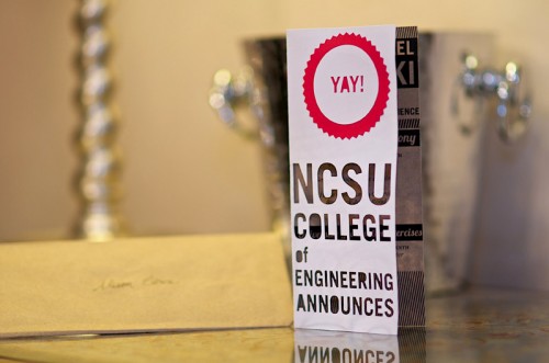
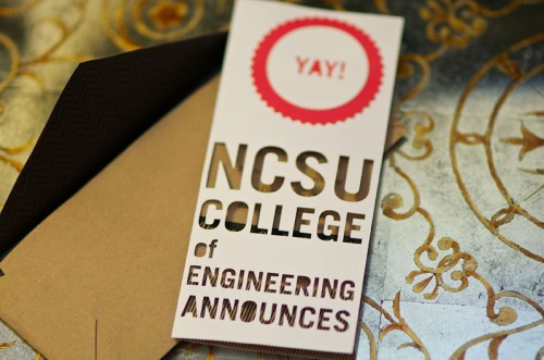
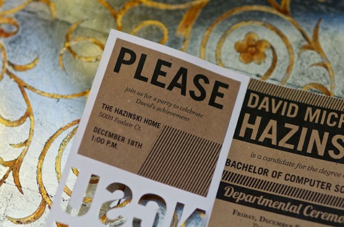
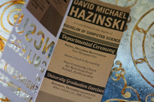
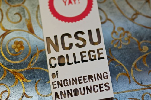
It’s been a while since I featured some graduation announcements, so when Alison from Love Citron sent over the announcements that she designed for a friend and upcoming computer science graduate, I just couldn’t resist.   Alison kept things clean with a red, black, white, and kraft paper color palette – and I love the cut out details on the front of the announcements!

College-Engineering-Graduation-Announcements

From Alison: These announcements were for my close friend David, who is graduating with a degree in computer science. I wanted to make something that was modern and fun, just like him, and vaguely referenced computers.  His school colors are red, white, and black, and I added the kraft paper because he always wraps his gifts and makes cards using old grocery bags.

College-Engineering-Graduation-Announcements

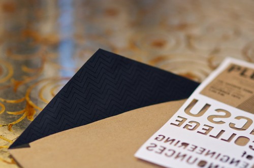
I also made the envelopes and printed the liners with a black-on-black pattern, because that’s his favorite printing style.  In the end, I wanted something unique and fun, that would mark this very special occasion.

College-Engineering-Graduation-Announcements

College-Engineering-Graduation-Announcements

College-Engineering-Graduation-Announcements

College-Engineering-Graduation-Announcements

Thank you so much Alison, and a big congratulations to David!

{image credits: Alison Citron}

Vintage Inspired Tea Party Bridal Shower Invitations

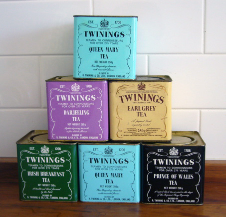
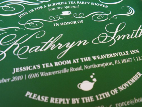
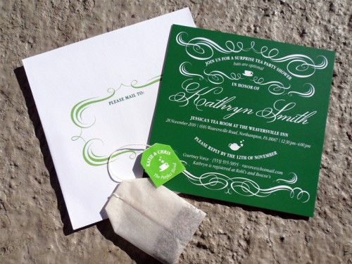
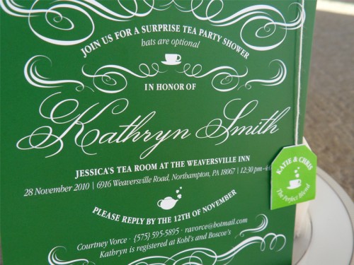
You might remember Stephanie‘s beautiful blue and white nautical wedding invitations from a few weeks ago.  Well, Stephanie is back, this time with a bridal shower invitation inspired by vintage tea tins!  For these invitations, Stephanie went with a green and white color palette and vintage-inspired flourishes to complement the tea tin design inspiration.

Bridal-Shower-Tea-Party-Invitations-Inspiration

From Stephanie:  The bride is having an Irish themed wedding and the shower is going to be a tea party!  It was a little challenging to tie the two concepts together but in the end we decided to use vintage tea tins, particularly Irish breakfast tea, as a model for the invitations.  We used a green color palette along with little shamrocks to incorporate some Irish whimsy!

Bridal-Shower-Tea-Party-Invitations-Detail

Bridal-Shower-Tea-Party-Invitations-Suite

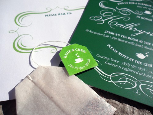
In order to drive home the tea theme we decided to wrap the invitations with a tea bag hanging from twine and a custom made tag that read “Katie & Chris, The Perfect Blend.”  I hope the guests enjoyed receiving these invitations as much as I enjoyed creating them!

Bridal-Shower-Tea-Party-Invitations

Bridal-Shower-Tea-Party-Invitations-Tea-Tag

So pretty!  Thank you so much Stephanie!

{image credits: stephanie pryor}

Melissa’s Golf-Themed Wedding Details

Earlier this year, I had the pleasure of featuring Melissa and Jerome’s elegant letterpress golf-theme wedding invitations and save the dates.  Melissa and Jerome were married in September at a local golf club, and Melissa carried some of the more subtle elements of her theme through to the wedding day details, including the menus, ceremony programs, even the wedding cake! Today I’m thrilled to welcome Melissa back to share some lovely photos – courtesy of Joe Elario Photography – and the inspiration behind the details!

Golf-Theme-Wedding-Cocktail-Hour-Label

From Melissa:  As a graphic designer, I brand projects and design for clients all day long.  When I started with the the golf tee save the date, I wasn’t sure how far I would take the golf theme, but knew at that point that I really wanted to push the logo, the green and white color palette, and the overall aesthetic.
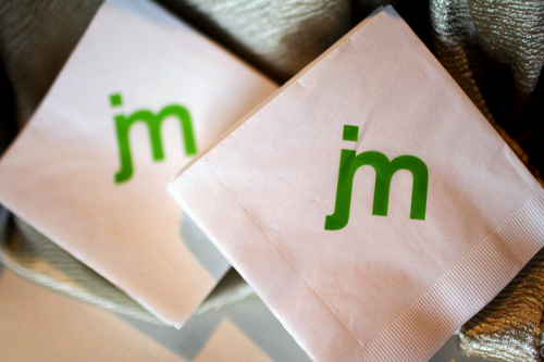
Golf-Theme-Wedding-Napkins

The venue, being a golf club, is very green outside and very brown inside.  Because the interior is so brown, I chose not to bring in any brown elements, but rather played only to green and balanced it all with white and cream flowers.
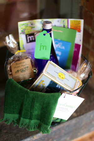
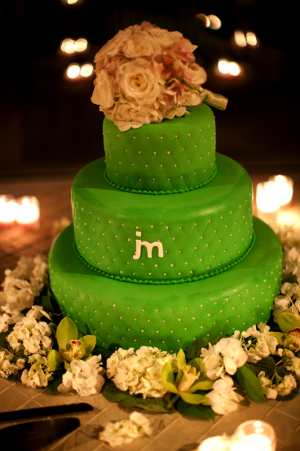
Golf-Theme-Wedding-Welcome-Basket Golf-Theme-Wedding-Cake

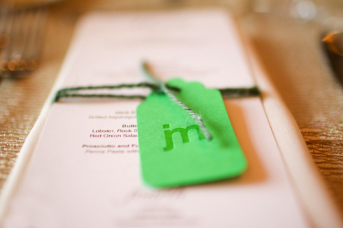
Golf-Theme-Wedding-Menu

I decided to keep the ‘golf’ theme subtle, but brought in elements here and there — like using driving range golf ball baskets to hand out programs and for welcome baskets.
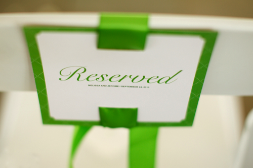
Golf-Theme-Wedding-Ceremony-Reserved-Seat-Sign

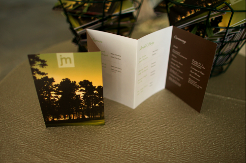
For the ceremony programs, I knew that I wanted to create an accordion fold, using photos from our engagement shoot on the back.  The cover of the program uses a portion of the golf course image I used on the invitation design.
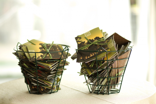
Golf-Theme-Wedding-Ceremony-Programs

Golf-Theme-Wedding-Ceremony-Programs-Front

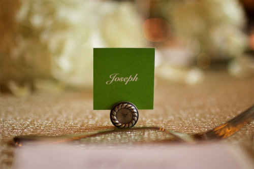
For the escort cards, I knew that buttons with phrases like “I’m a dance machine” or “Which way to the bar” would really lighten the mood.  It also gave me another opportunity to play off the bellyband on the invitation design, which had a die-cut circle show casing the logo.
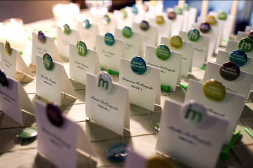
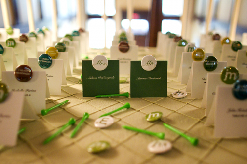
Golf-Theme-Wedding-Escort-Cards2

Golf-Theme-Wedding-Escort-Cards

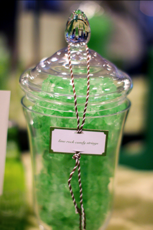
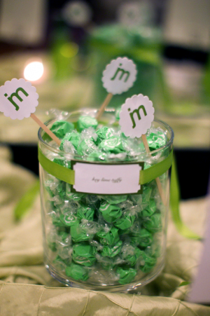
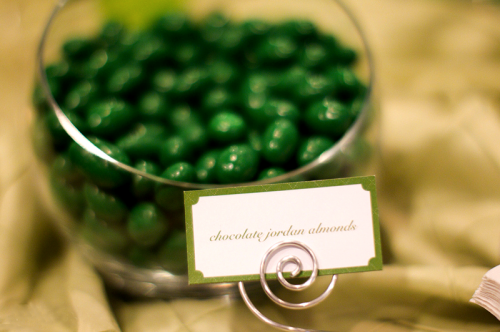
I had to have a green candy bar, no question!  It was just another great way to break up the heavy brown in the venue.  I knew the decision to have a candy bar meant extra work to create the labels, but in the end the candy bar created a great display of color.  It also gave me a great excuse to bring in the quote on the candy bags.
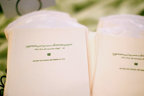
Golf-Theme-Wedding-Candy-Bar-Bags

Golf-Theme-Wedding-Candy-Bar2 Golf-Theme-Wedding-Candy-Bar

Golf-Theme-Wedding-Candy-Bar3

We played to the argyle as much as possible.  The guestbook exterior used a more pronounced green and white pattern, where as the cake used a more subtle pattern bringing the argyle influence through texture.  For the rehearsal dinner, we used socks as place cards – which was a great way to give our family and everyone in the party just a little something extra to remember the day.
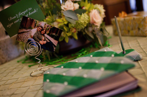
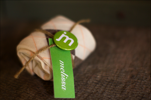
Golf-Theme-Wedding-Guestbook

Golf-Theme-Wedding-Sock-Favors

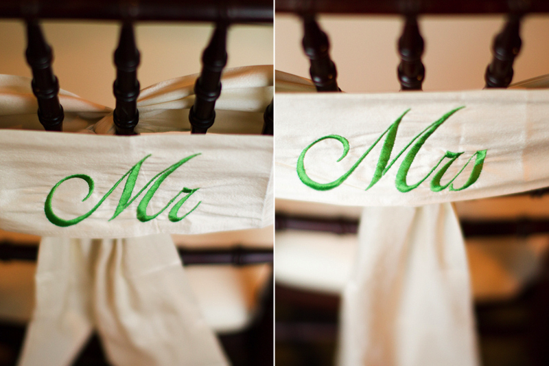
We wanted to create a very modern feel with a lot of these elements—while still being elegant.  The table numbers, which are quilled, really gave a playful feel to each table.  In the end, I think all the little touches—like the drink stir sticks, chair sashes and labels really made for a unique experience.
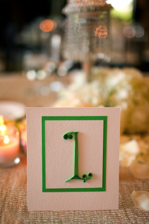
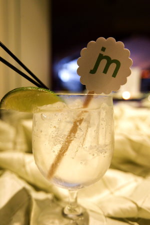
Golf-Theme-Wedding-Quilled-Table-Numbers Golf-Theme-Wedding-Drink-Stir-Stick

Golf-Theme-Wedding-Place-Cards

Golf-Theme-Wedding-Chair-Sash

Melissa was responsible for the design for all of the details in her wedding, but she was kind enough to provide a list of the different production resources that she used for other couples looking for something similar for their own wedding.  Thanks Melissa!

Stir Sticks: Lemon and Lavender
Quilled Table Numbers: Paper Daisy Card Design
Candy Bags and Chair Sashes: Bella Bride Designs
Buttons: Not Made in China
Guestbook: To Have and To Hold
Ceremony Programs: UniqueActive
Letterpress Hang Tags: Sideshow Press

{image credits: Joe Elario Photography}

{happy weekend!}
Happy Friday everyone!  As you all read this, I’ll be in the middle of a long drive with my husband to visit his family in upstate New York.  I’m not looking forward to the long drive up, but it’ll be nice to chase after our niece and nephew all weekend.  Before I head off, I’ll leave you with one last reminder to enter the holiday card giveaway from Satsuma Press – the contest closes tonight at midnight!  But in the meantime…

…a few links for your weekend!

And in case you missed it, a quick round-up of this week’s posts:

That’s it for me this week!  I hope you all have a wonderful weekend and I’ll see you all back here on Monday!

{image credits: cheska annellise via mary ruffle}

2011 Calendar Round-Up, Part 6

Now that November is upon us, I’m getting ready to move on from calendars to holiday cards.  But before we wrap up the calendar round-ups for 2011, I’ve got a few more lovely designs to share with you!  If you missed any of the previous round-ups, you can check out Parts 1 – 5 right here!

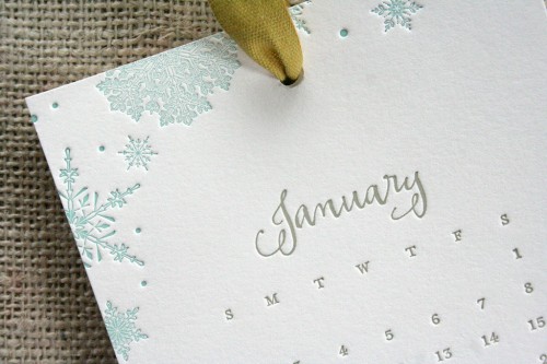
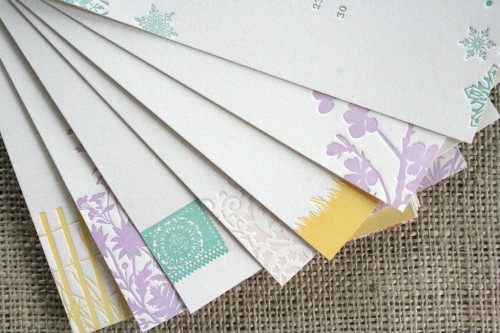
First up, I love the limited edition 2011 letterpress calendar from Parrott Design Studio – featuring some of Sarah’s favorite vintage illustrations and calligraphy from Li at Fat Orange Cat Studio!

Parrott-Design-Studio-2011-Calendar

Parrott-Design-Studio-Calendar

{parrott design studio}

This circus-theme calendar print from illustrator Judy Kaufmann would be perfect for a child’s bedroom!

{judy kaufmann}

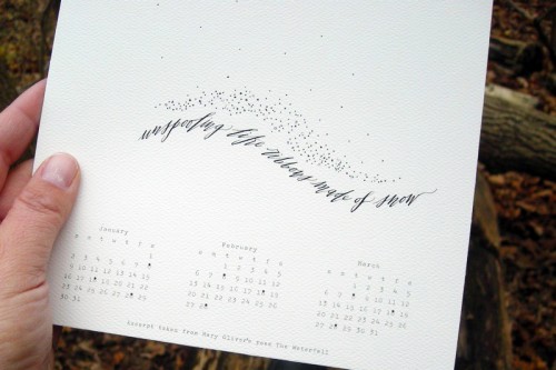
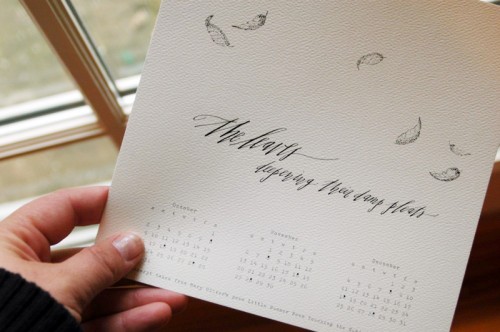
The annual calendars from Hello Handmade are always incredibly romantic – and this year is no exception.  The calendars are divided by season, each featuring a quote from Mary Oliver along with Betsy Dunlap’s gorgeous calligraphy and Shanna Murray’s beautiful illustrations:

hello-handmade-2011-calendar

hello-handmade-2011-calendar-feathers

{hello handmade}

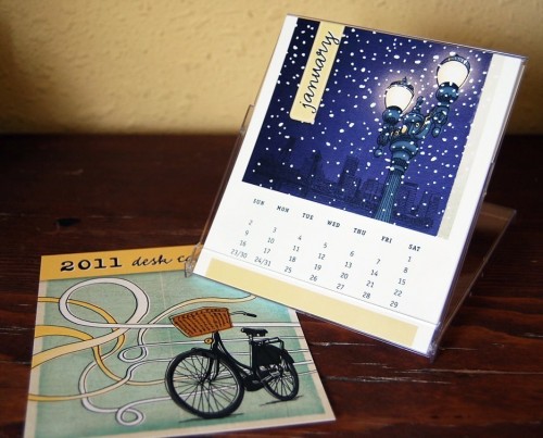
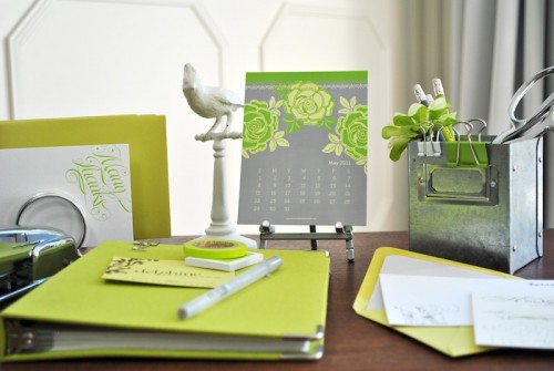
I’m loving the bursts of color in this year’s desktop calendar from Delphine.  In addition to the brightly colored illustrations for each individual month, the back of each month is also printed with a solid ink color for an extra punch. The calendar comes with a magnetic bull clip so you can hang it on your fridge, magnetic bulletin board, or even a filing cabinet:

Delphine-2011-Calendar-May

{delphine}

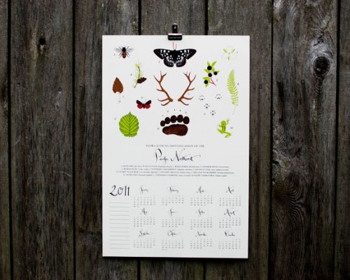
For those of you from or living in the Pacific Northwest, this calendar from Mossière is the one for you.  Screen printed in four colors, the design features 13 flora and fauna specimens from the region, along with calligraphy from Kathryn Murray.  Bonus – it can be trimmed and framed as a square print at the end of the year!

{mossière}

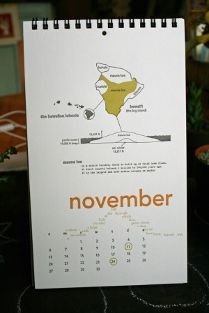
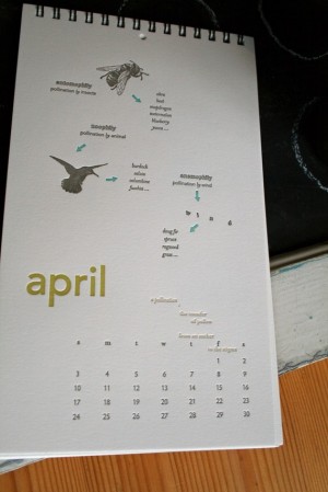
The 2011 letterpress calendar from Lark Press has a different theme for each month of the year:

{lark press}

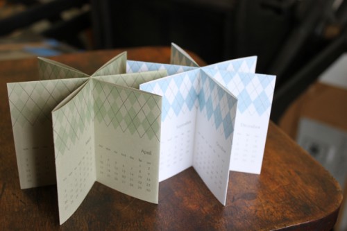
Albertine Press has two calendar formats this year, a wall calendar with beautiful illustrations and a star-shaped accordion calendar in an argyle pattern.  The accordion calendar is really cool – it can sit right on your desk or table, spinning around as the year progresses!

Albertine-Press-Wall-Calendar

Albertine-Press-Star-Accordion-Calendar

{albertine press}

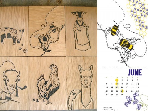
The 2011 calendar collaboration from Bird Dog Press and WonderBound Press features twelve amazing handmade woodcut illustrations of heritage breed farm animals – all designed to pay respect to homesteading. Each month includes a month of days, the phases of the moon, a heritage breed, an heirloom crop, a feedsack-inspired pattern and is handprinted on an antique letterpress on sustainable bamboo paper:

{available for pre-order here}

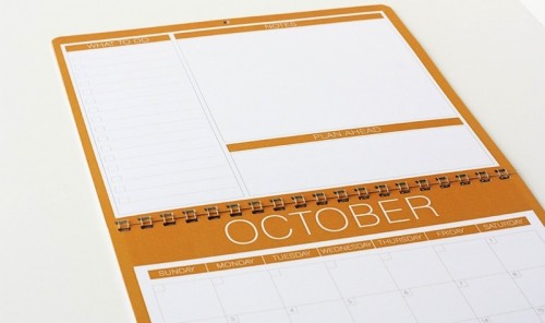
This colorful 2011 wall calendar from Perideau Designs has plenty of space for keeping track of upcoming appointments, events, and tasks:

Perideau-Designs-Wall-Calendar

{perideau designs}

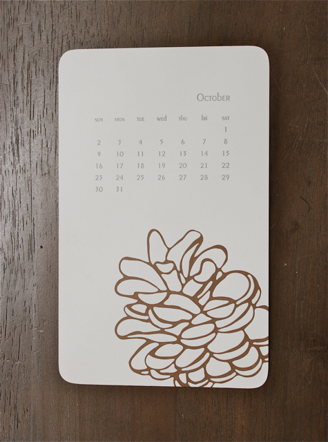
For bright color in a monthly format, check out this illustrated desktop calendar from Alex Winjen:

Alex-Winjen-2011-Calendar

{alex winjen}

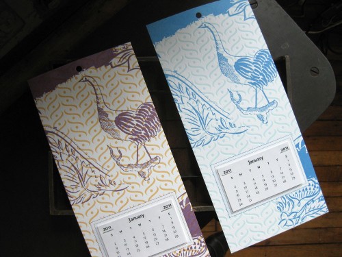
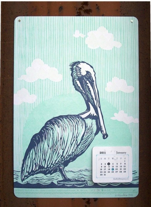
In addition to other larger-format calendars featured earlier, both Pistachio Press and Blackbird Letterpress are releasing these cool tear-away calendars:

tear away letterpress 2011 calendar

{pistachio press}

blackbird-letterpress-pelican-calendar

{blackbird letterpress}

{all images from their respective sources}

*Delphine is one of my fantastic sponsors; for more on my editorial policies please click here.