Behind the Stationery: Darling + Pearl

Our next guest on Behind the Stationery is bartender-turned-stationer, Lauren Reed from Darling + Pearl Lettepress. Her stationery business focuses primarily on custom wedding invitation suites and Lauren’s here to share about how she works with her clients in innovative ways, encouraging couples to share non-designer work as inspiration. Welcome, Lauren! —Megan Soh

Behind the Stationery: Darling & Pearl

From Lauren: Hi! My name is Lauren Reed: bartender, turned designer + letterpress printer and the founder of Darling + Pearl Letterpress. I started designing stationery in 2009 during my engagement to now-hubby, Greg. Terribly cliché story, I know. After bartending throughout (and after) college, I was itching to find something to be wildly passionate about, so I put together a small collection of invitation designs to jump into the industry.

Behind the Stationery: Darling & Pearl

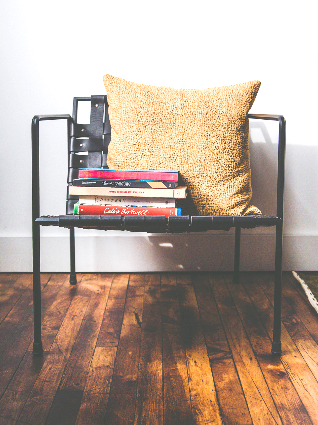
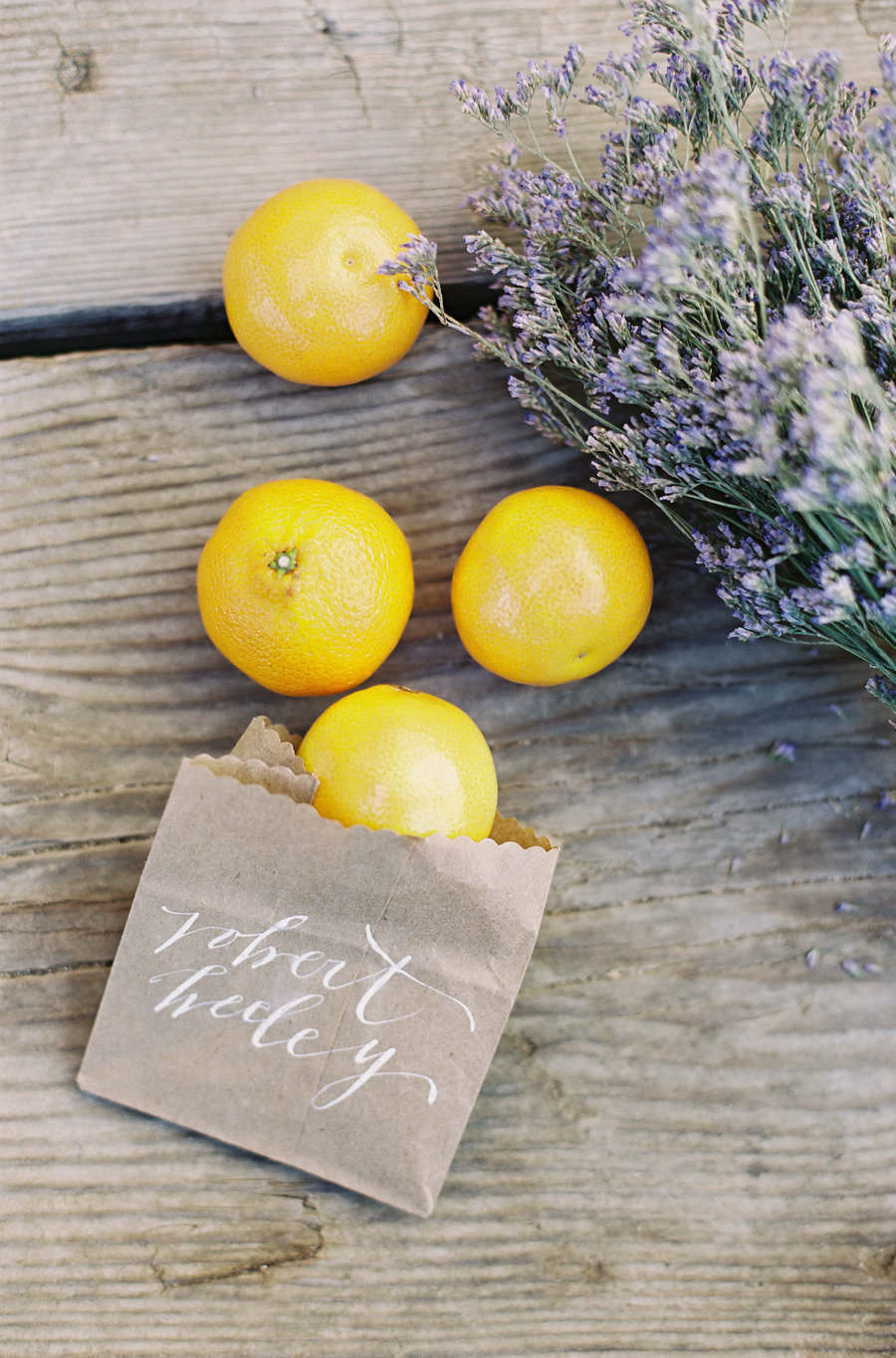
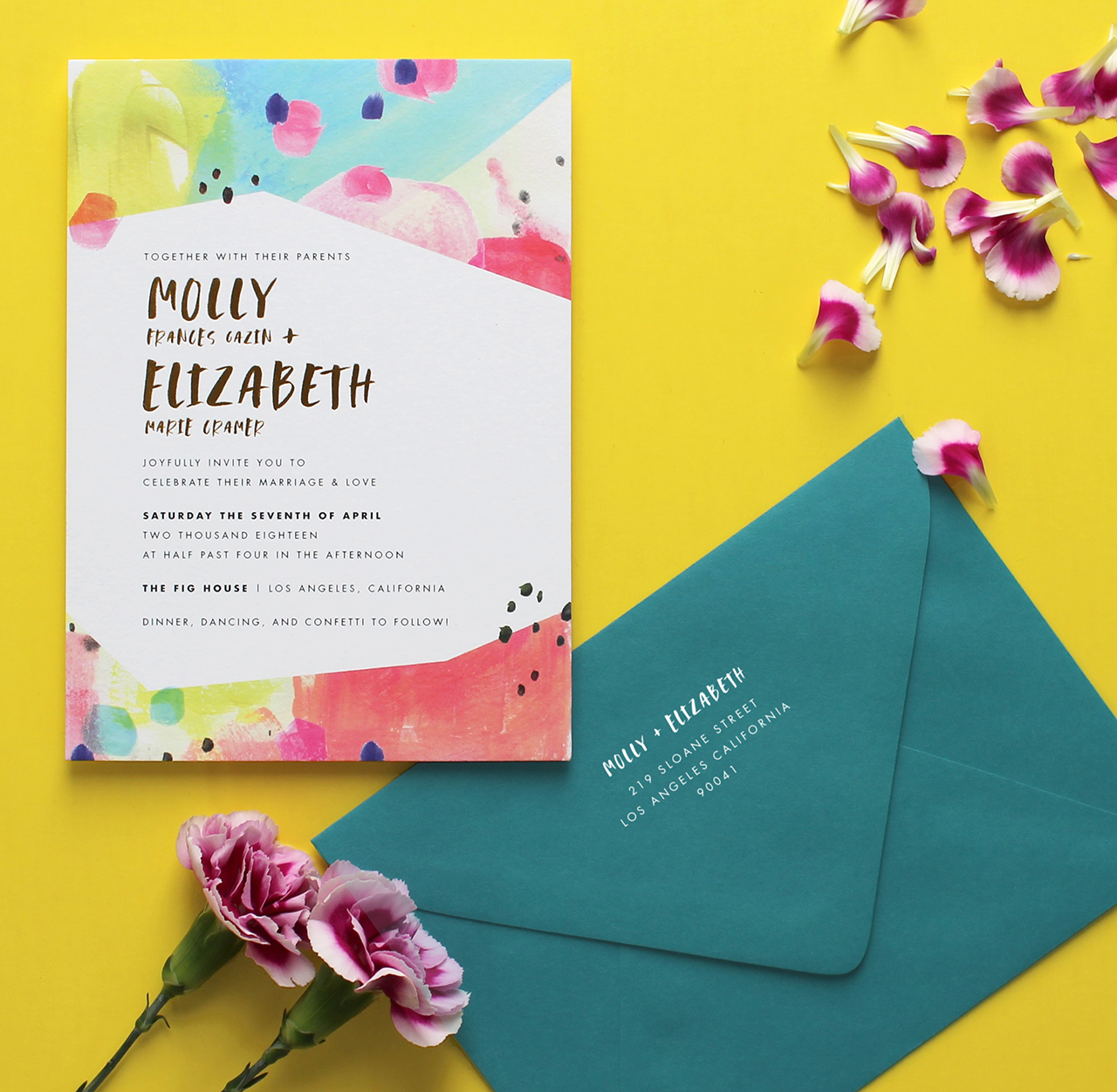
Photo by Quarter Moon Co.

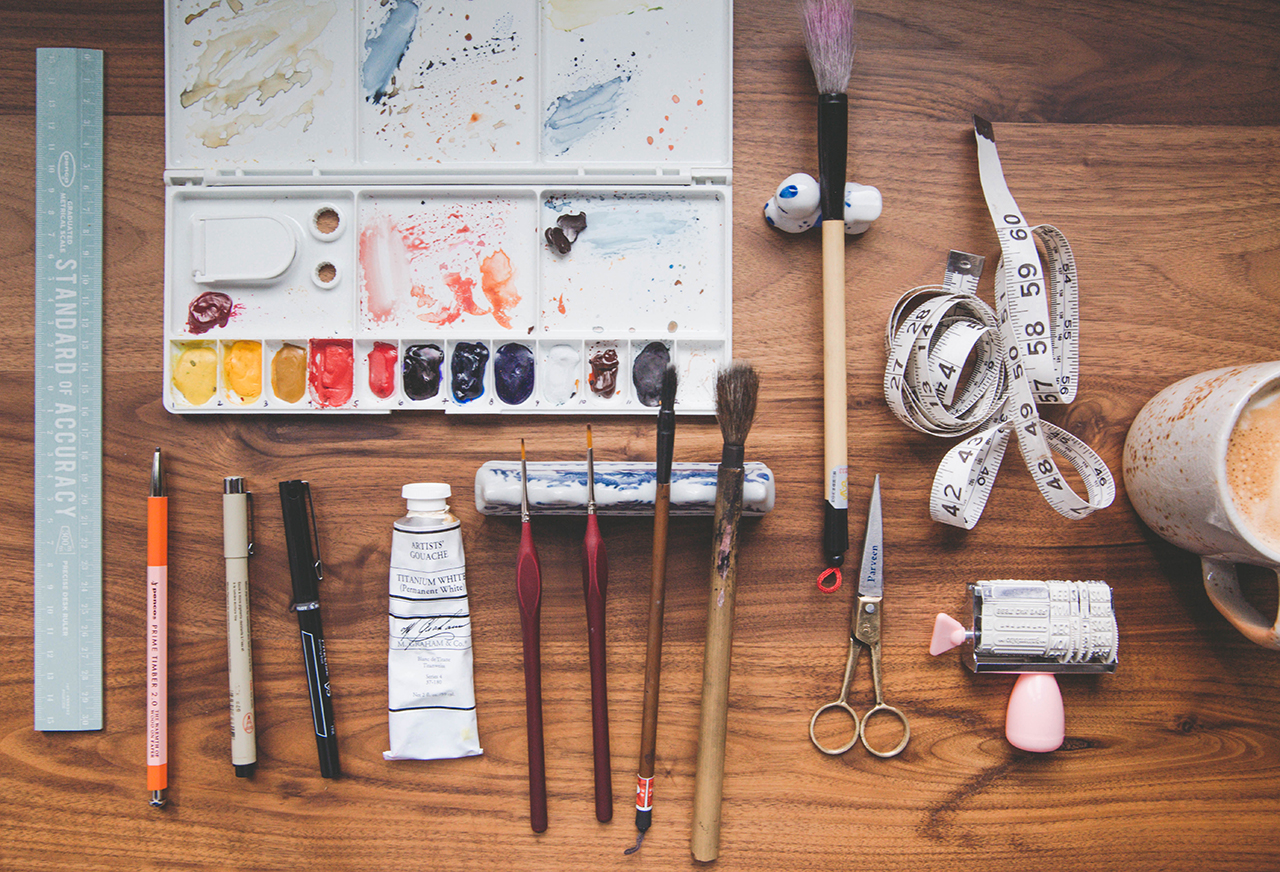
I knew I had a ton to learn, and a niche to find so as I settled in and started to get comfortable, I decided I wanted to understand the process and equipment involved in everything, but specifically letterpress printing. In 2010, I bought my first small press, followed by my 1905 Golding Pearl (part of my namesake). And in 2014 I bought my workhorse 10×15 C&P, along with some other additions to my cast iron “family”. I’m a natural born problem solver — dead on ISTP (if you’re familiar with Myers–Briggs Personality Types) — so really this entire learning, printing, business-owning process has brought me a greater understanding of myself and some of my greatest strengths (and weaknesses, naturally).

Behind the Stationery: Darling & Pearl

I currently work out of 2 different studio spaces (one for press and one for design and finishing) in the Central New Jersey area. At this point in my life, with two small kids (Declan 6, and Finna 3), a “typical” workday for me doesn’t really exist. It’s more like a typical week with flexible details.

Behind the Stationery: Darling & Pearl

Mondays and Tuesdays are generally spent in my home studio designing, sketching, communicating, emailing, and ordering supplies to prepare for the following week’s presswork. Wednesdays and Thursdays are usually dedicated to the print studio. And Friday is flexible, even to the point of sometimes being able to keep my daughter Finna at home to hang (and help me style some stationery to photograph!). Since my work is all varying levels of custom, my work schedule is more of an ebb and flow and very much dependent on the communication of my clients at any given time. I find that it’s easier to batch projects so I’m moving them through the same part of the process at the same time.

Behind the Stationery: Darling & Pearl

At this point in my career, I’m focused on custom/semi-custom (mostly wedding) letterpress and mixed media stationery.

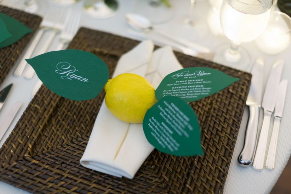
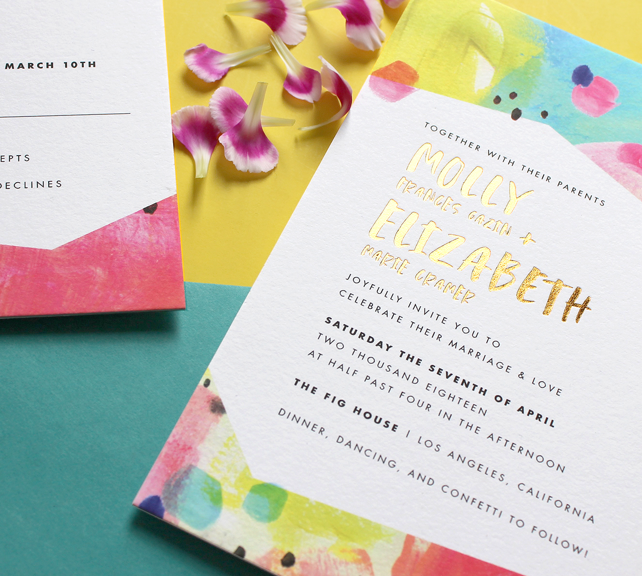
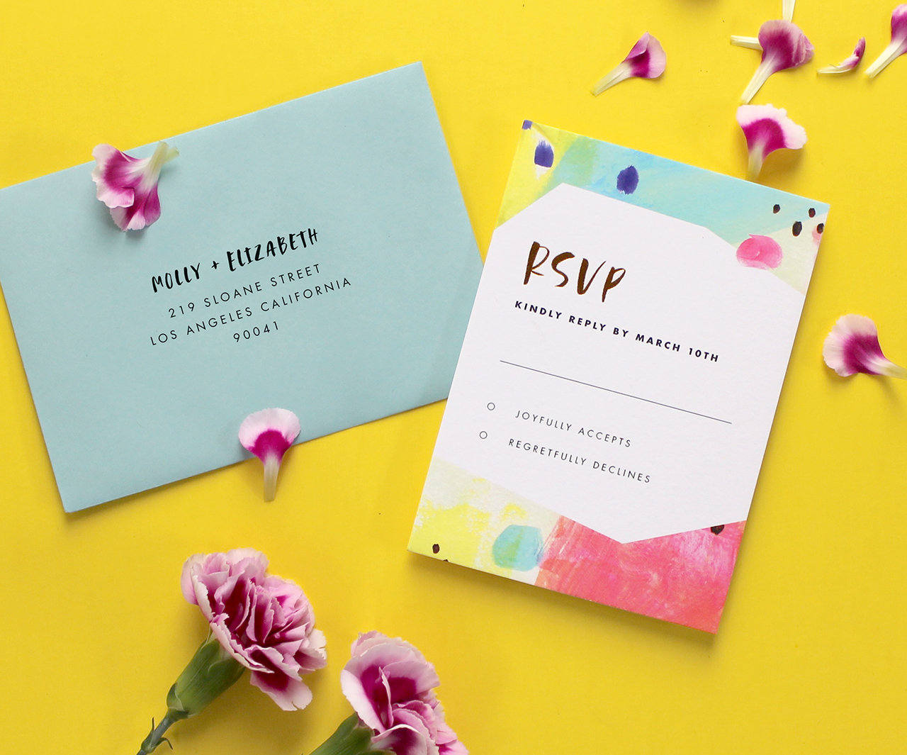
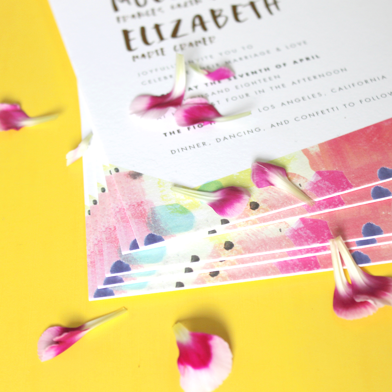
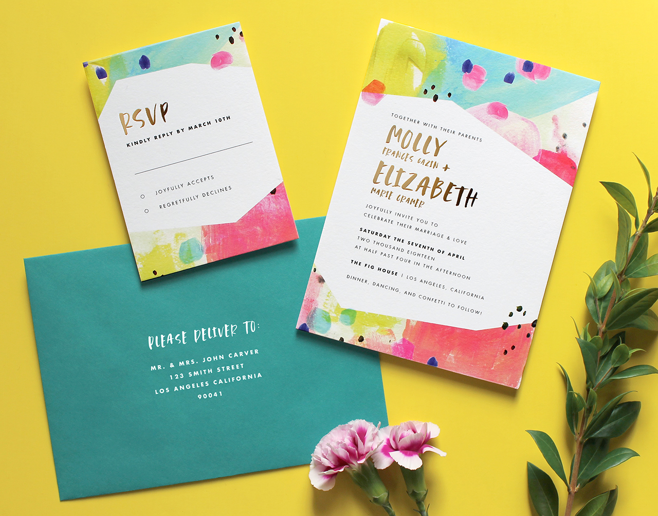
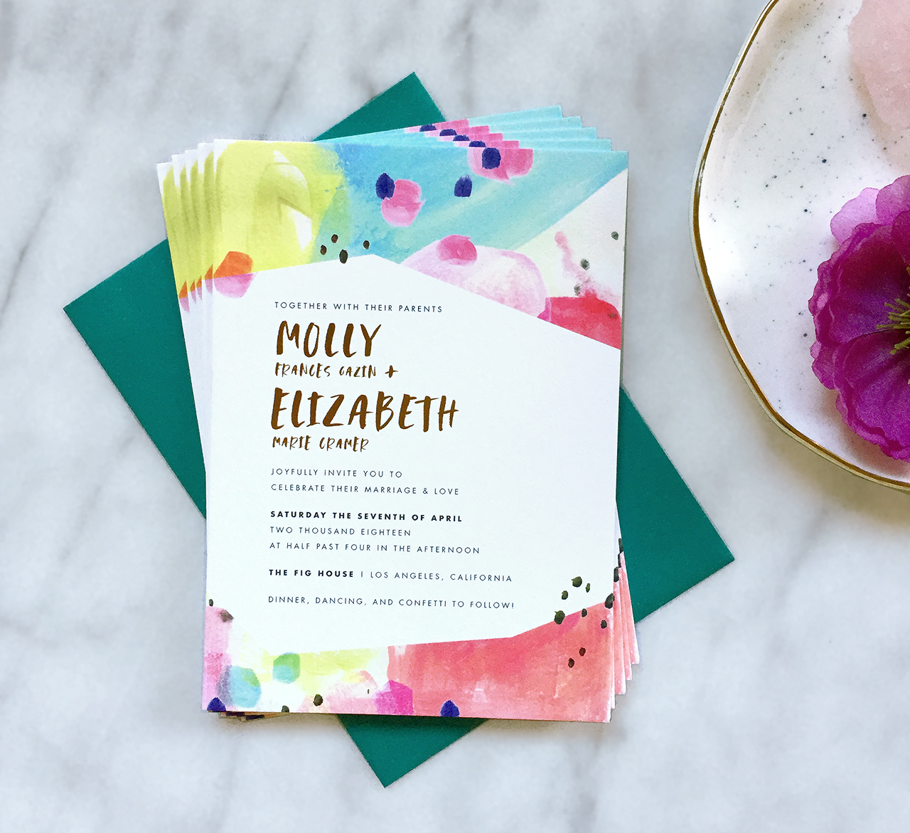
I absolutely adore the process of piecing together a custom invitation suite and the supporting stationery — save the dates all the way through event day items and signage. For me, it’s very similar to completing a puzzle, or even successfully loading the dishwasher (haha, seriously though!). The elements are: the couple, their history, their vision, their colors, the venue and the *feel* of the event, as well as *my* aesthetic and design sense, which is also really important for me to hold on to. I love the challenge of balancing all of these items and at the same time creating a final design that both my clients and myself are head over heels in love with. It’s so corny, but I tell my clients that working with me for custom stationery, they really get a piece of my heart in the process. And I think realizing that has made all the difference in understanding that this is where I need to be for now.

Behind the Stationery: Darling & Pearl

Since I handle the vast majority of production in house, it’s really a great opportunity for me to fulfill some different creative avenues without the typical risk (and the cost) of outsourcing to other production houses. It also enables me to stay creative with mixing and matching my processes in new and exciting ways.

Behind the Stationery: Darling & Pearl

To get started, my clients fill out a contact questionnaire so I can send over some pricing and package options. Once the invoicing details are in place, I’ll setup a communication board (through Trello) where they can upload inspiration images, view proofs, their timeline, and have access to wording questionnaires, address templates, and they can sign off for final approvals- etc. What’s really great about this setup is the lack of emails, and the detailed (and easy to find) record of communication. There’s no searching though inboxes or mis-filing a final approval.

Another important revelation of the past couple years is in regards to inspiration images.

Behind the Stationery: Darling & Pearl

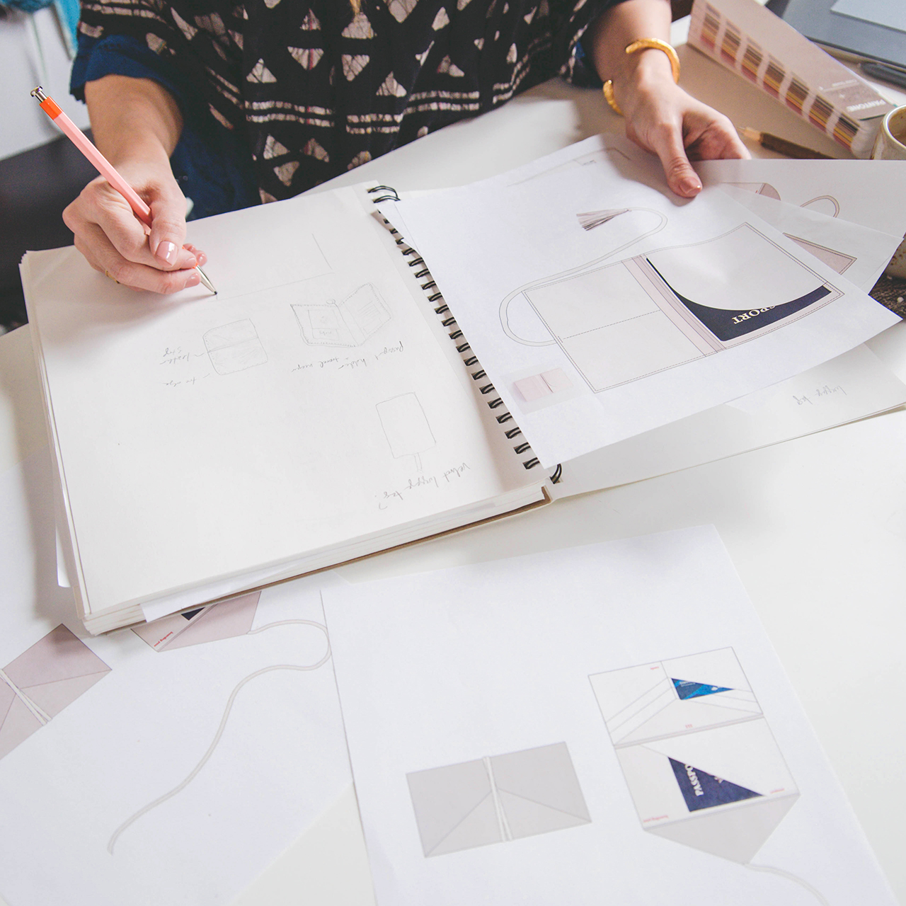
I always felt a massive struggle to try to create something unique when my clients were putting other designer’s work in front of me. So at the end of 2015, I started asking for 4-5 non-stationery images (and I love floral inspiration!). I found that I had a great connection with their organic inspiration and it really helps me create something that fits them and their event. This is really where I started to develop my unique and recognizable “voice.” After I have their wording and inspiration, I put together the first proof. We then communicate any adjustments to work towards a final approval. Once everything is perfect, they sign off, settle the balance, and then I get to work (on the physical, churn-it-out side).

Behind the Stationery: Darling & Pearl

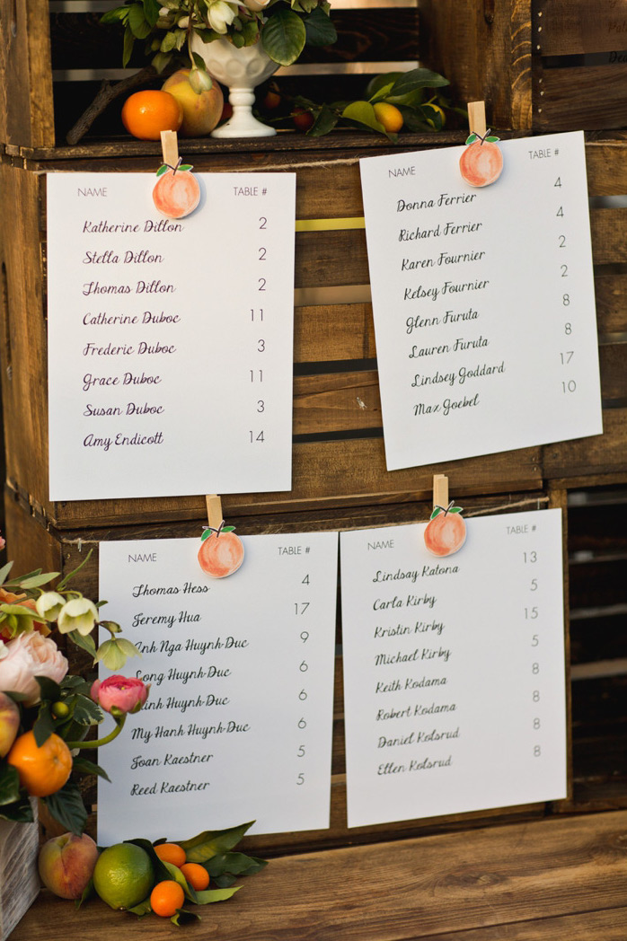
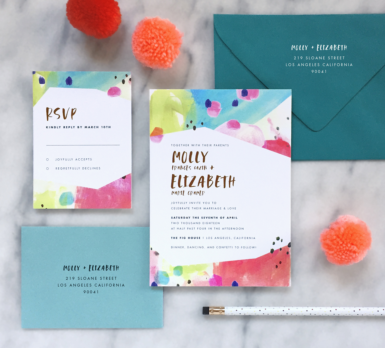
Assembly days are always my favorite. It’s the first time I get to see all the elements together in the same physical space and get to experience my entire vision really come to life. And most times it’s the culmination of weeks or months of work and collaboration.

Behind the Stationery: Darling & Pearl

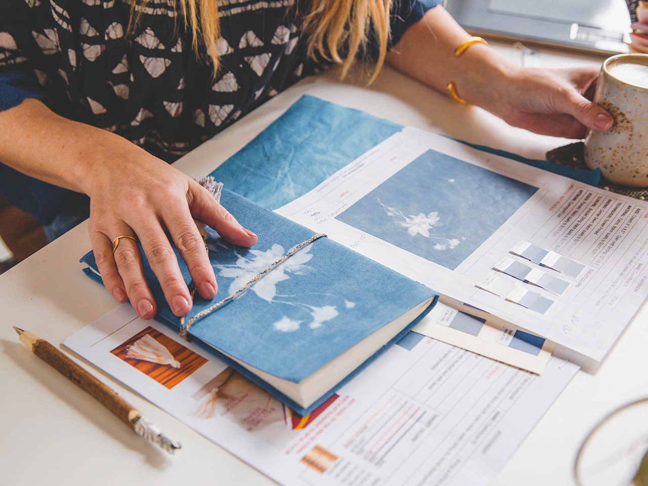
My favorite add-on-details to include are venue sketches and curated vintage postage. There are so many different postage options out there and it really allows us to tell their guests about some of the details of their lives, or even just deepen or accent the color palette that we’re using for their stationery. Plus, it always makes for a beautiful envelope, full of character. Adding a sketch to the package also helps distinguish the event in a new an unexpected way from what people have grown accustomed to.

Behind the Stationery: Darling & Pearl

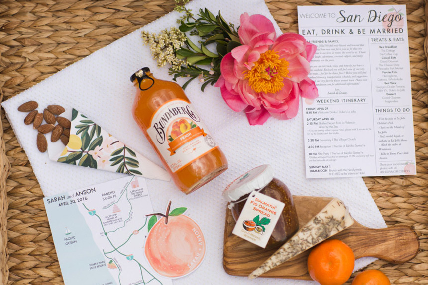
Photos courtesy of Darling + Pearl Letterpress except where noted.

Want to be featured in the Behind the Stationery column? Reach out to Megan at megan [at] ohsobeautifulpaper [dot] com for more details.

Behind the Stationery: Printfresh

Today we’re headed to Philadelphia to chat with Amy Voloshin of Printfresh about her stationery business story! As a textile designer, Amy has taken a unique path to developing a stationery line. She’s here to share the integral role that fabric, textures, and patterns play in her designs. Amy is also a huge supporter of her community in Philly and shares about the various ways she teams up with local organizations to give back. — Megan Soh

Behind the Stationery: Printfresh

From Amy: I studied textiles at the Rhode Island School of Design and focused on print and knitting. My first job out of school was working for URBN designing prints and garments for the Urban Outfitters and Free People lines. It was back in 2003 when technology was still limited in the industry and the work was very hands on — we used gouache to mock up colorways, and made repeats with pencil and a photocopier. It was an incredibly creative environment and the experience opened the door to an art director position for a textile design studio in New York. I loved the work but missed Philadelphia, and I decided pretty quickly to move back and use what I had learned to start my own studio.

Behind the Stationery: Printfresh

I rented a small warehouse space and began developing a print collection to sell to fashion designers. At the time I was screen printing many of our designs by hand and going on sales appointments myself! Our company grew tremendously over the next 10 years, and I was able to pull together an amazing team of talented designers and passionate saleswomen. Print design is so focused on behind-the-scenes work, and as our business became more established I started dreaming about what creative avenues I wanted to explore next. I’ve always loved stationery, but find that so many of the designs out there are too preppy for my personal bohemian aesthetic. After a lot of thought, I decided to apply my love and expertise in textiles and pattern to the world of paper. I signed up for the 2017 National Stationery Show and started working with a few of our textile designers to develop the very first Printfresh stationery collection. We got such amazing feedback at the show, I knew I’d made the right choice.

Behind the Stationery: Printfresh

Our studio is based in the Kensington area of Philadelphia. My husband and I are obsessed with old warehouses and found a beautiful carpet factory built in the late 1800s. We decided to renovate and relocate our studio here, and we finally moved in last fall. I love that our building was was used for textiles in the past. It still has many of the gears and industrial equipment from working with carpet rolls, and we’ve done our best to preserve some of it and show the history of the space. The Kensington neighborhood faces a lot of social and economic challenges, and our hope is that by restoring this warehouse and creating a community of small business owners and creatives we can help spur economic development and revitalization here.

Behind the Stationery: Printfresh

We’re invested in the Philadelphia community (I live less than a mile from our studio) and when starting the stationery line I knew I wanted to find a way to leverage the brand to give back. For the past two years we’ve partnered with Philly Paper Jam to donate a full year’s supply of paper to two local schools. We’ve also started giving 5% of our online sales to organizations that provide creative programming to children in Philadelphia’s public schools. Each quarter we feature a select group of amazing local organizations on our social media and blog, and it’s been great learning about and connecting with men and women who are really making a difference in Philadelphia.

My typical work day is very scheduled. I’m pretty busy between my entrepreneurial ventures and being a working mom. I’m a nut about Google calendars — everything is scheduled. I usually get up pretty early (around 5:45AM every day) to start working on something I really want to do, whether it’s a creative project or a walk around the neighborhood. That’s my power hour and I really try to do the thing I most want to do then. I spend time with my kids when they wake up and get them ready for school, and then I’m off to the office. During the work day most of my time is dedicated to meetings with my teams. I help direct all things visual – upcoming marketing materials, product development, progress on new collections, and ideas for upcoming selling events.

Behind the Stationery: Printfresh

Our current collection focuses on journaling and desk, and I think that our point of view (combining a love for fabric, subtle patterns, soothing color and purposeful design) is what really makes us unique. While we’ve developed some purely paper products, the majority of our collection features fashion-inspired touches like fabric covers, woven wraps, ribbon bookmarks, and traditional textile processes like silkscreen and hand-marbling. One of our most popular product categories are our velvet journals, featuring plush velvet accented with metallic foil text and patterns. Another of our most popular styles are the noteblocks – they’re the absolute best desk accessory. Natural cork bases give these notepads a touch of something tactile, while the gold foiled edges evoke a modern shine.

Behind the Stationery: Printfresh

While the products and inspiration changes, my process for creating each new collection is usually pretty consistent. Like most people these days I start with a new Pinterest board. I gather inspiration for color, silhouette and pattern and start identifying what kind of products and finishes are most inspiring me. I try not to spend too much time there, since another big part of the concepting process includes seeking inspiration in-person. I try to go to museums, art exhibits and flea markets to find more primary sources for my work. It helps the designs feel more pure and less derivative, and plus it’s more fun!

Behind the Stationery: Printfresh

Once I have a few general concepts I start creating really loose sketches illustrating different types of silhouettes. Finding time to sketch in the office can be hard during a busy day, so I tend to do my most creative work away from the studio. I started drawing the latest collection after Thanksgiving dinner! You never know when creativity is going to strike, so I always love to have a sketchbook on hand.

Behind the Stationery: Printfresh

After I’ve finished sketching I start making decisions on materials, choosing fabrics, embellishments and trims. Then when I’ve developed a clearer vision I work with a team member to start creating the artwork and rendering the silhouettes in Photoshop. We render all of our designs in fairly high detail – I’m a very visual person, and I find it helpful to see exactly what the designs would look like in real life. It’s also incredibly important on the production end of things, since we work with artisans and craftspeople in India rather than manufacturing in-house. We need to be very specific about almost every aspect of each design, and we prepare incredibly detailed instructions (including everything from overall dimensions to paper weight to Pantone colors) that we call tech packs. If something is even just a little bit off in the tech pack, the finished product will suffer for it!

Behind the Stationery: Printfresh

Once we receive our first prototypes we review the product, decide on any style changes, and work with our vendors to develop a 2nd prototype. At that point we have to make the tough decision about which products make the cut and are good enough to be shown at the big industry trade shows like NYNOW, the Atlanta Gift Show, and NSS.

Starting a new line is never easy, and it definitely comes with challenges. I’ve found that creating and cultivating a cohesive brand is the most difficult and also most rewarding part. I don’t have a lot of experience in branding, especially since my textile design studio focuses more on relevant designs and great business-to-business relationships (a much different market than that of the direct to consumer). But since this brand is my aesthetic, I’ve learned that I just need to trust my gut instincts. If something doesn’t sit right with me about the colors, pattern, silhouette or wording then it’s probably off brand. I try to make sure I’m making decisions on an emotional level and always staying true to my intuition.

Behind the Stationery: Printfresh

All photos courtesy of Printfresh.

Want to be featured in the Behind the Stationery column? Reach out to Megan at megan [at] ohsobeautifulpaper [dot] com for more details.

Citrus Wedding Inspiration

Today we’re celebrating one of our favorite wedding themes with some citrus wedding inspiration! Citrus is the perfect wedding theme any time of year. Plan a citrus-inspired indoor affair during cold weather months when citrus is in season down in the South, or incorporate citrus into your menu for a refreshing treat during the warm summer months. The ideas below will get you ready for sunshine, longer days, and lemonade (or in this case, limoncello!). –Annie

Citrus Wedding Inspiration / Oh So Beautiful Paper

Lemons make for the perfect place card! Just use a paint pen for crisp white lettering… | Photography: Brett Hickman Photographers, Event Planning and Design: A Good Affair Wedding & Event Production, Paper Goods and Calligraphy: A Good Affair Wedding & Event Production via Green Wedding Shoes

Citrus Wedding Inspiration / Oh So Beautiful Paper

…or write on pieces of handmade paper pinned to clementines! I like how they incorporate shades of pink. | Photography: Katelyn James Photography, Calligraphy: The Weekend Type via Grey Likes Weddings

Citrus Wedding Inspiration / Oh So Beautiful Paper

Citrus table numbers! | Photography: Jacqui Cole Photography, Event Planning: NK Productions Wedding Planning, Table Numbers: Paper Goat via Style Me Pretty

Citrus Wedding Inspiration / Oh So Beautiful Paper

These chalkboard signs offer a sunny greeting. | Photography: Brett Hickman Photographers, Event Planning and Design: A Good Affair Wedding & Event Production, Paper Goods and Calligraphy: A Good Affair Wedding & Event Production via Green Wedding Shoes

Citrus Wedding Inspiration / Oh So Beautiful Paper

Add a burst of color with a citrus-inspired watercolor menu. | Photography: Paula G. Furió, Event Design: Macarena Gea via Ruffled

Citrus Wedding Inspiration / Oh So Beautiful Paper

Send each guest home with a little bottle of limoncello! | Photography: Janet Kwan Photography, Event Planning and Design: Blissful Memories & Events, Stationery Design: Nadiya V Design, Calligraphy: Love Lettering via WedLuxe

Citrus Wedding Inspiration / Oh So Beautiful Paper

How cute are these leaf escort cards pinned to oranges? | Photography: Hunter Ryan Photo, Event Planning: Fabulously Chic Events, Stationery: The Paper Merchant via Every Last Detail

Citrus Wedding Inspiration / Oh So Beautiful Paper

Escort cards and favors: check. | Photography: Steve Steinhardt Photography via Brides

Citrus Wedding Inspiration / Oh So Beautiful Paper

Planning a welcome bag for your guests? Fill it with citrus goodies. I’ve got my eye on that fig orange spread. | Photography: Shewanders Photography, Event Design: Coastyle Events, Stationery: Paperless Post, Calligraphy: The Bloomery Co. via Martha Stewart Weddings

Citrus Wedding Inspiration / Oh So Beautiful Paper

Such a creative way to display your place cards and menus. | Photography: Westrich Photography, Event Planning and Design: Carrie Darling Events, Stationery and Calligraphy: Cheree Berry Paper via Martha Stewart Weddings

Citrus Wedding Inspiration / Oh So Beautiful Paper

These clothespins are so cute. | Photography: Shewanders Photography, Event Design: Coastyle Events, Stationery: Paperless Post, Calligraphy: The Bloomery Co. via Martha Stewart Weddings

Are you planning to incorporate citrus in your wedding? We’d love to hear the details!

A Few Recent Etsy Faves

Happy Monday everyone! Did you have a good weekend? DC is observing Emancipation Day and DC public schools and government offices are closed, so my kids get a three day weekend! Anyway, I thought we’d jump into the week with a few recent Etsy faves! It’s been a while since I did an Etsy-focused post, but I’ve been quietly gathering a list of handmade products and wanted to share them with you. A bit of jewelry, some ceramics, a couple of wall hangings, and a couple other odds and ends!

Etsy Faves / April Edition

1. Oh, hello gorgeous textile to hang on your wall! Emily from The Sweet Beast has one of these beautiful pieces in her home, and I always love seeing it on her wall. That pop of pink is just perfect.

2. I’ve been loving the look of stoneware ceramics lately! This blue and white mug is GORGEOUS.

3. How cute is this copper rainbow and yarn wall hanging? I’m thinking about getting one for Common Room Studio!

4. + 5. A big yes to statement earrings! These wood earrings and these acrylic and pom pom earrings are both super fun!

6. BEYOND obsessed with this brass hair clip. So ridiculously chic – I want one in every shape and size!

7. Absolutely beautiful leather-covered vases. I bet they will patina beautifully over time.

8. The prettiest pale pink planter. Done and done.

9. I have several colorful necklaces from Jill Makes and wear them constantly. Thinking about adding this one to the collection!

Bright and Colorful Modern Wedding Invitations

Anyone in the mood for bright and colorful modern wedding invitations? Good! We’ve got you covered with these lovely painterly beauties from Ashley at Fine Day Press. These beautiful invitations feature colorful abstract watercolor artwork with a funky angular shape, a bit of gold foil for sparkle, and gorgeous envelopes in complementary colors. Let’s take a look!

Bright and Colorful Modern Wedding Invitations by Fine Day Press

From Ashley: Molly and Elizabeth share a love of color and are getting married at the Fig House, a modern venue in Los Angeles filled with bold, jewel-toned hues. Molly reached out about creating a custom invitation suite with a painterly, brightly hued feel for their wedding. As soon as I read her email, I knew it was a match made in paper heaven!

Bright and Colorful Modern Wedding Invitations by Fine Day Press

To start, I created a custom painted design featuring turquoise, bright yellow and hot pink tones that we turned into the invitation’s colorful background. The couple is inspired by hexagons and geometric shapes, also featured in the venue, so we incorporated an angular shape to the invitation design.

Bright and Colorful Modern Wedding Invitations by Fine Day Press

Bright and Colorful Modern Wedding Invitations by Fine Day Press

We used bold brush lettering to highlight Molly and Elizabeth’s names, paired with a modern sans serif for the rest of the type. The names are printed in a gorgeous gold foil stamp that adds a super special touch, and to finish it off we printed on our double-thick cotton stock. So dreamy! We chose Euroflap envelopes by Waste Not Paper in the shades Pool and Peacock to complement the design of these bright and colorful modern wedding invitations.

Bright and Colorful Modern Wedding Invitations by Fine Day Press

Molly told me later that working on the wedding invitations was her absolute favorite part of the wedding planning process, and that Elizabeth’s mom cried when she saw them, because they suited the couple so perfectly. How sweet is that?!? So thrilled I got to be a part of this beautiful couple’s special day!

Bright and Colorful Modern Wedding Invitations by Fine Day Press

Bright and Colorful Modern Wedding Invitations by Fine Day Press

Thanks Ashley!

Check out the Designer Rolodex for more tal­ented wed­ding invi­ta­tion design­ers and the real invi­ta­tions gallery for more wedding invitation ideas!

Photo Credits: Fine Day Press