Caitlan + Andrew’s Black Heavy Metal Wedding Invitations

You might remember these awesome book wedding invitations that Lyndsay from It’s A Date Design created last year, and today Lyndsay is back with wedding invitations that are just as fabulous – and definitely different from anything I’ve featured here before!  This time, Lyndsay drew her inspiration from the groom’s love of heavy metal music.

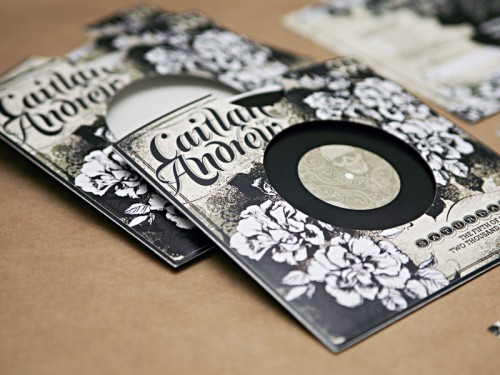
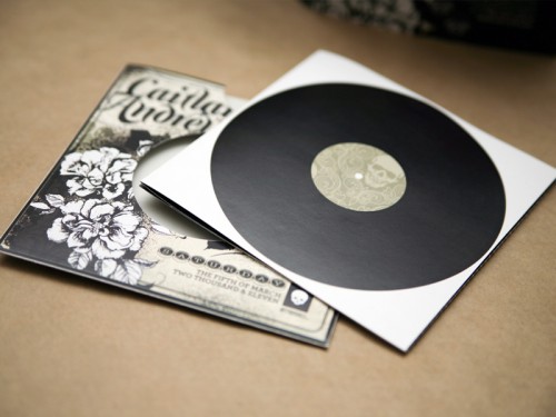
black-heavy-metal-wedding-invitations-record-album

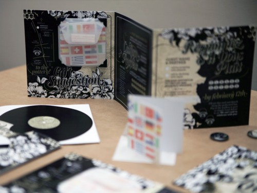
From Lyndsay: When I first spoke to Caitlan, her request for the design was that it celebrate her future husband Andrew’s interests – which were predominantly related to a love of heavy metal music.  One of their first dates was to a concert which she referred to as a “sea of fading black t-shirts!”

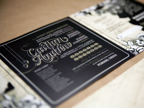
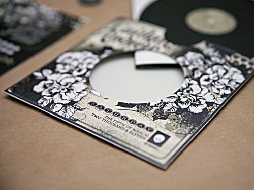
black-heavy-metal-wedding-invitations-inside

black-heavy-metal-wedding-invitations

black-heavy-metal-wedding-invitations

My first thought was, “this couple is destined for a fantastic life together” – because it is so rare that a bride will pursue something so unconventional for her wedding stationery in order to respect the groom’s passion!  We talked a lot about having some subtle references to his favourite bands (as well as hers, which included Regina Spektor and Ani DiFranco), but I also decided this would be a challenge: to make skulls cute!

black-heavy-metal-wedding-invitations-record

black-heavy-metal-wedding-invitations

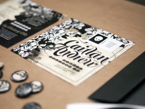
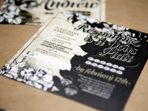
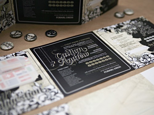
The result is somewhere between Slipknot and Florence and The Machine: a compilation of the couple’s important wedding information, folded like a mini-accordion, with a reply postcard that could be detached via perforation and sent back to the couple, all packaged within their own “LP.”  I modeled their monogram, which is used several times throughout the design, loosely on the Rolling Stone magazine masthead.

black-heavy-metal-wedding-invitations-inside

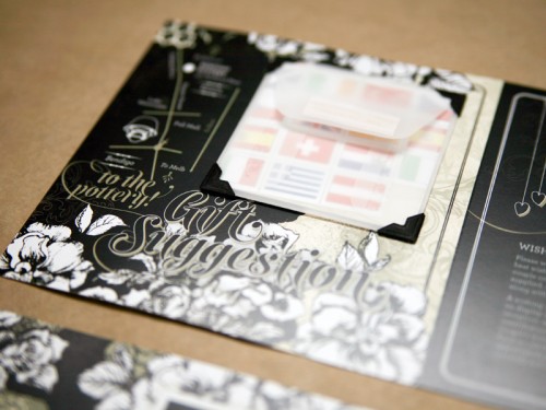
Another sweet featured: their request as a “gift” was for guests to write a little note to them in provided cards (decorated with flags of all the countries they plan to visit as a married couple) for them to keep as a memento of their day, which I pre-affixed inside each invitation with little cardboard photo corners inside vellum envelopes.  Each invitation was hand-trimmed, folded and assembled with love.

black-heavy-metal-wedding-invitations

We also made little button badges out of favourite design elements from the suite for an extra rock-concert reference.  Whilst these invitations don’t scream “wedding”, they are a reflection of a young, unconventional and fun couple who have a very bright future ahead of them.

black-heavy-metal-wedding-invitations-suite

So cool, Lyndsay!  I love the entire invitation, from the concept to the color palette.  Thanks so much for sharing these with us!

{image credits: it’s a date design}

Red + Aqua Carnival Birthday Party Invitations for Grace!

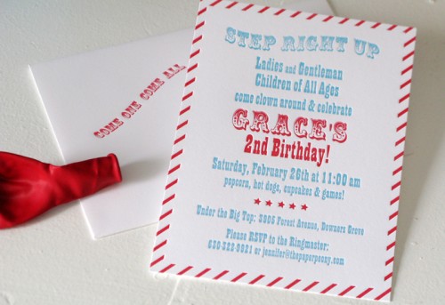
As much as I love wedding invitations, there’s just nothing like the youthful exuberance of a kids party invitation.  Jennifer from The Paper Peony sent over these adorable carnival-inspired letterpress invitations that she designed and printed for her daughter Grace’s second birthday, along with some images of the party itself!

red-white-blue-2nd-birthday-party-invitation

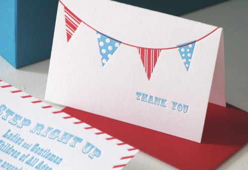
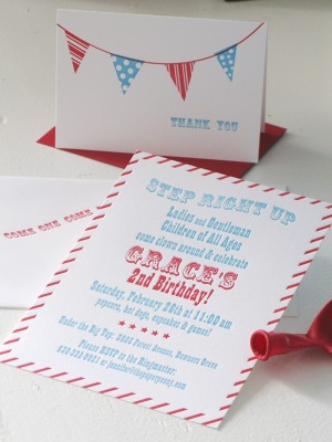
From Jennifer:  We planned a vintage red and aqua carnival theme for a small gathering in our home.  The invitations set the tone with fun fonts, stripes, and a red balloon in each envelope.  I designed the thank you notes with sweet little flags to compliment the party décor.

red-white-blue-birthday-party-invitation-bunting

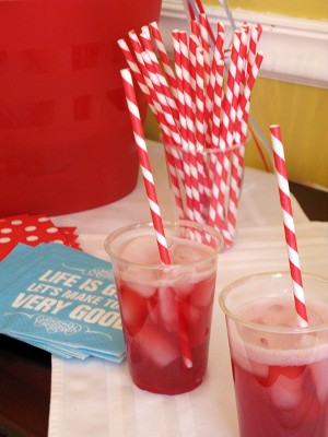
red-white-blue-birthday-party-invitation red-white-blue-circus-birthday-party-red-straws

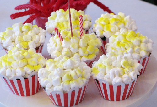
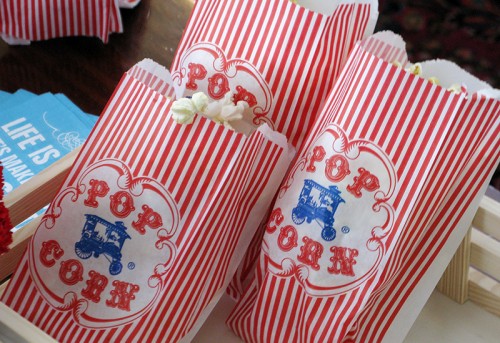
We decorated with lots of balloons and wonderful hand-made fabric banners that were hung all over the house (thanks to my mother-in-law).  We served lots of popcorn, gourmet hotdogs and salads as well as “popcorn” cupcakes that I made for the kids. They were a huge hit!

red-white-blue-circus-birthday-party-popcorn-cupcakes

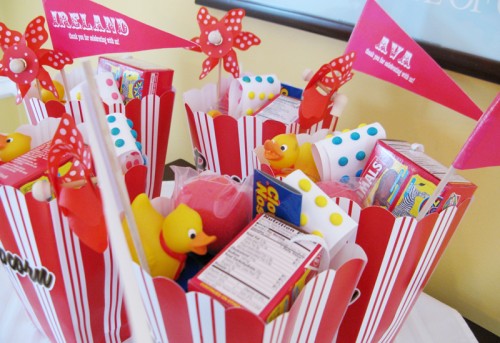
We had toss games for activities and my husband Shaun even learned how to make balloon animals and flowers the night before.  He got really good at it too!  The kids favors were so fun to put together!  We included rubber ducks, animal crackers, clown noses, pin wheels, candy dots and whoopee cushions!  I also made little paper flags with each child’s name.

red-white-blue-circus-birthday-party-popcorn

red-white-blue-birthday-party-invitation-favor-bags

red-white-blue-birthday-party-invitation-birthday-girl

Such a fun party, and it looks like Grace had a total blast!  Thank you so much Jennifer!

{image credits: jennifer larkin | the paper peony}

Elizabeth and David’s Hand Illustrated Farm Wedding Invitations

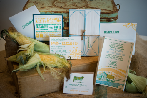
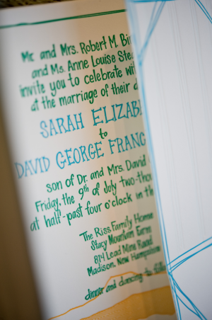
I know we’re barely out of January, but I can already tell that these wedding invitations are going to end up as one of my favorites from 2011.  Samantha and Whitney, the talented ladies behind Gus & Ruby in Portsmouth, New Hampshire, teamed up with illustrator Nate Duval to create a truly custom wedding invitation designed around the wedding venue – the groom’s family farm!


Hand-Illustrated-Letterpress-Farm-Wedding-Invitation-Suite

From Samantha and Whitney: Elizabeth and David came to us looking for a completely original wedding invitation design. After much discussion and many sketches, we hired illustrator Nate Duval to bring our vision to life.  With our direction, Nate illustrated the farm that David’s family owns in Madison, New Hampshire (and the wedding venue!).

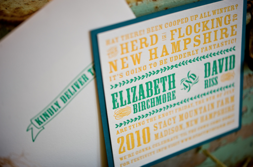
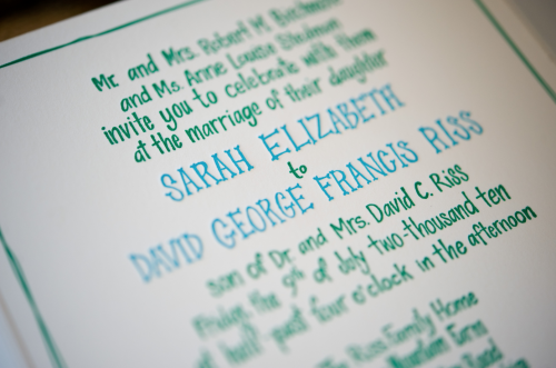
Hand-Illustrated-Letterpress-Farm-Wedding-Invitation-Text

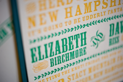
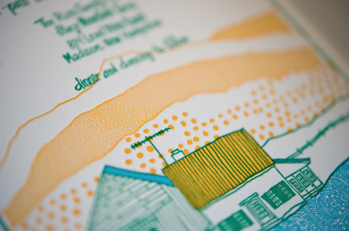
Hand-Illustrated-Letterpress-Farm-Wedding-Invitation-Detail

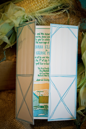
Their color palette was a mix of bright colors: yellow, orange, green, and blue and they gave us complete free reign to be as creative as we wanted.  Nate did an awesome, graphic illustration of the house, barn, and hills and even incorporated geometric patterns to fill in shaded areas.

Hand-Illustrated-Letterpress-Farm-Wedding-Invitation-Barn-Doors-Text Hand-Illustrated-Letterpress-Farm-Wedding-Invitation

Hand-Illustrated-Letterpress-Farm-Wedding-Invitation-Detail

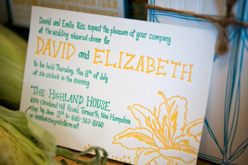
Hand-Illustrated-Letterpress-Farm-Rehearsal-Dinner-Invitation

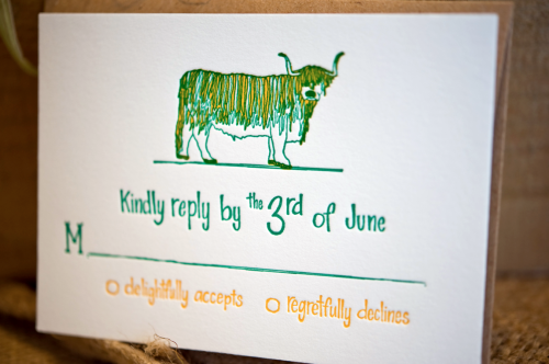
Nate did a singular illustration of a day lily (they are abundant on the property) as well as a ridiculously awesome illustration one of the cows (a very specific breed) that graze on the farm fields.  One of our favorite moments with this couple was when the groom’s mother saw the suite for the first time and exclaimed “Oh, it’s Fiona!” upon seeing the cow.  She recognized the specific cow immediately!  Too cute.

Hand-Illustrated-Letterpress-Farm-Wedding-Invitation-RSVP

Hand-Illustrated-Letterpress-Farm-Wedding-Invitation-Wording

Instead of pairing a refined font with Nate’s rad illustrations, we decided to opt for hand lettering.  Whitney set out and hand wrote every piece of information – from the invitation text to the wording for the rehearsal dinner card – it was a labor-intensive process, but we couldn’t have been more thrilled with the results.

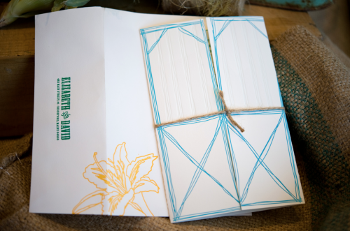
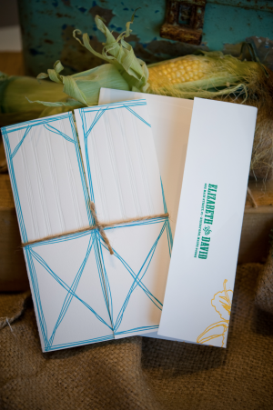
Hand-Illustrated-Letterpress-Farm-Wedding-Invitation-Barn-Doors

Hand-Illustrated-Letterpress-Farm-Wedding-Invitation-Barn-Doors Hand-Illustrated-Letterpress-Farm-Wedding-Invitation

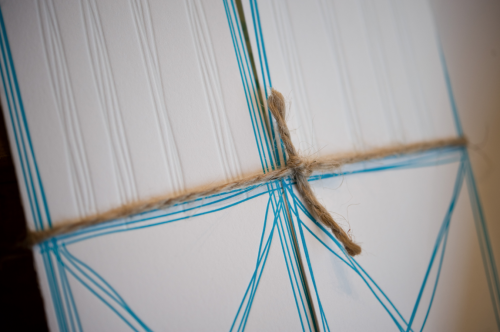
Our favorite part of the suite, which Whitney dreamed up just as she was preparing the final files, was to create barn doors as a vehicle to hold the invitation.  When guests pulled the suite out of the envelope they were faced with the doors and had to untie the rustic twine to reveal the invitation.  The additional pieces (reply card + envelope and rehearsal dinner invitation) were tucked underneath the twine on the backside of the doors.

Hand-Illustrated-Letterpress-Farm-Wedding-Invitation-Barn-Doors-Blind-Impression

Are these not the most adorable farm wedding invitations ever?  The entire suite is absolutely stunning, from the save the dates to the illustrated RSVP card.  Thanks Samantha and Whitney!

Illustration: Nate Duval
Hand Lettering and Letterpress Printing: Gus & Ruby

Invitation Styling by Meagan Gilpatrick of Maine Season Events; Photography by Brea McDonald

{happy weekend!}

Happy Friday everyone!  It’s been a long week for me, and I have mixed feelings heading into the weekend.  I’m looking forward to hanging out with friends and relaxing a bit, but still really missing my hubby overseas.  I’ve also been spending a lot of time listening to the band in the video below, Two Door Cinema Club – they’re from Ireland and it’s just what I need to keep my spirits up.  But in the meantime…

…a few links for your weekend:

This week on Oh So Beautiful Paper:

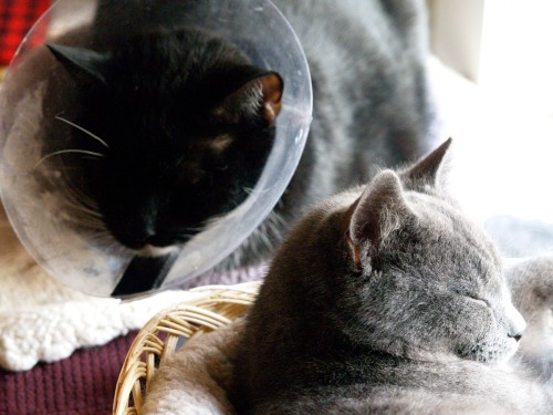
That’s it for me this week!  I hope you all have a lovely weekend!  I’ll be trying to stay warm with these two fuzzballs.  And yes, that’s our cat Leopold in the upper left, still in his cone of shame from his surgery back in November.  What an ordeal.  See you back here on Monday!

Leopold and Charlie

{photo by me}

Julian’s Red White and Blue Birth Announcements

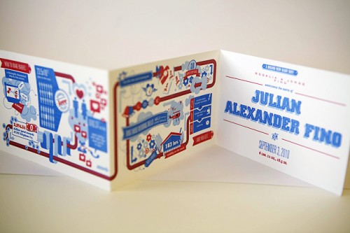
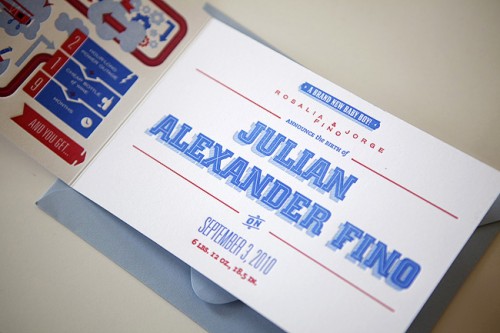
It’s been a while since we’ve had any birth announcements here, so I was thrilled when Miguel Castro from Heavy Metal Letterpress sent over these fun red, white, and blue fold-out letterpress birth announcements that he printed in collaboration with designer Jorge Fino for Jorge’s son Julian!

Red-White-Blue-Baby-Boy-Birth-Announcement

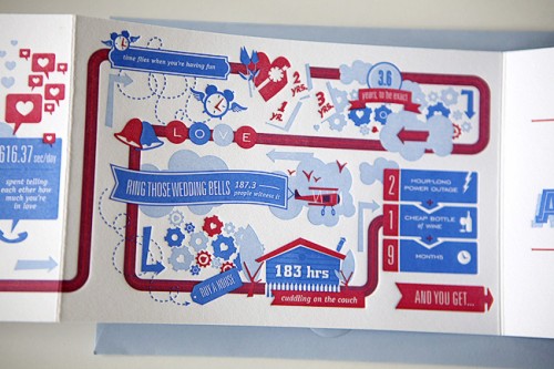
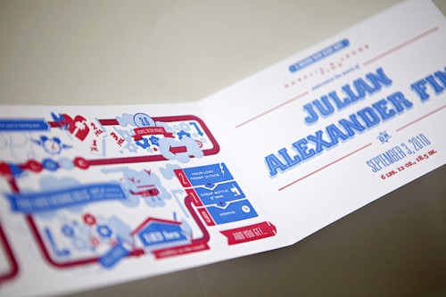
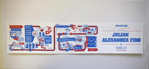
From Jorge:  The process initially began with a specific visual design style –mid-century modern design – in mind.  Thankfully, Miguel was extremely up for pushing the production level to as high as I saw fit.  I finally settled on detailing a whimsical story of how a baby is made and to depict specific stages in a couples’ life that lead up to the creation.

Red-White-Blue-Baby-Boy-Birth-Announcement

Red-White-Blue-Baby-Boy-Birth-Announcement

I decided to visualize this all in infographic style, which lends itself well to the design style of the mid-century era.  I was inspired heavily by Ty Mattson’s wonderful piece (also a birth announcement).  The original design was vertical, but it didn’t include an area to display the birth announcement info.  I considered a double-sided piece, but ultimately it felt like a piece that didn’t have a clearly defined front and back, so I decided on a fold-out horizontal format.  This turned out much better because the reveal of the announcement information on the last panel enhanced the overall concept.

Red-White-Blue-Baby-Boy-Birth-Announcement

Red-White-Blue-Baby-Boy-Birth-Announcement

Fabulous work!  Thanks so much Miguel and Jorge!

{image credits: heavy metal letterpress}