Behind the Stationery: Bench Pressed

The husband and wife team of Bench Pressed are no rookies to the stationery world – even though they launched their business just a couple years ago. Jane and Andy are here to share their creative process, from brainstorming and sketching to hitting the letterpress! I love this story on how they discovered the voice to Bench Pressed â€“ read on about one of their favorite cards and how it shaped the brand. Take it away, guys! –Megan

Behind the Stationery: Bench Pressed / Oh So Beautiful Paper

Hi there! Welcome to Bench Pressed! We are Jane and Andy Shannon, a husband and wife team, running a letterpress and design company in the Twin Cities and faking it until we make it.

Before we started Bench Pressed, Andy was working as a freelance illustrator and I was a stationery buyer at a small boutique in Minneapolis. After a few years, we decided to take our two passions and merge them. We launched Bench Pressed at the National Stationery Show in 2013, and we’ve been working on it ever since. Both of us still have side-jobs one day a week to help support ourselves and our dogs, but we are now working on creating greeting cards full-time.

Behind the Stationery: Bench Pressed / Oh So Beautiful Paper

Our shop is located in the old Hamm’s brewery in East St. Paul, Minnesota. This side of the neighborhood is slowly being revitalized after sitting vacant for a long time. Now our neighbors are small start-ups, like a craft brewery, small distillery, chocolatier and an urban hydroponic farm, all drawn to the neighborhood by the historic building and the cheap rent. Also, we are close to the best taco truck in all of the Twin Cities (priorities).

Behind the Stationery: Bench Pressed / Oh So Beautiful Paper

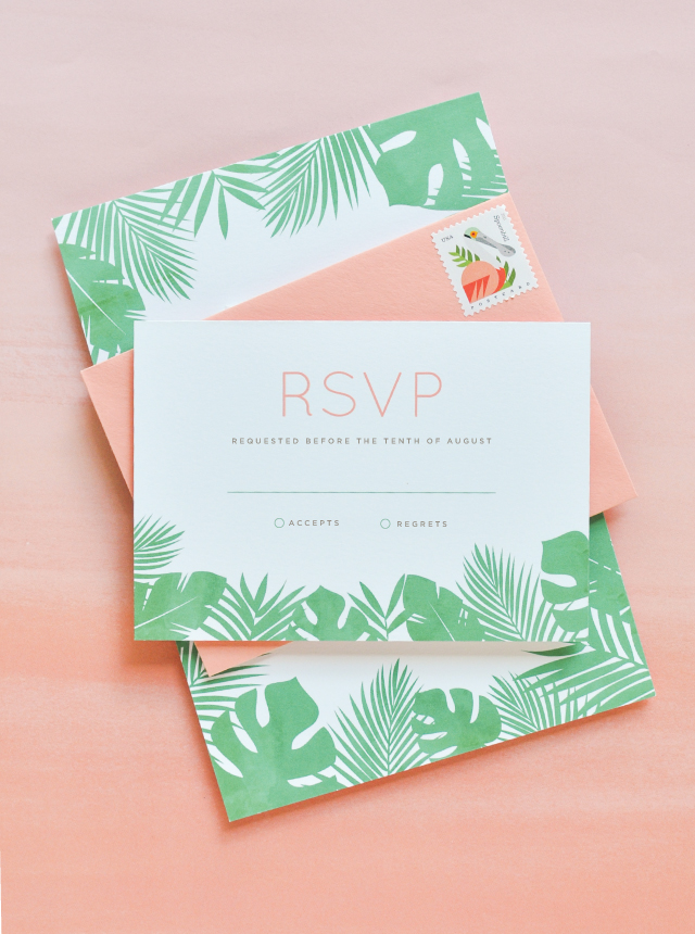
Bench Pressed is a letterpress shop. We specialize in hand-drawn and hand-printed cards, which means that all of our designs begin with pen on paper. We like to say that our cards are “tongue-in-cheek, with a little sweet.”

Behind the Stationery: Bench Pressed / Oh So Beautiful Paper

Coming up with card ideas is the best part. Andy keeps multiple Moleskine journals around and is drawing constantly. We both use the Notes app on our phones to write down things that make us laugh, which might end up as a card. Most of the time we’re working on cards we need in advance of a certain season (Valentine’s, Christmas, etc.), but not all of our cards are contrived.

For example, one of our most popular cards was just a random doodle that I found inside of Andy’s sketchbook, a little house with the words “Hope Your Neighbors Aren’t Creepy” (which I’m assuming was inspired by our neighbor who has many, many cats).

Behind the Stationery: Bench Pressed / Oh So Beautiful Paper

Behind the Stationery: Bench Pressed / Oh So Beautiful Paper

Once an idea and an illustration is made, he redraws the images from his sketchbook with tracing paper. The images are scanned into Photoshop where we add color, resize if needed, and prep all the cards into large files to be sent out to Boxcar Press for our photopolymer plates.

Behind the Stationery: Bench Pressed / Oh So Beautiful Paper

Our cards are all printed by us in our shop. We have three presses, a small table top press, a Chandler and Price, and our newest member of the family, the Heidelberg. We are using the windmill the most these days, but still use the C&P on some of the cards.

Behind the Stationery: Bench Pressed / Oh So Beautiful Paper

Behind the Stationery: Bench Pressed / Oh So Beautiful Paper

A typical day at Bench Pressed means that I’m at the computer answering emails and keeping on track of our orders, both retail and wholesale. Andy is usually working on our ever-growing print-list or on new products.

Behind the Stationery: Bench Pressed / Oh So Beautiful Paper

As for a team, right now it’s just the two of us. We plan on eventually adding more people to the mix – more hands for printing, folding, and packing up orders – but for now, it’s just us and the dogs at the shop.

Our struggles right now are getting ahead of our print-list to create more time for new products. I also think that keeping business separate from regular life can be tough, especially when you work with your partner. We have to remind ourselves take the weekend off or to take a step back when we need to.

Behind the Stationery: Bench Pressed / Oh So Beautiful Paper

One of our favorite cards is the “Oh Shit” pregnancy test card. It was one of our first designs and it really opened up the door for us to get a little more snarky with our line. At first, we didn’t want to push the envelope too much and didn’t want to upset people, but when we released this card there was such an overwhelming response to it that we were able to keep creating cards that we would want to give. And I guess that’s the exciting thing about making greeting cards for a living; we get to be a (tiny) part of people’s everyday joys.

Behind the Stationery: Bench Pressed / Oh So Beautiful Paper

We find inspiration from a lot of places. First of all, the stationery and paper industry is the most supportive industry that I know. We have learned so much from other stationers from printing techniques and troubleshooting to the best places to buy cello sleeves, envelopes, etc. Going to the National Stationery Show is one of our favorite things every year because we get to meet new and see old friends and catch up with them. It could be so easy for us to all see other stationers as competition, especially since we use the same medium, but instead it seems like we all boost each other up. Which is really refreshing and energizing.

Behind the Stationery: Bench Pressed / Oh So Beautiful Paper

In more basic terms of inspiration, we are constantly blown away by other artists and makers on various social media accounts, mostly Instagram. There is so much to see, from furniture makers and jewelers to installation artists, photographers, and chefs – strangers and friends alike – literally hours could vanish and not a damn thing would be done around the shop. Sometimes it is overwhelming, but there is an endless amount of talent out in the world and it’s kind of a paralyzing beauty.

All product photos by Bench Pressed, all other photos by 2nd Truth Photography.

Interested in participating in this column? Reach out to Megan at megan(at)ohsobeautifulpaper.com for more details about Behind the Stationery.

Behind the Stationery: Dancing Pen and Press

For our next feature, I want to introduce Elecia from Dancing Pen & Press – she’s a calligrapher turned letterpress and watercolor artist. Learning from Morgan of Ladyfingers Letterpress, Elecia expanded her skill set to expand and appeal to her customer base. Her story is proof that with determination in teaching yourself and the powers of Google, you can learn and do anything. From selling on Etsy to having her own website and soon her own brick & mortar location, here is Elecia! – Megan

Behind the Stationery: Dancing Pen and Press / Oh So Beautiful Paper

Hello, Oh So Beautiful Paper readers! My name is Elecia and I would love to share with you all a bit about us here at Dancing Pen & Press. It started with just a pen and a dream…literally. As a little girl I was obsessed with calligraphy. Going to grade school in New England in the ’80s while most kids had their “erasable” ballpoint pens (that never really erased, did they?), my love of calligraphy and art followed me throughout my teenage years. I started college as a Biology major, but I ended up graduating with a major in Textiles, Merchandising & Design and a minor in Fine Arts. The numerous color theory and color science classes I took did not go to waste. Mixing color is one of my favorite tasks here at Dancing Pen & Press, and we mix a LOT of color!

Behind the Stationery: Dancing Pen and Press / Oh So Beautiful Paper

We custom mix all of our letterpress inks, watercolors, and calligraphy inks. I find it a personal challenge when a client gives me a swatch to get it exact. After working for a few years in corporate retail, I started Dancing Pen in 2008. I learned that there was a “new” type of calligraphy out there. It wasn’t new at all, actually. It was a form of calligraphy called copperplate, dating back to the 1700s. This type of calligraphy uses a pointed dip pen instead of a flat tip. Using pressure on the down stroke of the letterform creates the gorgeous thick and thin lines of this style of calligraphy. This opens the nib and allows more ink to flow through.

Behind the Stationery: Dancing Pen and Press / Oh So Beautiful Paper

I ordered all of the supplies and instructional guides from the United Kingdom because they weren’t yet available here in the States. I didn’t have a website, and had not heard of Etsy, so I put up a listing on Craigslist of all places. Within 24 hours, I had my first job! It was 275 envelopes for a Bat Mitzvah in Boston. More and more jobs came my way, and a few short months later I started my Etsy shop.

For a few years, calligraphy was the bread and butter of Dancing Pen Calligraphy. We offered hand calligraphy envelopes, place cards, vows and simple marriage certificates. I would ask my clients to include one sample of their wedding invitation so I could get a feel for their aesthetic and carry that look to their envelopes. I remember getting my first letterpress invitation in my hands and just fell in love!! I didn’t even know what it was called, but I knew I had to learn how to create something with that type of depth, texture, and handcrafted yet luxurious feel.

Behind the Stationery: Dancing Pen and Press / Oh So Beautiful Paper

After a few minutes on the Internet (Google did not fail me), I learned about the wonder that is letterpress printing. Lucky for me, AS220, a local community print shop offered three-day letterpress workshops. Morgan Calderini of Ladyfingers Letterpress (before there was a Ladyfingers Letterpress) taught the class. I quickly realized that this was a calling for me. I just adored the way that I could “marry” the hand calligraphy I have always loved, with my new crush – letterpress. I scoured local ads and found a Chandler & Price New Style letterpress for the deal of the century at $200. And this is when Dancing Pen Calligraphy, became Dancing Pen & Press.

Behind the Stationery: Dancing Pen and Press / Oh So Beautiful Paper

In 2010, I packed my bags and moved from Rhode Island to sunny Houston, Texas. I wanted to expand my horizons with custom marriage certificates and add more flair to them besides hand calligraphy. My Chandler and Price letterpress isn’t large enough to print an 18×24″ certificate so I knew that I had to learn watercolor! Just like calligraphy, I purchased a book and taught myself that as well. I seriously LOVE the unpredictable nature of watercolor and plan to incorporate it more in letterpress wedding invitations in the near future.

Behind the Stationery: Dancing Pen and Press / Oh So Beautiful Paper

Our business is busy all year long, but depending on the season product popularity ebbs and flows. Late winter to early summer we are humming right along with letterpress invitations, then mid-summer to early fall we are in marriage certificate season, followed by a huge Christmas/Holiday letterpress card season. I love all of the different aspects of what we do. They are all my babies and I could not pick my favorite!

Behind the Stationery: Dancing Pen and Press / Oh So Beautiful Paper

In 2012, Allison joined the team. It was so nice to share some of the responsibilities of running a business. I am also a huge brainstormer, so it’s fantastic to have someone to bounce ideas off of. I have always thought of myself as having a keen eye for color. She helps with quality control, packing up letterpress goodies with care and scheduling.

At this point we were still running our business 100% off of Etsy. We shipped all over the world, but most clients came from Los Angeles, NYC, Australia (yes, Australia!), and the Southern Belle states. Allison and I launched our website exactly one year ago and our new Houston clientele immediately responded.

We like to joke that we should rebrand ourselves as “Swanky Letterpress”, because we are Southern (Allison), and Yankee (Elecia). Did I mention we are huge word dorks? We work well together since we are so different. I love traditional curly calligraphy or trendy gold foil on an invitation, while Allison leans more towards clean lines and a contemporary aesthetic.

Behind the Stationery: Dancing Pen and Press / Oh So Beautiful Paper

We have been wanting to expand to a brick & mortar storefront for a while now. Envelopes, boxes of Crane Lettra paper, pads of watercolor paper, samples, ink cans, watercolor palettes, hot foil stamping machines, and the like have been overflowing to other parts of my not-so-huge house in the past year or two. We have been searching for the perfect location for Dancing Pen & Press to call home. We are THRILLED to announce that we have secured a location, and are in the process of renovating & will open doors the first week of November!! We will of course be posting a photo diary all along the way of our progress. Think dove grey painted wood floors and cabinetry, blush walls, gold…well, we won’t give it all away.

Stay tuned!

All photos courtesy of Dancing Pen & Press.

Interested in participating in the Behind the Stationery column? Please send an email to Megan at megan[at]ohsobeautifulpaper.com for more information.

Rustic Watercolor Garden Wedding Invitations

These beautiful wedding invitations from Amanda at Wide Eyes Paper Co. seamlessly combine whimsical watercolor, beautiful botanicals, and a nature-inspired color palette of green and kraft for a casual-meets-rustic elegance design. Amanda carried the garden-inspired design all the way from the save the dates to the wedding invitations, menus, and day-of stationery!

Rustic Watercolor Garden Wedding Invitations by Wide Eyes Paper Co / Oh So Beautiful Paper

From Amanda: This bright and cheery garden themed set is inspired by a wonderland of floral botanicals with rustic and whimsical accents that highlight the onset of Spring and Summer.

Rustic Watercolor Garden Wedding Invitations by Wide Eyes Paper Co / Oh So Beautiful Paper

Hannah, the bride, contacted us with a specific vision for her wedding invitations and stationery. She wanted the design to convey a combination of casual and rustic elegance. With this in mind, we painted whimsical floral elements in her color scheme, and also created symmetry among the pieces by adding in simple sprigs of greenery. We executed her vision starting with the save the dates all the way through to the day-of stationery, including a custom rubber stamp and menus.

Rustic Watercolor Garden Wedding Invitations by Wide Eyes Paper Co / Oh So Beautiful Paper

Rustic Watercolor Garden Wedding Invitations by Wide Eyes Paper Co / Oh So Beautiful Paper

One of the more personal touches to the stationery is the custom scenery we painted for the couple. They were married under a beautiful botanical arch that we captured and incorporated onto the information card.

Rustic Watercolor Garden Wedding Invitations by Wide Eyes Paper Co / Oh So Beautiful Paper

Hannah and James wanted to stick with the “natural look” for the envelope liners so we painted a simple watercolor liner with touches of greenery and paired it with our natural kraft envelopes to tie in her rustic theme. The set also showcases a custom monogram we created for the couple which is engraved into real wood and assembled together with natural jute twine. The monogram is also displayed on the menus as well as the letterpress tags created to assemble the save the dates.

Rustic Watercolor Garden Wedding Invitations by Wide Eyes Paper Co / Oh So Beautiful Paper

This is one of our favorite new sets, and we had an absolute blast collaborating with Hannah and James to make it perfect for their charming outdoor wedding.

Rustic Watercolor Garden Wedding Invitations by Wide Eyes Paper Co / Oh So Beautiful Paper

Rustic Watercolor Garden Wedding Invitations by Wide Eyes Paper Co / Oh So Beautiful Paper

Rustic Watercolor Garden Wedding Invitations by Wide Eyes Paper Co / Oh So Beautiful Paper

Thanks Amanda!

Design: Wide Eyes Paper Co.

Watercolor: Emily Fages 

Wide Eyes Paper Co. is a member of the Designer Rolodex – you can see more of Amanda’s work right here or visit the real invitations gallery for more wedding invitation ideas!

Photo Credits: Jasmine Fitzwiliams of Let’s Frolic Together

Happy Weekend!

Happy Friday everyone! It has been nothing but rain, rain, rain all week here in DC thanks to Hurricane Joaquin! My garden is super happy to have all of this rain, but the heavy clouds have been messing with my photography schedule! Of course we’d get hurricane-related weather the week that I have like four separate deadlines involving original photography. Gah! I’m wrapping up the last of those deadlines today and I’m ready to take a big deep breath as we head into the weekend. But in the meantime…

Sarah Benning Embroidery / Oh So Beautiful Paper via Instagram

Gorgeous embroidery by Sarah Benning via Instagram!

…a few links for your weekend!

This week on Oh So Beautiful Paper:

That’s it for me this week! Check back later for this week’s cocktail recipe – I hope you all have a wonderful weekend, and I’ll see you back here on Monday! xoxo

Tropical Leaf Wedding Invitations

Oh man. It’s probably a good thing that I’m already married, because with all the tropical vibes happening these days – from cocktails to stationery – I’d probably just run off and have a big tropical-meets-Tiki destination wedding celebration! Designer Lauren Chism feels the same way, which is what led her to design the newest addition to her Resort destination wedding collection – the Riviera – full of gorgeous tropical leaves!

Tropical Leaf Wedding Invitations by Lauren Chism Fine Papers / Oh So Beautiful Paper

From Lauren: I always have plans to launch new collections, but have found it hard to find time to really make a big launch. Realizing that wasn’t going to happen, I have decided to do a little refresh by adding a design or two to each of my collections. This is a current favorite that is being added to my ‘Resort’ collection.

Tropical Leaf Wedding Invitations by Lauren Chism Fine Papers / Oh So Beautiful Paper

I personally had a beach destination wedding and the lack of invitation options (back then) is what led me to design my own – which in turn led me to starting my business. So as you can imagine, having a collection catered to destination weddings was a big focus and really the inspiration behind my business. That was 6+ years ago and to this day, I still feel a special connection with my clients that are having similar weddings to my own.

Tropical Leaf Wedding Invitations by Lauren Chism Fine Papers / Oh So Beautiful Paper

Back to the design! Riviera is simply all about the palm leaves. Mexico, Hawaii, Florida, Bahamas – you can’t find a beach destination that isn’t synonymous with these tropical trees. There’s a subtle watercolor detail in the palm leaves, which is my favorite part of these digitally printed invitations. There’s been a big surge with letterpress popularity, but there are some things you just can’t achieve with letterpress, and a watercolor effect is one of them. For the rest of the design, I went with a modern and minimalist typography layout that I think compliments the palm leaf detail without overpowering.

Tropical Leaf Wedding Invitations by Lauren Chism Fine Papers / Oh So Beautiful Paper

While I am normally a neutrals gal, I was really drawn to color with this suite. This bright green and salmon color just work so well together – I can’t get enough. And it seems like the US post office and I were on the same page, because how perfect are these postage stamps?!

Tropical Leaf Wedding Invitations by Lauren Chism Fine Papers / Oh So Beautiful Paper

Tropical Leaf Wedding Invitations by Lauren Chism Fine Papers / Oh So Beautiful Paper

Thanks Lauren!

Design: Lauren Chism Fine Papers

Lauren Chism Fine Papers is a member of the Designer Rolodex – you can check out more of Lauren’s beautiful work right here!

Photo Credits: Lauren Chism