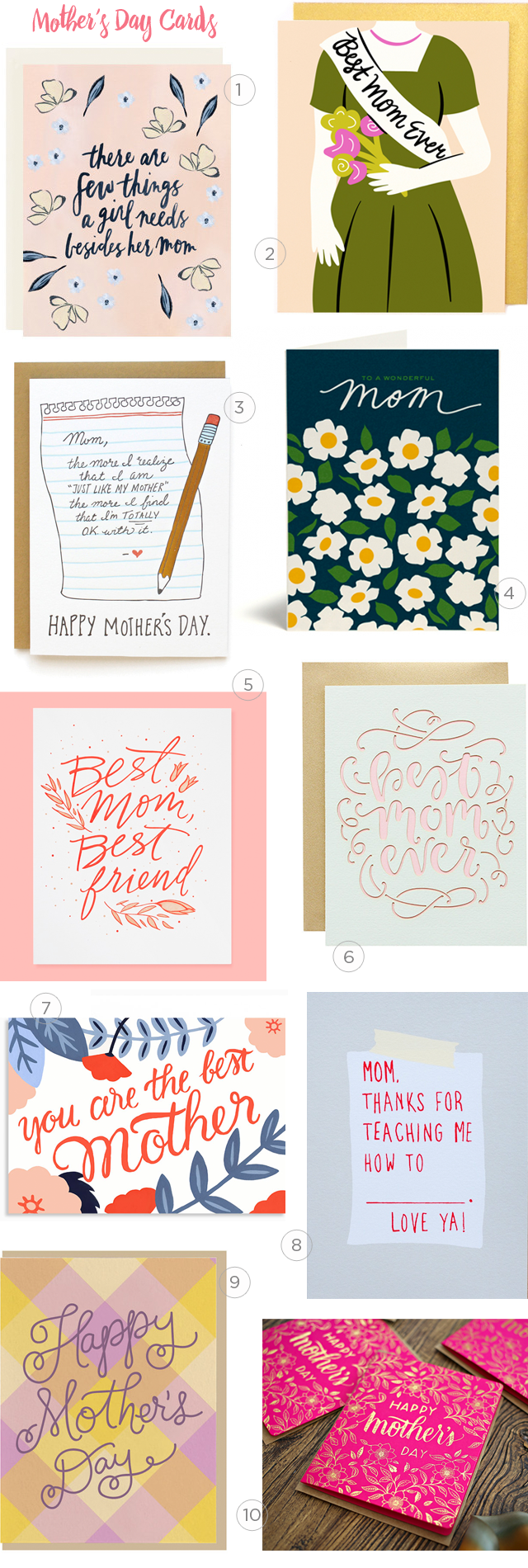
I remember meeting Sara back at Tradeshow Bootcamp in 2013! Her aesthetic and authenticity caught my eye and I have been a fan ever since. I’m honored to feature this new mother, entrepreneur, and friend on OSBP today. Sharing about her (mostly) family powered business and how she’s adapted her business since becoming a mom, here’s Sara from Constellation & Co. –Megan

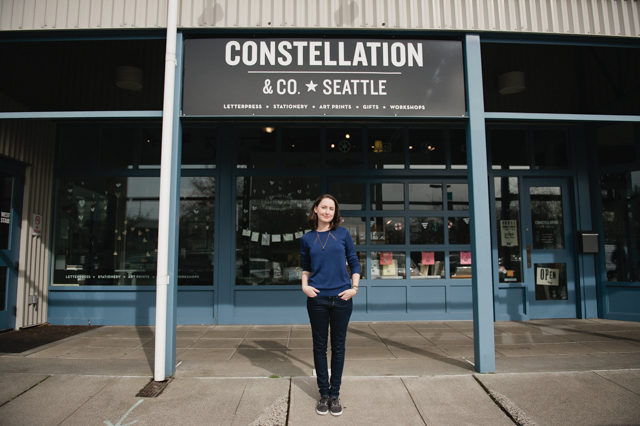
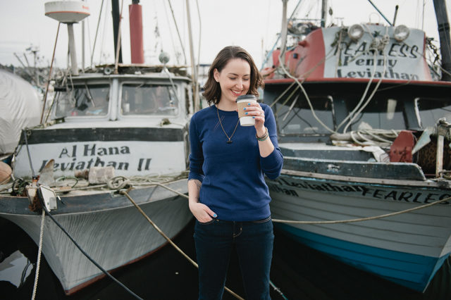
Constellation & Co. is located in Seattle, Washington. Our storefront studio and shop is in the Magnolia neighborhood of Seattle in the historic Fishermen’s Terminal. The Fishermen’€™s Terminal is home to the Northwest fishing fleet – giant fishing vessels that spend fall through spring in Seattle and head to Alaska for the summer. We’re right on the water, and that’s been a huge part of what has inspired me this past year. There is nothing better than a mid-day walk on the docks, breathing the fresh air and letting the water calm me.

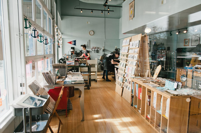
Our space is naturally bright, with huge windows, pale blue walls and light wood floors. It has soaring high ceilings and a romantic spiral staircase up to our loft office. I remember the first time I saw the space, the way it made me feel. It was ripe with possibility, hopeful and beautiful. It was new and exciting, but also felt like home. It’s a gift.
It’s a creative space and I feel inspired when I’m there. It’s full of beautiful things – antique equipment, lovely people, and amazing products made by fellow artists and designers. When we moved in I wasn’t sure how it would work having retail, office, and production all in one space. We get to share the practical craft letterpress with the public, and connect with the people who buy our cards in a real way. One of my favorite perks is using our shop to do product testing. I can put a brand new card out on the rack as soon as I print it, and get feedback right away.

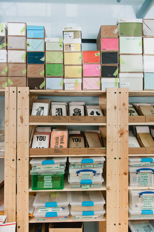
Our loft office is all about practical storage. It’s a small space and it’s home to all of our paper and envelopes, including in-process and packaged cards. We’ve worked hard to keep the storefront space inviting to customers as well as practical for a working letterpress shop. It’s a daily challenge, but I think we balance it well. Knowing that the general public sees everything is a great way to stay organized!
The shop is open six days a week, with my beautiful team keeping the doors open and greeting customers. Our team consists of myself (owner/designer/printer), Chelsa (wholesale manager), Brooke (letterpress printer), as well as Meredith, Dorothy and Sam who keep the shop running and online orders going out (plus a lot of other things!). My mom, Suzi, is our bookkeeper extraordinaire. My husband Brad, dad Chuck, and sister Beth chip in too.

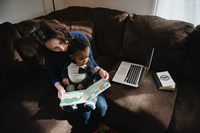
I became a mom a year ago, and spent the first six months at the shop every day. When my very sweet, very active son started crawling at six months, the plan had to change. Now I work from home four days a week, and have one full day of child care. I also work a lot of nights and weekends. I’ve found that being a mom and an entrepreneur is possible, but it is not simple. It takes a lot of planning, flexibility, sense of humor, and grace for myself and others.
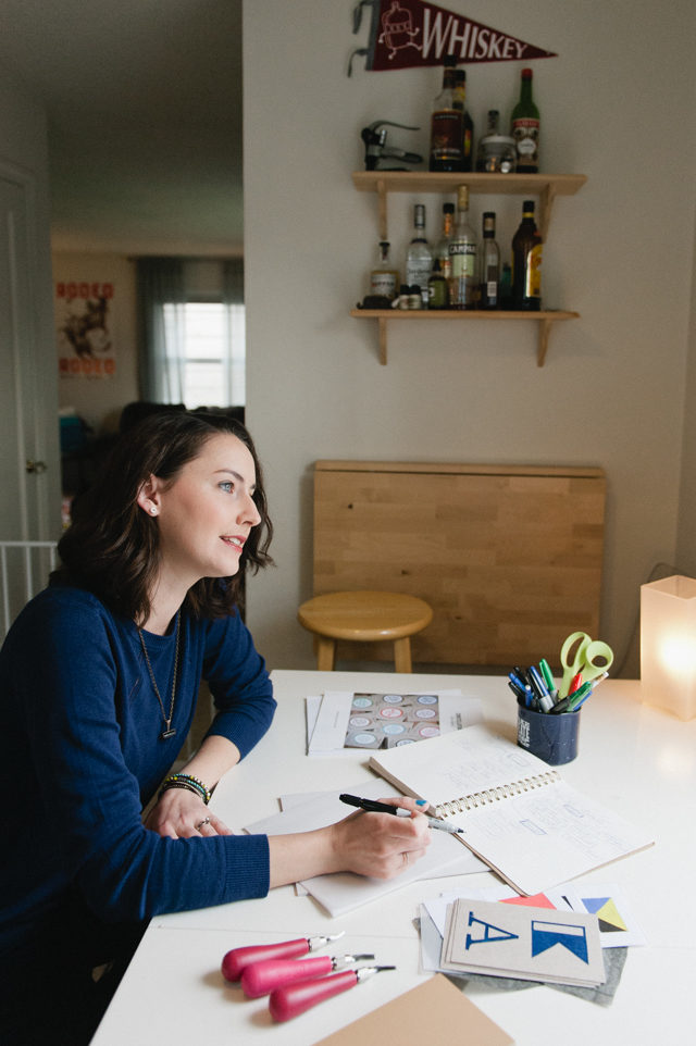
None of my days are really typical, but these are some of my daily work from home rituals. I make and eat breakfast in the kitchen with my son. We listen to music and I do silly dances to make him laugh. He takes a morning nap, and I spend time answering e-mails and planning my tasks for the day. I listen to a podcast and work on creative tasks, like linoleum cuts for a project, designs for new cards, client work, etc. My little one wakes up and we eat lunch. If the weather is nice, we go for a walk or play in the yard. When he’s ready for his afternoon nap, I get started on necessary tasks – ordering paper, social media marketing, planning upcoming events and trade shows, jotting down product ideas, doing dishes or laundry, etc.

On my in-shop days, my dad comes in the morning to care for my son. I run an errand or two and head into the studio. I love those mornings when it’s just me in the shop. I play loud music and sing my heart out. I open the mail, tidy the print shop, prepare my projects for the day, and start up the Windmill. My Heidelberg Windmill has been with me less than a year, but she’s become my special friend. Learning to print on a new press is a scary and rewarding endeavor! Brooke prints nearly every day on our platen press, and now with two production presses we can be really efficient.

By lunchtime, there’s usually four of us working in the shop: Brooke and I printing, Chelsa and Dorothy (depending on the schedule) filling wholesale orders, packaging cards, and checking out shop customers. At some point throughout the day, I take a break to visit the boats. I print more or less all day, while answering questions, saying hello to visitors and trying to take enough Instagrammable photos to get me through the week (haha!). At the end of the day I’m missing my boy, and I head home tired but happy. I love my inky hands, tired feet and sense of accomplishment.
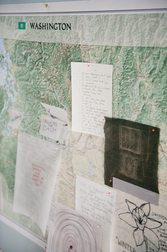
Most of our products start with a line of text scribbled in my notebook. I write everything down, and eventually come back to it. If it speaks truth to me the next time I see it, I’ll make it into something. If it feels lame when I come back to it, I let it stay in my notebook.

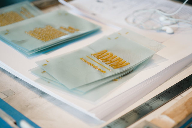
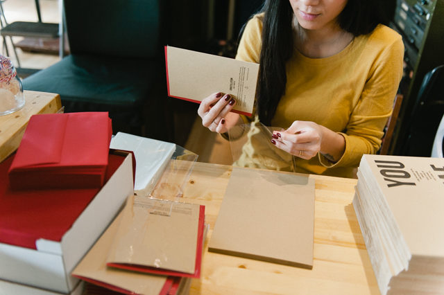
Before becoming a mom, most of our products were designed by setting lead or wood type. Many of our products are still (and always will be) printed that way, with hand-set type and wood engravings. Now that I’m working remotely most of the time, I’ve had to change tactics for new products. I’ve returned to my roots as a graphic designer, working in Adobe Illustrator and setting type digitally. I order the designs as photopolymer plates and letterpress print them. One of my favorite parts of designing new products is choosing the paper and envelope colors for each design. Once the card is finished, matched with an envelope and packaged in a clear sleeve, it all feels very official!

Our line is focused on universal truths and simple beauty. Our process is simple because our products are simple! I want the words to shine, and for nothing to distract from the emotional honesty. Whether it’s silliness, expressions of love, or being there for someone dealing with tragedy and grief, it’s the connections between people that are important. If words from my heart and pieces of paper that have been lovingly printed in shop make a difference in people’s relationships, I’m a success.

One of my favorite new skills with the Windmill is die cutting. I’d never tried it before, but I was emboldened after taking the Windmill Workshop at Flywheel Press, and now I love it! I’ve ordered a few dies for cutting and scoring our A7 and 4bar cards, and I’m totally hooked. I’m thinking in shapes all of a sudden. It’s fun to see how my thinking changes with new skills and equipment. It’s an encouragement to keep learning, keep growing, and being open to try new things.
This year I’ve been working on a large series of linoleum cuts that will launch as a product in May. I’ve enjoyed having a physical component that I can work on from home. The design for that series still started as a digital design, and was transferred by hand to the blocks with carbon paper. A new trick that Sam from my team introduced me to is using a heating pad to keep the linoleum blocks warm so they carve more smoothly. I put 3 or 4 small blocks under the pad and swap them out with they start cooling down. What have I been doing all this time without this trick!?

Photos by Meredith McKee.
Interested in participating in the Behind the Stationery column? Email Megan at megan [at] ohsobeautiful paper [dot] com.
