I spent the better part of this week tending to my submissions folder. This task is exhausting. I want to provide a thoughtful reply to each submission, but I can’t. I don’t have the time, and I fear that my feedback – even if well intentioned – will be taken as an insult. I’ve given feedback that has been taken as an insult. I never want to be the reason a line stops growing and I’ve used that to justify my short replies. But I always have more to say. Today, I want to share a few of the potentially tender reasons I don’t accept lines. I hope you’ll take them in the manner they’re meant: as true constructive fuel that can help a line grow. ~ Emily of Clementine.
Illustration by Emily McDowell for Oh So Beautiful Paper
Many of you already run strong, stunning, professional lines that are carried by many shops. This post isn’t for you. You may apply to shops like mine and not get picked up and it really is because the timing isn’t right, or I admire what you do, but it’s just not a fit. However, there are other lines who are new and growing, in the early stumbling stages, getting rejected or simply hearing crickets after you apply. This post is for you. There are some concrete, fixable reasons that you may be rejected. This feedback can be awkward to give one-on-one, but I believe our creative community could use a little constructive criticism.
So here goes:
- Your line lacks an understanding of design and/or a compelling aesthetic. Let’s be blunt, not everyone is fit to run a successful wholesale stationery line. You may love to draw. You may have always dreamed of having a card line. These things should propel you forward, but they don’t compel me to order from you. I’m overwhelmed by the number of submissions I receive that seem to lack a basic understanding of design (borders, type, color, pattern). Retailers can, and should, disagree on the aesthetics that they choose for their store, but we all want lines that meet basic standards of design. If you have no idea what I’m talking about, it’s time to invest in some course work: visual art and graphic design. There are some incredible online options these days, and continuing education courses you can take. Hone your skills, sharpen your eye. Get excited about what you don’t know.
- Beyond good design, of course, is the overall look: the art and sentiments themselves. I have seen many early attempts that are very heartfelt, but simply not very good. This is a hard area to receive feedback on, because it hurts and it’s hard to solicit feedback on because your friends and family will lie. It’s time to explore Etsy, craft fairs, and other sales venues where you see if there’s a market for your work. In other words, send your submission to retailers after your dream of having a card line has actually taken root and begun to grow.
- Your line doesn’t look professional. On the other hand, you may be a really talented artist, but you don’t seem to care about how to sell. You may, for example, decide to turn your [fine art, photography, doodles, etc] into cards, and you didn’t give much thought to how to present it. Major tells in this area are: poor printing quality, inconsistency in paper, poor envelope quality, and poor packaging. Bottom line: printing quality matters, packaging matters. If you’re not willing to invest in your line, I’m unlikely to invest in you. Go to the stores where you envision your line and look critically at the items that are already there. Your line should not mimic what has already been picked, but it should be able to stand along side the current lines.
- You don’t seem to understand what wholesale is. I get it – wholesale talk can seem like a big secret society when you’re on the other side. But the truth is, there’s very little you can’t Google your way into. For that reason, if you submit your line without the basics: a catalog and line sheet and some industry standards around pricing, minimums, and policies – it’s a red flag that working with you may mean more work for me.
- Your line isn’t extensive or cohesive enough. Early on, many talented crafters take a spaghetti-against-the-wall approach to see what sticks. Are you a designer, a potter, a seamstress? Do you want your cards to be letterpress or flat printed? Are you offering custom items? It’s ok to try out different product lines and methods, but when you present your line to retailers, it should feel cohesive and it should be extensive enough to convey that I’ll be able to rely on you for fresh products as the seasons change.
- Your submission seems careless or spammy. I always recommend taking 5 minutes on each retailer’s site to learn their name and any submission guide lines. It takes very little time to be thoughtful and most retailers I know receive so many submissions that if it’s not addressed to us by name, we feel permission not to respond.
- Your intro is too long, too casual, or off-color. I offered a template for email submissions here and I plan to write another about mail submissions. In short: your submission should be short, sweet and professional. It should not be seven paragraphs. It should not be too personal unless we actually know each other. You may assume I’m laid back, don’t mind a well placed curse word, and love to laugh (all true), but your submission email should still err on the side of business casual, not casual Friday. We’ll get to know each other later.
- Your photos and collateral aren’t appealing. Assume I have 30-90 seconds to look at your submission. Good photos and collateral (business cards, and other marketing extras) are often the only reason I linger. They also give a nod to the fact that you understand that our business is visual and that I can rely on you for quality presentation going forward.
- Your line looks too much like another line. In private conversation, this is a frequent topic. My friends and colleagues often disagree on who may be copying who. But for the purposes of picking a line, it’s not the copying that I’m focused on, it’s that your similarity to another line is either a distraction (because all I can think of is whether you’re copying someone else) or it means you don’t stand out on your own. If you want to sell professionally, you should be aware of the work of your peers and step back to critique how and when you may need to veer away from a design that seems played out. Please don’t hop on a new trend after you see it on line. The world only needs more gold foil pineapples if yours are spectacular. What retailer’s really want is to find something we’ve never seen that only you can show.
- You don’t stand out. Lately, I’ve seen an increase in submissions from designers who really do seem to understand the format of a good card, but I flip through the catalog and it’s immediately indistinguishable from dozens of others: the designs seem safe, the colors bland, the sentiments re-hashed versions of what’s out there. It’s hard to truly trust your gut and make the cards that you’re meant to make, but there’s nothing I love more than finding lines that do. You should cringe a little at your prior efforts, and then use them as a springboard to try something new.
If you feel like maybe I’m talking directly to you, rest assured, I’m probably not. These nine bullet points represent issues that I see repeatedly in hundreds of submissions each year. But now, I’m curious to hear from you – if you don’t get an order in response to a submission, do you want to know why? Do you want details? Do you want a dialogue? What more would you want from retailers? I’ve been investigating ways (periscope? Facebook live?) that we could turn this into a discussion. I await your suggestions and promise, when asked, to give true feedback to your line, if (and only if) you request it. I would also love to hear from my fellow retailers – tell me what I might have missed.

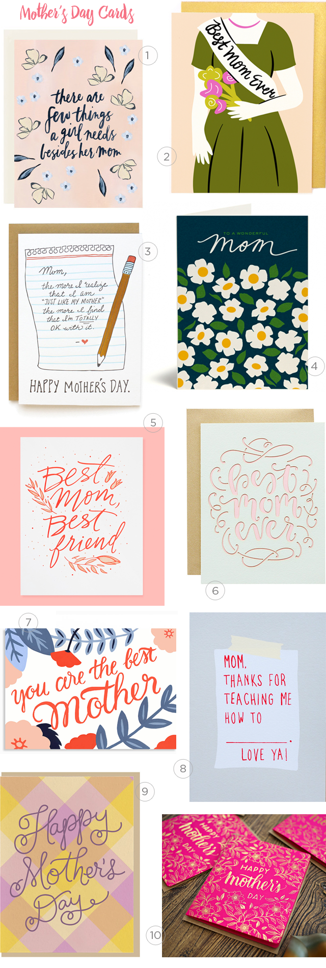
I’ll leave you with my current view at Clementine: Mother’s Day + a few other favorite cards on some shoddy shelves that I made, which are basically held together with dreams and wood glue. We all have our strenghts and weaknesses. I always welcome your constructive construction criticism and your feedback…xoxo, Emily