Colorful Mexican Fete-Inspired Wedding Invitations

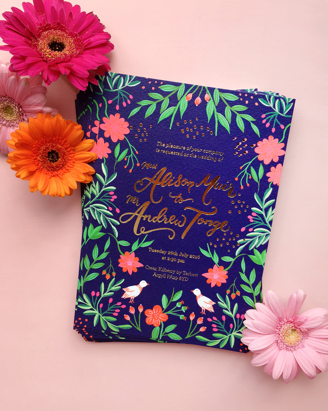
Well, hello there! Last week ended up being a bit more of a rollercoaster for me than I had originally expected – first, with a trip to New York for the NYNOW trade show (did you follow along on Instagram??), and second, we ended up having to replace our car! We’re a single car family here in DC, but we use our car every day for school drop offs and the commute to the military base where my husband works. Our poor 13-year old car decided to call it quits on us the day after I got back home. We’re super happy to have a brand new car sitting in our garage, even though the whole process took us about three full days. Anyway! I thought we’d start off the week with these colorful Mexican fete-inspired wedding invitations from Erin of BerinMade! I’m loving the bright illustrated florals and pretty gold foil details!

Colorful Mexican Fete-Inspired Wedding Invitations by BerinMade / Oh So Beautiful Paper

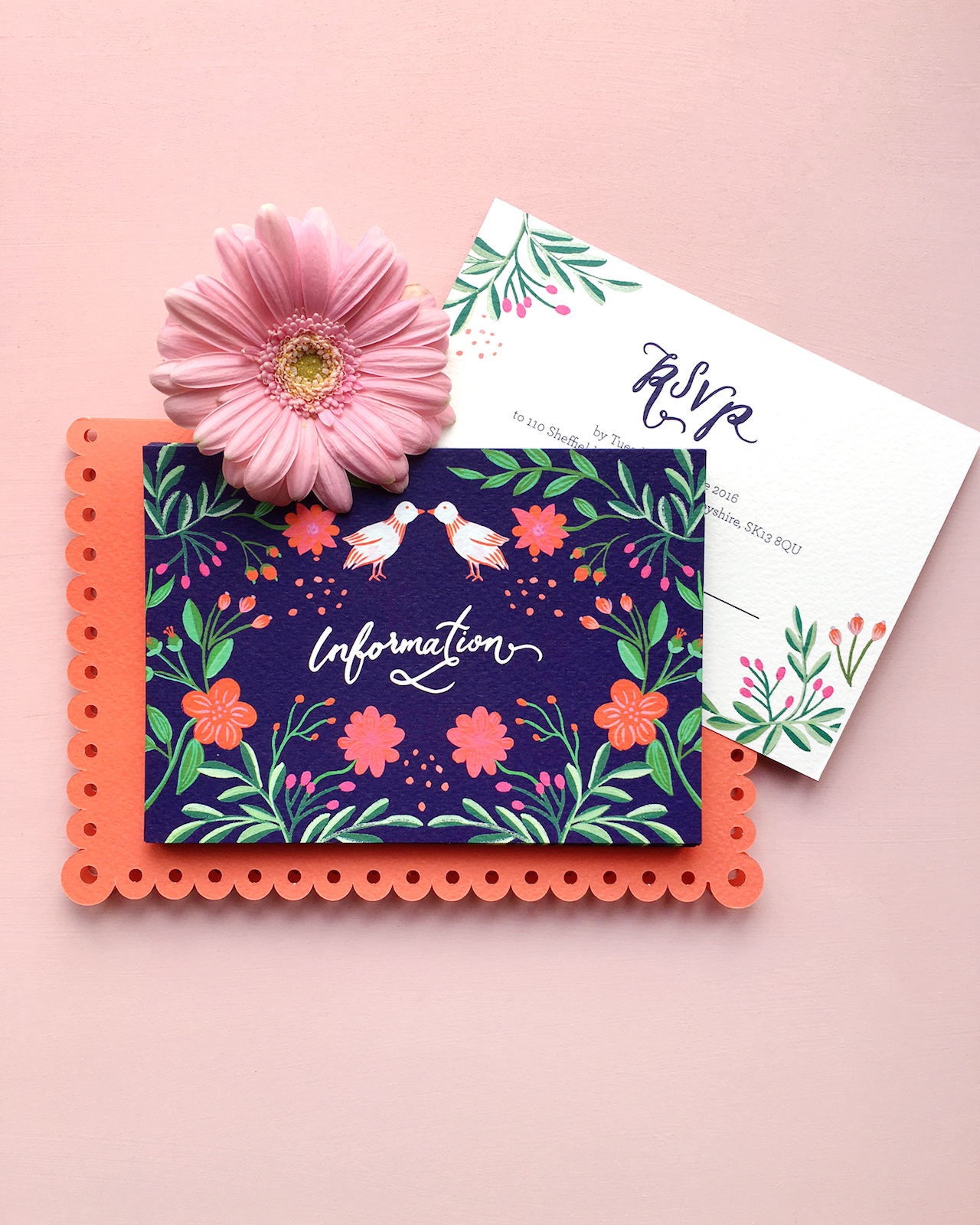
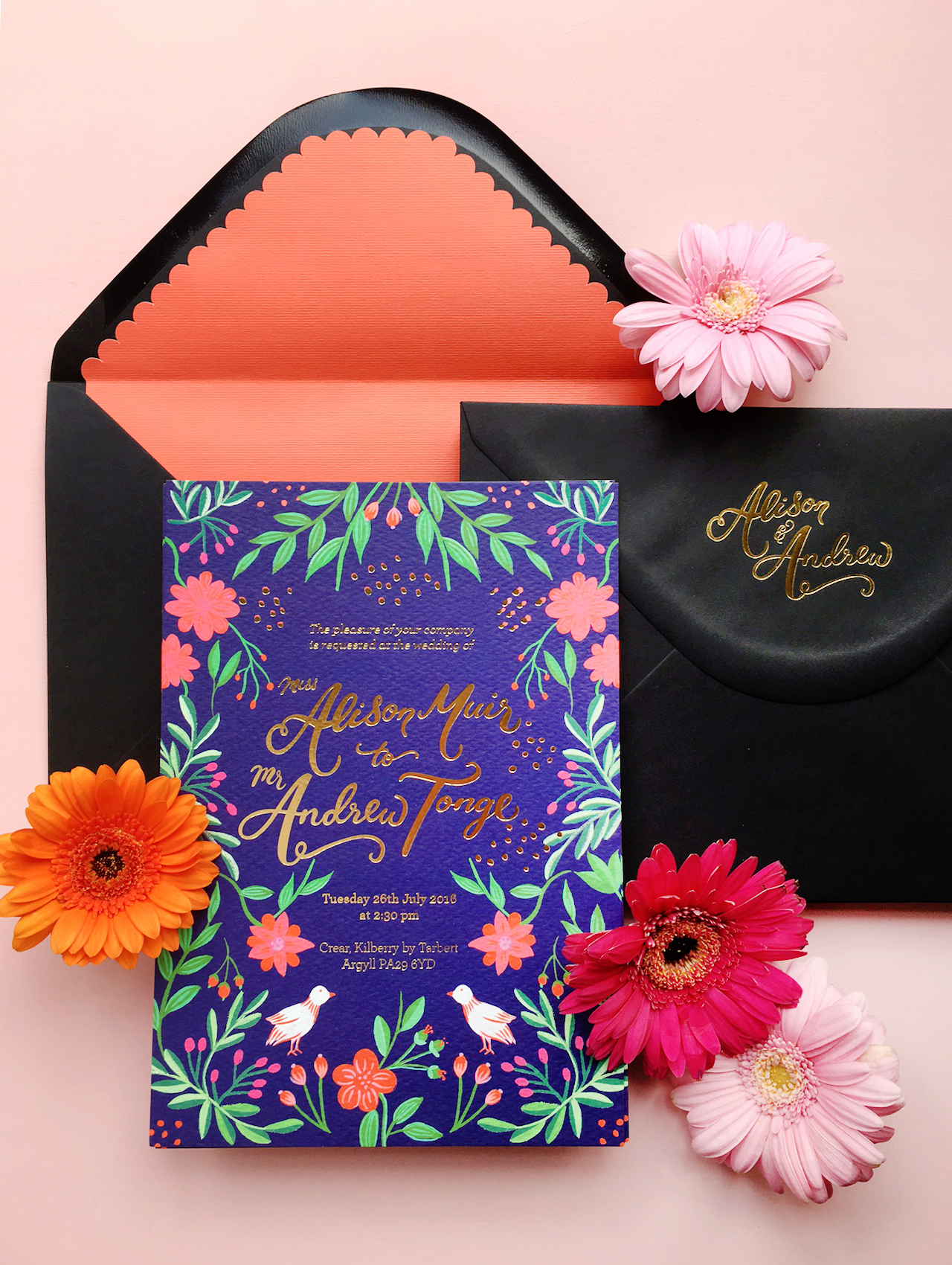
From Erin: Alison and Andrew were a dream couple to work with! They approached me last year with a few inspiration images, and wanted their wedding stationery to be loosely based on a colorful Mexican fete, with illustrations of flower, nature, and foil details. The goal is to have these elements as a nod to their fun, playful celebration, without necessarily being too “themed” or feminine.

Colorful Mexican Fete-Inspired Wedding Invitations by BerinMade / Oh So Beautiful Paper

I pulled some inspiration images of Folk art, drawing inspiration from symmetrical patterns, very bright intricate floral patterns as well as papel picado, the art of paper cut flags.

Colorful Mexican Fete-Inspired Wedding Invitations by BerinMade / Oh So Beautiful Paper

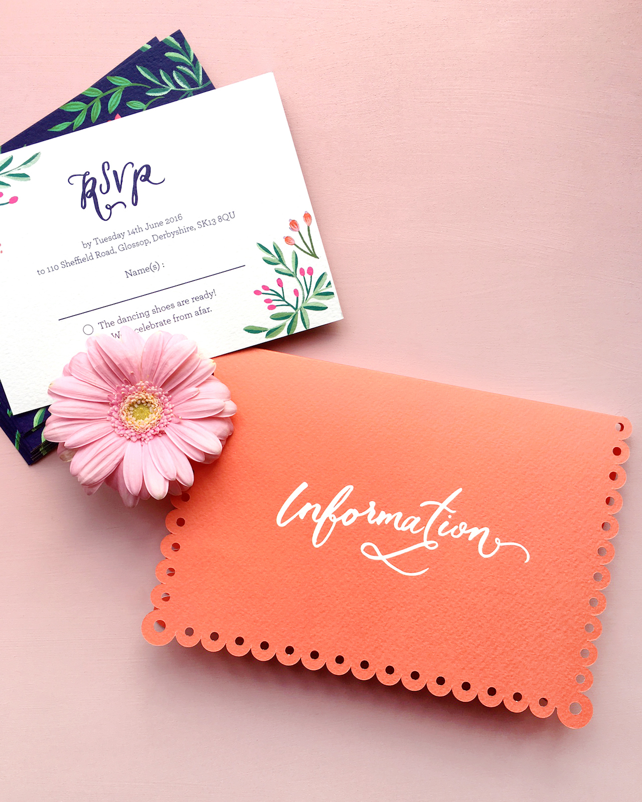
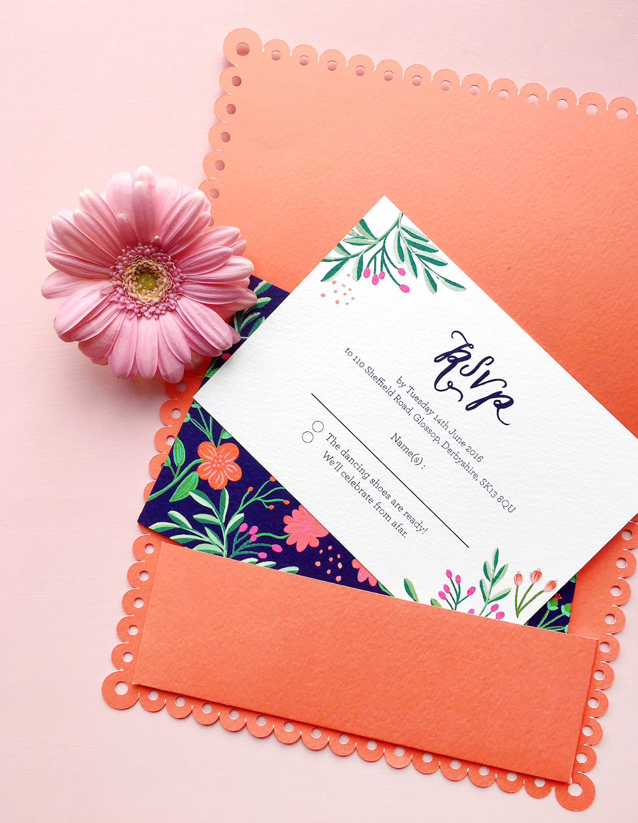
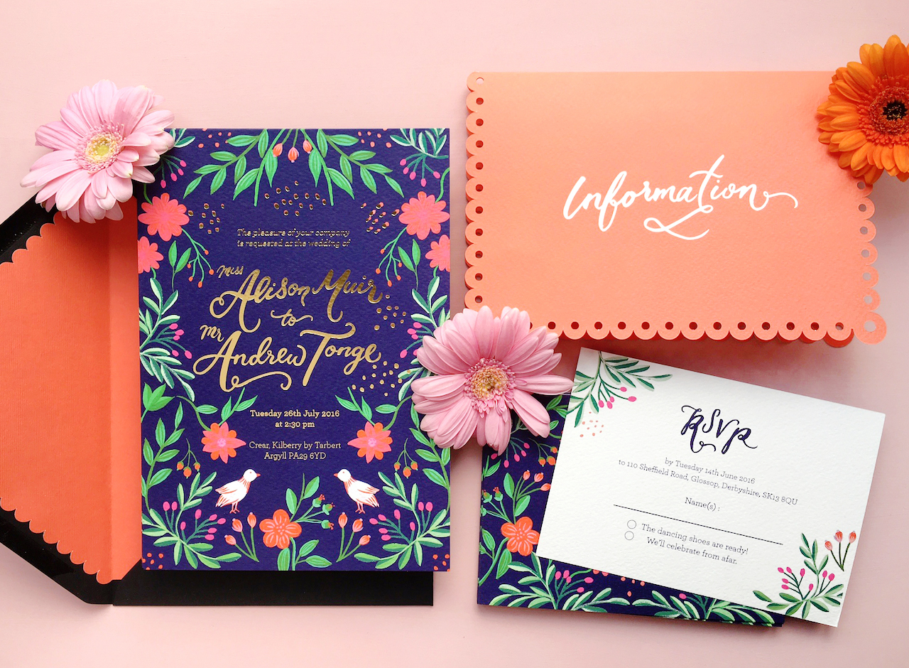
I wanted these to be subtle influences, so we decided to have the symmetrical illustrations take centre-stage and to make a separate enclosure pocket with a scalloped edge as an elegant nod to Mexican paper flags.

Colorful Mexican Fete-Inspired Wedding Invitations by BerinMade / Oh So Beautiful Paper

We went for a color palette that was bright and happy without being garish, and set it against the navy background to ground all the colorful elements together. It was after finalizing the illustrations and layouts that we decided to also lift a bit of the illustrations to foil alongside their names and the invitation text!

Colorful Mexican Fete-Inspired Wedding Invitations by BerinMade / Oh So Beautiful Paper

Colorful Mexican Fete-Inspired Wedding Invitations by BerinMade / Oh So Beautiful Paper

Thanks Erin!

BerinMade is a member of the Designer Rolodex – you can see more of Erin’s beautiful work right here or visit the gallery for more real wedding invitation inspiration!

Photo Credits: BerinMade

Stationery A-Z: Back to School Supplies!

Happy Monday everyone! DC public schools start back up this week, so I thought I’d start the week off with a round up of some of my favorite back to school supplies! We’re talking notepads, notebooks, pens and pencils, rulers – even an awesome pencil cup that I want on MY desk. My own daughter is starting her second year of preschool (DC starts at age 3), but sadly there aren’t a lot of fun school supplies involved at the preK stage. So this round up is geared more towards middle school through college and grad school – and plenty of it doubles as office stationery for those of you who are (thankfully) all done with school. I hope you find it useful!

Stationery A-Z: Back to School Supplies / Oh So Beautiful Paper

1. There are so many great notepad options, it’s really impossible to go wrong! This one is from The Good Twin – I love the color palette!

2. Compliment pencils in all the best colors from Ban.do

3. If you need to take notes (or sketch!) during class, you might as well do it in a pretty notebook! I like this pink, kraft, and gold notebook from Katie Leamon

4. These gold foil notebooks from Smitten on Paper are super cute, and small enough to carry around easily!

5. IRIDESCENT LEATHER PENCIL CASE. ‘Nuff said, right? By Tracey Tanner Studio!

6. Pens! I love the colors of these pens from Ban.do and these tropical leaf pens from Idlewild Co.

7. Colorful highlighters (and markers!) from Poppin

8. Pep talk pencils from Richie Designs

9. Rulers! I love the colorful rulers from Poppin and these brass rulers

10. Sugar Paper has an amazing assortment of notebooks – I’m loving this chambray fabric cover notebook, and you can even add a gold foil monogram!

11. Use this gold foil pocket notebook from Antiquaria to keep track of goals and ideas for the school year

12. Endless notepad options from Rifle Paper Co.

13. So many beautiful hand painted spiral bound notebooks from Moglea – perfect for making lists and taking notes

14. Perhaps the cutest eraser ever, by Sugar Paper for Target!

15. These brass number clips work great as bookmarks for textbooks – or even for marking important pages in notebooks and folders

16. This cute zippered pouch from Maika is perfect for carrying pens, pencils, binder clips, and erasers!

17. Loving the mint interior of this hexagon pencil cup from CB2

18. Cute sticky note blocks from Idlewild Co. – Moglea also has some really pretty options

19. Copper binder clips for keeping important documents together! 

20. Gorgeous floral pencils from Rifle Paper Co.

Unique and Memorable Save the Date Ideas

The ring has been picked, the question has been popped, and the answer has been exclaimed: YES! Congratulations on your engagement! Now it’s time to make sure your nearest and dearest know about your upcoming wedding – assuming you have a venue and a date, of course. Small details people. You need a Save the Date of course! Here are a few unique and memorable Save the Date ideas to help get the inspiration flowing. –Nichole of Coral Pheasant

Often there is a push to get Save the Dates out as soon as pos­si­ble and it can be over­whelm­ing to make a quick deci­sion. A tried and true option is to use a favorite photo – and that’s great! Your friends and fam­ily will cer­tainly know whose wed­ding is com­ing up. But if there’s time to put a lit­tle more thought into your Save the Date, the result can be unique and mem­o­rable. Con­sider favorite mem­o­ries and past times. Maybe you met in col­lege or the two of you love sam­pling wines. Or if you have a solid sense of the cel­e­bra­tion you are plan­ning, take inspi­ra­tion from that. Below are a col­lec­tion of Save the Date ideas that break the mold and truly set the stage for a wed­ding not to be missed!

coral_pheasant_save_the_date_1_navy_laser_cut_tuxedo

It’s always a treat when a cou­ple has enlisted the help of a sea­soned event plan­ner. Bren­dan and Ryan hired Diana at Jubilee Events to design and coor­di­nate their upcom­ing wed­ding. Diana learned that Ryan, who works in fash­ion in NYC, was hav­ing a cus­tom navy blue Tom Ford tuxedo made. A light ­bulb went off and they had the idea to cre­ate a Save the Date inspired by the tux. When they shared the con­cept with me, I thought it would be a fun guest expe­ri­ence to be able to inter­act with the design. Here, the tuxedo is laser cut out of navy blue stock and the “shirt and bow tie” insert slides out to reveal the details of their day.

coral_pheasant_save_the_date_2_gold_foil_hollywood_regency_hip_hop

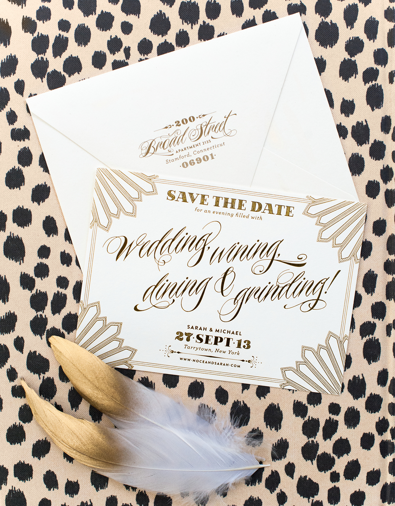
Sarah and Mike might just be the fun­ni­est clients I’ve had the plea­sure of work­ing with. Sarah’s vision for her wed­ding was a gor­geous affair inspired by Hol­ly­wood Regency details with lots of shim­mer­ing gold. And hip-hop. The two of them love their music and cer­tainly didn’t take them­selves too seri­ously. Their Save the Dates fea­tured a strong typo­graphic design with Regency details and slightly inap­pro­pri­ate language.

coral_pheasant_save_the_date_3_circus_carnival_illustration

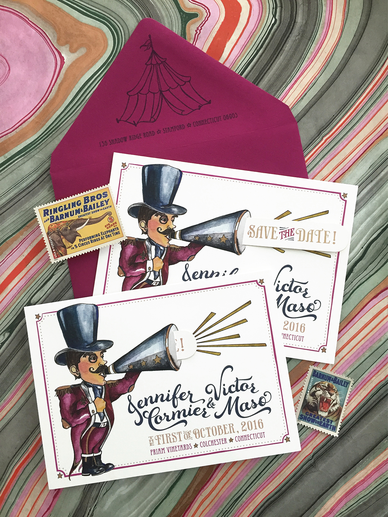
When your wed­ding is inspired by a vin­tage car­ni­val, what bet­ter than to “announce” it with an illus­trated pull tab Save the Date?! The cus­tom illus­tra­tion by Myr­tle and Lloyd incor­po­rates the wed­ding col­ors and a small slit in the mega­phone allows for a tab that, when pulled, reveals “Save the Date!” The enve­lope was flipped upside down so that the cir­cus tent above their return address fit sweetly onto the flap.

coral_pheasant_save_the_date_4_trifold_preppy_connecticut

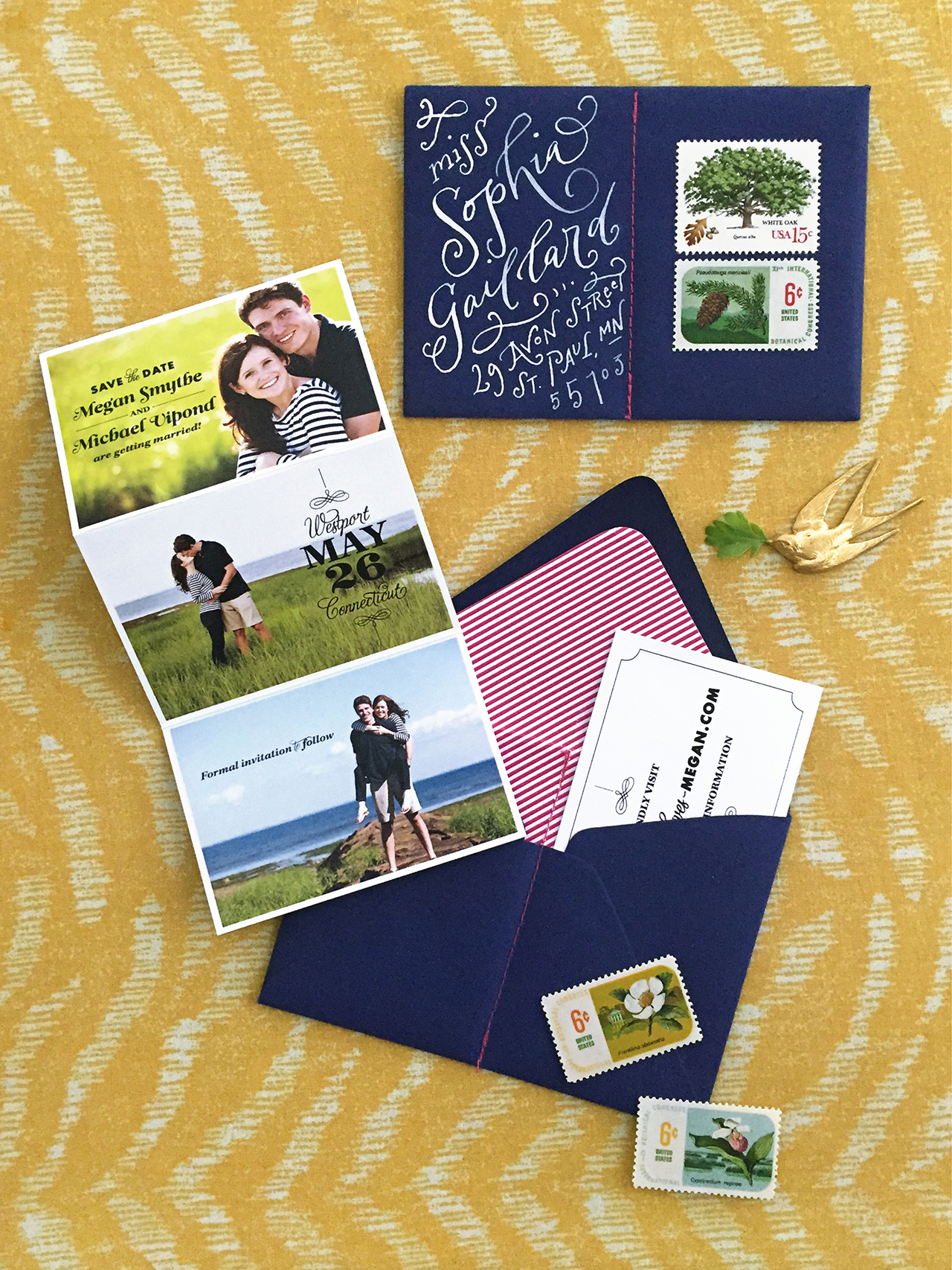
The first three exam­ples of Save the Dates were clearly derived from the couple’s indi­vid­ual wed­ding designs – but that’s not always the case. It’s per­fectly fine for your Save the Dates to be unique and sep­a­rate from your actual wed­ding. Megan and Mike wanted to use their engage­ment pho­tos and I – always lov­ing the chance to engage the guest – cre­ated a fold out card that showed sev­eral of them. The enve­lope was sewn in half to cre­ate two pock­ets. The photo card slipped into one side while the other pocket held a small card with their wed­ding website.

coral_pheasant_save_the_date_5_gold_foil_new_years_eve

When your wedding is on one of the most festive nights of the year, you werk it. New Year’s Eve, gold foil, festive language, fireworks. You get it. AmIright?!

coral_pheasant_save_the_date_6_yellow_blue_college_university_pennant

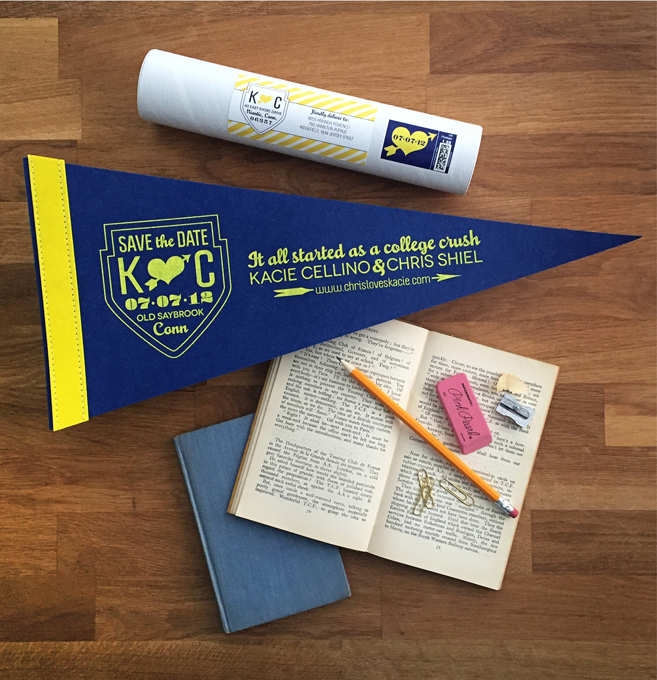
Kacie and Chris met and fell in love while stu­dents at Quin­nip­iac Uni­ver­sity. A cus­tom pen­nant in the university’s col­ors serves as their Save the Date. The pen­nant was rolled and mailed to guests in a mail­ing tube with a coor­di­nat­ing label and postage stamp.

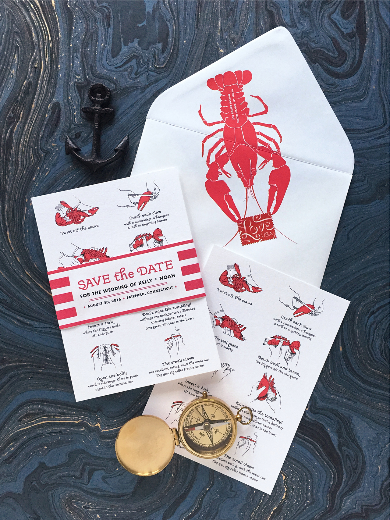
coral_pheasant_save_the_date_7_lobster_clam_bake_nautical

This casual clam­bake lob­ster fest wed­ding was announced with step-by-step instruc­tions on how to chow down. Their upcom­ing nup­tials are cer­tainly claws for cel­e­bra­tion! (See what I did there?!)

coral_pheasant_save_the_date_8_purple_plum_art_deco_magnet

A new take on a mag­net Save the Date. The announce­ment was printed on double-thick stock and the mag­net was mounted within a printed frame.

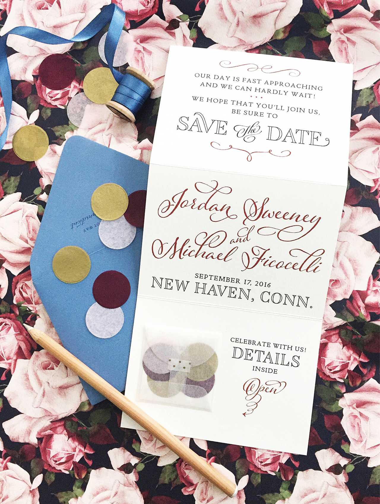
coral_pheasant_save_the_date_9_blush_pink_marsala_rustic_vintage_trifold_confetti

Jor­dan and Mike’s rus­tic vin­tage wed­ding will be held at the bride’s fam­ily home in Sep­tem­ber. Their tri­fold Save the Date unfolds to reveal the details and a lit­tle glas­sine enve­lope filled with coor­di­nat­ing con­fetti and a card with their wed­ding web­site. A vin­tage flo­ral pat­tern in their event col­ors appears on the reverse (that’s the flo­ral pat­tern seen in the back­ground) and hints at the event design dreamed up by Diana of Jubilee Events.

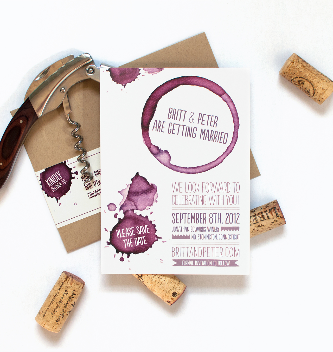
coral_pheasant_save_the_date_10_boozy_wine

When Britt described her ideal wed­ding as a “big fun boozy party” I knew we would have some fun with her Save the Dates. For these oenophile’s (aka wine lovers!), wine rings and splat­ters announce their wed­ding at Jonathan Edwards Winery.

Photo Credits: Coral Pheasant

Behind the Stationery: Red Cap Cards

What an honor to share with you all this next stationery duo’s journey. From Red Cap Cards, Carrie and Hal are here to share about the importance of pajamas, insight on working with illustrators and artists, and behind their new collaborative collection debuting at NYNOW in two short weeks! It’s amazing to see how they changed their career paths and adjusted their vision, individually and together. —Megan

Behind the Stationery: Red Cap Cards / Oh So Beautiful Paper

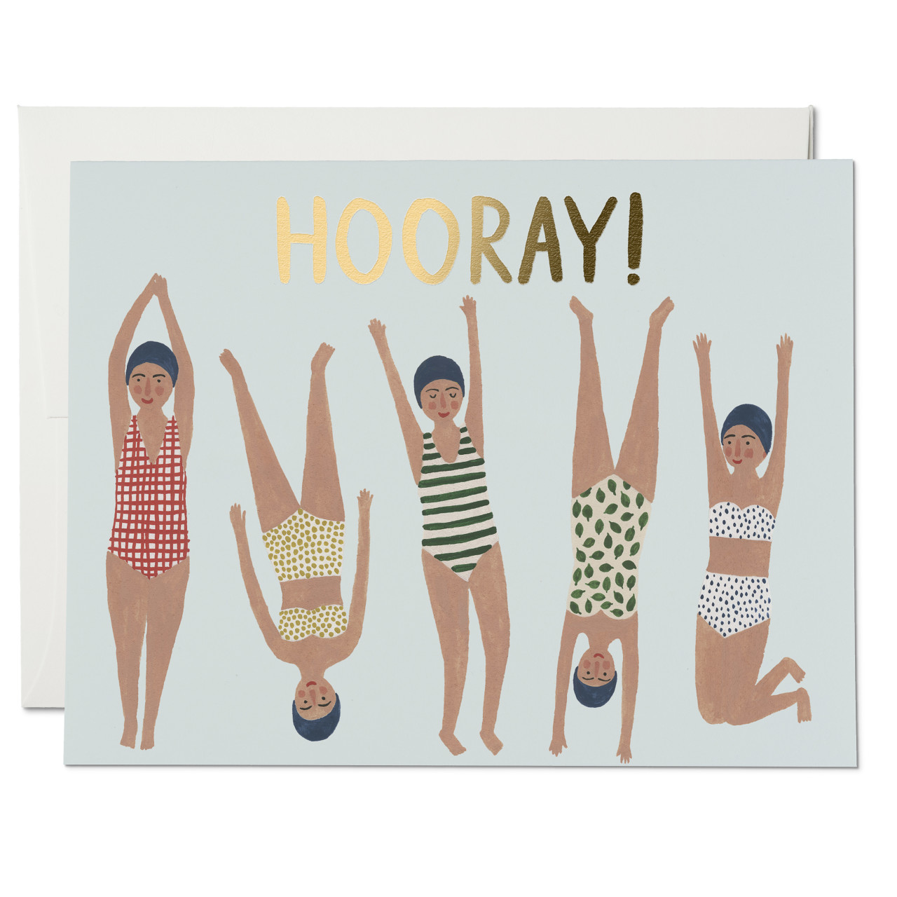
Hello! We are Carrie and Hal from Red Cap Cards. Our company is based out of Los Angeles, California. We are a stationery company that celebrates artists, creating a platform to share their work through beautifully designed paper products.

Our story began in 2005 when Hal and I decided we wanted to work together and create a lifestyle for ourselves that allowed us to be completely in charge of our own time. I think some people are just meant to work for themselves and that would be us. Hal and I both had different careers. He was running a coffee roasting business and I was a children’s theatre director. Although we were passionate about these careers, we decided to take a leap of faith and start a creative business that was in line with the creative vision we had for our life. At the time, I was illustrating cards as a hobby and people loved them. We recognized the potential in the concept of bringing amazing art and illustration to the doorstep (quite literally) of the masses. So, in our tiny West Hollywood bungalow, Red Cap Cards was born.
Behind the Stationery: Red Cap Cards / Oh So Beautiful Paper

Over time our company has evolved. In the beginning, I was the only illustrator and now we have over twenty different artists in our line—which is constantly evolving. We realized early on that we had loyal fan base and felt that this was ultimately the most valuable aspect of our business. So in 2007, we began collaborating with artists from all around the world. We started with a few artists that were friends of ours, and then we added more over time.
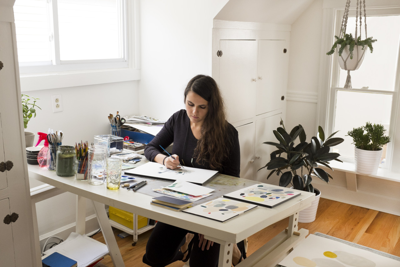
Behind the Stationery: Red Cap Cards / Oh So Beautiful PaperPhoto (courtesy) of Kate Pugsley

All of the artists that we have worked with have ended up becoming friends and members of a tight-knit family that we cherish. Creating amazing products is a wonderful part of our business but being champions for the artists we work with is our favorite part of our job. They are some of the most talented artists out there, and we consider ourselves lucky to introduce their work to a new collective.

Behind the Stationery: Red Cap Cards / Oh So Beautiful Paper

Hal and I have held true to our vision. We work from home and can pretty much do our job from anywhere, thanks to the magic of technology. We always start the day with coffee. This is an essential in our house! I’m typically in pajamas all day; this is the sad but awesome truth. Hal and I sit at one long desk in our office that we have had for 10 years. We also have an amazing team of writers and designers who all work from their own spaces, and this is by design. One thing Hal and I have never wanted to do was manage people. We never liked feeling micro-managed, and we believe that our business model is one that empowers people and leads to a richer quality of work. I love knowing almost everyone on our team is happy working from the studios that inspire them. The remote office is the only way to go for us! Pajamas for everyone!
Behind the Stationery: Red Cap Cards / Oh So Beautiful Paper

I retired from illustrating for Red Cap Cards in 2012 to take on the role as our creative director and collection curator. I spend most of my day working with our creative team, which consists of our artists, our amazing designer, Michelle, and Andie who writes our blog and helps with all things PR-related. Hal typically spends his day working with our logistics team which consists of Betsy, our wholesale manager and all around super star, Denise, who manages our warehouse in Minnesota, and Rich, who runs all of our print jobs here in Los Angeles.
Behind the Stationery: Red Cap Cards / Oh So Beautiful PaperPhoto by Carolyn Gavin

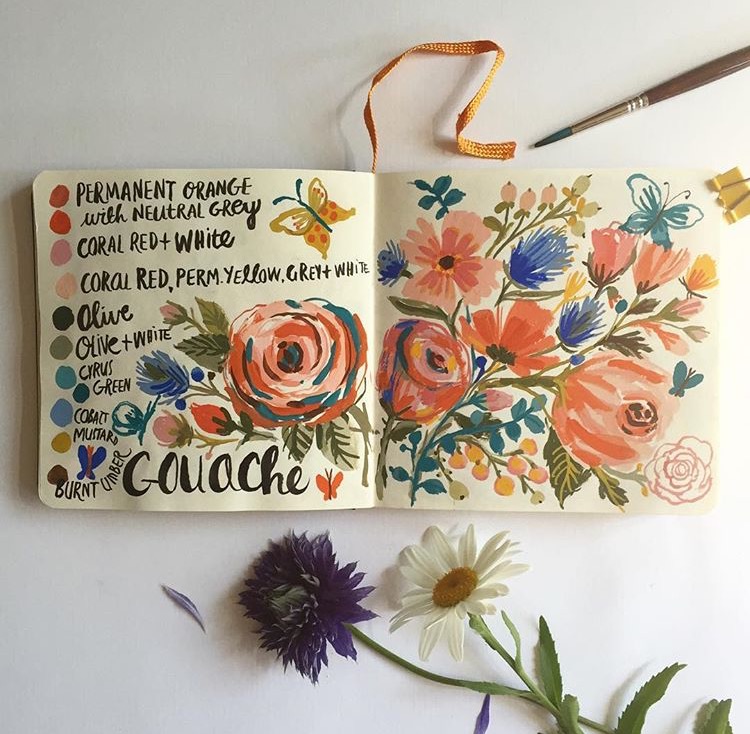
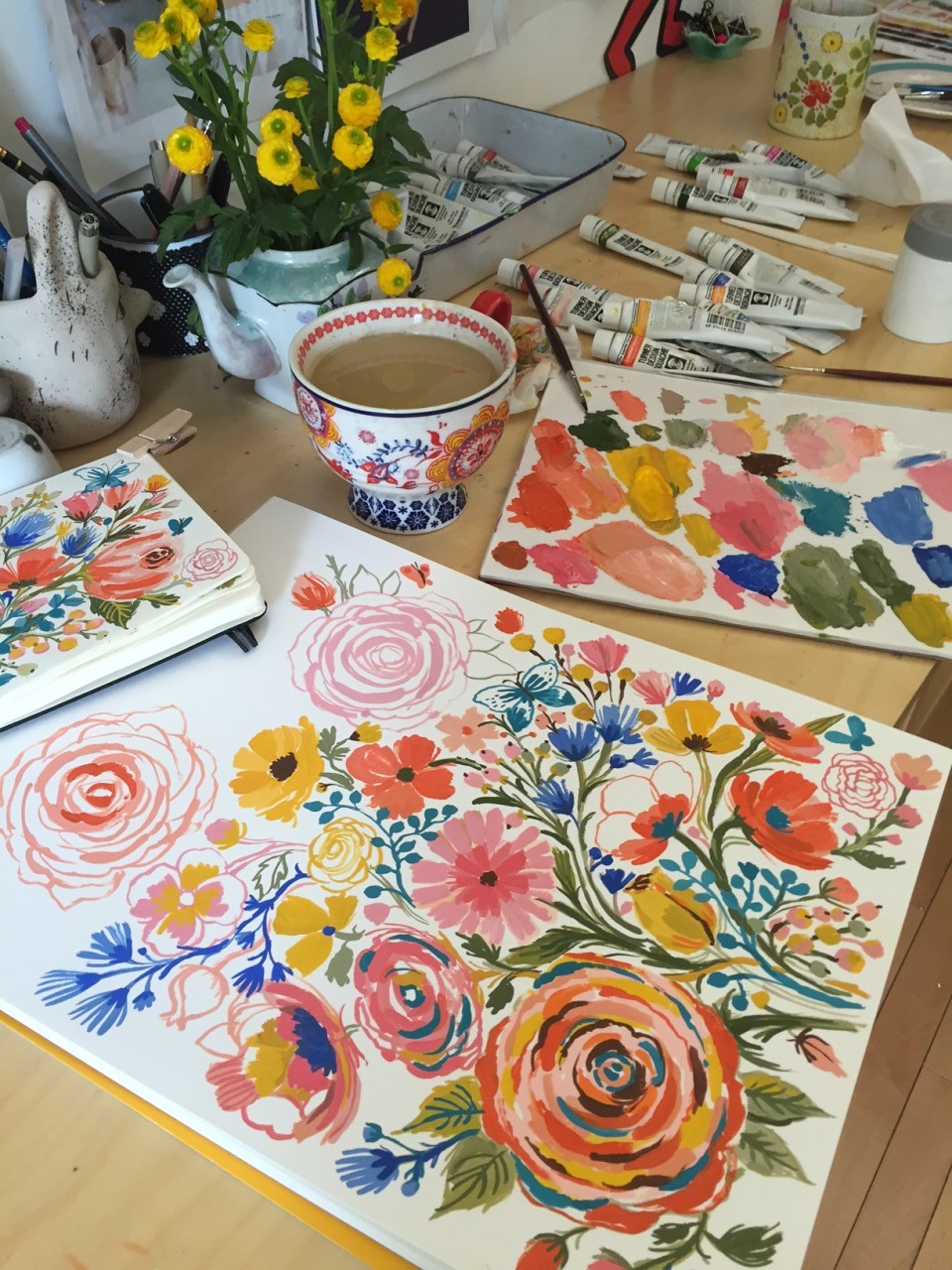
When creating a collection for Red Cap I always begin with the illustrator. I think about the unique perspective that the individual artist will bring to our line. Each artist we work with has their own approach to their work, which means that each process is a little bit different. Some artists love direction and others, not so much. We always suggest that greeting card occasions help to inspire the narrative in our cards, but we try not to let those occasions limit our artists or box them in. We want our artists to create work that they love, which is communicated through a “free” artistic process. That’s really important to us. Sometimes we have a general theme to help inspire a collection, and others times it’s random and very organic.
Behind the Stationery: Red Cap Cards / Oh So Beautiful PaperPhoto by Carolyn Gavin

I typically start the process by looking at their current body of work to help give them a general direction of what I feel would work on a card. Then we start a conversation about the kind of collection they’d like to create. The challenge in working with many different artists is creating a cohesive collection. Our goal is to curate a line that harmonizes together, but one that allows each card to stand independently on its own.
Behind the Stationery: Red Cap Cards / Oh So Beautiful Paper

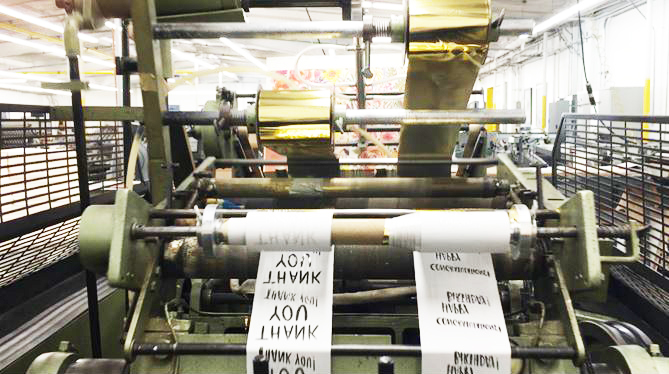
We use several different types of printing processes including offset and gold foil-stamping, and have a special collection of spot color Pantone® cards. All of our products are printed and manufactured right here in Los Angeles and are quality checked by our standards. Behind the Stationery: Red Cap Cards / Oh So Beautiful Paper
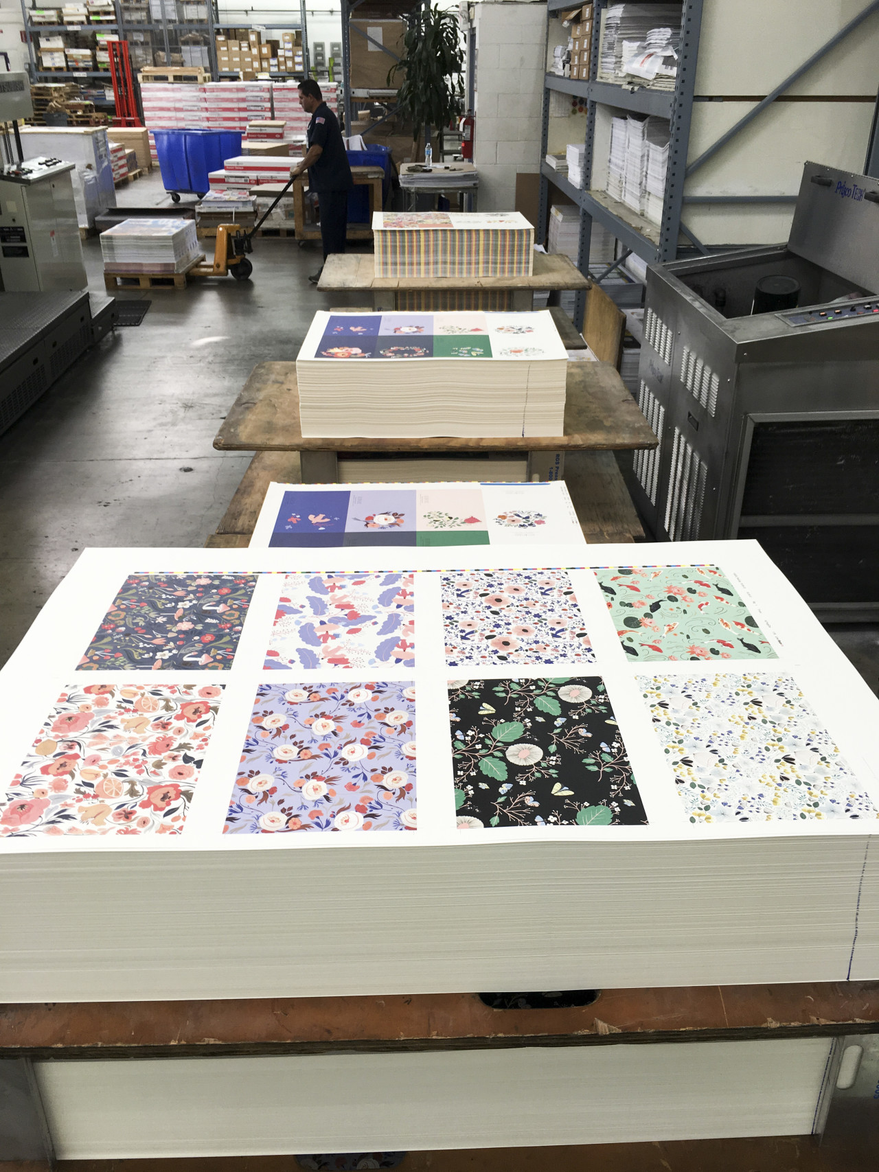
We show up at 9am for every press run and are there as our printers deliver the cards into our hands hot off the presses. We adore our pressmen, some of whom have been in the printing business for over thirty years!
Behind the Stationery: Red Cap Cards / Oh So Beautiful Paper

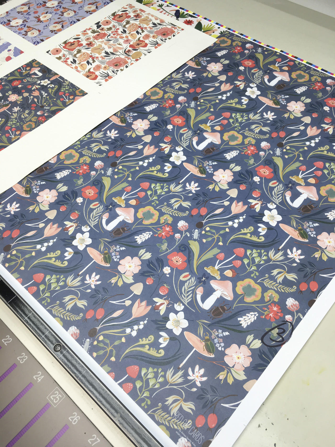
We adjust colors until they are as close to perfect as we can get, which can be a difficult process. Certain colors are hard to print, and we want to get them just right! After our cards are printed, we send them to our awesome warehouse in Minnesota, which is another business run by a husband-and-wife team. We love them dearly! They do an amazing job.
Behind the Stationery: Red Cap Cards / Oh So Beautiful Paper

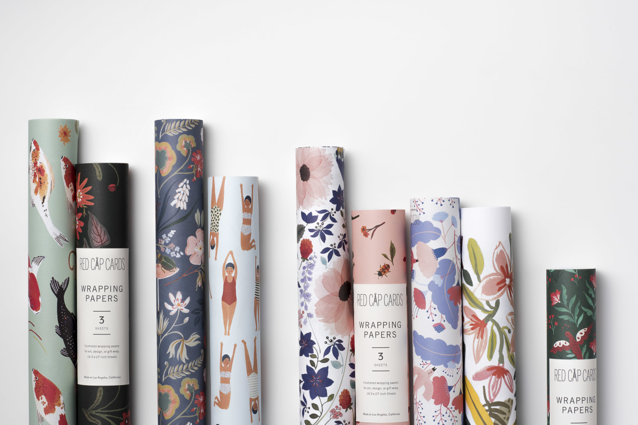
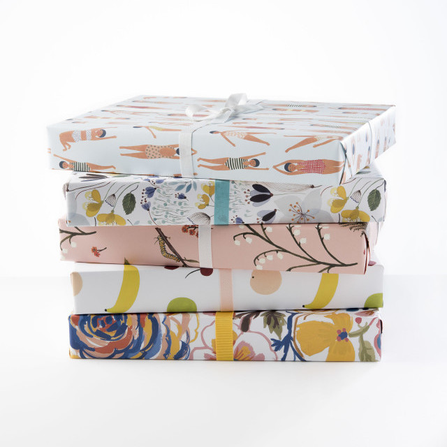
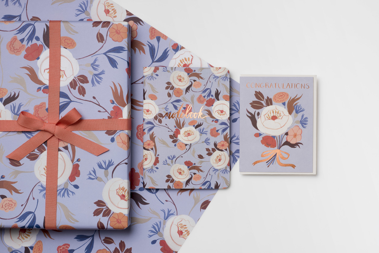
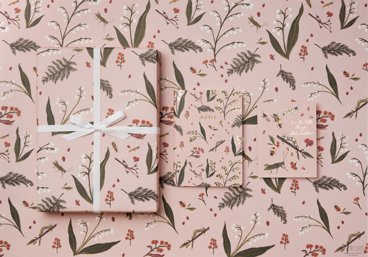
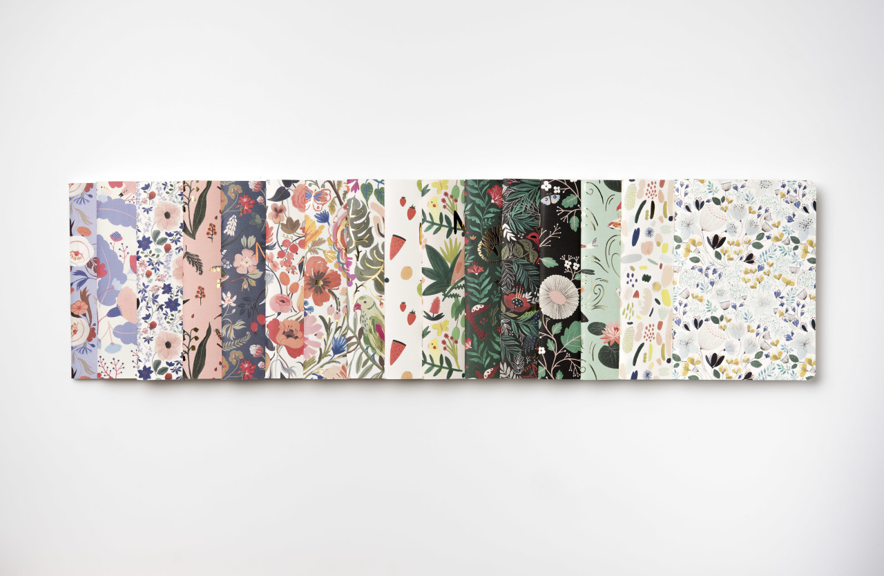
Recently, seven of our artists came together to create our first line of coordinating wrapping paper, notebook and greeting card suites. I wanted this collection to be a stunning showcase of how well our artists work together while remaining completely true to their individual vision. In order to do this, I had our artists create color stories that they shared with one another. The idea was to allow the different color stories inspire each other’s work.
Behind the Stationery: Red Cap Cards / Oh So Beautiful Paper

This was a really fun way to for our artists to play with one another and create a collection that harmonized in color. I’m so happy with the end result. We really do work with some of the most talented artists in the world, and wouldn’t trade it for anything. We hope that our labor of love comes through to the customers who buy our cards. This collection will be debuting at NYNOW on August 20th at the Crow & Canary booth!
Behind the Stationery: Red Cap Cards / Oh So Beautiful Paper

Hal and I are beyond grateful to be living such a wonderful life surrounded by so many talented people. If you would have asked me when I was a kid if I would grow up to run a stationery company, I would have laughed. I love how life can surprise you. I’m excited about the unknown future of Red Cap and I feel so much gratitude for folks like Oh So Beautiful Paper who have supported us from day one. That means the world to us.
Behind the Stationery: Red Cap Cards / Oh So Beautiful Paper

All photos taken by or for Red Cap Cards except where noted.

Interested in being featured in this column? Reach out to Megan at megan [at] ohsobeautifulpaper [dot] com for more details!
Wedding Invitation 101: Where to Start

Happy Monday everyone! I’ll be away for a couple of weeks to catch up on some personal things, but I’m leaving you in EXCELLENT hands while I’m away! Ashley from Fine Day Press graciously agreed to fill in for me this week, and we’re kicking things off with the first installment in a series of posts about wedding invitations! It’s a wonderful primer for anyone feeling overwhelmed by the world of wedding invitations and save the dates. Welcome Ashley!! –Nole

Invitation-101-Where-to-Start-Title

Hey there! Ashley Austin from Fine Day Press here. Nole has kindly invited me to guest blog this week, and I’m super-duper excited to be here sharing some fun posts with you all! Today we’re kicking off a weekly series all about wedding invitations called Wedding Invitation 101. Invitations are a big part of what I do over at Fine Day Press, in addition to greeting cards, calendars and other paper goodies. Over the years, I’ve learned a few tricks to streamline the process, and I’m sharing them with you here.

WHERE TO START

Your wedding invitations are often the first thing your guests will see; it should represent the spirit of the day and set the tone. It’s never too early in the planning process to start envisioning your dream invitations!

Will your wedding be a formal affair or is it more of a barefoot-on-the-beach event? Think about your style as a couple – does gold foil on navy stock suit your style, or will you go for a more romantic vibe with something hand-illustrated?

Maybe you’ve determined your wedding location, chosen your dress, flowers or even selected your color palette… All of these details can inspire your invitation suite.  But even if you haven’t figured those biggies out, you can still start dreaming up your perfect paper pairing.

FIRST STOP: GET INSPIRED!

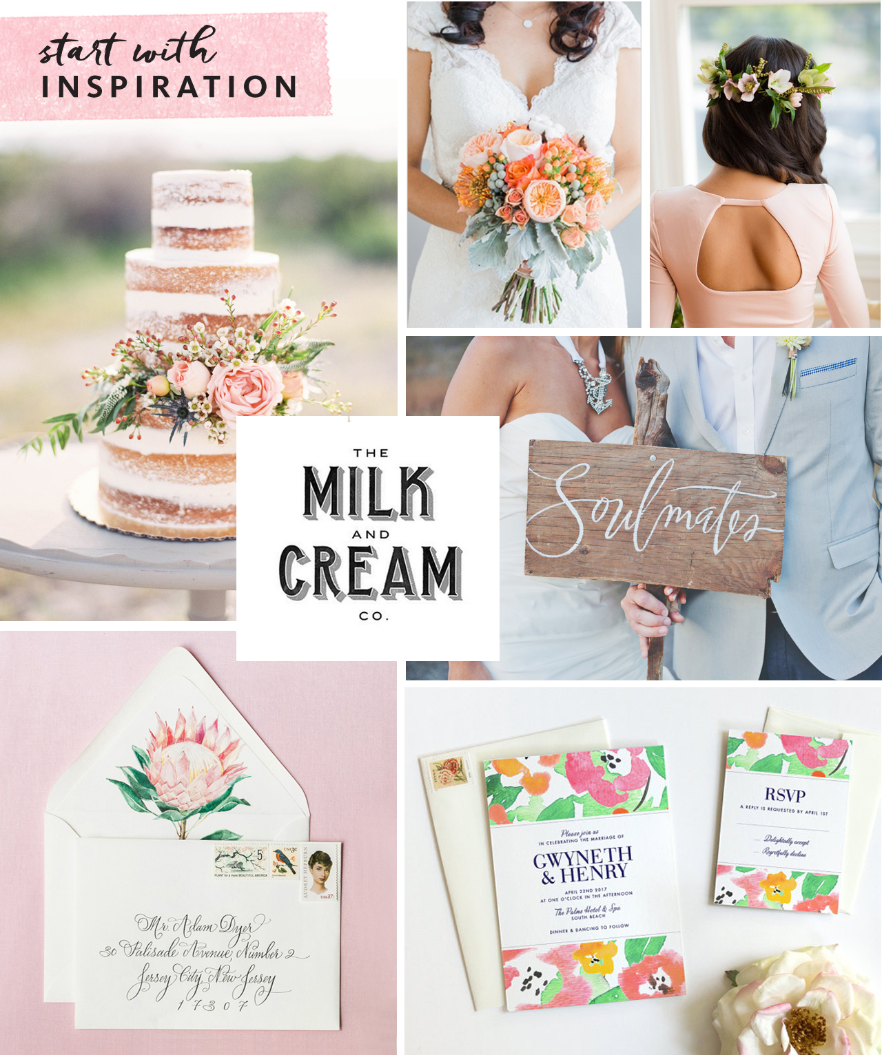
Collecting inspiration is a great way to kick off the process. This could be as simple as making a folder on your computer to save images as you’re browsing wedding blogs, clipping things out of magazines, or creating a Pinterest board specifically for invitation ideas (my personal favorite!). Below is an inspiration board I’ve created for example:

Invitation-101-Where-to-Start-1

Clockwise from top center: Bouquet via Southbound Bride; Hairstyle via Refinery29;  Soulmates painted sign Julie Song Ink; Invitation by Fine Day Press; Envelope & liner by Lana’s Shop; Naked cake via Wedding Sparrow; Milk & Cream type via Pinterest

Don’t just collect examples of invitations – think about colors, textures, ribbons, flowers, anything that might inspire you – like a throw pillow that’s the perfect shade of coral or the lace detail on the back of a dress.

Start researching stationery shops (whether brick & mortar or online) to identify a few you might like to work with. Found a stationer you like? Most stationery companies allow you to order a sample, so that you can see the paper and quality in person before committing to a bigger purchase. Local shops will have samples on hand for you to touch and feel.

CUSTOM OR READY-MADE?

There are as many ready-made invitation styles out there as there are brides-to-be, and finding an existing design can be a great option. Your selected design can often be customized with your colors and typography choice, among other details.

If you love being part of the creative process, or have a very specific design idea for your suite, a custom design may be for you. Crafting a custom design typically takes longer and may involve an initial meeting, moodboard development (this is where that inspiration you’ve collected comes in handy), and multiple rounds of design development. Budget will come into play here as well, as creating a from-scratch design requires significantly more hands-on time and pricing usually reflects this.

TO SAVE OR NOT TO SAVE

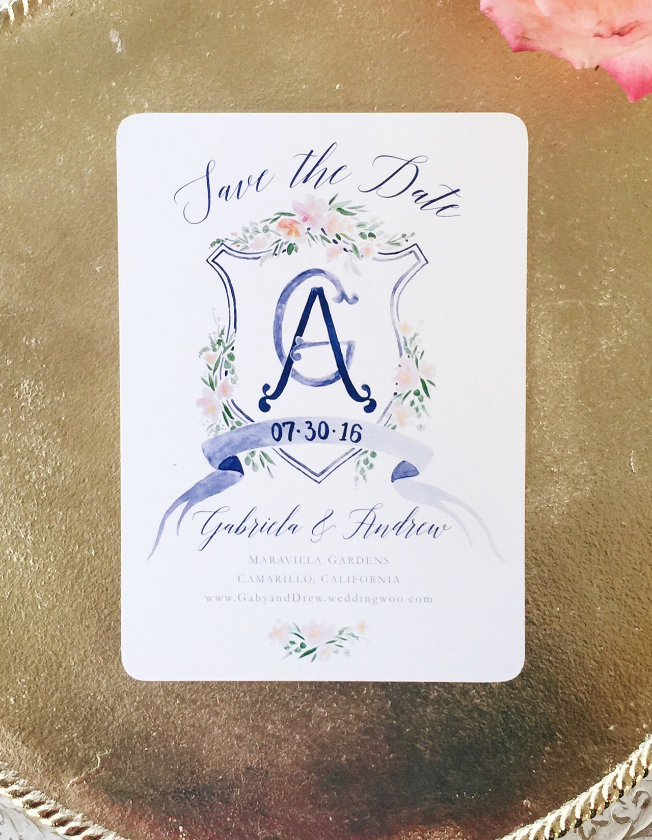
Sending out a Save the Date is a great way to give everyone on your list a heads up on your plans, and set the tone for the invitation to follow. Save the Dates are a great opportunity to do a less formal version of your invitation – for example, a magnet, a balloon or even a temporary tattoo are fun ideas! If you are having a destination wedding in a far-flung locale, a Save the Date is a must, in order to give your guests sufficient time to plan their travels.

Invitation-101-Where-to-Start-2

A beautiful printed Save the Date from Designer Rolodex member Sable & Gray

Are mailed Save the Dates a must-do? Not necessarily! If you are getting out your invitations super early, you could skip it. Or perhaps your wedding is small enough that word of mouth is sufficient until the invitations are sent. Some folks may prefer to send a digital Save the Date. This can also serve to direct guests to your wedding website. Keep in mind, though, that less digitally-savvy relatives (hi, Grams!) may feel left out with this option.

We’ll cover invitation timing in greater detail in a future installment of this series!