Rustic Orange, Navy, and Wood Rehearsal Dinner Invitations

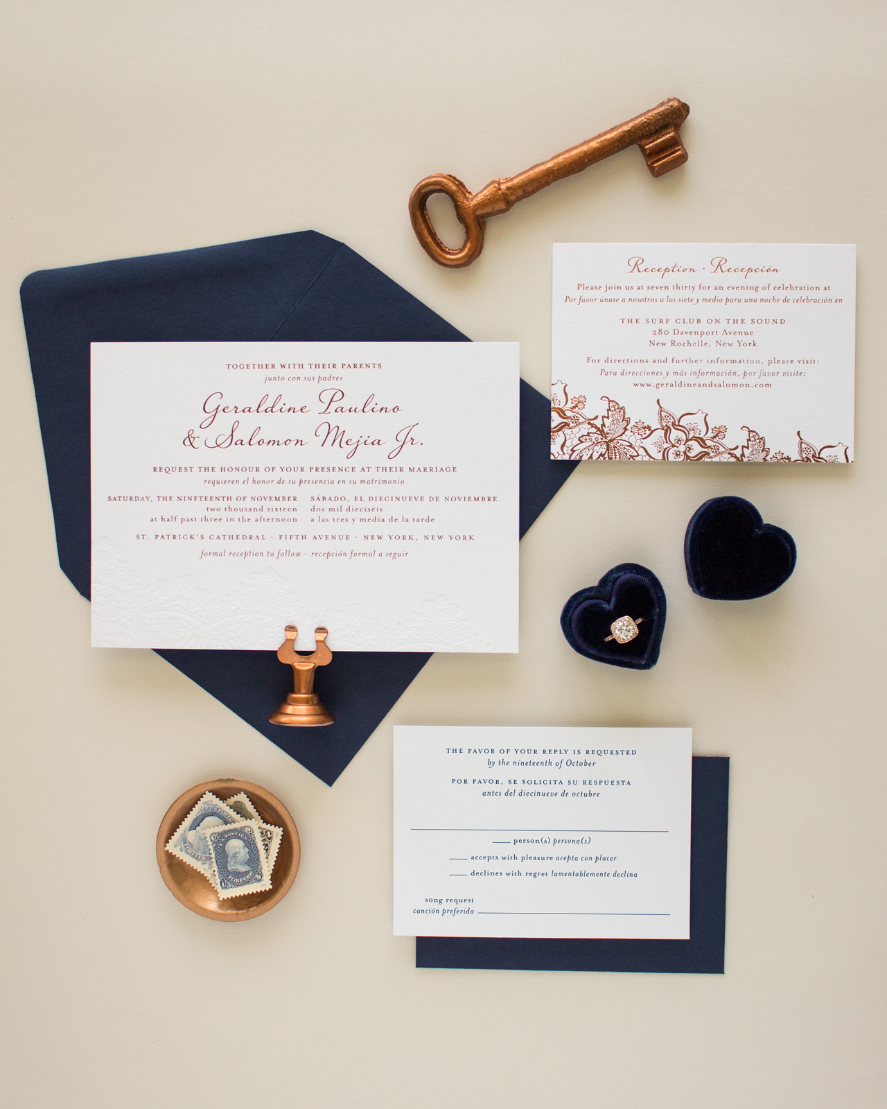
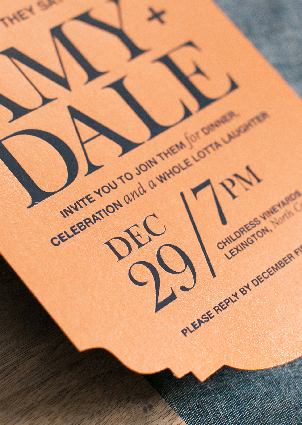
Crisp and refined, with a hint of prep and elegance! Melissa of Atheneum Creative created these rustic orange, navy, and wood rehearsal dinner invitations for Dale Earnhardt Jr. and his then-fiancée Amy Reimann. We’re loving the unique die cut shape and the walnut wood veneer pocket sleeves – the perfect mix of modern and rustic!

Rustic Orange, Navy, and Wood Rehearsal Dinner Invitations by Atheneum Creative

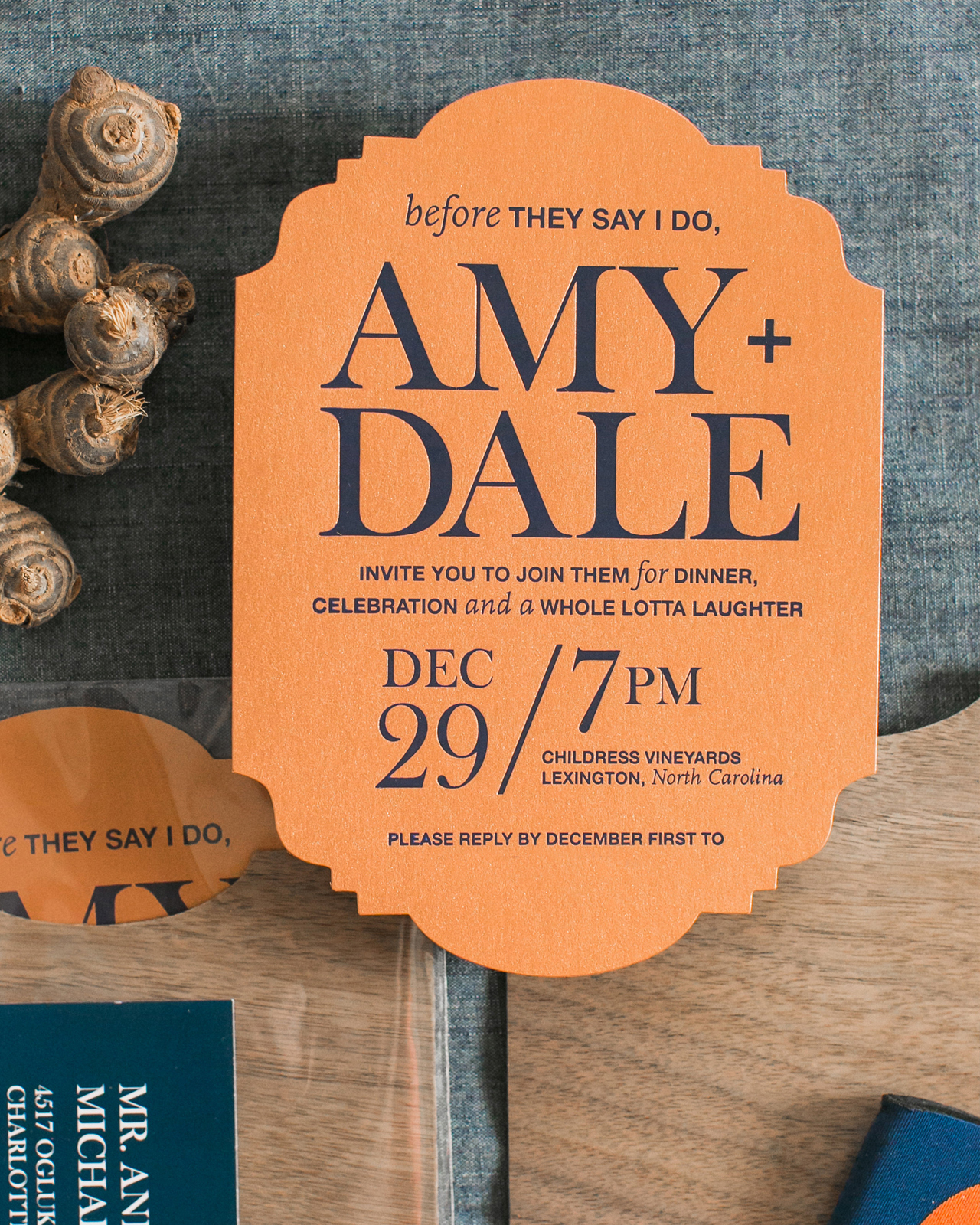
From Melissa: Amy and Dale are such a fun couple. While their wedding was on New Years Eve and had the look and feel of an energetic disco ball, their rehearsal dinner had a completely different feel. With denim and orange as their color palette, paired with a more rustic aesthetic, we knew the invitation needed to both set the tone for the rehearsal dinner and be starkly different from the look and feel of their wedding invitation and wedding materials.

Rustic Orange, Navy, and Wood Rehearsal Dinner Invitations by Atheneum Creative

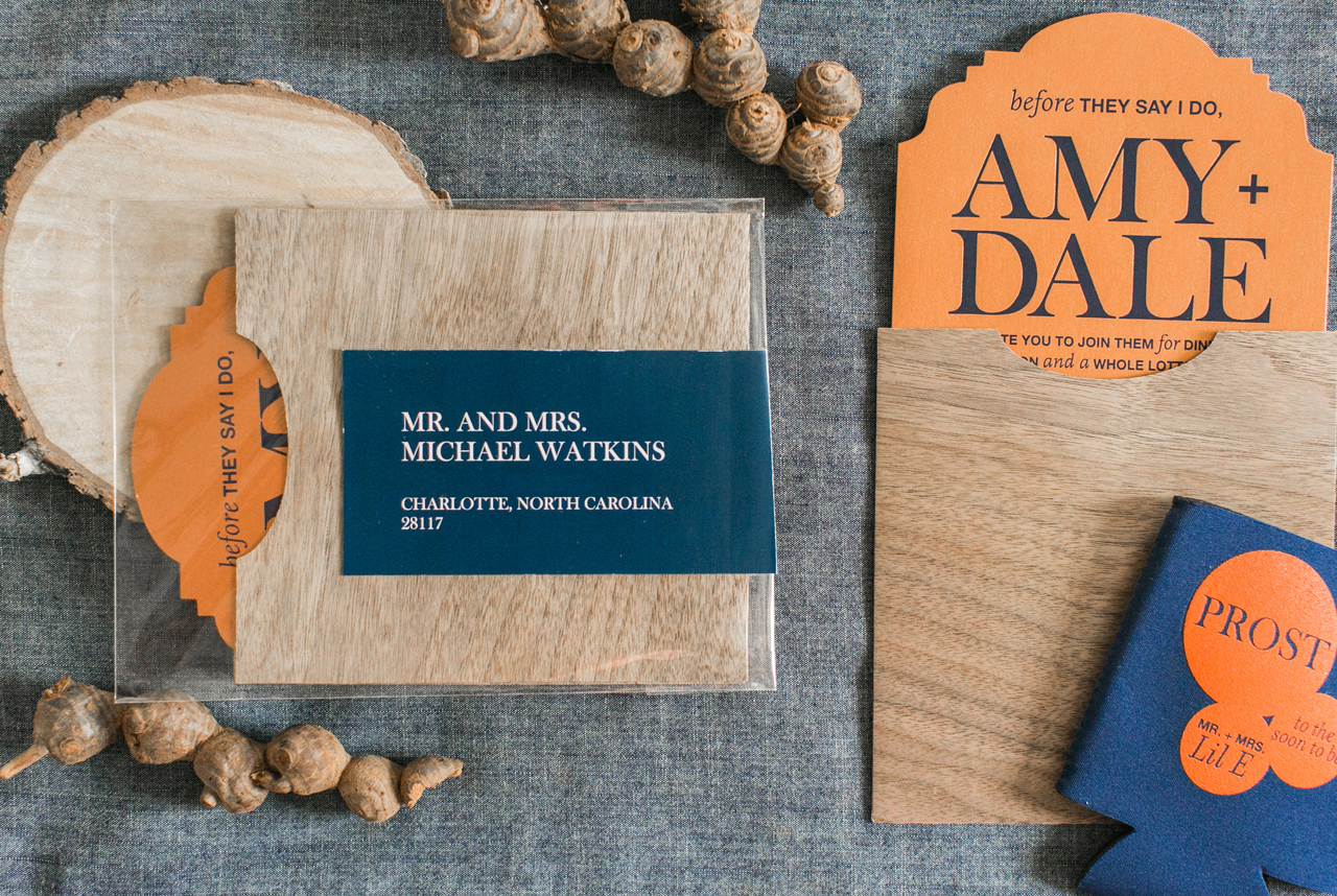
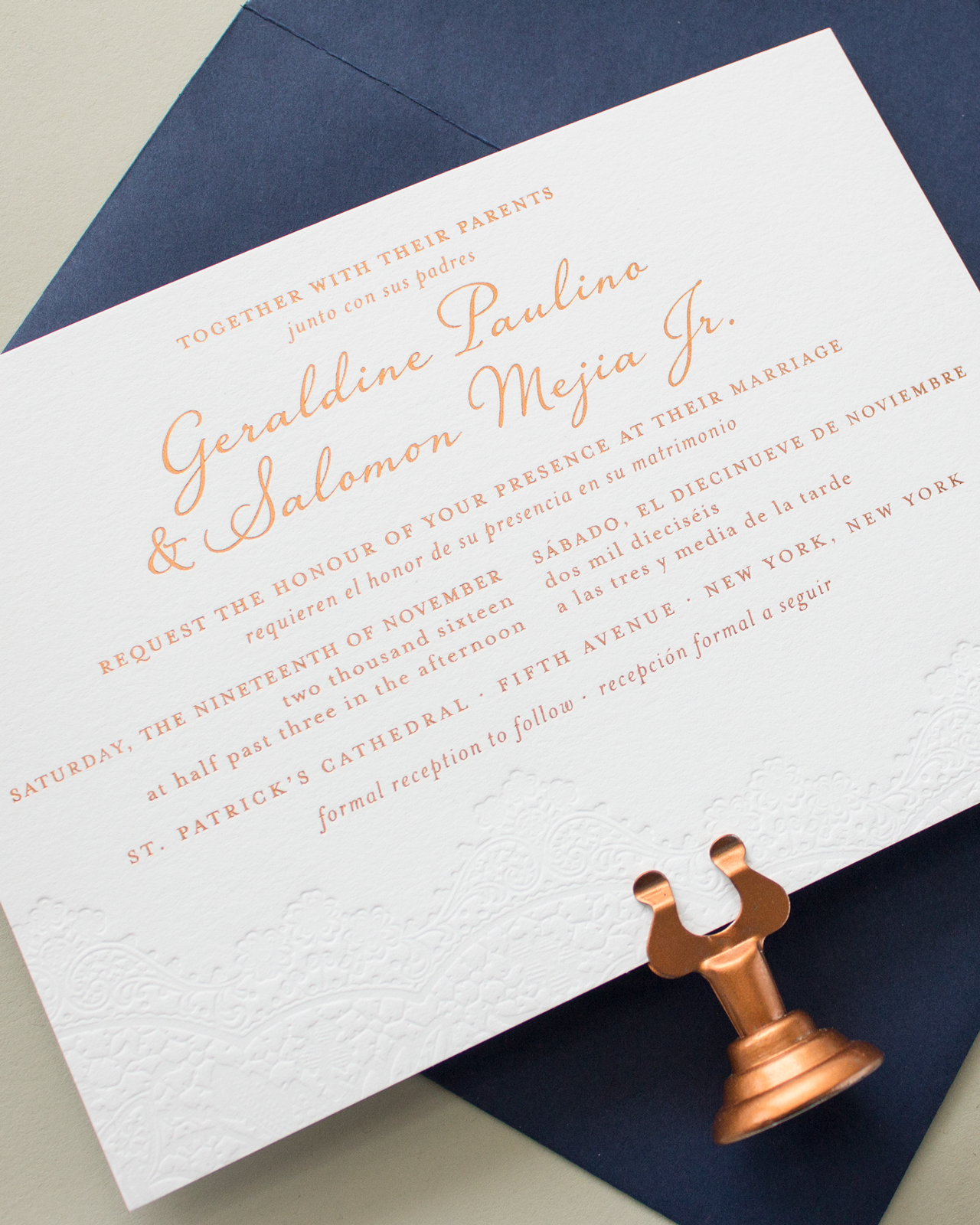
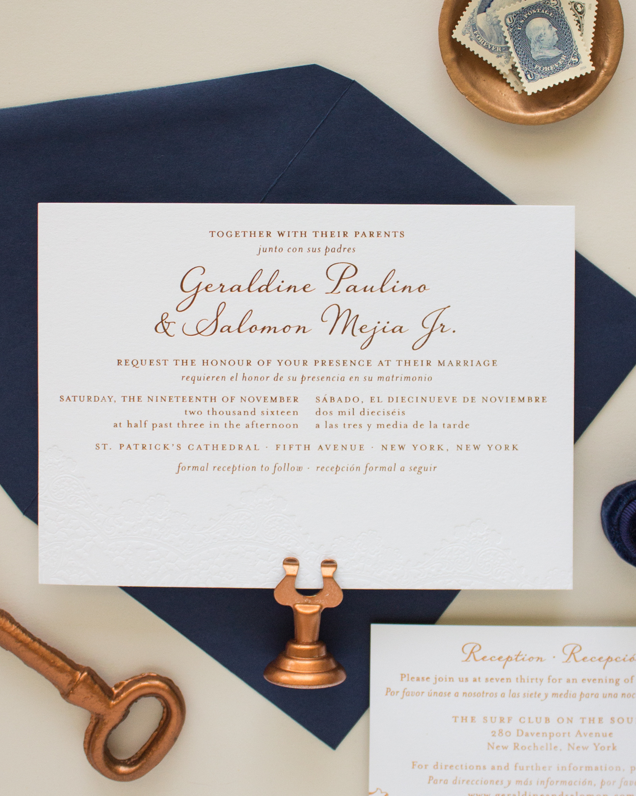
We built a custom pocket from walnut wood veener to hold the invitation. The invitation itself is printed with a navy blue foil on an orange paper and die cut to create the unique shape. For the invitation typography and design, we wanted to keep a mix of modern and rustic with fun pops like the date and time. Whenever we have the opportunity to play with the invitation wording, we always try to give the invitation a little bit of extra fun. Invitation wording is just as important as the overall design for setting the tone for an event.

Rustic Orange, Navy, and Wood Rehearsal Dinner Invitations by Atheneum Creative

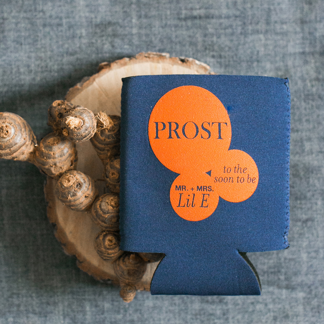
We wanted the guests to experience the feel of this party the second they got the invitation in their stack of mail. We mailed the invitation suite in a crystal clear envelope with a wrap around address label. By using this envelope the guests could see all the colors of the wood, orange, and navy before they even opened the envelope. We also worked on a day-of few items for their guests for the rehearsal dinner, including a koozie printed with the reverse color scheme – orange ink on navy fabric.

Rustic Orange, Navy, and Wood Rehearsal Dinner Invitations by Atheneum Creative

Thanks Melissa!

Design: Atheneum Creative

Atheneum Creative is a member of the Designer Rolodex – you can see more of their beautiful work right here or visit the real invi­ta­tions gallery for more wedding invitation ideas!

Photo Credits: Chelsea Davis Photography

Stationery A-Z: Will You Be My Bridesmaid Cards

Since winter is the most popular time of the year to get engaged, chances are there are a few of you getting ready to ask friends and family to be in your wedding party! If you aren’t able to ask in person, we HIGHLY recommend sending a beautifully designed card to ask that all important question. Although bridesmaid cards are the main our roundup below, we know and love that wedding parties come in all shapes, sizes, and roles. There’s pretty much every option you can think of available, but we’ve selected our favorites below:

Stationery A-Z: Will You Be My Bridesmaid Cards

From top right:

1. “Will you be my bridesmaid pretty please?” asks this rather polite pale pink and gold foil design from Sugar Paper.

2. Make a wedding party obligation cheeky, with this gold foil and hand lettered sentiment from Ashkahn.

3. Brides get a bad rap. Poke fun at stereotypical bridezilla antics while asking your BFF to be your MOH (via Ladyfingers Letterpress).

4. Archer and Olive will take your request one step further by personalizing your intended’s name right on the card.

5. Don’t forget to thank those hard working gals (and guys) for their time and unending commitment to your big day with this floral illustration from Banquet Workshop.

6. Beautifully painted flowers and elegant hand lettering from Shannon Kristen Studio.

7. Prescription drugs aside, this Emily McDowell design also features a clever use of post-its and checkboxes.

8. Surprise your bestie with this super fun scratch-off greeting from Inklings Paperie.

9. Groomsmen are people too. This handsome number comes courtesy of Paper Tie Affair.

10. Not simply a gold foil sentiment, “bride tribe” is also a temporary tattoo. Bachelorette party perhaps? Via Daydream Prints.

11. Perfect for a rustic setting, this Pen + Pillar design features a painted backdrop and elegant hand lettering.

12. Yet another beautiful hand lettered and dip dyed design (via Moglea).

Bilingual Copper Foil and Blind Letterpress Wedding Invitations

If you can’t have a typical destination wedding, why not bring the destination home to you? Sarah from Banter & Charm designed these bilingual copper foil and blind letterpress wedding invitations as a nod to both the English and Spanish heritage of the couple! A delicate blind letterpress printed lace-inspired design was the perfect way to complement the festive copper foil details!

Bilingual Copper Foil and Blind Letterpress Wedding Invitations by Banter and Charm

From Sarah: Copper foil and blind letterpress with navy accents – it’s no wonder that Geraldine and Salomon’s wedding invitation suite is one of my favorite designs from the past year. Geraldine came to me looking for a custom invitation design to accommodate the bilingual wording she and her fiancé would be using for their New York wedding. Since Geraldine and Salomon were inviting guests that spoke both English and Spanish, they wanted to include both languages in their wedding stationery.

Bilingual Copper Foil and Blind Letterpress Wedding Invitations by Banter and Charm

Instead of having two separate invitations, they decided to go with a bilingual design that incorporated both languages on a single card. Geraldine knew she wanted a romantic design, and really wanted to incorporate a vintage lace graphic with blind letterpress printing. She loved several of the designs from my invitation collection, but we decided to go with a custom design to accommodate the additional wording she needed.

Bilingual Copper Foil and Blind Letterpress Wedding Invitations by Banter and Charm

The final invitation design featured a gorgeous blind letterpress printed lace detail along the bottom edge, with copper foil printing for the text, all on Crane’s Lettra paper in Fluorescent white. With so much text to include, we needed to get creative on the layout. By using italics for the Spanish wording, we were able to distinguish between the two languages while keeping the design cohesive.

Bilingual Copper Foil and Blind Letterpress Wedding Invitations by Banter and Charm

The reception card was also bilingual, and featured copper foil printing for all the elements. I love the contrast of the subtle blind letterpress printed lace on the invitation with the bold copper foil lace on the reception card. To bring in some color, we went with navy ink in flat printing for the response card. The navy ink added a great pop of color, and by using flat printing for the response card we were able to keep costs down.

Bilingual Copper Foil and Blind Letterpress Wedding Invitations by Banter and Charm

I absolutely love the way this suite turned out. Copper is my new favorite foil, and I have a feeling I’ll be using it a lot in the future.

Bilingual Copper Foil and Blind Letterpress Wedding Invitations by Banter and Charm

Thanks Sarah!

Design: Banter & Charm

Banter & Charm is a member of the Designer Rolodex – you can see more of their beautiful work right here or visit the real invi­ta­tions gallery for more wedding invitation ideas!

Photo Credits: Banter & Charm

Illustrated Farm to Table Inspired Wedding Invitations

When you’re getting married at a farm-to-table restaurant inside a gorgeous refurbished barn in upstate New York, why would you look anywhere else for your wedding invitation inspiration? Enter these gorgeous illustrated farm to table inspired wedding invitations with rich natural hues and stunning copper foil details from Rachel of Robinson Press! From the save the date card inspired by an antique seed packet to the sophisticated navy wedding program, every stationery element from this farm to table wedding is perfect for a crisp fall wedding!

Illustrated Farm to Table Inspired Wedding Invitations by Robinson Press

From Rachel: Hope and Miles wanted to build excitement for their farm to table wedding celebration at the esteemed Blue Hill at Stone Barns restaurant. We decided to base the save the date design on antique seed packets. The save the date was letterpress printed in three colors on Reich Savoy double thick cotton paper.

Illustrated Farm to Table Inspired Wedding Invitations by Robinson Press

The invitation evolved from there to include antique botanical illustrations, mixed with artful borders, and hand calligraphy of the couple’s names and return address by Jenny at Leveret & Hare.

Illustrated Farm to Table Inspired Wedding Invitations by Robinson Press

We added some copper foil details and enlarged a lavender illustration to create an abstract foil printed envelope liner. We letterpress printed it all on Reich Savoy double thick cotton paper, enlisting the help of our pals at DWRI Letterpress in Providence.

Illustrated Farm to Table Inspired Wedding Invitations by Robinson Press

We used Colorplan amethyst RSVP envelopes for a pop of dark purple here and there. We took the printed suite to our friend Angela at Studio Carta and spent way too long trying out different colors and styles of ribbon for the perfect complement to tie together the four coordinating pieces. Settling on a metallic copper ribbon, we then sent the outer envelopes off for calligraphy addressing by Jenny at Leveret & Hare.

Illustrated Farm to Table Inspired Wedding Invitations by Robinson Press

Meanwhile, for the wedding programs, we designed and hand-bound 150 passport sized booklets with Italian parchment endpapers and waxed Irish cotton linen book thread. We made further use of the beautiful borders and botanicals for escort cards, table names, and welcome notes.

Illustrated Farm to Table Inspired Wedding Invitations by Robinson Press

Thanks Rachel!

Design: Robinson Press

Calligraphy: Leveret & Hare

Foil Printing: DWRI Letterpress

Ribbon: Studio Carta

Bookbinding Supplies: Talas Bookbinding

Paper: Reich Paper and Colorplan Paper

Robinson Press is a member of the Designer Rolodex – you can see more of their beautiful work right here or visit the real invi­ta­tions gallery for more wedding invitation ideas!

Photo Credits: Rachel Robinson

Backyard Black Tie Wedding Invitations

Sophisticated yet laid back. These backyard black tie wedding invitations from Ashling of Lotus & Ash welcomed guests to a barefoot, relaxed, and formal wedding celebration. We love the juxtaposition of high fashion and low-key relatability! This is such a fun suite, including nods to the couple’s collegiate days where they first met. The modern calligraphy by Nicole Miyuki and classic serif typefaces make the perfect final detail of juxtaposition to pull it all together!

Backyard Black Tie Wedding Invitations by Lotus & Ash

From Ashling: As a wedding invitation designer, it’s what I’ve come to call the “triple crown” – a collaborative bride with impeccable taste, a film-worthy love story over a decade in the making, and a shared goal to design a suite that was traditional and timeless, but didn’t take itself too seriously.

Backyard Black Tie Wedding Invitations by Lotus & Ash

The mature, edgy, and meaningful invitation suite was such a trifecta. The thread for their wedding weekend was “Black Tie and Barefoot,” and it lived every bit up to its promise. The couple was married in front of the groom’s childhood home, followed by an elegant black tie reception held in the backyard. The celebration ended with an after party in the pool house, and the bride and groom jumping, fully clothed, into the pool.

Backyard Black Tie Wedding Invitations by Lotus & Ash

When Steph and Mark first came to us to design their full wedding stationery suite in less than 5 months, we were beyond excited for the opportunity, but needed to get their save the dates out quickly. Still unsure of what their exact wedding aesthetics would be, we celebrated their days as Stanford students with a save the date that incorporated watercolor university ephemera and a portrait of the fraternity house where they first met. We incorporated a vintage map of Stanford from the couple’s collection as a personal, colorful envelope liner.

Backyard Black Tie Wedding Invitations by Lotus & Ash

As the details came together for Steph and Mark’s backyard, black tie wedding, we knew we wanted to create something that was both sophisticated and formal, yet fun and modern. Aubergine envelopes with brush calligraphy opened to reveal a Carrara marble liner and foil-stamped pocket, inspired by the wedding decor.

Backyard Black Tie Wedding Invitations by Lotus & Ash

The letterpress announcement, printed on the ever gorgeous 2-ply Crane’s Lettra, featured modern calligraphy paired with a classic serif typeface and a blind deboss detail on both the front (the couple’s monogram) and back (a rose pattern). The suite also included weekend details and reply cards with arresting typography, dark floral photography, and haphazard black watercolor swashes, digitally printed on an Indigo press on #130 Classic Crest.

Backyard Black Tie Wedding Invitations by Lotus & Ash

Backyard Black Tie Wedding Invitations by Lotus & Ash

Our personal favorite element from the suite? It’s nearly impossible to choose, but the attire card takes the crown. It featured glassine envelopes filled with colorful swatches to inspire guests attire and the instructions “black tie invited, shoes optional.” In our dream world, that would be the requested dress code for all weddings!

Backyard Black Tie Wedding Invitations by Lotus & Ash

Thanks Ashling!

Design and Illustration: Lotus & Ash

Calligraphy: Nicole Miyuki

Letterpress Printing: Dependable Letterpress

Foil Printing: JR Press

Check out the Designer Rolodex for more tal­ented wed­ding invi­ta­tion design­ers and the real invi­ta­tions gallery for more wedding invitation ideas!

Photo Credits: Katrina Jayne Photo