Jennifer + Barron’s Gold Foil Watercolor Crest Wedding Invitations

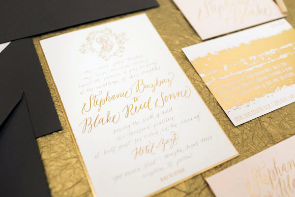
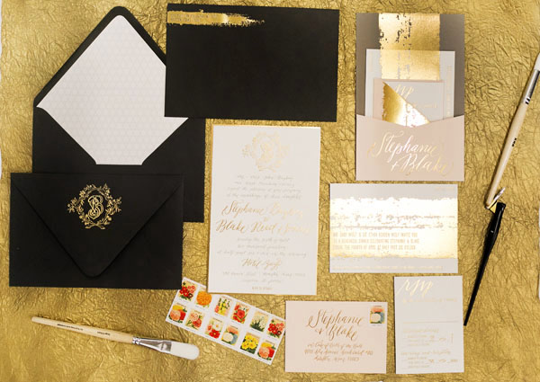
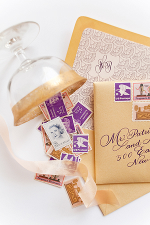
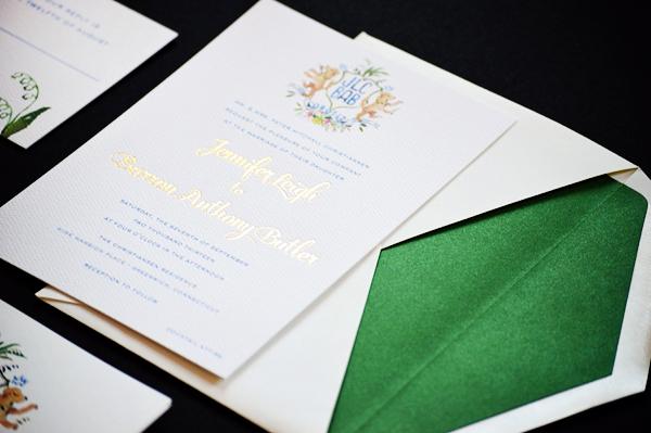
Our next set of wedding invitations mixes classic sophistication with modern glamour and watercolor illustration! With a custom watercolor crest created by Happy Menocal, these invitations from Sandy of Roseville Designs feature gold foil text and a metallic emerald envelope liner. So pretty!

Watercolor-Gold-Foil-Crest-Wedding-Invitations-Roseville-Designs-OSBP

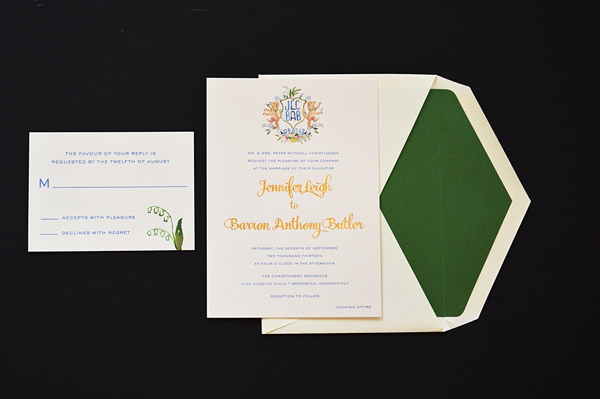
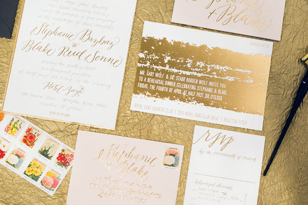
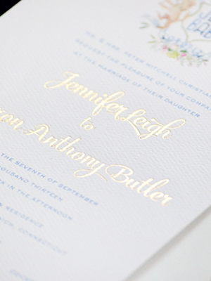
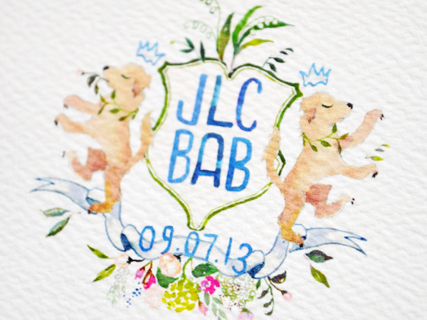
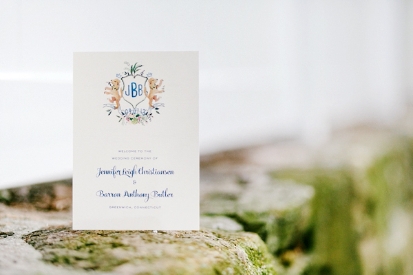
From Sandy: The bride wanted to have a classic wedding invitation with a little bit of fun and glam! The starting inspiration was the gorgeous custom watercolor crest created by Happy Menocal. It featured the couple’s initials and their beloved dog, Pedro! We balanced the softness of the crest with gold foil stamping of their names in a modern script. We also included elements of the crest on the RSVP card to tie it all together. The entire suite was printed on double-thick ecru felt stock, and finished with a metallic colored envelope liner.

Watercolor-Gold-Foil-Crest-Wedding-Invitations-Roseville-Designs-OSBP2

Watercolor-Gold-Foil-Crest-Wedding-Invitations-Roseville-Designs-OSBP6Watercolor-Gold-Foil-Crest-Wedding-Invitations-Roseville-Designs-OSBP15

Watercolor-Gold-Foil-Crest-Wedding-Invitations-Roseville-Designs-OSBP5

Watercolor-Gold-Foil-Crest-Wedding-Invitations-Roseville-Designs-OSBP7Watercolor-Gold-Foil-Crest-Wedding-Invitations-Roseville-Designs-OSBP8

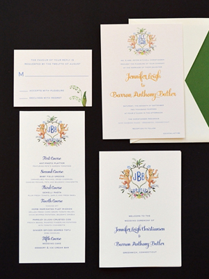
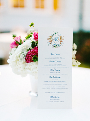
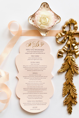
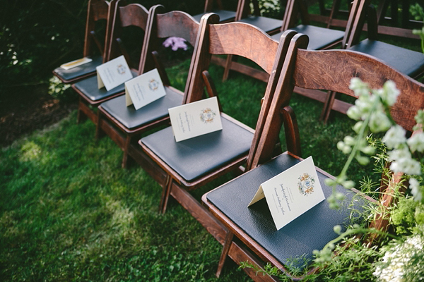
Happy Menocal also created a married version of the crest, which we used in their day-of wedding stationery. We designed programs, menus, table numbers, and other signage that lived throughout the reception tent.

Watercolor-Gold-Foil-Crest-Wedding-Invitations-Roseville-Designs-OSBP10

Watercolor-Gold-Foil-Crest-Wedding-Invitations-Roseville-Designs-OSBP13

Thanks Sandy!

Design: Roseville Designs

Watercolor Crest: Happy Menocal

Printing: StationeryHQ

Check out the Designer Rolodex for more tal­ented wed­ding invi­ta­tion design­ers and the real invi­ta­tions gallery for more wedding invitation ideas!

Photo Credits: Roseville Designs, Wedding Photography by Hudson River Photographer

Happy Weekend!

Happy Friday everyone! And what a week! Sophie has been experiencing some separation anxiety at night, making bedtime a wee bit difficult in our house these days. Sigh. This too shall pass, I hope. Yesterday I took a quick up-and-down trip to New York City for a meeting – I love traveling by train and I’m so glad we live close enough to make these kinds of trips feasible! This weekend we’re hoping to take Sophie to the National Zoo to say goodbye to the Invertebrate Exhibit. We’re so sad that it’s closing! But in the meantime…

Union-Station-DC-OSBP-Instagram

The beautiful Union Station // Photo by me via Instagram

…a few links for your weekend:

This week on Oh So Beautiful Paper:

Check back soon for this week’s cocktail! I hope you all have a wonderful weekend, and I’ll see you back here next week! xoxo

Stephanie + Blake’s Painterly Gold Foil Wedding Invitations

Like just about everyone else in the world, I’m a big fan of gold foil – but I don’t think I’ve ever seen gold foil wedding invitations quite like this! Created by the ladies of Papellerie, the invitations feature shiny gold foil printed to mimic paintbrush strokes and a combination of gray offset printing, gold foil text, and even knockout text within the painterly texture. Seriously cool, and seriously pretty.

Painterly-Gold-Foil-Wedding-Invitations2

From Papellerie: We had so much fun designing for Stephanie and Blake! During the creative process they realized they loved paint strokes, metallic gold, pale pink cherry blossoms, and Moroccan design, so we took it from there!

Painterly-Gold-Foil-Wedding-Invitations6Painterly-Gold-Foil-Wedding-Invitations9

The calligraphy was done by Alyssa, our in house calligrapher. The invitations incorporate gold foil and gray offset printing on the front, and gold foil with a custom pocket assembled on the back. The pocket was foil stamped with Stephanie and Blake’s names and holds the reply card and return envelope as well as the rehearsal dinner invitation in one neat little package.

Painterly-Gold-Foil-Wedding-Invitations3

We lined the envelope with a custom illustrated moroccan inspired pattern which relates back to the shape of the crest on the main invitation.

Painterly-Gold-Foil-Wedding-Invitations

Painterly-Gold-Foil-Wedding-Invitations5

Thanks ladies!

Check out the Designer Rolodex for more tal­ented wed­ding invi­ta­tion design­ers and the real invi­ta­tions gallery for more wedding invitation ideas!

Photo Credits: Chelsea Davis Photography

Ashley + Anthony’s Gray and White Foil Wedding Invitations

I love it when couples do something unexpected for their wedding invitations! Instead of going for a typical rustic design for their vineyard wedding, Ashley and Anthony chose a gray, white, and poppy red color palette and folk art-inspired floral details for their wedding invitations. Created by Emily and Anna of Paper Moss, the final design features gray paper paired with white foil printing and a pop of color in the envelope liner. So fun!

Gray-White-Foil-Floral-Wedding-Invitations-Paper-Moss-OSBP5

From Emily and Anna: Ashley and Anthony wanted something unconventional for their rustic wedding invitations. With a vineyard wedding and wedding colors of gray, poppy, and white, we jumped at the opportunity to use a gray stock as a base. Challenged with keeping the all gray invitation suite from feeling too dark, we chose a softer textured paper and added contrast with hot white foil printing.

Gray-White-Foil-Floral-Wedding-Invitations-Paper-Moss-OSBP6Gray-White-Foil-Floral-Wedding-Invitations-Paper-Moss-OSBP7

Inspired by folk art floral patterns, we brought in a floral motif to almost all the pieces but most prominent in the bright and happy poppy-colored envelope liner, and matching custom postage. In order to stay true to the romantic and rustic feel they were going for, we made sure to work with elegant fonts, along with floral art that had a hand-drawn feel.

Gray-White-Foil-Floral-Wedding-Invitations-Paper-Moss-OSBP

Ashley and Anthony loved the idea of a small booklet for their “Schedule of Events” held together by a mini belly band. To capitalize on this cute addition, we introduced a soft white stock with gray letterpress ink. This also complimented the address wrap labels around the envelopes!

Gray-White-Foil-Floral-Wedding-Invitations-Paper-Moss-OSBP4

Gray-White-Foil-Floral-Wedding-Invitations-Paper-Moss-OSBP3

Thanks ladies!

Check out the Designer Rolodex for more tal­ented wed­ding invi­ta­tion design­ers and the real invi­ta­tions gallery for more wedding invitation ideas!

Photo Credits: Ruth Eileen Photography

Nicole + Patrick’s Vintage-Inspired Lasercut Wedding Invitations

Happy Monday everyone! How about some beautiful vintage-inspired wedding invitations to start off the week? This invitation suite from Nichole at Coral Pheas­ant features gold foil on pale pink paper, intricate lasercut details, and romantic calligraphy from MM Ink. What more could a girl possibly ask for??

Lasercut-Great-Gatsby-Wedding-Invitations-Coral-Pheasant-OSBP

From Nichole: The wedding celebration of Nicole and Patrick was held at Branford House, a turn-of-the-century mansion with carved Gothic paneling and grand Baroque fireplaces overlooking the Long Island Sound. The magnificent Gatsby-esque venue, combined with details from the bride’s stunning beaded gown and palette of purples, pinks and gold was all the inspiration needed to bring this stationery suite to life!

Lasercut-Great-Gatsby-Wedding-Invitations-Coral-Pheasant-OSBP4

Lasercut-Great-Gatsby-Wedding-Invitations-Coral-Pheasant-OSBP3

The invitations were gold foil stamped and letterpress printed on blush Arturo cotton stock – duplexed to make it extra thick. Deco-inspired fonts were paired with beautiful calligraphy by MM Ink. Each invitation was mounted into a custom designed laser cut violet folio. For a modern take on the inner envelope, the folios were wrapped with a gold shimmer belly band each bearing the guest’s name in calligraphy.

Lasercut-Great-Gatsby-Wedding-Invitations-Coral-Pheasant-OSBP5

Lasercut-Great-Gatsby-Wedding-Invitations-Coral-Pheasant-OSBP9

The entire package was slipped into a gold shimmer envelope lined in a scallop pattern that was inspired by the beading on the bride’s gown. The outside of the envelope was just as carefully considered as the invitation. A collection of vintage stamps in coordinating shades of pink and purple adorned the outside and further ornamentation was added by MM Ink‘s gorgeous penmanship.

Lasercut-Great-Gatsby-Wedding-Invitations-Coral-Pheasant-OSBP2

Lasercut-Great-Gatsby-Wedding-Invitations-Coral-Pheasant-OSBP6

Lasercut-Great-Gatsby-Wedding-Invitations-Coral-Pheasant-OSBP11Lasercut-Great-Gatsby-Wedding-Invitations-Coral-Pheasant-OSBP10

For the day-of stationery, the laser cut folio was re–imagined as the cover for the wedding programs and an enlarged version of the die cut details card became the dinner menu. The welcome box contained sweet and salty snacks with coordinating labels and the cover of welcome booklet featured the scallop pattern used on the envelope liners. Nicole embraced every opportunity to bring elements of her invitation design to her celebration – and I adored her for that level of detail!

Lasercut-Great-Gatsby-Wedding-Invitations-Coral-Pheasant-OSBP7

Lasercut-Great-Gatsby-Wedding-Invitations-Coral-Pheasant-OSBP12

Thanks Nichole!

Paper Design: Coral Pheas­ant

Calligraphy: MM Ink

Coral Pheasant is a member of the Designer Rolodex – you can see more of Nichole’s beautiful work right here or visit the real wedding invitations gallery for more invitation inspiration!

Photo Credits: Coral Pheas­ant