Now that the holiday season is behind us – it’s time to get back to wedding invitations! I’m so excited to share this beautiful gold foil and calligraphy wedding invitation from Sally of la Happy as our first wedding invitation of 2015. Enjoy!

From Sally: Peter and Rachel were a wonderful couple to work with. Rachel has such a fun personality and from the minute we started working together we were on the same page with the look and feel for her wedding stationery: hand lettering, kraft paper with white lettering, bits of kelly green, light pink and gold foil!

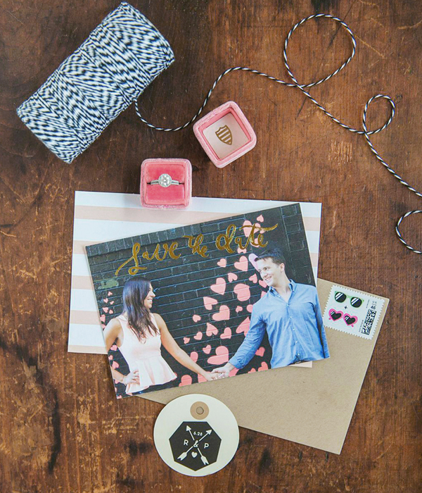
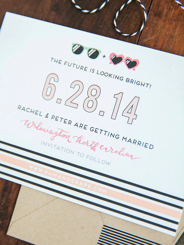
We started off by designing their save the date cards. We paired gold foil calligraphy brush lettering with an adorable, digitally-printed photo of the couple (just look at those pink hearts!). The reverse side of the card reads, “The Future is Looking Bright!” with custom illustrations of his and her sunglasses. The wedding was held at a beach town in North Carolina, so we wanted to give gusts a beachy, fun vibe with the save the dates. We also created the couple’s monogram – to use across all of their paper goods – which we stamped on the outside of all of the kraft paper envelopes.


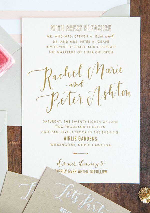
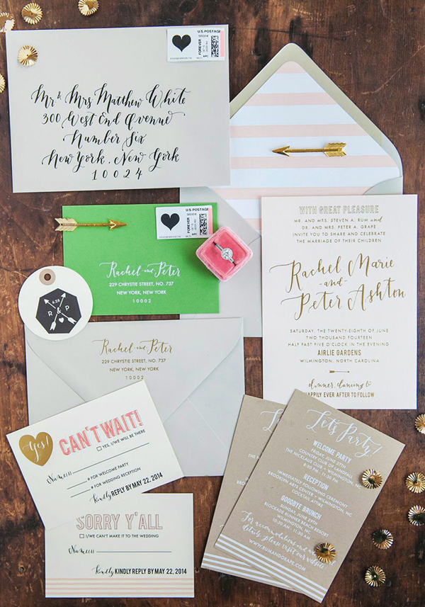
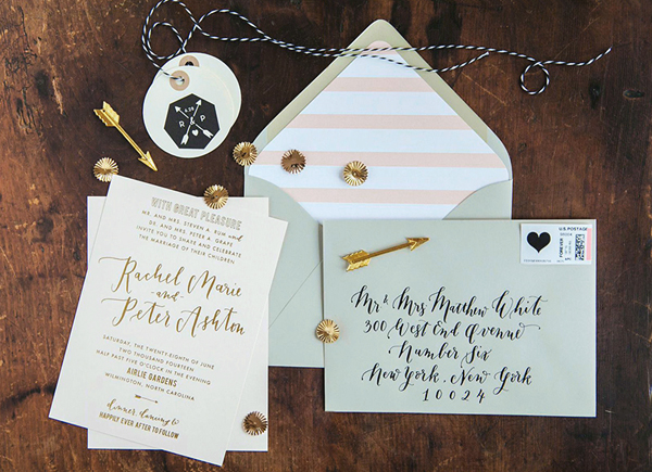
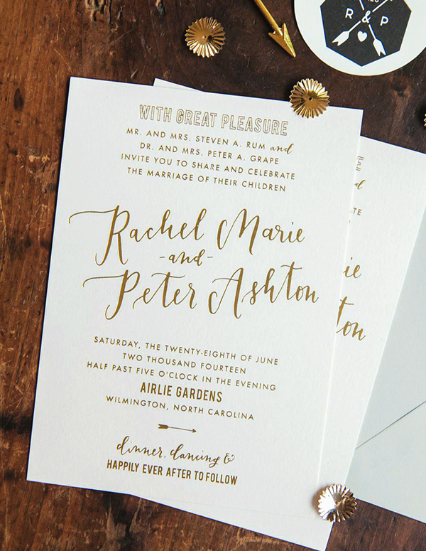
The invitation set was created in a color scheme of light gray, kraft, light pink, and cream. The entire set was printed digitally and with gold foil… with a little letterpress thrown in! The invitation was designed with a clean, modern typeface and custom calligraphy (no calligraphy fonts here!) and then gold foil stamped onto light pink card stock. We wanted the invitations to be fun and a little bit modern.


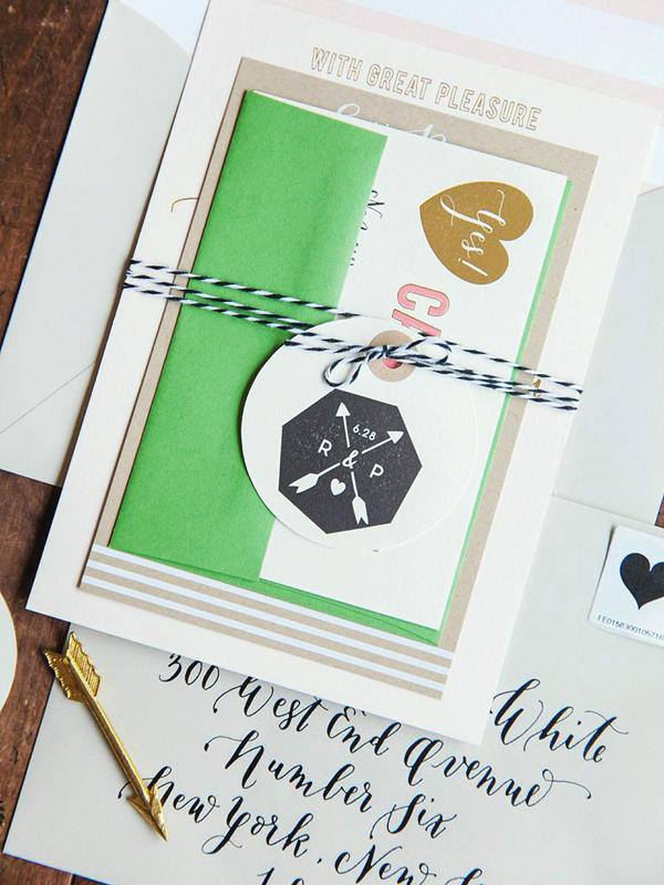
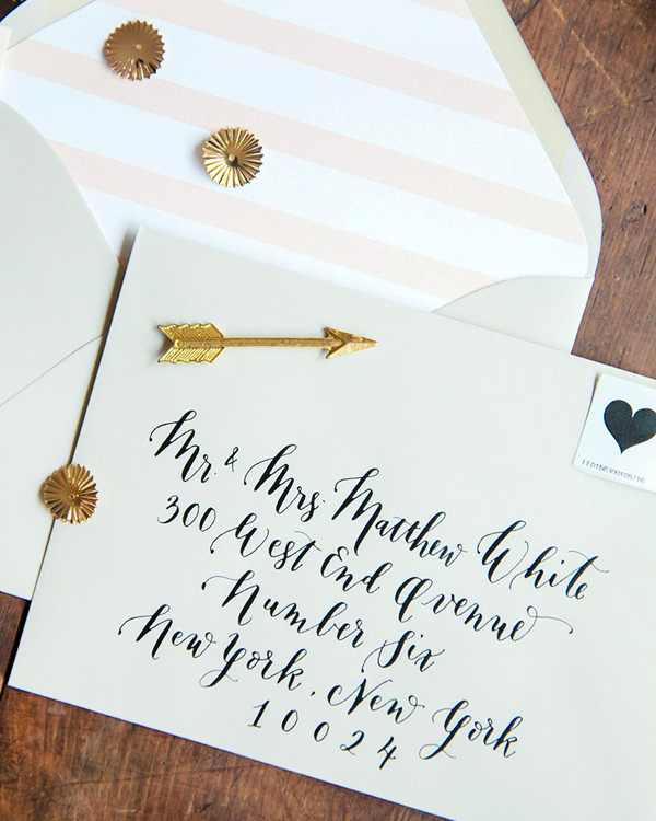
The invitation sets were tied together with adorable black and white twine. Strung around the twine were custom, letterpress-printed tags (printed in a beautiful, rich, black ink) with the bride and groom’s monogram. The sets were then mailed in light-gray envelopes lined in a peachy/pink envelope liner. The return addresses on the outer envelopes were gold-foil-stamped (which was such a great combo against the gray!). I then calligraphed the guests addresses in black ink.


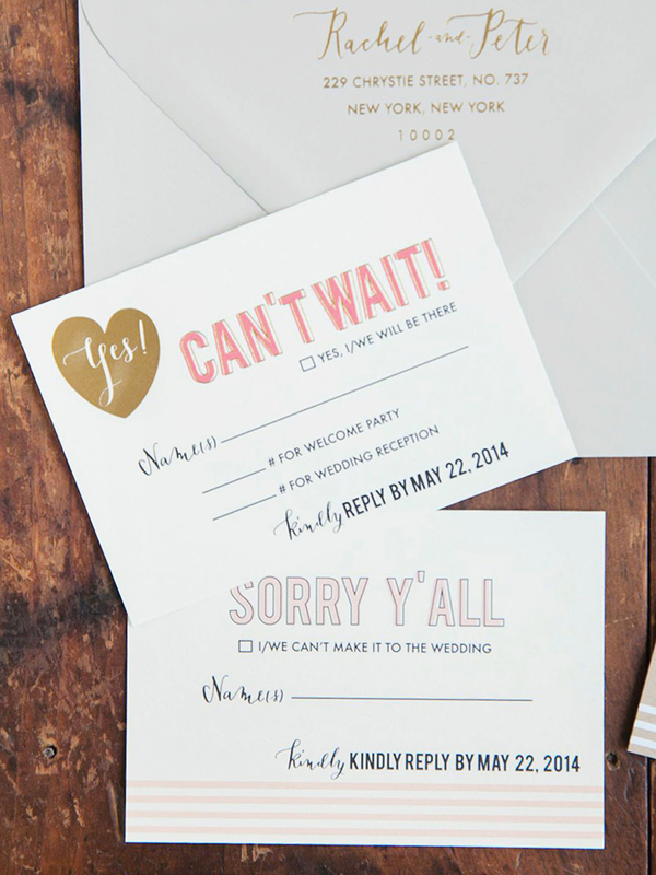
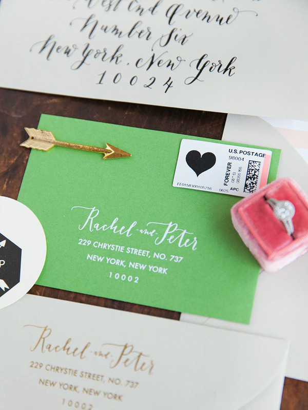
The response cards were double-sided and printed on a soft, cream card stock. The cards incorporated a little southern feel with the wording. The response cards were digitally printed and then we added some gold foil details such as a gold heart with the word “yes!” in calligraphy. The response envelopes were a beautiful light kelly/moss green. They were white matte foil stamped with the return address and then we used custom postage for the return postage.


Rachel and Peter’s wedding invitations also included one of my favorite combos: kraft paper with white matte foil stamping. The information cards were a mix of modern typefaces and custom calligraphy. I love the way they look paired with all of the other colors!

Thanks so much Sally!
Design + Calligraphy: la Happy
la Happy is a member of the Designer Rolodex – check out more of Sally’s beautiful work right here or visit the real inviÂtaÂtions gallery for more wedding invitation ideas!
Photo Credits:Â Katie Parra Photography
