How to Choose Cocktail Glasses

The most frequent comment we receive on our cocktail posts is this: where do we get those beautiful cocktail glasses? It’s a good question: the perfect drink deserves the perfect glass. You’re not going to ruin a delicious drink by using the wrong glass, but using the right glass can definitely enhance your experience. The good news is, we’re starting our own Etsy shop, Liquorary, to share some our best finds from over our years of cocktail posts. We’ve scoured antique stores and shows, thrift shops, estate sales, and flea markets. We’ve searched forgotten dusty corners and overlooked shelves for our cocktail glasses. We’ve found classic coupes and flutes, midcentury highballs, and a load of other gorgeous glasses that are perfect for your next drink.

So if you’re going to put care into making a recipe, whether it’s a classic or own of ours or own of your own, then it’s worth putting some care into your glassware.
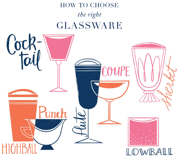
How to Choose Cocktail Glassware by Oh So Beautiful Paper

Illustration by Jillian Evelyn / Hand Lettering by Maria Filar for Oh So Beautiful Paper

The Cocktail Glass

The modern cocktail glass is iconic: a slender stem, with a cone-shaped bowl and wide rim. Also known as the Martini glass, the modern cocktail glass is an Art Deco homage to the classic cocktail glass. And it’s a total disaster. It’s poorly balanced, and its shallow bowl and sharply angled sides are practically designed to slosh your drink all of you. And, with few exceptions, it’s way too big – so either you’re going to end up with a half-filled glass, or you’re going to mix a huge drink that’s way too big and will warm up before you can finish it. Instead, you want something like this: The-Robert-Frost-Cocktail-Recipe-OSBP-6
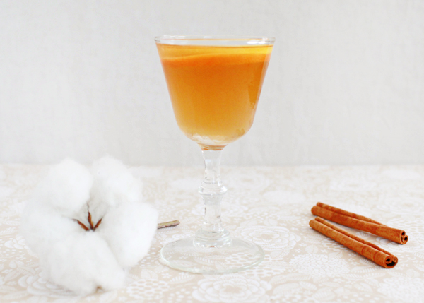
The Robert Frost

This is a vintage cocktail glass, the vintage shape our of which our modern Martini glasses evolved. Its sides are less shallow than a modern glass, making it harder to spill. Its flat-bottomed bowl gives it a better balance, leaving it harder to knock over. Its stem will keep your warm hand away from your drink. And its smaller size – just four to six ounces – is a perfect fit for most drinks. No super-sized, watered down and warmed up cocktails need apply. All-spirits drinks, like the Old Fashioned, the Martini, or the Manhattan, are perfect for the smaller end of that range, while many Sours will fit in the larger end. These aren’t easy to find these days. I’ve seen some from Libbey Glass that fit the bill, but your best bet is to go vintage. Antique stores and shows, yard and estate sales, and online auctions can be a pain to hunt through, but are your best bet for the best glassware.

Coupes

The coupe was first invented as a champagne glass in the late 1600s, but it’s actually pretty terrible at that job. It’s wide brim lets the champagne release all of its carbonation too quickly. But it probably didn’t take too long for anyone to figure out that the coupe has a much better role: serving cocktails. It plays pretty much the same role that the classic cocktail glass used to play: well balanced, easy to hold without spilling, and elegant.
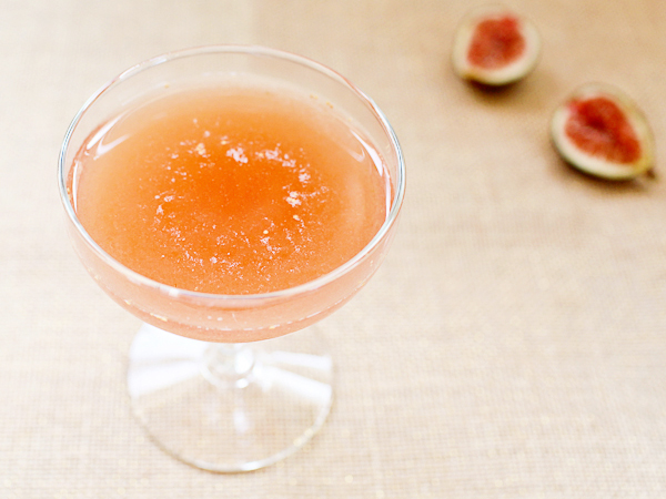
OSBP-Signature-Cocktail-Recipe-Raised-in-a-Red-Barn-29

Raised in a Red Barn

It’s much easier to find beautiful antique and vintage coupes, and there’s tremendous variety in shape, color, and design. There are also some modern coupes that are both beautiful and just the right size; check out Cocktail Kingdom‘s selection, especially their 3.75 and 6 oz sizes. Coupes are perfect for the same drinks as the classic cocktail glass, all-spirits drinks and Sours.

Flutes

OSBP-Signature-Cocktail-Recipe-The-Brandy-Crusta-24

The Brandy Crusta

Unlike the coupe, the flute actually is pretty good for champagne. Its narrow bowl reduces the drink’s surface area and retains carbonation for longer. This makes the flute ideal for any drinks that incorporate Champagne or another carbonated ingredient, like the French 75. It’s also pretty useful for recipes with big garnishes, like the whole lemon peel in the Brandy Crusta. We’re still partial to vintage, but there’s a big array of new flutes available, so these should be easy to find. Aim for three to four ounces, and no more than six.

Lowballs
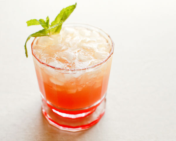
Signature Cocktail Recipe: Sunset Mai Tai by Oh So Beautiful Paper (6)

Sunset Mai Tai

Lowballs – also called Old Fashioneds, tumblers, and rocks glasses – are low glasses, with wide rims and heavy bottoms. As the name and shape suggest, they’re perfect for any drink that you build in the glass, layering and muddling ingredients, like the Old Fashioned, Caipirinha, or Smash. Like the flute, there are tons of good vintage and new versions available, and some pretty cool looking reproductions of classic designs, so these should be easy to find. Look for glasses between six and ten ounces.

Highballs

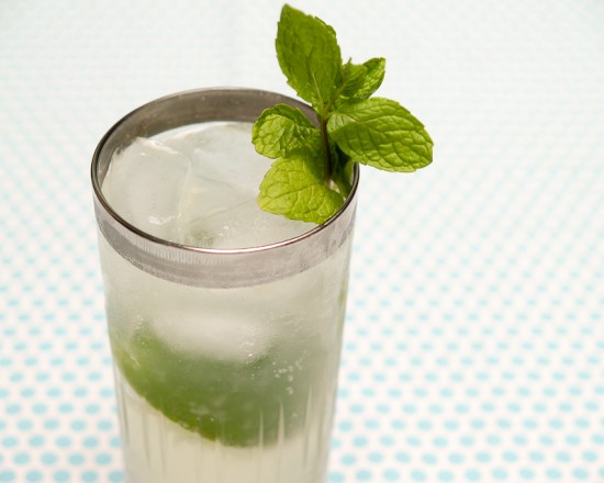
The Gin Rickey

The highball is the Laurel to the Old Fashioned’s Hardy: tall and narrow, perfect for bigger drinks (also known as long drinks) built in the glass. At eight to twelve ounces, the highball is your go-to for drinks like the Mojito, the Cobbler, and the Rickey, drinks with lots of ice and muddled ingredients. (The Collins glass is slightly taller and narrower yet than the highball, but there’s quite a bit of overlap between the two styles so I tend to use the terms interchangeably.) As with the Old Fashioned, vintage designs are pretty easy to find, but there are also lots of new and reproductions available too these days.

Sherbets
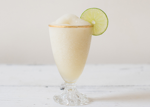
Frozen St-Germain Daiquiri Cocktail Recipe by Oh So Beautiful Paper / Photo by Sweet Root Village

Frozen St-Germain Daiquiri

Looking generally something like a stocky coupe, the sherbet glass is stemmed with a broad, deep bowl and thick glass sides. As the name suggests, the sherbet started life as a dessert glass for sherbets and ice cream. They’re plentiful at antique shows and flea markets, far more so than any proper cocktail glasses, though I can’t tell if that’s because a variety of large-bowled glassware is getting lumped together as “sherbets.” In any case, the more delicate of them can often serve as good stand-ins for coupes, and the larger are often perfect for frozen and Tiki drinks.

Punch Bowls
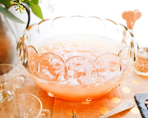
OSBP-St-Germain-New-Years-Eve-Cocktail-Party-Ideas-Recipes-236

Alliance Club Punch

I’m no expert – I’ve only made punch a few times, though always to great acclaim – but I do know you should look for big punch bowls (2-3 quarts should be enough for spirits, citrus, and ice) and tiny punch glasses (2-3 ounces should do it). The idea is to encourage your guests to make lots of trips to the punch bowl to refill their glasses, making the punch bowl a center of interaction.

The List Goes On

I’m already over a thousand words and I feel like I’ve barely scratched the surface. Mugs for Moscow Mules and Blue Blazers? Cordials? Hurricane glasses? There’s still a huge array of glasses, especially specialty glasses for individual drinks, that we haven’t even talked about at all. And that’s ok. It’s easy to fall down the rabbit hole of glassware when you don’t need to. Yes, the Hurricane is named after a glass that looks just like a hurricane lamp. And you know what? A Hurricane served in a highball or a sherbet glass will taste just as good. Looking for the exact glass for every drink can leave you with overflowing cabinets and an empty wallet. Now, if someone wanted to get you some niche glasses as a gift, I’m not saying to turn them down…

Photo Credits: Frozen St-Germain Daiquiri by Sweet Root Village / all others by Nole Garey for Oh So Beautiful Paper

Guest Post: Jen of The Haystack Needle

I’ve asked some of my favorite creative mamas to help out while I’m away with our new baby. Today, the wonderful Jen from The Haystack Needle is sharing some thoughts on motherhood – specifically some things she’s learned as a mama of two! Thanks Jen! –Nole

The-Haystack-Needle-Balloon-Festival

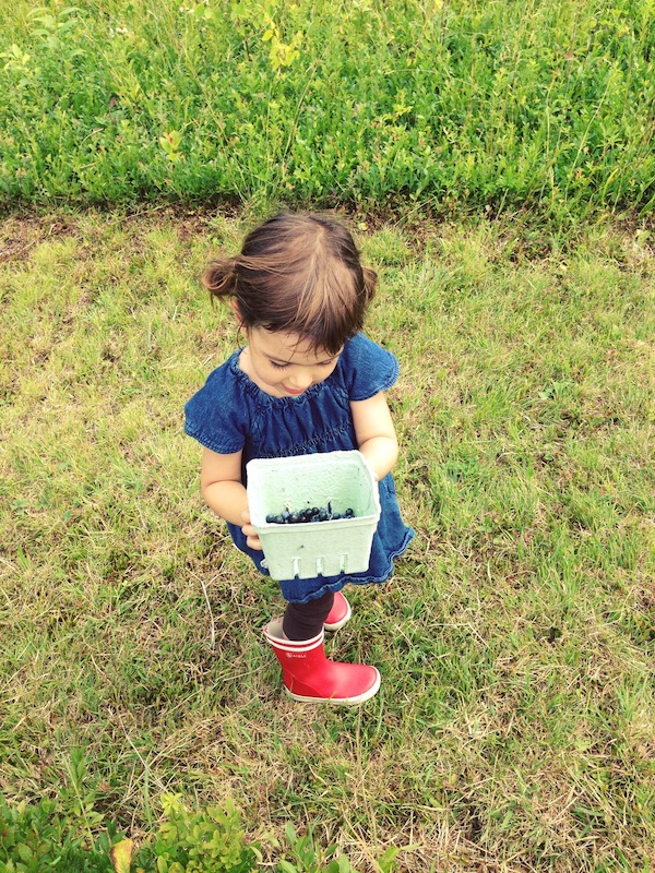
Hello! I’m Jen and feel lucky to have connected with the ever-inspiring Nole through blogging (back when I did blog.) I’m now a freelance writer/editor working from home and mostly being a mama to Juniper (3) and Leo (18 months). My kids are 20 months apart and are the sweetest spirits who keep me feeling light and searching for little moments of amazing in each day. We just moved to Portland, Maine, from Brooklyn back in January. And I have to say, Portland has stolen my heart. It was such a dream spending this summer going blueberry picking, swimming in lakes, making sand castles at the beach, flying kites, loading up on lobster rolls by a lighthouse, and feeding goats at the farm where we get our milk. I was mourning the end of summer, till I remembered we have apple cider doughnuts to look forward to. Location-wise, I will say it’s incredibly easier being a mama to two when you don’t have to get everyone up and down three flights of stairs (and deal with getting to your car that stores your stroller being two blocks away thanks to alternate side street parking) like we did back in Brooklyn. But no matter the location, two little ones can feel like triple the chaos in moments. Here’s what I’ve tried to pass onto friends moving into being a mama to two.

The-Haystack-Needle-Blueberry-Picking

+ Go on dates with your kid. I don’t mean this in the formal way. A date could simply be curling up on the sofa with a longish book that you wouldn’t read while your younger one’s attached to you. It’s the simplest advice and it helped us through hurdles in the beginning, when I was nursing nonstop and couldn’t actively play with her the same way, and even now when random toddler tensions build up (and then I remember, wait! When was the last time I got 20 minutes of quality alone time with her?). Kids need so little to refuel with your love. And you’ll miss your alone time with your first and need to reconnect. You’ll know you’re desperately in need of a date if you think back on what you’ve said in the last day to your oldest, and if it’s a lot of don’ts, let’s not, and let’s go. Then yes, you need a date. It could be as simple as looking through old photos together or taking a walk where she takes the lead on how fast you go. But, I found it needs to be you and her, no babywearing the younger one, or half looking at your phone. True together time. And then I found the meltdowns and odd behavior calm down for a bit.

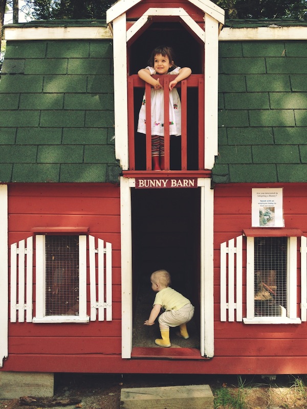
The-Haystack-Needle-Kids-at-Farm

+ Don’t forget the tricks that worked when she was little. I’ll never forget the day that putting Juniper in a sling saved me. And I’m not talking about when she was a newborn and I got to have my first hot meal or do some laundry. I’m talking about two-and-a-half year old Juniper who was having a tough moment out with me and Leo, and it was dissolving fast. Leo, by default as the younger one who wasn’t walking yet, always was in the carrier and Juniper would walk or ride in the stroller. And then, as you learn with kids 2+ years in age, having options always helps, and I thought to offer her the sling in the heat of the moment. And that’s when I heard it in her voice. That she’d been missing some mama love. She happily went in the sling and just wanted to be held for a short time. And then all was calm. That’s repeated itself for us, and it always works. I wore Juni in wraps, carriers, and slings from birth through most of my pregnancy with Leo (in a back carry). But as soon as Leo arrived, of course he was the one I carried. It took me a few months to figure out she missed that part of our relationship.

The-Haystack-Needle-Kids-at-Camp

+ Be positive in how you talk about your kids, especially when they’re around. We’re all blogging and snapping beautiful Instagrams of our little loves. But I find it’s so easy, especially when you’re hanging around other mamas, to endlessly talk about how hard it is or how much your little guy sleeps or how tough it is when your two-year-old doesn’t want to get dressed in the morning. Yes, we all need to release some of the pressure and know that we’re not alone in the challenges of parenting. But I’ve tried to spend less time talking about the hard stuff, especially on playdates or on the playground. Because in a way, I think it sets up this tone of you against the kids or one kid against the other (since it’s so easy to talk about how different your kids are), rather than celebrating the moments that are pure awesome. And there are so many! I’ve read about how bad it is for a marriage to cut your partner down in conversation with someone else, and I think it applies to kids too. Sometimes just talking positive helps. I have a lot of days where I’m zapped, but those are the days I try to remember to say to my two, “hey we’re a team this morning, the three of us, let’s go have a good day.” And then there’s a high five and we’re off.

The-Haystack-Needle-Holding-Hands

+ Nothing is permanent. Do what works for you now. As with everyone, my kids sleep, eat, play, and have gone through their first years in totally different ways. It’s easy (especially thanks to grandparent schools of thought) to think if you do this, you’ll never be able to do that or transition them out of this or that. I disagree. Do what you need to survive right now, not what you think you have to be doing because you’re afraid of some permanent habit. Especially with regards to sleeping arrangements. Just follow what works for you, and when it doesn’t work, change it up and it will naturally move on to the next phase. You’re the best expert on your kids, anyhow.

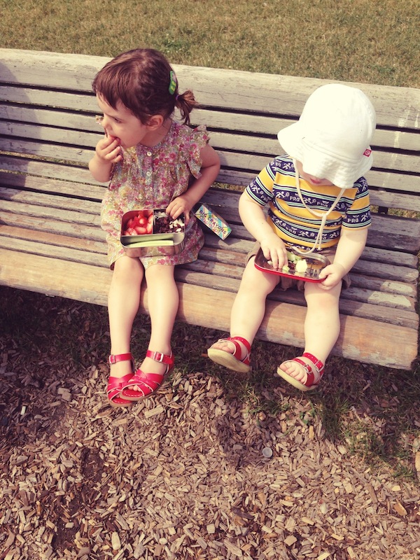
The-Haystack-Needle-Kids-Snack-at-Playground

+ Say less. Once your littlest is moving around, the sibling relationship really starts to shine. I’ve found the easiest way to help support my kids bonding is to not play referee. Don’t intervene with little squabbles or minor sharing/pushing moments and let them work it out themselves. For the most part, they do and no one gets hurt. And that’s when you find your 15-month old running in circles on squares of felt in a fit of giggles with your 3-year-old because they just made up some new game, just them.

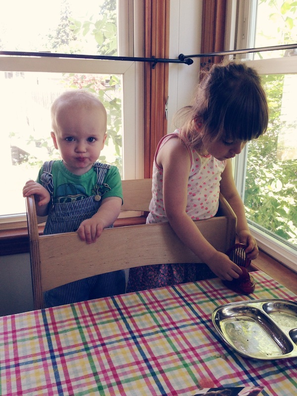
The-Haystack-Needle-Kids-Learning-Tower

Oh and prepare to have your heart melt every time they hug each other, read books together, or you watch your oldest feed your little guy strawberries that she just sliced for him. And then you’ll really feel silly that you spent all that energy worrying about not being able to focus on your oldest child after your second arrives. I’m pretty sure Juniper would say I gave her the best gift ever with our little Leo. And I would agree.

Filed under: jen

DIY Tutorial: Calligraphy Gift Tags

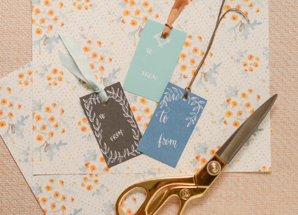
As the season of gifting approaches, we always like to think of new and beautiful ways to present the gifts that were so thoughtfully selected. Gift tags, which are usually an afterthought, can be made really beautiful and special with just a little white ink and a pen. Using blank business sized cards in various colors, we hand made gift tags for our loved ones. They would even make a lovely gift in themselves. – Bailey and Emma of Antiquaria

DIY Tutorial: Calligraphy Gift Tags by Antiquaria for Oh So Beautiful Paper
 

Materials

White ink

Calligraphy Starter Kit, or dip pen and nib

Blank business cards – we used Pool, Lake and Slate

Hole punch

Ribbon


DIY Tutorial: Calligraphy Gift Tags by Antiquaria for Oh So Beautiful Paper
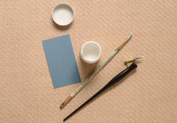
Step One: Gather your supplies. We used various 2″ x 3.5″ colored cards, our very favorite white ink and a pointed calligraphy pen. It’s also handy to grab a cheap paint brush to mix the ink.

DIY Tutorial: Calligraphy Gift Tags by Antiquaria for Oh So Beautiful Paper
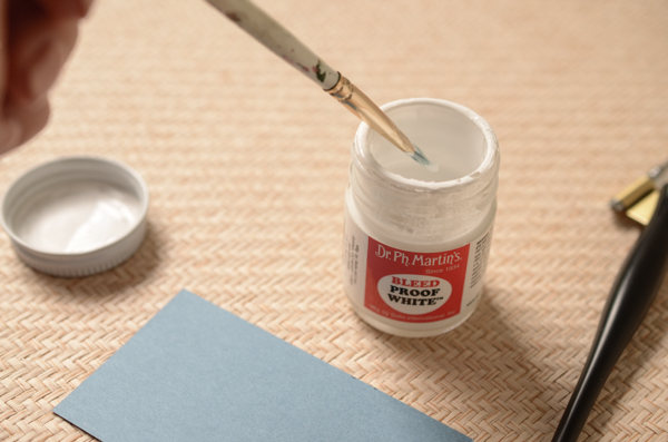
Step Two: Bleed Proof White ink is fabulous because it can be used on dark colors and remains very opaque if mixed correctly.  When the ink is new, it is a thick, paste like consistency. You can make it into workable ink by adding distilled water into the jar and gently stirring it in (this is where your cheap paintbrush comes in handy) until it looks like heavy cream. Start slow, it’s easier to add more water than to remove water. You’re looking for the ink, when tested, to be very opaque but flow out of the pen smoothly.

DIY Tutorial: Calligraphy Gift Tags by Antiquaria for Oh So Beautiful Paper
Step Three: Put your creative hat on! Decorate the tags to suit the gifts or recipients that they’re for. We did a variety of tag decorations, including leaves, hearts and modern lines. It can really be as simple or as ornate as you’d like! It’s also a really fun effect to decorate around where the hole will be punched, as shown in some of the designs above. Let all of your tags dry very thoroughly. White ink can even take overnight to dry in some climates so don’t rush on to the next step!

DIY Tutorial: Calligraphy Gift Tags by Antiquaria for Oh So Beautiful Paper
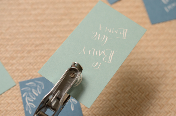
Step Four: Once all of the tags are good and dry, punch holes in the top center of each one.

DIY Tutorial: Calligraphy Gift Tags by Antiquaria for Oh So Beautiful Paper
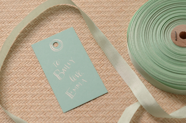
Step Five: Select a ribbon to coordinate and you’re all done!

Photography by Antiquaria for Oh So Beautiful Paper
Hello Brick & Mortar: Packaging for Retail

I judge books by their covers, wine by its label and brands by their logos. I know the good stuff is on the inside, but I could ogle good packaging all day and have been known to buy things for reasons far divorced from utility. (I’d guess I’m not alone in this crowd.) Packaging may not seem like the sexiest topic, but good packaging is an invitation to purchase, and that’s an invitation we want to extend. –Emily of Clementine

Hello Brick + Mortar by Emily of Clementine for Oh So Beautiful Paper
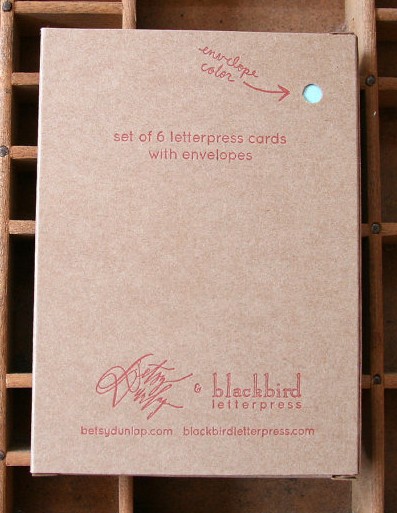
Illustration by Emily McDowell for Oh So Beautiful Paper
First, the golden rule of retail packaging: They’re going to try to open it anyway. I know, you wrote “blank inside.” Customers will still look at me and ask “is it blank inside?” while opening the cellophane. I know, it’s sealed with a sticker. They will carefully peal back the sticker and reach for the card. I know, you labeled what’s inside and drew a little picture on the back showing the 6 different cards in a card set. Maybe they’ll ask me to open it. Why? I think it’s human nature. If you close something, people want to open it. Especially if it’s pretty. But let’s see if we can make your packaging something customers want to open, but instead choose to purchase and wait until they get home to break into. How? 90% of it is simple show & tell.

1. Tell them what’s inside. Pretty basic, but I receive a lot of beautiful, poorly labeled stationery. Is it a flat card? Is it blank inside? Is it a card set? How many card are in the set? Are they all the same or different? How big is that print? Is it a sticker or a mini-note? What’s it for….? I watch customers fumble through unclear packaging every day. Often, I can interrupt a quizzical look to explain what’s inside, but if I don’t, she’s stranded and will put it back down. If you don’t know what to include, try calling a friend and describing what the product looks like. Then find a well designed way to say the same thing. (Where? My vote is usually on the back. Unless you can make it work with the image.)

Hello Brick + Mortar: Packaging for Retail by Emily of Clementine for Oh So Beautiful Paper
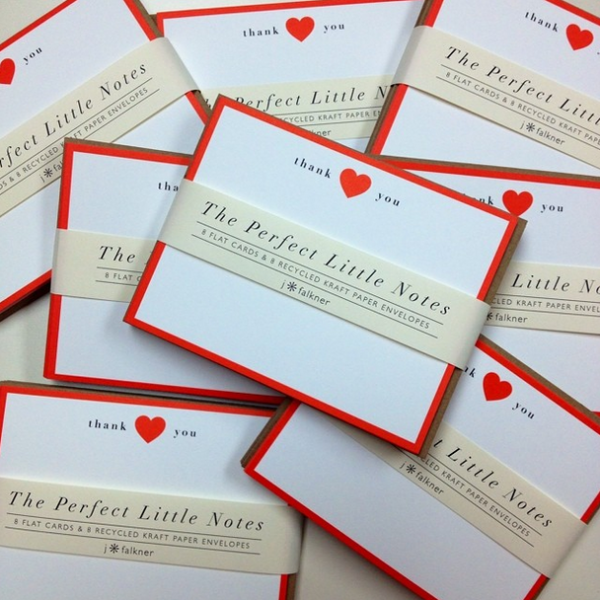
J. Falkner’s Perfect Little Notes use paper bands to tell what’s inside without interfering with the product. The bands are a slight deterrent for customers to open the box and allow retailers to slip the band off for a photo, and put it back on for customers. Win/win!

2. Show them what’s inside. In your online shops, you can clearly photograph and explain. In person, your packaging must speak for the contents. Unless you are packaging a single card or print that is clearly visible, you need to show what’s inside (with a photo, a great good drawing or innovative packaging). Every time customers pick up a box of cards, they’re asking “what’s inside? Answering this clearly increases the likelihood that your product will sell. (Where should you put this information? My vote is for the back if it’s a card/set/calendar or smack in the middle if it’s a tube.)

Hello Brick + Mortar: Packaging for Retail by Emily of Clementine for Oh So Beautiful Paper
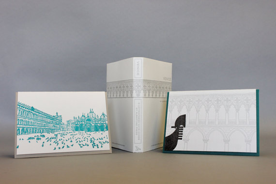
The Albertine Press letterpress library is one of the few products, I (happily) display without cellophane. The spine tells what’s inside and a quick flip open reveals the cards. The packaging itself feels like a gift and looks beautiful displayed in multiples.

3. Extend your branding. The cost of packaging increases the price of your products, but don’t make it a throwaway purchase. Good packaging makes your product feel like a gift, and if done well, can make an indelible mark that the customer returns to.

SHP_Packaging3

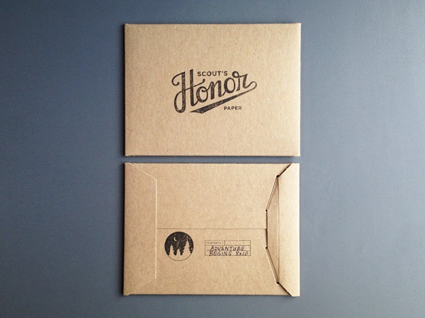
Scout’s Honor Paper packages her prints in stiff craft sleeves with a strong branded stamp on the front and back that tells the print name and size. Though she totally breaks my rule of showing what’s inside, I can easily take one print out to display and house the extras behind. 

4. Packaging should keep it together and look great. Do you want the parade of horribles? I’ve had cello sleeves crumple or split as customers shove cards back in; stiff cello boxes that pop open; sealed small notes that aren’t affixed within the package so they jumble, but I can’t adjust them without damaging the package; prints with crumpled corners after being dropped; boxes that obscure the card design; gorgeous prints, postcards and tea towels that no one buys because they have no idea what’s inside; closure stickers that pop open more than they stick; belly bands that come unstuck and end up all over the floor; twine that frays and looks frumpy; calendars and prints with no backing that slide to the floor; products that fade in the window; and (through fault of my own) a cello box or two melted each winter due to radiator proximity. Those horribles are not so horrible, but these are costs that retailers absorb, if a product remains poorly packaged we won’t take the risk. You can’t always avoid these pitfalls, but you can mitigate by simply using the packaging yourself: pack your product up, throw the box around, unpack it and leave it on a table for a few weeks. See which of your items still shine, and adjust the rest.

5. There’s no right answer. When in doubt, reach out to a retailer you trust or hop into your favorite store and see what’s working. You should decide on the packaging you want, but here are some considerations:

  • Single Cards – Cellophane sleeves are a must. I’m torn on whether a sleeve with the fold over seal is preferable. A little sticker on the back can tell the customer if the card is flat or folded, how big it is and whether the card is blank inside.
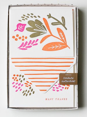
  • Card Sets – Card sets are the slowest sellers. I think they’re also the most vaguely labeled. You can only show one card on the front, but you can show and tell on the back of the box. How many cards are in there? Are they all the same (if not, please include a label with a photo or drawing), what color is the envelope? Tying it with twine can look pretty or obstruct your image. Stickers can make a pretty seal but the occasional customer that ignores the sticker’s purpose and opens it, leaves me with a damaged product.

Hello Brick + Mortar: Packaging for Retail by Emily of Clementine for Oh So Beautiful Paper
Moglea’s vibrant packaging shows both envelope and note, while the sticker draws your eye from the front to the back of the box where you learn the details of what’s inside!

OSBPblackbirdback

The cute peephole on the back of this card set from Blackbird Letterpress invites the customer to look closer while communicating basic info about this card set.

  • Tiny notes, gift tags, book plates, recipe cards – These things don’t often get much respect in a retail setting because they’re little and often confuse the customer. They benefit from super clear packaging, and a bit of personality to invite the customer to pick them up.

EMexistingnote


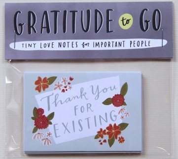
Emily McDowell draws people in with words alone. By the time customers read what her notes say, they’re already sold on the sentiment, with little need to even know the function.


  • Pads of paper, journals & notebooks – You guys, wars could be started over whether a notebook should have lined or unlined pages. Let the customer know upfront. Also, let them know how many pages are in there. Cello sleeves help keep the corners neat and the pages clean.
  • Prints – Customers often buy prints for gifts or quick decor, so including the dimensions is crucial. A sturdy piece of cardboard lets retailers display the print safely. Prints packaged in tubes are the most difficult to sell. I often have large prints professionally framed, but if the framed print sells, we’re back to the tube. A large color sticker is the best way to show what’s inside.
  • Calendars – Customers who are on a calendar hunt want the days to be in boxes, customers who fall in love with your designs don’t care! Either way, it’s nice to show the customer whether or not there are boxes and display each month on the back (customers want to see their birth month, it’s often what sells them.) Like prints, a sturdy piece of cardboard is helpful for display and protection. I see a lot of dual purpose calendars these days (eg, once used, each month can be a print!) I love this idea, but make sure it’s clear so the customer knows they’re getting two uses for the price.
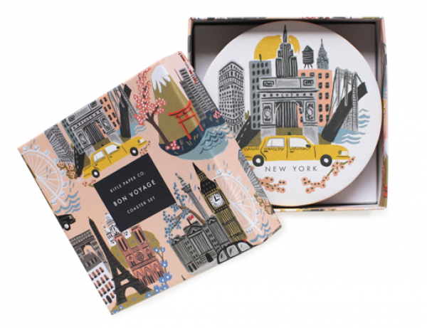
  • Coasters – Coasters are one item where the packaging might be saved for storage, so this can be a great chance to extend your brand into a customer’s home.

Hello Brick + Mortar: Packaging for Retail by Emily of Clementine for Oh So Beautiful PaperRifle Paper Co’s coasters are packaged in boxes that make adorable storage for any other little thing. It’s a perfect extension of branding and makes the packing bridge into extended use.

  • Tea Towels – Tea towels are almost always displayed folded. To prevent constant unfolding, a nice wide belly band with an image of the opened towel can help. (Bonus: offer to send a sample to display if your retailer buys a certain quantity.)
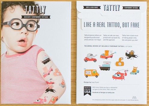
  • Temporary tattoos – Temporary tattoos are often shared, or used as party favors, so people want to know how many they’re getting. I also think they look better on the body, so a photo of them in action is a super plus.

TattlyAnimalDrivers

Tattly’s packing shows the products on (uh, adorable) models, then the back manages to be fun while describing exactly what’s inside.

  • All other beauties – You makers are so darn prolific, I can’t even keep up with all of the areas that you’re branching into, so I’ll leave you with something simple: let the product speak for itself. Let it guide the packaging and be ok with being simple. Sometimes, that’s the best approach.

Hello Brick + Mortar: Packaging for Retail by Emily of Clementine for Oh So Beautiful Paper
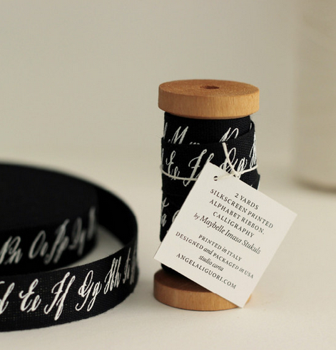
I’m utterly blown away by the beauty created by mixing the talents of Angela Liguori and Maybelle Imasa Stukuls. All I want to know is more about this ribbon, and Angela’s simple spool and clear font on a card give me just that. 

The final golden rule of packaging is this: if you have an innovative idea, go for it. All of this is open to your interpretation. I don’t like cello sleeves, but I’m pimping them out here because it’s the current best solution to selling cards. If you have a better idea, please, go on. As long as your packaging shows and tells what’s inside, you’re meeting your retailers’ needs. If you can make it inventive and even more fun, you’re taking a step further to extend your brand and build a relationship with your retailers and customers.

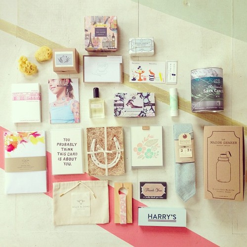
Search outside of the stationery world for ideas. When I need a bit of inspiration (like how to finish up this post) I pull a collection of items from Clementine to see where themes emerge. I love the packaging below for all kinds of reasons: font, color, utility. Mostly, because it draws you a step closer to the product, making the customer one step closer to falling in love and taking it home.

Hello Brick + Mortar: Packaging for Retail by Emily of Clementine for Oh So Beautiful Paper

Just another day in the shop, lost down a rabbit-hole of the beauty you all make via my Instagram.

I can’t wait to see what you pack up next! xoxoxo – Emily

Bug Birthday Party

Hi there, Oh So Beautiful Paper readers! Audrey here again, and this time I’m giving you a peek into some of my family life at home when I’m not working at Urbanic. When my eldest son Javin came to me and said that he wanted a ‘bug party’ for his 6th birthday, I admittedly wasn’t too excited about this. I imagined that it was going to be tough to find a way to keep this party from becoming overly cutesy or un-attractively creepy. I spent some time searching for design inspiration and came up with a plan to make it work with a little bit of crafting and some food fun.
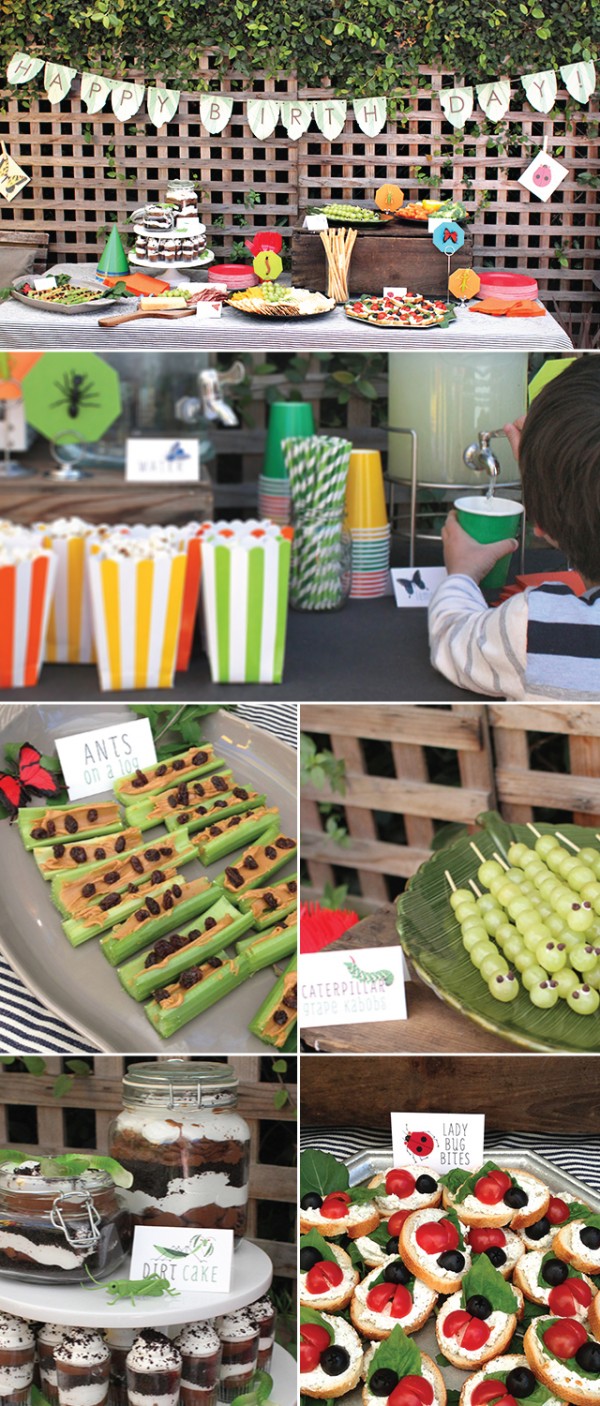
Bug Theme Kids Birthday Party by Urbanic via Oh So Beautiful Paper
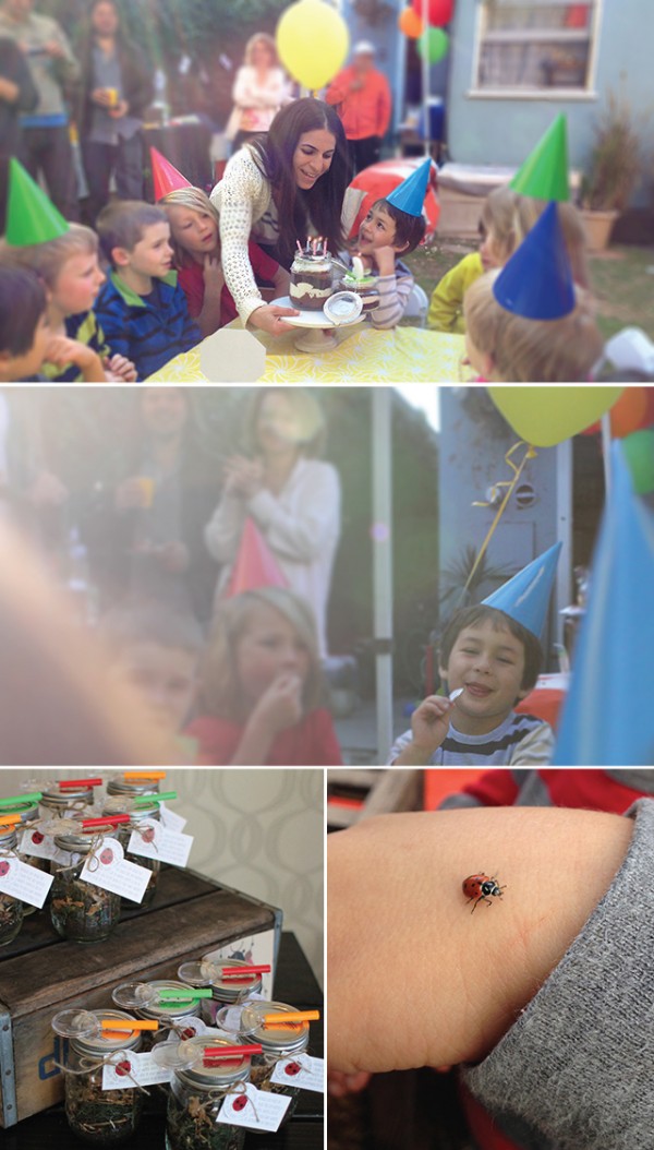
For decor, I mounted plastic insect ‘specimens’ to hexagon colored card stocks and strung a bitten leaf  birthday banner which we had punched lots of holes in! All of the foods were healthy small bites inspired by insects. We had ‘lady bug bites’, ‘caterpillar kabobs’, ‘ants on a log’, and then sang Happy Birthday with a ‘dirt cake’ made up of chocolate mousse, whipped cream and cookie crumbs. The kids each had their own adorable serving crowned with a gummy worm! Bug Theme Kids Birthday Party by Urbanic via Oh So Beautiful Paper

The activities we hosted for the children consisted of a bug bounce and a bee toss. We also made kids sized play stations that involved little games and challenges with plastic bugs.

Bug Theme Kids Birthday Party by Urbanic via Oh So Beautiful Paper

For favors, we punched holes in the lids of mason jars and turned them into lady bug habitats. The kids got to take them home and release into their yards. We added a little legend to each jar about how special lady bugs are and they ways they can benefit a garden. They whole thing was so fun … except getting those lady bugs into the mason jars!

xo

Audrey

PS Here’s where I found everything: ladybugs , dirtcake, cute signage,  spaceships & laserbeams invitation download,  plastic bugs, mason jars + magnifying glasses


Â