Modern Brush Lettering Tips for Beginners

Modern Brush Lettering Tips for Beginners from Fine Day Press / Oh So Beautiful Paper

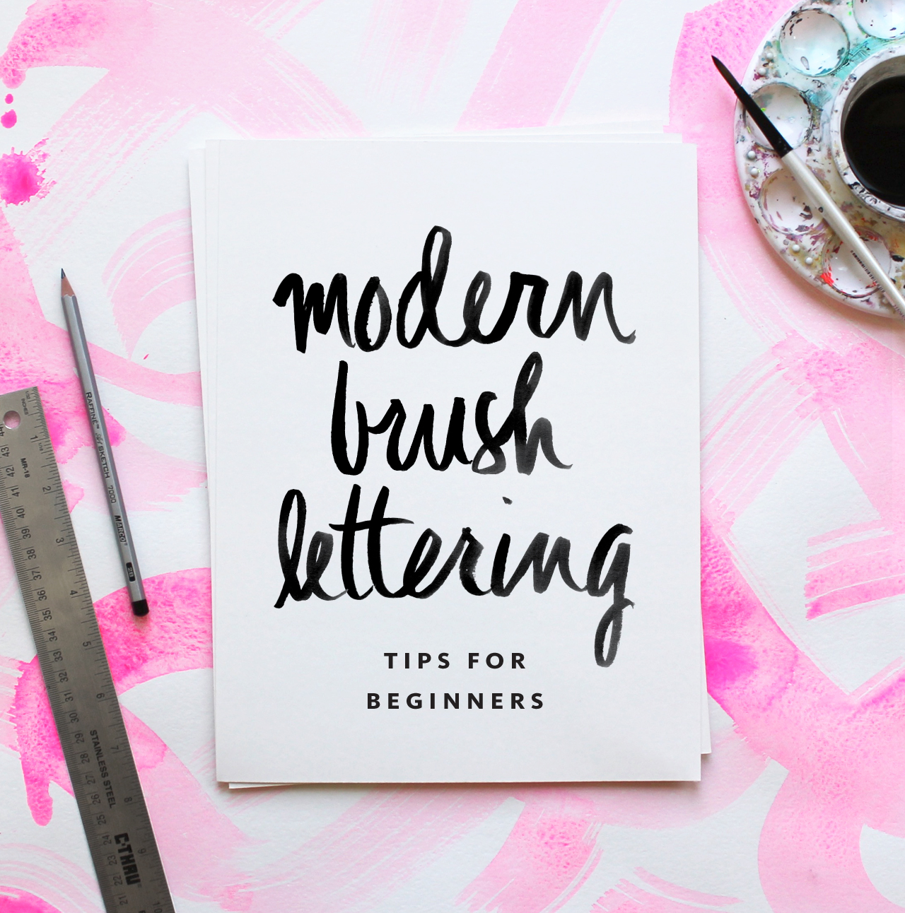
Hi there! Ashley from Fine Day Press here with another guest post – this time on one of my favorite topics, brush lettering. My background is in graphic design; I’ve been painting and lettering for as long as I can remember and  it’s something I’ve always been passionate about. Recently, I’ve been teaching Intro to Modern Brush Lettering workshops at The Paper+ Craft Pantry here in Austin. I’m excited to share some of my best modern brush lettering tips for beginners with you here, along with a downloadable Brush Lettered Alphabet I created that you can use as a practice guide!

I think it’s so great that there’s a big interest in hand lettering these days. We’ve been hearing about handwriting and lettering as potentially becoming a lost art as we all become more technology-dependent. And I’ll admit, after a day of working on the computer, it sometimes feels strange to hold a pen or brush until I get warmed up. But there are so many examples of beautiful hand-done type in the stationery and design world right now, so I personally hope this trend continues for a long time.

Brush lettering is the most painterly of all hand lettering styles – it can be spontaneous, free flowing, and a little messy (in a good way). One of the cool things about brush lettering is that, once you know the basics, you can loosen up and develop your own style with it.  The best way to find your style is to practice, practice, practice.

RECOMMENDED MATERIALS

• #6 pointed round brush
You can experiment with different sizes and shapes but this is a great all-purpose brush.

• India ink or watercolor paint
Both of the above work well for brush lettering. For beginners (and for those working only in black), I recomment giving India ink a try. It’s very fluid, and gives you a super-smooth medium for practicing with the brush. If you want a more textured look or want to experiment with colors, go for watercolor. A word of warning: because of its fluidity, india ink is highly spill-able, and it will stain, so be careful when using it and clean up any spills right away.

• Protected work surface (cutting board, vinyl tablecloth, or art table)
Brush lettering can be wet and messy, so protect your table with a large cutting board or vinyl tablecloth. I have a table cover from Party City that makes a great work surface.

• Small palette cup to hold paint or ink
I like this one from Michael’s. 

TIP: A LITTLE INK GOES A LONG WAY. Start with a small amount of paint or ink in your plastic palette dish. You can always add more!

• Jar of water

• Paper towels

• Pencil, ruler, eraser

• Scratch paper for preparatory sketching

• Card stock for practicing
Card stock is more economical than watercolor paper so it’s great for practicing! Save the watercolor paper for when you’re ready to make a more finished piece.

• Watercolor paper or Bristol board
Both of these thick surfaces will stand up well to a wet medium like brush lettering. Bristol board is very smooth, whereas watercolor paper will usually have a bit more toothiness and texture.
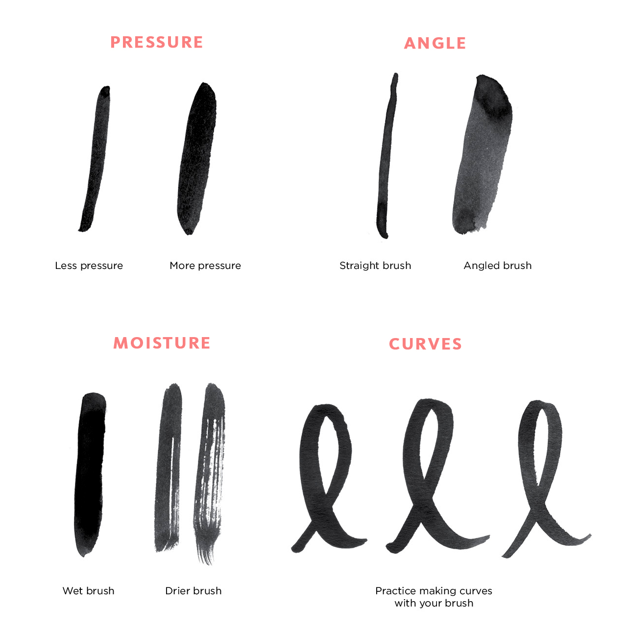
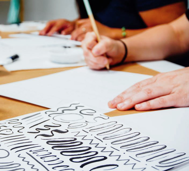
Modern Brush Lettering Tips for Beginners from Fine Day Press / Oh So Beautiful PaperModern Brush Lettering Tips for Beginners from Fine Day Press / Oh So Beautiful PaperAbove: Sample practice strokes, along with a practice session from our recent workshop (photo by Lucia Hua)

WARM UP

A lot of brush lettering is about movement. You want to keep it loose and try to make your motions smooth, so I like to be relaxed when I’m lettering! Beginning with several practice brush strokes will help get you in a relaxing frame of mind.

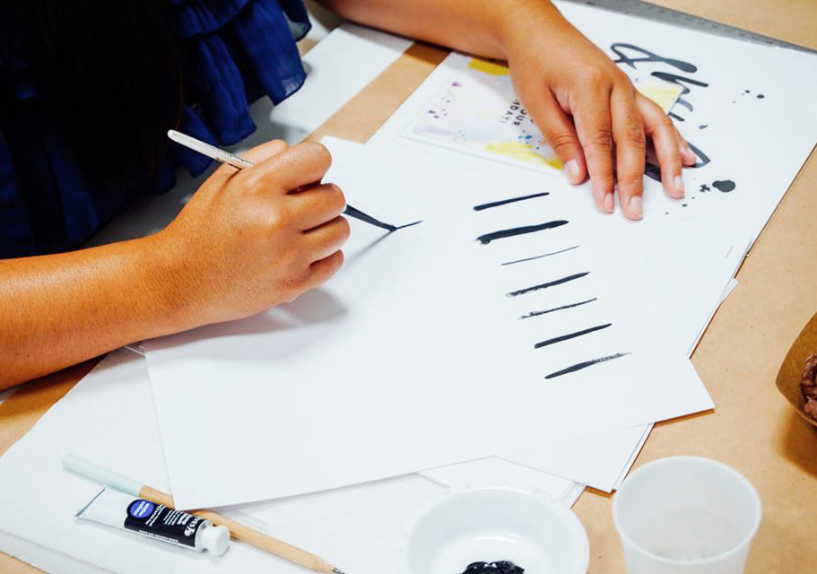
Start out with a small stack of cardstock and do some basic brush motions to get warmed up. Wet your brush in your water jar, then dip into your ink. Practice making very basic motions – vertical, diagonal, horizontal lines. Vary the pressure of your stroke and notice how this impacts your line – more pressure will give you a thicker line. Continue to load up your brush with ink between every few strokes. Practice making curves, o’s and loops. I like to fill 1 or 2 sheets of paper with these types of practice stokes before I start lettering.

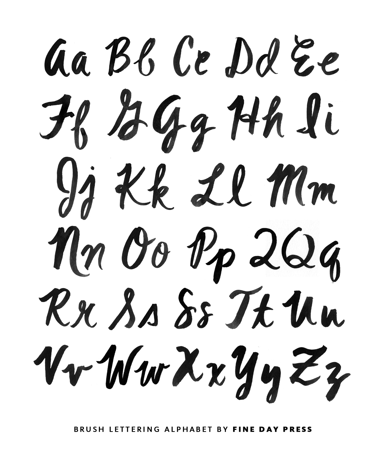
Next, it’s time to practice the alphabet! This may take you back to your grade school days of practicing cursive. I recommend practicing two ways – first, lightly sketch the letter in pencil and trace it with your brush to get a feel for the letterform. Then try it freehand. Test out different angles with your brush as you practice and see how these affect your stroke. To download my sample alphabet, click here.
Modern Brush Lettering Tips for Beginners from Fine Day Press / Oh So Beautiful Paper

Modern Brush Lettering Tips for Beginners from Fine Day Press / Oh So Beautiful Paper

Above: Workshop photo by Lucia Hua; Sample alphabet by Fine Day Press

MAKING AN ART PIECE

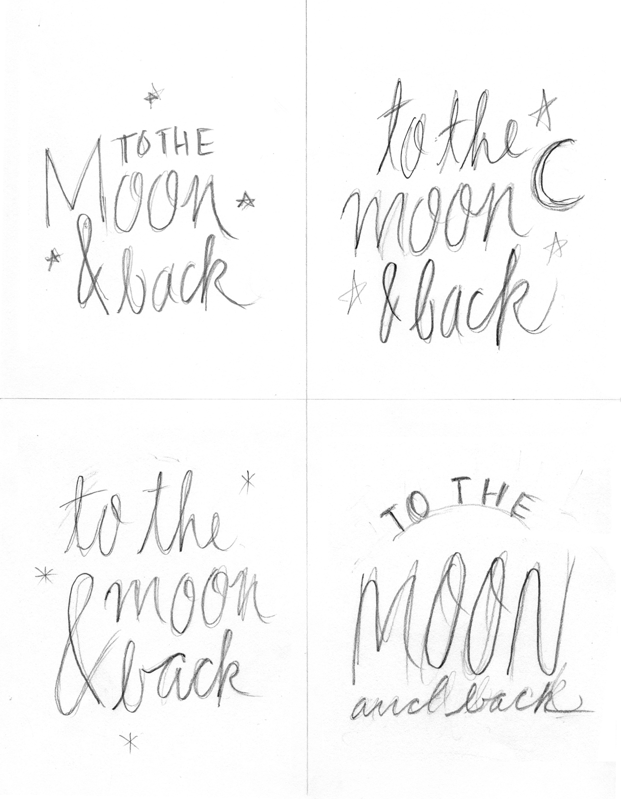
When you’re ready to make an art print of your brush lettering, there are a few steps involved. You’ll want to have a few pieces of scratch paper and your pencil handy to create a few preparatory sketches. These sketches will give you an opportunity to think about the composition of your piece – how do you want the words arranged on the page? Will some words be bigger than others for emphasis? Will some of the type be on a curve? There are so many options here!

Once you have a sketch you like, do a practice version on cardstock – lightly sketch out the words in pencil. You don’t have to exactly trace over them, but you want to create a visual guideline for where your brushstrokes will go on the page. Use your brush and ink to go over the letters. After you’ve done this, you can see if you want to make any changes before moving on to your nice watercolor paper.
Modern Brush Lettering Tips for Beginners from Fine Day Press / Oh So Beautiful Paper

Modern Brush Lettering Tips for Beginners from Fine Day Press / Oh So Beautiful Paper

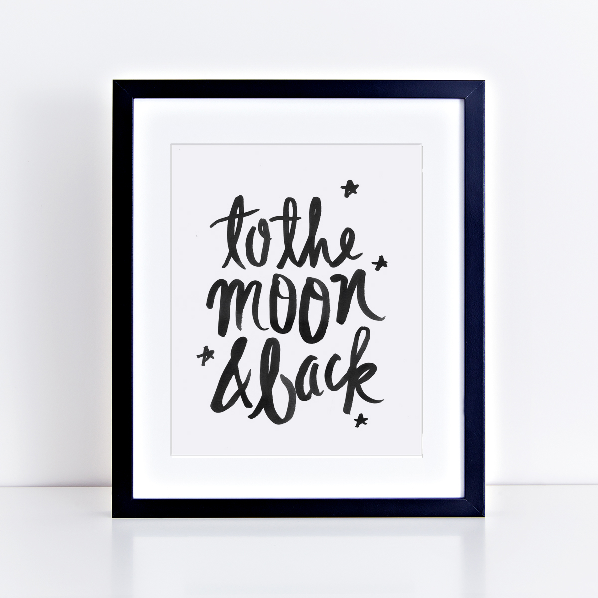
Above: My initial sketches for “To the moon & back”; the final art print

Next, you’re ready to start on your watercolor paper (or Bristol board). Again, I like to lightly sketch out my composition here just to make sure it’s fitting on the page how I want it. Leave some margins around your work and try to center your artwork on the page.

TIP: EXHALE AS YOU STROKE THE BRUSH

It helps to take a breathe and exhale as you start a new stroke – this will steady your brush and relax your hand.

Aim to find a smooth rhythmic movement with your brush. Don’t rush it – paint each letter one stroke at a time. Go back into your water and india ink as much as needed. Depending on how much ink you get on the brush, how absorbent the paper is, and what kind of letter you’re making,  you may need to “reload” after each letter or two.

I like to think of brush lettering as more like painting than writing – and most of all, I just enjoy the process! Don’t worry to much about results when you’re starting out. Just keep going until you get to where it feels natural, and have fun with it – that’s where the real creative magic happens!

Wedding Invitation 101: Where to Start

Happy Monday everyone! I’ll be away for a couple of weeks to catch up on some personal things, but I’m leaving you in EXCELLENT hands while I’m away! Ashley from Fine Day Press graciously agreed to fill in for me this week, and we’re kicking things off with the first installment in a series of posts about wedding invitations! It’s a wonderful primer for anyone feeling overwhelmed by the world of wedding invitations and save the dates. Welcome Ashley!! –Nole

Invitation-101-Where-to-Start-Title

Hey there! Ashley Austin from Fine Day Press here. Nole has kindly invited me to guest blog this week, and I’m super-duper excited to be here sharing some fun posts with you all! Today we’re kicking off a weekly series all about wedding invitations called Wedding Invitation 101. Invitations are a big part of what I do over at Fine Day Press, in addition to greeting cards, calendars and other paper goodies. Over the years, I’ve learned a few tricks to streamline the process, and I’m sharing them with you here.

WHERE TO START

Your wedding invitations are often the first thing your guests will see; it should represent the spirit of the day and set the tone. It’s never too early in the planning process to start envisioning your dream invitations!

Will your wedding be a formal affair or is it more of a barefoot-on-the-beach event? Think about your style as a couple – does gold foil on navy stock suit your style, or will you go for a more romantic vibe with something hand-illustrated?

Maybe you’ve determined your wedding location, chosen your dress, flowers or even selected your color palette… All of these details can inspire your invitation suite.  But even if you haven’t figured those biggies out, you can still start dreaming up your perfect paper pairing.

FIRST STOP: GET INSPIRED!

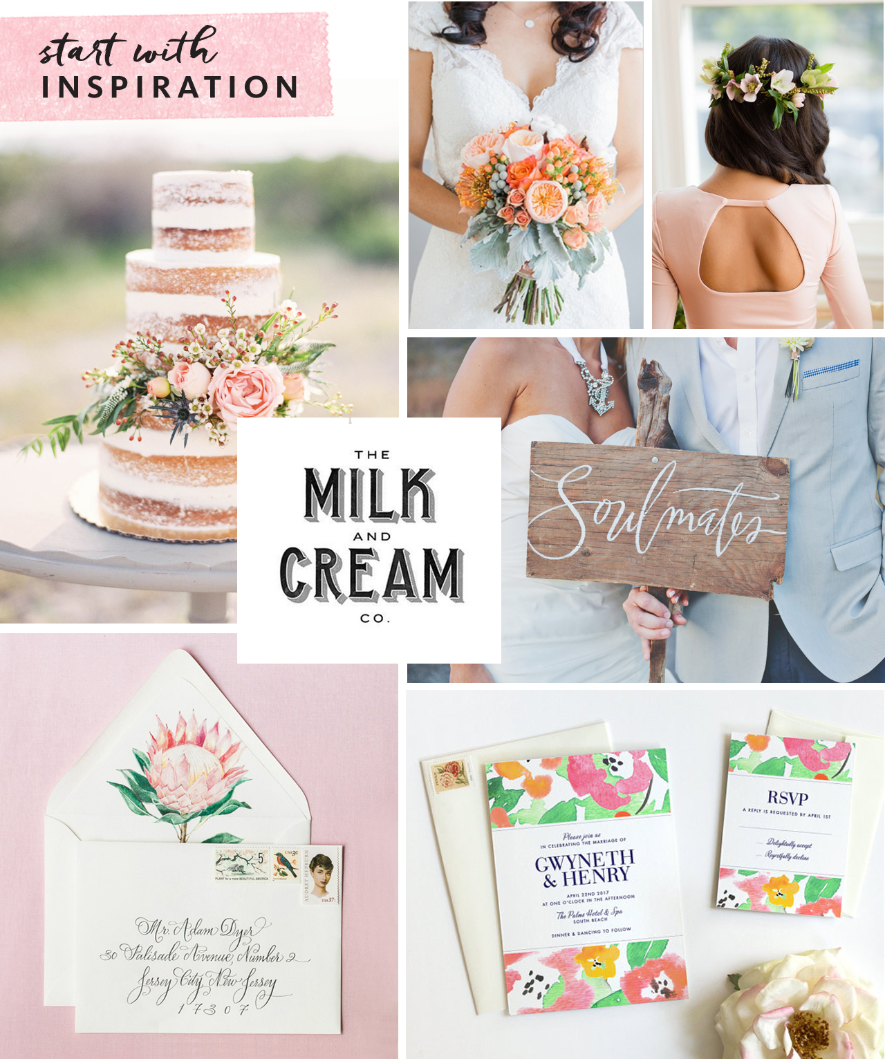
Collecting inspiration is a great way to kick off the process. This could be as simple as making a folder on your computer to save images as you’re browsing wedding blogs, clipping things out of magazines, or creating a Pinterest board specifically for invitation ideas (my personal favorite!). Below is an inspiration board I’ve created for example:

Invitation-101-Where-to-Start-1

Clockwise from top center: Bouquet via Southbound Bride; Hairstyle via Refinery29;  Soulmates painted sign Julie Song Ink; Invitation by Fine Day Press; Envelope & liner by Lana’s Shop; Naked cake via Wedding Sparrow; Milk & Cream type via Pinterest

Don’t just collect examples of invitations – think about colors, textures, ribbons, flowers, anything that might inspire you – like a throw pillow that’s the perfect shade of coral or the lace detail on the back of a dress.

Start researching stationery shops (whether brick & mortar or online) to identify a few you might like to work with. Found a stationer you like? Most stationery companies allow you to order a sample, so that you can see the paper and quality in person before committing to a bigger purchase. Local shops will have samples on hand for you to touch and feel.

CUSTOM OR READY-MADE?

There are as many ready-made invitation styles out there as there are brides-to-be, and finding an existing design can be a great option. Your selected design can often be customized with your colors and typography choice, among other details.

If you love being part of the creative process, or have a very specific design idea for your suite, a custom design may be for you. Crafting a custom design typically takes longer and may involve an initial meeting, moodboard development (this is where that inspiration you’ve collected comes in handy), and multiple rounds of design development. Budget will come into play here as well, as creating a from-scratch design requires significantly more hands-on time and pricing usually reflects this.

TO SAVE OR NOT TO SAVE

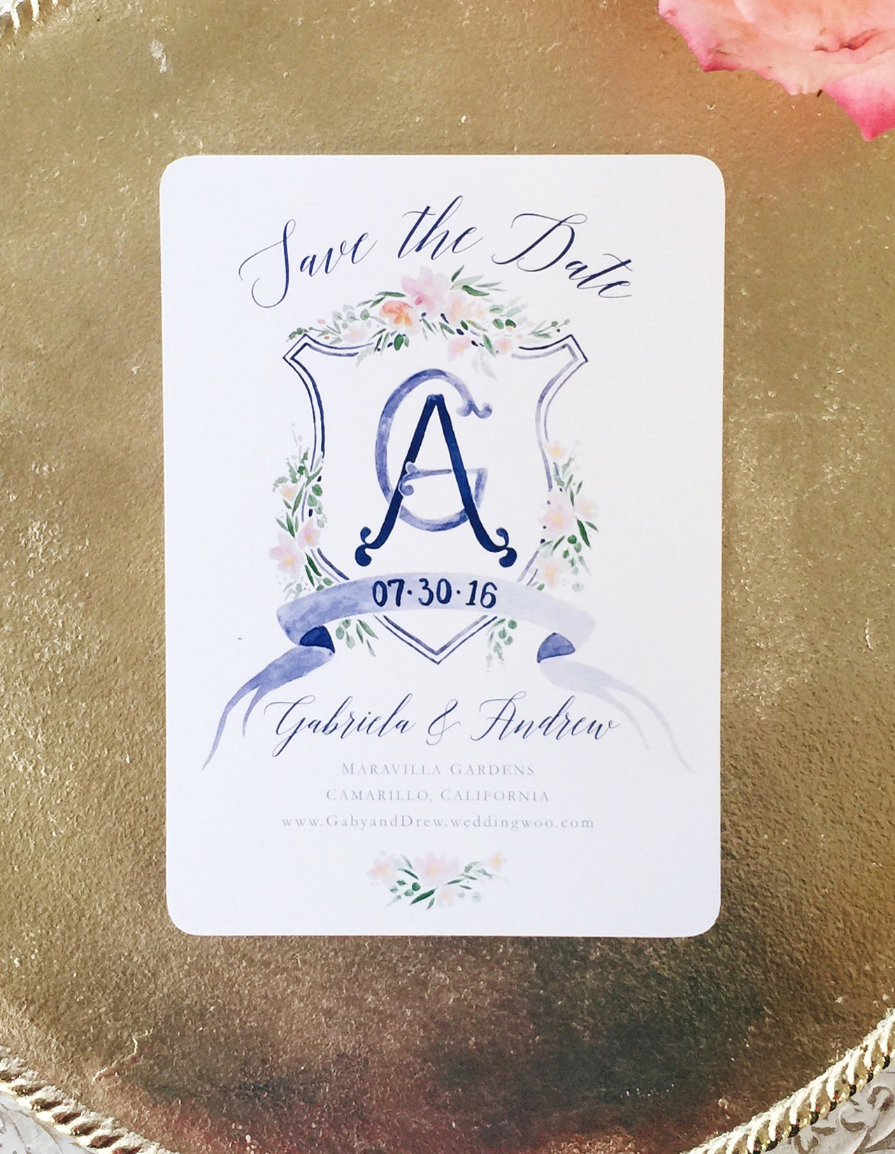
Sending out a Save the Date is a great way to give everyone on your list a heads up on your plans, and set the tone for the invitation to follow. Save the Dates are a great opportunity to do a less formal version of your invitation – for example, a magnet, a balloon or even a temporary tattoo are fun ideas! If you are having a destination wedding in a far-flung locale, a Save the Date is a must, in order to give your guests sufficient time to plan their travels.

Invitation-101-Where-to-Start-2

A beautiful printed Save the Date from Designer Rolodex member Sable & Gray

Are mailed Save the Dates a must-do? Not necessarily! If you are getting out your invitations super early, you could skip it. Or perhaps your wedding is small enough that word of mouth is sufficient until the invitations are sent. Some folks may prefer to send a digital Save the Date. This can also serve to direct guests to your wedding website. Keep in mind, though, that less digitally-savvy relatives (hi, Grams!) may feel left out with this option.

We’ll cover invitation timing in greater detail in a future installment of this series!

DIY Iridescent Favor Bags

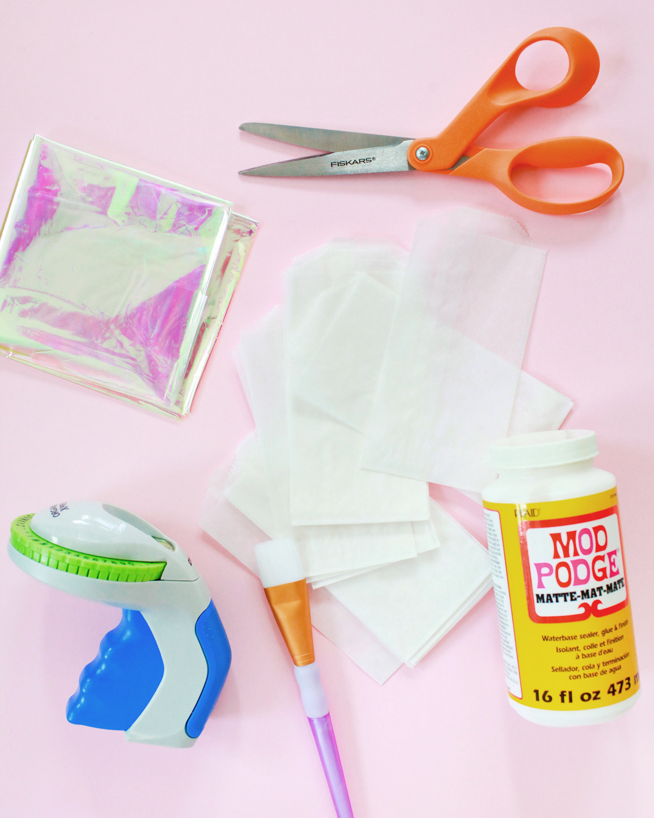
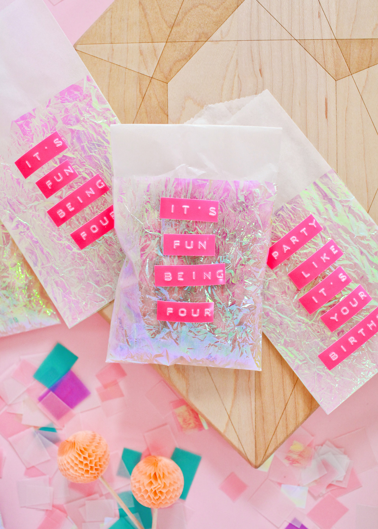
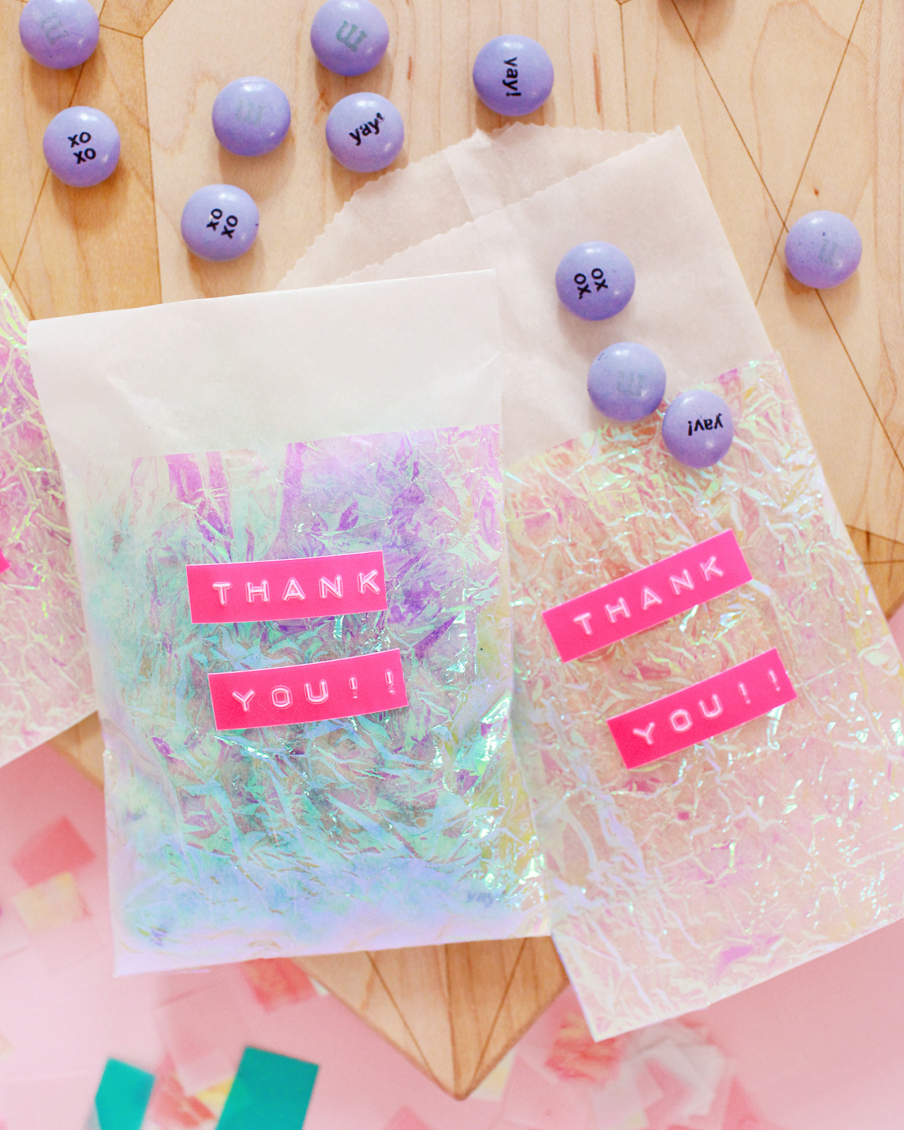
Yesterday I shared a few DIY party favor ideas, all with iridescent and pastel elements. Glassine bags are a quick and easy way to package party favors, and I originally searched for some readymade iridescent glassine bags to use in the post – but I couldn’t find any! So I decided to take matters into my own hands and make some DIY iridescent favor bags. It was so simple, and I absolutely loved how they turned out, so I thought I’d share the steps with you along with a quick and easy idea for personalizing your party favor bags!

DIY Iridescent Favor Bags / Oh So Beautiful Paper

DIY Iridescent Favor Bags / Oh So Beautiful Paper

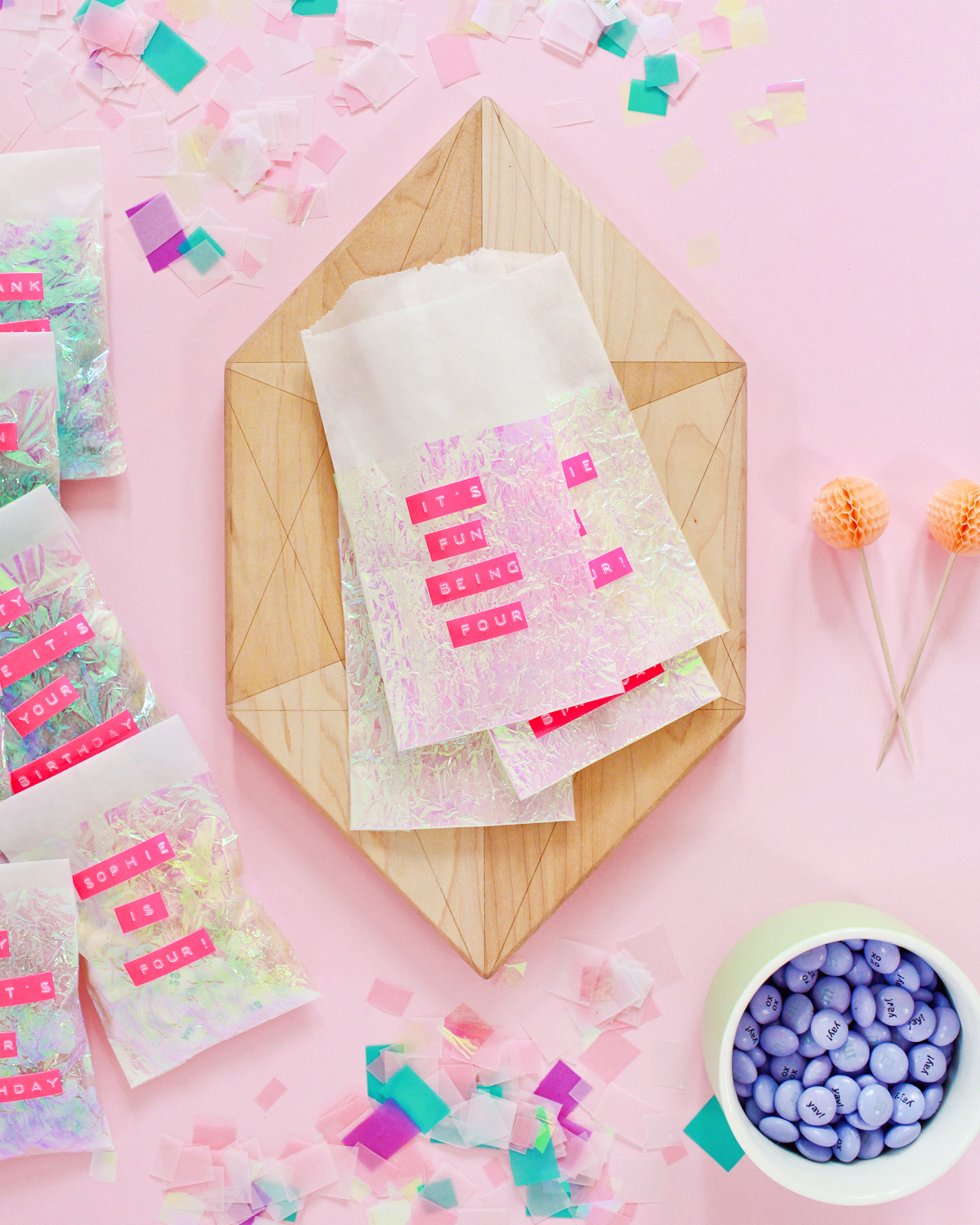
I absolutely loved the iridescent favor bags paired with prism twine from Knot & Bow and vellum party favor tags from Swiss Cottage Designs (which you can download here), but I wanted to add even more personalization to the favor bags. So I turned to my favorite DYMO label maker! I use the classic black embossing tape to label and organize just about everything at home, and it seemed like a fun and modern way of adding a personalized message to the bags. I had my daughter’s upcoming 4th birthday party in mind when creating these favor bags, so I was thrilled to discover the neon pink label tape! Neon pink and iridescent party favors? Done and done. Here’s how to make your own!

DIY Iridescent Favor Bags / Oh So Beautiful Paper


Supplies

DIY Iridescent Favor Bags / Oh So Beautiful Paper

To make the iridescent favor bags:

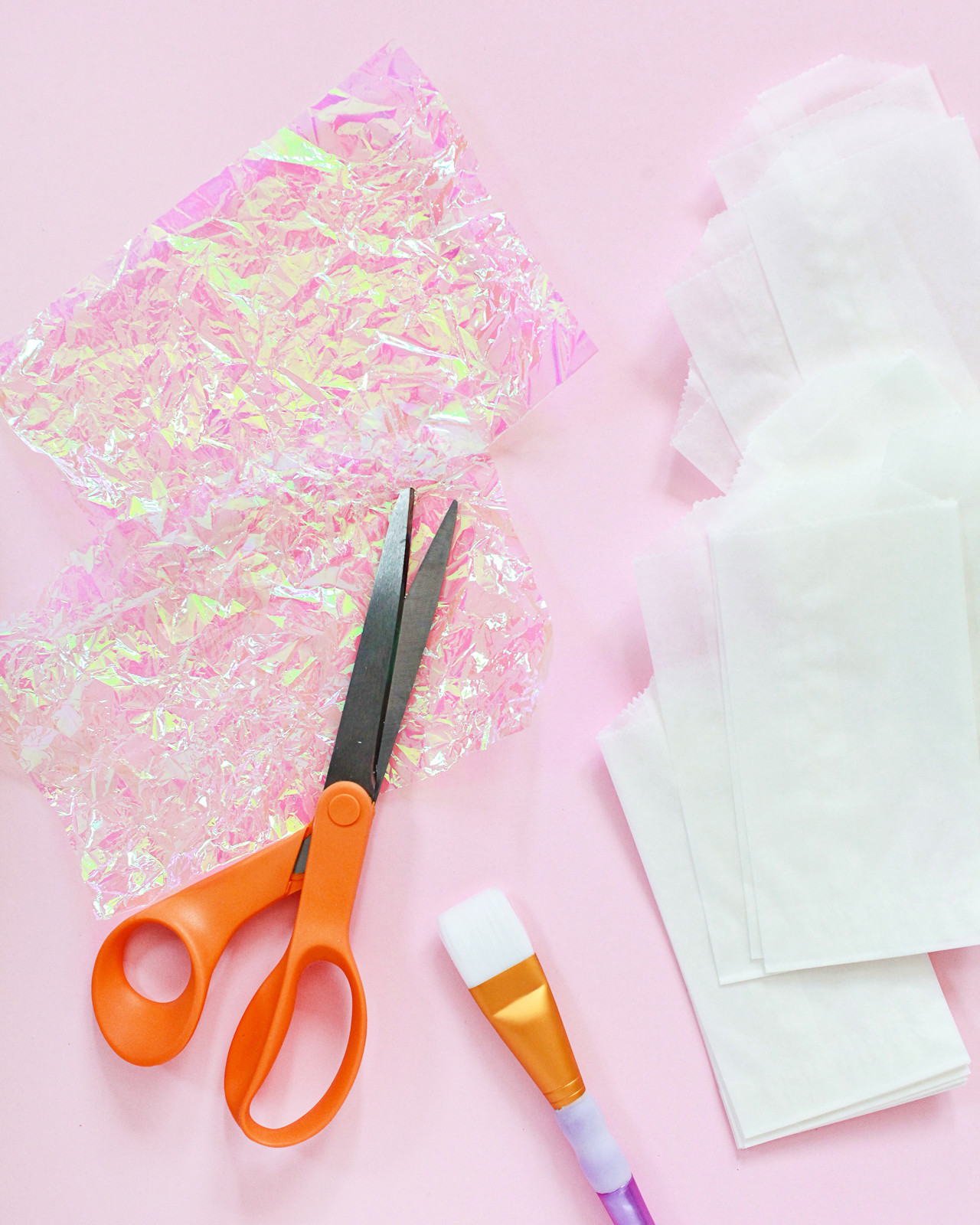
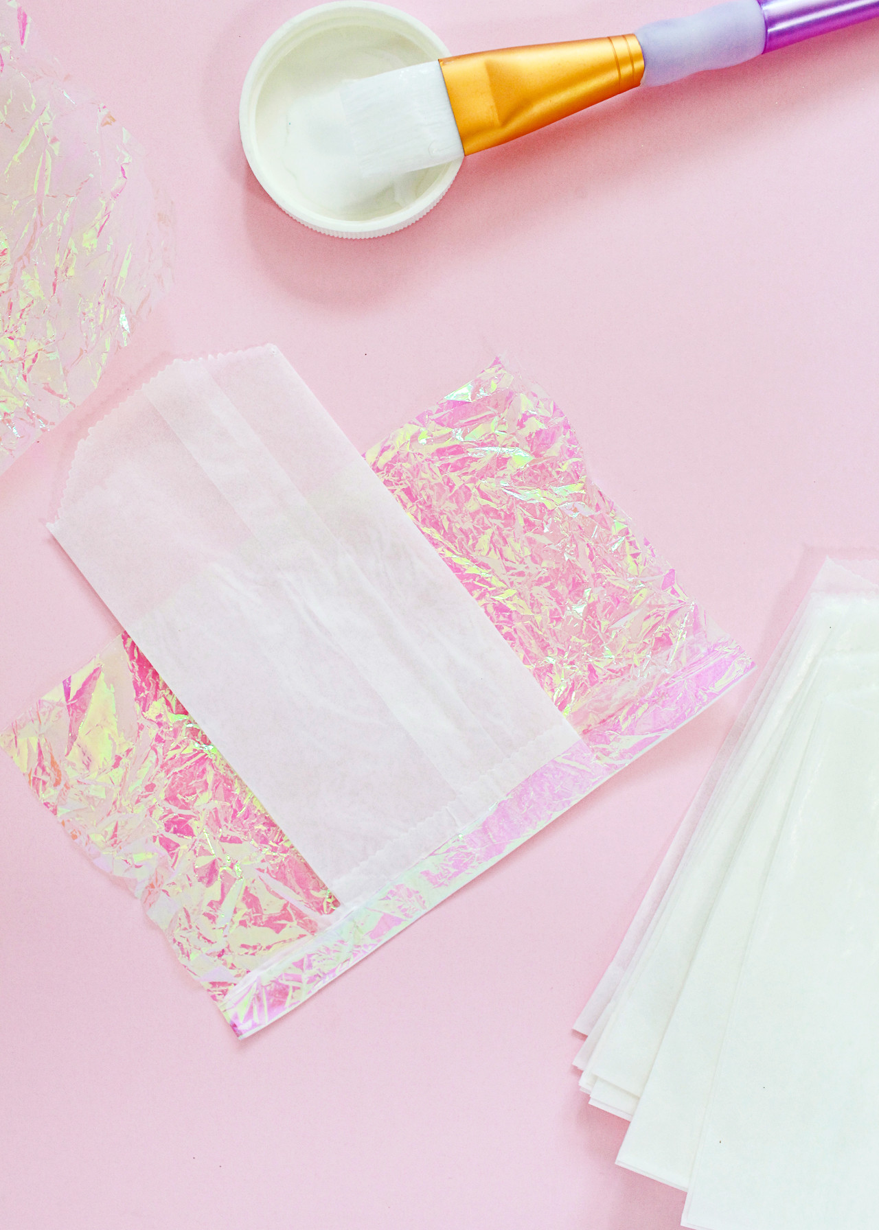
Step 1. Cut a piece of iridescent cellophane or tissue that is twice as wide as the glassine bag and comes about 3/4 of the way up the glassine bag, plus another inch. My glassine bags were 3″ wide by 5.5″ tall, so my pieces were approximately 6″ wide and 4.5″ tall. You’ll need one piece of iridescent cellophane per glassine bag. I made each of my cellophane pieces super crinkly by crumpling several pieces together in my hand, then once again laying them out flat.

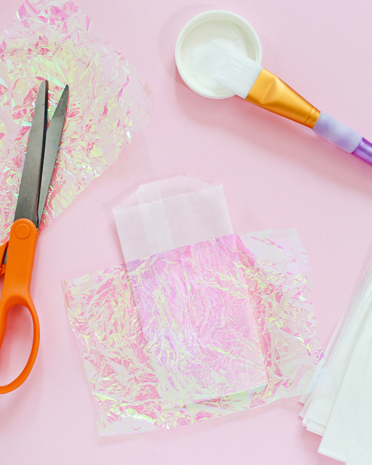
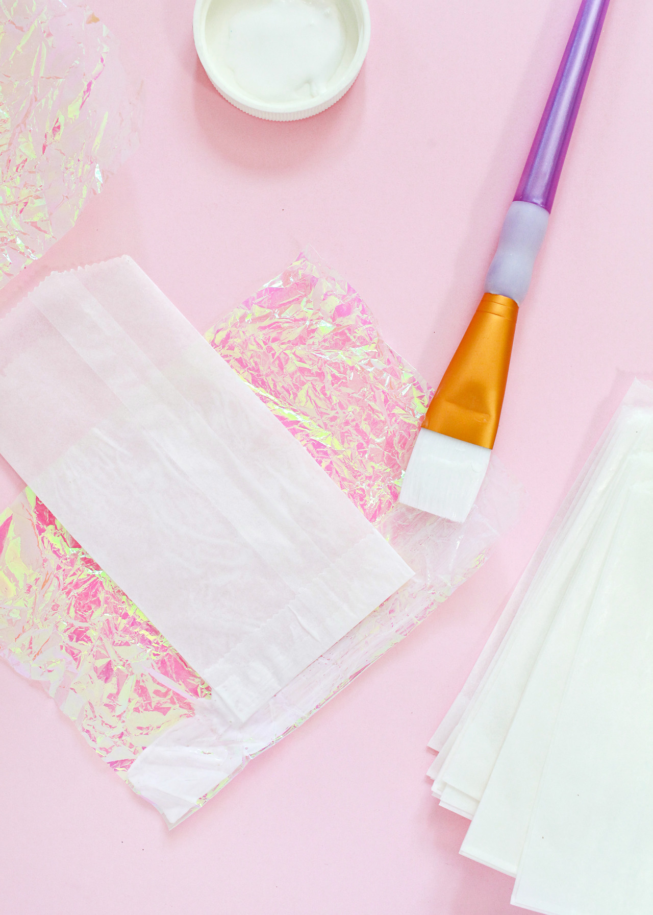
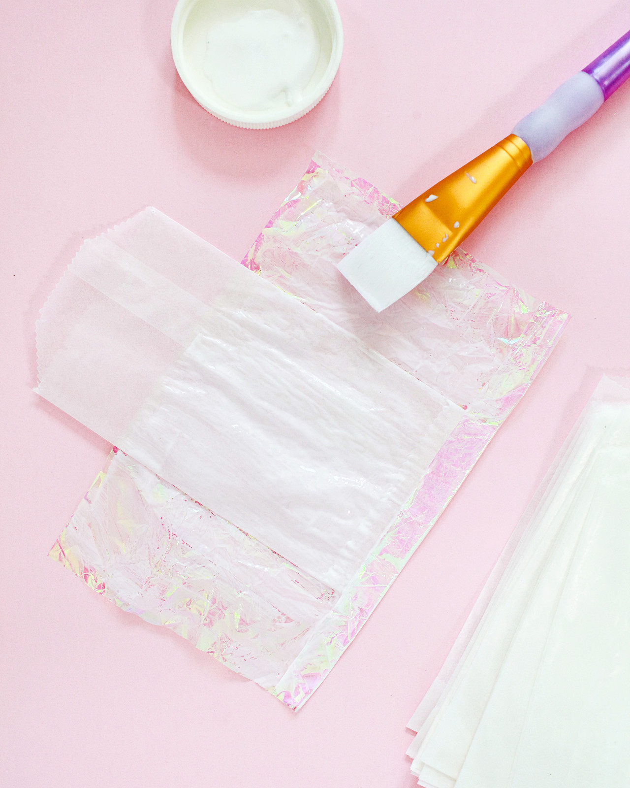
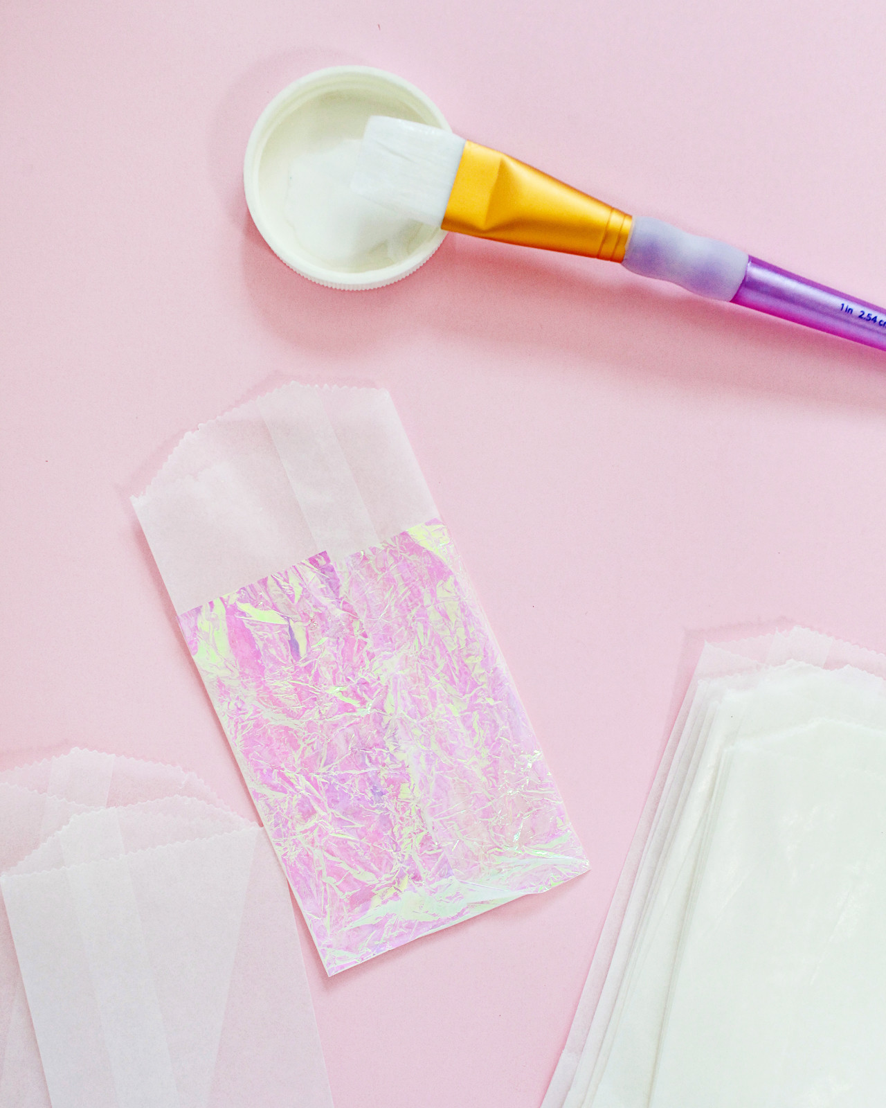
Step 2. Use your paintbrush to apply a thick coat of Mod Podge to the front of the glassine bag. Place the piece of iridescent cellophane (roughly centered) over the glassine bag and press down. Flip the glassine bag and iridescent cellophane over and apply another strip of Mod Podge to the bottom of the glassine bag and iridescent cellophane, then fold the iridescent cellophane over the bottom of the glassine bag and press down. Repeat on both sides until the entire bag is covered in iridescent cellophane. Allow everything to dry completely, ideally overnight.

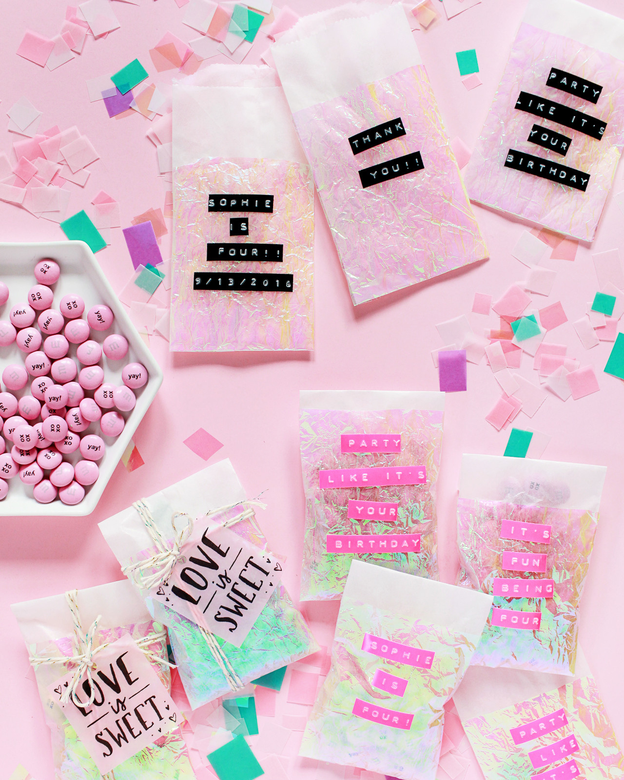
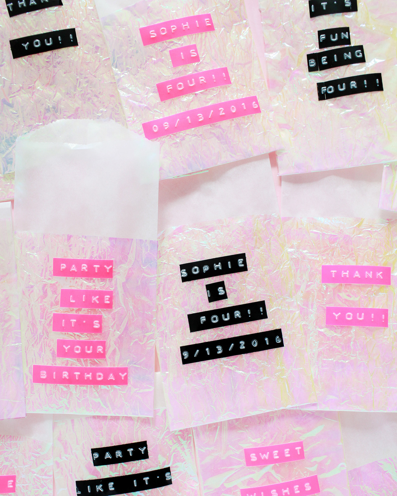
Step 3. Use your label maker to create a few fun and personalized party messages, and apply the phrases directly to the favor bag. For a kids birthday party I think it would be super cute to have the child’s name, age, and the party date on each bag! For a wedding, the names of the couple and the wedding date. Or keep it simple with a short thank you message – whatever works for your event!

Step 4. Fill each bag with a sweet treat and seal them in the back with a piece of washi tape. Place them in a tray or basket so party guests can grab a bag on their way home!

DIY Iridescent Favor Bags / Oh So Beautiful PaperDIY Iridescent Favor Bags / Oh So Beautiful Paper

DIY Iridescent Favor Bags / Oh So Beautiful PaperDIY Iridescent Favor Bags / Oh So Beautiful Paper

DIY Iridescent Favor Bags / Oh So Beautiful PaperDIY Iridescent Favor Bags / Oh So Beautiful Paper

DIY Iridescent Favor Bags / Oh So Beautiful Paper

The black label tape is still totally cute, BTW! I love the neon pink for a kids birthday party, but black and iridescent would be a fun combination for a modern wedding, don’t you think??

DIY Iridescent Favor Bags / Oh So Beautiful Paper

DIY Iridescent Favor Bags / Oh So Beautiful Paper

Aaaaaannnd….. now I kind of want to add an iridescent layer to ALL THE THINGS. It’s so fun and sparkly! What should we iridescent-ify next??

p.s. Iridescent and pastel party favor ideas with printable favor tags!

Photos by Nole Garey for Oh So Beautiful Paper

Behind the Stationery: The Good Twin

Based in the colorful land of Los Angeles, California, Katie from The Good Twin is here to share with us the founding moments of her stationery company and take us through a day in her life. I love seeing her pins and stationery in local Brooklyn shops here in New York! So glad to have you here today, Katie. Take it away –Megan

Behind the Stationery: The Good Twin / Oh So Beautiful Paper

Hi there! I’m Katie, owner and operator of The Good Twin, based here in toasty Los Angeles. And yes, I am a twin, although my brother might argue with you about the â€œgood” part, ha. I’m so excited to be chatting with you guys today – Oh So Beautiful Paper has been a source of inspiration for me for many years, and stationery is one of my favorite things to talk about, go figure.

Behind the Stationery: The Good Twin / Oh So Beautiful Paper

I’ve been working in stationery since my college days in Minneapolis, after a childhood in Portland spent creating greeting cards for family and friends for pretty much any occasion. While I was in art school, I interned for a corporate greeting card company, and then a small letterpress shop, both of which really helped me learn the ins and outs of the industry. I realized I was really excited about the big picture of a business — growing a full line and having creative control, rather than being a hired gun for an art director, and I set my sights on producing my own designs.

When I graduated, I worked a few jobs (barista, library assistant, and freelance illustrator) while my friend John and I started Dude and Chick, a tiny line of letterpress cards. After a few years of long hours and late nights, I moved to L.A., where I eventually decided to leave Dude and Chick and start my own line. The Good Twin was finally off and running in May of 2014.

Behind the Stationery: The Good Twin / Oh So Beautiful Paper

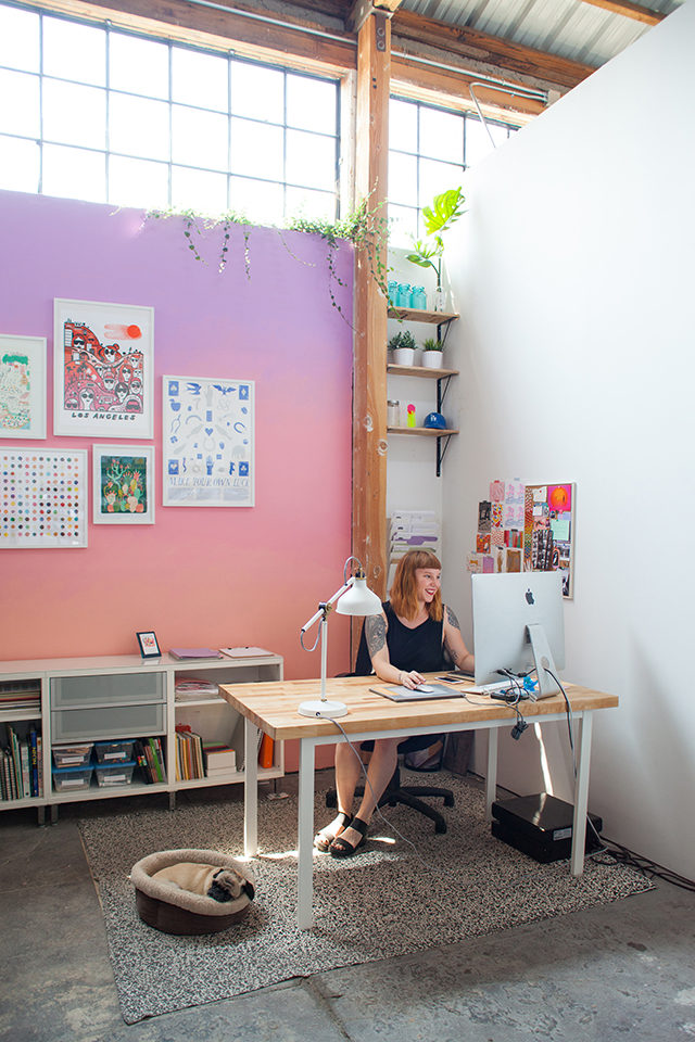
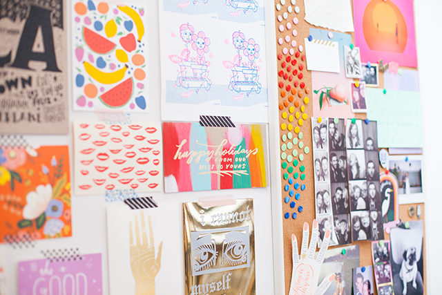
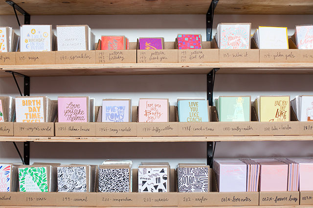
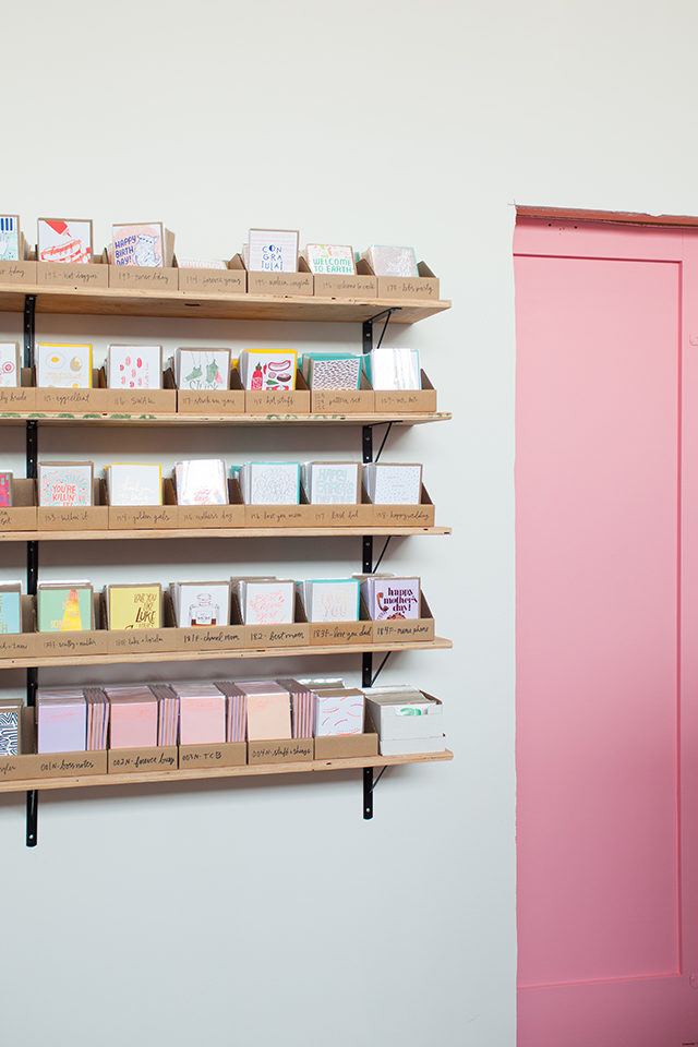
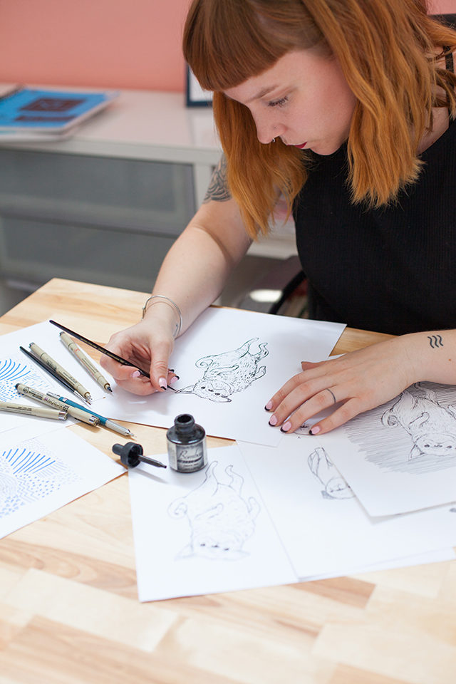
My studio is in Lincoln Heights, way on the east side of Los Angeles just northeast of downtown. It’s small, but it’s mine! I only recently moved into a space outside of my house, which has been a big change, but also very welcomed – my apartment feels like a real place again, rather than a storage locker filled to the brim with paper! All of my inventory lives in the studio, and I also carved out a designated area that feels a bit more officelike, with a big desk for drawing.

Behind the Stationery: The Good Twin / Oh So Beautiful Paper

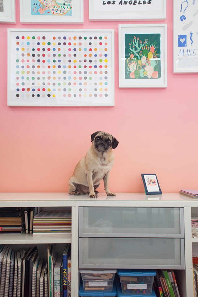
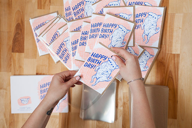
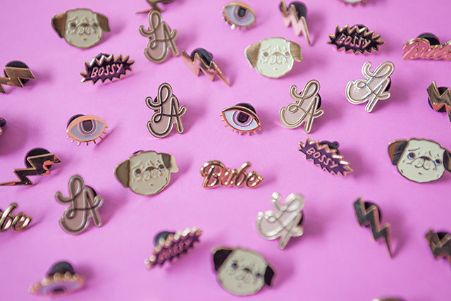
I usually bring my pug Peggy to work with me, and we’re joined a few times a week by my friend Bryan, who helps out with inventory management and order fulfillment. Having an employee has been my saving grace —before that, my nights and weekends (and sometimes afternoons) would be spent sleeving cards and pulling orders. I still do a lot of that, but now I have a lot more time to focus on illustrating and the business as a whole.

Behind the Stationery: The Good Twin / Oh So Beautiful Paper

As The Good Twin has grown and expanded, I’ve learned to delegate a bit, but I still find myself packing my days with a million different things. I work best when I’m multitasking. My best trick for any problem is to step away for a few minutes and work on something else, then return with a fresh eye. I’ve always relied pretty heavily on a routine and regular work hours, since my brain responds really well to structure. There’s always something to do when you run the show, so I try to put in a full day even if I’m feeling uncreative or having one of those blocks where I feel like I’ll never be able to draw again.

Behind the Stationery: The Good Twin / Oh So Beautiful Paper

Days usually begin around 9am, after a morning run and breakfast at home with my boyfriend. Mornings are reserved for processing orders and managing my books (nothing like a little Quickbooks with a cup of coffee to wake me up!). I spend a lot of time writing and answering emails from buyers, sales reps, and printers, as well as entering expenses and planning budgets for reprints and new products in the works.

By the afternoon I’m ready for a little creativity. I do my best to draw a bit every day, even if it’s just a few minutes of calligraphy practice. I keep a folder on my phone with all my dumb (and occasionally awesome) ideas for new cards and products. About half the time, I start from a really concrete idea, but often I’ll just be browsing through my endless Pinterest boards for inspiration and just make a drawing or pattern I really like.

Behind the Stationery: The Good Twin / Oh So Beautiful Paper

Every week I comb through my sketchbooks and pull anything I feel is worthwhile, and from there I ink those drawings (sometimes with a Micron pen, sometimes with a brush), scan them in, and start playing around with layout and color in Illustrator. Although I do hand draw everything, including type, I usually piece things together either in the computer or with a light box. For me, it’s easier to focus on each piece of a composition separately, and then assemble everything in post.Behind the Stationery: The Good Twin / Oh So Beautiful Paper

My biggest challenge has always been color, and sometimes I’ll go through ten different palettes before I find something I like. Each season’s release gets one huge file where I keep everything so I can be sure it all looks nice together. Once I have the general look down, each design gets a separate file for cleanup, color separations, and other finishing touches before they go off to print. While I’m working, I like to listen to music and podcasts and occasionally audio books.

Behind the Stationery: The Good Twin / Oh So Beautiful Paper

I head home for the day between 5-8pm depending on how busy things are and how much I’m getting done. I really love my job, and hands down my favorite aspect of running a small business is the variety. As much as I love designing, it’s important to me to understand things like profit margins, trend research, and sales patterns. I think it helps me better direct my own work and style. I’m constantly giving myself pep talks and figuring out things that I never dreamed I’d be wrestling with, but that’s how I like it.

Behind the Stationery: The Good Twin / Oh So Beautiful Paper

Stationery is really exciting industry, and I love seeing change in my own style as well as the different lines I admire. Hope you enjoyed the peek into my corner of the paper world! Thanks for having me, Megan and Nole!

Photos by Kate Miss

Want to be featured in Behind the Stationery? Email [email protected] for details.

Stationery A-Z: New Baby Cards, Part 2!

A couple of weeks ago, I shared a much-belated round up of new baby cards. Well, we unearthed so many great cards during our search that I couldn’t resist doing a second installment! So today we’re sharing twelve more adorable cards to send love and congratulations to new parents. Each and every one of these cards makes me smile and laugh, whether it’s a sweet sentiment that has me remembering the indescribable feeling of holding a newborn in your arms – or a joke about the sleep deprivation that all new parents experience. Oh, and they’re all gender neutral, so you can totally stock up now and save these cards for just the right baby. And if you’re still looking for just the right card, you can always check out the New Baby page in the Market List any time of year to browse our list of nearly 300 (and growing!) new baby cards from some of our favorite stationers!

New Baby Card Round Up / Oh So Beautiful Paper

1. Truth from Sea & Lake – bye bye sleep!

2. Bunnies! This quirky baby card from People I’ve Loved just makes me smile

3. A sweet card from Mr. Boddington’s Studio

4. Send a bit of encouragement to a brand new parent with this card from Emily McDowell Studio

5. Yay for mini versions of ourselves! From Farewell Paperie

6. A super cute card to welcome a new baby from Hello!Lucky

7. Parenthood is DEFINITELY one wild ride, right Smudge Ink?

8. Congrats for new parents from The Good Twin

9. One of my faves from Dear Hancock

10. Send love to Earth’s newest resident from Ladyfingers Letterpress

11. So many emotions all wrapped up in one card from laLa Grace – parenthood definitely requires a healthy sense of humor, particularly during those early sleep-deprived days

12. Love this gender-neutral new baby card from Hammerpress

More new baby cards in the Market List right here!