Ashley + Jeff’s Modern Chic Neon Pink Wedding Invitations

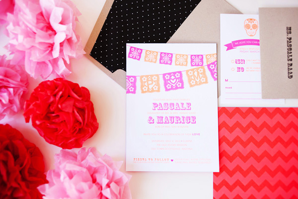
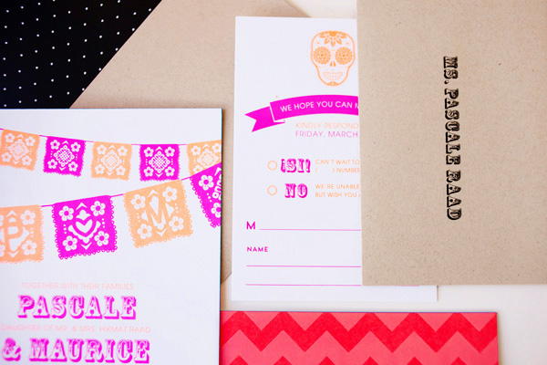
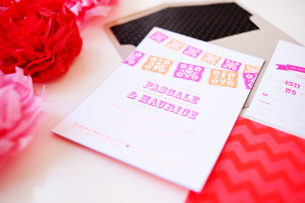
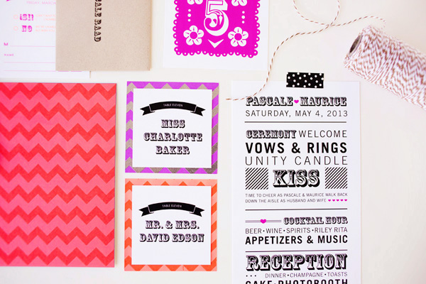
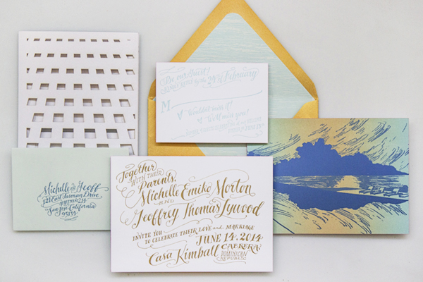
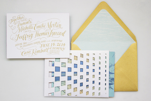
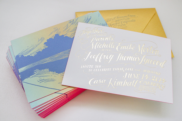
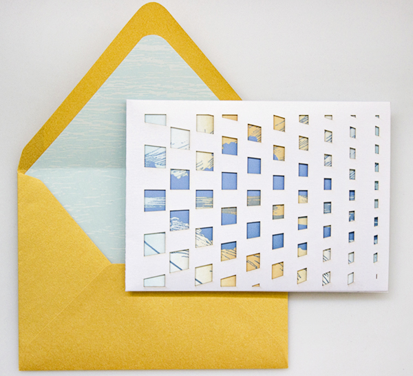
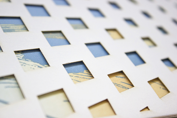
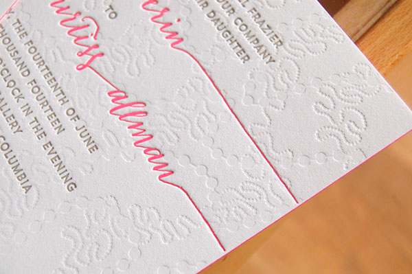
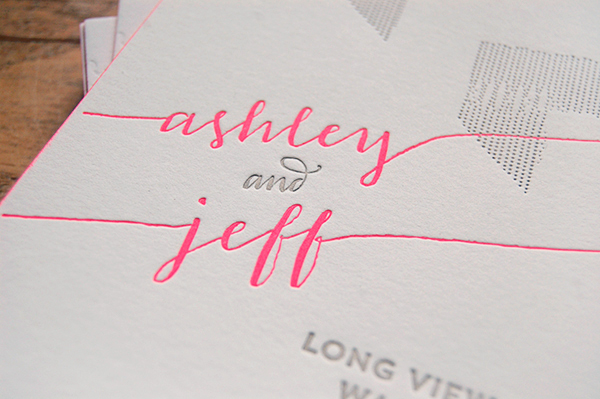
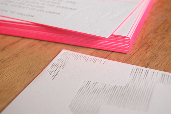
These weddings invitations are the result of a fantastic collaboration – designed by the bride (and featuring her own calligraphy!) and letterpress printed by Alia and Jason of Darling Press. Ashley wanted her wedding invitations to reflect both her love of paper (yay!) and her modern chic wedding style. The design features a blind impression pattern inspired by the texture on Ashley’s wedding dress and pops of neon pink. Love!

Neon-Pink-Modern-Calligraphy-Wedding-Invitations

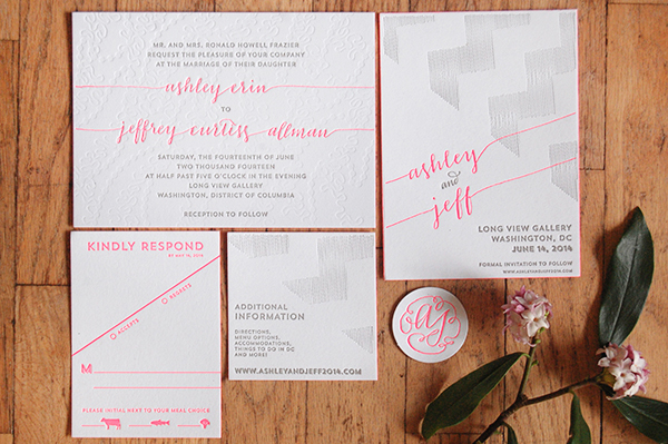
From Ashley: I wanted our invitations to be really unique and really us. I love paper, typography, letterpress, and everything that goes along with it. I wanted to set a tone through the paper that we could carry throughout the rest of the wedding plans: sophisticated, chic, modern, and clean. Our wedding will take place in an art gallery in DC, and our tables will be Pantone colors instead of numbers – hence my interest in getting very specific ink colors.

Neon-Pink-Modern-Calligraphy-Wedding-Invitations2

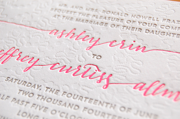
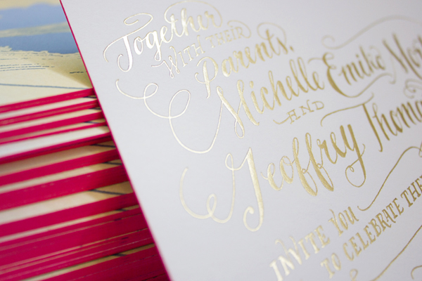
The blind impression pattern is inspired by the embellishment on my wedding dress. I was using a font for the calligraphy at first, but then I took a calligraphy class from Michele Fritz of Meant to be Calligraphy here in DC, and she convinced me to replace that font with my own writing.

Neon-Pink-Modern-Calligraphy-Wedding-Invitations3

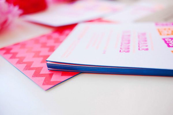
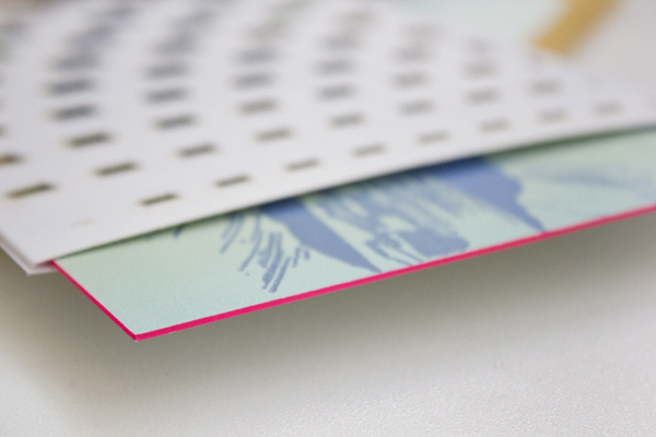
When it came time to print the invitation suite, Alia and Jason of Darling Press to letterpress printed the design on 236# Savoy Bright white paper with neon pink edge painting.

Neon-Pink-Modern-Calligraphy-Wedding-Invitations4

Neon-Pink-Modern-Calligraphy-Wedding-Invitations5

Thanks Alia and Jason!

Design: Ashley Frazier

Letterpress Printing: Darling Press

Check out the Designer Rolodex for more tal­ented wed­ding invi­ta­tion design­ers and the real invi­ta­tions gallery for more wedding invitation ideas!

Photo Credits: Darling Press

Pascale + Maurice’s Colorful Cinco De Mayo Wedding Invitations

How about a little neon to brighten up your Wednesday? Heidi from idieh design sent over these vibrant invitations created for a Cinco de Mayo wedding, featuring neon fuchsia and neon orange paired with bright blue edge painting and kraft paper envelopes. So fun!

Cinco-De-Mayo-Wedding-Invitations-idieh-design

From Heidi: Pascale and Maurice wanted to merge tradition and trend in a fun and artistic way. Their wedding would take place on Cinco de Mayo weekend, so they chose to honor the Mexican holiday with a “fiesta-chic” theme. They wanted their invitation suite to incorporate a whimsical color scheme inspired by the very colorful Mexican culture.

Cinco-De-Mayo-Wedding-Invitations-idieh-design2

We decided on an extra-thick invitation with vibrant neon fuchsia and neon orange to let guests know it was going to be a fun, festive, and bold celebration. The graphic Mexican banner subtly enclosed the couple’s initials within the cuts of the design. The invitation was backed with a vibrant chevron pattern that utilized spot coating varnish for a glossy finish.

Cinco-De-Mayo-Wedding-Invitations-idieh-design3

Bright blue edge painting on the main invitation provided a finishing touch. The entire suite, including the adorable response card, was packaged in a kraft envelope lined with a black and white polka dot patterned liner. 

Cinco-De-Mayo-Wedding-Invitations-idieh-design4

The bold graphics and colorful palette continued throughout the wedding day with the over-the-top playful ceremony programs, the whimsical table numbers, and the cheerful escort cards.

Cinco-De-Mayo-Wedding-Invitations-idieh-design8

Thanks Heidi!

Check out the Designer Rolodex for more tal­ented wed­ding invi­ta­tion design­ers and the real invi­ta­tions gallery for more wedding invitation ideas!

Photo Credits: Michelle Herrick Photography

Quick Pick: Moglea Spring Collection

Now that it really feels like Spring, I just want to surround myself with color – I’m so happy to see green, yellow, pink, and purple returning to our neighborhood! I’m a huge fan of the painterly style and whimsical hand lettering of Meg from Moglea. Meg just released a bunch of new cards from her spring collection, and I’m loving all the gorgeous color – from hand painted patterns to bright edge painting (on die cut cards no less!). I can’t wait to see more at the National Stationery Show in just a few weeks!

Quick-Pick-Moglea-Spring-Collection4

Quick-Pick-Moglea-Spring-Collection6Quick-Pick-Moglea-Spring-Collection2

Quick-Pick-Moglea-Spring-Collection8Quick-Pick-Moglea-Spring-Collection7

Quick-Pick-Moglea-Spring-Collection3

Quick-Pick-Moglea-Spring-Collection5Quick-Pick-Moglea-Spring-Collection

Quick-Pick-Moglea-Spring-Collection9

Lots more in the Moglea etsy shop!

Photo Credits: Moglea

Gold Foil Hand Lettered Wedding Invitations

Happy Monday everyone! Before I head off for a few days in the sun, I just had to share these gorgeous wedding invitations from Arley-Rose and Morgan of Ladyfingers Letterpress! Created for a wedding in the Dominican Republic, these invitations feature Arley-Rose’s signature hand lettering in stunning metallic gold foil, a beautiful rainbow roll sunset, architectural laser cut details, and a pop of bright neon edge painting. Love, love, love!

Neon-Gold-Foil-Hand-Lettered-Wedding-Invitations-Ladyfingers-Letterpress6

From Arley-Rose and Morgan: It didn’t take long for Michelle and Geoff to knock us off our feet and inspire us to make some of our most favorite invitations we’ve ever made! Influenced by their correspondence through adorable hand-written cards, genuinely sweet emails, and giddy phone calls filled with excitement and pure joy, we put our heads together to come up with some invitations fit for some of the sweetest clients we’ve ever had!

Neon-Gold-Foil-Hand-Lettered-Wedding-Invitations-Ladyfingers-Letterpress5

Since their wedding is going to be held in the Dominican Republic, they wanted an invitation suite that reflected the excitement and love they have for each other, while relaying the modern simplicity of their beautiful ocean-side venue. 

Neon-Gold-Foil-Hand-Lettered-Wedding-Invitations-Ladyfingers-Letterpress

Their hand-lettered invitations were hot foil stamped in bright gold foil onto thick, 220lb cotton Crane Lettra paper. On the backside of the invitation, a drawing of the sunset from the Casa Kimball infinity pool was rendered as a dual-split letterpress rainbow roll. Hot pink edge painting was applied to the edge of each piece, giving just the perfect amount of pop for each invitation!

Neon-Gold-Foil-Hand-Lettered-Wedding-Invitations-Ladyfingers-Letterpress4

Neon-Gold-Foil-Hand-Lettered-Wedding-Invitations-Ladyfingers-Letterpress9

The design for their enclosure mimics a pattern found in one of the architectural features at the venue. The pattern was then laser cut out of a Shimmer Ice paper and assembled with a pocket in the back to hold the RSVP card and envelope.

Neon-Gold-Foil-Hand-Lettered-Wedding-Invitations-Ladyfingers-Letterpress10

Neon-Gold-Foil-Hand-Lettered-Wedding-Invitations-Ladyfingers-Letterpress2

Their bright gold outer envelope is lined with a soft blue paper that was letterpress printed with a serene ocean design, and a letterpress return address. In the end, we were sad to see these invitations leave our studio, but happy to know that they were going to a good home. Sure enough, every time we come across the extras that we made here in the studio, we think of Michelle and Geoff and are reminded how fortunate we are to be able to make beautiful things for wonderful people!

Neon-Gold-Foil-Hand-Lettered-Wedding-Invitations-Ladyfingers-Letterpress7

Thank you so much ladies!

Ladyfingers Letterpress is a member of the Designer Rolodex – check out more of their beautiful work right here or visit the real invi­ta­tions gallery for more wedding invitation ideas!

Photo Credits: Ladyfingers Letterpress

Happy Weekend!

Happy Friday everyone! I greedily look forward to each Friday this time of year because with every passing week we get closer to spring! I’m sure I sound like a broken record at this point, but some days it’s really all I can think about. Anyway. Our big news this week is that we just finished our first major project at home: living room built-ins! I’ll be sharing more about those soon, but I’m so happy they’re done and looking forward to a weekend of filling them with books and some of our other favorite objects. But in the meantime…

Jenny-Vorwaller-Never-Fade-Painting

Never Fade painting by Jenny Vorwaller (I’m obsessed with the entire series)

…a few links for your weekend!

This week on Oh So Beautiful Paper:

Sadly, no cocktail recipe this afternoon! We had an unexpectedly hectic week, so we’re taking some time to regroup and will be back in cocktail action next Friday. I hope you all have a wonderful weekend and I’ll see you back here early next week! xoxo