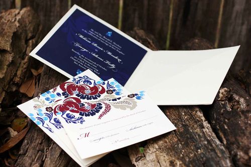
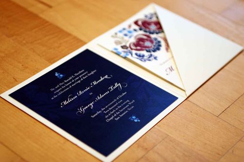
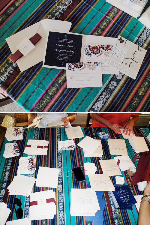
Melissa and George were married last October in San Antonio, Texas. Â Melissa works as a graphic designer, so naturally she decided to take on the task of designing her own wedding invitations. Â With her bold pattern selections and color palette, Melissa infused her invitations with a folk art-inspired feel, while still maintaining a traditional layout that suited her semi-formal wedding:
From Melissa:Â I loved the idea of a square format invitation and a full-bleed (no white border) design, but knew I needed to include a lot of information and wanted a more formal look-and-feel, since our church wedding and reception was more on the traditional side.
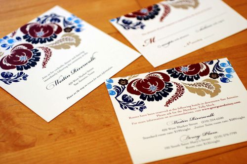
I sourced vector artwork from Shutterstock and colored and rearranged the pattern until I found one I liked. Our wedding colors were navy, cranberry and cream with a hint of turquoise, which I think was fully reflected in the final design.
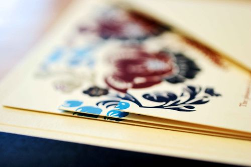
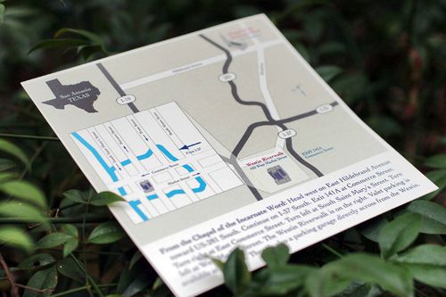
We had more than half of our guests traveling from out of town, so I needed to include hotel and transportation information and a map of the area, along with our web site url and RSVP postcard. Â The three stacked cards were designed to look like one cohesive image, but staggered to fit all the necessary details. Â The diagonal pocket folder and envelopes were from Paper Source.
The invitations were digitally printed by Ginny’s Printing in Austin, Texas on 100# Classic Crest natural cover.  My mom, sisters, grandmother and bridesmaids helped assemble more than 200 invitations by affixing glue dots to the back of the navy blue card and attaching the cranberry belly bands.
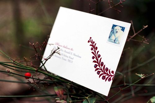
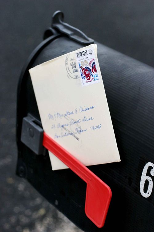
My mom hand-addressed each envelope — and she also calligraphed the guests’ names on small square cards attached to the belly band around the invitation.  She’s a champ!
Melissa is now offering her wedding invitation design and several other designs as printable invitations in her etsy shop — check out the full selection right here!
{image credits: invitation photos by Katie Shagman, assembly photos by Melissa}

