Pink + Yellow Elephant Baby Announcements

I've been saving these sunny and happy birth announcements all week — the joyful pink and yellow color palette seems like a perfect fit for a Friday morning!  Richele from Richie Design created these two-color letterpress birth announcements, with a space on the left where the new parents could include a photo:

Pink-yellow-elephant-baby-announcement

I particularly love the pink baby elephant surrounded by hearts:

Pink-yellow-elephant-baby-announcement2
Pink-yellow-baby-announcement-digital-mock-up

So cute!  Richele has a bunch of other baby announcements and wedding invitations on her blog, and you can find her stationery and note cards in her etsy shop!

{image credits: richie design}

Home Office Inspiration

There is a separate room in our new apartment that was billed as a 2nd bedroom, but which is really too small to be anything other than a home office.  We’re still getting things settled in the bedroom and living room, so the office is more of an overgrown storage closet at the moment.  Even though it’ll probably be a couple of weeks before I can really focus on getting that room together, I’ve been busy collecting inspiration and ideas.  I’m particularly loving the combination of dark walls with matchstick bamboo shades that Chelsea and Anne both recently featured:

Lonny-Dark-Office {photo from Lonny via frolic!}

Bamboo-shade-canadian-house-home {photo from Canadian House and Home via The City Sage}

As I mentioned, the room is pretty small and has only one window, so I do worry about dark walls making the room feel too cave-like, although as long as the room feels warm and cozy I think it would be okay.  Even if I chicken out on the dark walls, I think the matchstick shades would look pretty good with a lighter wall color, although not necessarily this robin’s egg blue:

Lonny-Bedroom{photo via Lonny}

Also on my list – find a new desk!  I’m hoping to get out of the city for a weekend at some point soon and go antique shopping in the hopes of finding the perfect piece!

{images from their respective sources}

Matt + Lauren’s Hand Lettered Save the Dates

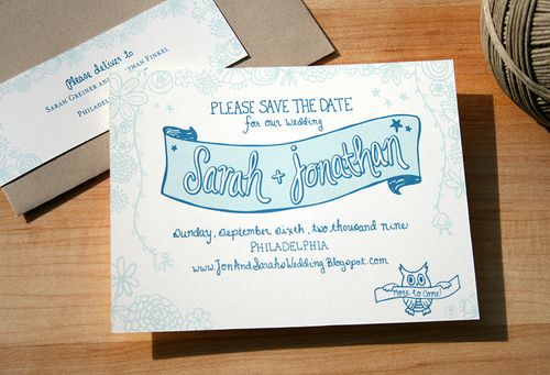
I’m super-excited about today’s Save the Dates because we get to go through the entire creation process, from inspiration to sketching to the final result!

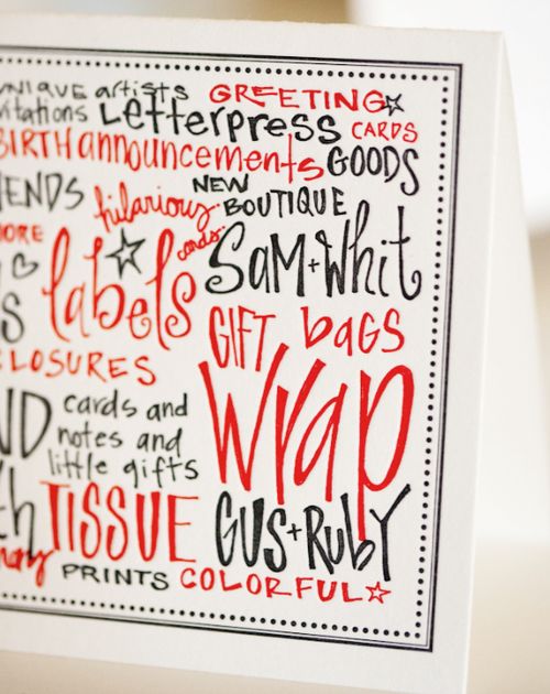
These Save the Dates come to us from Sam and Whitney at Gus & Ruby Letterpress, who were approached by Lauren and Matt last October to discuss their upcoming June wedding.  Having received the store’s grand opening invitation in the mail, they were set on having Whitney use her fun handwriting to hand-letter the text and then blind print them on super-thick stock.

Gus-Ruby-Store-Opening
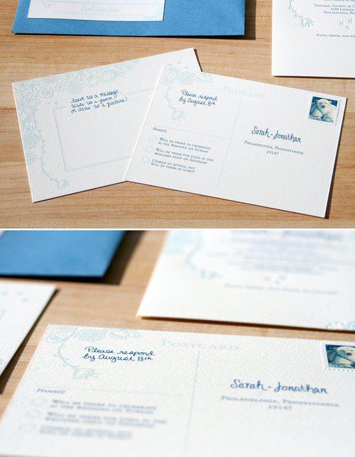
{photo by Emilie Inc. Photography}

Whitney started off by sketching out options in different hand-lettering styles…

Hand-Lettering-Sketches

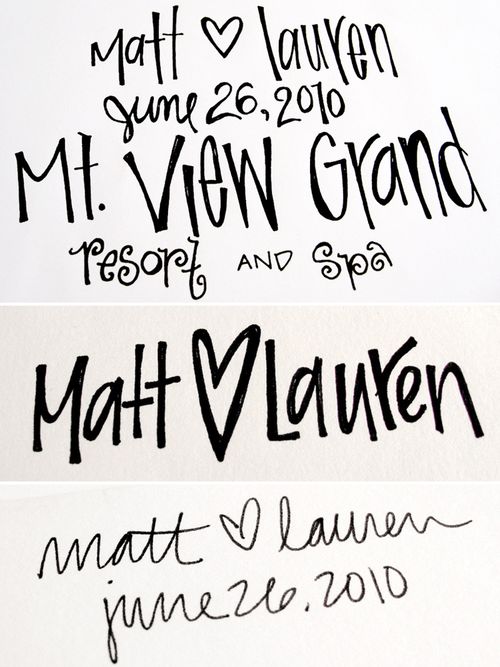
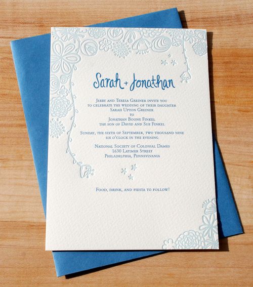
…and eventually came to this final design:

Save-the-Date-Sketch

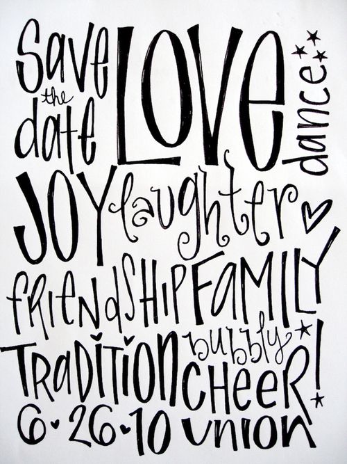
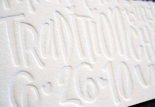
And here’s the printed result!
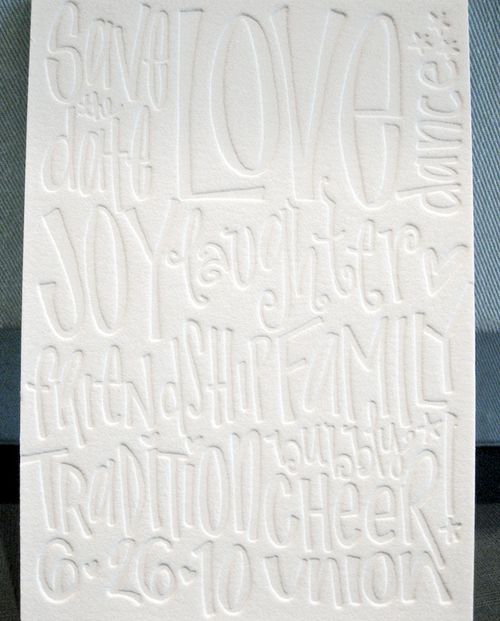
Save-the-Date

From Whitney: The blind printing came out beautifully on the duplex because I was able to give it a lot of impression without showing through to the back side.

Save-the-Date-Detail2

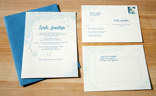
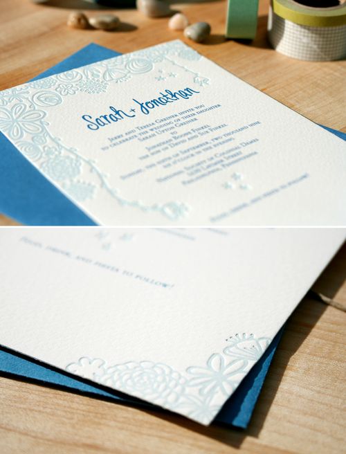
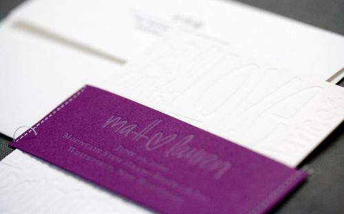
Lauren, who is super crafty, also wanted a purple belly band that she could sew herself.  We chose a nice, rich, beet paper for the band, but instead of bringing in another ink color, we chose to print opaque white knowing that the effect would be a lighter shade of the beet — more of a lavender.

Hand-Letter-Blind-Impression-Letterpress-Save-the-Date
Purple-Letterpress-Wedding-Invitation-Belly-Band
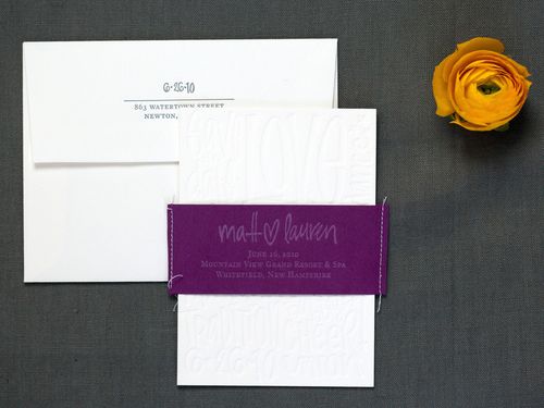
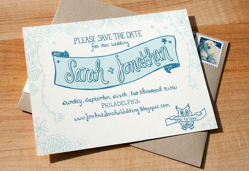
{photos by Emilie Inc. Photography}


I had never printed opaque white on a dark, colored stock, but was thrilled with the results.  Once they were finished Lauren brought her sewing machine to the store and we assembled them as a team.  Group assembly parties are always encouraged here at Gus & Ruby Letterpress!

Thanks Sam and Whitney!

{image credits: where noted photos by emilie inc., all others courtesy gus & ruby letterpress}

Sarah + Jon’s Floral Illustrated Wedding Invitations

As promised, I’ve got Sarah and Jon’s wedding invitations to share!  Sarah continued her nature-inspired floral illustrations that we saw earlier today in the Save the Dates, while mixing digital and letterpress printing methods to give her invitations a tactile feel without going over budget.

Sarah-Letterpress-Floral-Wedding-Invitations-Main

From Sarah: We chose our venue because of its gorgeous garden tucked
away in Philadelphia so it was natural to use the lush beauty of
the grounds as inspiration when designing the paper for the event.

Sarah-Letterpress-Floral-Wedding-Invitations

I wanted the invitations relate to the Save the Dates, but a little more fancy.  Designing the invitations was not nearly as daunting as I
thought it would be.  As a graphic designer you put a lot of weight on personal
projects, especially when they are for your own wedding, but I really just let
our personalities and the venue do the talking in the end.

Sarah-Letterpress-Floral-Wedding-Invitations-Detail

Of course I wanted the invitations to be letterpress but couldn�t afford to print all of the pieces in two colors.  My
solution was to only letterpress the floral details on the invitation to emphasize their natural, organic quality and to
keep all of the typography digital.  The postcard-style RSVP and the
accommodations card were printed digitally but the colors matched the letterpress
exactly.  Mercurio Brothers did the letterpress printing — and by only printing one
color, we saved a lot of money!

Sarah-Letterpress-Floral-Wedding-Invitations-RSVP

The RSVP cards were double-sided postcards and we encouraged guests to use the space on the back to write or draw us anything they wished.  We got some amazing words of wisdom and works of art along with their responses and saved them in an album along with our photos.

Thanks so much Sarah!  You can see more photos from Sarah’s wedding on her blog right here!

{image credits: sarah grenier}

Sarah + Jon’s Nature-Inspired Save the Dates

Today’s save the dates were inspired by the wedding venue’s beautiful natural setting.  Sarah and Jon were married in a lovely garden setting hidden away in the middle of Philadelphia.  And since Sarah is an illustrator and stationery designer, she couldn’t help but be inspired by the lush surroundings:

Chuppah-Flowers

From Sarah: My name is Sarah Greiner, and I am a packaging designer in Philadelphia with a little Etsy shop called RedRedOrange.  My husband Jon and I were married in September in a little garden behind the National Society of Colonial Dames.  It is a historic building with tons of character, but it was the gorgeous garden in the back that we were most drawn to.  Even though the site was right in the middle of Center City, the garden felt like a sanctuary where we could escape the hustle and bustle of downtown.

Birch-Chuppah-Canopy

For the Save the Dates, we wanted to give our guests a sneak peak into what the evening would hold and to set the tone for the laid back, dinner party atmosphere that we had planned.  The ceremony itself was going to take place in front of a brick wall covered in creeping vines and hydrangea bushes, and the cocktail hour would be under the stars.

Sarah-Illustrated-Banner-Save-the-Date

When I started sketching, I just kept envisioning a magical secret garden with flowers and greenery creeping in from all sides.  The banner that holds our names was a nod to the Chuppah canopy we would be married under.

Sarah-Illustrated-Floral-Save-the-Date

We wanted to stress that our wedding was going to be a casual affair in a garden setting so I hand drew everything on the Save the Dates (including the anatomically incorrect owl with four wings).  These were digitally printed at home.


Coming up next… Sarah’s wedding invitations!

{image credits: wedding photos by alyssa maloof, save the dates by sarah}