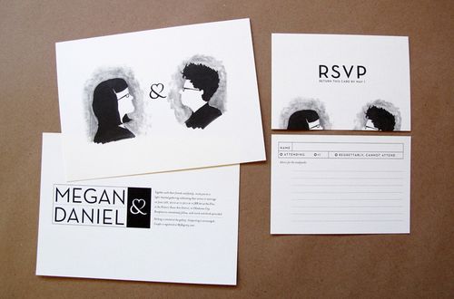
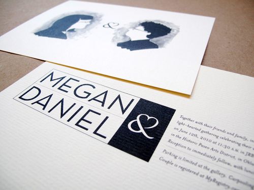
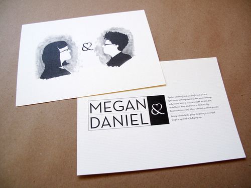
Happy Monday everyone! Â I thought I’d start the week off with a fun, quirky wedding invitation suite that Kathleen recently designed for her friend Daniel’s upcoming wedding. Â Kathleen kept the overall invitation relatively simple, incorporating a sweet illustration from the bride as the main design element. Â Check it out:

From Kathleen:  Daniel has been a longtime co-worker and friend of mine so I was not only thrilled that he found an amazing girl to marry but that he asked me to design their wedding invitations.

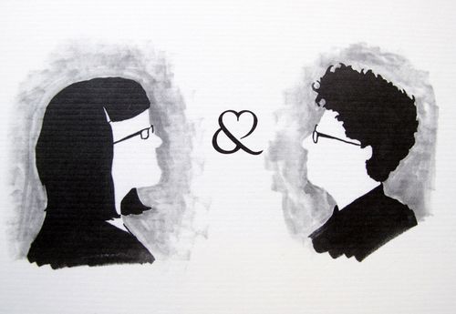
Megan drew up these quirky illustrations for me to use and from there I decided to keep it simple and let the illustrations do their thing.

I love utilizing only one or two colors when designing custom invitations — especially black (I
only used black on my invitations as well).

Using only one or two colors presents a unique challenge and produces even more unique invitations
every single time. Â Printing in a single color is also budget friendly.

We decided on an off-white touchy-feely matte textured stock to complement the hand-drawn silhouettes. The cream paper also takes some of the edge off a stark black and white invite.
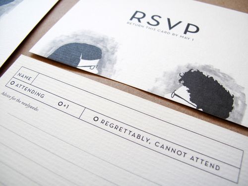
I absolutely adore the sweet little ampersand throughout the invitation suite, and I love the way Megan’s illustration peeks out from the bottom of the RSVP card — too cute!  Thanks so much Kathleen!
{image credits: jeremy and kathleen}

