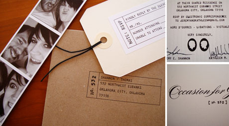
Holy moly do I love these invitations, featured yesterday on A Cup of Jo. From the vellum of the main invitation to the rsvp tag to the mix of script and typewriter fonts, the whole invitation suite is just fabulous:
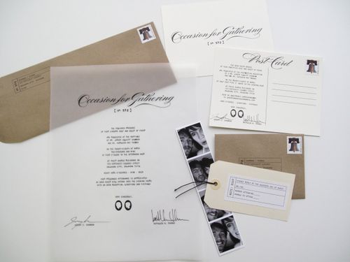
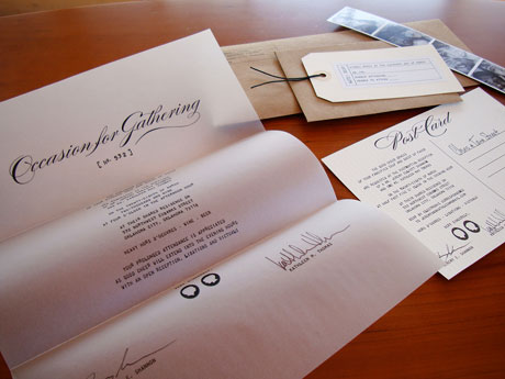
The bride, Kathleen, designed the invitations herself (she’s an art director for a local ad agency) and said she was going for a kind of Wes Anderson/correspondence letter vibe – and she definitely pulled it off! I particularly love the non-traditional wording on the invitation. Kathleen’s sister wrote the text with a few tweaks from Jeremy. In case you can’t read it in these photos, here’s what it says:
of your sincere self and guest of favor Are requested at the nuptials of
Jeremy + Kathleen*
Date
Time
Venue/Location
heavy hors d’oeuvres . wine . beer
Your prolonged attendance is appreciated
as good cheer will extend into the evening hours
with an open reception, libations, and victuals
Yours sincerely,
And then they signed the invitation below two custom silhouettes! How great is that? You can read more about Kathleen and Jeremy’s invitations on their blog right here.
*they use their full names here over two separate lines, but I’m abbreviating it here.
{images via A Cup of Jo and J + K}
Beautiful. I love all the different papers together. And vellum? Such a great look.
The photo booth addition is a fabulous idea!
Adele
gorgeous! love it!
Oh my word, I love this set so much!!
I’m looking to use kraft envelopes as well but find they tend to be quite flimsy. Any suggestions as to where I could buy some that are still recycled but feel a bit more sturdy? Thanks and gorgeous suite!
Hey All – for anyone looking for kraft paper supplies (either envelopes or paper), here are a few links that I would suggest:
Envelope Mall -http://www.envelopemall.com/SearchResult.aspx?CategoryID=56
Hobby Lobby – http://www.hobbylobby.com/ (if you have a store near you)
French Paper – http://www.mrfrench.com/results.asp?image=3037&wwwflag=3&imagepos=8
just perfect!!!!!!!!!
These are wonderful!! The vellum is what caused me to swoon. This is such a creative invitation, I can’t stop looking at the photo and taking in every little detail.
Thanks for posting!