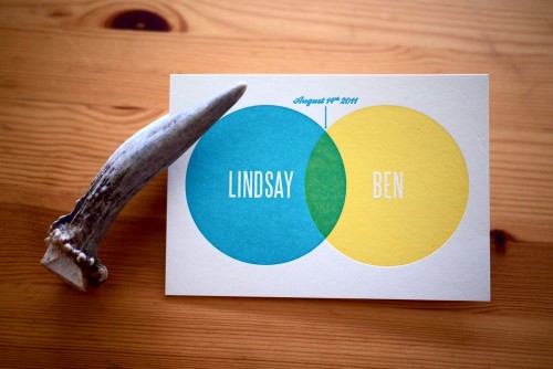
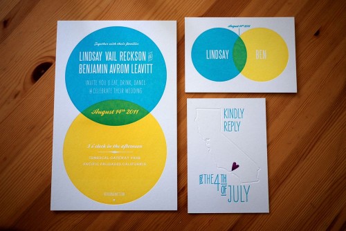
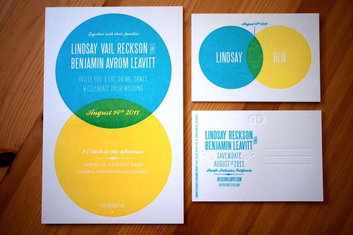
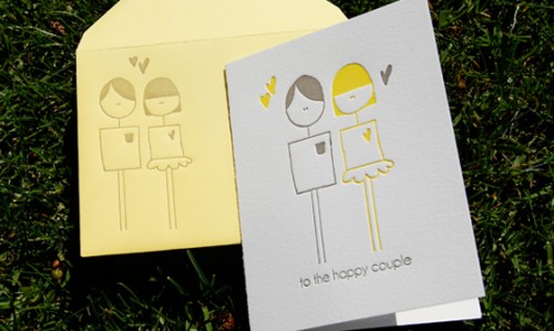
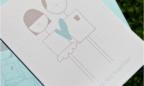
The concept behind this wedding invitation suite – a venn diagram – is just so completely perfect I can barely stand it.  Lindsay and Ben have been a couple for more than a decade, so when it came time to create their wedding invitations they couldn’t imagine a symbol that would better represent their relationship and upcoming nuptials.  From the bright color palette to the beautiful blind impression and overprinted letterpress elements, I’m loving every single detail from Lindsay and Ben’s invitations.

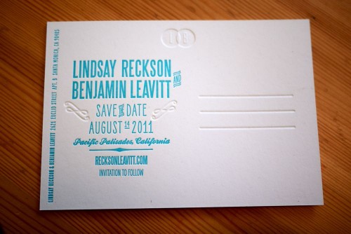
From Lindsay:  In February of this year, my fiancé Ben and I enlisted our close friend and Ben’s directing partner Nick Carbonaro to help us create an invitation suite that would capture our modern, upbeat aesthetic. The venn diagram became a way to mark our longtime union (we’ve been together for over ten years) and to celebrate the wonderful overlap that is our life together.  Another friend noted that our invitation color scheme mimics the ziplock seal: fittingly, as we like to keep things fresh (both relationship-wise and design-wise) and we love snacks.


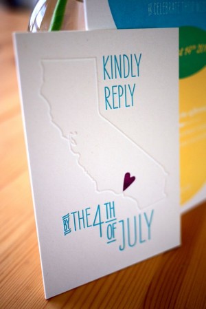
As our save-the-date postcard and invitation used the same venn diagram design, we wanted to do something a little different for our reply card.  Using a tiny, hand-carved stamp from etsy seller little t jane, we created a California-themed (and happily rhyming) postcard.
 Â
 
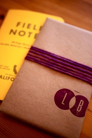
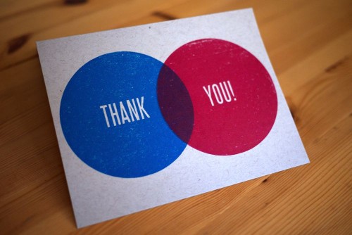
 We also carried the venn diagram into our wedding favors, wrapping small California state notebooks from Field Notes in butcher paper and stamping them with our initials.  And most recently, we used two enormous stamps and primary color inks to make our thank you cards.

Our good friend Laurie Smithwick of LEAP Design provided wonderful advice and guidance, and Studio on Fire printed the whole suite in gorgeous letterpress.

Just stunning Lindsay!  And totally pitch perfect from start to finish.  Congratulations!
Photo Credits: Lindsay + Ben

